
Wikipedia:Graphics Lab/Images to improve/Archive/Jul 2007
 | This page, part of the Graphics Lab Wikiproject, is an archive of requests for July 2007. Please do not edit the contents of this page. You can submit new requests here. |
 Done Persatuan Pandu Puteri Malaysia
-
b/w line art which also shows Guide Motto
Article(s): Persatuan Pandu Puteri Malaysia
Request: Please combine the two, larger size and text of the b/w with the color scheme of the pink one. Chris 05:06, 20 July 2007 (UTC)
Graphist opinion:
Improved SVG version of Persatuan Pandu Puteri Malaysia image Released into Public Domain Preaction 07:30, 20 July 2007 (UTC)
- I can't get it to open at the site that it's at. Thank you ahead of time, though! Chris 07:37, 20 July 2007 (UTC)
DonePoole Longspee Charter
-
 Original
 -
 Retouched


Article(s):Poole
Request: I took this image a few days ago unfortunately there are spoltlights all over the image and the lighting is bad. Not to mention the charter is at an odd angle. I'd appreciate anyone who could try and clean up the image and/or seperate the actual charter from the bricks/spotlights etc. Thank you so much! LordHarris
Graphist opinion: Sorry to say, but the best way to improve that image is to retake it. A very talented photoshopist may be able to do something, but a genuine picture is much better for that kind of thing. If you are able to retake the picture, that would be my suggested course of action. --BsayUSD [Talk] [contribs] 19:51, 21 July 2007 (UTC)
- Any specific advice? I'd assume that a straight on shot (If possible) would be preferred... 68.39.174.238 01:16, 22 July 2007 (UTC)
- Before you go having to take another picture, see if the retouch is satisfying. -- VegitaU 02:08, 23 July 2007 (UTC)
- Hi that retouch looks much better and the light reflections are gone. Great work and many thanks. I'll change it on the Poole article. Thanks again. LordHarris 09:59, 23 July 2007 (UTC)
- VegitaU, looks like you're a very talented photoshopist by my definition, keep up the great work! --BsayUSD [Talk] [contribs] 21:20, 23 July 2007 (UTC)
- Thanks.
 -- VegitaU 22:07, 23 July 2007 (UTC)
- Thanks.
Done Sedevacante coatofarms

Article(s): Way too many, including almost every papal conclave one, the template for them (!), and sede vacante.
Request: That a SVG free image be created to replace this noxious fair-use one. The Image:Emblem of the Papacy.svg has the keys and ring in it, so it could be used as a starting place, with someone coming up with the umbrella. 68.39.174.238 11:39, 12 July 2007 (UTC)
Graphist opinion:
I will start work now--Cronholm144 11:44, 12 July 2007 (UTC)
Yay! A-symmetrical and low-res my favorite. I will have something by tomorrow bout this time or before. Cheers--Cronholm144 12:33, 12 July 2007 (UTC)
added pic, prob due to a known error just keep clicking till you get to the image. The problem won't be there with the finished product.--Cronholm144 14:35, 12 July 2007 (UTC)
Possible solution: Save as a plain SVG in Inkscape. If there are any blurs or things this can also interfere. Also, would this new image also be fair-use? --Dave the Rave (DTR)talk 15:31, 12 July 2007 (UTC)
- I don't think so, mostly because that image itself has to be ancient, however I wouldn't know how closely you tried to copy the original image. 68.39.174.238 15:43, 12 July 2007 (UTC)
I went a little crazy with the shading, and I know it isn't uniform. I figured I'd give you a variety.--Cronholm144 03:15, 13 July 2007 (UTC)
You may wish to upload this to commons, they have two images, Image:Sede vacante.png (Fair use on Commons!) and Image:Pavillon pontifical.png, an "inferior" version. Thanx. 68.39.174.238 12:22, 13 July 2007 (UTC)
- What errancy, never mind, I just realized it WAS on Commons to begin with. Ick. Thanx for the SVG though. 68.39.174.238 12:23, 13 July 2007 (UTC)
If is okay with you I am going to finish, I have a feeling that the base pics are going to get deleted from commons--Cronholm144 06:59, 15 July 2007 (UTC)
- It looks fine now, but if you want to keep refining it that's fine, I think... 68.39.174.238 17:50, 15 July 2007 (UTC)
Done A bunch of small icons for a list


Article(s):List of wild mammal species in Florida
Request: I was looking to improve those pictures somehow. They came from ![]() , and I am using them in a table (other than the one above). Somebody said that they look "awful". I guess it would be good to keep the same look as they came from the original svg, but this is not an absolute requirement. Thanks for the help!--Legionarius 16:03, 20 July 2007 (UTC)
, and I am using them in a table (other than the one above). Somebody said that they look "awful". I guess it would be good to keep the same look as they came from the original svg, but this is not an absolute requirement. Thanks for the help!--Legionarius 16:03, 20 July 2007 (UTC)
Graphist opinion: Shouldn't take but a moment--Cronholm144 16:05, 20 July 2007 (UTC) The text is off center, but I am too lazy to fix it. :) someone else can or you can download inkscape and adjust them yourself--Cronholm144 16:25, 20 July 2007 (UTC)
- Thanks!! That was super fast.--Legionarius 16:32, 20 July 2007 (UTC)
- I can isolate the originals, if you prefer those.--Cronholm144 16:43, 20 July 2007 (UTC)
- What do you think is better? I was trying to keep the same look, because those icons are used in a number of taxonomy articles across WP. I was trying to find the same fond for the two extra "gray" I did, byt I am not good in this.--Legionarius 18:31, 20 July 2007 (UTC)
- I can isolate the originals, if you prefer those.--Cronholm144 16:43, 20 July 2007 (UTC)
Take a look now.--Cronholm144 19:03, 20 July 2007 (UTC)
- Looking great! Thanks!!!--Legionarius 19:49, 20 July 2007 (UTC)
I tweaked the gray ones, the reason that none of them looked right at first is complicated and annoying(media wiki engine). Anyways I think thats about it. Come by anytime.--Cronholm144 19:55, 20 July 2007 (UTC) BTW you can now scale the images to any size by indicating the desired number of pixels.--Cronholm144 19:56, 20 July 2007 (UTC)
- Hope you don't mind, I've retweaked the grey ones to use the same font face as the rest of the set. Cheers, Stannered 20:25, 20 July 2007 (UTC)
Mind??? This is a collaboration, I believe thanks are in order...Thanks, looks much better :)--Cronholm144 00:53, 21 July 2007 (UTC)
- Thanks to both! Ny article is looking much better. What was the Font btw?--Legionarius 01:33, 21 July 2007 (UTC)
- I used FreeSans Bold, as FreeSans was mentioned in the original image for the captions (although it renders as Bitstream Vera Sans on MediaWiki, so I converted it to paths as was done in the original for the two-letter codes). Stannered 04:54, 21 July 2007 (UTC)
- Thanks :-)--Legionarius 19:12, 21 July 2007 (UTC)
- I used FreeSans Bold, as FreeSans was mentioned in the original image for the captions (although it renders as Bitstream Vera Sans on MediaWiki, so I converted it to paths as was done in the original for the two-letter codes). Stannered 04:54, 21 July 2007 (UTC)
- Thanks to both! Ny article is looking much better. What was the Font btw?--Legionarius 01:33, 21 July 2007 (UTC)
Done Lightbulb image


Articles: Template:Wider attention
Request: SVGify maybe? As it's currently used on that template, it's very badly blown up. 68.39.174.238 12:07, 17 July 2007 (UTC)
Graphist opinion:
I will take care of it, BTW please use the template at the top of the page--Cronholm144 16:12, 17 July 2007 (UTC)
If the background isn't white there could be a problem. Let me know if I need to adjust.--Cronholm144 16:53, 17 July 2007 (UTC)
Nevermind it is solid now. I reset the gradient styling.--Cronholm144 17:09, 17 July 2007 (UTC)
The name of this image implies that it's part of an icon set. If so, there may be an SVG already available somewhere. This would probably be preferable to use, but at the least, the source of the image should be found so it can be put on the image details. CountingPine 18:06, 17 July 2007 (UTC)
This is the icon for the KDE program Ktip, I installed it on my system, but the SVG wasn't much, infact the one Cronholm has made is much better, no need to worry about if there is an SVG out there now. > Rugby471 talk ⚔ 18:15, 18 July 2007 (UTC)
- You're right, I found a link to the icon, and there does seem to be a disparity between the SVG and the 64*64 PNG. The new SVG is indeed better. I've updated the details for both versions and put the 64*64 PNG as the original source. CountingPine 01:39, 19 July 2007 (UTC)
I think we can consider this one finished. CountingPine 15:46, 26 July 2007 (UTC)
Done "Wallpaper" templateicon
-

-
 How about just using this for {{wallpaper}}
 -
 Wide version


Articles: None, but a ton of images via Template:wallpaper.
Request: Basically an image that gets the point across without using any potentially copyrighted elements (See image talk page for the concerns of this one). 68.39.174.238 01:21, 22 July 2007 (UTC)
Opinion: How about just changing {{wallpaper}} to use an existing free image like Image:Video-display.svg? Mike Dillon 01:57, 22 July 2007 (UTC)
- I see that you've changed it. It looks like there are a few more places where the old image is being used:
- I thought it might be cool to make a "widescreen" version of Image:Video-display.svg, so I had a go at it as Image:Video-display-wide.svg. Mike Dillon 02:10, 24 July 2007 (UTC)
Cool, just added some translucent arrows to make it obvious Mike.
Done Map of Yellowknife, NWT - SVG issue
-
 Yellowknife Map

Article(s):
Request: Bit of a different request today: This image looked fine in Illustrator, but when I uploaded it to Wikipedia, the bottom half of the land area gets cut off. Could anyone help me with this? Thanks. -YK Timestalk 22:28, 25 July 2007 (UTC)
Graphist opinion: It looks like the land layer was misaligned with the ocean and text overlay. How does it look now? Mike Dillon 23:52, 25 July 2007 (UTC)
- Sorry Mike. Maybe I had exported it wrong, but the bottom layer of land was aligned properly, but rather just cut off; the dot for Yellowknife was located correctly. I went back into Illustrator, and re-saved the map, and it came out fine this time. Thanks for your help though. -YK Timestalk 14:55, 26 July 2007 (UTC)
- Sounds good. Mike Dillon 14:58, 26 July 2007 (UTC)
Beeching II Map
Because of the success of that (Central Citylink) map- could you do the same to this image:

A simplified version (like the Citylink map) would be find, but could you keep it in the shape of the UK as far as possible? The original image is probably unsuitable for the same reasons, although it has not been marked as such.
Many thanks, Dewarw 17:44, 7 July 2007 (UTC)
Uhh, Has anyone helped you? If they haven't I can start now.--Cronholm144 21:42, 8 July 2007 (UTC)
Done, except for one island.--Cronholm144 02:10, 9 July 2007 (UTC)
Looks good! Would it be possible for you to put any of the place names on the map? If you could, it would be a great help. Thanks again, Dewarw 18:43, 9 July 2007 (UTC)
I can't read the place names, I will need a list or higher resolution--Cronholm144 19:53, 9 July 2007 (UTC)
Here is the map in a higher resolution. It is in three parts. If you still cannot get all of the names then I will be able to write them. Dewarw 21:28, 9 July 2007 (UTC)
Here are the names. If it looks like I have missed one please say, or use the higher resolution images. They are top to bottom. Where two/three are at the same level, they are listed side by side. I would only use these names as a last resort as there might be small mistakes.
- ELGIN
- INVERNESS
- ABERDEEN
- MONTROSE
- DUNDEE
- PERTH
- STIRLING
- DUNFERMLINE
- GLASGOW
- EDINBURGH
- BERWICK-UPON-TWEED
- CARSTAIRS
- KILMARNOCK
- AYR
- DUMFRIES
- CARLISLE
- STRANRAER SUNDERLAND
- NEWCASTLE
- WORKINGTON
- MIDDLESBROUGH
- DARLINGTON
- NORTHALLERTON
- SCARBOROUGH
- BARROW
- HEYSHAM HARROGATE
- YORK
- LEEDS
- BLACKPOOL BRADFORD HULL
- GRIMSBY
- DONCASTER
- LIVERPOOL MANCHESTER
- SHEFFIELD
- HOLYHEAD
- LINCOLN
- CHESTER
- CREWE
- STOKE
- DERBY
- GRANTHAM
- NOTTINGHAM KINGS LYNN
- STAFFORD YARMOUTH
- NORWICH
- SHREWSBURY LEICESTER
- WOLVERHAMPTON PETERBOROUGH
- BIRMINGHAM ELY
- RUGBY
- NORTHAMPTON
- WORCESTER
- CAMBRIDGE
- IPSWICH
- BANBURY
- HEREFORD
- BLETCHLEY COLCHESTER HARWICH
- FISHGUARD HARBOUR
- GLOUCESTER
- CARMARTHEN
- OXFORD
- MILFORD HAVEN WATFORD
- SWANSEA DIDCOT SOUTHEND-ON-SEA
- NEWPORT
- LONDON
- SWINDON
- BRISTOL
- READING
- CARDIFF
- BATH
- WESTBURY GUILFORD ASHFORD DOVER
- FOLKSTONE
- SALISBURY WINCHESTER
- TAUNTON
- HASTINGS
- YEOVIL SOUTHAMPTON HASTINGS
- EXETER BOURNEMOUTH NEWHAVEN EASTBOURNE
- WEYMOUTH
- PLYMOUTH
- PENZANCE
- Did you trace that manually? I think we have fairly precise SVG outlines of Britain around here somewhere... ¦ Reisio 02:39, 10 July 2007 (UTC)
Yes, as a last resort. Unfortunately, the accurate svg Britain we have on commons doesn't match well with the Britain in the pic (railroads into the ocean). The country must have changed shape! :)--Cronholm144 03:21, 10 July 2007 (UTC)
Thanks a lot, it is coming on really well. I don't mean to be picky, but I have spotted a few slips. Unfortunately on the map "R"s look like "A"s so it is "Perth" not "Peath."
Others:
- Harwich, not Warwick.
- Fishguard Harbour, not Harbor.
- Hastings, not Hasting
- Southend on Sea not Southead
I am really grateful for this, Dewarw 16:48, 10 July 2007 (UTC)
Done, I will upload momentarily--Cronholm144 20:46, 10 July 2007 (UTC)
For the record, I've added in the islands shown on the original (to make it look 'right') and fixed a typo (Kilmanrock -> Kilmarnock). Time3000 12:31, 13 July 2007 (UTC)
Awful scan of old engraving

Article: Attock
Request: To me that looks like a horrendous scan of an old image, but I don't know if anything can be done for it. If not, I would request possibly it be deleted as an awful blurry thing. 68.39.174.238 15:35, 11 July 2007 (UTC)
Graphist opinion: I think the best thing that can be done for it is to reupload the source version at its original size. It's a shame the original was uploaded at such low quality. CountingPine 13:08, 12 July 2007 (UTC)
- The source image is the same low quality. Question is where the image came from in the first place. Valentinian T / C 13:16, 12 July 2007 (UTC)
- Should be be deleted as "no source" ? 68.39.174.238 12:48, 13 July 2007 (UTC)
Map of rabies, etc
-
Source GIF
-
 Base SVG Map
 -
 SVG with no text


Articles: Rabies
Request: An SVG-image, which correct applications of information, and a little text in the image as possible. You may wish to preserve the existing image as an example of what SHOULDN'T be done with a map! 68.39.174.238 15:48, 12 July 2007 (UTC)
Opinion: That shouldn't be too hard. Would it be okay to base it on the blank world map (see above)? Also, are there any preferences as to colours? I'll have a go at creating an initial SVG. --Dave the Rave (DTR)talk 17:54, 12 July 2007 (UTC)
- Due to the sheer size of the Base SVG (WOW) I'm having some problems editing it in Inkscape, and I don't really know how to edit it as XML. I'll just trace the original and see if that is acceptable. My apologies. --Dave the Rave (DTR)talk 18:29, 12 July 2007 (UTC)
- First Upload: How's that? --Dave the Rave (DTR)talk 20:28, 12 July 2007 (UTC)
- The base SVG file is pretty straightforward to edit for something like this, since the
<g>or<path>elements representing the top-level object for each country are identified by their ISO country codes. For example, Australia hasid="au"on it. Mike Dillon 03:48, 13 July 2007 (UTC)
- No good, while it's an SVG and doesn't have the text, it's still no good. "Singapore" is still about 500 times too large. Are you sure the blank world map is no good? Also, as to the colors, you could probably keep the grey and white and just fill in the requisite countries in green on it. 68.39.174.238 12:08, 13 July 2007 (UTC)
- I've done a very simple version without the text. Unfortunately, Guam doesn't show up at all (it's just too small) - I don't know whether this is important or not. The text shouldn't be too hard to add when I (or someone else) gets the opportunity. Time3000 13:00, 13 July 2007 (UTC)
- Perfect! 68.39.174.238 15:16, 13 July 2007 (UTC)
- Apologies for being useless and having a slow PC. --Dave the Rave (DTR)talk 15:20, 13 July 2007 (UTC)
- It's fine. I suspect that tracing could be deleted now though, since the newer SVG has been substituted. 68.39.174.238 12:13, 14 July 2007 (UTC)
There's a note on the original image's page suggesting Australia should no longer be on an accurate, up-to-date map. ¦ Reisio 07:05, 15 July 2007 (UTC)
"Holy See" coatofarms
Articles: Coat of arms of the Holy See and others
Request: This one should be easy: The Coat of Arms of the H.S. is just the Vatican City coatofarms with the colors of they keys interchanged and the cord done in gold (Image:Coa Vatican.svg). 68.39.174.238 12:12, 14 July 2007 (UTC)
Graphist opinion: Do you want us to colour the png and upload or an svg?--Cronholm144 12:33, 14 July 2007 (UTC)
- No, just screw with the SVG of the Vatican's coat of arms, since it's the same thing but with two colors difference. The PNG is some fairuse thing that I'm trying to supplant with a free SVG. 68.39.174.238 16:18, 14 July 2007 (UTC)
It has been screwed with.--Cronholm144 06:57, 15 July 2007 (UTC)
- Excellent, all articeluses replaced. 68.39.174.238 13:19, 15 July 2007 (UTC)
- I've removed the deletion notice from the original image. I remember a debate on WP:HV where the two images were described as similar but that something differed about the positioning of the cord. The original image's talk page carried the following comment: (quote) The arms of the Holy See, blazoned as follows: Gules, two keys in saltire or and argent, interlaced in the rings or, beneath a tiara argent, crowned or. This achievement is the only one I've found that conforms precisely to the blazon and was created by Bruno Bernard Heim, herald for John XXIII and John Paul I. (unquote). The main thing is, the blazon does not mention the keys being tied together. If the blazon doesn't mention it, then the keys should be depicted as in the fair use image. In any case, this one needs more researching. Valentinian T / C 18:59, 15 July 2007 (UTC)
- I've placed a comment on WP:HV asking for more information about the details of this insignia. Valentinian T / C 19:18, 15 July 2007 (UTC)
- I've dropped a note to WP:CATHOLIC as well. Don't know why I forgot to do so in the first place. Valentinian T / C 09:03, 17 July 2007 (UTC)
- I've placed a comment on WP:HV asking for more information about the details of this insignia. Valentinian T / C 19:18, 15 July 2007 (UTC)
- I've removed the deletion notice from the original image. I remember a debate on WP:HV where the two images were described as similar but that something differed about the positioning of the cord. The original image's talk page carried the following comment: (quote) The arms of the Holy See, blazoned as follows: Gules, two keys in saltire or and argent, interlaced in the rings or, beneath a tiara argent, crowned or. This achievement is the only one I've found that conforms precisely to the blazon and was created by Bruno Bernard Heim, herald for John XXIII and John Paul I. (unquote). The main thing is, the blazon does not mention the keys being tied together. If the blazon doesn't mention it, then the keys should be depicted as in the fair use image. In any case, this one needs more researching. Valentinian T / C 18:59, 15 July 2007 (UTC)
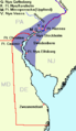
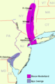
Done "New Sweden"
-
-
 Found this one later


Articles: New Sweden and Swedish colonial empire
Request: An SVG if possible, however anything could probably be better. 68.39.174.238 17:53, 15 July 2007 (UTC)
Request: In the interest of accuracy, and using the U.S. Post Office 2-character designators - Connecticut is "CT" ("CO" is Colorado).
Opinion: Just for reference: we also have image:Kartskiss över Nya Sverige.png which is nicer, but some may like an image that also shows the modern U.S. states. Valentinian T / C 21:11, 15 July 2007 (UTC)
- Excellent, I didn't know about that one. Anyway, if someone can make/find an SVG equivalent of this one, that would be nice, however in the mean time I think that is preferable on several counts to the present one... 68.39.174.238 23:56, 15 July 2007 (UTC)
I don't like maps all that much, but if someone doesn't bite in a couple of days I will take care of it.--Cronholm144 20:45, 17 July 2007 (UTC)
Both articles link to an SVG version. The CO/CT error is corrected. Karlfk (talk) 07:47, 28 August 2014 (UTC)
Scottish Parliament building

Article(s):Prince's Palace of Monaco
Request: See above Mcginnly | Natter 10:57, 16 July 2007 (UTC)
Graphist opinion: Same here, no real need for conversion to svg. We certainly can but this should be last on a very long list.
- No problem guys - I thought this one particularly was a bit 'lossy' but if you think its ok we can delete this request. regards --Mcginnly | Natter 23:13, 16 July 2007 (UTC)
With both of these I think SVG would be the ideal format, though I agree that it's not a priority. But if not SVG, then it would be better to have them as PNGs instead of JPEGs. See Wikipedia:Preparing images for upload. CountingPine 00:28, 17 July 2007 (UTC)
Done Erie, Pennsylvania — easy ones
-
 result
 -
 result
 -
 source for center of seal and flag

Articles: Erie, Pennsylvania
Request: SVGification. Note that the "Coat of Arms" in the center of both is, in fact, as far as I can tell, the same one as one the State Flag, which is already an SVG. 68.39.174.238 15:27, 13 July 2007 (UTC)
Graphist opinion:

...That flag is not an svg. Do you know of one that is?--Cronholm144 12:35, 14 July 2007 (UTC)
- This one? 68.39.174.238 16:18, 14 July 2007 (UTC)
Yes, I wasn't reading closely enough (I thought when you linked the flag it was the some one I was looking at).--Cronholm144 06:50, 15 July 2007 (UTC)
Hey Dave, could you do some PoP on the seal, Also, the lines deformed when I uploaded and I don't know why.--Cronholm144 08:34, 15 July 2007 (UTC)
- Hey, thanks for noticing! When I have time, I'll have a go at that. However, wouldn't it be simpler to use text on path (Text Menu/Put on Path), or is there a problem with MediaWiki? --Dave the Rave (DTR)talk 10:30, 15 July 2007 (UTC) Also, the lines look fine to me in Inkscape.... --Dave the Rave (DTR)talk 10:40, 15 July 2007 (UTC)
It must be mediawiki, maybe it would work if I saved it as a non inkscape svg?--Cronholm144 10:54, 15 July 2007 (UTC)
That's generally the best idea when uploading Inkscape SVGs, I find. Also, if some of the circle/lines are ellipses, maybe converting them to a path would help. --Dave the Rave (DTR)talk 11:25, 15 July 2007 (UTC) Also, flowed text and mediawiki don't get along well... --Dave the Rave (DTR)talk 11:29, 15 July 2007 (UTC)
I uploaded an image to commons, but it has the same problems as this one; I'm going to have my dinner, and try PoP later. --Dave the Rave (DTR)talk 11:45, 15 July 2007 (UTC)
That sounds good, the other option is the good ol' one letter...rotate...place letter...again... method. :)--Cronholm144 11:58, 15 July 2007 (UTC)
Now that I've thought about it, PoP would just do the same as text on path, but (in the XML) generate a path rather than text, so it would be same as converting the text to a path. The only problem with this is that defining the text as a path might increase the file size, and it would be difficult to edit after. I've done this, but if the result is impractical then it's time to move and rotate lots of text(!) --Dave the Rave (DTR)talk 12:59, 15 July 2007 (UTC)
Whoa there's something weird going on.... The text is rendered fine (except for the one I forgot to convert to a path), and the circles are messed up lots. --Dave the Rave (DTR)talk 13:16, 15 July 2007 (UTC)
I fixed that by using nested circles (fill only) with no border. The border of circles, when converted to a path, freaks out for some reason.--Cronholm144 13:34, 15 July 2007 (UTC)
What, so stroked circles are useless? This would be a lot easier if mediawiki used the same engine to render as Inkscape, or one that actually renders SVG properly. --Dave the Rave (DTR)talk 14:48, 15 July 2007 (UTC)
Yes, and yes. We will just have to deal for now though.--Cronholm144 15:37, 15 July 2007 (UTC)
Sigh... I will try to have these done by tomorrow.--Cronholm144 01:43, 21 July 2007 (UTC)
Seeing as 'tomorrow' was a long time ago, I'll try and finish this off for Cronholm. --Dave the Rave (DTR)talk 13:04, 4 August 2007 (UTC)
- There's the seal done, I'll work on the flag ASAP. --Dave the Rave (DTR)talk 15:38, 4 August 2007 (UTC)
- Just noticed the centre of the SVG seal is lightly different colour-wise when compared with the .JPG seal, that'll need fixing. Cronholm, I hope you enjoyed your holidays!
- Ack! Vacation came sooner than expected... but I am back now. However, it looks like Dave has things under control.--Cronholm144 11:20, 5 August 2007 (UTC)
- Thanks for that! I just uploaded the flag SVG: Any Comments? --Dave the Rave (DTR)talk 10:39, 7 August 2007 (UTC)

Thanks for making SVGs of the flag and seal of Erie (I don't know how to create SVG images or I would have made them myself), but (don't know if anyone else noticed) the word "incorporated" on the seal is spelled wrong. It's spelled "incorperated", it should have an "o" instead. --Dtbohrertalk•contribs 17:23, 7 August 2007 (UTC)
- That would be my fault. I'll fix that right away - shouldn't be too hard. Also, if you are interested about creating SVGs, you might want to take a look at Inkscape. It's free software that I (and most of the other Wikigraphists, I think) use Inkscape to make SVG images. --Dave the Rave (DTR)talk 18:36, 7 August 2007 (UTC)
- I've install Inkscape twice before, both times I tried and thought god this is complicated and uninstalled it. Maybe third times the charm. --Dtbohrertalk•contribs 18:54, 7 August 2007 (UTC)
- Spelling Mistake fixed. Anything else, any comments? (Especially from 68.39.174.238). --Dave the Rave (DTR)talk 21:22, 7 August 2007 (UTC)
- Excellent work, all of you. 68.39.174.238 16:48, 8 August 2007 (UTC)