
Wikipedia:Graphics Lab/Image workshop/Archive/Nov 2008
 | This page, part of the Graphics Lab Wikiproject, is an archive of requests for November 2008. Please do not edit the contents of this page. You can submit new requests here. |
Stale
Nkwenkwe Nkomo

Article(s): Nkwenkwe Nkomo
Request: define head better against dark backdrop... Chris (クリス • フィッチ) (talk) 01:13, 12 October 2008 (UTC)
Graphist opinion:
Colonialism

Article(s): Colonialism
Request: remove spaces on template at left Chris (クリス • フィッチ) (talk) 13:43, 12 October 2008 (UTC)
Graphist opinion:

.svg)
.svg)
Article(s): Colonialism
Request: the US Ethiopia and Saudi flags are wrong... Chris (クリス • フィッチ) (talk) 13:43, 12 October 2008 (UTC)
Graphist opinion: Sorry, what's wrong with them? §hep • ¡Talk to me! 23:56, 13 October 2008 (UTC)
- I think it's that they're anachronistic; Imperialism2.png seems to show a 50-star flag when it is supposed to be 45, it uses the modern Saudi and Ethiopian flags instead of the flags shown in the gallery above... --Golbez (talk) 00:47, 14 October 2008 (UTC)
- Smacks forehead. I thought he meant something was wrong with the flags. §hep • ¡Talk to me! 02:49, 14 October 2008 (UTC)
- I think it's that they're anachronistic; Imperialism2.png seems to show a 50-star flag when it is supposed to be 45, it uses the modern Saudi and Ethiopian flags instead of the flags shown in the gallery above... --Golbez (talk) 00:47, 14 October 2008 (UTC)
iPod lineup
-
 Model (make something like this with the new models)
 -
 Or like this, without blurring the screens
 -
 iPod Classic
 -
 iPod nano (only use the front)
 -
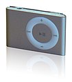 iPod shuffle


Article(s): iPod
Request: Apple announced their new iPod line a week or so ago, and the iPod article is without an image. Unfortunately, we don't have a free iPod Touch 2G pic yet, but in the mean time, I would like a conglomeration (much like the samples above) of the iPods shuffle, nano, and classic (we can add the touch later). I have linked what I think are the best images we have to work with in the gallery, but you can use anything you can find, provided the iPod resembles the ones in the above images (no point in using an old model).
A note about copyright: some users contest that Apple's interface is copyrighted and therefore we must blur the screens. I think this is absurd. It mischaracterizes the iPod, misleads users, and lessens the enc value. The nano is turned off anyway, and the classic (bereft of other iPods) is on the Commons without issue. Make a fair use claim (here, not on Commons), or make the screen look likes it's off (the nano would make a good guide), but don't blur the screen. Ideally, let sleeping dogs lie and worry about making the iPods look nice. Thanks in advance for you patience, understanding, and work.HereToHelp (talk to me) 02:13, 5 October 2008 (UTC)
- I think the principle of de minimis applies in this case. ---J.S (T/C/WRE) 00:55, 15 October 2008 (UTC)
- See also Commons:Commons:De minimis for a discussion about the implications on copyright law. ---J.S (T/C/WRE) 00:58, 15 October 2008 (UTC)
- Thanks. Aido2002 made the most recent version; I contacted him hoping he could use the old one and make the shadows uniform but he hasn't gotten back to me. In the mean time, how about an image?--HereToHelp (talk to me) 13:39, 19 October 2008 (UTC)
- See also Commons:Commons:De minimis for a discussion about the implications on copyright law. ---J.S (T/C/WRE) 00:58, 15 October 2008 (UTC)
Graphist opinion:
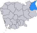
Map of Ratanakiri
-
 I made this crappy thing a while ago
 -
 The already existing useful scalable map
 -
 A topographical map made by User:Demoeconomist from Ratanakiri.svg
 -
 physical map


Article(s): Ratanakiri Province
Request: I'd like to have a vector map of Ratanakiri showing the province's physical geography (not administrative divisions, like we have now). The best map I've found is this. There's also this one. If someone could make something based on the first one, that would be great. Please, no administrative divisions. Also, the tourist sites are not needed. What I'd like is a map that shows the rivers, maybe the roads, and the towns. Thanks a million!! Calliopejen1 (talk) 18:58, 27 September 2008 (UTC)
Graphist opinion: You find a scalable map showing the district Ratanakiri already at commons(the second one above): commons:Image:Ratanakiri.svg
I made the third one above based on it: commons:Image:Ratanakiri_topography.svg--Demoeconomist (talk) 14:45, 12 October 2008 (UTC)
- I'll look into making a higher resolution map of this. Jackaranga (talk) 18:16, 14 October 2008 (UTC)
- I added one I made to the gallery above, let me know if you want me to add anything else, like towns, for example. The map you linked to shows some towns that don't seem to really exist (such as Andoung Meas), I have the Cambodia gazetteer, but there are too many little villages in it, so I can't decide which ones to plot. I left the elevation data as png embedded in the svg file, because elevation data is provided in raster format so it didn't make much sense converting to vector. Jackaranga (talk) 11:33, 22 October 2008 (UTC)
Republic of Ireland outline 1
-
 outline of Republic of Ireland including Northern Ireland (in pink)

Article(s): Republic of Ireland and many templates
Request: There are no simple outlines of the Republic of Ireland on its own without Northern Ireland. Similar to the one above without Northern Ireland, the numbers or the county boundries. Thank you! Help!--Googlechrome (talk) 18:24, 13 October 2008 (UTC)
Graphist opinion: Image:Ireland.svg can apparently be toggled to make Northern Ireland disappear. Also Image:Ireland stub.svg is republic only. /Lokal_Profil 19:11, 13 October 2008 (UTC)
- So what do you want done? §hep • ¡Talk to me! 23:42, 13 October 2008 (UTC)
- Here is Ireland.svg with N Ireland off: Image:Ireland outline.png Narayanese (talk) 23:43, 22 October 2008 (UTC)
Sinuiju Special Administrative Region Flag and Emblem
Article(s): Sinuiju Special Administrative Region
Request: SVG please --SelfQ (talk) 11:24, 16 September 2008 (UTC)
Graphist opinion: I gave a shot at converting the flag to Svg. What do you think? §hep • ¡Talk to me! 23:43, 26 September 2008 (UTC)
- I'll give the emblem a go. --Slashme (talk) 11:13, 19 October 2008 (UTC)
- OK, something just came up, so I only got the main shapes down before being interrupted. Next graphist please! --Slashme (talk) 11:44, 19 October 2008 (UTC)
- Shouldn't the svg flag also be fair use since it's derived of the fair use image. /Lokal_Profil 14:05, 19 October 2008 (UTC)
- Technically, it probably should be. But, there's no need for copyright paranoia. Also, since it isn't currently used in the article this keeps it from getting deleted. §hep • ¡Talk to me! 20:22, 19 October 2008 (UTC)
- Shouldn't the svg flag also be fair use since it's derived of the fair use image. /Lokal_Profil 14:05, 19 October 2008 (UTC)
- OK, something just came up, so I only got the main shapes down before being interrupted. Next graphist please! --Slashme (talk) 11:44, 19 October 2008 (UTC)
Another WAA Needs Work! (Please Fine-Tune it for me!)
Article(s): Wikipedia:WAA
Request: Make it look like a knight with a WAA-insigniated helmet is using a pencil's eraser as his weapon to "erase" the bad posts ("MAIM") from Wikipedia. Make it look like "MAIM" is half-gone, and a cloud of eraser shavings are where the other half of "MAIM" would be. BlueCaper (talk) 13:38, 24 October 2008 (UTC)
Graphist opinion: Whaaa? ... is there anything to start from, or is this a creative graphist project? James1293 (talk) 00:44, 25 October 2008 (UTC)
Map of Vancouer SkyTrain
-
 A map of the Vancouver SkyTrain.
 -
 SVG
SVG


Article(s): List of Vancouver SkyTrain stations
Request: I just want someone to help me in converting this image to SVG format. Thanks. -- SRE.K.Annoyomous.L.24[c] 23:02, 21 October 2008 (UTC)
Graphist opinion: What's wrong with Image:Vancouver SkyTrain Map.svg ? Your map is obviously just plagiarism of the svg one, you don't credit the original one like the license obliges you to, you didn't even bother to modify the description. If you do want to build on the SVG file, credit the author correctly, also it's pointless to convert from svg to jpg to svg. Jackaranga (talk) 11:48, 22 October 2008 (UTC)
- I'm surprised you would do this, you look like a reputable editor. Jackaranga (talk) 11:51, 22 October 2008 (UTC)
- I've fixed the licensing/source info. ---J.S (T/C/WRE) 17:49, 22 October 2008 (UTC)
- Jackaranga, May you please use a neutral point of view against me instead of calling me a "reputable editor". I am trying to help. Also, the original version of the map, the one you pointed out, include the SeaBus, the West Coast Express, and the pointers for the expansions/projects. So I made the one I am requesting for conversion just to remove those. I also don't know how to make an SVG file. All I'm saying is please use a neutral point of view and language. Thank You.
- I've fixed the licensing/source info. ---J.S (T/C/WRE) 17:49, 22 October 2008 (UTC)
By the way, thanks to J.smith for fixing the licensing/source info. -- SRE.K.Annoyomous.L.24[c] 03:23, 23 October 2008 (UTC)
- "reputable editor" is a compliment. "adjective: held in good repute; honorable; respectable; estimable: a reputable organization."[1] ---J.S (T/C/WRE) 13:44, 23 October 2008 (UTC)
- That ought to do it. §hep • ¡Talk to me! 22:18, 23 October 2008 (UTC)
- Crap!!!!!! Anyone know why the numbers got smaller, when I didn't even touch them? §hep • ¡Talk to me! 22:20, 23 October 2008 (UTC)
- Thanks for coverting the picture to svg. The only problem is, as mentioned above by yourself, are the wordings. Thanks again! -- SRE.K.A
nnoyomous.L.24[c] 22:23, 23 October 2008 (UTC)- Also, can you remove the note of the Canada Line opening, as the Canada Line is still undecided whether or not if it will be branded with SkyTrain. -- SRE.K.A
nnoyomous.L.24[c] 22:25, 23 October 2008 (UTC)- Sorry I missed that one. §hep • ¡Talk to me! 22:30, 23 October 2008 (UTC)
- Also, can you remove the note of the Canada Line opening, as the Canada Line is still undecided whether or not if it will be branded with SkyTrain. -- SRE.K.A
- Thanks for coverting the picture to svg. The only problem is, as mentioned above by yourself, are the wordings. Thanks again! -- SRE.K.A
- Crap!!!!!! Anyone know why the numbers got smaller, when I didn't even touch them? §hep • ¡Talk to me! 22:20, 23 October 2008 (UTC)
There is something wrong with both of these images. The Millennium Line stations, Sapperton and Braid, are switched, so I need them to be switched back to their original positions. Thanks. -- SRE.K.Annoyomous.L.24[c] 20:09, 25 October 2008 (UTC)
- Please keep discussions about the same image in the same section. Thanks. §hep • ¡Talk to me! 20:21, 25 October 2008 (UTC)
- The second image has been altered, but I'm not going to touch the orignal. I don't want to mess with text size of the numbers. §hep • ¡Talk to me! 20:26, 25 October 2008 (UTC)
Oeste region
Article(s): pt:Região de Turismo do Oeste, ...
Request: It's this map : http://europedirect.draplvt.min-agricultura.pt/imagens/mapa_regiao_oeste.png
Please, it's aslo a this map, not Portugal Cancelos (talk) 12:33, 17 October 2008 (UTC)
Graphist opinion:I was looking for a different map, and it would help to know where the map is located. Portugal from the looks of it? Also, what article would this go into? Thanks! §hep • ¡Talk to me! 21:12, 6 October 2008 (UTC)
- Image:LocalNUTS3Oeste.svg describes where in portugal it is. Image:Mapa de Portugal.svg can be used to get the subdivisions. /Lokal_Profil 16:57, 26 October 2008 (UTC)
Map of Portugal

Article(s): : pt:Portugal
Request: Hello, I would need to have this plan in SVG and another colors if possible, thank you Cancelos (talk) 20:01, 20 October 2008 (UTC)
Graphist opinion:
- Have you looked in commons:Category:SVG maps of Portugal. /Lokal_Profil 20:15, 20 October 2008 (UTC)
- I don't like others Cancelos (talk) 18:32, 21 October 2008 (UTC)
- What colors would you suggest, can you give us what the words say (diacritics and such), and what don't you like about the existing maps? That way we know not the replicate the problems. Thanks! §hep • ¡Talk to me! 21:47, 21 October 2008 (UTC)
- It's Portugal's beige and SVG. Cancelos (talk) 13:14, 25 October 2008 (UTC)
- Not going to try this one but for whoever is I recommend using Image:Mapa de Portugal.svg as a base. It's a complex map but it's easy to remove say municipal and national borders if only county borders are to be kept. /Lokal_Profil 16:46, 26 October 2008 (UTC)
- No because ; Portugal's article is voting for good article. This map is good, it's a jpg (SVG à faire !), Cancelos (talk) 07:55, 27 October 2008 (UTC)
- I don't like others Cancelos (talk) 18:32, 21 October 2008 (UTC)
Maas Brothers store
-
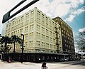 Maas Brothers downtown Tampa Store 1991

Article(s): Maas Brothers
Request: Can we remove that large object above the building in the upper left of the photo? It looks like an arm for a traffic light or something, but it's not really crucial to the image, and is rather distracting. And for the same reason, is it possible to remove the lady from the bottom of the photo? SchuminWeb (Talk) 05:55, 19 October 2008 (UTC)
Graphist opinion:Hi, I did retouch the image (removed the traffic light and the lady) but it seems the image have no source information and it is uploaded only in en wikipedia. Please complete source information and verify the copyright status of this images, then I can upload the retouched image to the Commons. ■ MMXXtalk 10:40, 19 October 2008 (UTC)
- Yeah. I can remove the object and the lady, only if you add source info. --Jackl 08:43, 26 October 2008 (UTC)
- Unfortunately, what you see on the image description page is all I have to go by. I have messaged the user, but have unfortunately received no reply. SchuminWeb (Talk) 18:54, 1 November 2008 (UTC)
Create Image:Hangul writing scheme.svg (SVG easy to do)
Article(s): Hangul
Request: Hello ! The Korean writing system have special rules of letter combinaisons, display on this this external image. It would be interesting to create an SVG image to showing the similar example. You can get the korean characters on Hangul or on the Korean wikipedia. Yug (talk) 21:39, 29 October 2008 (UTC)
- Am I right in assuming that the idea is to better illustrate the Jamo placement within a block section? --Wiml (talk) 19:03, 2 November 2008 (UTC)
Graphist opinion:
I encourage new graphists to manage this request, that can be an good start to practice with Inkscape. ;) Yug (talk) 21:39, 29 October 2008 (UTC)
White Americans

Article(s): White Americans
Request: wikify map, standard colors... Chris (クリス • フィッチ) (talk) 01:25, 22 October 2008 (UTC)
- By the way, one note: Canada's Maritime Provinces aren't yellow, while the rest of the country is; I'm assuming that the entire country should be the same colo(u)r. Nyttend (talk) 00:24, 1 November 2008 (UTC)
Graphist opinion: I might try to figure out Inkscape while recreating the map based on commons:Image:BlankMap-World6.svg Tadpole9(talk • contribs) 03:46, 4 November 2008 (UTC)
- I just found GunnMap, might use that instead. Anyone know the source of the data used in the existing image? Tadpole9(talk • contribs) 05:01, 4 November 2008 (UTC)
A few graphs on the housing bubble
-
 original
 -
 svg
svg -
 original
 -
 SVG
SVG -
 original
 -
 SVG
SVG -
 original
 -
 SVG
SVG -

-
 original
 -
 SVG
SVG -


Articles: Subprime mortgage crisis and related articels.
Request: For all of them, SVGify if possible, since they are perfect for it (Boxes, colors and text). For the graphs, they should be recreated with (if possible) a standard look, but definitely free of unneeded dimensions (EG. Spurious 3D effects or shading). 68.39.174.238 (talk) 20:49, 7 September 2008 (UTC)
- Question: Who vectorized these and didn't tell me? 68.39.174.238 (talk) 22:34, 29 September 2008 (UTC)
- Answer:Checking who uploaded them would be a good start, although the line graph doesn't look that accurate?. §hep • ¡Talk to me! 23:00, 29 September 2008 (UTC)
- A question for some other people: Do you think having the exact #s at the head of the bars is an improvement or not? 68.39.174.238 (talk) 22:39, 30 September 2008 (UTC)
If I can get the data used for these graphs then I can draw them all with gnuplot. -- Borb (talk) 14:30, 18 October 2008 (UTC)
Opinion:The last table simply as wikitable:
Earnings Remain Well Below Year-Earlier Levels year $ Billions -4 0 4 8 12 18 20 24 28 32 36 40 2004 1
31.8 2
33.2 3
34.7 4
32.6 2005 1
34.0 2
33.2 3
34.7 4
32.6 2006 1
36.9 2
38.0 3
38.1 4
36.3 2007 1
36.6 2
38.8 3
28.8 4
0.6 2008 1
19.3
Net operating income, securities and other gains/losses
--Demoeconomist (talk) 16:58, 23 October 2008 (UTC)
For the SVG of the cause/effect diagram, under "Response", the one box has "Hope New Alliance", which should be "Hope Now". Thanx, 68.39.174.238 (talk) 18:40, 26 October 2008 (UTC)
- Any idea why it gets so ugly at thumbnail size? I don't know that it would affect its use in articels, but I'm curious. 68.39.174.238 (talk) 21:08, 1 November 2008 (UTC)
- Thanx. Can you change "programe" to "program" ? 68.39.174.238 (talk) 23:10, 5 November 2008 (UTC)
BBFC U Cert

Article(s): BBFC
Request: There is a lot of noise around the edge of this image. Please could someone remove this noise. Thanks Mangwanani (talk) 18:02, 9 October 2008 (UTC)
Graphist opinion:
- Not sure I see what you mean. /Lokal_Profil 20:01, 12 October 2008 (UTC)
- Look around the outside edge of the black triangle. There is a lot of white noise in this area. While this may not be wholly visible in the chequered area it is noticeable on a black background. Mangwanani (talk) 15:45, 13 October 2008 (UTC)
- I also can't see any noise. Are we missing something? --Slashme (talk) 10:34, 27 October 2008 (UTC)
- You can't see it on the checkered background but copy it into Word or something and give the transparency a black background and there is a white haze around the triangle which can't be missed... There was also the same problem with the 15 Certificate but I put that in the lab and that was fixed. Mangwanani (talk) 10:49, 27 October 2008 (UTC)
- That's the best I could get it, but I only have MS Paint to work with. Someone with PS should be able to do this better with less hassle. Hope that helps. §hep • ¡Talk to me! 06:33, 29 October 2008 (UTC)
- You can't see it on the checkered background but copy it into Word or something and give the transparency a black background and there is a white haze around the triangle which can't be missed... There was also the same problem with the 15 Certificate but I put that in the lab and that was fixed. Mangwanani (talk) 10:49, 27 October 2008 (UTC)
I just cleaned up the U one completely. I uploaded it back over the original. I'll do the 12 when I get a moment. Mfield (talk) 06:53, 29 October 2008 (UTC)
I knocked out the 12 and uploaded it over the original. --pbroks13talk? 09:16, 7 November 2008 (UTC)
Cordoba flag
-
Cordoba flag (to SVGize)
-
SVG coat of arms for center of flag
Article(s): Córdoba, Spain
Request: Can you SVGize the flag. Shouldn't be too difficult since the hardest parts are already done in the coat of arms. gren グレン 01:43, 13 October 2008 (UTC)
Graphist opinion: Done. I'm waiting for a copyright issue with the arms (actually the city logo) to be resolved over at Commons—I'll upload as soon as it's clear. Fvasconcellos (t·c) 02:57, 13 October 2008 (UTC)
- Thank you, and sorry I didn't see that there was a copyright issue when I requested this (and I didn't sign my name). gren グレン 10:59, 18 October 2008 (UTC)
- Actually, it appears they have been deleted. Will you upload it... or at least the original with a fair use claim? I did not make a copy. gren グレン 11:00, 18 October 2008 (UTC)
- I'd upload it as fair use, but what about Image:Flag of Córdoba, Spain.svg? Fvasconcellos* (t·c) 18:49, 1 November 2008 (UTC)
Resolved
Jaffna library
-
 Photo of the Jaffna library
 -
 Edit1 by Mfield


Article(s): Burning of Jaffna library
Sri Lankan place name etymology
Request: In my opinion, the img is slightly tilted. Could one make the building look parallel to the horizon? Jasy jatere (talk) 08:41, 28 October 2008 (UTC)
Graphist opinion: How about this? Corrected pincushion and perspective distortions, slight rotate, noise reduction on sky. Mfield (talk) 09:06, 28 October 2008 (UTC)
- nice work in taking out the frog perspective. However, I think that the frog perspective was not a problem. Now the walls are very close to the border of the img, which makes the img look squeezed, don't you think? My main problem with the original was that it seems like the left hand side of the building is lower than the right hand side.Jasy jatere (talk) 17:49, 28 October 2008 (UTC)
- Well, its an architecture shot and as such the verticals should be vertical to give an accurate viewer representation of the subject. Unfortunately there was not enough space left in the original image to allow correction with any less crop than this, but a tight corrected crop is infinitely preferable to a building that appears to be falling backwards for encylopedic purposes. I certainly don't think the image looks squeezed. Mfield (talk) 18:01, 28 October 2008 (UTC)
- OK, I trust your judgment on matters of photography. It is indeed a pity that there is not more space left, but I suppose there is nothing that one could do. Can you change the default img then? Jasy jatere (talk) 21:30, 28 October 2008 (UTC)
The Prisons Department


Articels: Bureau of Prisons
Request: SVGify the seal, based on the Justice Department's one. Thanx, 68.39.174.238 (talk) 19:19, 17 October 2008 (UTC)
Opinion: That's incredible. Resolved, then? James1293 (talk) 00:37, 25 October 2008 (UTC)
- No, nothing's been done.... 68.39.174.238 (talk) 01:00, 25 October 2008 (UTC)
- Looks good, as best I can tell on this terrible monitor. 68.39.174.238 (talk) 08:31, 29 October 2008 (UTC)
Cherokee flag


Article(s):
Request: SVGify... Chris (クリス • フィッチ) (talk) 06:11, 26 October 2008 (UTC)
Graphist opinion: How's that? --pbroks13talk? 06:26, 27 October 2008 (UTC)
- Good, except the Cherokee characters are the wrong ones, and maybe make the star larger in the middle. But beautiful thus far! Chris (クリス • フィッチ) (talk) 06:32, 27 October 2008 (UTC)
- Oops. I messed up the last letter. The text translates to "Tsa la gi yi A ye hli". Look at this image and match up the text with the letters. I think that it is just a font difference. --pbroks13talk? 06:51, 27 October 2008 (UTC)
- Looks good, but your last edit reduced the star size again. Chris (クリス • フィッチ) (talk) 07:00, 27 October 2008 (UTC)
- That's a neat trick! What did I do when I hit ctrl+F5? Thank you so much for your beautiful work! Chris (クリス • フィッチ) (talk) 07:17, 27 October 2008 (UTC)
- Short explanation (Sorry): It basically tells your browser to go and get and render the website, even if it thinks it already knows what it looks like (When I learned it (On IE), Ctrl+F5 was called "Unconditional refresh"). 68.39.174.238 (talk) 08:14, 29 October 2008 (UTC)
Scout Wikiproject logo (our own image, so free to tweak)
Chris (クリス • フィッチ) (talk) 17:01, 30 October 2008 (UTC)
-

-
 Symmetrical version with filled in trefoil
 -
 now that I'm looking at them side-by side, this should be color-matched
 -
 Scout logo.svg
 -
 GGGSgreengold3.svg


Article(s): 1500+
Request: Please make the green behind the yellow symmetrical (you can tell it's not), have the hollow trefoil filled in with green (textured like the yellow petals), so that both the boy emblem and the girl emblem have substance, bulk and texture. When I first designed the original, I didn't even think about that, I was trying to simply incorporate both emblems. Now this seems like a natural progression. Chris (クリス • フィッチ) (talk) 01:12, 9 October 2008 (UTC)
- Ps-enlarge stars so they are clearly visible, and remove the black shading behind them. Thanks! Chris (クリス • フィッチ) (talk) 01:16, 9 October 2008 (UTC)
- We generally use this logo on a green background; at smaller sizes the trefoil is very washed out. --—— Gadget850 (Ed) talk - 10:28, 9 October 2008 (UTC)
Graphist opinion:
- I'm on it. /Lokal_Profil 17:40, 10 October 2008 (UTC) —Preceding unsigned comment added by 92.236.228.40 (talk)
- Done. everything in that image was asymmetrical actually. Made it symmetrical and filled in trifoil. Do you want even bigger stars? /Lokal_Profil 23:38, 10 October 2008 (UTC)
- Looks good. Make the stars about 50% larger; compare to Image:BSA universal emblem.svg. --—— Gadget850 (Ed) talk - 10:40, 11 October 2008 (UTC)
- Done. everything in that image was asymmetrical actually. Made it symmetrical and filled in trifoil. Do you want even bigger stars? /Lokal_Profil 23:38, 10 October 2008 (UTC)
- Proportionally, the stars should be about 1/3 the width of the petal, so actually larger, please. Chris (クリス • フィッチ) (talk) 00:59, 12 October 2008 (UTC)
- Chris- How about making the trefoil larger so the height is the height of the FdL? --—— Gadget850 (Ed) talk - 01:14, 12 October 2008 (UTC)
- Usually that proportion is not done, because the trefoil has no lower bulk, see Image:Sweden SSF.svg. Chris (クリス • フィッチ) (talk) 01:22, 12 October 2008 (UTC)
- Chris- How about making the trefoil larger so the height is the height of the FdL? --—— Gadget850 (Ed) talk - 01:14, 12 October 2008 (UTC)
- This is really beautiful work, by the way! Chris (クリス • フィッチ) (talk) 01:25, 12 October 2008 (UTC)
- I reverted one step so the stars are more centered. I think it's great, what about you, Ed? Chris (クリス • フィッチ) (talk) 01:01, 13 October 2008 (UTC)
- Looks great. Put it up at WT:SCOUT for review. --—— Gadget850 (Ed) talk - 19:55, 13 October 2008 (UTC)
- Already done. Thank you, Lokal, please upload it over the original name, so we don't have to change it thousands of times, thanks! Chris (クリス • フィッチ) (talk) 22:27, 13 October 2008 (UTC)
- With original name do you mean Image:Scout logo.svg or Image:Scout logo2.svg? First would make more sense but second might be more used. Whichever way we go it would only take a short time on AWB to change all pages to point to whichever name we pick. /Lokal_Profil 13:44, 14 October 2008 (UTC)
- Good point. Scout logo2.svg is the one everything uses now, but Scout logo.svg is a better name. Do you have a working knowledge of AWB? Chris (クリス • フィッチ) (talk) 14:31, 14 October 2008 (UTC)
- Yes, I use it on commons and sv.wiki but haven't got around to requesting an account here. /Lokal_Profil 14:58, 14 October 2008 (UTC)
- Throw up a version of both greens for both images. Right now the dark green looks too dominating. Or perhaps a shade in btwn the two would be best. — Rlevse • Talk • 02:29, 15 October 2008 (UTC)
- Lokal, please make a lighter green version of Image:Scout logo3.svg and upload it over Image:Scout logo.svg. Please also make a darker green, textured version of your Image:GGGSgreengold.svg. The reason I ask you to upload is that we don't want so many variants at Commons. A light one and a dark one of each are enough. Thank you! Chris (クリス • フィッチ) (talk) 02:56, 15 October 2008 (UTC)
- Changed the colour and uploaded as Image:Scout logo.svg. Did you want me to make any edits to Image:GGGSgreengold.svg as well? /Lokal_Profil 12:42, 18 October 2008 (UTC)
- Please, can you make a darker, textured variant of Image:GGGSgreengold.svg for comparison? Thank you! Chris (クリス • フィッチ) (talk) 17:05, 18 October 2008 (UTC)
- That's great! Right now this is being chewed on at the Scouting Project. Chris (クリス • フィッチ) (talk) 07:25, 20 October 2008 (UTC)


Article(s): Ramba (comics)
Request: This 8-panel comic strip is not only a bit graphic content-wise but is too busy for the infobox. Please pull the 4th frame out as a solo. That is, the second row down and on the right side showing the protagonist firing a weapon with the words STU-TU-TUNF. If this could be made a single frame as well as improved, a bit sharper and any other clean-up it would be super-duper! We'll use the 8-panel version further down in the article. Thank you!!!! -- Banjeboi 10:48, 24 October 2008 (UTC)
Graphist opinion:
- Is there something I've done wrong or not explained? -- Banjeboi 22:07, 30 October 2008 (UTC)
- Nope, it just happens that like everyone else here we're volunteers. Since no graphist has decided to take on this task as of yet, it is incomplete. Since this seems like a fairly simple crop job you may be interested in trying the crop yourself. We have a list of free image software that our graphists recommend here. Hope this message is helpful. §hep • ¡Talk to me! 22:40, 30 October 2008 (UTC)
- I'm technically challenged so even a simple crop and clean is beyond my means at the moment. Thank you, for responding - usually the lab is quite fast so I was surprised this wasn't dealt with already. Any help appreciated. -- Banjeboi 02:24, 31 October 2008 (UTC)
- Nope, it just happens that like everyone else here we're volunteers. Since no graphist has decided to take on this task as of yet, it is incomplete. Since this seems like a fairly simple crop job you may be interested in trying the crop yourself. We have a list of free image software that our graphists recommend here. Hope this message is helpful. §hep • ¡Talk to me! 22:40, 30 October 2008 (UTC)
- Made a crop, problem is that the original is at a very low resolution so a detail such as the 4th frame has an even lower resolution. /Lokal_Profil 17:47, 31 October 2008 (UTC)
- That's perfect! We're using it in an infobox so it's much better than what we had. Thank you so much!
Lemur range map template
-
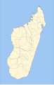 SVG image of Madagascar with rivers and provinces (main map for template)
 -
 SVG blank map of the world (with Antarctica), used in the corner of the final template
 -
 Sample target image: target should look something like this, without the rest of Africa (details below)


Article(s): (template for...) Ring-tailed Lemur, Ruffed Lemur, and eventually all lemur pages
Request: I would like a (simple?) attractive template that I can color in to create range maps for all lemur species. The world map (BlankMap-World6.svg) can be placed in any corner of a larger Madagascar map (Madagascar_Locator.svg), extending the image if needed. I'd actually prefer a landscape orientation, similar to the sample target image (LocationMadagascar.svg). To me, it makes the most sense to extend the Madagascar map to the right (east), into the Indian Ocean, so that there's no overlap with the location of Africa. I just need enough room for a legend (if needed). I would also like the box drawn around Madagascar on the world map, as shown in the sample target image. SVG is perferred, although I will graciously accept a very high resolution PNG file. And unless better reasons can be given, I would prefer to follow the standard color conventions from WP:WPMAP. Thank you for your time. –Visionholder (talk) 06:15, 30 October 2008 (UTC)
- After many hours of playing around with Inkscape, I think I've figured out how to do this. I've created my template:

- (Unfortunately, 20 minutes after uploading the SVG image it is still not showing up in my web browser. The image looks fine in Inkscape on my computer, so I'm assuming the server will eventually reflect the download properly.) Anyway, if it looks like I've figured out what I'm doing, just mark this as done. My only concern was the importing of the world map, which seemed to only be possible from a PNG file, not a SVG. –Visionholder (talk) 11:21, 30 October 2008 (UTC)
- Visionholder, the SVG is trying to refer to a file on your local hard drive. Something called "BlankMap-World6.png" - Just download "BlankMap-World6.svg" as an SVG and then include it in the file and you'll be set. ---J.S (T/C/WRE) 17:46, 30 October 2008 (UTC)
- My problem is that when I import the SVG file in Inkscape, it imports as a large, solid black image in the shape of the map it's supposed to be. If I import it as a PNG, it imports the map correctly. Am I doing something wrong? Also, what is the best way to import one SVG file into another so that I don't have problems with the images referring to files on my hard drive? (Btw, I uploaded my PNG file in case anyone wants to use it.) –Visionholder (talk) 18:50, 30 October 2008 (UTC)
- I found out I had to embed the PNG file, not import it. Unfortunately, there appears to be no way to embed another SVG file... which I think is pretty dumb. Otherwise, I think the template is ready. (Let me know if you disagree or have other suggestions.) Thanks for letting me waste your request space as I taught myself how to use Inkscape to solve my own problems. Your feedback was very helpful. –Visionholder (talk) 19:49, 30 October 2008 (UTC)
- One last thing—If there is any way to embed a SVG file into another, please let me know. In the graphic I made above, the world map is grainy when resized, whereas the rest of the image looks great. Any suggestions on how to improve it would be greatly appreciated. –Visionholder (talk) 21:40, 30 October 2008 (UTC)
- I found out I had to embed the PNG file, not import it. Unfortunately, there appears to be no way to embed another SVG file... which I think is pretty dumb. Otherwise, I think the template is ready. (Let me know if you disagree or have other suggestions.) Thanks for letting me waste your request space as I taught myself how to use Inkscape to solve my own problems. Your feedback was very helpful. –Visionholder (talk) 19:49, 30 October 2008 (UTC)
- My problem is that when I import the SVG file in Inkscape, it imports as a large, solid black image in the shape of the map it's supposed to be. If I import it as a PNG, it imports the map correctly. Am I doing something wrong? Also, what is the best way to import one SVG file into another so that I don't have problems with the images referring to files on my hard drive? (Btw, I uploaded my PNG file in case anyone wants to use it.) –Visionholder (talk) 18:50, 30 October 2008 (UTC)
- Visionholder, the SVG is trying to refer to a file on your local hard drive. Something called "BlankMap-World6.png" - Just download "BlankMap-World6.svg" as an SVG and then include it in the file and you'll be set. ---J.S (T/C/WRE) 17:46, 30 October 2008 (UTC)
Graphist opinion:
- To import an SVG file into another in Inkscape, open the first file, then go to File->Import and choose the second file. In this case you saw only a black oval because the world map uses a style sheet which you can find at the top of the document in the <style></style> block. Normally inkscape only uses inline style, however it can understand a style sheet and class references just fine, but it will not write to them. Thus when you import one file into another, the style sheet is lost, only inline style is kept, which means the class references were invalid for the new document. For example you have class="landxx coastxx fr re", but you have no style sheet defining these classes, so the colours just default to black. You have to manually copy the contents of the style block across to the second file using a text editor like notepad. Jackaranga (talk) 23:07, 30 October 2008 (UTC)
- I was just writing a reply but you were faster. Did not know about this style sheet issues, but I noticed that I don't get this black oval when I first open the world map and then import the Madagascar map. Why is that? @Visionholder: Since the world map you are using is rather large and appears only in the final map to locate the island, it might be better to use a smaller world map like one of those here. Maybe this section should be moved to Wikipedia talk:WikiProject Maps ? bamse (talk) 23:20, 30 October 2008 (UTC)
- Thank you very much for your time, help and explantions. Before I had seen that Jackaranga had fixed the map template, I downloaded a new, smaller blank world map and imported that instead. After lots of consideration, I decided to keep Jackaranga's update. Having learned to move content from one SVG to another via a text editor, I have gone on to fix my first range map without any complications. :-) If you would like to see this template's first use (in case you take pride in that kind of thing), just visit Ring-tailed Lemur. Best wishes. –Visionholder (talk) 05:19, 31 October 2008 (UTC)
- I was just writing a reply but you were faster. Did not know about this style sheet issues, but I noticed that I don't get this black oval when I first open the world map and then import the Madagascar map. Why is that? @Visionholder: Since the world map you are using is rather large and appears only in the final map to locate the island, it might be better to use a smaller world map like one of those here. Maybe this section should be moved to Wikipedia talk:WikiProject Maps ? bamse (talk) 23:20, 30 October 2008 (UTC)
Robert Park
-
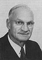 Photograph scanned from PD book

Article(s): Robert Park (football coach)
Request: Because I actually scanned it from the book, the image came out slightly crooked; I just would like to see it straightened. Nyttend (talk) 00:17, 1 November 2008 (UTC)
Graphist opinion: How's that? §hep • ¡Talk to me! 00:36, 1 November 2008 (UTC)
- That's what I asked for. Thanks! Nyttend (talk) 00:45, 1 November 2008 (UTC)
- Feel free to mark a request with {{resolved}} when a graphist has completed the request to your liking. §hep • ¡Talk to me! 00:48, 1 November 2008 (UTC)
Image:Logosch.jpg
Article(s):
Request: this image doesn't show up, and should probably only be on en:Wiki, not commons, please make it show up and fix that... Chris (クリス • フィッチ) (talk) 15:28, 2 November 2008 (UTC)
Graphist opinion: Can you please explain what you mean? It shows up for me just fine and if the image if free-use it should be on commons. 63.80.111.2 (talk) 19:33, 2 November 2008 (UTC)
- Scouting logos are not counted as free use unless defunct. Chris (クリス • フィッチ) (talk) 00:40, 3 November 2008 (UTC)
- The file was corrupt, in both IE7 and FF2. I've uploaded a PNG and make it transparent. §hep • ¡Talk to me! 20:44, 2 November 2008 (UTC)
- Thank you so much! Chris (クリス • フィッチ) (talk) 00:40, 3 November 2008 (UTC)
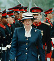
Margaret Thatcher
-
 1
1 -
 2
2 -
 3
3 -
 4
4 -
 5
5 -
 6
6 -
 7
7


Article(s): Margaret Thatcher, among others
.JPG)

.jpg)
Request: I have attempted for many months now to find a good looking, color, free use image of Margaret Thatcher which focuses solely on her. Most are copyrighted, and the ones that we can use usually do not work or do not look decent. Just recently I cropped Image:Margaret Thatcher DF-SD-06-15534.jpg to Image:Margaret Thatcher Reagan funeral.jpg, and made that the main image, replacing Image:Margaret Thatcher 1983.jpg. I don't think it looks bad, but I would prefer an image of her during her tenure as Prime Minister. So I need a graphists opinion: which of the above images could be cropped to focus solely on Margaret Thatcher? And could a graphist perhaps experiment with cropping them, because I do not have the tools to reduce noise or change a background to improve the image when it is cropped. If nothing comes of this, it's okay, but it is worth a shot. My best, Happyme22 (talk) 03:56, 12 October 2008 (UTC)
Graphist opinion:Hi, I cropped the image 3, and also removed President Ronald Reagan's shoulder from the image, but the source image quality wasn't good enough, and i don't know if it is good for article or not, i think the current image looks nice; Is there any better version available? ■ MMXXtalk 21:08, 12 October 2008 (UTC)
- Hi, thanks for your attempt. I still find it to be really cool how you completely removed President Reagan's shoulder from the image! Computers are truly amazing! I don't have a problem with the current image (this one) but I was looking for one of her as Prime Minister. All of the images that were shown above are within this catalog, and direct links to them are on their pages. I'm not sure if there is any better version available, and I doubt it. Perhaps something could be done with image number six? Thanks, Happyme22 (talk) 05:53, 13 October 2008 (UTC)
- I did make another one (from image 6), but for this one i can not remove the background, do you think the crop should be more close? ■ MMXXtalk 08:50, 14 October 2008 (UTC)
- Yes, perhaps that would look better. Then with the closer crop, maybe you could remove the man's face? Or is that not possible at all? Thanks for your hard work! --Happyme22 (talk) 23:24, 14 October 2008 (UTC)
- It is possible to remove the men's face but it would not be a nice image, because the photo needs some background!!! I also think it wouldn't be appropriate if I cut the face of man in the right from center, I think the best thing to do is to cut image just from bottom of photo up to her first button. ■ MMXXtalk 12:49, 15 October 2008 (UTC)
- Here it is, you can compare both images (old) (new). ■ MMXXtalk 13:00, 15 October 2008 (UTC)
- Yes, perhaps that would look better. Then with the closer crop, maybe you could remove the man's face? Or is that not possible at all? Thanks for your hard work! --Happyme22 (talk) 23:24, 14 October 2008 (UTC)
- I did make another one (from image 6), but for this one i can not remove the background, do you think the crop should be more close? ■ MMXXtalk 08:50, 14 October 2008 (UTC)
I listed all three images here so we can decide which one is better for article. ■ MMXXtalk 13:59, 21 October 2008 (UTC)
- Oh, I apologize for the late response. I think that despite our best efforts, the photo in the middle of Mrs. Thatcher at Reagan's funeral works best. It's good to know that there are other options, though. And I thank you so much MMXX for all of your help because you have really helped me and the article out! I'd say this is resolved. Best, Happyme22 (talk) 07:09, 2 November 2008 (UTC)
COA of Zaire
-
 You can use the lion head from this SVG.
 -
 SVG
SVG
.svg)
.svg)
Article(s): Zaire, Coat of arms of the Democratic Republic of the Congo, Republic of the Congo (Léopoldville).
Request: SVG please. You can use the lion head from the COA of the Democratic Republic of the Congo: --SelfQ (talk) 15:31, 7 November 2008 (UTC)
Graphist opinion: Here's my attempt. The text isn't working yet, though. I'll fix it. Tadpole9(talk • contribs) 22:21, 7 November 2008 (UTC)
- Could you also do the spears in grey/silver. thanks. --SelfQ (talk) 23:03, 7 November 2008 (UTC)
- I think I have it working now, but anyone with more experience, feel free to improve it. Tadpole9(talk • contribs) 03:37, 8 November 2008 (UTC)
- I messed with it a little bit, more to try to make it resemble the original image. If the changes don't look good please revert them. Nice job btw. §hep • ¡Talk to me! 04:57, 8 November 2008 (UTC)
- I think I have it working now, but anyone with more experience, feel free to improve it. Tadpole9(talk • contribs) 03:37, 8 November 2008 (UTC)
-
 Bar graph
 -
 An existing map of Kiribati showing the location of Banaba


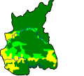
Article(s): Banaba Island
Request: Hello! I want to know if it is possible to extract or to make some graphs and maps from this PDF file. I mean if it is OK to do that, because of the author rights. I need that location map (p. 7), the Mean monthly rainfall graph (Figure 1.2, p. 8), the Mean annual rainfall over Western Kiribati map (Figure 1.3, p. 8), Figure 1.4 and Figure 1.5. If it is possible, it would be great. Thanks in advance, Sebi (talk) 15:53, 26 September 2008 (UTC)
Monthly rainfall
Graphist opinion:
- There is currently nothing suggsting that the images from SOPAC are free from copyright. Sorry. /Lokal_Profil 16:14, 3 October 2008 (UTC)
- OK, I understand that, but the location map can be generated from existing Oceania/Kiribati maps. Thanks, Sebi (talk) 14:15, 6 October 2008 (UTC)
- Has the island geography been updated since 1936? §hep • ¡Talk to me! 14:33, 6 October 2008 (UTC)
- And with the bar graph. Since there wasn't any real data there I made my own. How's that look? §hep • ¡Talk to me! 14:58, 6 October 2008 (UTC)
- Has the island geography been updated since 1936? §hep • ¡Talk to me! 14:33, 6 October 2008 (UTC)
- OK, I understand that, but the location map can be generated from existing Oceania/Kiribati maps. Thanks, Sebi (talk) 14:15, 6 October 2008 (UTC)
Better color? Also, the map in the PDF is pretty much unusable due to quality. Has the island changed since this map? If not, it would be very easy to make a color version. §hep • ¡Talk to me! 21:03, 7 October 2008 (UTC)
- Yes, now it is much better. No, the map has not changed, but I need the location map. Sebi (talk) 12:00, 8 October 2008 (UTC)
- Sorry, I misread your request! I have a location map that is PD. I should be able to upload it later tonight to see if it fits your needs. §hep • ¡Talk to me! 19:09, 8 October 2008 (UTC)
- OK, thank you very much. — Sebi talk 13:48, 9 October 2008 (UTC)
- The map I had won't work. If it's close enough to even identify Banaba, you can't see any of the other islands. Once you cn see the other islands Banaba isn't visible. Sorry. Anyone else have a good map? §hep • ¡Talk to me! 21:46, 11 October 2008 (UTC)
- OK, thank you very much. — Sebi talk 13:48, 9 October 2008 (UTC)
- Sorry, I misread your request! I have a location map that is PD. I should be able to upload it later tonight to see if it fits your needs. §hep • ¡Talk to me! 19:09, 8 October 2008 (UTC)
- I understand that. However, thank you for the graph. — Sebi talk 14:11, 14 October 2008 (UTC)
Location map
Graphist opinion: You find a good map of Kiribati with a mark of Banaba already(see the second one above).--Demoeconomist (talk) 15:09, 23 October 2008 (UTC)
Homeric_Greece.svg
-
 Map of Homeric Greece

Article(s): Achaea
Request: The city of Athens is misspelled. It is currently rendered as "Ahens", and it should be "Athens". 24.167.96.235 (talk) 07:02, November 9, 2008 (UTC)
Graphist opinion: I fixed it. bamse (talk) 11:05, 9 November 2008 (UTC)
Flatten paper


Articels: Marriage a-la-mode: 1. The Marriage Settlement
Request: Is it possible to "flatten" the paper out, correct the washed out parts and crop the black so it's possibly legible? 68.39.174.238 (talk) 22:15, 25 October 2008 (UTC)
Oppinion: I can crop the image and adjust for the color/brightness... but I can't remove the bend of the paper. I'll give it a try when I get home. ---J.S (T/C/WRE) 02:09, 26 October 2008 (UTC)
- Good improvements, but the upper right hand is still very dark. Can anything be done about it? 68.39.174.238 (talk) 18:37, 26 October 2008 (UTC)
Opinion 2: How about this (-edit1). I cropped your original, did some noise reduction, adjusted levels and removed the browning and sharpened to enhance readability. Mfield (talk) 06:29, 27 October 2008 (UTC)
- Better, but the upper right corner is still noticeably darker. Is there anything that can be done the, or is that as good as it gets? 68.39.174.238 (talk) 08:24, 29 October 2008 (UTC)
- I'll accept this as done. 68.39.174.238 (talk) 18:05, 14 November 2008 (UTC)
Russian Scout Guide, Image:RussianScoutGuide.jpg
Article(s):
Request: umm, just basically cleanup-background, perspective, depth of coloration... Chris (クリス • フィッチ) (talk) 15:29, 6 November 2008 (UTC)
Graphist opinion:
- That does not appear to be a free image (scan of a book cover, etc) and there is no fair-use rational. Can you fix the licensing first? ---J.S (T/C/WRE) 07:37, 8 November 2008 (UTC)
- Fixed. 118.13.94.131 (talk) 17:45, November 8, 2008 (UTC)
- It's nice, thank you! Can you trim off excess bordering (still black spots on left side), and is it possible to even out the coloration? Thank you! Chris (クリス • フィッチ) (talk) 13:11, 9 November 2008 (UTC)
- I uploaded three other version over same file (See file history), please compare them and tell me which one is better, then (if needed) I will upload the final version agein. ■ MMXXtalk 09:23, 11 November 2008 (UTC)
- I just would like to point out that the quality of the already poor original image is severely degraded in the latest edit from 10:19, 11 November 2008[2] (very visible JPEG or sharpening artifacts, lost details). I think that the best version is the
first edit from 20:25, 13 December 2006first edit from 10:01, 9 November 2008 although it is oversharpened. --pabouk (talk) 09:51, 11 November 2008 (UTC)
- I just would like to point out that the quality of the already poor original image is severely degraded in the latest edit from 10:19, 11 November 2008[2] (very visible JPEG or sharpening artifacts, lost details). I think that the best version is the
- I uploaded three other version over same file (See file history), please compare them and tell me which one is better, then (if needed) I will upload the final version agein. ■ MMXXtalk 09:23, 11 November 2008 (UTC)
- I am confused by your comment, about sharpening the final version wich labled (Edit 4) and first edit wich labled (Retouched - 09:01, November 9, 2008) and the original image (19:25, December 13, 2006) are nearly same, I did only sharpened the image just in (Edit 3 - 09:18, November 11, 2008) and (Edit 2 - 09:16, November 11, 2008). I think you have problem with viweing images try emptying your browser's cache or refresh page by (Ctrl+F5). and also I don't know why the numbers that you wrote in your comment are different by the hours in the file history. ■ MMXXtalk 05:28, 12 November 2008 (UTC)
- Sorry, I originally included wrong date for the first edit (now I repaired it). The hours are probably different because I am in a different time zone and the time is displayed as local time (not UTC). I certainly do not have problem with cached images. The first edit labelled "Retouched" is a little bit aggressively sharpened. Maybe your software sharpens images without letting you know. May I know what do you use? I would say that there is no need to sharpen the original image or it could be sharpened just very lightly. Please compare the original image and the last edit "Edit 4" (probably made from the first edit). You will see that there are ugly artifacts on the sharp edges - easily visible on the line under the label in the centre.
- The edits 2 and 3 are not only sharpened but also converted to monochrome / two-levels (light and dark). I am certainly not a fan of such heavy modifications. It is not a restoration of the original. --pabouk (talk) 10:52, 13 November 2008 (UTC)
- I did upload another version without any sharpening, but the problem is stretching the image make it more blurred than original image so I thought a little sharpening would be fine and also a little sharpening make the image more clear, anyway you can compare edits and decide which one is better. by the way I use Adobe Photoshop. ■ MMXXtalk 08:35, 14 November 2008 (UTC)
- Thank you. You are right that the stretched image is slightly blurred and a little bit of sharpening will probably help. Maybe the stretching tool in Photoshop allows selection of interpolation algorithm. Lanczos with higher parameter than 3 will produce sharper output. Personally I would say that Edit 5 is much better than Edit 4. But I am not one who is interested in this particular image. I am just a passer-by :) --pabouk (talk) 11:07, 14 November 2008 (UTC)
- This is great, thank you so much! Marking Chris (クリス • フィッチ) (talk) 18:14, 14 November 2008 (UTC)
 Resolved
Darya Saltykova
-

-

png -

jpg
.jpg)
.png)
_crop.jpg)
Article(s):
Request: Trim away background... Chris (クリス • フィッチ) (talk) 03:14, 14 November 2008 (UTC)
Graphist opinion: Background removed. --GateKeeperX (talk) 06:16, 14 November 2008 (UTC)
- Wasn't sure if you wanted a transparent background (gif/png) or just a white background. -- GateKeeperX (talk) 07:01, 14 November 2008 (UTC)
- The png is best, thank you! Chris (クリス • フィッチ) (talk) 18:16, 14 November 2008 (UTC)
- Wait, can you trim the pin off the top, rotate slightly upright, and trim down the transparent background to the outer edges of the frame? Thanks Chris (クリス • フィッチ) (talk) 18:18, 14 November 2008 (UTC)
- top trimmed, cropped further, and aligned. Anything else? -- GateKeeperX (talk) 06:19, 15 November 2008 (UTC)
- Überbueno, you rock! Chris (クリス • フィッチ) (talk) 14:49, 15 November 2008 (UTC)
Coat of Arms of Indonesia
-
 Coat of Arms of Indonesia

Article(s): Coat of Arms of Indonesia
Request: Please correct the national motto held by the bird. It should read "BHINNEKA TUNGGAL IKA" instead of "INKA".Please check with http://en.wikipedia.org/wiki/Bhinneka_Tunggal_Ika, which shows the correct spelling. 202.13.5.157 (talk) 10:28, 25 October 2008 (UTC)
Graphist opinion:
- Probably easiest for Sagredo to do since he might still have a version with the text as text rather then paths. /Lokal_Profil 16:54, 26 October 2008 (UTC)
- Done it, but I've changed the font used. --F l a n k e r (talk) 18:10, 29 October 2008 (UTC)
Flag of the Kingdom of León
-
 Flag of the Kingdom of León
 -
 COA with SVG lion
 -
 SVG banner


Article(s): Kingdom of Asturias, Kingdom of León, Kingdom of Castile, Battle of Uclés (1108), Crown of Castile.
Request: SVG please. You can get the lion from this COA: Also the white needs to be transparent. --SelfQ (talk) 18:14, 16 November 2008 (UTC)
Graphist opinion: I used the lion and background from the COA to create the SVG banner. I don't know how closely the background shape should match, so I didn't work with it very much. Tadpole9(talk • contribs) 00:49, 17 November 2008 (UTC)
Flag of the Umayyad Caliphate
-
 Flag of the Umayyad Caliphate
 -
 SVG version


Article(s): Battle of Tours, Umayyad Caliphate, Abbasid Caliphate, Flag of Lebanon, Barghawata, Rashidun Caliphate, Visigothic Kingdom, Template:Country data Umayyad Caliphate.
Request: SVG please. --SelfQ (talk) 18:14, 16 November 2008 (UTC)
Graphist opinion: I can't see that image at all, somehow. Tadpole9(talk • contribs) 00:30, 17 November 2008 (UTC)
- Their flag was sheer white. Added. --Kamangir1214 (talk) 01:50, 17 November 2008 (UTC)
- Isn't that then redundant to the old flag of France (Also pure white)? 68.39.174.238 (talk) 06:31, 19 November 2008 (UTC)
Fyodorov

Article(s):
Request: trim to encyclopedic-too much background on both sides... Chris (クリス • フィッチ) (talk) 15:45, 21 November 2008 (UTC)
Graphist opinion: Cropped. Tadpole9(talk • contribs) 19:00, 21 November 2008 (UTC)
- Perfect, and fast, thank you! Chris (クリス • フィッチ) (talk) 01:11, 22 November 2008 (UTC)
Guerville

Article(s):
Request: trim away blank space on all sides... Chris (クリス • フィッチ) (talk) 15:50, 21 November 2008 (UTC)
Graphist opinion: Cropped. Tadpole9(talk • contribs) 21:01, 21 November 2008 (UTC)
- Perfect, and fast, thank you! Chris (クリス • フィッチ) (talk) 01:12, 22 November 2008 (UTC)
OrthoPerspective.JPG
-
Orthophoto diagram
-
 SVG
SVG

Article(s): Orthophoto
Request: I have already vectorized this file! However, I am having trouble uploading it, and I get a "The file is corrupt or has an incorrect extension. Please check the file and upload again." error when I try. I am posting the image at http://senduit.com/8a0dc9 if you would care to see it (it's done!) but for some reason I get that error. If you could help me either on this page or on my talk page it would be greatly appreciated. Thank you! Mononomic (talk) 03:55, 22 November 2008 (UTC)
Graphist opinion: Uploaded at Commons (Image:OrthoPerspective.svg) -- GateKeeper(X) @ 04:02, 22 November 2008 (UTC)
- Any ideas why it wasn't working? Mononomic (talk) 04:04, 22 November 2008 (UTC)
- No, but I think I've gotten the same problem once or twice before on a file. Maybe a software glitch? -- GateKeeper(X) @ 04:08, 22 November 2008 (UTC)
Takako Doi
-

Original -
Try 1

Article(s): Takako Doi
Request: brighten face... Chris (クリス • フィッチ) (talk) 13:56, 22 November 2008 (UTC)
Graphist opinion:
- Posted Try 1 -- GateKeeper(X) @ 15:17, 22 November 2008 (UTC)
- Thank you! Please overwrite the original! Chris (クリス • フィッチ) (talk) 15:21, 22 November 2008 (UTC)
- I'll overwrite it.
 Done §hep • ¡Talk to me! 04:31, 26 November 2008 (UTC)
- I'll overwrite it.
COA of the Seconde French Empire
-
 COA of the Second French Empire
 -

.PNG


![[2]](https://upload.wikimedia.org/wikipedia/en/9/96/RussianScoutGuide.jpg)
Article(s): Second French Empire, National Emblem of France, List of royal houses, List of the last monarchs who ruled the Americas.
Request: Place on a transparant background --SelfQ (talk) 14:33, 26 November 2008 (UTC)
Graphist opinion:
- PNG w/ transparent background -- GateKeeper(X) @ 15:36, 26 November 2008 (UTC)
Coat of arms

Article(s): Pi Kappa Phi
Request: Can someone convert this image to SVG. Thanks. — ŁittleÄlien¹8² (talk\contribs) 20:55, 31 October 2008 (UTC)
Graphist opinion: I made one. The original says that it was made in 1909, so I tagged the new one with {{PD-old}} from the commons, making it no longer fair-use. --pbroks13talk? 18:37, 1 November 2008 (UTC)
- Wouldn't that make the original one PD-US too? 68.39.174.238 (talk) 21:05, 1 November 2008 (UTC)
- I've marked the JPG as such. §hep • ¡Talk to me! 23:30, 1 November 2008 (UTC)
- Wow, that looks great! Thank you so much for making this image. — ŁittleÄlien¹8² (talk\contribs) 00:12, 2 November 2008 (UTC)
- The first version of the Coat of Arms was designed in 1909, "The current coat of arms is much different from the original." is what it says on Pi_Kappa_Phi#Coat_of_arms. Thus both the svg and the jpg are fair-use only. /Lokal_Profil 01:46, 2 November 2008 (UTC)
- Wow, that looks great! Thank you so much for making this image. — ŁittleÄlien¹8² (talk\contribs) 00:12, 2 November 2008 (UTC)
- The final version (with all of the current modifications) was completed by 1909. The original version, that the passage is referring to, was created soon after the fraternity was founded in 1904. — ŁittleÄlien¹8² (talk\contribs) 01:55, 2 November 2008 (UTC)
The section in the Pi Kappa Phi article is incorrect. If you look at the cited reference, it indicates that the changes that took place "in the early years," happened before 1909. — ŁittleÄlien¹8² (talk\contribs) 01:58, 2 November 2008 (UTC)
- Ok. Technically it could still be a problem since the way the Coat of Arms was depicted might have changed although it contents have remained the same, ideally a scanned in version from 1909ish should be used to get around this problem. But I won't press on that. /Lokal_Profil 12:47, 2 November 2008 (UTC)
- Hmm. Looking at this image, this coat doesn't seemed to have changed much in the last 90 years... any thoughts? --pbroks13talk? 06:38, 4 November 2008 (UTC)
- Possibly the design of the lamp might be under a new copyright, but then the image doesn't include the book either so if that was added in say 1911 the lamp might have changed to it's current shape at the same time. Wouldn't worry unless someone writes and complains though. /Lokal_Profil 16:47, 4 November 2008 (UTC)
- Hmm. Looking at this image, this coat doesn't seemed to have changed much in the last 90 years... any thoughts? --pbroks13talk? 06:38, 4 November 2008 (UTC)