
Wikipedia:Graphics Lab/Illustration workshop/Archive/Apr 2011
 | This page, part of the Graphics Lab Wikiproject, is an archive of requests for April 2011. Please do not edit the contents of this page. You can submit new requests here. |
Stale
Criminal Minds: Suspect Behavior
Can anyone have a logo for "Criminal Minds: Suspect Behavior" create? Thank you very much! -- 91.64.31.210 (talk) 16:26, 14 March 2011 (UTC)
Coat of arms of Sudan
Article(s): Coat of arms of Sudan
Request: vectorize... Kintetsubuffalo (talk) 02:46, 15 March 2011 (UTC)
Graphist opinion(s):
Help with Account Creation Improvement Project
Article(s): Mediawiki:Welcomecreation and other pages (see below)
Request: I am working with the Account Creation Improvement Project and we are testing new pages for the entire account creation process, to encourage people with new accounts to start (and continue) editing. Up until now, most of the pages have been created by me and a few others, with little or no regard for the aesthetics of the pages. As you can see for yourself, they have been text based tables with very little colour and feel. This may be less than inspiring - in fact, the first impression that new users get should be something good-looking, that speaks to Wikipedia's quest for quality material.
The first page that we are working on is the page newcomers reach after they have created their accounts. What do we want? We don't know. We are testing things still. But we guess that you can design (either wireframe or actual coding) the page better than most of us.
There have been some attempts at designing other parts of the account creation pages:


So feel free to make something different, or base it on text that's on one of the existing versions, or work from inspiration from other websites. Choose any of the three pages in the account creation process, or all of them. Anything is better than nothing, but of course, beauty is always welcome.
If you have any questions, please contact me. I will check this page regularly. Thanks in advance// Hannibal (talk) 13:47, 11 March 2011 (UTC)
Graphist opinion(s):
PIJ emblem

Article(s): Palestine
Request: Do something with them... 202.152.202.41 (talk) 09:53, 19 March 2011 (UTC)
Graphist opinion(s): If anyone could tell us what is written on it in Arabic the non Arabic speaker graphists could vectorize it too. Ufo karadagli (talk) 09:30, 3 April 2011 (UTC)
USN SSGN boat insignia
-
 USS Ohio
 -
 USS Michigan
 -
 USS Florida
 -
 USS Georgia


_crest.png)
Article(s): USS Ohio (SSGN-726) • USS Michigan (SSGN-727) • USS Florida (SSGN-728) • USS Georgia (SSGN-729)
Request: The USN SSGN boat insignia's require vectorization and/or cleanup. Apologize for posting all four; Ohio is primary but I thought I would include the other three instead of making additional sections. Thanks in advance. Evan.oltmanns (talk) 07:48, 21 March 2011 (UTC)
Graphist opinion:
- Well, "Ohio", "Michigan" and "Georgia" have very low resolution, unfortunately, there's no meaningful way to vectorize them. But their appearance gives the impression that they originated from vector files, so there might be a chance you'll find a vector version embedded in a related PDF file somewhere. "Florida" has much better resolution, but it has a problem in the center, where the black lines are all jumbled. I advise not to vectorize, but you might find other graphists interested in doing it. Regards, -- Orionist ★ talk 12:15, 3 April 2011 (UTC)
Help needed
-
A fist with Arab flags on it
Article(s):
Request: I have tried to make an SVG version of the original picture but I just can't seem to be able to (I am new to the SVG thing). I would love it if someone can help with it. Thanks! -- The Egyptian Liberal (talk) 16:19, 5 April 2011 (UTC) Comment(s):
- Is there actually some kind of use for this? I'm not sure it's worth making such a complicated fist if it's not used anywhere or comes from any source. NikNaks talk - gallery 07:43, 7 April 2011 (UTC)
- Yes, the original image is being used in other wikipedia projects and I am trying to create a natural image about the revolutions/Uprising/Protests from the main article and infobox -- The Egyptian Liberal (talk) 19:44, 8 April 2011 (UTC)
- I'm sorry, but Wikipedia articles should be neutral, and using a political poster to illustrate them is not a good idea, even if it's done by other projects. We'd like to help but we have to be sure of encyclopedic value and usability. Let me suggest, for the infobox, using a photomontage like the one used in Revolutions of 1989, that would also be more meaningful and expressive than any kind of general illustration. Regards, -- Orionist ★ talk 21:25, 8 April 2011 (UTC)
- Yes, the original image is being used in other wikipedia projects and I am trying to create a natural image about the revolutions/Uprising/Protests from the main article and infobox -- The Egyptian Liberal (talk) 19:44, 8 April 2011 (UTC)
Graphist opinion(s):
Resolved
A map of the Arab World with flags
-
 A map of the Arab League countries with flags

Article(s):
Request: Request conversion to SVG. Thanks! The Egyptian Liberal (talk) 05:40, 19 March 2011 (UTC)
Graphist opinion(s):
![]() Done — The Egyptian Liberal (talk) 03:50, 24 March 2011 (UTC)
Done — The Egyptian Liberal (talk) 03:50, 24 March 2011 (UTC)
Nintendo Power logo
Article(s): Nintendo Power
Request: Upload vector version. www.nintendopower.com/images/NP242_TOC.pdf 99.22.219.243 (talk) 18:11, 29 March 2011 (UTC)
Graphist opinion(s): ![]() Done - Regards, Fallschirmjäger ✉ 19:05, 29 March 2011 (UTC)
Done - Regards, Fallschirmjäger ✉ 19:05, 29 March 2011 (UTC)
- By the way this logo is {{PD-textlogo}} and hence can be uploaded to Commons and resized to larger sizes (more than 300 px, if you want). Regards, -- Orionist ★ talk 22:29, 29 March 2011 (UTC)
Amazon Kindle
-
 Amazon Kindle Logo
 -
 New SVG
Article(s): Amazon Kindle
Request: Convert to SVG. —Preceding unsigned comment added by 79.73.24.216 (talk) 17:16, 30 March 2011 (UTC)
Graphist opinion(s): ![]() Done, regards Fallschirmjäger ✉ 18:51, 30 March 2011 (UTC)
Done, regards Fallschirmjäger ✉ 18:51, 30 March 2011 (UTC)
Steinbach logo
-
 Steinbach department store logo
 -
 SVG on commons

Article(s): Steinbach (store)
Request: Request conversion to SVG. Thanks! SchuminWeb (Talk) 04:06, 19 March 2011 (UTC)
Graphist opinion(s): The font for this logo looks a lot like Arial. But in Arial and its variants the tail portion of the letter 'a' does not have the curvature. Does any body have any idea on this? --Jovian Eye (talk) 03:23, 25 March 2011 (UTC)
Nimbus sans? Jon C (talk) 23:13, 26 March 2011 (UTC)
- Thank you Jon, for the input.
 Done --Jovian Eye talk 04:03, 29 March 2011 (UTC)
- Looks awesome, thanks! SchuminWeb (Talk) 01:40, 2 April 2011 (UTC)
WWE logos

Article(s): WWE Raw, WWE SmackDown
Request: Replace both images and convert them to SVG. FreshCorp619 (talk) 18:58, 19 March 2011 (UTC)
Graphist opinion(s): All the bevels in the image would make it virtually impossible to convert exactly into SVG. Since it's fairuse, we shouldn't mess around with creating an SVG, which will quite possibly misrepresent the logo. The PNGs are okay, IMO. Connormah (talk) 23:57, 28 March 2011 (UTC)
I agree with Connormah, I found the logos in PDFs. Turns out even they don't have a vector version of the logo. The logo is combination of 100s of small bitmap images. Ufo karadagli (talk) 12:14, 30 March 2011 (UTC)
Orbital capture animation cleanup

Article(s): Moons of Mars, others?
Request: Unhorrify? The Sun should be fixed, and the orbit artifacts cleaned up. Planets should always be centered on the orbit lines (they wobble around them), and Phobos/Deimos should be labeled P/D for clarity, although if you can think of a language-independent identification scheme, go for it. More frames would be nice, although I know know if it's possible. The exact shape/scales/speed of the orbits aren't important here, so feel free to recreate this from scratch. Headbomb {talk / contribs / physics / books} 08:02, 4 February 2011 (UTC)
Graphist opinion(s): This is an orphaned image (can't blame them - it's one horrible child!) I don't see where in the Moons of Mars article that it would fit in - folks may have more incentive to work on it if it's going to be more readily usable. Jon C (talk) 22:09, 22 February 2011 (UTC)
- Apparently it was removed immediately after I made the request. But if it's cleaned up, I would definitely bring it back in the article. Headbomb {talk / contribs / physics / books} 22:11, 22 February 2011 (UTC)

- A note: the Sun should really lie in one of the two focuses of an elliptical trajectory (Ellipse#Planetary orbits). For your reference, the distance of a focus from the center of an ellipse can be calculated , where width refers to the length of the long axis and height to the length of the short axis. Though, of course, I won't expect you to follow this rule in a digram too strictly, which would be difficult, but I'm rather mentioning this as something to simply keep in mind. And apologies if I'm bothering you with something you are already perfectly aware of! —Quibik (talk) 14:23, 25 February 2011 (UTC)

- Thanks Quibik for the astronomy reminder. I casually thought about Kepler when doing the illustration, but didn't check to see how far away the foci is from the of the ellipse center - will make modifications to make this somewhat more accurate (while still keeping the "intersection" of the orbits in place). Jon C (talk) 20:29, 25 February 2011 (UTC)
- What about the following animated gif?

- I created this from scratch, so I can modify the sizes, orbit radii, colors, speeds, file size etc... 4dhayman (talk) 15:03, 6 March 2011 (UTC)
- I'm not an expert in planetary science, but it seems highly unlikely that two separate asteroids were captured during the same Mars orbit, which is implied by that diagram. It might be possible if they were a binary asteroid, but in which case the diagram would need to show them orbiting each other before encountering Mars. Beyond the postulate that both are captured asteroids, what evidence is there for any of those orbits? Or indeed your claim that 'The "original" Phobos & Deimos orbits passed closer to Jupiter'? Modest Genius talk 03:37, 7 March 2011 (UTC)
- I have a couple of comments:
- 1. The orbits look circular with the sun in the center, they should be slightly elliptical with sun in one of the focuses, you can find the correct orbits here or here. And can you please make the sun smaller? I know this is not to scale but each time I look I picture Mercury instead of mars ;-)
- 2. As I understand the sequence of events: A) Two asteroids are in their orbits at the very far edge of the asteroid belt (Hence their orbits should not intersect with that of Mars, and they should be closer to Jupiter's.) B) The asteroids get (relatively) close to Jupiter, and Jupiter's strong gravity sends them tumbling towards Mars (We can make the Jupiter approach happen one by one, let's say one at the 5 o'clock position and the other at 9 o'clock position, to emphasize that they were not necessarily "kicked" or captured at the same time.) C) They are captured by mars one after the other (The larger moon is the one closer to mars by the way.)
- Excellent work otherwise. Regards, -- Orionist ★ talk 13:20, 8 March 2011 (UTC)

- Fantastic! That's exactly what I was talking about! There is still one issue (it should be easy): The second moon should not cross the orbit of Mars, remember there are three planets between Mars and the Sun, although they aren't shown here ;-) and I don' think that kind of movement is possible anyway with the presence of the Sun. Instead it should be captured just like the first moon, from the outer side of the orbit, in a tangent to its new orbit (i.e. touching, looks something like this.) As for the file size, I think you can comfortably shave off about three seconds from the beginning, maybe make it start when Jupiter is at 12 or 1 o'clock, and you can probably shave off another second from the end. And I think that's about all! Regards, -- Orionist ★ talk 16:24, 10 March 2011 (UTC)
- One more slight adjustment, to align the orbits more correctly, Jupiter's orbit needs a slight nudge to the bottom-left, and the Sun needs to move by half of it's diameter to the top left. But if it'd take too much time, forget it :-) Regards, -- Orionist ★ talk 16:37, 10 March 2011 (UTC)
I'm on it.I've uploaded the new file, I'm just having some file size issues, which is why the animation above is not playing. 4dhayman (talk) 01:06, 12 March 2011 (UTC)- Great job! I was able to reduce the file size just by re-saving in Photoshop. At first I thought the number of colors may have played a part, since I converted the file to 128 colors (with no loss in quality). But as I found the difference between copies with 256 and 128 colors to be only 18kb, the main factor in size here must be something else, maybe it has to do with compression or the way the software saves the file. The good news is that you can upload a smoother, higher-quality version of the file (or e-mail it to me if you want), and I'll do the size reduction. By the way I removed a couple of "still" frames (Nos. 71 and 86) that caused glitches in the animation. As for the Animation not playing here, I'm not sure if it's caused by the file size or the dimensions? It's playing only at 360px thumb sizes and above, which is weird, I'll try to find if there's anything written about it in the help pages. Regards, -- Orionist ★ talk 13:51, 16 March 2011 (UTC)
- I've just found out here the reason for the thumbnailing issue:
- Great job! I was able to reduce the file size just by re-saving in Photoshop. At first I thought the number of colors may have played a part, since I converted the file to 128 colors (with no loss in quality). But as I found the difference between copies with 256 and 128 colors to be only 18kb, the main factor in size here must be something else, maybe it has to do with compression or the way the software saves the file. The good news is that you can upload a smoother, higher-quality version of the file (or e-mail it to me if you want), and I'll do the size reduction. By the way I removed a couple of "still" frames (Nos. 71 and 86) that caused glitches in the animation. As for the Animation not playing here, I'm not sure if it's caused by the file size or the dimensions? It's playing only at 360px thumb sizes and above, which is weird, I'll try to find if there's anything written about it in the help pages. Regards, -- Orionist ★ talk 13:51, 16 March 2011 (UTC)
- One more slight adjustment, to align the orbits more correctly, Jupiter's orbit needs a slight nudge to the bottom-left, and the Sun needs to move by half of it's diameter to the top left. But if it'd take too much time, forget it :-) Regards, -- Orionist ★ talk 16:37, 10 March 2011 (UTC)
- Fantastic! That's exactly what I was talking about! There is still one issue (it should be easy): The second moon should not cross the orbit of Mars, remember there are three planets between Mars and the Sun, although they aren't shown here ;-) and I don' think that kind of movement is possible anyway with the presence of the Sun. Instead it should be captured just like the first moon, from the outer side of the orbit, in a tangent to its new orbit (i.e. touching, looks something like this.) As for the file size, I think you can comfortably shave off about three seconds from the beginning, maybe make it start when Jupiter is at 12 or 1 o'clock, and you can probably shave off another second from the end. And I think that's about all! Regards, -- Orionist ★ talk 16:24, 10 March 2011 (UTC)
| “ |
|
” |
- The file is now 360 X 360 X 126 = 16,329,600 way bigger than 12.5MP, so we'll have to either reduce the dimensions and/or reduce the number of frames. We can safely shave off the end of the animation by making it stop when Jupiter reaches 12 o'clock, that can remove 20 frames from the current file, still not enough, but it will allow for less reduction in dimensions, or for smoother movement by adding more frames to a smaller file. For example, a file 300 X 300 pixels will allow for 138 frames (300 X 300 X 138 =12,420,000). So, less pixels, more frames, and vice versa. Regards, -- Orionist ★ talk 14:46, 16 March 2011 (UTC)
- Sorry for the slow response, I've been busy lately. A new animation is up. It seems to run fine (see the image above, which I made smaller), but doesn't have any of your optimizations, which I don't know how to do. Thanks for all your help! 4dhayman (talk) 15:06, 23 March 2011 (UTC)
Cumbria
-
 Flag of Cumbria (requires SVGification)
 -
SVG'ed

Article(s): Cumbria, List of English flags
Request: SVGification, please, but would also be great if the flowers and colours were more closely matched to those shown in the source material of File:County Flag of Cumbria.svg. 86.156.96.153 (talk) 23:22, 4 March 2011 (UTC)
Graphist opinion(s):
For anyone going to do this vectorization I found these:

![]() --Ufo karadagli (talk) 23:12, 13 March 2011 (UTC)
--Ufo karadagli (talk) 23:12, 13 March 2011 (UTC)
![]() Done Jon C (talk) 02:26, 3 April 2011 (UTC)
Done Jon C (talk) 02:26, 3 April 2011 (UTC)
Maxwell's equal area rule

Article(s): Van der Waals equation#Maxwell equal area rule
Request: Fix the issues with text rendering and crop the empty space in the horizontal direction. —Quibik (talk) 08:51, 25 March 2011 (UTC)
Graphist opinion(s): Slashed the size by 94%. Turns out all the lines were a series of circles and everything was stretched, so I re-did it. Please let me know if any of the labels no longer make sense and I'll change the diagram. I think the text issues are now solved, also. NikNaks talk - gallery - commons 17:00, 1 April 2011 (UTC)
- Thank you! It's much better now. I don't see anything that would need to be changed either. —Quibik (talk) 09:52, 2 April 2011 (UTC)
Fix some Feynman diagram (easy)
-
 A box diagram for kaon oscillations
 -
 Another
 -
 Vector of diagram that appears on description pages


Article(s): CP violation, W and Z bosons (and these should really be in Kaon too)
Request:
- The first diagram is off. Minor changes would make it right. 1) The W+ and W− should be inverted. 2) On the left, "u, c, t" should be changed to u, c, t.
- The second diagram would look nicer if u, c, t was changed into u, c, t.
- Could you make sure the minuses are actually minuses (−) and not hyphens (-)?
- Could you also make sure the bars are place at the same height over all letters? For example, the bar on s looks higher on the second diagram than on the first.
Thanks a bunch. Headbomb {talk / contribs / physics / books} 13:47, 25 March 2011 (UTC)
![]() Request taken by NikNaks93.
Request taken by NikNaks93.
Graphist opinion(s): Okay, I've done as you requested. However, there still seems to be a discrepancy. The straight lines on one diagram follow from s to u, c, t and then through to d, with the others being antiparticles, whilst the other goes from s to u, c, t and on to d. Which is correct? Or am I reading the diagram incorrectly? I'll also remake the Kaon diagram on the page. NikNaks talk - gallery - commons 15:40, 1 April 2011 (UTC)
- The diagrams are not equivalent, they represent two different ways to get the same thing. However, I overlooked something in the middle diagram. To make both diagrams consistent with each other in their convention of what is labelled a particle and what is labelled an antiparticle, the W+ and W− should be switched from left to right. Headbomb {talk / contribs / physics / books} 16:40, 1 April 2011 (UTC)
As far as I'm concerned, yup. Headbomb {talk / contribs / physics / books} 19:55, 1 April 2011 (UTC)
- Although stuff could always be horizontally/vertically aligned... with the "bottom" labels of the first image being consistently under the diagram... and the u, c, t / u, c, t and W+ / W− being on the "outsides" of the diagrams, ... but that's up to you. Headbomb {talk / contribs / physics / books} 20:00, 1 April 2011 (UTC)
- Does that look about right? NikNaks talk - gallery - commons 20:24, 1 April 2011 (UTC)
- Although stuff could always be horizontally/vertically aligned... with the "bottom" labels of the first image being consistently under the diagram... and the u, c, t / u, c, t and W+ / W− being on the "outsides" of the diagrams, ... but that's up to you. Headbomb {talk / contribs / physics / books} 20:00, 1 April 2011 (UTC)
Current composition of UK House of Commons
-
 UK House of Commons composition, after 2010 election
 -
 Current composition


Article(s): Parliament of the United Kingdom
Request: Based on the above file, can a new image be created for the current composition of the House. To represent the speaker, a blue box needs to be removed and a white one added, perhaps in the last row and last column of the top (opposition) chunk. Also one red (Labour) box needs to be removed and second grey one added at the end of that chunk. Can the new one be saved at File:UK Commons 2011 Composition.svg. Zangar (talk) 14:43, 15 March 2011 (UTC)
Graphist opinion(s): Redid it using uniformly sized blocks so it looks clean at full size. Is this correct? I also added the key, but I can create a version with it cut off, too. NikNaks talk - gallery - commons 19:25, 2 April 2011 (UTC)
- I've uploaded the version with a key here: File:UK_Commons_Current_Composition_with_key.svg NikNaks talk - gallery - commons 19:31, 2 April 2011 (UTC)
- Great work! Although one final tweak - would you be able to move the white (speaker) square 3 spaces down and 8 to the right, so that it appears more separate from the opposition block? Cheers Zangar (talk) 21:06, 2 April 2011 (UTC)
- Ah, I see what you meant now. I've put it one row in from the right so it's not lost entirely. I hope it looks alright! NikNaks talk - gallery - commons 13:50, 3 April 2011 (UTC)
- Errr... When I view the file, it appears that the speaker hasn't moved - did you upload the correct file? :) Zangar (talk) 17:31, 3 April 2011 (UTC)
- I thought that when I uploaded, but the thumbnail is wrong. Commons is having some trouble at the moment, so once that's fixed it should update itself. If you're using Firefox or Chrome, you might be able to click on the thumbnail and look at the raw SVG to confirm in the meantime. NikNaks talk - gallery - commons 18:24, 3 April 2011 (UTC)
- Errr... When I view the file, it appears that the speaker hasn't moved - did you upload the correct file? :) Zangar (talk) 17:31, 3 April 2011 (UTC)
- Ah, I see what you meant now. I've put it one row in from the right so it's not lost entirely. I hope it looks alright! NikNaks talk - gallery - commons 13:50, 3 April 2011 (UTC)
- Great work! Although one final tweak - would you be able to move the white (speaker) square 3 spaces down and 8 to the right, so that it appears more separate from the opposition block? Cheers Zangar (talk) 21:06, 2 April 2011 (UTC)
Greater Manchester Combined Authority
-
 Convert to SVG
 -
 This is an example of what's needed
 -
 SVG version
Article(s): Greater Manchester, Greater Manchester Combined Authority
Request: Convert to SVG with transparent background, upload to File:Greater Manchester Combined Authority.svg at Wikimedia Commons. 86.156.96.153 (talk) 10:29, 29 March 2011 (UTC)
Graphist opinion(s):
![]() Done I couldn't find a pdf with the vector logo, so I recreated it since I have the same font (Avenir) used in the logo (which is something I don't usually do, but it's okay in the case of such simple text logo). Regards, -- Orionist ★ talk 11:52, 3 April 2011 (UTC)
Done I couldn't find a pdf with the vector logo, so I recreated it since I have the same font (Avenir) used in the logo (which is something I don't usually do, but it's okay in the case of such simple text logo). Regards, -- Orionist ★ talk 11:52, 3 April 2011 (UTC)
Zara
-

-
 SVG
SVG
Article(s): Zara (clothing)
Request: Convert to .SVG format.
- http://static.zara.net/wcsstore/ZaraStorefrontAssetStore/images/logo_Zara.png - Cleaner-looking PNG image —Preceding unsigned comment added by 79.78.23.254 (talk) 13:45, 4 April 2011
Graphist opinion(s): ![]() Done Connormah (talk) 03:36, 5 April 2011 (UTC)
Done Connormah (talk) 03:36, 5 April 2011 (UTC)
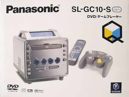
Panasonic Q
Article(s): Panasonic Q
Request: The creation of an SVG Panasonic Q logo.
Graphist opinion(s):
![]() Done
Done
New file: Panasonic Q.svg Ufo karadagli (talk) 09:12, 7 April 2011 (UTC)
Before and after comparision of Fukushima I building
-
NHK Sōgō channel news program screen shot (linked, not free use): File:2011-03-12 1800 NHK Sōgō channel news program screen shot.jpg
-
 Free use computer graphics version

Article(s): Fukushima I nuclear accidents
Request: The linked image at the left was derived from a screen capture off CNN.com and sourced to NHK international (left, undamaged) and NHK (right, after damage). Both cannot be incorporated in our Fukushima accident article for copyright reasons. An attempt has been made to create the free-use image to the right at File:Hydrogen explosion Fukushima Unit 1 cg visualization.png, but attempts at using this in English wikipedia articles result in it being reveretd for the non-free use image. Could someone create a free-use image more likely to stick? -84user (talk) 14:03, 5 April 2011 (UTC)
Graphist opinion(s):
As the creator of that graphic, can I as what is wrong with it? I was told that the reason they don't use it is that it is not the "real thing" which will never be fixed by a visualization... Nesnad (talk) 14:27, 7 April 2011 (UTC)
- The deletion nomination for the non-free image had several users indicate their dislike of the CG image, seeing that the "historic image" was irreplaceable and could never be substituted for a facsimile, among other reasons. There also was one user who reverted the non-free image for the free one in three articles while the deletion nomination was going on, citing "changed without consensus." --293.xx.xxx.xx (talk) 22:03, 7 April 2011 (UTC)
- Look for consensus on one of the talk pages for one of these articles and make sure it's all above board. Then feel free to contact WP:AN/I if the edit-warring continues. I don't think there's a need to create another image when this one is available and does the job just as well as any other free image could. NikNaks talk - gallery 08:17, 8 April 2011 (UTC)
German diagram that needs blanking or translating
-
 German diagram of Carbon 14 production
 -


Potential Article(s): Radiocarbon dating, Carbon-14
Request: A SVG diagram about radiocarbon dating that would be handy as a blank version (for localised versions on other wikis) or an English version. It is currently being used in de:Radiokohlenstoffdatierung. I'm sorry, but I can't help with translating the text. Malkinann (talk) 23:29, 6 April 2011 (UTC)
Graphist opinion(s): I had some issues with the German version with gradients and things, but there's a language-neutral version for you that's similar. The labels should be, according to the German one:
- 1: Formation of Carbon-14
- 2: Decay of Carbon-14
- 3: The "equal" equation is for living organisms, and the inequal one is for non-living ones, in which the C-14 then decays (hence the 2).
I hope this is helpful. If you have any changes you'd like, by all means ask! NikNaks talk - gallery 14:17, 9 April 2011 (UTC)
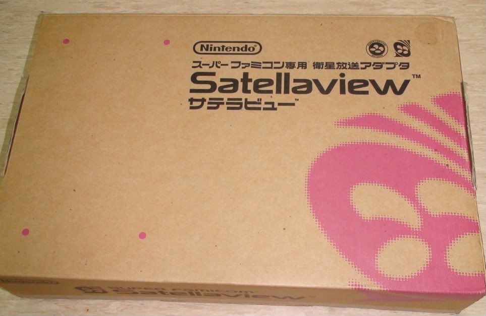
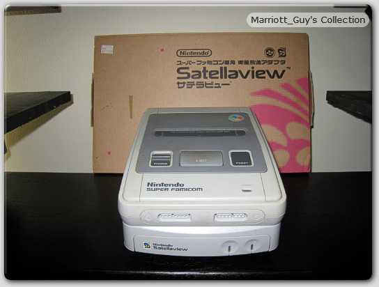
Satellaview

-
 Wordmark
Article(s): Satellaview
Request: Vectorized versions of the Satelleview logo and wordmark - done separately please. Wordmark - http://i877.photobucket.com/albums/ab338/yenchang/Gaming%20collectible/DSC01922.jpg?t=1273937880
Graphist opinion: done logo in SVG. What is workmark? Jon C (talk) 04:08, 12 April 2011 (UTC)
- The wordmark is the name of the brand in it's particular font.
- http://lh4.ggpht.com/_gdSznm1Dvpk/R0izg6agSMI/AAAAAAAACdw/enyV0oFraXE/s912/sfs.JPG
- http://kiddocabbusses.tryhappy.net/nothingforfree/BS-X/pasogood06-img600x450-1206986164dsc03309.jpg
- http://www.videogameconsolelibrary.com/images/1990s/95_Nintendo_Satellaview/95_Nintendo_Satellaview_BS-X_Other.jpg —Preceding unsigned comment added by 79.76.190.60 (talk) 09:10, 12 April 2011 (UTC)
- The wordmark is the name of the brand in it's particular font.
- Done Wordmark, not workmark -- I can't read :) Both are now done. Jon C (talk) 21:40, 16 April 2011 (UTC)
Mediaset España Comunicación
-
 Mediaset España logo
 -
 Vector version
Article(s): Mediaset España Comunicación
Request: Creation of vectorised Mediaset España Comunicación corporate logo 89.168.19.122 (talk) 17:17, 13 April 2011 (UTC) http://www.telecinco.es/inversores/es/documentacion/CP_NUEVA_IDENTIDAD_CORPORATIVA_MEDIASET_ESPANA_COMUNICACION.pdf
Graphist: ![]() Done Jon C (talk) 21:27, 16 April 2011 (UTC)
Done Jon C (talk) 21:27, 16 April 2011 (UTC)
illustration of damage to Fukushima I reactors
-
Earthquake and Tsunami damage-Dai Ichi Power Plant, Japan (linked, not free use): [1]
-
 Cartoon illustration of damage to Fukushima I reactors
 -
 Possible substitute?


Request: (adapted from [[]] request posted on 17 March.) Please create another image similar in intent to my amateur effort above showing the damage shown in this copyrighted photograph by Digital Globe. Any artistic illustration would be useful, as long as the image does not infringe the copyright of Digital Globe. Some simple images are at Commons:Category:Fukushima I Nuclear Power Plant and reference images via Google here.
Models and closeup images from NHK Television News can be seen in the first three minutes of video archived here (Real Video file, plays Ok in SMPlayer and VLC). -84user (talk) 14:19, 5 April 2011 (UTC)
Graphist opinion(s):
- Can this image File:Fukushima I nuclear accidents diagram.svg be a substitute? it contains the same information, Sodacan (talk) 23:35, 5 April 2011 (UTC)
- Yes that is a good substitute. Moreover it seems that the Digital Globe flickr image I linked to had already been released as File:Fukushima I by Digital Globe 2.jpg with a CC-BY-SA license via OTRS, several minutes before I posted my original request. So it seems we could close my request as having been already fulfilled. The non-commercial license on the flickr image distracted me. -84user (talk) 15:14, 9 April 2011 (UTC)
Thom McAn logo
-
Thom McAn logo
-
 text in SVG (new)
Article(s): Thom McAn
Request: Requesting that the "Thom McAn" text, by itself, be converted to SVG. Thanks! SchuminWeb (Talk) 18:57, 17 April 2011 (UTC)
Graphist opinion(s): ![]() Done Jon C (talk) 20:02, 17 April 2011 (UTC)
Done Jon C (talk) 20:02, 17 April 2011 (UTC)
- Thanks, though it doesn't look quite "crisp" enough compared to the source material. SchuminWeb (Talk) 03:20, 18 April 2011 (UTC)
- Looks good, thanks! SchuminWeb (Talk) 16:14, 18 April 2011 (UTC)
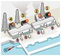
Fukushima I nuclear accident image
-
Profile view of Fukushima I nuclear plant (linked, not free use): http://www.asahicom.jp/national/update/0329/images/TKY201103280598.jpg
-
 I hope this does you good! It's language neutral (numbers representing the different things) and I spent a long time making it!
 -
Top view of Fukushima I nuclear plant (linked, not free use): http://www.asahi.com/national/update/0329/images/TKY201103290240.jpg
-
Top view #2 of Fukushima I nuclear plant (linked, not free use): http://www.asahi.com/photonews/gallery/infographics/images/110330_kakusantaisaku.jpg
-
Based on Image 3, but with important changes to labels and context. by User:Sodacan
Article(s): Fukushima I nuclear accidents
Request: The above two images are from a Japanese newspaper, and probably cannot be incorporated in our Fukushima accident article for copyright reasons. Even if Japanese law might allow their use, they are Japanese-language. However, in this instance, a image replaces a thousand words.
It is likely that water pumped into the reactor (image 1, far left) has leaked into the turbine (image 1, center), then down into the trench underneath the plant and is (or has) overflowed into the sea. Without a graphic, it is hard to describe this in text. The plan is to pump this water into the storage tank shown at the bottom of image 2. An alternate plan is shown in image number 3 - pumping it to a ship.
Could someone recreate a combination of these first two images that is language-neutral, and free of restrictions, so I can incorporate into our text?66.65.191.165 (talk) 19:38, 30 March 2011 (UTC)
Graphist opinion(s):
![]() Request taken by Nesnad. - I did the one that seemed most important. Does it suit you fine? Nesnad (talk) 09:49, 31 March 2011 (UTC)
Request taken by Nesnad. - I did the one that seemed most important. Does it suit you fine? Nesnad (talk) 09:49, 31 March 2011 (UTC)
- Excellent thanks. I have one more request, sorry I didn't think of it when I originally posted.
- Could you add a "#7" in the black space above #6? That is the measurement that has been pretty consistently reported (between 1m and 20cm). It's the space before the water overflows the trenches and pours into the sea. I'm not sure why the original newspaper image didn't show a number there.
- Thanks again. 66.65.191.165 (talk) 02:40, 1 April 2011 (UTC)
- Sure, I an add it... but... isn't that what 6 means??? What is 6 then? Cheers, Nesnad (talk) 14:29, 1 April 2011 (UTC)
- I think 6 is the distance from the "well" to the sea. It's a horizontal distance.
- I was thinking of the vertical distance for #7. How much further "up" must the blue go before it then has to go the #6 distance. Does that make sense? 66.65.191.165 (talk)
- Ooooh like the distance from the ocean to the shore, vertically? I don't think we have that information? But I can add a vertical bar from the ocean to the shore if you wish, but seems a bit hard to squish in to the picture. Nesnad (talk) 11:49, 2 April 2011 (UTC)
- Maybe. The distance from the top of the radioactive water (the blue) in the "well" (to the left of #5), to the top of the "earth" (at which point it will flow down like a waterfall). Another way of thinking talking about it (in this drawing), is the height of the brown triangle directly above the #5. In this drawing, the height of the brown triangle is almost the same as the height as the black to the left that I am calling #7. Does that make sense?
- Oh, actually, I'll just make an ascii representation in the comments. This is a blow up of the right side of the document.
- Ooooh like the distance from the ocean to the shore, vertically? I don't think we have that information? But I can add a vertical bar from the ocean to the shore if you wish, but seems a bit hard to squish in to the picture. Nesnad (talk) 11:49, 2 April 2011 (UTC)
- Sure, I an add it... but... isn't that what 6 means??? What is 6 then? Cheers, Nesnad (talk) 14:29, 1 April 2011 (UTC)
- Right now:
------
     |
     |
     |
brown|
 #4  |---------\
     |  black  |\
     |         | \
     |         |  \
     |---------|   \  <---------------------#6--------------->
     |         |    \
     |  blue   |     |
     |(well)   | #5  |----------------------------------------|
     |         |brown                                         | Ocean
     |         |                                              |
     |         |                                              | blue
-----          |                                              |
               |                   brown                      |
 blue          |                                              |
---------------|                                              |
brown                                                         |
                                                              |
---------------------------------------------------------------
Adding this text:
-----|
     |
brown|
     |---------\           ------------------
     |  black  |\                   /\
     |         | \                  |    #7 (Height of the black to the left)
     |         |  \                 \/
     |---------|   \       ------------------
     |         |    \
     |  blue   |     |
     |         |     |----------------------------------------|
     |         |brown                                         | Ocean
     |         |                                              |
     |         |                                              | blue
-----          |                                              |
               |                   brown                      |
 blue          |                                              |
---------------|                                              |
brown                                                         |
                                                              |
---------------------------------------------------------------
66.65.191.165 (talk) 21:06, 2 April 2011 (UTC)
I believe I have done what you requested! I hope! haha :) Someone (you?) has already started to use the image on English Wikipedia (and Russian?) so you might want to go in and add the captions to the English page ASAP. If this number 7 isn't what you are looking for, I can fix it, but I will be down south (of my current location), away from my computer, for a few day so there will be a delay. (Also, as of this writing the wikkimedia thumbnail server is down and not rendering the new images I uploaded, so if it is down still when you read this be sure to click the image to see what I made.) Anyway, cheers, Nesnad (talk) 14:13, 3 April 2011 (UTC) PS, I switched the 6 and 7's locations so don't get confused! haha Nesnad (talk) 14:15, 3 April 2011 (UTC)
- Great. I did put it on the Fukushima I nuclear accidents wiki. However, I haven't been able to update it to your newest image (with #7), since the image has the same file name, wikipedia keeps grabbing the image that was current when the image was added to the page. I'll try to update it again later. 66.65.191.165 (talk) 17:37, 3 April 2011 (UTC)
- Thanks for the image to whoever, but does someone know what the numbers are for so we can add this to the image caption and the image's description page on commons? Regrettably the japanese originals are meaningless to me and you cant auto-translate images. Sandpiper (talk) ::13:32, 4 April 2011 (UTC) Hate to be picky, but if the blue is water then it will all be at the same level if it is in open vessels or tunnels. It seems unlikely that the water level in 2 would be below that in 3 or 5. I presume 4 is a flooded tunnel, so water level is limited by its roof. The japanese version linked above has the same open water level throughout. Sandpiper (talk) 13:45, 4 April 2011 (UTC)
File:Fukushima I nuclear accidents diagram.svg (based on Image 3)
Just uploaded a version based on Image 3, please have a look and please tell me what needs to be changed (or even if it is usable at all) Sodacan (talk) 20:32, 5 April 2011 (UTC)
- Thanks to Nesnad and Sodacan for these images. As the original requester, I believe I am supposed to mark this as resolved. Since the images have been displayed on the Fukushima I nuclear accidents and/or the Fukushima I Nuclear Power Plant articles for some time, and my original request is complete, and most/all of Sandpiper's graphical requests are complete, I'm going to mark this resolved. Thanks all. 66.65.191.165 (talk) 05:47, 20 April 2011 (UTC)
Wappen Tirana.svg
-
 Coat of Arms of Tirana

Article(s): Tirana
Request: If someone please could remove the white background Vinie007 11:29, 17 April 2011 (UTC)
Graphist opinion(s): ![]() Done Jon C (talk) 02:03, 20 April 2011 (UTC)
Done Jon C (talk) 02:03, 20 April 2011 (UTC)
Woolworth's logos
-
1960s-era Woolworth's logo
-
 Final Woolworth's logo
 -
 SVG of old logo
 -
 SVG of new version
Article(s): F. W. Woolworth Company
Request: Requesting that these images be converted to SVG. Thanks! SchuminWeb (Talk) 18:42, 17 April 2011 (UTC)
Graphist opinion(s): ![]() Done new logo. Jovian Eye talk 20:10, 17 April 2011 (UTC)
Done new logo. Jovian Eye talk 20:10, 17 April 2011 (UTC)
- Awesome, thanks! Can you also SVG the old logo as well? SchuminWeb (Talk) 03:17, 18 April 2011 (UTC)
![]() Done Old logo. Jon C (talk) 17:24, 19 April 2011 (UTC)
Done Old logo. Jon C (talk) 17:24, 19 April 2011 (UTC)
- Awesome! Thanks much! SchuminWeb (Talk) 18:57, 19 April 2011 (UTC)
Albanian political parties
Fulfilled Requests
-
 Vectorized (logo only)
 -
 Vectorized (logo only)

.svg)
Article(s): Democratic Party of Albania, Socialist Movement for Integration and Party for Justice, Integration and Unity
Request: If someone please can vectorise this logo of the Democratic Party of Albania. Please make 2 files of it. One of full logo, 1 only of the Blue PD sign on left. And second the Socialist Movement for Integration logo. Vinie007 10:44, 12 April 2011 (UTC)
Graphist opinion: ![]() Done I made the logo for the Democratic Party of Albania, but I can't quite pick up the font (it looks like Arial Narrow but isn't). Are there higher resolution, less lossy versions of the rose logo out there?
Edit: fonts may be CamingoDos, Ubik, or BluSet?
Jon C (talk) 21:54, 16 April 2011 (UTC)
Done I made the logo for the Democratic Party of Albania, but I can't quite pick up the font (it looks like Arial Narrow but isn't). Are there higher resolution, less lossy versions of the rose logo out there?
Edit: fonts may be CamingoDos, Ubik, or BluSet?
Jon C (talk) 21:54, 16 April 2011 (UTC)
 Request taken by jkwchui. for PDIU logo. Jon C (talk) 19:51, 17 April 2011 (UTC)
- Done for PDIU logo. Jon C (talk) 20:17, 17 April 2011 (UTC)
Diagram for Huygens-Fresnel article - needs much improvement!
-
 Diagram relating to Huygens-Fresnel equation
 -
 SVG
SVG -
 B&W SVG


Article(s): User:Epzcaw
Request: Improve the quality... Epzcaw (talk) 17:30, 19 April 2011 (UTC)
Graphist opinion(s): Not sure what the figure was supposed to illustrate, but tooka stab at it nonetheless. Can you describe how this would be used? Jon C (talk) 02:21, 20 April 2011 (UTC)
- Thanks, that is perfect. I have uploaded it onot my user page which I will shorlty transfer to the main Huygens-Fresnel principle page. 93.97.124.215 (talk) 17:13, 20 April 2011 (UTC)
- Thanks - that is perfect. I have uploaded it onto my user page, and will shortly edit the main huygens-Fresnetl articel to include it. 93.97.124.215 (talk) 17:12, 20 April 2011 (UTC)
Thank you - that is excellent, except I would prefer it to be black and white.
It is illustrating the geometry used to develop Fresnel's diffraction integral, used in optical calculations.
Also - could you add a Q at the point where the two upper lines intersect?
Many thanks again Epzcaw (talk) 09:16, 20 April 2011 (UTC)
- Done I added the Q to the colored version, and added an additional B&W version with the same info. Please mark the entry as resolved if the req is fulfilled. Jon C (talk) 16:32, 20 April 2011 (UTC)
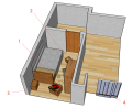
Sogen Kato Discovery Room
-
Bankisha program segment (linked, non-free use) News Program Builds Replica of Mummy Man’s House
-
 My pitiful attempt at making a free image for the article.
 -
 My not so much better attempt, but with at least a little more helpful design maybe? :)
 -
 A pseudo-3D rendering


Article(s): Sogen Kato
Request: Basically, a news programme recreates the room where Sogen Kato's mummified body was found, based on police reports. Any chance someone can replace my junk image into something abit more....proper? If you can't understand Japanese, the visuals alone in the video clip should be sufficient enough to guide you, and my notes on wikicommons. --293.xx.xxx.xx (talk) 23:02, 6 April 2011 (UTC)
Graphist opinion(s):
![]() Done - I tried to make this a little better with my limited skills. Is this what you were looking for? I took the liberty of replacing the image on the page since you said you were looking for one. Let me know if I didn't do something correct. Cheers, Nesnad (talk) 08:21, 8 April 2011 (UTC)
Done - I tried to make this a little better with my limited skills. Is this what you were looking for? I took the liberty of replacing the image on the page since you said you were looking for one. Let me know if I didn't do something correct. Cheers, Nesnad (talk) 08:21, 8 April 2011 (UTC)
- May I make a small comment? The man looks too big to be able to come through the door, so maybe you want to enlarge the rooms and doors a bit :-) Regards, -- Orionist ★ talk 21:45, 8 April 2011 (UTC)
- It's good, just, your forgetting some of the furniture, like the table where the police found the newspapers "dating" his death (which would be directly in front of the door leading into his room). But overall, hell of a better job than my hatchet job.--293.xx.xxx.xx (talk) 10:34, 9 April 2011 (UTC)
- Gave this a try while learning to use Google Sketchup... even though it says SVG, it's not a real SVG. Used numerals for multilingual use. Jon C (talk) 01:49, 20 April 2011 (UTC)
- I like it. It looks great.
Gonna use it now.Nevermind, it's in the article already. Derp.--293.xx.xxx.xx (talk) 19:14, 21 April 2011 (UTC)
- I like it. It looks great.
Woolco logo
-
 SVG
SVG
Article(s): Woolco
Request: Requesting that this image be converted to SVG. Thanks! SchuminWeb (Talk) 04:34, 21 April 2011 (UTC)
Graphist opinion(s): ![]() Request taken by Jovianeye.
Request taken by Jovianeye. ![]() Done I'm confused whether this logo is copyrightable. Like to know what others think. Jovian Eye talk 14:17, 21 April 2011 (UTC)
Done I'm confused whether this logo is copyrightable. Like to know what others think. Jovian Eye talk 14:17, 21 April 2011 (UTC)
- It looked like a handwritten (calligraphic) text (sans logo-logo), and with the company no longer existing, PD-text? Jon C (talk) 15:37, 21 April 2011 (UTC)
- I was thinking PD-text as well, but lacking any second opinions on the matter, chose to err on the side of caution when listing. Now that others have echoed my own suspicions without any prompting, I think we can safely change the license on it. SchuminWeb (Talk) 04:19, 22 April 2011 (UTC)
- And by the way, the SVG looks great. Thanks. SchuminWeb (Talk) 04:19, 22 April 2011 (UTC)
New unfree image icon
-
 Copyright symbol
 -
 Warning symbol
 -
 combined SVG


Article(s): Wikipedia:Graphic_Lab/Photography_workshop/Top_4
Request: Could I have these two SVG images combined, similar to ![]() , with the warning symbol being small? The icon will be used in the Top 4 gallery, in place of a fair-use file image. See here for an example. Please upload under the file name "Unfree image.svg", no hyphens please. Thank you! – Kerαunoςcopia◁galaxies 17:35, 22 April 2011 (UTC)
, with the warning symbol being small? The icon will be used in the Top 4 gallery, in place of a fair-use file image. See here for an example. Please upload under the file name "Unfree image.svg", no hyphens please. Thank you! – Kerαunoςcopia◁galaxies 17:35, 22 April 2011 (UTC)
Graphist opinion(s): ![]() Done Changed color to blue - since red-on-red just gave one big blotch. Jon C (talk) 19:03, 22 April 2011 (UTC)
Done Changed color to blue - since red-on-red just gave one big blotch. Jon C (talk) 19:03, 22 April 2011 (UTC)
Lëvizja Zgjohu
-
Lëvizja Zgjohu logo (main NGO in Albania)
-
 SVGified

Article(s): Lëvizja Zgjohu
Request: Please vectorise and remove background Vinie007 16:43, 21 April 2011 (UTC)
Graphist opinion(s): ![]() Done Please mark as resolved if adequate. Jon C (talk) 21:42, 21 April 2011 (UTC)
Done Please mark as resolved if adequate. Jon C (talk) 21:42, 21 April 2011 (UTC)
![]() Done Fixed AL per request. Regards, Jon C (talk) 19:24, 23 April 2011 (UTC)
Done Fixed AL per request. Regards, Jon C (talk) 19:24, 23 April 2011 (UTC)
Signature of Hiram Bingham I
Article(s): Hiram Bingham I
Request: Requesting an SVG trace of the signature. thanks! --KAVEBEAR (talk) 04:13, 25 April 2011 (UTC)
Graphist opinion(s):
![]() Done
Done
Please produce SVG versions of my hand-drawn sketches
-
 Geometric arrangement used in deriving Kirchhhoff's diffraction formula
 -
 Geometric arrangment used to express Kirchhoff's formula in a form similar to Huygens-Fresnel
 -

-


Article(s): user:epzcaw
Request: Please convert to SVG.
The article is currently in my user page, but ultimately will be at Kirchhoff's diffraction formula. Many thanks Epzcaw (talk) 13:27, 25 April 2011 (UTC)
Thank you - they are excellent.Epzcaw (talk) 15:36, 25 April 2011 (UTC)
Graphist opinion(s):
![]() Done: It's done, check for errors. —Preceding unsigned comment added by 83.21.132.175 (talk) 15:36, 25 April 2011 (UTC)
Done: It's done, check for errors. —Preceding unsigned comment added by 83.21.132.175 (talk) 15:36, 25 April 2011 (UTC)
Signatures


Article(s): multiple
Request: Requesting an SVG trace of these signature, if possible. Last two photos need to be isolate from the color background, if possible. Thanks!--KAVEBEAR (talk) 11:12, 26 April 2011 (UTC)
Graphist opinion(s):
![]() Done 1 is done; 2 is done; 3 is done; 4 is done; 5 & 6 is done; 7 is done; 8 is done; 9 is done.
Done 1 is done; 2 is done; 3 is done; 4 is done; 5 & 6 is done; 7 is done; 8 is done; 9 is done.
Signature
Article(s): Luigi Einaudi
Request: Requesting an SVG trace of this signature, if possible. Thanks! Angelus (talk) 14:50, 26 April 2011 (UTC)
Graphist opinion(s):
![]() Done
Done
Signature
Article(s): Crescenzio Sepe
Request: Requesting an SVG trace of this signature, if possible. Thanks! Angelus (talk) 16:44, 26 April 2011 (UTC)
Graphist opinion(s):
![]() Done
Done
-
 Signature of Azem Hajdari

.svg)
Article(s): Azem Hajdari
Request: Requesting an SVG trace of this signature, if possible. It need to be isolate from the color background, if possible. Thanks! Angelus (talk) 21:49, 26 April 2011 (UTC)
Graphist opinion(s):
Done
Assassin's Creed
Article(s): Assassin's Creed
Request: Maybe convert this logo into vector. Kungfu2187 (talk) 00:53, 27 April 2011 (UTC)
Graphist opinion(s):![]() Request taken by Jovianeye.
Request taken by Jovianeye. ![]() Done --Jovian Eye talk 02:16, 27 April 2011 (UTC)
Done --Jovian Eye talk 02:16, 27 April 2011 (UTC)
Cousin chart
-
 Kinship terminology chart

Article(s): Cousin
Request: Spelling correction: "Legende" → "Legend". Also, changing the dashed line separating the legend from everything else to a dotted line would also be nice. Cybercobra (talk) 20:05, 11 April 2011 (UTC)
Graphist opinion(s): Done and done. I've also fixed the twice/thrice errors at the bottom of the chart, at least I think I have. If they're wrong, I can switch back. The text error fixed itself on saving. NikNaks talk - gallery 11:59, 12 April 2011 (UTC)
Logos of Companies
-
 Godrej SVG on commons
Article(s): Godrej Group, Jaypee Group, iGATE and Ibibo
Request: Vectorize.--Kkm010 | Talk with me 12:20, 21 April 2011 (UTC)
Graphist opinion(s): Godrej and iGATE done, I am looking for others. Jovian Eye talk 13:32, 21 April 2011 (UTC)
- Hello, did you found the other two logos ? --Kkm010 | Talk with me 05:00, 27 April 2011 (UTC)
- I found Jaypee Group, but Ibibo is not possible because none of the PDFs have the vector version. Jovian Eye talk 19:24, 27 April 2011 (UTC)
- Hello, did you found the other two logos ? --Kkm010 | Talk with me 05:00, 27 April 2011 (UTC)
- OK, Thanks --Kkm010 | Talk with me 04:19, 28 April 2011 (UTC)
New unfree image icon
-
 version by Jovianeye

Article(s): Graphic Lab Top 4 and candidate for Template:GLNF image replacement. I will definitely be using it on Photograph/Top 4 NFCC requests, though.
Request: Please create an SVG icon using the above image as an example (please start from scratch). This image is a derivative of File:Unfree_image.svg. Icons used and the desired result:
- File:NotCommons-emblem-copyrighted.svg – no 3D highlights, light gray-lavender hue, transparent (I have 64% opacity on my PS layer).
- File:Nuvola_apps_important.svg – desaturated closer to a burgundy color, not transparent
- WP:NFCC text – Arial Black font, please.
Thank you guys so much! – Kerαunoςcopia◁galaxies 20:33, 26 April 2011 (UTC)
Graphist opinion(s): I have created one version. Dont understand why the text is not rendering properly. Looks fine in Inkscape. Jovian Eye talk 20:53, 26 April 2011 (UTC)
- Hmm, it's too small. Could it be as close to the example as possible? Maybe File:Copyright.svg isn't the right starting point (I was just looking at the talk page). In photoshop, I actually used File:NotCommons-emblem-copyrighted.svg but retraced the outer circle to remove the 3D-highlights. To keep the text above from overlapping the ©, the whole thing can be pushed down a bit and the text raised some, but I would still like the entire icon to be square, so there's no shrinkage of either image. – Kerαunoςcopia◁galaxies 21:00, 26 April 2011 (UTC)
- I moved the text up and the image down on the PNG version... – Kerαunoςcopia◁galaxies 21:06, 26 April 2011 (UTC)
- I definitely need help for the text from somebody better skilled. I think the rest should be ok. The text I used is Arial Bold. Jovian Eye talk 21:38, 26 April 2011 (UTC)
- I like the position of the text, with the baseline in the center of the uppermost circle. I do have a few more tweak requests: the triangle needs to be a bit bigger (the ratio was perfect on File:Unfree_image.svg) and the font should be Arial Black, which is a heavier weight than Arial Bold. – Kerαunoςcopia◁galaxies 22:16, 26 April 2011 (UTC)
- Ive changed the font to Arial Black and increase the ratio of File:Nuvola apps important.svg. The whole thing looks good in Inkscape but MediaWiki rendering is making it look weird. --Jovian Eye talk 22:39, 26 April 2011 (UTC)
- I like the position of the text, with the baseline in the center of the uppermost circle. I do have a few more tweak requests: the triangle needs to be a bit bigger (the ratio was perfect on File:Unfree_image.svg) and the font should be Arial Black, which is a heavier weight than Arial Bold. – Kerαunoςcopia◁galaxies 22:16, 26 April 2011 (UTC)
- I definitely need help for the text from somebody better skilled. I think the rest should be ok. The text I used is Arial Bold. Jovian Eye talk 21:38, 26 April 2011 (UTC)
- I moved the text up and the image down on the PNG version... – Kerαunoςcopia◁galaxies 21:06, 26 April 2011 (UTC)
- I think it looks great, excellent job! I definitely don't understand why the "WP" is rendering with a block behind it. When I download the SVG file and preview it, it looks completely normal. Is there one line of code that MediaWiki is misinterpreting or something? Of course, that's all beyond me. I may download a trial version of Illustrator and take a stab at it, but that won't be until later. – Kerαunoςcopia◁galaxies 03:35, 27 April 2011 (UTC)
- More advanced graphists should be able to fix this issue in a day or two. Jovian Eye talk 04:03, 27 April 2011 (UTC)
- I think it looks great, excellent job! I definitely don't understand why the "WP" is rendering with a block behind it. When I download the SVG file and preview it, it looks completely normal. Is there one line of code that MediaWiki is misinterpreting or something? Of course, that's all beyond me. I may download a trial version of Illustrator and take a stab at it, but that won't be until later. – Kerαunoςcopia◁galaxies 03:35, 27 April 2011 (UTC)
Text is fixed. I resized the triangle by making it a fraction smaller. Just re-saving the image seemed to fix the text issue. Now can someone take it back into Inkscape and replace the warning triangle? The paths get messed up (as do the colors). I read online that Illustrator isn't so hot with gradients, and also compatibility issues between Inkscape and Illustrator do exist. But hopefully now the text won't remain weirded out by WikiMedia. – Kerαunoςcopia◁galaxies 07:20, 27 April 2011 (UTC)
- Ive updated the file. Surprised to know that illustrator fixed the text. Jovian Eye talk 14:20, 27 April 2011 (UTC)
- Just one of those weird glitch situations. Like opening up a Word file in WordPerfect and resaving it to fix a formatting issue maybe. Or resetting a piece of equipment by unplugging it and plugging it back in. I have no idea, but it worked! Thanks for fixing the triangle, thanks for your help on this Jovianeye! – Kerαunoςcopia◁galaxies 18:13, 27 April 2011 (UTC)
AWWDMBJAWGCAWAIFDSPBATDMTAD
-
 Logo for m:AWWDMBJAWGCAWAIFDSPBATDMTD
Article(s): m:AWWDMBJAWGCAWAIFDSPBATDMTD
Request: As recently corrected on this Wikimedia page, the initialism is actually missing an A at the end. The initials should read AWWDMBJAWGCAWAIFDSPBATDMTAD, with the last three letters, TAD, replacing TD. – Kerαunoςcopia◁galaxies 01:59, 28 April 2011 (UTC)
Since I'm a noob at this, I thought I'd give it a whirl, but my SVG file won't render the last two letters properly. I can, however, save a PNG image that can be used for tracing maybe. My own tracing functions disappeared lol. Stupid programs (or stupid me).- To create from scratch, the font appears to be Times New Roman, bold weight. The bars on the top and bottom seem to be added separately. Ignore my PNG image, it's not right. – Kerαunoςcopia◁galaxies 06:00, 28 April 2011 (UTC)
Graphist opinion(s): ![]() Done You're right - it's Times / bold, with a -60 kerning. Jon C (talk) 03:57, 29 April 2011 (UTC)
Done You're right - it's Times / bold, with a -60 kerning. Jon C (talk) 03:57, 29 April 2011 (UTC)
- Wonderful, thank you as always. And good call on making it the same length! – Kerαunoςcopia◁galaxies 04:10, 29 April 2011 (UTC)
Company Logos
-
 Power Finance Corporation SVG on commons
 -
 SVG on commons
Article(s): NMDC, Hindalco Industries, Power Finance Corporation and Oil India
Request: Vectorize.--Kkm010 | Talk with me 15:01, 28 April 2011 (UTC)
Graphist opinion(s):![]() Request taken by Jovianeye. 2 done. Searching for Oil India. --Jovian Eye talk 19:12, 28 April 2011 (UTC)
Request taken by Jovianeye. 2 done. Searching for Oil India. --Jovian Eye talk 19:12, 28 April 2011 (UTC)
- Done I think Hindalco should be left the way it is. SVG of the Aditya Birla is difficult. --Jovian Eye talk 19:39, 28 April 2011 (UTC)
- If one logo can't be done its OK. Thanks --Kkm010 | Talk with me 05:53, 29 April 2011 (UTC)
Kimati Dinizulu
Article(s): Kimati Dinizulu
Request: Please crop off the white border, including the caption. Squandermania (talk) 21:44, 28 April 2011 (UTC)
Graphist opinion(s): ![]() Request taken by Jovianeye.
Request taken by Jovianeye. ![]() Done In future please make all photo editing requests at the photgraphy workshop. --Jovian Eye talk 21:56, 28 April 2011 (UTC)
Done In future please make all photo editing requests at the photgraphy workshop. --Jovian Eye talk 21:56, 28 April 2011 (UTC)