
Talk:Primary color/Archive 3
| This is an archive of past discussions. Do not edit the contents of this page. If you wish to start a new discussion or revive an old one, please do so on the current talk page. |
| Archive 1 | Archive 2 | Archive 3 | Archive 4 |
"Additive and subtractive color mixing" and "Examples" should be merged to something like "Primary Color Mixing Applications"
Both have the obvious substructure of the canonical examples of RGB for pixels, CMYK for printing and paint with muddled redundancy. "Additive and subtractive color mixing" isn't a good section title since neither model explains paint.Maneesh (talk) 20:14, 6 October 2017 (UTC)
Maneesh's October rewrite
Maneesh, I haven't had a chance to review your long string of edits yet. This is the opposite of what I advised, which was to go slow, allowing review and reactions. We'll see how it goes. For now, please at least do respect heading case conventions; massive over-capitalization like in "Color Applications Based On Primary Mixing" is not OK. Dicklyon (talk) 05:40, 13 October 2017 (UTC)
- These edits were generally small and done over a week (with 24hr periods in between) and even proposed right above for discussion with no response. What is your definition of "slow"? It's really just overcapitalization, and clearly inconsistent. I think that is a fairly easy mistake to fix, and certainly not intentionally made.Maneesh (talk) 21:32, 13 October 2017 (UTC)
I see you added "Small red, green and blue picture elements in electronic displays mix additively in the eye at an appropriate viewing distance to synthesize compelling colored images.[2]" This is a rather non-standard use of the term "picture elements", not supported by the cited source. Dicklyon (talk) 05:46, 13 October 2017 (UTC)
- Plenty of people refer to pixels as "picture elements"[1]. Not sure I understand your objection here as I am sure you are aware of the etymology of the word "pixel". Not particularly attached to "picture element" but I don't think it as unclear as you make it out to be or that it requires a citation.Maneesh (talk) 21:32, 13 October 2017 (UTC)
- Well, I do know a thing or two about "pixel" and "picture element". In displays, it is not usual to refer to color subpixels as pixels (though there have been exceptions). And the cited source does not use that variant terminology. So "red, green and blue picture elements in electronic displays" is pretty much wrong. Perhaps "red, green, and blue display elements" could work, but that's still not supported by the cited source, which doesn't have any hint of separate display elements. Dicklyon (talk) 03:57, 14 October 2017 (UTC)
- By all means change it to subpixel, but it isn't like the use of "picture element" is something totally crazy[2].Maneesh (talk) 22:42, 14 October 2017 (UTC)
- But the source still doesn't support it with subpixel, since it doesn't talk about how primary colors from different places blur together. It's just about mixing colors in place. So find another source, perhaps? Dicklyon (talk) 03:37, 15 October 2017 (UTC)
- I think you could pick the intro section on just about any book on any sort of digital imaging. You have some more experience here, picking the right reference for the general reader would require some consideration. The red, green and blue "things" ("phosphors" seems to be most frequent) don't seem to have a consistent name across sources. E.g. here is one on ccd cameras, a physics course at U Colorado and not quite as explicit in Fairchild's free book. There is an infinitude of choices here, I'm not so sure I can pick the "right" one.Maneesh (talk) 19:13, 16 October 2017 (UTC)
- But the source still doesn't support it with subpixel, since it doesn't talk about how primary colors from different places blur together. It's just about mixing colors in place. So find another source, perhaps? Dicklyon (talk) 03:37, 15 October 2017 (UTC)
- By all means change it to subpixel, but it isn't like the use of "picture element" is something totally crazy[2].Maneesh (talk) 22:42, 14 October 2017 (UTC)
- Well, I do know a thing or two about "pixel" and "picture element". In displays, it is not usual to refer to color subpixels as pixels (though there have been exceptions). And the cited source does not use that variant terminology. So "red, green and blue picture elements in electronic displays" is pretty much wrong. Perhaps "red, green, and blue display elements" could work, but that's still not supported by the cited source, which doesn't have any hint of separate display elements. Dicklyon (talk) 03:57, 14 October 2017 (UTC)
This one-word edit took the text from vague to precisely meaningless. There is no sense in which equality of luminance or luminosity is what's important here; illuminance would make more physical sense, but that doesn't need to be near equal either. Dicklyon (talk) 05:54, 13 October 2017 (UTC)
- No I don't think "illuminance" would make sense here. The sentence says "coincident chromatic blue and red spotlights with equal luminance on a white surface and dark surround will appear magenta or purple and brighter than either of the spotlights alone". Illuminance is a property of a surface not a light, luminance is a property of a light source. Without laying out the obvious scenarios in detail, I presume it is clear that categorizing the hue of a surface receiving light from two sources with different hues and grossly unequal luminance just introduces unnecessary complication. You could change the frame of reference in the sentence to use illuminance, but it makes more sense to describe the lights. Please do point out the error in my reasoning, "luminance" appears to be exactly correct to me. There is nothing that appears to be vague about the sentence, I presume it appears as over-specified to some eyes, but the surround conditions have to be declared before we can state predictions about color appearance.Maneesh (talk) 21:32, 13 October 2017 (UTC)
- I think you're confusing luminance for illuminance, but my main point is that the "equal" thing is wrong. To get a good magenta half-way between red and blue you would use a much greater luminance (reflecting from the surface) or illuminance (from the light at the surface) of red than of blue. What's more nearly equal will be the radiometric intensity (radiance or irradiance). Anyway, "spotlights with equal luminance on a white surface" should be corrected to something like "spotlights causing equal luminance of a white surface" if you want to use luminance; but then the surface doesn't need to be white. If you want to count on the surface being white, then "spotlights providing equal illuminance on a white surface" would be more appropriate (except you really want equal irradiance, probably, though it's not really that simple). The source talks about "balanced luminant intensity"; I'm not sure what that means, but perhaps it really means equal intensities? Dicklyon (talk) 03:57, 14 October 2017 (UTC)
- I have no idea what radiometry has to do with this, we're talking about the eye perceiving colors (photometry). A simple example then to make things clear: monochromatic blue 450nm light coincident with red 660 nm light with equal power will look awful blue. Rather than speculate on the hue category (since the differences can be pretty close[3]) and since the chroma is only partially specified I tried to cover my bases and say the color would be somewhere between purple and magenta. It sounds like you have illuminance and luminance exactly backwards, look at photometry or here[4]. Both sources will explain that luminance is a property of a lightsource, illuminance is a property of a surface, "spotlights causing equal luminance of a white surface" doesn't make sense. "spotlights providing equal illuminance on a white surface" does make sense. In any case, this seems to be minor misunderstanding or misstatement on least one of our sides that would certainly be cleared up with more discussion about well understood facts. Making claims about hues of lights on surfaces does require rather onerous specification, I don't think it is really worth it to leave the example in (unless there was a photo or something to accompany it).Maneesh (talk) 22:42, 14 October 2017 (UTC)
- I don't see what you're seeing in those sources. Luminance is a measure of light coming off a surface, typically used to characterize what a surface looks like, combining the illuminant and the reflectance spectrum (which is why the surface doesn't need to be white if you talk about its luminance). A distributed source surface (as opposed to a point source) also has a luminance, but when you're looking at a white wall with spotlights on it, the luminance coming off the wall is what matters. Equal source luminances would be of no sense at all if the source areas could be differnet (in addition the different color problem). Reflected surface luminance depends on the incident light, which is measured by illuminance (at the surface, but from a source), and the reflectance. Neither of these things is about sources or surfaces per se. Radiance is useful because if you have, for example, narrowband blue and red sources, the mix that makes a magenta will typically be more nearly equal radiometrically (not necessarily, of course), because equal luminances off the surface will make a much bluer mix than magenta, since blue is much less luminant than red, so you'll use a higher intensity of blue. I'm not saying that radiometric equality is the right criterion, just that it will often be closer than luminant equality. The source hedges with its "balanced" terminology. Dicklyon (talk) 03:35, 15 October 2017 (UTC)
- Indeed, one would need to specify source areas (or sizes and distances). It would be easier to just refer to a canonical demonstration an ideally a photograph (not just the conceptual diagrams). There are commercial kits with videos, but a picture in a textbook would be better I think. This picture is fine, but I swear I've seen it in older texts, I can't seem to verify anything about the experimental setup. Again, I think spotlights are rather far from everyday experience and require rather onerous specification here to be correct. I'm going to suggest just taking spotlights out, any other solution requires some compromises in correctness that I think could confuse the reader given that the basic nature of color is being discussed here.Maneesh (talk) 19:13, 16 October 2017 (UTC)
- I don't see what you're seeing in those sources. Luminance is a measure of light coming off a surface, typically used to characterize what a surface looks like, combining the illuminant and the reflectance spectrum (which is why the surface doesn't need to be white if you talk about its luminance). A distributed source surface (as opposed to a point source) also has a luminance, but when you're looking at a white wall with spotlights on it, the luminance coming off the wall is what matters. Equal source luminances would be of no sense at all if the source areas could be differnet (in addition the different color problem). Reflected surface luminance depends on the incident light, which is measured by illuminance (at the surface, but from a source), and the reflectance. Neither of these things is about sources or surfaces per se. Radiance is useful because if you have, for example, narrowband blue and red sources, the mix that makes a magenta will typically be more nearly equal radiometrically (not necessarily, of course), because equal luminances off the surface will make a much bluer mix than magenta, since blue is much less luminant than red, so you'll use a higher intensity of blue. I'm not saying that radiometric equality is the right criterion, just that it will often be closer than luminant equality. The source hedges with its "balanced" terminology. Dicklyon (talk) 03:35, 15 October 2017 (UTC)
- I have no idea what radiometry has to do with this, we're talking about the eye perceiving colors (photometry). A simple example then to make things clear: monochromatic blue 450nm light coincident with red 660 nm light with equal power will look awful blue. Rather than speculate on the hue category (since the differences can be pretty close[3]) and since the chroma is only partially specified I tried to cover my bases and say the color would be somewhere between purple and magenta. It sounds like you have illuminance and luminance exactly backwards, look at photometry or here[4]. Both sources will explain that luminance is a property of a lightsource, illuminance is a property of a surface, "spotlights causing equal luminance of a white surface" doesn't make sense. "spotlights providing equal illuminance on a white surface" does make sense. In any case, this seems to be minor misunderstanding or misstatement on least one of our sides that would certainly be cleared up with more discussion about well understood facts. Making claims about hues of lights on surfaces does require rather onerous specification, I don't think it is really worth it to leave the example in (unless there was a photo or something to accompany it).Maneesh (talk) 22:42, 14 October 2017 (UTC)
- I think you're confusing luminance for illuminance, but my main point is that the "equal" thing is wrong. To get a good magenta half-way between red and blue you would use a much greater luminance (reflecting from the surface) or illuminance (from the light at the surface) of red than of blue. What's more nearly equal will be the radiometric intensity (radiance or irradiance). Anyway, "spotlights with equal luminance on a white surface" should be corrected to something like "spotlights causing equal luminance of a white surface" if you want to use luminance; but then the surface doesn't need to be white. If you want to count on the surface being white, then "spotlights providing equal illuminance on a white surface" would be more appropriate (except you really want equal irradiance, probably, though it's not really that simple). The source talks about "balanced luminant intensity"; I'm not sure what that means, but perhaps it really means equal intensities? Dicklyon (talk) 03:57, 14 October 2017 (UTC)
This edit perplexes me. Why non-pigment-based and non-scattering? What are you trying to get at here? Ah, it's trying to respect the unsourced paragraph that follows; where is that from? A much simpler starting point for subtractive primaries is the use in transparencies, as in film; minor corrections for reflective substrates can be introduced later. Dicklyon (talk) 05:58, 13 October 2017 (UTC)
- I don't know if you are complaining about the edit ("non-scattering" etc. which didn't make sense to me) or the paragraph that follows. The section shouldn't explain subtractive mixing comprehensively but describe it in terms that are important to mixing a set of primaries (CMYK) where some of the perception is explained by subtractive mixing. Nothing in those sentences excludes film (" idealized physical situation of uniform layers of partially light absorptive media overlaid on a reflecting surface under illumination."). As an instance of subtractive mixing, I think CMYK printing is a far more relevant technology today than film and thus a better example (I don't know if anyone associates CMY with film). I don't think there is anything in there that doesn't follow from rather standard sources, the handprint link is in there and does quite a good job elaborating (and uses transparent film as an instance, which isn't terribly tangible to most people I think). I don't think there is any significant disagreement and what is written on handprint, or any other credible source. Again, happy to see any errors in my reasoning.Maneesh (talk) 21:32, 13 October 2017 (UTC)
- Adding these details like "non-scattering" and "non-pigment-based" seems wildly out of place, hard to interpret, and probably not very correct. Simplification here seems like a good idea. Dicklyon (talk) 03:57, 14 October 2017 (UTC)
I did some copyedits, not paying any attention to whose work I was editing. Let me know if you see issues with my cleanup and simplifications. It seems there was a lot of POV waffling and weasel words in there to no good effect. Dicklyon (talk) 03:18, 19 October 2017 (UTC)
- They make sense to me. Only thing with the spotlights example is many source use that very example to say that magenta is the hue obtained from mixing blue and red light in "equal proportion" (e.g. Additive color). The "purple" vs. "magenta" thing can be nonspecific and confusing in this very context. I think there is more trimming to be done in the main body, after which it might make sense to make the lede more reflective of the article content.Maneesh (talk) 04:01, 19 October 2017 (UTC)
I removed the paragraph that uses words like "tiny slivers" of gamut, "general purposes" and "reasonable". These are vague terms in this context. Artists have long used single pigments (e.g., sanguine) or even just two (a nice example from handprint, modulo beads). Abstract art certainly has many examples. I don't think the article should try to spuriously associate trichromatic vision with certain practical aspects of using pigments to make pictures.Maneesh (talk) 21:31, 25 October 2017 (UTC)
- The paragraph has been reinserted. I'm not sure how one can consider broad classes of drawings and paintings made from one or two chromatic pigments not a "general purpose" or somehow quantify the number of such works vs. those made with three or more chromatic pigments. I can't find the place in the citation that supports the notion that trichromacy has something to do with the subjective preferences and varied practical constraints around the way pigments are selected for "general purposes" (what are they?). If one said for "photographic reproduction", that might make sense. Page 10 in the added cite shows the log transformed cone fundamentals, makes it quite clear that *all* wavelengths stimulate more than one type of photoreceptor (not just "middle wavelengths" in the visible spectrum).Maneesh (talk) 05:57, 26 October 2017 (UTC)
- If you tolerate a cutoff of about 1/1000 of the peak (log below -3.0), then the shortest wavelengths, below 395 nm, stimulate only the S cones. The longest, above 685 nm, only the L. In between these, there's a "middle" range that stimulates M and one or both of L and S. This middle range is smaller is you like a more reasonable cutoff, like -2.5. Maybe you can find a better way to make that clear? It's not really helpful to pretend that all wavelengths stimulate more than one receptor, since the hue change with wavelength is completely imperceptible at the long and short ends.
- Not sure what the rest of your point is. It's pretty clear that using fewer than two primaries is not "general purpose", in the sense that it can only produce colors along a thin line in chromaticity space. I don't think numbers of work or subjective preferences has anything to do with that. I agree that having a good source better aligned to what we say is a good idea. So work on that. Dicklyon (talk) 01:51, 27 October 2017 (UTC)
- It is presumptuous of you to suggest entirely arbitrary cutoffs and believe that they are somehow relevant to the complex mechanisms by which inputs are weighted in visual perception. It is not a matter of being helpful, it is an elementary fact of vision science that all visible wavelengths stimulate at least two photoreceptor types. If 390nm only stimulated S, we could use that wavelength to see color of pure S response, and determining the S cone fundamental would be a whole lot easier (the same argument for using 690nm for L). Of course we can't do that because S and L are imaginary primaries. I've provided you a table from CVRL that shows this as clear as day. I've pointed to handprint too many times in these discussions, but you will find a very helpful explanation there. If you need a textbook to tell you precisely this fact: look here or here. Let's settle this fact before moving to the next point.Maneesh (talk) 04:44, 27 October 2017 (UTC)
- No, you're wrong. "If 390nm only stimulated S, we could use that wavelength to see color of pure S response, and determining the S cone fundamental would be a whole lot easier" is nonsense. The fact that very short wavelengths do not appreciably stimulate any but the S cones does not have much to do with determining the imaginary primaries. Dicklyon (talk) 05:11, 30 October 2017 (UTC)
- And I'm not suggesting using arbitrary cutoffs, just suggesting that whatever level of significance you choose, it would be very hard to to claim any perceptible level of stimulation of other than S at very short wavelengths, or other than L at long enough wavelengths. Pretending otherwise makes a point that is not true. Dicklyon (talk) 05:14, 30 October 2017 (UTC)
- I don't think you have a good handle on this information. L and M cone fundamentals, the numbers in the respective columns in this table at 390 nm (generally understood to be the left boundary of the visible spectrum), is certainly perceived since *all* the numbers in that table are a result of color matching experiments with human participants. Those experiments are inherently perceptual, differences in perception (color matching) are what give us those different numbers (different intensities on "primary" lights set by human participants). The numbers in the table are only different since there are differences in perception. There is no question that L and M contribute to our perception at the very left and right end of the visible spectrum. I am baffled by what you are trying to claim.Maneesh (talk) 21:40, 30 October 2017 (UTC)
- It's not a deep issue, just a simple disagreement as to whether the M response goes to effectively zero at long wavelengths where L response remains nonzero. It's not clear to me how the tables you point to are arrived at from color matching experiments, but I'd bet there's a fair amount of smoothing and extrapolation involved; your reference doesn't say. Dicklyon (talk) 01:50, 25 November 2017 (UTC)
- (just saw this response) It does seem to be a deep issue because the claims you have made are counter to well established color science. Simple facts like LMS being imaginary primaries are not true if your claims are true. Every visible wavelength of light stimulates at least two cones, not just in the middle of the spectrum as you have claimed. None of the sources I've provided here suggest that what you are claiming is true. All credible sources and canonical datasets are summarized the same way: S response is negligible at long wavelengths and S is negligible for luminosity. No source suggests that L and M are negligible at short wavelengths or that M is negligible at long wavelengths. Go to the CVRL page->CVRL functions->Stockman and Sharpe Cone Fundamentals. The "2 deg" in the name implies there is a target with an arc diameter implying that there is an observer. Read Stockman2000, these fundamentals are clearly derived from from color matching experiments (says so in the abstract). The basic features of S negligibility and L/M sensitivity across the spectrum are not unique to this specific set of cone fundamentals. As I have mentioned below the basic feature of L and M being sensitive across the visible spectrum was long known and shared across different cone fundamental datasets. The precise smoothing method varies across datasets but does not affect these basic conclusions I have mentioned (the details get complicated for things like dealing with lens pigment). There is no extrapolation in terms of wavelengths, the data are acquired at 5 nm steps (why would you imagine they wouldn't be?).Maneesh (talk) 00:18, 29 November 2017 (UTC)
- "Simple facts like LMS being imaginary primaries are not true if your claims are true." That's nonsense. There's nothing about color science that changes if these curves go faster to zero at extreme wavelengths. The difference is negligible. But by your reasoning, no wavelength is too long to be visible, because is there was a long enough wavelength to give negligible L response, then the M response an order of magnitude lower would be negligible at a shorter wavelength than that, which you deny is possible. Dicklyon (talk) 00:37, 29 November 2017 (UTC)
- Your reasoning makes no sense, I think you are trying to use the cone fundamentals as absolute sensitivities when they are not (we only know them to an arbitrary scale factor). You are making implicit and incorrect assumptions about how the brain uses the M and L signals that no color scientist I know makes. We only have empirical measurements of color matching from which we must use certain assumptions to derive the cone fundamentals to an arbitrary scale factor. I am not sure if there is any other way I can explain this fact to you. You claim that there is some visible wavelength at which the S and M cone stimulation is negligible. Given the common convention of the visible range to be between 400-700 nm, you are claiming that the M response is negligible at some wavelength boundary. Is it at 700 nm (the wavelength used in the CIE experiments)? Why doesn't the derivation of the cone fundamentals from the color matching functions assume that the M response is zero at that wavelength then (like it does for S)? If it was, how would L be an imaginary primary since 700 nm would elicit an L response with a negligible S and M response. How is it that L is an imaginary primary if there is some real wavelength that stimulates only L? This is all a matter of convention, S isn't negligible above 560 nm if you use a bright enough source. Indeed we can see as low as 310 nm and as high as 1100 nm, but this is under special conditions. The cutoffs are arbitrary but the convention of around 400 nm - 700 nm is sound, the M and L cones have specific values across that entire interval and I don't see any source that suggests that the operating assumption is that both contribute to perception across that entire interval . I've never read anything that suggested that the M response is negligible at long wavelengths, can you find a credible source? People go to some effort to characterize the M and L response at long wavelengths no one that I know says the response is negligible at long wavelengths. I can't think of a study that looks at carefully at the S response above 560 nm, precisely because it is essentially negligible for the conditions we study color vision under. Maneesh (talk) 07:06, 29 November 2017 (UTC)
- "Simple facts like LMS being imaginary primaries are not true if your claims are true." That's nonsense. There's nothing about color science that changes if these curves go faster to zero at extreme wavelengths. The difference is negligible. But by your reasoning, no wavelength is too long to be visible, because is there was a long enough wavelength to give negligible L response, then the M response an order of magnitude lower would be negligible at a shorter wavelength than that, which you deny is possible. Dicklyon (talk) 00:37, 29 November 2017 (UTC)
- (just saw this response) It does seem to be a deep issue because the claims you have made are counter to well established color science. Simple facts like LMS being imaginary primaries are not true if your claims are true. Every visible wavelength of light stimulates at least two cones, not just in the middle of the spectrum as you have claimed. None of the sources I've provided here suggest that what you are claiming is true. All credible sources and canonical datasets are summarized the same way: S response is negligible at long wavelengths and S is negligible for luminosity. No source suggests that L and M are negligible at short wavelengths or that M is negligible at long wavelengths. Go to the CVRL page->CVRL functions->Stockman and Sharpe Cone Fundamentals. The "2 deg" in the name implies there is a target with an arc diameter implying that there is an observer. Read Stockman2000, these fundamentals are clearly derived from from color matching experiments (says so in the abstract). The basic features of S negligibility and L/M sensitivity across the spectrum are not unique to this specific set of cone fundamentals. As I have mentioned below the basic feature of L and M being sensitive across the visible spectrum was long known and shared across different cone fundamental datasets. The precise smoothing method varies across datasets but does not affect these basic conclusions I have mentioned (the details get complicated for things like dealing with lens pigment). There is no extrapolation in terms of wavelengths, the data are acquired at 5 nm steps (why would you imagine they wouldn't be?).Maneesh (talk) 00:18, 29 November 2017 (UTC)
- It's not a deep issue, just a simple disagreement as to whether the M response goes to effectively zero at long wavelengths where L response remains nonzero. It's not clear to me how the tables you point to are arrived at from color matching experiments, but I'd bet there's a fair amount of smoothing and extrapolation involved; your reference doesn't say. Dicklyon (talk) 01:50, 25 November 2017 (UTC)
- I don't think you have a good handle on this information. L and M cone fundamentals, the numbers in the respective columns in this table at 390 nm (generally understood to be the left boundary of the visible spectrum), is certainly perceived since *all* the numbers in that table are a result of color matching experiments with human participants. Those experiments are inherently perceptual, differences in perception (color matching) are what give us those different numbers (different intensities on "primary" lights set by human participants). The numbers in the table are only different since there are differences in perception. There is no question that L and M contribute to our perception at the very left and right end of the visible spectrum. I am baffled by what you are trying to claim.Maneesh (talk) 21:40, 30 October 2017 (UTC)
- It is presumptuous of you to suggest entirely arbitrary cutoffs and believe that they are somehow relevant to the complex mechanisms by which inputs are weighted in visual perception. It is not a matter of being helpful, it is an elementary fact of vision science that all visible wavelengths stimulate at least two photoreceptor types. If 390nm only stimulated S, we could use that wavelength to see color of pure S response, and determining the S cone fundamental would be a whole lot easier (the same argument for using 690nm for L). Of course we can't do that because S and L are imaginary primaries. I've provided you a table from CVRL that shows this as clear as day. I've pointed to handprint too many times in these discussions, but you will find a very helpful explanation there. If you need a textbook to tell you precisely this fact: look here or here. Let's settle this fact before moving to the next point.Maneesh (talk) 04:44, 27 October 2017 (UTC)
- The last book I used actually cites handprint. Just look at Stockman2000 (who is at CVRL): "The spectral sensitivities of the three cone types overlap extensively throughout the spectrum. Consequently, the measurement of the spectral sensitivity of a single cone type in the normal trichromatic observer requires special procedures to isolate its response from the responses of the other two unwanted cone types." This wouldn't be true if we had wavelengths that stimulated only S or only L.Maneesh (talk) 05:27, 27 October 2017 (UTC)
- "Overlap extensively throughout the spectrum" is true except at the extreme long and short ends of the visible spectrum that define pure violet and pure red. These wavelengths are more extreme than the main S and L response regions, and do not have much to do with the complicate problem of measuring the spectral sensitivity curves through the big middle part of the spectrum. Dicklyon (talk) 05:11, 30 October 2017 (UTC)
- You are confused. The overlap isn't just in the middle, it is at both ends. You only need to start qualifying in very special contexts (e.g., 800 nm light, in vitro, or lack of prereceptoral filtering). Again the the table shows it clearly (note how the S response is truly assumed to be non-contributing on the long end). I'll restate the links to make it convenient for someone else to weigh in and confirm that, unequivocally, *every* visible wavelength stimulates at least two cones and this is an elementary fact of vision science. "...any visible wavelength will stimulate at least two of three types of cones.", "The sensitivity curves of the L, M and S cones overlap each other: every monochromatic (single wavelength) hue must stimulate two or even three cones simultaneously.", "...in fact, the measurable sensitivity of the L and M cones extends over the entire visible spectrum, although the sensitivity of the M cone is very low in the near infrared...""The MW and LW cone sensitivities overlap across the entire visible spectrum, but the SW cone sensitivity is more separated...", "The M and L cones have overlapping spectral sensitivities that span the entire visible spectrum." This idea is essential to understand LMS as imaginary primaries.Maneesh (talk) 21:40, 30 October 2017 (UTC)
- I remain baffled by the claims that "[it is] very hard to to claim any perceptible level of stimulation of other than S at very short wavelengths" and "very short wavelengths do not appreciably stimulate any but the S cones", the credible sources above make it quite clear that that isn't true. This is really basic vision science, not something controversial.Maneesh (talk) 19:45, 9 November 2017 (UTC)
- Completing the sourced quote that you truncated, it says, "Having overlapping wavelength ranges for the three photoreceptors means that light at any visible wavelength will stimulate at least two of the three types of cones." This is obviously nonsense; even if what you're saying is true, it's certainly not implied by "Having overlapping wavelength ranges for the three photoreceptors". Anyway, it's hardly worth arguing about; the plots show the M about an order of magnitude below the L at long wavelengths. I consider it negligible, but I'll grant it might be measurable. Similarly, at short wavelengths, M and L are more than an order of magnitude below S. I call it negligible, but maybe it's not. Color science isn't going to care much one way or the other. Dicklyon (talk) 01:50, 25 November 2017 (UTC)
- In your slide show ref with "The MW and LW cone sensitivities overlap across the entire visible spectrum, but the SW cone sensitivity is more separated..." on slide 19, that's an electrophysiological measurement over 6 orders of magnitude, as it says. Two slides earlier, the curves based on perception show the M curve crapping out short of 700 nm, which is more as I understood it, as a perceptual effect. Dicklyon (talk) 02:07, 25 November 2017 (UTC)
- I can't suss out your position, you seem to be trying to nitpick at a quote from a credible source when the meaning is quite clear to anyone familiar with the science. The fact that the M and L responses an order of magnitude lower than S at short wavelengths (very true, as seen in the table I've linked to earlier) does not mean that they are negligible or imperceptible; how the brain ends up using those inputs is the brain's business and it clearly does use them. The small difference in LMS values at short and long wavelengths are clearly perceptible, human observer wouldn't make the matches they did otherwise; there is no reason to believe that the differences in perception are solely due to the differences in S response. The luminous efficiency functions generally ignore S across the entire visible spectrum, yet we see that we can resolve differences even at short wavelengths. If it is "very hard to to claim any perceptible level of stimulation of other than S at very short wavelengths" as you claim, why do subjects perceive different luminosities for short wavelengths and assume that S is not contributing? Color science already knows that L and M contribute to color perception across the entire visible spectrum and that every visible wavelength stimulates at least two cones. It knew a long time ago.Maneesh (talk) 03:28, 25 November 2017 (UTC)
- Just so I don't forget, this is a very credible review of color science circa 1986. Note how it summarizes the various cone fundamentals: "The L and M cones are sensitive across the entire visible spectrum...". These are conclusions drawn from psycohphysical experiments which, fundamentally, measure differences that the human eye can perceive.Maneesh (talk) 05:47, 25 November 2017 (UTC)
- Boynton describes the M and L cones with a couple of points there:
- The Land M cones are sensitive across the entire visible spectrum, with their peak sensitivities lying not too far apart at about 565 and 540 nm, respectively .
- In the long wavelengths, L-cone sensitivity far exceeds that of the M cones.
- My point is that the second is more corrrect, implying M essentially zero before L going to zero defines the longwave edge of "the entire visible spectrum". The first point doesn't really make sense; if you pick some sensitivity level of L to define "the entire visible spectrum" on the long end, then M drops below that level, to essentially zero, at some shorter wavelength. It's not a deep point, just pointing out that claiming at least two cones types are stimulated at all wavelengths has to break down at the extremes, and is sloppy thinking (yes, even Boynton can get into that). Dicklyon (talk) 00:46, 29 November 2017 (UTC)
- Why would the author say "The L and M cones are sensitive across the entire visible spectrum" first then if that isn't a salient point? Why are you picking a sensitivity level of L to define the entire visible spectrum when the luminous efficiency function is fitted by L+M? The only sloppy thinking I can see here is on your side. I presume you understand now that M and L obviously contribute to perception at short wavelengths, since S is negligible for the luminous efficiency function (and the citations tell you why). Your original claim that it is "very hard to to claim any perceptible level of stimulation of other than S at very short wavelengths" is quite plainly wrong. Now you seem to want to focus on the long wavelength end. Why do you see that it is so often and clearly mentioned that it is sound to ignore S in the luminous efficiency function and at long wavelengths but no corresponding claims for M at long wavelengths? I've already supported my positions with a lot of very credible sources, you seem to be pointing at a convention that I've never seen.Maneesh (talk) 07:06, 29 November 2017 (UTC)
- I don't know why he says that, or why you have such trouble getting my point. Look at all the plots at [5] for example. They pretty much all show M going to zero short of 700 nm. Dicklyon (talk) 07:19, 29 November 2017 (UTC)
- Why would you look at bitmaps? Look at the actual numbers, the M response simply is not 0 at 700 nm. Can you find a source that claims the M response is negligible at 700 nm they way many credible sources claim S is negligible past about 560 nm? Again, look at a canonical set of table of cone fundamentals. The arbitrarily scaled values for L and M are -2.32004, -3.54839 log units. Not 0.Maneesh (talk) 07:31, 29 November 2017 (UTC)
- Part of the reason I am having so much trouble getting your point is because are making incorrect statements. Do you agree that the claim that it is "very hard to to claim any perceptible level of stimulation of other than S at very short wavelengths" is incorrect?Maneesh (talk) 07:41, 29 November 2017 (UTC)
- No, I don't have sources that say quite that; just pointing out that saying the opposite seems nonsensical. At the extreme wavelengths, the M response is more than an order of magnitude lower than the already very low S or L response at the wavelengths that define the limits of visibility. It's hard to see therefore how those low values can be considered psychologically significant. And those standard curves are based on a certain amount of extrapolation and smoothing of data, so don't interpret those small values are actual psychophysical data. Dicklyon (talk) 22:49, 29 November 2017 (UTC)
- This is where you are making your error in reasoning, you are assuming you can translate the arbitrarily scaled numbers straightforwardly into perception. You can't. To show you this is true: you've already seen the link to CVRL describe canonical, long ago well established color vision science: S is negligible to luminance. In other words, the perception of some wavelengths being brighter than others is only a function of L and M . This is true across the entire spectrum. It doesn't matter what values you read off the S cone fundamental, it is an empirical fact that the S cone contribution to the perception of luminance is negligible. Do you see now how the statement about it being "very hard to to claim any perceptible level of stimulation of other than S at very short wavelengths" is simply wrong? L and M are clearly contributing to luminance at short wavelengths because S, essentially, doesn't. Color scientists didn't decide to wire the brain this way, but that's how it works. Once you understand this, you can see that color science does consider S to be negligible above ~560 nm reflected by how specific unknowns for 700 nm light are set to 0 in the derivation of the cone fundamentals. It isn't a hard truth, pump up the intensity of the light and you will see an S response eventually at > 560 nm, but true enough for the conditions we test color vision in. That same assumption isn't made for M with the 700 nm light, you can't say that M is negligible in the same way as S is at 700 nm given the difference in treatment. The criteria for negligibility is quite clear here, that's why the credible sources I've cited say true things like "every visible wavelength stimulates at least two cones". Yes, M does seem to contribute less to luminance at the long end ("color" vs. luminance gets complicated to my knowledge) but I can't find a a source that considers M negligible. I think we should let the established color science literature tell us what is negligible and what is not, you can't determine it just by looking at numbers in a table. Maneesh (talk) 07:13, 30 November 2017 (UTC)
- No, I don't have sources that say quite that; just pointing out that saying the opposite seems nonsensical. At the extreme wavelengths, the M response is more than an order of magnitude lower than the already very low S or L response at the wavelengths that define the limits of visibility. It's hard to see therefore how those low values can be considered psychologically significant. And those standard curves are based on a certain amount of extrapolation and smoothing of data, so don't interpret those small values are actual psychophysical data. Dicklyon (talk) 22:49, 29 November 2017 (UTC)
- I don't know why he says that, or why you have such trouble getting my point. Look at all the plots at [5] for example. They pretty much all show M going to zero short of 700 nm. Dicklyon (talk) 07:19, 29 November 2017 (UTC)
- Why would the author say "The L and M cones are sensitive across the entire visible spectrum" first then if that isn't a salient point? Why are you picking a sensitivity level of L to define the entire visible spectrum when the luminous efficiency function is fitted by L+M? The only sloppy thinking I can see here is on your side. I presume you understand now that M and L obviously contribute to perception at short wavelengths, since S is negligible for the luminous efficiency function (and the citations tell you why). Your original claim that it is "very hard to to claim any perceptible level of stimulation of other than S at very short wavelengths" is quite plainly wrong. Now you seem to want to focus on the long wavelength end. Why do you see that it is so often and clearly mentioned that it is sound to ignore S in the luminous efficiency function and at long wavelengths but no corresponding claims for M at long wavelengths? I've already supported my positions with a lot of very credible sources, you seem to be pointing at a convention that I've never seen.Maneesh (talk) 07:06, 29 November 2017 (UTC)
- Boynton describes the M and L cones with a couple of points there:
- In your slide show ref with "The MW and LW cone sensitivities overlap across the entire visible spectrum, but the SW cone sensitivity is more separated..." on slide 19, that's an electrophysiological measurement over 6 orders of magnitude, as it says. Two slides earlier, the curves based on perception show the M curve crapping out short of 700 nm, which is more as I understood it, as a perceptual effect. Dicklyon (talk) 02:07, 25 November 2017 (UTC)
- Completing the sourced quote that you truncated, it says, "Having overlapping wavelength ranges for the three photoreceptors means that light at any visible wavelength will stimulate at least two of the three types of cones." This is obviously nonsense; even if what you're saying is true, it's certainly not implied by "Having overlapping wavelength ranges for the three photoreceptors". Anyway, it's hardly worth arguing about; the plots show the M about an order of magnitude below the L at long wavelengths. I consider it negligible, but I'll grant it might be measurable. Similarly, at short wavelengths, M and L are more than an order of magnitude below S. I call it negligible, but maybe it's not. Color science isn't going to care much one way or the other. Dicklyon (talk) 01:50, 25 November 2017 (UTC)
- "Overlap extensively throughout the spectrum" is true except at the extreme long and short ends of the visible spectrum that define pure violet and pure red. These wavelengths are more extreme than the main S and L response regions, and do not have much to do with the complicate problem of measuring the spectral sensitivity curves through the big middle part of the spectrum. Dicklyon (talk) 05:11, 30 October 2017 (UTC)
- The last book I used actually cites handprint. Just look at Stockman2000 (who is at CVRL): "The spectral sensitivities of the three cone types overlap extensively throughout the spectrum. Consequently, the measurement of the spectral sensitivity of a single cone type in the normal trichromatic observer requires special procedures to isolate its response from the responses of the other two unwanted cone types." This wouldn't be true if we had wavelengths that stimulated only S or only L.Maneesh (talk) 05:27, 27 October 2017 (UTC)
- In this Stockman et al paper, the S response doesn't go to zero at 700 nm either. Nobody would claim that's perceptible; where should we put the cutoff? Or should we claim that all three are stimulated at all visible wavelengths because of this source? Dicklyon (talk) 22:57, 29 November 2017 (UTC)
- Read this 1999 paper by Stockman that says the same thing that Stockman's site I've already linked to says. Read page 2902 carefully. See how sr = 0 and mr is not 0? Clearly notable work in this field assumes "sr is effectively zero, if we assume, quite reasonably (see Table 3), that the S-cones are insensitive to the red primary". Why do you think color scientists don't seem to assume mr is 0 when dealing with the careful matter of determining cone fundamentals?Maneesh (talk) 22:03, 1 December 2017 (UTC)
- In this Stockman et al paper, the S response doesn't go to zero at 700 nm either. Nobody would claim that's perceptible; where should we put the cutoff? Or should we claim that all three are stimulated at all visible wavelengths because of this source? Dicklyon (talk) 22:57, 29 November 2017 (UTC)
This paper describes some of the smoothing and curve fitting that goes into making the most modern "fundamental" estimates. Nobody is saying that they should go to identically zero, but it's also not the case that the data prove the responses are perceptibly nonzero at the wavelength extremes; it just looks that way when plotted on a log scale, and not when plotted on a linear scale. Dicklyon (talk) 23:08, 29 November 2017 (UTC)
- I have not seen any acknowledgement of the misconceptions that were presented in the long thread above. L and M cones are sensitive across the entire visible spectrum (a fact that is stated explicitly in a number of credible sources), one only needs to understand what established color science has to say about the luminous efficiency function and the fact that the LMS primaries are imaginary. One can't simply compare values from (arbitrarily scaled) cone fundamentals to draw conclusions on the contributions to perception. The cone fundamentals are certainly suggestive but you need to understand a little more about color vision to draw the right conclusions (e.g., S doesn't contribute to the perception of photopic brightness).Maneesh (talk) 07:15, 12 December 2017 (UTC)
New lede suggestion
I think the body of the article is a lot better than it used to be and more succinct. I think the article deserves a better lede that more accurately summarizes the article and incorporates "popular color theory" as discussed two sections above with QuoJar. I presumed they would give it a whirl, but haven't seen changes since the discussion. The following is an attempt. Important ideas that I think are here: distinguish between perceptual and conceptual, this provides a nice hierarchy of concepts and naturally leads to the "conceptual" primaries of "popular color theory" (whatever that is). I haven' added references but every assertion here is supported by links that have been cited in the long discussions prior:
A set of primary colors is, most tangibly, a small set of real physical pigmented media or colored lights that can be combined in varying amounts to produce a range or "gamut" of colors. This is the essential method used in applications that are intended to elicit the perception of diverse sets of color, e.g., electronic displays, color printing and painting. Predicting the perception associated with a given combination of primary colors is done by applying the appropriate mixing model (additive, subtractive, additive averaging etc.) that embodies the underlying physics of how light interacts with the media and (ultimately) the retina.
Primary colors can also be conceptual, either as additive mathematical elements of a color space model or as irreducible phenomenological categories in domains such as psychology and philosophy. Color space primaries are precisely defined and empirically rooted in psychophysical experiments that are the basis of understanding color vision. While some color space primaries correspond to real light sources (e.g., in sRGB), many color space primaries are imaginary — they do not correspond to known percepts — and complete in that all colors (in a given color viewing context) can be specified by weighted sums of the primaries. No finite real set of primaries can be complete. Describing primary colors from a phenomenological perspective is difficult to do succinctly but phenomenological accounts, such as the psychological primaries, have led to practically useful insights.
All sets of real and color space primaries are arbitrary, there is no one set of primaries that can be considered the canonical set. Primary pigments or light sources selected for a given application on the basis of subjective preferences as well as practical factors such as cost, stability, availability etc.
Art education materials, dictionaries and popular artist tools are known to define the primary colors as a fixed set of three conceptual colors. Such sources do not present a coherent, consistent definition of primary colors. As an example: a popular color wheel that claims that red, yellow and blue are the primary colors but the parent company's web page states that cyan, magenta and yellow are the primary colors. These sorts of inconsistent positions on primary colors demonstrate that a clear understanding of the concept requires the perspective of modern colorimetry.Maneesh (talk) 01:56, 24 November 2017 (UTC)
Color-space primaries, Completeness and Non-negativity
The following sentence in the article: "Primaries of some color spaces are complete (that is, all visible colors are described in terms of their weighted sums with nonnegative weights)" is a result of adding in the words "nonnegative weights". Complete color spaces like CIELAB specify real colors with negative coefficients in front of the a* and b* primaries (all green and blue colors). I hope this makes it clear that the "nonnegative weights" constraint is incorrect and unnecessarily specific. The intent seems to be to differentiate between negative coefficients in other incomplete colorspaces (where allowing negative weights would make them complete). Consider sRGB, the nonnegative constraint is a part of the color space definition (look at how the gamut is canonically shown) and sound given that negative amounts of real primaries aren't very useful for most applications. The scRGB space uses primaries with the same real values as sRGB but explicitly allows for negative weights. "nonegative weights" should be removed, I can't see how it is correct.Maneesh (talk) 06:57, 12 December 2017 (UTC)
- Really, you think CIELAB has a set of color-space primaries in the sense of this article? I don't think so. For sRGB and such sets of primaries, the primary sets are complete unless there's a nonnegativity constraint. If you want completeness to be a property of the primary set, nonnegativity is needed. Right? Dicklyon (talk) 07:16, 12 December 2017 (UTC)
- You believe that X, Y and Z from CIEXYZ are imaginary primaries don't you?Maneesh (talk) 07:20, 12 December 2017 (UTC)
- Yes, X, Y, and Z are imaginary primary, and can make all colors with nonnegative weights. The signed a and b weights in CIELAB are something quite different, being applied to nonlinear combinations of those. So don't muddy the waters. Dicklyon (talk) 16:22, 12 December 2017 (UTC)
- I'm disturbed by the accusation of water muddying (especially after the long thread above) but I agree with your sentiment. "Complete-ness" as I have used it (or it's negation, "imperfect-ness", as used in handprint) seems to be problematic here. There is obviously straight forward, continuous, one-to-one functions that map between XYZ, LMS and L*a*b(and between many other spaces); if XYZ and LMS are imaginary primaries hard understand why L*a*b* are not (what disqualifies them? I don' think there is anything special about a non-linear transformation). If you assume L*a*b* are primaries, you have to allow negative weights which makes one think that the non-negativity constraint is really a property of the color space instead of the primaries. I can't find good sources that refers to L*a*b* as "imaginary primaries", but many that correctly describe XYZ as arbitrary (implying that L*a*b* are primaries). In sRGB vs. scRGB, the weight constraints/bounds are really a property of the color space and not the primaries (since they are the same between the two color spaces). Brief searching doesn't suggest anyone has been bothered enough to sort this out. The only resolution I can think of is to say something like "primaries (in the context of a given color space) are complete if their weighted sums can specify all possible colors...".Maneesh (talk) 01:03, 13 December 2017 (UTC)
- To start with, L*a*b* is not an additive colorspace. It's a weird nonlinear transformation of XYZ (and hence of LMS or any RGB space rooted in XYZ); it does not have primaries of its own. You seem to be trying to use it to question the idea of completeness involving nonnegative weights. It's really very simple. If the color triangle defined by additive primaries, in the xy plane, covers all visible chromaticities, then the primary set is said to be complete. If it's smaller than that, then some chromaticities need negative weights, and can't be reproduced if weighting are constrained to be nonnegative. None of this makes sense outside of linear additive combinations. Dicklyon (talk) 03:24, 13 December 2017 (UTC)
- We can specify any color as jL* + ka* + lb*, where jkl are scalars, I don't think the failures of Grassman's 2nd and 3rd law matter; we can still "mix" L*a*b* to specify all possible colors the same way we can mix LMS and XYZ. In principle I could shine L*a*b* imaginary lights (with a given whitepoint) on color matching targets the very same way I could with XYZ and eventually dial in the amounts to match. I can't see how L*a*b* don't meet the definition of conceptual primaries. In any case, the problem now is with scRGB and RGB, they share the same primaries but scRGB allows negative weights; complete-ness appears to be a property of the primaries in the context of the space and not just three primaries.Maneesh (talk) 04:15, 13 December 2017 (UTC)
- You're being too absurd. You can't shine imaginary L*a*b* lights, as there are no such colors. It's not remotely like XYZ even. Neither imaginary nor any other kind of primary. There's no "mixing" or "adding" in L*a*b*. Dicklyon (talk) 04:27, 13 December 2017 (UTC)
- Perhaps I am grossly misinterpreting what you are saying but I am again perplexed on your interpretation of some very basic notions. I am not sure what, after these extensive discussions, would suggest I am not aware of what an imaginary color is. It is a common construction to imagine the imaginary primaries as we do the real primaries. We can take the color matching functions as a function of wavelength and then make the exact same sort of graph for XYZ, even though XYZ are imaginary. This is what people mean when they make the analogy of color matching with imaginary lights (even though those lights don't exist) as there is an obvious correspondence between the two graphs. Every wavelength along the x axis corresponding to an X,Y,Z triplet (the same way it does to an r,g,b triplet). There is a bijective function that takes the X, Y, Z triplet gives a unique L*, a*, b* triplet(assuming a whitepoint) we can make the exact same sort of graph for L*a*b* as we did for rgb and XYZ(I used the colorscience package in R to convert from XYZ to L*a*b*...seems to look ok). The analogy is quite clear. If the X Y and Z unit vectors are imaginary primaries so are the L*, a* and b* unit vectors. I don't think of this as anything other than straightforward. Granted, no one usually talks about CIELAB like this (as I've already said, I can't find someone that does) but there is nothing obviously absurd along these lines of thinking. I have no idea how you can say L*a*b* is not "remotely" like XYZ when there are many places that describe procedures to convert between the two spaces.Maneesh (talk) 23:12, 13 December 2017 (UTC)
- Additive color spaces are related via linear 3x3 transforms. Not so L*a*b*. Without linearity, you don't have color matching functions or primaries. Real primaries have nonnegative color matching functions. L*a*b* has nothing analogous. Of course, all colorspaces rooted in XYZ are related by bijective mappings (if you remove the gamut consrtraint of nonnegative weights that limit to a color triangle in chromaticity space). And yes, sRGB and scRGB are equivalent if you do that; I've used the terminology "linear sRGB" for the part without the gamma compression and clipping (like in this book); linear sRGB is the space within which those primaries make an additive color space. Just as sRGB is a nonlinear encoding of linear sRGB, you should think of L*a*b* as just a nonlinear encoding of XYZ; if you want to think it has primaries, then they are the XYZ primaries; if you get back to the space where things are additive, you make all colors by linear mixing of X, Y, and Z with nonnegative coefficients. You can't get all colors that way with real primaries, until you allow negative mixing weights. It's pretty simple really, if you stay linear, and pretty meaningless otherwise. Dicklyon (talk) 01:18, 14 December 2017 (UTC)
- I don't see how you need linear additivity for color matching functions, I can match colors with imaginary L* a* b* lights; "color matching function" doesn't seem to ask for much else. In any case, I can't find even a glimpse of support for my general contention that L* a* and b* are primaries so I'm happy to leave that alone. It seems that others have had to emphasize the importance of terminology here. ISO 22028-1:2016(en) defines an "additive RGB colour space" as the triplet of the set of primaries, whitepoint and transfer function. scRGB doesn't seem to be in line with this. The current wording is correct ("some color spaces" and scRGB isn't complete), but perhaps it would be better to reflect the points here. Perhaps: "Color-space primaries are precisely defined for additive colorspaces" and "In the context of essentially all additive color spaces, primaries that are complete...."Maneesh (talk) 22:36, 14 December 2017 (UTC)
- If you'll read any of these books, it should become clear that color matching functions are all about linear additive color spaces. If you find any interpretation outside of that linear additive color spaces, let us know. Not sure why you're waffling on the "essentially all" bit. It's better to be precise and say you mean by complete, in terms of nonnegative weights. Dicklyon (talk) 06:09, 15 December 2017 (UTC)
- I agree in that I can't find a source that supports the assertion that the bases of non linear transformations of linear color spaces are not considered primaries. I also can't find a source that authoritatively suggests they need to be linear. Most definitions, like this excerpt from The Optical Society of America Handbook of Optics, don't mention linearity: "Primary lights. Three independent lights (real or imaginary) to whose scaled mixture a test light is matched (actually or hypothetically). They must be independent in the sense that no combination of any two can match the third.". This definition makes intuitive sense and does not exclude L*a*b* as primary lights (and it only makes reference to Grassman's first law and the text contains extensive discussion on linearity). I still think, given what I see as ambiguity, it makes sense for the article to restrict discussion to linear additive color spaces. The waffling is coming from the fact that scRGB defines weight constraints with negative numbers, whereas the color spaces in the sRGB ISO standard cited earlier implicitly allow only positive weights. scRGB isn't complete but one can easily imagine a color space with sufficiently negative bounds to make it so, thus, it may make sense to qualify "non-negative" somewhere. Maneesh (talk) 06:34, 22 December 2017 (UTC)
- Note also what the terminology doc that you linked says: "Note 1 to entry: A simple linear 3 × 3 matrix transformation can be used to transform between CIE XYZ tristimulus values and the radiometrically linear colour space values for an additive RGB colour space." This is actually true for any XYZ, real or imaginary. But in many cases the resulting linear RGB values will be negative, or too big, so will be out of gamut with respect to the full RGB colorspace encoding spec; different specs have different limits (like sRGB and scRGB). When primary sets are "complete", that just means the XYZ of any color corresponding to a nonnegative spectrum will give nonnegative RGB (or whatever primaries) tristimulus values, unlike sRGB and other colorspaces with real primaries. Dicklyon (talk) 06:16, 15 December 2017 (UTC)
- If you'll read any of these books, it should become clear that color matching functions are all about linear additive color spaces. If you find any interpretation outside of that linear additive color spaces, let us know. Not sure why you're waffling on the "essentially all" bit. It's better to be precise and say you mean by complete, in terms of nonnegative weights. Dicklyon (talk) 06:09, 15 December 2017 (UTC)
- I don't see how you need linear additivity for color matching functions, I can match colors with imaginary L* a* b* lights; "color matching function" doesn't seem to ask for much else. In any case, I can't find even a glimpse of support for my general contention that L* a* and b* are primaries so I'm happy to leave that alone. It seems that others have had to emphasize the importance of terminology here. ISO 22028-1:2016(en) defines an "additive RGB colour space" as the triplet of the set of primaries, whitepoint and transfer function. scRGB doesn't seem to be in line with this. The current wording is correct ("some color spaces" and scRGB isn't complete), but perhaps it would be better to reflect the points here. Perhaps: "Color-space primaries are precisely defined for additive colorspaces" and "In the context of essentially all additive color spaces, primaries that are complete...."Maneesh (talk) 22:36, 14 December 2017 (UTC)
- Additive color spaces are related via linear 3x3 transforms. Not so L*a*b*. Without linearity, you don't have color matching functions or primaries. Real primaries have nonnegative color matching functions. L*a*b* has nothing analogous. Of course, all colorspaces rooted in XYZ are related by bijective mappings (if you remove the gamut consrtraint of nonnegative weights that limit to a color triangle in chromaticity space). And yes, sRGB and scRGB are equivalent if you do that; I've used the terminology "linear sRGB" for the part without the gamma compression and clipping (like in this book); linear sRGB is the space within which those primaries make an additive color space. Just as sRGB is a nonlinear encoding of linear sRGB, you should think of L*a*b* as just a nonlinear encoding of XYZ; if you want to think it has primaries, then they are the XYZ primaries; if you get back to the space where things are additive, you make all colors by linear mixing of X, Y, and Z with nonnegative coefficients. You can't get all colors that way with real primaries, until you allow negative mixing weights. It's pretty simple really, if you stay linear, and pretty meaningless otherwise. Dicklyon (talk) 01:18, 14 December 2017 (UTC)
- Perhaps I am grossly misinterpreting what you are saying but I am again perplexed on your interpretation of some very basic notions. I am not sure what, after these extensive discussions, would suggest I am not aware of what an imaginary color is. It is a common construction to imagine the imaginary primaries as we do the real primaries. We can take the color matching functions as a function of wavelength and then make the exact same sort of graph for XYZ, even though XYZ are imaginary. This is what people mean when they make the analogy of color matching with imaginary lights (even though those lights don't exist) as there is an obvious correspondence between the two graphs. Every wavelength along the x axis corresponding to an X,Y,Z triplet (the same way it does to an r,g,b triplet). There is a bijective function that takes the X, Y, Z triplet gives a unique L*, a*, b* triplet(assuming a whitepoint) we can make the exact same sort of graph for L*a*b* as we did for rgb and XYZ(I used the colorscience package in R to convert from XYZ to L*a*b*...seems to look ok). The analogy is quite clear. If the X Y and Z unit vectors are imaginary primaries so are the L*, a* and b* unit vectors. I don't think of this as anything other than straightforward. Granted, no one usually talks about CIELAB like this (as I've already said, I can't find someone that does) but there is nothing obviously absurd along these lines of thinking. I have no idea how you can say L*a*b* is not "remotely" like XYZ when there are many places that describe procedures to convert between the two spaces.Maneesh (talk) 23:12, 13 December 2017 (UTC)
- You're being too absurd. You can't shine imaginary L*a*b* lights, as there are no such colors. It's not remotely like XYZ even. Neither imaginary nor any other kind of primary. There's no "mixing" or "adding" in L*a*b*. Dicklyon (talk) 04:27, 13 December 2017 (UTC)
- We can specify any color as jL* + ka* + lb*, where jkl are scalars, I don't think the failures of Grassman's 2nd and 3rd law matter; we can still "mix" L*a*b* to specify all possible colors the same way we can mix LMS and XYZ. In principle I could shine L*a*b* imaginary lights (with a given whitepoint) on color matching targets the very same way I could with XYZ and eventually dial in the amounts to match. I can't see how L*a*b* don't meet the definition of conceptual primaries. In any case, the problem now is with scRGB and RGB, they share the same primaries but scRGB allows negative weights; complete-ness appears to be a property of the primaries in the context of the space and not just three primaries.Maneesh (talk) 04:15, 13 December 2017 (UTC)
- To start with, L*a*b* is not an additive colorspace. It's a weird nonlinear transformation of XYZ (and hence of LMS or any RGB space rooted in XYZ); it does not have primaries of its own. You seem to be trying to use it to question the idea of completeness involving nonnegative weights. It's really very simple. If the color triangle defined by additive primaries, in the xy plane, covers all visible chromaticities, then the primary set is said to be complete. If it's smaller than that, then some chromaticities need negative weights, and can't be reproduced if weighting are constrained to be nonnegative. None of this makes sense outside of linear additive combinations. Dicklyon (talk) 03:24, 13 December 2017 (UTC)
- I'm disturbed by the accusation of water muddying (especially after the long thread above) but I agree with your sentiment. "Complete-ness" as I have used it (or it's negation, "imperfect-ness", as used in handprint) seems to be problematic here. There is obviously straight forward, continuous, one-to-one functions that map between XYZ, LMS and L*a*b(and between many other spaces); if XYZ and LMS are imaginary primaries hard understand why L*a*b* are not (what disqualifies them? I don' think there is anything special about a non-linear transformation). If you assume L*a*b* are primaries, you have to allow negative weights which makes one think that the non-negativity constraint is really a property of the color space instead of the primaries. I can't find good sources that refers to L*a*b* as "imaginary primaries", but many that correctly describe XYZ as arbitrary (implying that L*a*b* are primaries). In sRGB vs. scRGB, the weight constraints/bounds are really a property of the color space and not the primaries (since they are the same between the two color spaces). Brief searching doesn't suggest anyone has been bothered enough to sort this out. The only resolution I can think of is to say something like "primaries (in the context of a given color space) are complete if their weighted sums can specify all possible colors...".Maneesh (talk) 01:03, 13 December 2017 (UTC)
- Yes, X, Y, and Z are imaginary primary, and can make all colors with nonnegative weights. The signed a and b weights in CIELAB are something quite different, being applied to nonlinear combinations of those. So don't muddy the waters. Dicklyon (talk) 16:22, 12 December 2017 (UTC)
- You believe that X, Y and Z from CIEXYZ are imaginary primaries don't you?Maneesh (talk) 07:20, 12 December 2017 (UTC)
Further Improvements
The page has seemed stable for some time other than the odd bit of what seems to mostly be vandalism or edits rooted in common misconceptions about primary colors. I think the page needs two important sections:
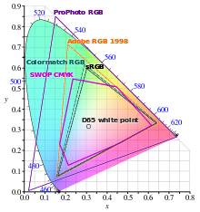
- CIE xyY Gamut diagram with source code. I made one earlier with the standard sort of gamuts (XYZ, sRGB, CMYK). I think it makes sense to have oil paints on there as well, given that there are accurate CIE LAB coordinates under standard illumination and that makes the article consistent (phosphors, inks and paint). The trouble is of course I can't find reference mixing trajectories for paints; I think it makes sense to simply plot the paint chromaticities (without connecting them into a 2d shape) and caption with idea that the color space trajectories are hard to predict (as the article says).
- I don't think the lede image is representative, it doesn't really let the reader in on the idea of what a primary color is. There is a clear idea presented in the lede and article that "primary color" can mean different things (light, ink and paint), they mix in different ways and that they are arbitrary. A lede image should reflect that but not simply duplicate the representative images in the article. Some ideas:
- A standard sort of vision diagram depicting the process of light hitting a surface with paints, reflecting off as light and then entering the eye. Something like this or this.
- A photograph of mixed paint? Ideally not use red, green and blue or cyan, magenta, yellow. The idea being to emphasize to the reader that if they came here to find out if the primary colors are either RGB or CMY, they are going to need to do some more reading.Maneesh (talk) 23:51, 20 August 2018 (UTC)
I revert some recent changes that imply that the xy diagram can be an adequate illustration of the gamut for CMY. It can't. In subtractive colors, the size of the gamut in xy space reduces as lightness increases, as opposed to additive spaces where there is a constant well-define chromaticity gamut up to some max lightness. The previous comment about using xy diagrams to illustrate subtractive gamuts is still sort of OK, though could be better, but the new section (over-capitalized as "Gamut Size") implied the gamut size was represented in these diagrams; that's wrong when subtractive spaces are included. Dicklyon (talk) 03:23, 4 September 2018 (UTC)
- CMY is described on an xy diagram, we've been over this before.
CIE1931xy gamut comparison - Is that not a CMY gamut I see in that CIE xyY diagram? I don't know what "subtractive colors" are. I know what "subtractive mixing" is. How is what you are saying in line with "Thus, the printed page contains dots of cyan, magenta, yellow, red, green, and blue, which mix additively in your eye if you stand back far enough".Maneesh (talk) 05:15, 4 September 2018 (UTC)

The "optimal colors" that bound the gamut of any reflective color system have a very luminance-dependence extent in the xy plane. - Consider the 3d plot of "optimal colors". Any subtractive/reflective system's gamut has to be within this; the chromaticity range gets much smaller when the color is lighter. I don't disagree that CMY can be described on an xy diagram; I just disagree that its "gamut size" can be evaluated on an xy diagram. Your statement that "The shapes defined by the primaries enclose areas that are proportional to the size of the gamut" is not tenable. Actually, I see you said in xyY, not xy, but that's a different problem: the gamut is a volume, not an area, and the xy diagram has a hard time showing it (though it can be done with Y slices); the xy area enclosed by the primaries relates to the xyY volume, but not very closely, with huge differences between additive and subtractive combination of those primaries. Maybe if you can find a source that does this, it could be made OK. The bit you removed, "A chromaticity diagram can illustrate the gamut of different choices of primaries..." at least was sourced. Dicklyon (talk) 05:55, 4 September 2018 (UTC)
- There is some refinement due (I used CMYK in the caption when I meant CMY, prefix gamut with "chromaticity" and perhaps use "relative size" etc.), but this a common type of diagram that notable sources do use to describe "gamut size" in the context of comparing RGB and CMY. Why would the enclosed polygons be shown the way the are in the diagram used in the gamut article? "Hey there are these two shapes here that should *not* be thought of in relation to each other when thinking about gamuts!". That doesn't make any sense. As usual, I think these reverts are too quick and not as constructive as they should be. "The conventional CMY printing ink gamut has a rounded shape of approximately the same size as the sRGB gamut". It seems that it is common to acknowledge that common gamuts really can only be compared in 3d, but understanding complex 3D shapes on 2D paper or screen is hard. It is a common convention to use 2D out of "convenience" or "pragmatism":
- It is important to note here that a true comparison of gamuts can only happen in 3D, a point often lost in the convenient use of the chromaticity coordinates.
- However, from the point of view of color science, any reference to area coverage in a chromaticity diagram is inappropriate because a color gamut is considered to form a solid in a three-dimensional perceptual color space inherently due to the trichromatic nature of human vision.


- but still, the authors of the last quote end up justifying the use of xy areas:
- "However, their gamut predictions differ significantly from one another, in spite of their computational complexity, and it is inordinately difficult to determine the true values [15], [16]. Therefore, it is advisable to use an approach more reasonable than attempting to determine the true volume.
- ...
- Herein, the use of the xy diagram to measure relative display gamut sizes is validated by presenting a quantitative analysis of gamut sizes divided into three hue regions: cyan, magenta, and yellow (CMY)."
- Everyone seems to know that comparing gamut sizes on an xy diagram and between additive and subtractive color spaces has limitations; but this seems to be a convention that makes sense. Why else are CMY gamuts shown overlaid on top of sRGB triangles so often? What is the intended interpretation if not "Gamuts (including sRGB and CMY) correspond to shapes in CIE xy, the sizes of those shapes correspond to the sizes of those gamuts".Maneesh (talk) 17:46, 4 September 2018 (UTC)
- I am still do not understand Dicklyon's objection to equating gamut size and xy areas. The caption of the diagram I cited earlier reads as "Comparison of some RGB and CMYK colour gamut on a CIE 1931 xy chromaticity diagram...". What is being compared if it is not 2d shapes and areas as a convenient and pragmatic (as the other sources I already cited say) measure of gamut size and overlap?Maneesh (talk) 23:22, 9 September 2018 (UTC)
- The objection is that ignoring the 3rd dimension makes for a very misleading picture. In the xy plot of a subtractive color space gamut, the edges are achieved only when there's no area uncovered with ink dots of at least one of the primary-color inks, or more generally, only when the pigment of at least one primary is at maximum density. So only rather dark colors can be made near that boundary, unlike the situation in additive systems, where a large range of intensities can be made along the edges of the triangle. So comparing areas is pretty misleading. Dicklyon (talk) 04:54, 10 September 2018 (UTC)
- So "Gamuts (including sRGB and CMY) correspond to shapes in CIE xy, the sizes of those shapes correspond to the sizes of those gamuts" is just wrong. If anyone besides you has said that, they're wrong, but point them out. Dicklyon (talk) 04:57, 10 September 2018 (UTC)
- And the paper you quote is only about comparing the color triangles of additive systems. That makes more sense, though as they note xy is not the best space for measuring areas in. Dicklyon (talk) 05:02, 10 September 2018 (UTC)
- "The objection is that ignoring the 3rd dimension makes for a very misleading picture." Yet we seem to do it commonly as you can see on the CMYK page (same digram that is here). Again: what is being "compared" between those gamuts in that diagram if not overlap and size?Maneesh (talk) 05:23, 10 September 2018 (UTC)
- I'm not saying people don't do it. But we shouldn't pretend it makes more sense than it does. Dicklyon (talk) 05:34, 10 September 2018 (UTC)
- I presume that you agree that making a link between xy areas and shapes to gamut sizes is a common thing to do. Most sources do explain that things should really be done in 3D, but there doesn't seem to be standard approach to that while It seems to be a convenient and pragmatic (sometimes in a*b* areas). Marc Levoy's course seems to demonstrate an applet where you can make this very comparison you are arguing against (click "typical printer"). I don't know what the true differences are between volume and area are, so it's hard for me to know how little sense that approach makes (most sources don't seem to spend any time quantifying it, probably because the real answer starts getting a little impractical to describe I think). One piece of evidence that we should use xy areas in this article is precisely because it seems to be a fairly standard thing and that there doesn't seem to be another standard way to do it. Not showing the diagram doesn't seem to be a good idea given we can find it in many credible places on the subject of gamuts. Saying something like "Many sources agree that 2D projections are limited representations of 3D gamuts, all that can be inferred from the diagrams is that there are a significant number of colors that can't be matched between gamuts. Mapping between gamuts has practical implications when reproducing colors in commercial applications". "Gamut Mapping" might be a more appropriate title in that case.Maneesh (talk) 00:00, 11 September 2018 (UTC)
- Yes, some approach like that, that doesn't claim that gamut "sizes" can be compared by xy areas, between additive and subtractive systems, would be more acceptable. I'm not arguing to not look at the extrema in xy, just to not make unfounded claims about what it means when you do. Dicklyon (talk) 04:55, 11 September 2018 (UTC)
- I presume that you agree that making a link between xy areas and shapes to gamut sizes is a common thing to do. Most sources do explain that things should really be done in 3D, but there doesn't seem to be standard approach to that while It seems to be a convenient and pragmatic (sometimes in a*b* areas). Marc Levoy's course seems to demonstrate an applet where you can make this very comparison you are arguing against (click "typical printer"). I don't know what the true differences are between volume and area are, so it's hard for me to know how little sense that approach makes (most sources don't seem to spend any time quantifying it, probably because the real answer starts getting a little impractical to describe I think). One piece of evidence that we should use xy areas in this article is precisely because it seems to be a fairly standard thing and that there doesn't seem to be another standard way to do it. Not showing the diagram doesn't seem to be a good idea given we can find it in many credible places on the subject of gamuts. Saying something like "Many sources agree that 2D projections are limited representations of 3D gamuts, all that can be inferred from the diagrams is that there are a significant number of colors that can't be matched between gamuts. Mapping between gamuts has practical implications when reproducing colors in commercial applications". "Gamut Mapping" might be a more appropriate title in that case.Maneesh (talk) 00:00, 11 September 2018 (UTC)
- I'm not saying people don't do it. But we shouldn't pretend it makes more sense than it does. Dicklyon (talk) 05:34, 10 September 2018 (UTC)
- "The objection is that ignoring the 3rd dimension makes for a very misleading picture." Yet we seem to do it commonly as you can see on the CMYK page (same digram that is here). Again: what is being "compared" between those gamuts in that diagram if not overlap and size?Maneesh (talk) 05:23, 10 September 2018 (UTC)
- I am still do not understand Dicklyon's objection to equating gamut size and xy areas. The caption of the diagram I cited earlier reads as "Comparison of some RGB and CMYK colour gamut on a CIE 1931 xy chromaticity diagram...". What is being compared if it is not 2d shapes and areas as a convenient and pragmatic (as the other sources I already cited say) measure of gamut size and overlap?Maneesh (talk) 23:22, 9 September 2018 (UTC)
The page now says "Red, green, and blue light are popular primaries for additive color mixing since primary lights with those hues provide a large triangular chromaticity gamut.[11] ", where it previously said "largest". The reference says: "For additive systems (like a color TV) red, green, and blue fulfill this requirement. They are commonly used as primaries because they allow you to make the widest range of colors in an additive system and therefore the best TVs.". I fail to see why "large" is better than "largest" given the reference clearly says "widest range of colors" not "wide range of colors". What is the reasoning behind the reversion? I can't parse the the reason given: "How can you think "largest" is even a sensible thing to say without specifying monochromatic primaries of particular wavelengths? that's not what RGB is (except maybe CIE RGB)". The sentence is about hues, not specific wavelengths.Maneesh (talk) 05:42, 10 September 2018 (UTC)
- The point is that that source is sloppy in its use of the superlative. We don't need to repeat that. Dicklyon (talk) 05:45, 10 September 2018 (UTC)
- EDITED: I don't think it is sloppy. What three hues would primary lights have if they could make a larger gamut in an additive space than lights with red, green and blue hues? If there are no such hues, then lights with red green and blue must be hues that make the largest gamut in an additive space.Maneesh (talk) 07:12, 10 September 2018 (UTC)
- In that same paragraph, Mark Fairchild is sloppy about efficiency. He says "Other sets could be selected, but they just wouldn't be as efficient." The truth is, you can get a larger gamut with monochromatic longer red, green, and shorter violet wavelengths, but the efficiency, in a luminance per power sense, would be much worse. It's a tradeoff space, with compromises always being made, not the highest efficiency or the widest gamut, but somewhere in between. And I'm not criticizing Mark Fairchild; he understands this stuff very well, but his page of short answers can't really go into a lot of depth. We just shouldn't over-interpret what he says as if it's literally exactly true. Most color TVs and monitors (before LEDs) used close to the sRGB primaries, which are a red, green, and blue that make a much smaller color triangle than some other primaries; so it's hard to make a literal interpretation of "For additive systems (like a color TV) red, green, and blue fulfill this requirement. They are commonly used as primaries because they allow you to make the widest range of colors in an additive system and therefore the best TVs." If you just back off on the superlative "widest" it makes a lot more sense. Dicklyon (talk) 04:48, 11 September 2018 (UTC)
- Fair enough, a shorter blue would be violet. I tend to forget that it is a spectral hue.Maneesh (talk) 06:22, 11 September 2018 (UTC)
- In that same paragraph, Mark Fairchild is sloppy about efficiency. He says "Other sets could be selected, but they just wouldn't be as efficient." The truth is, you can get a larger gamut with monochromatic longer red, green, and shorter violet wavelengths, but the efficiency, in a luminance per power sense, would be much worse. It's a tradeoff space, with compromises always being made, not the highest efficiency or the widest gamut, but somewhere in between. And I'm not criticizing Mark Fairchild; he understands this stuff very well, but his page of short answers can't really go into a lot of depth. We just shouldn't over-interpret what he says as if it's literally exactly true. Most color TVs and monitors (before LEDs) used close to the sRGB primaries, which are a red, green, and blue that make a much smaller color triangle than some other primaries; so it's hard to make a literal interpretation of "For additive systems (like a color TV) red, green, and blue fulfill this requirement. They are commonly used as primaries because they allow you to make the widest range of colors in an additive system and therefore the best TVs." If you just back off on the superlative "widest" it makes a lot more sense. Dicklyon (talk) 04:48, 11 September 2018 (UTC)
- EDITED: I don't think it is sloppy. What three hues would primary lights have if they could make a larger gamut in an additive space than lights with red, green and blue hues? If there are no such hues, then lights with red green and blue must be hues that make the largest gamut in an additive space.Maneesh (talk) 07:12, 10 September 2018 (UTC)

To get the "largest" gamut would certainly require monochromatic primaries, as in CIE RGB. However, as you can in the image, the green they chose does not give the largest possible triangle area in xy, though it may very well in some more reasonable space like uv. And the red and violet (which they call blue) that they chose have very low luminous efficiencies, so nobody would try to make a TV work this way. Always compromises... Dicklyon (talk) 23:34, 11 September 2018 (UTC)
Junk Science
I see junk science being introduced into the article. This subject seem particularly vulnerable to such ideas and sources. I'm not going to critique the newly added section Subtractive mixing of pigment line-by-line, because it is filled with nonsense. To see how little sense the new section makes consider the validity of "The CMY color model became the modern primary colors for pigments as the matter absorbs and reflects the light and the colors themselves are the opposites or negatives of the color that the human cone cells detect (R-G-B, respectively)...".Maneesh (talk) 19:19, 18 June 2019 (UTC)
- Well, without trying to say that there was nothing good in there, addition is structured more like a long rambling essay /commentary than enclyclopedic material. If the editor is still interested in adding material, suggest proposing shorter succinct enclyclopedic entries. North8000 (talk) 12:17, 21 June 2019 (UTC)
- "The edits suggest the author doesn't know how cones work". More like you're the one who doesn't know how cones work? And Junk science? More like the junk is the one who deleted that 2000-character contribution. Do you know that matter absorbs light and reflects it? Now does it makes sense to you that our lighting should be CBY (cyan, blue, and yellow) color model for the additive color model to match the RYB (red, yellow, and blue) color model for the subtractive color mixture? You seem adamant with your statements. My contributions are nonsense unless you provide the explanations. It's not a misattribution to the RYB by Newton, it's just innovation. There's a clear difference between innovation and misattribution. It's like saying not using vinyl records is a misattribution to Peter Carl Goldmark, where's there something's already better than those such as CDs and the internet. Don't get me wrong, but you sound like RYB biased and sound smartass when it comes to color, yet you don't even know how CMY works and just because you see Newton in my contributions doesn't mean you should bring him up here. Smith131072 (talk) 05:31, 24 June 2019 (UTC)
- You be like, "It's nonsense because I don't want to talk about it because it's nonsense. Why? Because it's nonsense". Smith131072 (talk) 05:32, 24 June 2019 (UTC)
- Smith, instead of this kind of argument, it would be better if you could state clearly some improvement you'd like to make to the article. Your previous edit was too much at once, making it hard to discuss other than to say we don't like it. I agree the comments above were harsh, but I also agree that a revert was an appropriate reaction. So let's work on getting better content in smaller bites, and we can discuss the content instead of the contributor. Dicklyon (talk) 05:39, 24 June 2019 (UTC)
- Agree, which is the suggestion I made above. North8000 (talk) 12:50, 24 June 2019 (UTC)
- Smith, instead of this kind of argument, it would be better if you could state clearly some improvement you'd like to make to the article. Your previous edit was too much at once, making it hard to discuss other than to say we don't like it. I agree the comments above were harsh, but I also agree that a revert was an appropriate reaction. So let's work on getting better content in smaller bites, and we can discuss the content instead of the contributor. Dicklyon (talk) 05:39, 24 June 2019 (UTC)
Recent Reverts on Primaries in Paints
The citation to Les Élémens de Peinture Pratique to support the notion that 8 colors are a common upper bound on of primary pigments on an oil palette was reverted with the claim of it being "ancient". The text seems fine given it is cited in contemporary articles, painting realistically isn't really that different today. I doubt there will ever be a credible survey to quantify "often" in terms of palette choices (some artists use many more, as you can see in the external link<-EDIT: ADDED LINK), a notable old text on painting seems like sensible to use as evidence for "often"; I suppose one could change the claim to something like "there is evidence for widespread use of 4-8 primary pigments for painting in realist style", that seems to sacrifice sensibility for accuracy though. The cite was only supporting 8 primaries, 4 is implicitly supported by sources that describe the "Zorn" palette. Other claims in the revert summaries include "black is not a primary color", I don't know where the editor learned that from and it contradicts the article (see Zorn palette). If primaries are arbitrary, and paints are physical primaries and black paint is used to mix other colors...how does one come to the conclusion that black pigment cannot be considered a primary? Maneesh (talk) 23:33, 9 July 2019 (UTC)
- Why don't you just look for a more modern (preferably English) source that characterizes up to 8 colors in palette as primaries? And maybe a source that characterizes black as a primary; seems off to me. Dicklyon (talk) 01:15, 10 July 2019 (UTC)
- The link that I've provided above from a company that produces pigments for sale that translates that very book to English seems fine to me. 'seems off to me' is not very specific, black as a primary color follows clearly from the sources on the page; what specifically seems off? I can't follow your reasoning here. The article now says contains "...is also usually used since it is difficult to mix a dark enough black ink using the other three inks", while CMYK color model#Benefits of using black ink is much more complete and really ought to be linked here.Maneesh (talk) 03:40, 10 July 2019 (UTC)
Dicklyon has also suggested that: '"primaries" in scare quotes clearly means he is not saying that pigments are primaries per se, so let's not call them that'. I do not think the editor has read handprint in detail, in spite of voluminous correspondence with me on this talk page where I have suggested he take a close look before reverting. The quotes seem to be obviously because of the subtle interpretation of the word "primary" that is explored in great depth on handprint. MacEvoy's use of quotes is quite clearly to let the reader know that he is not using the term naively. Just search for "primary pigment" on handprint and you will find many instances. It is quite clear what is meant there. This revert makes little sense.Maneesh (talk) 00:03, 11 July 2019 (UTC)
- Not naively; I think it signals he's not using the term as it is usually understood. Dicklyon (talk) 00:13, 11 July 2019 (UTC)
- Referring to the arbitrary set of paints (usually made of single pigments) being used to mix other pigments on a palette as "primaries", "primary colors", "primary pigments" is common. You can see good evidence for that on handprint with the search I've provided. Are you suggesting this is somehow specific to handprint?Maneesh (talk) 00:23, 11 July 2019 (UTC)
- I'm not a fan of handprint, as they have a somewhat idiosyncratic point of view. So yes other sources would be nice. Dicklyon (talk) 00:27, 11 July 2019 (UTC)
- You can throw a rock on google to see that it is common to use those terms interchangeably; using those terms interchangeably to mean the arbitrary set of paints used on a palette to mix other colors is not an idiosyncrasy of handprint. You are free to change the cite, but "primary pigment" makes an awful lot of sense to use here.Maneesh (talk) 00:36, 11 July 2019 (UTC)
- Here is my rock toss. Dicklyon (talk) 00:44, 11 July 2019 (UTC)
- Fairchild's site, An Adobe/GMU research paper, David Briggs' site, a book on portrait painting. James Gurney's site. This is common language; you'll have to be clearer on how to interpret the google n-gram.Maneesh (talk) 01:46, 11 July 2019 (UTC)
- The n-grams just show that "primary pigments" is rare compared to "primary colors"; not much to it. Let's look at what you found:
- Fairchild's site, An Adobe/GMU research paper, David Briggs' site, a book on portrait painting. James Gurney's site. This is common language; you'll have to be clearer on how to interpret the google n-gram.Maneesh (talk) 01:46, 11 July 2019 (UTC)
- Here is my rock toss. Dicklyon (talk) 00:44, 11 July 2019 (UTC)
- You can throw a rock on google to see that it is common to use those terms interchangeably; using those terms interchangeably to mean the arbitrary set of paints used on a palette to mix other colors is not an idiosyncrasy of handprint. You are free to change the cite, but "primary pigment" makes an awful lot of sense to use here.Maneesh (talk) 00:36, 11 July 2019 (UTC)
- I'm not a fan of handprint, as they have a somewhat idiosyncratic point of view. So yes other sources would be nice. Dicklyon (talk) 00:27, 11 July 2019 (UTC)
- Referring to the arbitrary set of paints (usually made of single pigments) being used to mix other pigments on a palette as "primaries", "primary colors", "primary pigments" is common. You can see good evidence for that on handprint with the search I've provided. Are you suggesting this is somehow specific to handprint?Maneesh (talk) 00:23, 11 July 2019 (UTC)
- Fairchild's site – Nothing about primary pigments, nor black as a primary, nor the set of colors on palette being called primary, unless I've missed it.
- An Adobe/GMU research paper – Yes, they introduce their own terminology: "When painting, artists choose or create a relatively small set of pigments to be used throughout the painting. We call this set the primary pigment palette." No claim that this term has been used that way before. They say of their ref 15: "Our work is contemporaneous with Aharoni-Mack et al. [15], who decompose watercolor paintings into linear mixtures of a small set of primary pigments also using the Kubelka-Munk mixture model." but this paper they reference never mentions primary colors nor primary pigments. They're just using their own newly minted terminology.
- David Briggs' site – Yes, it has this secondary definition for "Primary colour": 2. Less commonly, the specific paints of a painter’s palette. Definitely a different and less common definition that I've ever seen.
- a book on portrait painting on p. 180 "a palette of raw umber and three primary pigments" does use the term "primary pigments", meaning primary-color pigments, but does not treat all pigments on the palette as primaries. More like that on p.40. No mention of black as a primary, but does mention mixing with black.
- James Gurney's site – a set of highly chromatic "primary" pigments with the scare quotes again suggests this is an unusual use of the word primary, but does exclude black as a primary.
- So what were we supposed to see in this list of sources that support some point you were trying to make? Dicklyon (talk) 04:50, 11 July 2019 (UTC)
- One by one. From Fairchild you can see that the title is "What are the Primary Colors?" and there is a picture with paints in it that must be colored from pigment. You can see that the caption says "Almost any color can be a primary color depending on how it is used and what other colors it is used with. Notice how I was able to make gray paint out of two different sets of primaries,". You can see this language is consistent with "primary color"(s) being synonymous with "primaries", that they can refer directly to physical paints/pigments and that any pigment can be a primary depending how it is used. Yes?Maneesh (talk) 05:30, 11 July 2019 (UTC)
- Yes, any pigment can be a primary (that is, a primary color); but not all pigments are primaries. Don't read more than that into the illustration. Dicklyon (talk) 16:22, 11 July 2019 (UTC)
- We seem to agree that Fairchild is saying that "any pigment can be a primary" or equivalently "any pigment can be a primary color"; what prevents, say, ivory black (a pigment) from being a primary?Maneesh (talk) 17:20, 11 July 2019 (UTC)
- "What prevents" me from making up other relationships not in sources? Dicklyon (talk) 17:49, 11 July 2019 (UTC)
- No idea what you are saying. Can you address how both "any pigment can be a primary" and "ivory black cannot be a primary pigment" can be true at the same time?Maneesh (talk) 18:00, 11 July 2019 (UTC)
- Nope, can't explain; just one of those little corner traps of trying to apply logic to language. Don't go there. Dicklyon (talk) 18:36, 11 July 2019 (UTC)
- Your response comes across as very opaque. I hope that another editor can look at this and see the obvious conflict in the two statements I mention. Continuing, we can see "CMYK" primaries used all the time with "key" being interchangeable with "black", first paper I can access from google scholar. Look at figure 4.1 if you need a specific place to start. You can see that black is considered one of the CMYK primaries throughout the paper. How is black not a primary pigment here?Maneesh (talk) 18:48, 11 July 2019 (UTC)
- Sorry, I should have referred to WP:SYNTH. You note that some sources call the pigments in a palette primary colors, and some sources show that black pigment is often included in a palette, and therefore one can logically conclude that black is a primary color. But that's WP:SYNTH, not something you'd actually find in sources. Language is not always precise and logical. If you're working with a definition by which you call all the pigments you use to mix colors primaries, and you allow black pigment in that set, then you'd allow bone black as a primary pigment; maybe someone has done that. I can imagine it more with pigments than with colors. But show us if so. Dicklyon (talk) 19:06, 11 July 2019 (UTC)
- Here is a section from an introductory book on oil painting that describes the common approach of using a limited palette. Do you see "...ivory black...as neutral primary colors."?Maneesh (talk) 19:53, 11 July 2019 (UTC)
- Fascinating; they use ivory black as a blue: "mix ivory black as if it were a blue, albeit a very neutral blue". And their "neutral" palette also contains yellow ochre and Indian red. So are they really saying that an actually neutral color could be a primary? Not clear. Nice find though. Dicklyon (talk) 20:03, 11 July 2019 (UTC)
- Mixing something as if it were something else doesn't make ivory black blue, it's ivory black because it looks black. This isn't particularly fascinating after a little painting experience, all black pigments we use are lighter than very dark shadows in typical viewing conditions and will generally shift hue in mixtures. The "neutral" description of the palette refers to the fact that yellow ochre and red iron oxide are much lower chroma than, say, cadmium yellow and cadmium red. No black pigment has a perfect absorbance profile and will always have some small tiny chroma to it depending on viewing context. The source reflects common language in painting, pure pigments are used to mix other (more neutral) piles of pigment; the slugs of paint from the tube are referred to as primary colors/pigments/paints. The source clearly is referring to ivory blak as a primary color here, not sure why you don't see that clearly.Maneesh (talk) 20:59, 11 July 2019 (UTC)
- Sure, it's called black because it looks black. But if you dilute with white, you see it's actually blue, as this and other sources point out. I do see clearly what they're saying here, and I wouldn't extrapolate it to saying that black is normally accepted as a possible member of a set of primary colors. This is another weird corner case. I'm not claiming that nobody has ever listed black among primaries, just that it's unusual, idiosyncratic, rare, against normal usage, etc. Dicklyon (talk) 21:04, 11 July 2019 (UTC)
- How are you using "actual" here? Ivory black paint is, quite obviously, achromatic. It isn't "actually blue" since a mixture of white with it will appear ever so slightly blue. Gamblin's own page describes it as "brown" black. Paint mixing is complicated; near neutral chroma is very difficult to categorize as into hue, very context dependent and will vary with batch. We can only tell the difference between blacks in very careful matching side by side (I don't think people can identify the hue, just the relative difference), not in regular viewing experiences. Not sure how you are able to pull out something as idiosyncratic here given the great deal of (internally) inconsistent source material. I think it makes sense to take the most credible sources (handprint, fairchild, briggs etc.) and find the consistent subset of language. What you are calling 'corner cases' I see as clear inconsistencies that any reader would like to understand the resolution to. Using the simplest, clearest and most consistent subset amongst sources (while acknowledging the inconsistency that is out there) seems to be a sensible way to present the information.Maneesh (talk) 23:40, 11 July 2019 (UTC)
- I don't claim to know thing one about ivory black, just going by what I read there, where they use it to get blue. The main "corner case" is where we started: is black a primary color or not? It's very rare or perhaps nonexistent to see it called that, even if ivory black pigment is being characterized as a "primary" in that limited palette. primaries are always, or almost always, restricted to be "chromatic"; and the ivory black's blue chromatic properties are described and utilized there. Dicklyon (talk) 23:47, 11 July 2019 (UTC)
- I don't understand how something could be non-existent with an example in front of you. So you believe the reason that the ivory black pigment can be called a primary in that limited palette is because it is being "used as" blue? All black pigments (lamp, mars, perylene etc.) have *some* hue and chroma; by this reasoning any black pigment can be a primary since it has, in principle, some hue and chroma. If we take Fairchild's definition "any set of three (or more) colors for which no one of the colors can be made by mixing any of the others from the set" then again ivory black would be a primary color in that limited palette since you could not possibly mix it from red oxide, yellow ochre and white. Taken with Briggs and MacEvoy, these seem to be a sensible set of color science-focused sources that would converge on the idea that black paint can be a primary color and that we can call pigments on palettes "primaries" or "primary pigments" (especially since the article needs to compare against lights). I really don't think this constitutes WP:SYNTH. Shorting the other thread, I don't think there is meaningful difference between "primary colorant" and "primary pigment"; black is clearly a primary in "CMYK primaries" (first hit on googlebooks for "CMYK primaries" says "four primary colors"). Looking into art books gets tricky since so few are consistent here (Gurney uses "subjective primaries" which could be...anything and also consistent with a black paint being a primary). The corner-ness of the case rests on the reducing the pile of inconsistent information out there from poor quality art books into something sensible, focusing on the color science definitions then pointing out that various sources are inconsistent would make sense here. Some marketing drivel that refers black as a primary color. Maneesh (talk) 05:00, 12 July 2019 (UTC)
- I don't claim to know thing one about ivory black, just going by what I read there, where they use it to get blue. The main "corner case" is where we started: is black a primary color or not? It's very rare or perhaps nonexistent to see it called that, even if ivory black pigment is being characterized as a "primary" in that limited palette. primaries are always, or almost always, restricted to be "chromatic"; and the ivory black's blue chromatic properties are described and utilized there. Dicklyon (talk) 23:47, 11 July 2019 (UTC)
- How are you using "actual" here? Ivory black paint is, quite obviously, achromatic. It isn't "actually blue" since a mixture of white with it will appear ever so slightly blue. Gamblin's own page describes it as "brown" black. Paint mixing is complicated; near neutral chroma is very difficult to categorize as into hue, very context dependent and will vary with batch. We can only tell the difference between blacks in very careful matching side by side (I don't think people can identify the hue, just the relative difference), not in regular viewing experiences. Not sure how you are able to pull out something as idiosyncratic here given the great deal of (internally) inconsistent source material. I think it makes sense to take the most credible sources (handprint, fairchild, briggs etc.) and find the consistent subset of language. What you are calling 'corner cases' I see as clear inconsistencies that any reader would like to understand the resolution to. Using the simplest, clearest and most consistent subset amongst sources (while acknowledging the inconsistency that is out there) seems to be a sensible way to present the information.Maneesh (talk) 23:40, 11 July 2019 (UTC)
- Sure, it's called black because it looks black. But if you dilute with white, you see it's actually blue, as this and other sources point out. I do see clearly what they're saying here, and I wouldn't extrapolate it to saying that black is normally accepted as a possible member of a set of primary colors. This is another weird corner case. I'm not claiming that nobody has ever listed black among primaries, just that it's unusual, idiosyncratic, rare, against normal usage, etc. Dicklyon (talk) 21:04, 11 July 2019 (UTC)
- Mixing something as if it were something else doesn't make ivory black blue, it's ivory black because it looks black. This isn't particularly fascinating after a little painting experience, all black pigments we use are lighter than very dark shadows in typical viewing conditions and will generally shift hue in mixtures. The "neutral" description of the palette refers to the fact that yellow ochre and red iron oxide are much lower chroma than, say, cadmium yellow and cadmium red. No black pigment has a perfect absorbance profile and will always have some small tiny chroma to it depending on viewing context. The source reflects common language in painting, pure pigments are used to mix other (more neutral) piles of pigment; the slugs of paint from the tube are referred to as primary colors/pigments/paints. The source clearly is referring to ivory blak as a primary color here, not sure why you don't see that clearly.Maneesh (talk) 20:59, 11 July 2019 (UTC)
- Fascinating; they use ivory black as a blue: "mix ivory black as if it were a blue, albeit a very neutral blue". And their "neutral" palette also contains yellow ochre and Indian red. So are they really saying that an actually neutral color could be a primary? Not clear. Nice find though. Dicklyon (talk) 20:03, 11 July 2019 (UTC)
- Here is a section from an introductory book on oil painting that describes the common approach of using a limited palette. Do you see "...ivory black...as neutral primary colors."?Maneesh (talk) 19:53, 11 July 2019 (UTC)
- Sorry, I should have referred to WP:SYNTH. You note that some sources call the pigments in a palette primary colors, and some sources show that black pigment is often included in a palette, and therefore one can logically conclude that black is a primary color. But that's WP:SYNTH, not something you'd actually find in sources. Language is not always precise and logical. If you're working with a definition by which you call all the pigments you use to mix colors primaries, and you allow black pigment in that set, then you'd allow bone black as a primary pigment; maybe someone has done that. I can imagine it more with pigments than with colors. But show us if so. Dicklyon (talk) 19:06, 11 July 2019 (UTC)
- When I search for "black" near "primary" or "primaries" in that dissertation you say treats black as a primary, I don't find it. I do find " The commonly used subtractive primary colors are cyan, magenta and yellow, and if we overlap all three in effectively equal mixture, all the light is subtracted giving black." What am I missing that leads you to say "black is considered one of the CMYK primaries throughout the paper"? Dicklyon (talk) 19:12, 11 July 2019 (UTC)
- Oh, I see now, they refer to the printer's "primary colorants" (which include black, but the word black is not used nearby). This is a fine use of imprecise language, not meant to say that black is a primary color even if in their terminology it's one of the printer's "primary" colorants. The word "primary" is completely superfluous there. Dicklyon (talk) 19:22, 11 July 2019 (UTC)
- The more conventional alternative is like here: "primary colorants and a black colorant". Or here: "white colorant; black colorant; and green-hued, blue-hued and red-hued primary colorants". Or here: "Mixing equal amounts of three primary colorants results in a color that is almost black. However, special black colorants, such as a fine black powder called carbon black, provide better blacks. Mixing black with a color produces a shade." Dicklyon (talk) 19:38, 11 July 2019 (UTC)
- Not that this would be hard to find given the above thread, but there are many instance of "four primary colors" in the context of CMYK on scholar and books. It is very clear that there is a convention to call black a primary color. Given that there is immense amount of inconsistent language about colors and primary colors, this convention is consistent with the other sources like Fairchild. It makes sense to use black as a primary color and then simply mention the widespread inconsistencies here.Maneesh (talk) 04:38, 16 July 2019 (UTC)
- The discussion seem to have come to a standstill. There links above that I've provided demonstrate clearly that credible sources consider primary colors in terms of light and dyes/pigments, that the choices for which pigments/primaries are selected is arbitrary and that there is a convention of considering black a primary color (obviously consistent with those definitions). The is specifically demonstrated in the context of CMYK. I have trouble understanding Dicklyon's objections. This isn't some sort of esoteric convention. It would be great to hear some other voices in this thread.Maneesh (talk) 19:23, 25 July 2019 (UTC)This one talks about "Collectively, CMYK represents the four primary colors of publishing..." but doesn't really say black is a primary.
- I think we found the opposite: that calling black a primary is a rare and unusual thing to do. Some sources talk about 3 primary colors plus black, for instance. Some of your hits teach away from what you're saying. This book doesn't call black a primary, but poses a question. Calling CMYK four primary colors in books and trade magazines started with the computer field about 1990, and is not representative of color science terminology; same in scholar. If you want to say that in CMYK, the black key in sometimes referred to a primary, then fine; but don't just say that black is a primary color. Dicklyon (talk) 23:40, 25 July 2019 (UTC)
- I was content to just keep lurking here but above seems to be a call for other voices. I lean towards not calling black a primary color, or calibrated language that says "sometimes called" . I think that common meanings of the term are important. One common meaning is that it is minimum set to create the colors. In most sets including black it is considered to redundant and just a practical addition for printers. Another common meaning it is a color that is combined with other colors to make other colors, and I think that as a practical matter, that rules out black. One might argue for inclusion based on a "set of colors from which all other colors can be made" definition, but by that definition a set of 10,000,000 colors fufils that and so each of the 10,000,000 colors is a "primary color" which would render the terms "primary color" or "set of primary colors" meaningless. North8000 (talk) 21:19, 26 July 2019 (UTC)
- I think the ambiguity is centered on the use of 'color' itself, handprint disambiguates things insightfully here in separating the ideas of 'material color' (the pigment itself), 'radiant' color (the SPD of the light), 'visual' color (what we might match in a perception experiment) and 'conceptual' color (a color that we can imagine or remember and think of outside of visual stimulation). There isn't a standard language for these things and conflation is common (look at the link to Fairchild above where he uses pigments in his definition of primary colors). If we consider radiant colors/SPDs than there is no reason why one would rule out black. In pigment, carbon blacks are darker than mixes (say, burnt umber and ultramarine blue), Fairchild also says that black pigment "...allows for much darker colors.... You simply cannot mix some very dark radiant colors/SPDs without 'black' (generally some sort of carbon) so at a 'minimum' making black necessary (not 'redundant') to target very dark radiant colors. Hopefully it is fairly clear that the 'cannot be mixed from other colors' is fairly clear from basic physics. As for "set of colors from which all other colors can be made", that is addressed in the article since an infinite number of (physical) monochromatic lights would be needed for mix 'all' colors, only 'imaginary' primaries can mix (added) to mix "all" colors. There is no physical pigment that has a higher chroma that a monochromatic light.Maneesh (talk) 01:35, 28 July 2019 (UTC)
- Your response comes across as very opaque. I hope that another editor can look at this and see the obvious conflict in the two statements I mention. Continuing, we can see "CMYK" primaries used all the time with "key" being interchangeable with "black", first paper I can access from google scholar. Look at figure 4.1 if you need a specific place to start. You can see that black is considered one of the CMYK primaries throughout the paper. How is black not a primary pigment here?Maneesh (talk) 18:48, 11 July 2019 (UTC)
- Nope, can't explain; just one of those little corner traps of trying to apply logic to language. Don't go there. Dicklyon (talk) 18:36, 11 July 2019 (UTC)
- No idea what you are saying. Can you address how both "any pigment can be a primary" and "ivory black cannot be a primary pigment" can be true at the same time?Maneesh (talk) 18:00, 11 July 2019 (UTC)
- "What prevents" me from making up other relationships not in sources? Dicklyon (talk) 17:49, 11 July 2019 (UTC)
- We seem to agree that Fairchild is saying that "any pigment can be a primary" or equivalently "any pigment can be a primary color"; what prevents, say, ivory black (a pigment) from being a primary?Maneesh (talk) 17:20, 11 July 2019 (UTC)
- One by one. From Fairchild you can see that the title is "What are the Primary Colors?" and there is a picture with paints in it that must be colored from pigment. You can see that the caption says "Almost any color can be a primary color depending on how it is used and what other colors it is used with. Notice how I was able to make gray paint out of two different sets of primaries,". You can see this language is consistent with "primary color"(s) being synonymous with "primaries", that they can refer directly to physical paints/pigments and that any pigment can be a primary depending how it is used. Yes?Maneesh (talk) 05:30, 11 July 2019 (UTC)
- So what were we supposed to see in this list of sources that support some point you were trying to make? Dicklyon (talk) 04:50, 11 July 2019 (UTC)
I think that another common meaning of primary color is simply RGB. We also need to acknowledge common meanings of terms. North8000 (talk) 20:57, 11 July 2019 (UTC)
- Or CMY or RYB. I think the article does acknowledge that. This discussion was about the addition of black as a primary, and related odd changes, which I reverted here. Dicklyon (talk) 21:07, 11 July 2019 (UTC)
English
Lomarile