
Talk:Primary color/Archive 1
| This is an archive of past discussions. Do not edit the contents of this page. If you wish to start a new discussion or revive an old one, please do so on the current talk page. |
| Archive 1 | Archive 2 | Archive 3 | Archive 4 |
Psychological Primary Colors
I'm surprised that this article doesn't explain the Psychological Primary Colors. Please put so in whatever article they are appropriate for. They were not invented by any Wikipedian; they are mentioned at http://dictionary.reference.com at "primary color", and at several Internet sites, as you can see by doing a Google search. 66.32.126.20 21:30, 3 Apr 2004 (UTC)
Old talk
"This is also lends some insight into why visible-light lasers tend to be only red, green, or blue. using combinations of colors creates frequency interference, causing the beam to become decollinated and to spread apart quickly. (But does it explain why lasers aren't orange, yellow, or cyan? Those colors can also be created with one wavelength.)"
There is nothing fundamental about these colors, they're just wavelengths. Color is arbitrarily determined by in the eye, depending on the intensity of the signal in one of the six different types of cone groups. For a quick proof by counterexample, the maser was invented before the laser (maser stands for Microwave Amplification by Stimulated Emission of Radiation, and has no color whatsoever)--BlackGriffen
I also removed:
This is the reason that television uses red, green, and blue phosphors. Any color combination can be represented by mixing different proportions of the primary colors. Note that in practice this is restricted by technical limitations of the medium, for example the television standard NTSC is noted for its inability to represent certain colors to retain backward compatibility with black and white televisions.
This isn't true at all. There's really no such thing a "primary" and "non-primary" color--the primaries are just whichever ones you choose to call primary, and the colors they can make with mixing are only those within the gamut of those your choose. Some make better choices than others, but let's not make it sound like there's some special property of red, green, and blue that make them magical or something. --LDC
What makes red, green, and blue special is that they correspond to the peak responses for the human eye's photoreceptors. Is that right? --Damian Yerrick
Well, yes, there is that. But the primaries typically chosen for TVs and such don't correspond exactly to the peaks of the cones' responses, but to colors that are pretty close and that have cheap available phosphors. And you really can stray pretty far from the actual human visual primaries and still get a good gamut. And non-human eyes may have entirely different primaries--birds have four, for example. --LDC
Red, green and blue are not the peak responses. The wavelengths of the peak responses are given in the color article. You choose red, green and blue light because you get the biggest part of the human color space that way. Red light for instance is lower in frequency than the "red" cone's peak frequency in the eye so that it won't create a response in the "green" cone (the cone's response curves overlap). There is a definite biological reason why red, green and blue light are the additive primaries for human color vision, but it's not the peak responses.AxelBoldt
Primaries in L*a*b space
On the diagram at color under 'CIE XYZ color space', the colors around the outside of the horseshoe shape (but not the bar that links the two ends) are colours that appear in the rainbow. That is, they can be made of light of a single wavelength. This makes them a bit special, and could be the basis for calling them primary. They cannot be made by mixing any other single-wavelength colors. The colors in the middle (which would include the colors of phosphors used in television) can be made by mixing pure-wavelength light (or colors from the outside of the horseshoe). The colors on the bar that links the two ends of the horseshoe are sometimes called 'imaginary colors', as they don't appear in the rainbow, and there is no single wavelength light of those colors. They must be made by mixing the blue and red wavelengths at either end of the rainbow.
- The "primaries" in XYZ space are beyond the range of human vision. In other words, they are purely imaginary. --jacobolus (t) 22:24, 22 April 2007 (UTC)
Ok for the hundredth time
And you are are very cose to correct but listen carefuly, cause it's confusing: Additive color is not a color space. RGB of given colors can be a color space. So you can say a such and such RGB is a color space which uses the additive color system..yadda yadda So you can say a such and such CMYK is a color space which uses the subtractive color system..yadda yadda
So ya almost got it
I'm getting the page entitled Subtractive color space deleted by the admins, 'cause it's just plain wrong. We willl eventually have a lovely page describing the subtractive color system.
Am I making sense?
It's subtle, but crucial--Dkroll2 02:51, Dec 27, 2004 (UTC)
Color and Color vision is a simple task to describe.
I havent' a clue what ya'll have done to this definition but it's been taken to the far side. Color and Color vision is a simple task to describe. Just do that, I can't believe all the techno mumbo jumbo which belongs somewhere else. I'm saying to delete the visible spectrum or the rods and cones, but red it and imagine you are coming there wanting to know how color works, and maybe link to a section on how to control it/standardize/quantify it. Too much in one place just for a tiny word "color" IMHO Love ya smarties anyway --Dkroll2 06:37, Dec 27, 2004 (UTC)
Wikiproject Color
I'm looking to start up Wikipedia:WikiProject_Color again. It seems to have been dormant for a while, even though there was a lot of great work and discussion already done. Anyone care to join me? --Laura S 01:31, 19 May 2006 (UTC)
The term vector basis may be improper
Hello. In the introduction, we have:
- If the color space is considered as a vector space, the primary colors can be regarded as a set of basis vectors for that space.
but I think it is not mathematically correct. If the color space is of dimension 3, then any three linearly independent colors would make a set of basis vectors, even if they are not primary colors. Probably primary colors would be better defined has extreme points of a convex set, or perhaps generative vectors of a convex cone. --Bernard 17:36, 22 September 2006 (UTC)
- No, basis vectors is exactly right. Any three linearly-independent colors can be called primary colors. There is absolutely nothing special about the primaries in widespread use. --jacobolus (t) 22:26, 22 April 2007 (UTC)
- To follow up, no 3 colors can be mixed to produce all other possible colors. In fact, most spectral colors (single wavelength) cannot be produced in a second way. The only way to mix all colors as a combination of three primaries is to make the primaries imaginary, beyond the range of human vision, as in CIE XYZ. --jacobolus (t) 22:28, 22 April 2007 (UTC)
- In other words, it's not a vector space. The gamut is a convex set and the area covered by a set of primaries is a convex cone, as he said. 86.5.99.20 12:13, 14 October 2007 (UTC)
- Oh, okay. You might be right. I'm realizing I don't have a precise understanding of the mathematical properties of the space of human vision—that is, what the effect is of making e.g. some spectral light source arbitrarily bright. Given that there is indeed some point beyond which additional intensity cannot be detected (or maybe it just fries your eyeballs at that point :), scalar multiplication doesn't necessarily hold for a large enough scalar, which would make us have not a vector space. But anyway, in the vector space of which the gamut of human vision is a subset, any three colors can be considered a bases for the space… so the description in the article is still fine I'd say. --jacobolus (t) 15:38, 14 October 2007 (UTC)
- Jacobolus wrote "The only way to mix all colors as a combination of three primaries is to make the primaries imaginary". That's not true. The other way is to allow negative coefficients in the linear combinations. It's a vector space, in theory, if you do not impose gamut limits, and this is what is meant in "If the color space is considered as a vector space". A gamut is then a region in this vector space (probably convex, but not necessarily so). It's important to keep clear the distinctions between mathematical colorimetric, human perception limits, device limits, etc. Within mathematic colorimetry, it's very clear what is meant by vectors, imaginary colors, etc. Dicklyon 17:06, 14 October 2007 (UTC)
- True; if you make that restriction to positive coefficients, that's when you get a gamut that doesn't cover all colors. That's still a region in a vector space. Dicklyon 22:52, 14 October 2007 (UTC)
Gendale?
I believe this is a newly discovered primary color. Shouldn't it be mentioned somewhere on this page?24.234.170.197 02:15, 5 October 2006 (UTC)
- Gendale is a joke, isn't it? From what I have seen on the web, it seems to be an impossible color --Bernard 19:10, 9 October 2006 (UTC)
Primary Colour or Colour?
I found the page by typing 'primary colour' and in the first paragraph it said 'A primary colour or colour'. I found the page again by typing 'primary color' and the introductory paragraph said 'A primary color or color'. Why does it say this?--Jcvamp 13:59, 11 December 2006 (UTC)
- Maybe it is some Wikipedian who allowed this to work, but I HAVE NO IDEA HOW THIS IS POSSIBLE. Georgia guy 14:43, 11 December 2006 (UTC)
B Class in wikiproject color?
This article has no introduction, is full of claims of dubious scientific merit, and has almost no relevant citations. It does not discuss the history of primary colors, or their historical application to paint mixing. It does not show any chromaticity diagrams with labeled primary color gamuts. It does not give the reader a clear understanding of the idea of a primary color, and it does not put that idea in its pre-20th-century historical context. I think I would classify this "start" class. --jacobolus (t) 22:45, 22 April 2007 (UTC)
Muddy brown
Just a question for the color experts here, and something that might be a nice addition to the article. The article mentions that "in theory" full combinations of saturated cyan, magenta, and yellow should produce black but that they don't. Is this because most light is not precisely white? If this is the case, it might be nice to point that out as the reason why for readers. If that's not the reason, does anyone know what is? —Preceding unsigned comment added by Troped (talk • contribs)
- Of the numerous references that repeat this comment, I only found a reason given in one, and it was wrong, so I won't bother quoting it. The problem is that the inks tend to be in layers, and the upper layers will reflect some light before giving the lower layers a chance to absorb it. If yellow is on top the result will be brown, but for other orders it will be some other off-black muddy color. Dicklyon 18:10, 8 June 2007 (UTC)
Also light is very rarely white, but the human brain adjusts to tell the color of something regardless of the light. For example, indoor light bulbs are usually very yellow -- —Preceding unsigned comment added by 209.247.23.35 (talk)
- White is not a well-defined color for light. When using incandescent light, the color of the light is usually taken as white, or the illuminant white point, even though this white is yellower than some other whites. So saying "light is very rarely white" is essentially meaningless. Dicklyon 18:27, 19 June 2007 (UTC)
tetrachromats
Is there any evidence (i.e. actual psychological experiments on birds, neurological arguments, or even speculation from reputable biologists, etc.) that species with four types of cone responses actually have vision which can be modeled in a four-dimensional space, or is this just a speculative extension of the three cone types → three-dimensional color vision that we humans have? I don't notice any cited sources for this claim. If not, I'd like to remove such claims, or at least eliminate the certainty with which they are stated in this article. If so, I'd like to see a better explanation, and some citations. --jacobolus (t) 01:14, 26 June 2007 (UTC)
- Also, it should be made clear that the three-dimensional models for trichromatic color are also just rough approximations, based on very strict assumptions. Color vision seems to be much more complex than any simple mathematical models, so this whole article is just a useful abstraction, not necessarily a direct representation of reality. --jacobolus (t) 01:44, 26 June 2007 (UTC)
- Okay, actually an academic paper linked from the tetrachromacy article says the following:
- One further modeling improvement supposes that the additional photopigment serves two different functions. First, the fourth pigment may possibly be serving as a normal pigment variation that is integrated into a standard three-dimensional structure of metameric classes (thus, heterozygotes with four-photopigment classes expressed are not discernible on the basis of color-matching measures). Second, the fourth pigment may also feed some higher order (probably cortical) mechanisms that take advantage of the signal from the fourth pigment for color discrimination in a way that differs from judging metameric class equivalences. This second possibility is not unlikely since, in other species, wavelength information can be used for various perceptual tasks quite independently from the structure of metameric color codes. That is, color vision and wavelength-dependent behavior can independently coexist in the same animal (e.g., bees exhibit trichromatic color vision exclusively in feeding and in recognition of the hive, while, at the same time, using spectrally narrow-band receptor channels for a variety of other tasks, such as celestial orientation and navigation; see Menzel, 1985, for a discussion). Thus, one might venture the speculation that the present results indicate that the fourth pigment—though it seems to merge with trichromatic equivalence classes of primary codes—is exploited by independent mechanisms that deal with the discrimination of border discontinuity and the like. Such architectural implications very much resemble those from studies on cortical colorblindness, or achromatopsia (Stoerig, 1998; Troscianko et al., 1996).
- Which implies to me that the ramifications are not precisely known, and these statements about four-dimensional spaces are speculative, without a rigorous experimental justification. So that should be reflected in the article, I think. --jacobolus (t) 02:48, 26 June 2007 (UTC)
- Good idea. I also haven't seen evidence of true tetrachromacy, though I wouldn't be surprised.
References
I cleaned up a bunch of misinformation, and found refs for most of what remains. Feel free to add more, or call for more citations on questionable info, or add more info. But don't add unsourced info: look it up, please. Dicklyon 06:42, 26 June 2007 (UTC)
Yellow and Blue make green
If you mix yellow paint with blue (blue, not cyan) paint you get green paint. The subtractive colour model does not account for this (try it, you get black), so why does it happen?
Red, Yellow and Blue are the traditional artistic primary colours, and they don't get a mention here, this is wholly different to the CMYK model. Its all too computer biased here with no basic artistic foundations. —Preceding unsigned comment added by 81.99.38.101 (talk)
- I suggest you read this link and this one, and perhaps look at this picture as well. Indeed this article isn't nearly as comprehensive as it should be. You're right that yellow and blue (though usually closer to "cyan" than "blue") paints mix to a rather unsaturated green. I don't think anything in this article contradicts that, however. What happens is that paint mixtures don't go along straight lines in a color space like CIELab or CIECAM02, but along curved paths, in this case bowing out towards the green. To get rich greens though requires using green pigments. See this picture which shows fairly unsaturated mixtures of blue and yellow paints on the top row, as compared to brighter green paints on the bottom row (and obviously the exact effect can't be accurately seen on a computer monitor; the distinction between top and bottom rows would appear if anything more dramatic on paper). --jacobolus (t) 01:11, 31 July 2007 (UTC)
- To be clear though, this article should certainly discuss "traditional artistic" colors, and discuss their historical changes as new pigments became cost-effective, etc., and should preferably roughly locate the "Red", "Yellow", and "Blue" intended in a color space like CIELab or similar, so that readers can have a better understanding of which colors specifically are meant by each of these descriptions. --jacobolus (t) 01:29, 31 July 2007 (UTC)
Secondary Colors are not Primary colors
I thought it was a fairly simple concept that a palette named the "secondary palette" was not, and did not claim to be, limited to primary colors, I also noticed that the palllate at the cited web page does not match the one listed here, so I'll be modifying that section.
Please do not start a revert war, thank you.67.34.196.115 16:55, 15 August 2007 (UTC)
- “Primary” colors are a human construct. A “split primary” palette also does not include “perfect primaries” in the eyes of the 18th-19th century color theorists who developed the idea of material trichromacy. By my definition any color which is used in a palette which cannot be mixed from the other colors of that palette is sufficiently “primary”. If you like, we can change this word to something less controversial (controversial in the 19th century perhaps…). Anyway, you still borked the citation format, changed the meaning of the article, and reverted several changes unrelated to the issue you care about. Before reverting again, please get a concensus on this talk page. Thanks. Also, consider making your own user page, so we don't have to refer to you by number. --jacobolus (t) 17:06, 15 August 2007 (UTC)
Just because something is a human construct does not make it valid to simply disregard its internal logic, the website your citing does not provide support for the statement its being used as a source for, first off red is not part of the secondary palette explained at the source, secondly the author does not call most of the colors on this palette primaries or even "primaries" the whole point is that it rejects the idea of primary colors altogether. If its that big a deal to keep it here I'll change it in a more conservative manner.
As for consensus so far you and I are the only people whove said anything about it one way or the other, I know becuase I listed RYB here in the first place and I've been watching it, this is a new section and any edits to it are essentially new changes to this page.
Velps 18:04, 15 August 2007 (UTC)
- No, but the point is that artists who use “primary colors” as a means of organizing their thoughts about color are oversimplifying, and relying on a model that imposes real costs on colorfulness of “non-primary” hues. Thus some artists instead use 6 (or more) colors, evenly-spaced around a “color wheel”, to reduce those costs. To change the link and wording as you did undermines that message (which is the reason that I originally wrote that sentence as I did). But equally, the problem was that you several times reverted unrelated changes, and damaged the formatting of the page, in your quest to revert to the version that you approved of, even after it had been pointed out. I've made one more fix to the sentence… see if that does it for you. --jacobolus (t) 18:12, 15 August 2007 (UTC)
- And note, the RYB color model article as it stands a) is poorly explained, b) contains quite a bit of unsubstantiated nonsense, c) is unsourced, d) has diagrams which obscure as much as they illuminate. It needs to have a solid historical section written, a much more thorough explanation of the gamut which can be made by RYB paints, with some solid diagrams, and a critical review section at the end which explains why it is no longer particularly useful, in light of newer and more perceptually-accurate models. I fixed the summary posted to this page (primary colors) to no longer contain nonsense, but I don't really have the time or energy to fix up the RYB color model page. --jacobolus (t) 18:18, 15 August 2007 (UTC)
I don't see how the validity or invalidity of the concept of primary colors or RYB color space in general has any bearing on the part of this section we're talking about, when I said I listed RYB here, I ment here in this particular article, RYB has historical importance and exists as a concept. In any event I've edited the section in a less severe way which is also supported by the cite hopefully this will be satisfactory for everyone Velps 18:25, 15 August 2007 (UTC)
- No. A palette with 6 colors is not 3 “primaries” and 3 “secondaries”. There is absolutely nothing special about three of the colors as opposed to the other three. You'll note that if there was, the three “primaries” according to this palette would then by cyan, yellow, and magenta. I really suggest you read this page before continuing to edit the page. It will hopefully give you a better understanding of so-called “primary” colors. --jacobolus (t) 18:31, 15 August 2007 (UTC)
There is nothing objectively special about them, and while you may, perhaps rightly, feel that all the colors on the secondary palette deserve to be called primaries, they're not, that's why its called the secondary palette. I'm not particulary interested in the scientfic or practical value of RYB with regard to this particular point.
Please keep in mind I'm only calling them notional secondary colors.
I also think you're relying way too much on this handprint website and starting to make an argument rather than convey information in a NPOV non-OR way. Velps 18:58, 15 August 2007 (UTC)
- Listen, the point of the sentence is to explain the limitations of relying on primary-color models, which happen to be bad models for a variety of reasons. If you leave out such explanation, the article endorses the ideas that RYB is good for painting, which is most certainly NPOV. Frankly, several more sections should be added to this primary color article, explaining historical development, and more robust criticisms. But until that point, I'd prefer to keep the part that is here both accurate and NPOV. --jacobolus (t) 19:19, 15 August 2007 (UTC)
Whether ot not RYB is "good" or "bad" is a personal preference and a value judgement, the article explains the limitations of RYB fairly thouroghly as is without the ideosyncratic definition of primary colors and the single source rant against the concept of primary colors Velps 19:51, 15 August 2007 (UTC)
- No, the model of color (so-called material trichromacy) is empirically wrong, and quite visibly deficient. As for the particular choice of paints or inks, that is certainly personal preference, but choices other than RYB (particularly those using more than 3 colors) lead to wider gamuts (note: this is not a matter of opinion). --jacobolus (t) 00:27, 17 August 2007 (UTC)
- What is "material trichromacy"? Does it appear anywhere other than handprint.com? Dicklyon 01:30, 17 August 2007 (UTC)
There is no person or body with the authority to declare RYB "wrong", its based on tradition, many people still use and teach red yellow and blue as primary colors, and even if there was such a person or group CMY is also based on three pigments so "material trichromacy" its not a problem particular to RYB.
Handprint.com is the only result for a google search on "material trichromacy" the websitre author doesn't appear to quoting it from anywhere that I could find I believe its a personal coinage.
Furthermore I couldn't find any other websites independently detailing the "secondary palette" mentioned at handprint.com nor does the author clearly state that this particular palette is used by "many" other painters.
On top of that the description of the secondary palette given here does not match that at the referenced website, which does not include red. Velps 01:48, 17 August 2007 (UTC)
- a) Anyone can quite clearly see that red, yellow, and blue paints cannot mix all colors. No authority is required to make such a declaration. b) That's fine, it's not necessary to list the specific colors which might be used in a broader color. c) Please stop adding "notional secondary color". It's meaningless as far as I can tell. --jacobolus (t) 02:10, 17 August 2007 (UTC)
- Is this version finally suitable for you, Velps? --jacobolus (t) 02:19, 17 August 2007 (UTC)
- Finally, some sense on the colour pages. I wonder if it's worth mentioning that you'd need eight starting colors in opaque paint to cover the same gamut that three could with light eg. two points in a cube produce a colour along a line between the points depending on concentration. I suppose you could count the paper as one of the starting colours. Neodymion 08:20, 30 September 2007 (UTC)
Whether or not RYB can mix all visible colors is a moot point with regard to whats been under discussion, I'm not aware of any set of three additive colors that can do that. I still think its less than ideal that we're relying quite so heavily on what is essentially a very nicely put together personal website for citation, but the content of the article itself looks fine. Velps 17:22, 17 August 2007 (UTC)
- Here's a book with good stuff on RYB system. – Dicklyon 18:01, 17 August 2007 (UTC)
The resolution of conflicts of opinion in WP should be solved by research into reliable or informative sources. Making authoritative-sounding statements is a recipe for edit wars. Instead, try to make statements that are reflected by reliable sources. In this case, the relevant fields are art and science. In some cases, these fields even use different definitions for words related to color (including "color" itself). I must admit that I am more persuaded by jacobolus since jacobolus refers to verifiable science, color maps and gamuts in particular, that are not directly related to human color perception. As with many other fields of knowledge, scientific models of human perception are necessarily incomplete and inaccurate. I can't find a souce, but I believe that there are colors (most would be highly-saturated colors) that cannot be created by combinations of any three colors. [Furthermore, an interesting question is whether there are colors that cannot be produced by combining any number of different colors.] David Spector 21:33, 21 March 2010 (UTC)
Colour!
The English invented English if your going to speak it do it right and stop being awkward, its colour. how would you feel if candians insisted in publishing stuff allover the net that spelt burger "bergar" just because they felt like it? Fists 10:55, 17 October 2007 (UTC)
- I've reverted your changes to this talk page. Please don't change others' comments: they are a historical record. --jacobolus (t) 03:30, 18 October 2007 (UTC)
How do you get orange?
If you're mixing cyan, magenta, and yellow in a subtractive way, how do you get shades of purple, orange, and brown? The article doesn't say. - Shaheenjim (talk) 04:06, 4 October 2008 (UTC)
- Get yourself some paints and mix them up, and it will become obvious. Orange is yellow plus a little magenta. Add more magenta and a little cyan to darken it up and make brown. Magenta is a purple; add a little yellow or cyan to get a different purple. Dicklyon (talk) 04:55, 4 October 2008 (UTC)
How do you get orange? (additive version)
The article says that, "Additive mixing of red and green light produces shades of yellow, orange, or brown. Mixing green and blue produces shades of cyan, and mixing red and blue produces shades of purple and magenta."
I think that passage should do more to distinguish between yellow, orange, and brown. And between purple and magenta. Specifically, what additive mixture of red and green gets yellow? (I suspect it's 1:1.) What different mixture of red and green gets orange? (I suspect it's 2:1.) And what third mixture of red and green gets brown? What mixture of red and blue gets magenta? (I suspect that's 1:1 too.) And what different mixture of red and blue gets purple? - Shaheenjim (talk) 17:12, 4 October 2008 (UTC)
- The ratios are indeterminate unless you get more specific about the spectral power distributions of the primaries. No ratio will distinguish orange from brown in any case. See brown. Any mixture of red and blue makes a purple, and magenta is one with a hue near the midpoint of that range. Dicklyon (talk) 18:26, 4 October 2008 (UTC)
Primary and Secondary Colors?
I cannot believe that this page talks about so many different possibilities of primary colors and secondary colors. To me, it seems that there should be just ONE, world-wide accepted, set of primaries, and ONE of secondaries.
I learned long ago that yellow, blue, and red were the three primaries, and that mixing these colors make the three secondaries: orange, green, and purple.
Now I hear about these primaries: <ol=1>
Magenta seems to be just a variation of purple. Cyan looks like a light blue, maybe mixed with some green.
Do yellow and red make orange? Do yellow and blue make green? Do blue and red make purple? How is it possible that the answers to those simple questions are different for a variety of unclear reasons, and then the answers themselves are potentially complicated?
If yellow and blue make green. Then, how is it even remotely possible that green and blue make yellow? That is a contradiction. Jon (talk) 10:56, 21 June 2009 (UTC)
- There is a pretty good explanation of all this here. And if you have better sources, you can improve it. But green and blue never make yellow, so you can rest easy on that one. Dicklyon (talk) 00:35, 22 June 2009 (UTC)
- I have no source or I would have already made an edit to the page. How am I expected to understand this stuff that is confusing and contradictory?
- I made a mistake about two color mixes. The Additive Primaries Color Chart says that green and blue make cyan, while green and red make yellow.
- The Subtractive Primaries Color Chart says that yellow and cyan make green, while magenta and yellow make red.
- How is this contradiction considered anything at all? Can you explain to me how the two above statements can both be true?Jon (talk) 02:56, 2 July 2009 (UTC)
yellow, red, and blue are colorized versions of white, grey, and black respectively
As anyone can plainly see, the 3 primary colors yellow, green, and blue correspond to white, grey, and black. Yellow being a sort of colorized version of white, green a colorized version of grey, and blue being a colorized version of black. Maybe this could be worked in to the article somehow. Lemmiwinks2 (talk) 19:01, 10 August 2009 (UTC)
- Um, yes, it is. Lemmiwinks2 (talk) 00:22, 10 November 2009 (UTC)
- I've altered the text above to change red to green.
- Lemmiwinks2 (talk) 11:14, 22 September 2011 (UTC)
- I guess what I mean is, that’s not a coherent statement given typical definitions of yellow, blue, black, &c. A word like “blue” describes a wide range of blue-hued colors, from extremely dark (e.g. “midnight blue”) to extremely light (e.g. “baby blue”). You can’t make some 1-1 mapping from hues to lightnesses, because they are fundamentally different concepts. It’s like saying “hot and cold are temperature-ized versions of hard and soft” – it doesn’t make any sense. –jacobolus (t) 22:53, 22 September 2011 (UTC)
- And now I've altered it back. Green is to yellow and blue exactly as orange is to red and yellow and exactly as purple is to red and blue. No reason to consider it primary. While its not as easy to see grey in red as it is to see white in yellow or black in blue, there is no reason not to accept it's being there. Lemmiwinks2 (talk) 22:34, 18 April 2012 (UTC)
- On WP, the solution is simple: if you can find a reliable source to confirm this hypothesis, then it can be included in the article. Otherwise, it cannot be included because it would be "original research" (in other words, opinion or belief). David Spector 21:37, 21 March 2010 (UTC)
The Truth about Colour was known 100 years ago.
The Article 'Primary Color', contains much of the gobbledygook artists have been plagued with for a century.
It is disappointing, to say the lease, to see Wikipedia part of the flat earth brigade on this subject.
See Web See http://www.anglowebs.com/truth/ See PDF See http://www.anglowebs.com/courses/the%20truth%20about%20colour.pdf
Peter Turner 9/11/09 18:56 GMT —Preceding unsigned comment added by 81.152.170.230 (talk) 19:01, 9 November 2009 (UTC)
- Is there something specific in the article which you feel is false or misleading? –jacobolus (t) 20:48, 9 November 2009 (UTC)
- The article you linked is oversimplified and makes several questionable statements. For a better look at the history of color naming and the use of color in art, I recommend John Gage's fantastic Color and Culture. For a scientific explanation of modern color science, Mark Fairchild's Color Appearance Models should do the trick. –jacobolus (t) 21:02, 9 November 2009 (UTC)
Recent major unsourced redefinition (Sources now provided)
Starting at about this edit, User:InternetMeme has completely redefined what primary colors are, under the (in my opinion) indefensible assumption that there is something like a unique set corresponding to the peaks of the three cone sensitivities. We need to fix this. Probably a big revert is in order. Dicklyon (talk) 22:48, 29 May 2010 (UTC)
I went ahead and did the revert to before InternetMeme's rewrite. If there are errors in the old version that need to be corrected, or good changes that I lost, let's fix that. But mostly the rewrite was all about an unsourced point of view that there is one correct set of primaries, and that everything else is wrong. Dicklyon (talk) 08:48, 31 May 2010 (UTC)
- Hi there,
- I'll find some reputable sources for this information. The problem with the previous writing style is that it basically states that the term "primary colors" is arbitrary, and that any three random colors one may choose can be primaries.
- I have a good understanding of the neurological mechanism behind color vision, but I'll obviously have to find some good sources to back it up : )
- Thanks, InternetMeme (talk) 11:54, 31 May 2010 (UTC)
- Hey there,
- I just found a very good source that covers all of the ideas that I integrated into the article. I've used it twice for two different paragraphs, so if anyone knows how to tidy up the duplicate reference that'd be really kind ; )
- Please don't revert the entirety of my edits, as I have put a great deal of thought and study into the ideas I presented. I'm happy to provide more references if the reference I provided doesn't back everything up adequately.
- InternetMeme (talk) 12:03, 31 May 2010 (UTC)
- The following paragraph is the introduction to an article titled Basic Colour Theory by a guy who "discusses numerous aspects of the optical characteristics of security devices embedded in the document substrate, the various security inks applied, the printed security patterns and the additional foil types containing metallic effects, diffractive and thin film interference features and micro-optics"
- I prepared this paper in 1996 as a reaction on quite a few web pages that present a more or less erroneous treatment on colour theory. The most frequent error that I encountered is, that the subtractive primaries are denoted as red, yellow and blue. This is an unfortunate and nearly ineradicable notion that has historical grounds, which are explained below
That self-published paper has the same problem as your edits (naturally, since that's why you chose it). I maintain the opposite. RYB are a perfectly good set of primaries, used successfully by artists for many years. And the choice of primaries is essentially arbitrary. You tried to back up RGB by saying they are tied to the peaks of the human cone sensitivity curves, but that is manistfestly false. Color science books do not make that mistake. Dicklyon (talk) 13:36, 31 May 2010 (UTC)
- It contains actual experiments that prove the veracity of its statements. It's scientifically provable that RGB are the (additive) primaries, and that CyMaYe are the subtractive primaries (or "secondaries"). In order to introduce RYB as primaries, we need an experiment that prove them to be so. InternetMeme (talk) 14:40, 31 May 2010 (UTC)
- I don't see any actual experiments; what are you referring to? How is it "scientifically provable that RGB are the (additive) primaries, and that CyMaYe are the subtractive primaries"? As a practicing color scientist, I've never encountered such a proof. On the contrary, it's provable that no set of three additive or subtractive colors is ideal. The proof of RYB being used as primaries is widespread among painters; it doesn't take any special properties to be a useful set of primary colors. Dicklyon (talk) 15:08, 31 May 2010 (UTC)
- I guess it's easier to prove what's not a primary. For instance, when mixing ink on paper, red can be produced by mixing magenta and yellow. Hence red is not a subtractive primary. This idea follows for the rest of the contenders. InternetMeme (talk) 16:32, 31 May 2010 (UTC)
- I think I know what you're getting at now. In terms of the electromagnetic spectrum, there's no such thing a "primary" color; it's simply a continuum of frequencies. The concept of primary colors relates only to any given vision system, for humans it's RGB, for dogs it's something like Yellow-Blue-Violet, etc. InternetMeme (talk) 16:44, 31 May 2010 (UTC)
- No, that's not what I'm getting at. It's not RGB for humans. It's RGB for some technologies. Read pages 4 and onward in this book on color science. Dicklyon (talk) 16:54, 31 May 2010 (UTC)
- InternetMeme: there are infinitely many choices for “primary” paints/lights/inks/dyes. What is used by any particular painter (for instance) is constrained by what produces a large gamut, or perhaps a pleasing gamut, or one including colors of interest for that painter’s paintings. For four-color (“process”) printing, the colors used as “primaries” are constrained by what can be produced cheaply, accurately, with adequate gamut (and other properties: light fastness, color constancy under different lighting conditions, &c. &c.). It is perfectly possible to use bright orange-red, yellowish green, and blue-violet ink, roughly matching the primaries of a computer display, and produce via their mixture any hue, including a dull purple, a dull yellow, or a dull blue, a dull purplish red (“magenta”) or a dull greenish blue (“cyan”). However, in general using cyan, magenta, yellow, and black inks produces a wider gamut. Nonetheless, different printers use somewhat different colors as their CMY: on newsprint colors will be much duller than in a poster, for example. Similarly, it would be possible to use purplish red, greenish blue, and yellow light sources, and in additive mixture produce any desired hue. These would not be able to make very colorful blue-violet, yellowish green, or orange-red colors, but for some purposes that might be fine. Does that clear things up at all? –jacobolus (t) 19:04, 31 May 2010 (UTC)
- One thing I think this page should do a better job of is orienting common additive/subtractive primaries relative to each-other, so that it can be seen clearly that, for instance, the “100%” additive mixture of RGB primaries “red” and “blue” is not even close to the same thing as the process ink “magenta”. There is widespread confusion about this, as is evidenced, for instance, by the paper InternetMeme cites as his source, which gets it dramatically wrong. –jacobolus (t) 19:04, 31 May 2010 (UTC)
- One last thing, your (InternetMeme’s) changes to this article make it somewhere between misleading and wrong. If someone else doesn’t first, I’ll either revert them or rewrite the relevant sections to be accurate sometime in a few days. I don’t have the energy to figure it out right now though. Dicklyon, if you want to do it, you have my full support. :-) –jacobolus (t) 22:30, 31 May 2010 (UTC)
- OK, I took it back to before the re-interpration of what primary colors are. I probably won't have time to check it in the next few days, as I'm traveling. Please do improve it within the current interpretation (any of you editors), but provide sources to back up any significant change away from the current consensus. Dicklyon (talk) 20:54, 1 June 2010 (UTC)
- There are a few ways to define "primary" based on various technological methods (mixing paints, phosphors, etc) and physiological measurements, and thus a few ways to compose the list. At the moment, the article calls one of the methods correct and the others "technically" incorrect. Better I think to call the others "alternative". Jim.henderson (talk) 17:09, 31 May 2010 (UTC)
- Hmmm. There's an important clarification we need to get straight here: Are we using the term "primary colors" to describe a phenomenon intrinsic to human vision, and one not neccessarily applicable to other animals? Or are we trying to define a general-purpose set of primary colors that are an inherent property of light? InternetMeme (talk) 13:00, 1 June 2010 (UTC)
- It's certainly not a property of light; any light can be used a as a primary in an additive system (though lights close to white would be very poor choices). It's related to human vision, as all color perception is. But there's nothing about human vision that uniquely prefers RGB as the set of additive primaries. Red-green-violet is not uncommon, and orange-green-violet was used in autochrome photograpy. They're just different color triangles with different gamuts. And Red-Yellow-Blue works pretty well for as paint primaries. Dicklyon (talk) 20:49, 1 June 2010 (UTC)
- Hmmm. There's an important clarification we need to get straight here: Are we using the term "primary colors" to describe a phenomenon intrinsic to human vision, and one not neccessarily applicable to other animals? Or are we trying to define a general-purpose set of primary colors that are an inherent property of light? InternetMeme (talk) 13:00, 1 June 2010 (UTC)
- Good, I'm glad we've got that straight. Since we're talking about a property of human vision, then the concept of primaries is derived from the frequency sensitivity ranges of the three cone cells in the retina. All aspects of color mixing theory are ultimately derived from there. InternetMeme (talk) 04:04, 2 June 2010 (UTC)
- We don't seem to have gotten it straight. Human vision certainly influences the choice of primary colors, but does not determine them. Primary colors are not "a property of human vision". They are technological choices made in attempts to reproduce a range of colors. Different choices give different ranges. No set will cover all colors; neither additive nor subtractive primaries have even a theoretical possibility of doing so. That's why different choices get made; it's not good to pretend that there aren't choices here, or that the primaries are predetermined by vision. Dicklyon (talk) 20:37, 2 June 2010 (UTC)
- Indeed, the “B” of a typical RGB display is about as close to “violet” as it is to “blue” (and the “R” is somewhere between reddish-orange and orangish-red, and the green is quite a yellowish green). In the early 20th century it was often called “blue-violet”; these days that has been shortened to just “blue”. –jacobolus (t) 23:12, 1 June 2010 (UTC)
- Exactly; it's what Hunt (p.25) calls "a red, a green, and a blue", with the indefinite article meaning we're free to select the primaries we want to use, which conventional nowadays go by these names. Just as "blue" in printing and painting primaries generally meant more of a cyan-blue, and "process red" was usually on the magenta side. The names are useful, but shouldn't be misinterpreted as specific colors. Dicklyon (talk) 20:52, 2 June 2010 (UTC)
- Quoting Newton: “For the Rays to speak properly are not coloured. In them there is nothing else than a certain Power and Disposition to stir up a Sensation of this or that Colour.” There’s nothing to “get straight”.... every reputable definition of color for at least a century is in agreement on this point. We’re talking about human vision, not electromagnetic radiation in general. As Dicklyon says though, there really isn’t anything that unique about additive/subtractive “primary” colors except that they happen to be the basis of some particular color reproduction technology or another. –jacobolus (t) 23:08, 1 June 2010 (UTC)
Unrelated, plesae don't delete the refernces I provided. First you (quite understandably) ask for references, then you delete them. That kind of thing is very bad for science. InternetMeme (talk) 04:04, 2 June 2010 (UTC)
- There is not much science-like in your web-page ref. There is much nonsense there, like "Light that stimulates only the green cones, but not the red or blue cones, is pure green. Light that stimulates only the blue cones, but not the green or red cones, is pure blue." Two key points here that you should understand if you understand human color vision: (1) there is no color or light that will stimulate only the green cones; (2) Light that stimulates only the blue cones is violet (very deep pure violet), not blue. The statement "Primary colors are any set of colors from which all other colors may be derived" both contradicts you main point and contains a conventional outrageous error, since primaries are indeed flexible choosable sets of colors, but there do not exist any such sets from which all other colors may be derived. This is all well known in color science, but not the amateur author of this web page.
- Please try to find reliable sources per WP:RS and please try to understand that they are saying before redefining the article topic. Dicklyon (talk) 20:31, 2 June 2010 (UTC)
Dubious
I tagged the first major error as "dubious" for now. Let's talk about reverting to behind this error, or fixing the recent changes some other way. Modern science has not found a reason to identify any particular set of 3 colors are primary, nor are red, green, and blue the peak sensitivities of the cone cells. Dicklyon (talk) 19:50, 30 May 2010 (UTC)
- My edit got swept in and reverted as part of someone else's 'major' edit. The one sentence in the lede regarding primary colors in fine art should not have a disclaimer. This sentence is about pigment and the historical primary color model. The "3 color" terms are broad only. Pigments are as many as there are minerals. Cyan, for example, is not a comprehensive pigment for blue when painting. No need to murk the paragraph up with the fixation on magenta. - Steve3849 17:18, 31 May 2010 (UTC)
- Hi there : ) Yeah, I guess that sentence was a bit too strong. When mixing paints, the principle that governs the resulting hues is average color value rather than additive or subtractive, and therefore more than three "primaries" are required. Nevertheless, if you were to have to pick only three, cyan, magenta and yellow will provide the widest gamut of hues. I'll try and clarify this. InternetMeme (talk) 18:57, 31 May 2010 (UTC)
- What does “average color” mean? Paint mixture is, by definition, what we call “subtractive”. In reality, “subtractive” mixtures rely on a combination of “additive” (some areas reflecting one color and other nearby areas reflecting a slightly different color, averaged by human vision) and “subtractive” (some wavelengths of light being absorbed by each pigment before the light is reflected back from the surface) effects. In principle, any number of “primary” paint colors might be chosen: most painters use more than three pigments, but it would be possible to paint a picture with a single pigment, or two, or twenty. –jacobolus (t) 20:29, 31 May 2010 (UTC)
Image of cone cell sensitivity.
Hi there,
I replaced the image of CRT light emissions with an image of cone cell sensitivity. Cone cell sensitivity is more fundamental to human color vision than CRT emissions, so it makes a more relevant image.
InternetMeme (talk) 04:21, 2 June 2010 (UTC)
- I reverted back to before your first edit of this article. As you'll notice from the talk above, most editors agree that your changes are unwarranted and full of errors, and that the web page you cited is very bogus itself. Please engage in the conversation to try to get clear on the issues before again making major redefinitions against a longstanding consensus. Nobody is saying the article has to stay as it is, but if you reason to declare that "primary colors" refers to particular color, other than to sets of colors based on how they are used, you need to find some sources to back that up, and then add it as an alternate interpretation, rather than throwing out what's there. I pointed you to a source, above, that will help you understand some of the historical contexts and interpretations of the notions of primary and fundamental colors. Also note that the colored curves for the three cone cells have already been objected to elsewhere for the false impression that they give that the cone cells are somehow sensitive to, or most sensitive to, those red, green, and blue colors (see the image history at [1]); I supported keeping these conventional colors, as the alternative is misleading in a different way.
- It's true that the cone cells are more fundamental to human vision, but this article is about primary colors. You need to understand that the RGB primaries of an RGB color space (like sRGB) or a CRT are defined by the phosphors used; human vision (or the standard observer) comes in to converting these spectra to xy chromaticities, but the color triangle bounded by the primaries is really a choice that was pinned down by the selection of CRT phosphors, not something that came from human vision directly or uniquely. Dicklyon (talk) 20:25, 2 June 2010 (UTC)
I'm PRETTY Sure that Yellow Is A Primary Color, and that Green Is Not
I remember memorizing this is art class about 2 days ago. Yellow and blue give you green. This should be fixed ASAP... --78.1.117.51 (talk) 13:45, 29 October 2010 (UTC)


- Your art class is not misleading you.
- somewhere in our evolution a shift took place.
- This shift takes place in the brain not at the photoreceptors.
- the photoreceptor that should be perceived as yellow is instead perceived as green.
- therefore the photoreceptors are green , red , and blue .
- Psychologically, the colors yellow , red , and blue are each a dimension forming a 3d cube.
- one corner is black and the opposite corner is white.
- the points directly between them are grey.
- the other 6 corners are the colors of the rainbow
- the edges connecting these 6 corners form a complete circle.
- yellow –orange –red –purple –blue –green –yellow
- you can see this in the image to the right
- The article, on the otherhand, ignores psychology and apearently concentrates exclusively on the photoreceptors and how the retina processes visual information.
- Lemmiwinks2 (talk) 00:20, 30 October 2010 (UTC), [revised 00:15, 1 November 2010 (UTC)]
- This is also incorrect, as explained by this article (albeit not terribly well). Also see color vision and opponent process. There are much better explanations in books; I’d be happy to recommend some if you’re interested. –jacobolus (t) 02:26, 30 October 2010 (UTC)
- In response to Lemmiwinks2’s later edits: images representing HSL or HSV really should not be described with words like “psychologically”. They are color spaces only very loosely related to human visual perception, as is extensively explained in the Wikipedia article about them. Indeed, the misguided belief that RGB (and simple derivatives such as HSL) are perceptually uniform causes a great deal of unfortunate confusion in people trying to use computers for visual art and design. –jacobolus (t) 18:03, 2 November 2010 (UTC)
- I agree with Jacobolus that there are good and correct explanations in books and in the various wikipedia articles that have been worked on by a lot of serious and knowledgeable editors who source their work to books. The original poster is partially correct; "yellow and blue give you green" is true of paints, more or less, and yellow is indeed a "primary" to artists and in the RYB color model. But that model is only loosely related to real color theory. I don't see anything that's correct in Lemmiwinks2's attempt to help; it's an example of what happens when people try to associate the three different cone cell types directly with colors, which can never lead to a sensible answer, and also illustrates the kinds of inaccuracies you get when people try to map things like cubic and circular color models onto psychology and vision, which they don't actually fit very well. Dicklyon (talk) 04:18, 30 October 2010 (UTC)
- It's unclear why Lemmiwinks2 says "The article, on the otherhand, ignores psychology and apearently concentrates exclusively on the photoreceptors and how the retina processes visual information." The article is about how colors are generated by additive or subtractive combinations of three primaries; I don't see any thing about photoreceptors and the retina; text search confirms that the article doesn't even mention those concepts. The mappings of color via the xy chromaticity space is a purely psychophysical concept; it does not give rise to the concept of primary colors, but does help show them, especially the additive type the define a triangle in that space. There are no circles or cubes in the psychology of color, except for circles at approximation to the shape of the chromaticity space. Dicklyon (talk) 01:02, 1 November 2010 (UTC)
Mike: Ok, tell me then how to get yellow from green and red paint? I tried and I can't.
I tried also it virtual world, in Photoshop. Two layers-one red, other green. No blending makes them yellow. —Preceding unsigned comment added by 195.252.67.101 (talk) 05:23, 18 November 2010 (UTC)
- please try messing around with template:fontcolor.
- the colors are specified by a hexadecimal number of the form #FFFFFF.
- the first 2 digits give the red.
- the second set of 2 digits gives the green component.
- the 3rd set of 2 digits gives the blue component.
- the number #FFFF00 gives yellow.
- Web_colors#HTML_color_names
- Just granpa (talk) 09:40, 18 November 2010 (UTC)
- I’m not sure who Mike is, but the way to get yellow from red and green is to paint two halves of a disk, one red and the other green, and then spin the disk rapidly so that the two combine additively. If you get typical red and green paint and just stir them together, you’ll likely end up with a nice brown or olive color. –jacobolus (t) 17:47, 18 November 2010 (UTC)
Mike: I just wanted to get into discussion to ask a question, but I didn't know how. BTW, I'm nobody :) Thanx for the explanation. I've read all evening, and today I understand all. This is macro pic of my LCD showing pure yellow: http://img225.imageshack.us/img225/4991/zuta.jpg You can erase all this, if you wish. If needed I can supply you with all three CYM+white+black macros. Just say. —Preceding unsigned comment added by 195.252.64.130 (talk) 01:31, 19 November 2010 (UTC)
- Oh, you're Mike? I thought you were addressing someone named Mike. :-) It’s fine to ask questions on relevant Wikipedia pages – it’s a good way to find out which parts of our articles aren’t sufficiently clear. Glad we could help sort things out. That’s a pretty good picture showing how green and red make yellow. :-) –jacobolus (t) 06:34, 19 November 2010 (UTC)
Mike: No problem, I was confused because I expected some sort of GUI, and may have made a little clumsy entrance. Nevertheless, I made more photos, and moved them all in album. Feel free to use them. Cheerz. http://img89.imageshack.us/g/magentav.jpg/
As for colours, when I first heard about subtractives and additives, I thought it was something physics :) Nowhere had I found a simple sentence: You can't print plain black text on white paper with just RGB cartridges. I mean, now when I think about it, it's so obvious, and it has nothing to do with subtracting or adding the frequencies of photons :) —Preceding unsigned comment added by 91.148.95.22 (talk) 22:49, 19 November 2010 (UTC)
Psychological colors not really psychological
I don't really have a problem with the other 5 (although yellow looks a touch too dark for me), but NCS "red" I have a major problem with: it looks like a variant of purple leaning toward red, like a magenta. Maybe it's because my color perception, while certainly not tetrachromatic, is certainly superior to most folks: I can faintly perceive infrared (nearest analogue: a dark reddish-brown) and ultraviolet (nearest analogue: a desaturated purply-blue, leaning towards blue). Don't get me wrong though, I'm neither on par with Apis mellifera nor your common snake. In any case, NCS sucks. — Preceding unsigned comment added by 96.48.56.129 (talk) 13:10, 25 November 2011 (UTC)
What about "no two colors can be mixed to make a primary color"?
Is that misinformation? If so, it is still extremely prevalent. For example, I just searched Google for "what two colors make red" and pretty much every result on the first page emphatically states, "No two colors can be combined to make red. Red is a primary color." The same answer is found for yellow and blue.
Just wondering if every one of those pages is wrong, or what. Hard to believe everyone else got it wrong and Wikipedia got it right. Usually logic would indicate that the one variant source is probably the one that's wrong.
If that is wrong, though, then why is it still so heavily propagated? I even found that definition of primary colors in current art textbooks. 70.59.74.42 (talk) 15:31, 14 December 2011 (UTC)
- It's generally true, or approximately so. But it depends on the context. You can make red by mixing yellow and magenta subtractive colorants. You can make yellow by mixing red and green light. But if you try to make green by mixing cyan and yellow light, you'll only get a pale green. If you try to make yellow paint by mixing other paint colors, you'll only get a dark yellow, known as brown. Dicklyon (talk) 15:47, 14 December 2011 (UTC)
excuse me, what about mixing red and yellow -lights-? orange or green? then cyan and yellow is pale green,but BLUE and yellow,is vivid green.--79.1.123.48 (talk) 01:40, 9 July 2012 (UTC)
- Mixing yellow and blue light makes white; that's how white LEDs work. You're mapping from RYB paint primaries to light, which doesn't make sense. Dicklyon (talk) 01:21, 9 July 2012 (UTC)
ah ok. but what gives red and yellow leds? just curiosity.sorry.--79.1.123.48 (talk) 01:40, 9 July 2012 (UTC)
- Red and yellow LEDs are monochromatic. White LEDs are blue LEDs with a YAG phosphor that emits a broadband yellow. Dicklyon (talk) 01:27, 9 July 2012 (UTC)
yes,i read it.sorry for my english,before i wanted to say :red led combined(plus) yellow led, (inverse of red+green=yellow), i can't guess if it gives orange, or green? light addition has confused me.--79.1.123.48 (talk) 01:40, 9 July 2012 (UTC) No one knows? --79.1.123.48 (talk) 01:57, 9 July 2012 (UTC)
- Keep in mind, these color names are also quite broad categories. “Red”, “green”, and “blue” LEDs are really more orangish-red, yellowish green, and blue–violet colors. Paint colors given the same names are going to be quite different colors. –jacobolus (t) 02:19, 9 July 2012 (UTC)
I,understand.but. "red light mixing with yellow light".does anyone knows, if it results in: orange light,or green light? i cannot find it on google. If no one knows, no matter ok. Ty to everyone.bye. (feel free to hate me. xD) --79.1.123.48 (talk) 02:43, 9 July 2012 (UTC)
ah,stupid me. yellow light is red+green. so red+yellow=red+red+green... --79.1.123.48 (talk) 02:49, 9 July 2012 (UTC)
- It’s a perfectly reasonable question, not stupid. A mixture of yellow and red light looks orange. –jacobolus (t) 05:30, 10 July 2012 (UTC)
Thank you, yes, and back to the first question, red is not primary in painting cause is made from magenta and yellow.--95.236.122.141 (talk) 06:27, 18 July 2012 (UTC)
- It can be primary if that's one of the colours you are starting with, and especially so if the pigment is generating a single wavelength. In this context, "primary" just means what you are using as a building block to get others. You can use red if you want. Sure, some sets of primaries can generate more variety than others, but from what I've read here, there is no way to take three (or four or five) frequencies and generate complete coverage of the colours we can perceive, not without allowing for weird negative values. For instance, RGB light in monitors gives us a nicely large subset, and CYMK printing gives us a smaller subset for some reason, as I've read among the related articles. 207.189.226.64 (talk) 06:13, 17 April 2013 (UTC)
Color/colour
Someone seems to have recently changed every single instance of "color" to "colour", claiming to be fixing the spelling. The title of the article remains spelled in the American way, so I feel that it should be spelled that way throughout the article and then kept that way. 76.218.109.224 (talk) 01:36, 31 January 2013 (UTC)
- Found the edits that made the change, but had to do a little work to revert since there were a bunch of other edits on top. I think I got everything, but left out the addition of what seemed to be weasel words in one section. PaleAqua (talk) 00:09, 19 March 2013 (UTC)
Assessment comment
| Expand request |
Last edited at 19:49, 26 August 2006 (UTC). Substituted at 03:23, 30 April 2016 (UTC)
Little Improvement
This is still a very poor quality article since my attempts in my opinion. Some users have gone to some effort to revert changes but the overall article still does a bad job in explaining what a primary color is. Some glaring deficiencies:
- The article doesn't mention the color matching imaginary primaries X, Y and Z that can indeed be used to make all possible colors. These should be mentioned in the first paragraph. They are the clearest notion of "primary color".
- The article talks about the notion of "negative color" in the first section, this is incredibly confusing; most people have no idea what a "negative color" is especially given that they've come to this page to learn what a primary color is. One only needs to introduce notions of "negative color" when describing the methods used in mapping CIE XYZ.
- There is a picture of of purple and green lasers that is inexplicably captioned "RGB lasers".
- The reference to the use of RYB in painting refers to a contemporary interior design book. The RYB model should be referenced in a historical context to provide evidence it was an important model.
- There is a lot of language that is presumptuous about the behavior of painters (without specifying time period, region, school, style etc.), e.g. "Most painters include colors in their palettes which cannot be mixed from yellow, red and blue paints,"... I am not aware of any comprehensive study on what all painters use on their palettes. Modern realists would suggest the Zorn palette but then you have to explain why there are 4 pigments instead of "three primary colors are typically used".
- The caption on the first graph says "... computer displays mix red, green and blue light to make all colors.". This is obviously not true, the gamut of computer displays is a subset of all colors.
- Why do I see a link to chord under See Also? That makes no sense, and is promoting some sort of vague nebulous association of three keys in a chord with three primary colors.
In summary, there seem to be systematic errors throughout the article that have long been left as standing and represent a lack of understanding of what a primary color is. Attempts to kickstart an improvement that is much more in line the the comprehensively referenced and correct sources like handprint have not been successful. It is troubling that such an article on such an elementary and important concept cannot be improved on wikipedia.Maneesh (talk) 17:56, 15 September 2016 (UTC)
Needed Diagram
What would be great to have is a a set of graphs that show multiple "primaries" across color space transformations.
The most sensible progression would be:
- Unweighted cone sensitivities (I put weighted ones in right now, but unweighted makes more sense).
- First graph showing the double fin of 3d LMS space (LMS as primaries).
- Transformation to 3d CIE XYZ (XYZ as primaries).
- 2d Projection of chromaticity with embedded triangles of different primaries (paints under standard illumination, RGB, inkjet inks etc.)
This set of graphs could show the useful imaginary primaries LMS and XYZ, as well as arbitrary imaginary primaries and primaries that map to the examples shown later (paints, monitors, printer inks).
I've stuck on making the first graph in R using packages colorscience, ggplot etc. I'm trying to transform the LMS coords from Stockman and Sharpe (color science provides datasets) and then transform them to RGB space so the dots on a corresponding scatterplot3d have the appropriate color. The supplied functions give me NAs when I try converting naively, there is something I don't understand about going from LMS to RGB. Representing the color solid in R is tricky too. Any help with this set of graphs would be appreciated. — Preceding unsigned comment added by Maneesh (talk • contribs) 05:04, 21 October 2016 (UTC)
Added diagrams
I've added a set of diagrams as I described above. The source for generating them in R is posted here, unfortunately the 3d package used to visualize the graphs doesn't produce sound svg output so the graphs are png bitmaps. I am a little worried in that my chromaticity diagram doesn't quite have the same dimensions as others I see on wikipedia and my colors seem to be shifted by 10-15nm. It isn't clear to me if there is an error in my code or if it is a result of the specific transformation matrices I've chosen. It would be great if an expert can improve these diagrams and perhaps place them more appropriately in the article. I've also deleted some other images as I think these emphasize the imaginary/real, arbitrary and completeness of these sets relative to each other.Maneesh (talk) 02:06, 10 November 2016 (UTC)
- I'm not sure I understand the new diagrams, but the way they were crammed into the lead, replacing the CRT primaries' spectra that was there, didn't seem OK, so I reverted it. Let's put the figures here on the talk page and talk about them, get them right, and figure out where they best fit. Dicklyon (talk) 04:31, 10 November 2016 (UTC)
- Yes the lede isn't the right place. As I said above, I would hope that you would move them instead of revert. The point of the images is to show multiple primaries, why they are useful and how they relate to each other in terms of imaginary-ness, complete-ness (they are all, of course, arbitrary). Looking at the article in these diagrams I think "biological basis" no longer makes sense. There is an understanding of primary colors from the perspective of modern color science (which itself is based on biology), I suggest making that change and going through these diagrams in sequence.


![[1]](https://en.wikipedia.org/wiki/File:Cones_SMJ2_E.svg)

- I thought of "imaginary primaries" but it doesn't make much sense, you have to talk about LMS first and to do that you need to explain LMS in terms of photoreceptors. The "biological basis" section veers into some other material. The best thing to do would be to have an explicit section "Modern Color Science Perspective" (or something similar) that would subsume the biology and explain these graphs. The final graph (essentially, can't find Lab coordinates for vermillion) maps directly to the primary examples in the other multi-image and allows us to compare a set of imaginary primaries with real primaries on the same graph, which wouldn't really make sense under a heading of "imaginary primaries".Maneesh (talk) 06:50, 10 November 2016 (UTC)
- Right, the LMS and XYZ are about imaginary primaries; the sRGB is not. And I'm not at all clear on what you're doing with LAB, which is not a system of primaries, but uses XYZ internally. My point about "little treatment in the current article" is that perhaps we should just keep this article about real primary colors, and only secondarily mention the extension of the concept to imaginary primaries like in XYZ and LMS. Dicklyon (talk) 15:29, 10 November 2016 (UTC)
- Oh, I see what you're doing with the LAB is just using it as a source spec for some pigment (subtractive) primaries and mapping those to display them as if they define a color triangle (which they really don't). Same issue with the FOGRA93 subtractive colors; they're not all that compatible with the chromaticity triangle concept. Dicklyon (talk) 15:36, 10 November 2016 (UTC)
- The sRGB triangle is plotted within the standard xy chromaticity diagram, x and y are imaginary primaries. Lab can be transformed into from any other color space, Lab is a set of imaginary primaries just as LMS and XYZ are. The CMY triangle I've done is indeed incorrect, but inkjet gamuts are plotted on chromaticity diagrams all the time. Across all the inkjet gamuts I've seen, I can't find out the underlying method and data to replicate the plots (often shown as hexagons) but there is no reason you can't plot on the xy plane. Oil paints mix both subtractively and through additive averaging and there are, of course, many physical effects involved in mixing trajectories. The mixing uncertainty has to be conveyed (perhaps with a dashed line), but there is no reason why we shouldn't be able to meaningfully represent oil paint gamuts on the xy plane (handprint does it with watercolor). Perhaps you could help by finding some of these methods and updating the R code?Maneesh (talk) 18:29, 10 November 2016 (UTC)
- It looks like you just measure the Lab values for the CMYK inks and then RGB overprints to make the hexagon.Maneesh (talk) 18:45, 10 November 2016 (UTC)
- I thought of "imaginary primaries" but it doesn't make much sense, you have to talk about LMS first and to do that you need to explain LMS in terms of photoreceptors. The "biological basis" section veers into some other material. The best thing to do would be to have an explicit section "Modern Color Science Perspective" (or something similar) that would subsume the biology and explain these graphs. The final graph (essentially, can't find Lab coordinates for vermillion) maps directly to the primary examples in the other multi-image and allows us to compare a set of imaginary primaries with real primaries on the same graph, which wouldn't really make sense under a heading of "imaginary primaries".Maneesh (talk) 06:50, 10 November 2016 (UTC)
Much better!
This version that I was hammering at does a much better job, IMHO, in terms of describing things in a consistent framework and graphs that describe a clear progression of concepts that map directly to actual examples of real imperfect primary colors. I couldn't quite translate Dicklyon's objections; it is common to describe printer gamuts in chromaticity diagrams (I was pleased to see that mine match existing ones once I added R,G and B). I still don't understand what "internal" use of XYZ in CIELAB means (in spite of actually writing out the functions that translate between the two spaces in the R code that generated the graphs). There might be a slightly better way to layout the images I added (perhaps by adjusting the wider images), but I think the current article is mostly high quality. I would welcome assessments.Maneesh (talk) 18:35, 17 November 2016 (UTC)
- Not really that much better. When an inexperienced editor does a large-scale rewrite with lots of issues of both style and content, it's very hard to work with. I see no alternative to reverting, and then discussing the points at a finer grain. Style-wise, both the 1000-point image widths and the title-case sentence headings jump out as very non-WP style. Content-wise, the refocusing of the article on a modern color science perspective might be possible, but I'm not convinced. There's a lot wrong with the current presentation. There was an OK lead image, and now it's gone. The first images are not about primary colors at all, but about LMS color matching functions and a very odd way of presenting a sort of an LMS gamut. And so forth.
- Consider these next images:
- The first seems to be a novel way to characterize a color space; if you've seen something like this in sources, please show us where. The second is clearly wrong, as everyone knows that it's possible to mix blue and yellow pigments and end up with a green hue, which this figure suggests is impossible. That's the sense in which a chromaticity space doesn't make it easy to predict gamuts of subtractive primaries.
- But I don't have a ton of time to work on this right now, so I invite other editors to have a look and decide whether to revert for now. Dicklyon (talk) 01:49, 18 November 2016 (UTC)
- I'm very surprised. Look at the list of simply incorrect things about the article I listed earlier ("RGB lasers"). I'm surprised that so much effort goes into reversion but so little into constructive improvement (as I noted earlier in this talk thread); I'm not sure how anyone expects the article to get to some presentable level of quality at this rate. I presume you understand now that the FOGRA39 gamut is correctly represented. Your ability to predict the colors of paint mixtures seems to be better than some expert, I wouldn't be sure that mixing a specific yellow and blue pigment would necessarily yield green. Yes the pigment gamut should be represented by curved lines, but there is little empirical data that describes mixing lines for pigments (forget about specific brands and batches). The goal is to convey uncertainty but still suggest that there is good evidence that mixing uncertainty is bounded. This could be addressed by using thick dashed outlines to emphasize the uncertainty (which is emphasized in the caption already). In this specific case a violety-ultramarine and dull orangey-yellow ochre tend to make about the dullest green you could think of (in watercolor, I just did a test myself in oils), it might even be yellow. It isn't obvious that the diagram is actually incorrect the two paints that were actually measured with the spectrophotometer for those two points. Before I go further, there is nothing novel about this treatment (which is why I know it and I have not done any original research in this area), what aspects of colorspace characterization do you see as novel? Have you simply googled terms like "3D LMS chart" to find examples? I just found one on wikipedia (incidentally, it certainly doesn't look correct to me).Maneesh (talk) 07:53, 18 November 2016 (UTC)
- It doesn't look correct to me, either. Without some basis in reliable sources, I think your novel kind of plot is inappropriate here. What sources can you show that do anything like that? Dicklyon (talk) 05:13, 20 November 2016 (UTC)
- I can understand that these 3D plots show the volume of colorspace that can be occupied with a limit on the total power in a nonnegative light spectrum. But who does that? And how does it clarify anything about primary colors? That's what I don't get. Dicklyon (talk) 05:20, 20 November 2016 (UTC)
- I have no idea what the "nonnegative light spectrum" is. You keep referring to novelty, but this type of plot isn't novel, the LMS curves are just three values plotted and it is rather obvious to anyone to plot them in three dimensions, there is nothing magical or novel about a 3d scatter plot of 3d data. The properties of the L, M and S (quite obviously (1,0,0), (0,1,0) and (0,0,0,1) in LMS space) primaries become clear from the three dimensional plot in 3d space: they are complete in that they can be combined linearly to to represent all possible visible colors (the grey interior), they are imaginary in that the space of all possible visible colors doesn't include L, M and S (those vectors are not in the grey solid) and they are arbitrary in that they can be transformed by many different sorts of functions and still be complete and imaginary. The fact that you don't seem to understand why this space is commonly visualized make me wonder why you wouldn't bother with due diligence to see if there are some holes in your knowledge. Handprint makes a similar plot here (where mine was inspired from, you will learn a great deal by going through that site), as well as cvrl (where the underlying dataset was downloaded from), as well as an intro course at Harvey Mudd. My graphs are better than these examples not just due to the fact that you can download the R based source to regenerate them freely. I am a little dumfounded by your continuous asking for sources when you don't understand that a 3d plot is a fairly obvious thing to do with this data, the convex hull is a fairly obvious thing to generate (based on Grassmann's law (optics)) and you could have found all of the other 3d LMS plots with an obvious google images search. Do you still think these plots are novel?Maneesh (talk) 05:09, 21 November 2016 (UTC)
- The examples you cite are fine for plotting the LMS normalized spectral sensitivity curves as 3D plots, but not very relevant to understanding primary colors. And none of them do what you did in trying to interpret these curves as the bounds of some kind of 3D solid or gamut, which does not make any sense even in light of Grassman's law, since the points on the curve do not correspond to spectra with any sensible gamut limit. A 3D solid is just not a good way to visualize mapping spectra to colorspace values, unless you specify some constraint on the spectra, such as a total energy constraint. The constraint implicit in the convex hull of the LMS spectral sensitivity curves is unprecedented in sources. I'm going to go ahead and revert. Ask for a third opinion if you like. Dicklyon (talk) 20:01, 24 November 2016 (UTC)
- I can't help you if you don't read sources carefully and do some basic due diligence. Look carefully at the cvrl graph,. Do you see the axis labels L, M and S and the colored labels L, M and S? Do you understand that the colored labels represent the LMS primaries (look at the correspondence between the 2d diagram above)? You'll find a basic set of undergraduate slides that do the exact same thing (just poorly relative to my graphs), search to find the terms "primaries" and "convex hull". Read slide 32 carefully:
"If we have N different colours, the set of visible colours that can be represented by (positive) combinations of those colours is the convex hull of the N points projected to the CIE xy-chromaticity diagram."
- If you believe that statement is true for xyY, then it has to be true for L, M and S as well as X, Y, Z if you understand how all those primaries are related (you needn't look farther than the R source that was used to generate the diagrams I've made). This is a basic fact that is presented in any introductory color science or computer graphics textbook, just another random pick from google books:
."Two views illustrating the cone of physically realizable colors in the XYZ color space. It is the convex hull of the set of monochromatic lights that lie on its shark-fin shaped boundary"
- Look at how convex hulls relate to gamuts in printing. This is really basic stuff, I'm rather stunned this keeps getting reverted here. I hope some other wikipedians can assess this content more correctly than you can.Maneesh (talk) 03:41, 25 November 2016 (UTC)
- I think you're really mixing up a couple of concepts here. The convex hull of the 3 colors of LMS (or other) primaries (if you wan to call those imaginary colors colors) is a cube. The convex hull of the 3D plot of the LMS spectral sensitivity curves is something else, not a gamut. I've never seen anything like that in a respectable color science book. The book you found talks about the convex hull of spectral colors defining the region of realizable colors in LMS space, as a semi-infinite cone; this is not a gamut. Dicklyon (talk) 07:00, 25 November 2016 (UTC)
- To be clear, you are saying that the convex hull of the three L, M and S primaries ( (1,0,0), (0,1,0), (0,0,1)) is a cube? I'll presume you meant to include the black point at (0,0,0) (I haven't been as explicit about this).Maneesh (talk) 18:29, 25 November 2016 (UTC)
- I misspoke. Yes, include the black point, and the convex hull is only half the cube. The full cube is what you get in the typical additive colorspace where you allow up to 1.0 of each primary. The convex hull of the points you get with pure spectral colors of constant intensity, plus black, is what your figures look like they're trying to show. It's a fairly useless funny shaped region, not the gamut of a system of primaries. Dicklyon (talk) 19:07, 25 November 2016 (UTC)
- The convex hull of the the four points (0,0,0), (1,0,0), (0,1,0), (0,0,1) should be a trirectangular tetrahedron, do you believe that is half of a cube?Maneesh (talk) 22:02, 25 November 2016 (UTC)
- I should slow down to avoid such mistaken beliefs, huh? Dicklyon (talk) 18:36, 26 November 2016 (UTC)
- I can't tell if you are acknolwedging the errors you've made in discussion or are being somewhat facetious. You seem to be stuck on the difference between "convex hull" and "convex cone". This perhaps requires some clarification but doesn't change the basic progression of diagrams from LMS->XYZ->xyY which ultimately look at chromaticity. The spectrum locus is a perfectly reasonable curve to cut off against in the 3D versions of LMS and XYZ since it maps directly to the first graph of LMS curves that all of those diagrams are derived from. You've removed the "misconceptions" subsection when it is supported by the very first reference in the article on handprint in the subsection entitled "Three Artists' Misconceptions.", why not look at those sources a little more carefully before reverting? How can you reconcile the definitions from those credible sources against what is written in this article? These misconceptions are widely known and already discussed in this talk page.Maneesh (talk) 07:35, 28 November 2016 (UTC)
- I am acknowledging my errors. You can restore a misconceptions sections if you include citations to sources about the misconceptions. Dicklyon (talk) 07:42, 28 November 2016 (UTC)
- I am grateful then. Please also look at Marc Levoy's notes form a 2nd year intro to computer graphics course at Stanford. Look for where he describes the convex hull of the spectral locus in LMS space. This is poor rendition of the convex hull I posted, yes you need to qualify with the normalization of L, M and S but it's perfectly reasonable to describe it as the "gamut of perceivable colors". I hope this shows very clearly that I am not "mixing up" concepts here as you've asserted earlier. You can see the same LMS and XYZ graphs as applets here as a part of another intro course by Levoy. These ones allow you to click "show gamut" to see the solid in slices. I hope it is clear at this point that the convex hull of the spectral locus in LMS an XYZ is an elementary, straightforward and precedented construction. The relevance to primary colors is quite clear from what I've already written many times and what is on those course pages.Maneesh (talk) 22:39, 2 December 2016 (UTC)
- I'll ask Marc about that (we work in the same building). The convention of limiting the spectrum to a unit sum and forming a volume this way and calling it a "gamut" seems very odd to me. Usually what gamut means is a region such that colors outside of it can't be reproduced. But in this case, there are no colors outside of it. And color sensing systems don't have gamuts, so it's not clear what "gamut of perceivable colors" means; I think it means the volume of 3 space that a color can map to, but that's not a gamut. Dicklyon (talk) 01:32, 3 December 2016 (UTC)
- Also, note that the LMS "gamut" displayed this way is highly distorted relative to how the LMS cones respond, since the curves have been artificially normalized to have max values of 1, unrelated to the actual cone response magnitudes; so the limit on total spectrum has no sensible physical interpretation. In any case, displaying a range of "all" (within limits) colors that way does little to clarify the concept of primary colors. Dicklyon (talk) 02:05, 3 December 2016 (UTC)
- By the way, see gamut, which treats a gamut as a subset of the "entire visible color space". It is uncommon to call this "entire visible color space" the "gamut of perceivable colors" as Marc did, but not unprecedented. Dicklyon (talk) 03:56, 3 December 2016 (UTC)
- I'm glad you can ask Marc directly, small world ;). The entire space of perceivable colors is, for most intents and purpose, unbounded since brightness is unbounded; generating a finite representation of the the corresponding convex cone would involve extending infinite lines that run from the blackpoint through the spectrum locus points. We have to cut it off the cone at some arbitrary point to show it, cutting along the locus makes sense since that is the underlying shape that is being "scaled out" (pick a radiant flux, any radiant flux, stand far away enough and that is what the LMS convex hull looks like). You would ned to add extra information to cut the cone differently. The first line on the gamut page says a "complete subset of colors". I don't really know what "complete" means here, I'm not sure why can't it just be a "set of colors" (which seems to make everything make sense)? "Unrelated" isn't quite right, all cone weightings are somewhat arbitrary. Population weights are physiological, normalizing to equal area is useful for perceptual chromatic adaption etc. Normalized LMS in terms of constant radiant flux, which makes sense since that is how the underlying color matching functions were obtained (you want to know that 700nm is "dim" relative to 535nm). Normalized LMS is where you need to start to ultimately get to the canonical xy chromaticity diagram that we use to compare gamuts all the time, so I don't have much trouble with showing the LMS diagram the way Marc and I have (maybe with a few lines that suggest the hull expands out to unbounded brightness).Maneesh (talk) 18:58, 3 December 2016 (UTC)
- LMS is an awkward place to start, since the conventional arbitrary normalization makes it look like there's a big spike of sort sort in the blue. The odd shape, and the shape of the convex hull it induces, doesn't really mean anything useful. If you start with XYZ you get something a bit less extremely distorted. But all of these things seem to me to be needed later, after the concept of primary colors mixing to cover a 3D gamut of colors is introduced. Yes, you want to get to the point of showing why no set of 3 real primaries can have a gamut that covers all colors; but starting there is something that only a color scientist would do, I think. The article should be aimed at a more general reader, including artists and those who make colors on their computers. These people usually start with the practice and art of color mixing, and get to the color science explanations later, if ever. So add a color science section (modifying the "Biological basis" section, perhaps), and let's reflect it in the lede later; don't start by throwing out what's there. Dicklyon (talk) 00:34, 4 December 2016 (UTC)
- LMS is a perfectly reasonable place to start, if you need an authority to tell you this:
"Color spaces are more straightforward and intuitive when they are defined by the cone fundamentals and represent cone excitation. Figure 8 shows the spectrum locus plotted as l, m chromaticity coordinates (a) and as LMS cone excitations (b)."
- from Stockman2003. I can't do much about nature making those shapes as odd as they are but that's just the way it is, I don't view XYZ are more or less "distorted". All colorspaces are distorted from that perspective, none of them adequately explain everything we know about color. The convex hull isn't meaningless, I'll wait for your answer from Levoy but it's a good representation of the semi-infinite convex cone (you can make any other part of the cone without it). Normalizing each of L, M and S to the same height is in some sense the simplest normalization, we know that they are all important in perception (which is a focus of this article as opposed physiology); if we don't know what the exact weights to assign something to begin with, setting them as equal is often a good idea. I think that talking about tangible pigments and lights before color science makes sense (but I don't know what wikipedia policy justifies this) here is a suggestion: clearly define notions of "real/imaginary", "ideal/imperfect" (or "complete/incomplete") and "arbitrary" in the lede; title the section currently called "Examples" to "Examples of real imperfect primaries"; and then something like "Color science perspective". "Biological basis" doesn't make sense since the experiments that give us LMS space involve psychology and physics as well, "color science" is clearly the correct term that encompasses all of these. With this organization the reader can see tangible concepts that they are more likely to be familiar with early on in the article but have a hint (seeing the words "real and imperfect" in the section heading) that there is deeper, more scholarly perspective that explains things in greater detail. EDIT: In this case the lede image should be a figure that summarizes the idea that pigments and lights are real/imperfect and imaginary primaries are (usually) complete (maybe paint tubes and lasers on one side and a color space diagram on the other). The existing lede image might doesn't bring this main point across and should be placed in the examples section. Maneesh (talk) 19:08, 4 December 2016 (UTC)
- I know LMS is a good place to start for understanding color vision, and to some extent colorimetry, but I don't think it's very good for primary color, since it's a long way around to get to that topic that is usually appreciated more intuitively. As for a 3D plot and a chromaticity cone, I rather like the way Erwin Schodinger did it. You can see an image of it in PhotoTech EDU talk number 2. It avoids the big lobe near blue that you get by normalizing the S cone curve the way you do; instead, normalizing to something like luminance, you get a nice simple shape. I don't know that he had calibrated it to LMS or anything like that (it looks more conceptual), but if you want a 3D representation, this is what it should look like if you want to avoid the misimpression that there's some big excursion in the range of blue wavelengths. That's why chromaticity plus luminance, something like xyY, is good. By the way, Marc was on his way to a meeting in China, took a look and said he didn't have time to study the issue in depth; he doesn't like wasting time on WP like I do. And in your Stockman linked article, notice that he shows the S curve (before normalization) more than an order of magnitude down from the L and M curves; the normalization is the problem (yes, I see he does that, too). Dicklyon (talk) 06:38, 14 December 2016 (UTC)
- You are suggesting Schrodinger's image that doesn't have axes I can interpret (though it seems to show some sort of spectral locus like I have) nor do we know what it is calibrated to; I can't even tell if it is in any sense correct since I can't map it back to cone sensitivities since there are no wavelength markers and the cutoff appears to be arbitrary (and doesn't show the cone extending to some unbounded brightness). The conceptual progression of color space goes from LMS->XYZ and then to various others (CIE LAB etc.). In order of data acquisition it starts at the colormatching functions but the color matching primaries are not particularly instructive since they don't map as directly to the underlying biological circuitry. Some diagrams seem to be normalized to something like L/(L+M+S) etc. as done at handprint. That is of course another primary, but you need the unnormalized versions before you can define the normalized version! The LMS graph as I have it make complete sense to put first since you start with equal energy L,M and S cone sensitivity curves. You use the word "misimpression' which doesn't make any sense to me. The data is just what it is and it is graphed correctly and has shown to be in line with some reliable sources. Though the caption doesn't say it, the log curves in figure 5a in Stockman2003 must be cone population weighted which is physiologically correct but needs extra information (the cone populations), this misrepresents the S response in terms of perception. S has a strong perceptual vote even though there isn't a lot of S, the shape won't look terribly different if you normalize on peak value (which is, in some sense, the simplest weight) vs. equal area (there must be more weightings I don't know). The 3D LMS plot shows color vision, at equal energy, why? From Stockman2000:
However, because we are usually unconcerned about the absolute sizes of [scale coefficients], the eight unknowns collapse to just five:[equations]...where the absolute values of [constants]remain unknown, but are typically chosen to scale three functions in some way: for example, [k_lL,k_m M,k_s S] peak at unity...Since the CMFs are invariably tabulated for test lights of equal-energy, we, like previous workers, use an equal-energy spectrum to define the unknowns in the equations and to calculate the cone spectral sensitivities from the CMFs.
- The tables for the LMS cone fundamentals in Stockman2000 (Table 2) are also log and normalized to equal height (you can see that they all "touch" 0). The 3D graph meaningfully divides color perception into two shapes: the above ~525nm 'flipper' where the response is mostly L and M (which are correlated) and the below 525nm 'fin' where L and M drop while S dominates. That's just the way it is, and the graph is a straightforward representation of that fact. At most you can consider adding lines extending from the blackpoint through the spectrum locus to emphasize the cone continues to arbitrary brightness, but showing the spectrum inside the solid just makes sense and the convex hull does as well (and I've already provided examples). No one normalizes to "something like luminance at this stage", from Stockman2000:
The luminosity function, V(λ), falls into a completely different category from cone spectral sensitivities, yet it is typically treated as if it did not. Unlike cone spectral sensitivities, the shape of the luminosity function changes with chromatic adaptation (e.g. De Vries, 1948 and Eisner & MacLeod, 1981). Thus, any luminosity function is only of limited applicability, since it is not generalizable to other conditions of chromatic adaptation, or necessarily to other measurement tasks. In contrast, cone spectral sensitivities (and CMFs, in general), which are determined by the cone photopigments, do not change with adaptation, until photopigment bleaching becomes significant (in which case, the changes reflect the reduction in photopigment optical density).
- In summary you need to let go of the idea that the graphs I've shown are misrepresenting anything, they plot standard tables of data from reliable sources (that also plot them in them same way) and are obtained using a sequential set of standard transformations between color spaces. The L, M and S primaries are exactly the obvious basis of the 3D LMS graph. You need to start with cone spectral sensitivities that are equal height to show that L, M and S are imaginary primaries then you can show XYZ then you can project to chromaticity. I can only imagine a small number of plausible adjustments to this (obvious) pedagogical sequence. Projecting the LMS triangle (you can see that image in the github repo for the code that generates the images) to a chromaticity plane might be more intuitive, but then you have to explain how you got there. It is much easier to follow if you start with the 3 curves (equal height), plot them directly in 3 dimensions (as so many credible sources have done) then show XYZ and the familiar xy. I'm sorry you feel you have been wasting your time, it appears I must've been doing the same. A great many people must come to this page to try and understand what primary colors really mean, the current page does those people a great disservice.Maneesh (talk) 19:14, 16 December 2016 (UTC)
- You are suggesting Schrodinger's image that doesn't have axes I can interpret (though it seems to show some sort of spectral locus like I have) nor do we know what it is calibrated to; I can't even tell if it is in any sense correct since I can't map it back to cone sensitivities since there are no wavelength markers and the cutoff appears to be arbitrary (and doesn't show the cone extending to some unbounded brightness). The conceptual progression of color space goes from LMS->XYZ and then to various others (CIE LAB etc.). In order of data acquisition it starts at the colormatching functions but the color matching primaries are not particularly instructive since they don't map as directly to the underlying biological circuitry. Some diagrams seem to be normalized to something like L/(L+M+S) etc. as done at handprint. That is of course another primary, but you need the unnormalized versions before you can define the normalized version! The LMS graph as I have it make complete sense to put first since you start with equal energy L,M and S cone sensitivity curves. You use the word "misimpression' which doesn't make any sense to me. The data is just what it is and it is graphed correctly and has shown to be in line with some reliable sources. Though the caption doesn't say it, the log curves in figure 5a in Stockman2003 must be cone population weighted which is physiologically correct but needs extra information (the cone populations), this misrepresents the S response in terms of perception. S has a strong perceptual vote even though there isn't a lot of S, the shape won't look terribly different if you normalize on peak value (which is, in some sense, the simplest weight) vs. equal area (there must be more weightings I don't know). The 3D LMS plot shows color vision, at equal energy, why? From Stockman2000:
- I know LMS is a good place to start for understanding color vision, and to some extent colorimetry, but I don't think it's very good for primary color, since it's a long way around to get to that topic that is usually appreciated more intuitively. As for a 3D plot and a chromaticity cone, I rather like the way Erwin Schodinger did it. You can see an image of it in PhotoTech EDU talk number 2. It avoids the big lobe near blue that you get by normalizing the S cone curve the way you do; instead, normalizing to something like luminance, you get a nice simple shape. I don't know that he had calibrated it to LMS or anything like that (it looks more conceptual), but if you want a 3D representation, this is what it should look like if you want to avoid the misimpression that there's some big excursion in the range of blue wavelengths. That's why chromaticity plus luminance, something like xyY, is good. By the way, Marc was on his way to a meeting in China, took a look and said he didn't have time to study the issue in depth; he doesn't like wasting time on WP like I do. And in your Stockman linked article, notice that he shows the S curve (before normalization) more than an order of magnitude down from the L and M curves; the normalization is the problem (yes, I see he does that, too). Dicklyon (talk) 06:38, 14 December 2016 (UTC)
- LMS is a perfectly reasonable place to start, if you need an authority to tell you this:
- LMS is an awkward place to start, since the conventional arbitrary normalization makes it look like there's a big spike of sort sort in the blue. The odd shape, and the shape of the convex hull it induces, doesn't really mean anything useful. If you start with XYZ you get something a bit less extremely distorted. But all of these things seem to me to be needed later, after the concept of primary colors mixing to cover a 3D gamut of colors is introduced. Yes, you want to get to the point of showing why no set of 3 real primaries can have a gamut that covers all colors; but starting there is something that only a color scientist would do, I think. The article should be aimed at a more general reader, including artists and those who make colors on their computers. These people usually start with the practice and art of color mixing, and get to the color science explanations later, if ever. So add a color science section (modifying the "Biological basis" section, perhaps), and let's reflect it in the lede later; don't start by throwing out what's there. Dicklyon (talk) 00:34, 4 December 2016 (UTC)
- I'm glad you can ask Marc directly, small world ;). The entire space of perceivable colors is, for most intents and purpose, unbounded since brightness is unbounded; generating a finite representation of the the corresponding convex cone would involve extending infinite lines that run from the blackpoint through the spectrum locus points. We have to cut it off the cone at some arbitrary point to show it, cutting along the locus makes sense since that is the underlying shape that is being "scaled out" (pick a radiant flux, any radiant flux, stand far away enough and that is what the LMS convex hull looks like). You would ned to add extra information to cut the cone differently. The first line on the gamut page says a "complete subset of colors". I don't really know what "complete" means here, I'm not sure why can't it just be a "set of colors" (which seems to make everything make sense)? "Unrelated" isn't quite right, all cone weightings are somewhat arbitrary. Population weights are physiological, normalizing to equal area is useful for perceptual chromatic adaption etc. Normalized LMS in terms of constant radiant flux, which makes sense since that is how the underlying color matching functions were obtained (you want to know that 700nm is "dim" relative to 535nm). Normalized LMS is where you need to start to ultimately get to the canonical xy chromaticity diagram that we use to compare gamuts all the time, so I don't have much trouble with showing the LMS diagram the way Marc and I have (maybe with a few lines that suggest the hull expands out to unbounded brightness).Maneesh (talk) 18:58, 3 December 2016 (UTC)
- I am grateful then. Please also look at Marc Levoy's notes form a 2nd year intro to computer graphics course at Stanford. Look for where he describes the convex hull of the spectral locus in LMS space. This is poor rendition of the convex hull I posted, yes you need to qualify with the normalization of L, M and S but it's perfectly reasonable to describe it as the "gamut of perceivable colors". I hope this shows very clearly that I am not "mixing up" concepts here as you've asserted earlier. You can see the same LMS and XYZ graphs as applets here as a part of another intro course by Levoy. These ones allow you to click "show gamut" to see the solid in slices. I hope it is clear at this point that the convex hull of the spectral locus in LMS an XYZ is an elementary, straightforward and precedented construction. The relevance to primary colors is quite clear from what I've already written many times and what is on those course pages.Maneesh (talk) 22:39, 2 December 2016 (UTC)
- I am acknowledging my errors. You can restore a misconceptions sections if you include citations to sources about the misconceptions. Dicklyon (talk) 07:42, 28 November 2016 (UTC)
- I can't tell if you are acknolwedging the errors you've made in discussion or are being somewhat facetious. You seem to be stuck on the difference between "convex hull" and "convex cone". This perhaps requires some clarification but doesn't change the basic progression of diagrams from LMS->XYZ->xyY which ultimately look at chromaticity. The spectrum locus is a perfectly reasonable curve to cut off against in the 3D versions of LMS and XYZ since it maps directly to the first graph of LMS curves that all of those diagrams are derived from. You've removed the "misconceptions" subsection when it is supported by the very first reference in the article on handprint in the subsection entitled "Three Artists' Misconceptions.", why not look at those sources a little more carefully before reverting? How can you reconcile the definitions from those credible sources against what is written in this article? These misconceptions are widely known and already discussed in this talk page.Maneesh (talk) 07:35, 28 November 2016 (UTC)
- I should slow down to avoid such mistaken beliefs, huh? Dicklyon (talk) 18:36, 26 November 2016 (UTC)
- The convex hull of the the four points (0,0,0), (1,0,0), (0,1,0), (0,0,1) should be a trirectangular tetrahedron, do you believe that is half of a cube?Maneesh (talk) 22:02, 25 November 2016 (UTC)
- I misspoke. Yes, include the black point, and the convex hull is only half the cube. The full cube is what you get in the typical additive colorspace where you allow up to 1.0 of each primary. The convex hull of the points you get with pure spectral colors of constant intensity, plus black, is what your figures look like they're trying to show. It's a fairly useless funny shaped region, not the gamut of a system of primaries. Dicklyon (talk) 19:07, 25 November 2016 (UTC)
- To be clear, you are saying that the convex hull of the three L, M and S primaries ( (1,0,0), (0,1,0), (0,0,1)) is a cube? I'll presume you meant to include the black point at (0,0,0) (I haven't been as explicit about this).Maneesh (talk) 18:29, 25 November 2016 (UTC)
- I think you're really mixing up a couple of concepts here. The convex hull of the 3 colors of LMS (or other) primaries (if you wan to call those imaginary colors colors) is a cube. The convex hull of the 3D plot of the LMS spectral sensitivity curves is something else, not a gamut. I've never seen anything like that in a respectable color science book. The book you found talks about the convex hull of spectral colors defining the region of realizable colors in LMS space, as a semi-infinite cone; this is not a gamut. Dicklyon (talk) 07:00, 25 November 2016 (UTC)
- I can't help you if you don't read sources carefully and do some basic due diligence. Look carefully at the cvrl graph,. Do you see the axis labels L, M and S and the colored labels L, M and S? Do you understand that the colored labels represent the LMS primaries (look at the correspondence between the 2d diagram above)? You'll find a basic set of undergraduate slides that do the exact same thing (just poorly relative to my graphs), search to find the terms "primaries" and "convex hull". Read slide 32 carefully:
- The examples you cite are fine for plotting the LMS normalized spectral sensitivity curves as 3D plots, but not very relevant to understanding primary colors. And none of them do what you did in trying to interpret these curves as the bounds of some kind of 3D solid or gamut, which does not make any sense even in light of Grassman's law, since the points on the curve do not correspond to spectra with any sensible gamut limit. A 3D solid is just not a good way to visualize mapping spectra to colorspace values, unless you specify some constraint on the spectra, such as a total energy constraint. The constraint implicit in the convex hull of the LMS spectral sensitivity curves is unprecedented in sources. I'm going to go ahead and revert. Ask for a third opinion if you like. Dicklyon (talk) 20:01, 24 November 2016 (UTC)
- I have no idea what the "nonnegative light spectrum" is. You keep referring to novelty, but this type of plot isn't novel, the LMS curves are just three values plotted and it is rather obvious to anyone to plot them in three dimensions, there is nothing magical or novel about a 3d scatter plot of 3d data. The properties of the L, M and S (quite obviously (1,0,0), (0,1,0) and (0,0,0,1) in LMS space) primaries become clear from the three dimensional plot in 3d space: they are complete in that they can be combined linearly to to represent all possible visible colors (the grey interior), they are imaginary in that the space of all possible visible colors doesn't include L, M and S (those vectors are not in the grey solid) and they are arbitrary in that they can be transformed by many different sorts of functions and still be complete and imaginary. The fact that you don't seem to understand why this space is commonly visualized make me wonder why you wouldn't bother with due diligence to see if there are some holes in your knowledge. Handprint makes a similar plot here (where mine was inspired from, you will learn a great deal by going through that site), as well as cvrl (where the underlying dataset was downloaded from), as well as an intro course at Harvey Mudd. My graphs are better than these examples not just due to the fact that you can download the R based source to regenerate them freely. I am a little dumfounded by your continuous asking for sources when you don't understand that a 3d plot is a fairly obvious thing to do with this data, the convex hull is a fairly obvious thing to generate (based on Grassmann's law (optics)) and you could have found all of the other 3d LMS plots with an obvious google images search. Do you still think these plots are novel?Maneesh (talk) 05:09, 21 November 2016 (UTC)
- I'm very surprised. Look at the list of simply incorrect things about the article I listed earlier ("RGB lasers"). I'm surprised that so much effort goes into reversion but so little into constructive improvement (as I noted earlier in this talk thread); I'm not sure how anyone expects the article to get to some presentable level of quality at this rate. I presume you understand now that the FOGRA39 gamut is correctly represented. Your ability to predict the colors of paint mixtures seems to be better than some expert, I wouldn't be sure that mixing a specific yellow and blue pigment would necessarily yield green. Yes the pigment gamut should be represented by curved lines, but there is little empirical data that describes mixing lines for pigments (forget about specific brands and batches). The goal is to convey uncertainty but still suggest that there is good evidence that mixing uncertainty is bounded. This could be addressed by using thick dashed outlines to emphasize the uncertainty (which is emphasized in the caption already). In this specific case a violety-ultramarine and dull orangey-yellow ochre tend to make about the dullest green you could think of (in watercolor, I just did a test myself in oils), it might even be yellow. It isn't obvious that the diagram is actually incorrect the two paints that were actually measured with the spectrophotometer for those two points. Before I go further, there is nothing novel about this treatment (which is why I know it and I have not done any original research in this area), what aspects of colorspace characterization do you see as novel? Have you simply googled terms like "3D LMS chart" to find examples? I just found one on wikipedia (incidentally, it certainly doesn't look correct to me).Maneesh (talk) 07:53, 18 November 2016 (UTC)
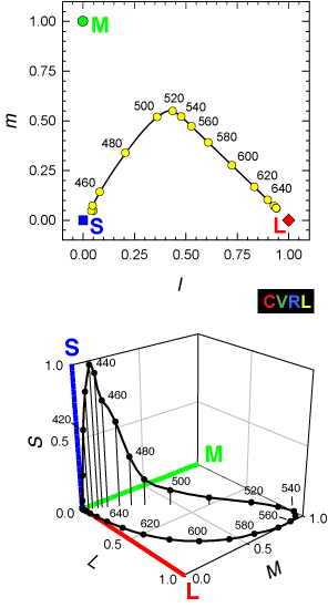
How to proceed
Maneesh, you obviously have knowledge to contribute, so here are some tips. Start off incrementally. Leave the lede as it is until after you've gotten a new section accepted into the article. Make a few corrections than can be individually undone if necessary, rather than a huge change all at once. Learn about wikipedia style (in particular, stop putting section heads in title case, and putting huge images). Don't delete the lede image; you can move it if you have a better one to use there instead. And so forth. Dicklyon (talk) 18:44, 26 November 2016 (UTC)
- I'm sure there are some stylistic issues with what I've written. Correcting these sorts of things is often easier if you just supply an example or two, I or someone else would easily come along and fix the remaining issues. Things like title case shouldn't take priority against overall correctness and clarity. It may only be a matter of casual mistake in discussion but I'll hope you can understand that I am not entirely convinced you have the expertise and understanding of some basic concepts here. The article has long had some glaring deficiencies; I would recommend you devote your energies to constructive improvement rather constantly reverting. I'll leave improvement of this article to some other wikipedian. FWIW I've found the process of trying to improve this article to have been onerous and unproductive. Obviously incorrect information seems to stick around a lot longer than correct information. I can't spend more time on trying to improve things.Maneesh (talk) 07:35, 28 November 2016 (UTC)
Primaries in art
Editor Karlfonza has been working on a section about RYB primaries in art, and I've been reverting him, since he seems to be starting from bad premises:
First attempt, a common misconception: "In painting, the three primary colors are red, blue and yellow. These are the colors that cannot be made by mixing other others."
Second attempt, a pretty much opposite definition: "Primary colors are any colors from which the entire color spectrum can be derived. Traditionally, these colors are colors on a color wheel such as blue, yellow and red. Any three colors on a color wheel that an equilateral triangle would point to can be primary colors."
Also, what's he writing about is not "art" really, but rather pigment mixing (subtractive colors); plenty of art is done with additive RGB primaries, too.
@Karlfonza: please join in and discuss. Dicklyon (talk) 23:38, 26 March 2017 (UTC)
- I can see what you're saying about the limits of our ability to reproduce a full color spectrum faithfully. That's what primary colors are according to Webster's dictionary though. "a set of colors from which all other colors may be derived" If you can't derive all visible colors from primary colors, that means primary colors and secondary colors, don’t exist, only colors do. I can change it to make it say the seven visible colors red, orange, yellow, green, blue and purple. My problem with the Wikipedia article, currently, is that it's so technical it offers no advice for an art student in Painting I trying to find out what a primary color is. The definition on Webster is so simple, that it doesn't either. Of the two, the most popular on Ecosia.org (the search engine I use) is this, which is popular with good reason, because it offers a common ground between the two.
- "There are seven colors defining wavelengths of visible light. They are red, orange, yellow, green, blue, indigo, and violet. However, the three "primary colors" for ADDITIVE combination (such as the colors on these web pages) are red, blue and green. All edited colors in computer images use a combination of these three. When added together, these component colors form the color "white".
- For SUBTRACTIVE coloration, as in art, the primary colors are red, blue and yellow. Karlfonza (talk)
- In printing, these three colors were superceded (just as they were for light primaries), the modern equivalents being cyan, magenta, yellow and black." (Found on answers.com)
- https://www.merriam-webster.com/dictionary/primary%20color
- The problem with that is that he doesn't cite his sources, but I have seen what he said in other places, so I'm sure it's fine. Here is a more art based approach on color mixing. https://www.sophia.org/tutorials/elements-of-art-color
- — Preceding unsigned comment added by Karlfonza (talk • contribs)
- Karl, you should really read the article, and then look for sources that back up whatever you're trying to say. I recommend book search and scholar search. Dictionary definitions are often too over-simplified or superficial to be useful. And the list of Newton's 7 color category names is pretty irrelevant to real colors and primaries; it's just a naming scheme with pretty arbitrary divisions. Dicklyon (talk) 05:06, 27 March 2017 (UTC)
- In art, red, yellow and blue are the primary colors. I think the confusion sets in when you realize that secondary colors can create primary colors, visually. But they can't, at the same time, because then the secondary colors would become a primary color set. https://www.reference.com/science/primary-secondary-colors-895d42630393d118#
- In light of that, I've created this definition that is less ambiguous. Primary colors are any set of colors that produces secondary and tertiary colors. In traditional painting, they are red, yellow and blue. In modern printing, they are cyan, magenta and yellow. The human eye contains three cones from which all colors visible to us are derived. Among animals, some fish, birds, reptiles and mammals have four cones. Primary colors cannot be produced using other colors, although secondary and tertiary colors can produce a primary color visually, they would not be considered a prime color if used in this way. — Preceding unsigned comment added by Karlfonza (talk • contribs) 16:47, 27 March 2017 (UTC)
- Karlfonza (talk) —Preceding undated comment added 17:30, 27 March 2017 (UTC)
- In Wikipedia, you don't really get to create a definition. You need to rely on what you can find in reliable sources. "Primary colors are any set of colors that produces secondary and tertiary colors" doesn't really say anything. You can call any set of colors primary, and make secondaries by mixing pairs of them. And the statement "In traditional painting, they are red, yellow and blue" is more about what they are called than what they are, since the primaries used in painting are often closer to magenta, yellow, and cyan (often colors between blue and cyan, and between red and magenta, are used, along with some kind of yellow). Dicklyon (talk) 01:44, 28 March 2017 (UTC)
- I'll update the entry later tomorrow, I'm going to leave out everything except for the first two sentences "Primary colors are any set of colors that produces secondary and tertiary colors. In traditional painting, they are red, yellow and blue." Because beyond that there is too much of a dispute among scholars. Karlfonza (talk) —Preceding undated comment added 00:34, 28 March 2017 (UTC)
- Let's try to reach an agreement before doing that. It's OK to add something about the RYB color model if that's missing, but redefining primaries without a solid source is not a great idea. Dicklyon (talk) 01:44, 28 March 2017 (UTC)
- Primary comes from the root "Prime" which means first in order of time. http://www.dictionary.com/browse/prime The first colors one uses are the primary colors in any field, because of this. Most artists teach that those colors are the RYB model. Since more than one model of primary colors exists, if you include the magenta, yellow and cyan model, it would make sense that... all of the primary colors themselves are arbitrary. Since, it could be argued that magenta and cyan are not a primary colors, but secondary colors that printers use to create primaries. My original thinking was that since they can create any color, they must be primaries, but that's not the case. Secondary colors can create a primary color, but they are still a secondary color, even if the gamut range is larger. That's not agree upon by everyone, just like indigo being either dark blue or purple... But, it is agreed that indigo is a color, so that's what I'm going for right now. Saying that it's a color doesn't say much, but at least it says what it is.
- I'm going to include the RYB model, because that's like saying indigo it either blue, purple, bluish purple or it's own color. It's the essence of what it is in the art world. I'm not going to include the frequency of the colors are anything like that, because optics are something I don't know much about. They are for another section of the article.
- With that in mind I'm making one final revision, because it can be argued that not all of the models of primary colors actually include primary colors. A printer and an artist could argue the point for days. I read Isaac Newton included a rainbow of 7 primary colors, so a scientist could confuse it even more, by basically eliminating the conventional secondary colors.. But something can't be primary and not have a secondary. So, I'm changing 'any' to 'a set'. It does say say something, which is what primary colors are. Since people don't agree upon the colors themselves, they have to agree upon that. This is the part I'm going to add, because I can find about 50 sources to back it up.
- "Primary colors are a set of colors that produce secondary and tertiary colors. In traditional painting, they are red, yellow and blue."
- Here are the definitions of secondary and tertiary colors, which proves it to be true. [2], [3]
- I also might change the part about the Zorn palette, as well, because I've read his used "snowflake white' and no mention of a yellow, so I'm assuming he could have used the RYB model as well, with 'snowflake white' being a kind of very pale yellow.
- Karlfonza (talk) 03:57, 28 March 2017 (UTC)
- Here's an article from New York University that backs up that the primary colors in art are red, yellow and blue. It seems wrong in saying that they can't be produced by other colors, because I've see first hand mixing watercolors, that secondary colors can produce primary colors, but while that is true, it's also true that primary colors cannot be secondary colors which is what it's really saying. Printers still use Isaac Newton's primary colors, which are the colors of the rainbow as opposed to brown and gray.
https://cs.nyu.edu/courses/fall02/V22.0380-001/color_theory.htm and it's found in many dictionaries http://encyclopedia2.thefreedictionary.com/Primary+Colors
- This is what I have arrived at.... Primary colors are a set of colors that produce secondary and tertiary colors. Isaac Newton proposed that they are colors of the rainbow. In traditional painting, as taught in elementary school, they are refined to red, yellow and blue. In modern printing they are magenta, cyan and yellow. In both painting and printing, certain triadic combinations of Isaac Newtons primary colors can produce any color of the rainbow as well as brown and gray. (Although not all the shades and hues of those colors i.e. not every tint of blue. As far we know, no system of primary colors can perfectly produce all the colors in existence. )
Karlfonza (talk) 03:01, 29 March 2017 (UTC)
- That anonymous web page at NYU that says "A primary color is a color that cannot be made from a combination of any other colors" is an outlier. Essentially undefined nonsense, since they don't say what "made from" means, nor what "other colors" they allow. Just about any color normally used as a primary can be created by combining other colors if no stringent constraints are imposed. I don't see that among the dictionary definitions that you link, which also has some doozies, and one that makes good sense in light of the usual meaning: "primary colors: Any three colors that can be mixed in proper proportions to specify other colors; they need not be physically realizable." Dicklyon (talk) 04:19, 29 March 2017 (UTC)
- Ok, this is what I've arrived at so far.
- Light itself is the origin from which all colors are derived, just as 0 or 1 is the beginning of mathematics. Isaac Newton did not count light as a color, and listed the primary colors as the colors of the rainbow, as seen after passing through a prism.
- The primary colors are clearly defined, as the colors that produce secondary and tertiary colors. The primary colors themselves, however, are a matter of debate, because the multitude of systems explaining them are not unified.
- Just as the natural numbers can be viewed as either 1-10, or 0-10 (to infinity), the actual colors comprising the primary colors can be viewed in many ways. For the sake of comparison, just as integers can be broken down into integers, positive integers, negative integers, rational integers and so forth, the primary color sets can be broken down.
- Primary Colors
1-10 view (Isaac Newton's Prismatic View) Red, orange, yellow, green, blue, purple, indigo.
(Indigo can be viewed here as the number 10, it's not a fundamental digit because 1 and 0 have already been covered, but it is fundamental as the first combination of different numbers. Indigo is the same way, by being the first and only combination color (dark blue/purple) it completes the fundamental set. It is also possible that some people perceive indigo as a unique color.)
- Primary Colors Set I
0-10 View (Crayola View) Red, orange, yellow, green, blue, purple, brown, gray, black and white.
The in-between colors are secondary. An example of this would be magenta (red-purple). Gray is already a combination color of black and white, so it represents the 10. Black and white are the 0 in this view.
Light red (pink) and dark red all the hue and shades of color are secondary. Dark brown and light brown (tan) are secondary.
Tertiary colors are the nearly infinite range of remaining colors, such as electric pink, azure blue, hot indigo. It can be argued that all colors we see are tertiary colors, because of the wide range of reds that can be defined as red.
- Primary Color Set II
0-10 View (my personal view)
Red, orange, yellow, green, blue, purple, brown, black and white.
All the in-between colors are secondary.
Adding any tone, tint, hue or value to the secondary color creates a tertiary color.
- Primary Color Set III
0-9 View (Goethe’s View) Red, orange, yellow, green, blue, purple.
All the in-between colors are secondary. Brown also counts as a secondary color.
Adding any tone, tint, hue or value to the secondary color creates a tertiary color.
- Primary Color Set IV
1,2,3 View (Art) Many teachers teach that the primary colors are red, yellow and blue, because they can be mixed to produce the colors of the rainbow, as well as brown.
Red, yellow and blue.
Any colors two of these create are secondary colors.
Any colors created by three colors is a tertiary color.
- Primary Color Set V
01010 Binary Code View
(Illuminated screens) Red, green and blue.
(Printing)
Cyan, magenta, yellow. Black can be used as a key.
Same as the RYB model but with a wider gamut.
- Primary Color Set VI
(-1,0,1,2,3) (Human Vision)
Varying triads of color person to person, corresponding to the three cones in the eye. Some people may have four cones.
- Primary Color Set VII
(0-infinity) (optics)
An arbitrary set of colors that can include infrared colors, and colors not visible to the human eye.