
Wikipedia talk:WikiProject Maps/Archive 2012
| This is an archive of past discussions. Do not edit the contents of this page. If you wish to start a new discussion or revive an old one, please do so on the current talk page. |
| Archive 2005 | ← | Archive 2010 | Archive 2011 | Archive 2012 |
Colours
There is a discussion at Talk:Kyoto Protocol#11.12.17 map colors which might be of interest for this WikiProject. cheers. --Elekhh (talk) 05:33, 6 January 2012 (UTC)
Mapmaker need tip : How to display time changes ?

Hello there, I'm working on a map for the article series on the Battle of Warsaw (1920) (notably the Battle of Radzymin (1920) and Battle of Ossów). I have the basic battlefield map ready and would love to hear some advice on what to add there, what to fix and how to proceed.
As the battle took more than 3 days and the composition of forces changed over time, I was thinking of simply shading the right side of the map (or rather tinting it red) to give the reader an impression of where the front-line was rather than where the actual units were (as their positions changed all the time). Any thoughts on that?
Also, currently the map doesn't render correctly (the preview apparently does work, but when you click on the "Full resolution", it gives an XML error ( <path id="path7610" sodipodi:nodetypes="cccccccccccccccccccc" fill="#010101" stroke="#010101" stroke-width="0.324" d=" ----------------^). Any idea how to fix that in Illustrator when I upload the final version? //Halibutt 23:51, 13 November 2011 (UTC)
- Hello Hali,
- First, I want to praise the quality of your map. That's the first of yours that I notice, and she have a pretty nice style : clean and elegant. Secondly, It seems you de facto proposed yourself a solution to your problem. That's common. Innovations usually work that way : who want something, then "who" create this solution, and share it with others. In your case, let's me do a summary for other mapmakers.
- Haki's tips: For a battle which took more than 3 days and complex moves, you eventually used different transparency level to display time's progressions.
- Isn't it ? Yug (talk) 14:16, 25 January 2012 (UTC)
- Thanks for your reply and your kind words. I was making this map back in November. But as I got no comments from anyone for, well, over 2 months, I simply decided to go the traditional way and used situation of one particular day rather than showing all three days on one map. Way easier and way more self-explanatory I believe. //Halibutt 17:46, 25 January 2012 (UTC)
RFC for Indian subcontinent and South Asia merge
There's an RFC at Talk:South Asia#Merging "Indian subcontinent" here which needs comments from neutral editors to form a clear consensus. Thanks. --lTopGunl (talk) 02:36, 21 January 2012 (UTC)
Railway illustrations
Hi everyone!
I came across a really great database of historical railways in the southern ontario area. They're in KMZ format so I open them in Google Earth. Is there a way we can use this data to draw a map suitable for use in the Wikipedia? In particular, I'd love to include a route map in the article on the Port Whitby and Port Perry Railway, but I could just as easily add it in others as well.
Is this the right place to start? Maury Markowitz (talk) 19:53, 26 January 2012 (UTC)
- It's a good place to ask - but I don't personally know the answer. EdwardLane (talk) 11:43, 27 January 2012 (UTC)
WP:BIAS issues
There are a two issues that have arisen that are of concern to members of the New Zealand and Australia wikiprojects that we'd like to raise; we see them as WP:BIAS issues.
- There is no easy way to embed maps with south-upwards. For example Wizard_of_New_Zealand should have an map as shown in Oamaru except inverted.
- Many of the World Maps chosen to illustrate random things on Wikipedia aren't actually world maps, since they omit areas near the poles. These are areas where people live; in some cases the entire traditional range of some indigenous peoples are excluded, imagine if your son or daughter was taught using maps that didn't have the place were you're from. See for example Image:World_map_-_low_resolution.svg linked to from Wikipedia:MAPS#World (and from there many other places). Many of the scientific and technical wikiprojects use polar maps for these areas, but this is segregation; only subjects of study appear on such maps, not people.
I'm not claiming (and I don't believe anyone else is claiming) that this situation has arisen deliberately, and I don't want to attach blame to particular editors, but Wikipedia:Systemic bias makes it clear that bias is something that must be actively challenged. There are a number of things that could be done to mitigate these issues:
- Making a non-trivial group of maps available in a form which allows them to be displayed in either orientation.
- A optional parameter to Template:Location map seems like a really good way to do this.
- Encouraging the use of a greater range of projections for world maps
- A projection parameter could be added to a number of commonly-used templates involving world maps which picked backing images dynamically
- Maps could be generated by dynamically adjusting the projection (I understand this involves higher-order math and may not be practical)
- Not call maps world maps unless they actually map all the world.
Stuartyeates (talk) 06:56, 15 February 2012 (UTC)
- For #1, I don't see any theoretical reason why Template:Location map wouldn't be able to do that, but admit I don't know the programming involved. I'd suggest bringing it up at the talk page for the template.
- For #2, I'm not really seeing it. The most widely used map by far is File:BlankMap-World6.svg and it's not cutting anything off. On Wikipedia:MAPS#World only one of the maps besides the one you link to is cut-off and that one is clearly labeled as omitting Antartica. By all means encourage appropriate projection usage but I don't see a widespread problem. Kmusser (talk) 17:06, 15 February 2012 (UTC)
- 1 - This may be trivial to implement. Open File:New Zealand location map.svg in Inkscape, rotate it through 180 degrees, then create Template:Location map New Zealand inverted copying the parameters from Template:Location map New Zealand, just swapping the top and bottom. This should work just fine. Wizard of New Zealand would most benefit from an adaptation of File:Hobo–Dyer projection SW.jpg to match his map.
- I don't see a major issue - the vast majority of maps used in the Australian and NZ contexts have north at the top. Reversed maps are only really used as part of discussion about the arbitrary convention, not to merely show the geography. Routine usage of reversed maps could cause confusion for readers ("Is that Tasmania: I thought it was roughly shaped like ∇ not Δ?"); this wouldn't be the case if reversed maps were in routine use. Compare this to the situation with the convention of the prime meridian at the center, non-standard variants are somewhat more common.
- 2 - The subject matter of the map is the important thing. If the map is about the Pacific Ring of Fire, a conventional north up map centered on Europe is wrong. A map centered on the Pacific is better, if Europe isn't shown it doesn't detract from the map. A discussion of Antarctica needs a polar projection and so on. For human subjects, it doesn't matter if a global map doesn't depict latitudes above 85 degrees N or S - no-one lives at there. A greater choice of projections (especially central meridians) is a good thing, as it means editors can use a different map when the standard Robinson map is not ideal for their subject.
- 3 - "World maps" ought to be things defined as "world maps" by reliable sources. For example, the Mercator projection can be used to produce world maps, even though the poles have to be clipped. That said, WP:MAPS#World should only list maps suitable for (almost) all purposes; there's enough to choose from we shouldn't encourage use of sub-optimal ones. There should be at least one global map accessible there which doesn't have the Pacific split in two.--Nilfanion (talk) 22:56, 15 February 2012 (UTC)
Taking that one point at a time:
- Yes, I'll try something like that, but without picking a name that privileges the system.
- I strongly disagree with sentence For human subjects, it doesn't matter if a global map doesn't depict latitudes above 85 degrees N or S - no-one lives at there. It is directly contradicted by Amundsen–Scott South Pole Station which says In recent years the wintertime population has been around 50 people.
- Two infinitely-small mathematical points need to be trimmed in a Mercator projection, which scale to nothing at the scales we're talking about; the rest appears to be a modern convention. If you look at the centuries-old File:Mercator_1569.png featured on Mercator projection it represents the polar areas very well, better than I've seen in any of the more modern images using the projection.
Stuartyeates (talk) 05:35, 16 February 2012 (UTC)
- If used in a location map, the template needs to make it clear that it has South at the top.
- The permanent population of Antarctica is zero. All the people in the various bases are citizens of nations; so for any map showing demographics are properly included in their home nation. The same applies to the International Space Station, it continuously manned but we don't include the ISS on maps. Things like GDP, birth rate, male/female ratio and diplomatic relations do not apply to Antarctica; so do not need Antarctica shown to display this. In any case, 85S is fully within the continent and I cannot think of any human context (apart from articles specifically about Antarctica) where depicting the South Pole is necessary.
- The poles get mapped to infinity in the Mercator projection. The result of this is on a Mercator map, the distance from 89N to 90N is infinitely large, this requires you to select an arbitrary latitude to clip at - its not just the poles themselves that are lost. A significant amount should be clipped on any map as otherwise the polar regions overwhelm the map. If you clip a Mercator projection at 89N and 89S, the regions from 80-89 take up as much space as everything in between 80N and 80S. It is not that surprising that a 16th Century map appears to handle the poles better: Terra Australis was thought to be much larger than Antarctica. Likewise, the true nature of Greenland and the North West passage were not understood then. File:Tissot mercator.png covers considerably more of the globe; it is clipped at about 85 degrees. The fact Greenland is as big as Africa is a major reason why Mercator projection isn't ideal for producing world maps.--Nilfanion (talk) 11:33, 16 February 2012 (UTC)
Periyar (river) Origin map assistance.
Hi, i have added multiple references to the article for its Proof's for it's origin in Sundaramala in Tamil Nadu.
1: http://ces.iisc.ernet.in/biodiversity/documents/rivers.htm
2: http://www.indiawaterportal.org/sites/indiawaterportal.org/files/Joseph%20M.L.pdf
3: http://www.irenees.net/fr/fiches/analyse/fiche-analyse-633.html
But the article may need a map to confirm the same. Please assist me in finding that.Pearll's SunTALK 16:48, 24 January 2012 (UTC)
- I found http://www.sandrp.in/basin_maps/Periyar150411.jpg, can't use it directly in the article as it'd be copyrighted, but you could cite it as a reference. Kmusser (talk) 18:50, 24 January 2012 (UTC)
- Hi, thanks for the map, seems helpful, i think a satellite map would help find the right location, all resources points its location to be Tamil Nadu which remains a reason for vandalism as the river flows through kerala but if a supportive map is produced then we can stop the issue. Pearll's SunTALK 09:30, 27 January 2012 (UTC)
- I find http://www.india-wris.nrsc.gov.in/webgis.php# a very good site for exploring India's river basins, especially in terms finding river basin boundaries. This website is a result of a collaboration between Central Water Commission (CWC) and ISRO. We can see the the basin boundary of West flowing rivers South of Tapi pretty much following the Kerala-Tamil Nadu border from Devikulam all the way to Trivandrum. In other words, the border follows the crest of the Western Ghats. The only place where the Periyar basin extends into Tamil Nadu is to the immediate north of Idukki district and just to the south of Valparai. The Upper Periyar basin as can be seen in the map does not extend into Tamil Nadu.
- I think all the websites quoting the source of Periyar being in Tamil Nadu ultimately get their information from M L Joseph's status report on Periyar. To be honest, there is some inaccurate data in the report (like the length of Periyar being 300km when pretty much every other source gives the length to be 244km). The Sivagiri peaks mentioned in the report refers to the town of Sivagiri immediately to the east of the source of Periyar in the Western Ghats. Although these peaks rise in the east from the plains of Tamil Nadu, the crest of the Ghats actually forms the Kerala-TamilNadu border. To the west of this crest lies the Periyar basin.
- In the map, you can see the source of the Periyar (source of the longest headstream) lies somewhere in the extreme south of the Idukki district. It might be on the Kerala-Tamil Nadu border or just inside Kerala, depending on the where the source of the longest headstream is. I personally think that this point http://www.wikimapia.org/#lat=9.2854059&lon=77.2592068&z=14&l=0&m=t is the point where the longest headstream starts. In any case, the source of the Periyar cannot be in Tamil Nadu alone. It is either on the border between Kerala and Tamil Nadu or in Kerala alone.
78.101.94.123 (talk) 20:18, 29 February 2012 (UTC) Ashinpt 78.101.94.123 (talk) 04:11, 1 March 2012 (UTC) Ashinpt
Barnstars
I thought I might mention this template
{{subst:Mapmaker's Star|1=Put your message here.~~~~}}
which can be used to give barnstars to folk who are making nice maps.

|
The Mapmaker's Barnstar | |
| Put your message here. ~~~~ |
EdwardLane (talk) 10:43, 28 February 2012 (UTC)
Dispute on depiction of the map of China
There is a discussion going on over the depiction of claimed and administered territories of China here. Comments are welcome. --kondi talk/contribs 21:43, 5 March 2012 (UTC)
- Pointless political or graphical dispute. No will to get involve ! :D Yug (talk) 22:23, 5 March 2012 (UTC)
Old maps of Ghent
Hello, I am trying to gather and sort out old maps of the city of Ghent. I started with uploading all PD-art/PD-Old images I could find on the web and tried to make a list of them. I would appreciate any tips to improve the page. http://commons.wikimedia.org/wiki/Old_maps_of_Ghent Donar Reiskoffer (talk) 11:04, 8 March 2012 (UTC)
- I went over to your new page, and I must say it looks just great. I wish that everyone would be so complete and take such care to present their uploads so meticulously. Congratulations, Madman (talk) 21:34, 8 March 2012 (UTC)
WP Maps in the Signpost
The WikiProject Report would like to focus on WikiProject Maps for a Signpost article. This is an excellent opportunity to draw attention to your efforts and attract new members to the project. Would you be willing to participate in an interview? If so, here are the questions for the interview. Just add your response below each question and feel free to skip any questions that you don't feel comfortable answering. Multiple editors will have an opportunity to respond to the interview questions, so be sure to sign your answers. If you know anyone else who would like to participate in the interview, please share this with them. Have a great day. -Mabeenot (talk) 00:48, 5 April 2012 (UTC)
Wikipedia:HighBeam
Wikipedia:HighBeam describes a limited opportunity for Wikipedia editors to have access to HighBeam Research.
—Wavelength (talk) 18:15, 5 April 2012 (UTC)
Deletion of Template:Osmrelation
New request was opened - Wikipedia:Templates for discussion#Template:Osmrelation - you may submit your comments or help keep it. I am disappointed about someone asking to delete this template at all, because it links to a valuable data in another free and open source project. --Kozuch (talk) 09:47, 6 April 2012 (UTC)
Incorrectness in Maps of Shanghai
User Daveduv on zh wiki reported an incorrectness in maps of Shanghai.
The Chongming County of the Shanghai city does not occupy the whole Chongming Island. Two small areas on the island are occupied by the Haiyong county from the Haimen city and the Qilong county[1] from the Qidong city. This[2] is the map of Haimen from the Haimen government and this[3] is the map of Qidong from the Qidong government.
Thus most maps of Shanghai on commons [4] are technically incorrect. --Skyfiler (talk) 09:33, 7 May 2012 (UTC)
- You should talk to the author of those maps, Fanghong appears to still be active. Kmusser (talk) 16:01, 10 May 2012 (UTC)
Parks and preservation areas
The guidance at Wikipedia:WikiProject Maps/Conventions/Areas maps indicates
should be used for "parks and preservation areas", and its an appropriate colour for that subject and it works well when the highlighted area is a large portion of the image.
However, it has relatively low contrast against the default #fefee9. This reduces its value for locator maps, as typically only a small area is highlighted on those maps, and it may be difficult to distinguish as a thumbnail. The equivalent shade for animal ranges (#f07568) doesn't have this problem, as even that fairly pale red still contrasts well with the beige.
I've tried a much darker green (#116400) for use on locators (eg File:Lincolnshire Wolds AONB locator map.svg), and this works at low resolution. I'm not sure if that's the ideal - I might have made it too dark?
Some guidance for highlighting marine areas would be good too. I imagine a mid-blue, with similar saturation to the red and green for land areas would be ok?--Nilfanion (talk) 21:46, 18 April 2012 (UTC)
Indeed, the convention's wording is unclear. The spirit of the convention is as following. When the area is relatively small (a city, but also anything else) you should use the
When the area is quite wide on the map, then, the thematic soft colors are prefered (more comfortable and elegant).
-
 Small area (relatively)= red color.
 -
 Large area (relatively) = soft color.


As a background, I encourage the location maps colors : soft, clean and simple. PS: I will update the convention according to your feeedback. Yug (talk) 12:38, 19 April 2012 (UTC)
- Note: It become need to align and to merge the Locator maps (blank), Areas maps, and Historical maps conventions, which actually are 3 sub-cases of multi-area maps/complex maps. I'm already on it. Yug (talk) 12:43, 19 April 2012 (UTC)
- That makes sense in general. However, I'm a bit uneasy with using a soft green for a wide area, and a deep red for a small area of equivalent status - it seems odd to use "opposite" colours in that way. A deep green is consistent, which feels more natural than B00000. UK editors have indicated preference for slightly non-standard colours - but I can upload a completely compliant map easily enough.
- As for the marine side of this: File:North Devon's Biosphere Reserve map.svg is one I did a while back; using #08B7E8 for the highlighted water (I can't find any existing convention on this).--Nilfanion (talk) 22:16, 19 April 2012 (UTC)
| 300px maps | 120px maps |
|---|---|
|
|


First is suitable for inclusion in guideline material, second shows the things that need a bit more thought...--Nilfanion (talk) 22:25, 12 May 2012 (UTC)
- A. On the number 2., you replaced the dark red recommendation (■■■ #B00000) for small areas, by a new dark green ■■■ #116400. Right ?
- B. The maritime proposal look pretty good. May conflict a bit with hydronyms
- May need to increase contrast between the two values so we can name these maritime parks in #0978AB (or should we name them in black, simply...).
- PS: which values exactly for each ? do you have any preference (softer/darker) ? Yug (talk) 09:06, 13 May 2012 (UTC)
- The two additional colours on the second map are ■■■ #116400 (the dark green) and ■■■ #08B7E8 (the darker blue). I have no real opinion on exact shades. That said, the green might be a bit too dark?
- With regards to the clash between the maritime parks and hydronyms, black may be more appropriate - these things are "parks" first, not "water bodies". The blue needs to stand out from the default water colour, and that means it will be closer to the hydronym colour. I chose that shade of blue to match the land park's saturation/value. Other options exist of course.--Nilfanion (talk) 23:56, 13 May 2012 (UTC)
- Received and agree completely. Green should be a bit lighter, otherwise better to use black, or the B0000 red. Yug (talk) 18:12, 14 May 2012 (UTC)
- Test: ■■■ #116400 VS ■■■ #00B000 VS ■■■ #B00000. Yug (talk) 10:00, 15 May 2012 (UTC)
- I wonder why the green 00B000 seems lighter to me than the red B00000... Strange. Just my screen ? Yug (talk) 10:00, 15 May 2012 (UTC)
- Its not your screen but your eyes. RGB doesn't match how the eye works (Lab color space is a closer match). 00B000 and B00000 are quite different in Lab.
- For comparison: ■■■ #B00000, ■■■ #006B00, ■■■ #00B000 (37,61,53, 37,-61,53 and 63,-60,61 in Lab).--Nilfanion (talk) 10:56, 15 May 2012 (UTC)
- Received and agree completely. Green should be a bit lighter, otherwise better to use black, or the B0000 red. Yug (talk) 18:12, 14 May 2012 (UTC)
Information design: Must see video
- Information design: McCandless, David (2010). "The beauty of data visualization". Yug (talk) 08:34, 11 May 2012 (UTC)
- By the way, this encyclopedic topic of Information design is of a very top importance for us. I just tagged it as such. Yug (talk) 08:35, 11 May 2012 (UTC)
Provins map bilong Papua Niugini
Two new provinces of Papua New Guinea were established on 17th May 2012, Hela and Jiwaka. I have modified the numbered province map to show the location of these: at present it is on en:wikipedia at File:Papua new guinea provinces (numbers) 2012.png. I was wondering what would be the best way to put this into commons - overwriting the existing File:Papua new guinea provinces (numbers).png, or with a different name? About 51 pages across 39 wikis have tables naming the provinces by reference to the map. I have left the numbers of the existing provinces unchanged, so if I did overwrite the existing map these would be right as far as they went, just have two unexplained numbers. I'm hesitant to launch into modifying all these pages myself - admittedly for most of them Hela & Jiwaka would be the correct entries, but there are 5 in Cyrillic (Хела & Дживака?), 1 in Greek (Έλα & Τζιβάκα?), and I wouldn't know where to start with Armenian, Chinese, Farsi, Hebrew, Japanese & Korean. Advice please.--Keith Edkins ( Talk ) 15:25, 23 May 2012 (UTC)
Assessment sweep
A nice way of sorting articles into ones that might be possible to assess highly was mentioned over at WikiProject Earthquakes , [5] shows the pages sorted by score and then importance. Anyway I might give that a bit of a go. Oh and Sorry I've been a bit less active on wikipedia lately, due to real life being busy. EdwardLane (talk) 09:16, 7 June 2012 (UTC)
RfC: Guideline on depiction of disputed lands/territories
{{rfc|hist|pol|policy|rfcid=7D16D98}}
Extended content
|
|---|
|
There is no explicit guideline or convention on the depiction of disputed lands/territories. A discussion is going on Talk:China#Chinese map as depicted in the article about the depiction of disputed lands for quite a time. --kondi talk/contribs 14:53, 7 April 2012 (UTC)
|
|
@Dear all : This talk become endless and unproductive. We can't explain to each new user BEFORE why we WILL use grey not red, why we keep neigbourg countries, talk about butterfly, etc: that's time consuming and not productive. Mapmakers' job is to work constantly with borders, borders changes, borders disputes. Edward (cartographer) and myself (cartographer) volunteered to propose a guideline (draft). Edward and myself already gather a long experience, and have the understanding and skills to make a good proposal. Successfull conventions were produce that way, by a single or duo of users, proposing a convention, sharing it, then the proposal was improved with feedbacks. This last way have proven efficient, elegant, and consensual. Accordingly, please simply let us some weeks to propose a guideline draft, then we will have something to comment on. Cheers, Yug (talk) 10:52, 9 April 2012 (UTC) |
- Yug, can you specify how much time it would take for you to come up with a guideline on this? I am in no hurry, but specifying a date would be very helpful. Thank you. — Nearly Headless Nick {c} 13:36, 19 April 2012 (UTC)
- Say 2 months. Maybe more. It needs maturation. I'm currently watching maps with this problematic in mind, thus gathering ideas of current practices and possible conventions. To tell more, the German team actually provided a nice start, light and nice, the bad points are 1. nothing for waterbody, 2. conflicting with the wikipedia (NGO) will to use doted lines (— - — - —) for international border. That's conflicting. My opinion of it will come according to what practices I see within this 2 months, then I will write down a comprehensive proposal within an afternoon. Yug (talk) 15:36, 19 April 2012 (UTC)
- Thank you. I will remind you after 2 months. — Nearly Headless Nick {c} 16:38, 19 April 2012 (UTC)
- Say 2 months. Maybe more. It needs maturation. I'm currently watching maps with this problematic in mind, thus gathering ideas of current practices and possible conventions. To tell more, the German team actually provided a nice start, light and nice, the bad points are 1. nothing for waterbody, 2. conflicting with the wikipedia (NGO) will to use doted lines (— - — - —) for international border. That's conflicting. My opinion of it will come according to what practices I see within this 2 months, then I will write down a comprehensive proposal within an afternoon. Yug (talk) 15:36, 19 April 2012 (UTC)
The two month window has now elapsed, and I hope there will be some resolution to this dispute. — Nearly Headless Nick {c} 19:52, 17 June 2012 (UTC)
Request a map
I wonder if there is a free equivalent of this map. It has to be old (before 18 March 2011), because the structure (Pearl Square) was demolished by authorities. Mohamed CJ (talk) 06:55, 16 July 2012 (UTC)
- The simpliest way is Sharemap.org. I'm creating the Barhain part to show you the way. May you draw the Cairo part and combine the both ? (I'm in exam period). Yug (talk) 14:58, 16 July 2012 (UTC)
- See: http://sharemap.org/public/Bahrain_protest . The Apps is quite simple, easy ti edit, so enjoy yourself ! Yug (talk) 15:01, 16 July 2012 (UTC)
- Wow. It looks nice. Thanks and good luck in exams! Mohamed CJ (talk) 15:45, 16 July 2012 (UTC)
Help with an Infobox map
I am having a difficult time with the Infobox map on Blob's Park. I followed the guidelines on Template:Infobox map but that did not seem to work. Any help would be appreciated. LarryGrim (talk) 12:49, 27 August 2012 (UTC)
- I got it for you, switched to a different template and it worked. Kmusser (talk) 14:02, 27 August 2012 (UTC)
File:Urals blank map.png
File:Urals blank map.png has been suggested that it isn't free and should be deleted -- 76.65.131.248 (talk) 20:50, 8 September 2012 (UTC)
Seeking critique & advice
Please let me know if there's a more appropriate venue in which to ask this. I'm looking for constructive critiques of a series of maps I'm creating. These are maps of reservoirs that were never built, which will illustrate an expanded article I plan to write on the defunct Meramec Basin Project.
-
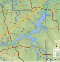 Meramec Park Lake
 -
 Pine Ford Lake
 -
 Union Lake
 -
 Irondale Lake
 -
 Virginia Mines Lake
 -
 Salem Lake


_approximate_extent.svg)


I'm planning on another couple of maps for major reservoirs that were proposed for a second phase of the project, plus one of the full basin showing them all in relation to each other and the basin. --Kbh3rdtalk 17:32, 7 September 2012 (UTC)
- Simply Awesome... the best topographic maps created on the English Graphic lab. Yug (talk) 18:11, 8 September 2012 (UTC)
- Those look great, I think they'd be fine as is. If you have it, it would be cool to show the existing river course going through the reservoirs (but keep it subtle, a light blue dashed line perhaps). I'd probably also use regular case for the water feature labels and reserve the all caps for just the counties, but that's a personal preference. Kmusser (talk) 14:45, 10 September 2012 (UTC)
- For deeper comments...
- 1. You map a small area, so you have neither the misleading north-arrow issue, nor the misleading scale issue. I suspect however that the grey lines indicate the real north (see File:Meramec Park Lake propose v4.svg).
- 2. Background is SVG, which is great (how did you make that ? which soft / script ?)
- 3. Colors are smooth thanks to the conventions.
- 4. I didn't remembered that rivers should have darker borders, but I guess you considered the big zoom justifies to look at rivers are water area rather than water lines.
- Suggestions: I may suggest you to enlarge a bit the frames. More interesting : to create an overall locator map to localize each frame. See File:Metacomet_Ridge_map-fr.svg. Yug (talk) 19:23, 10 September 2012 (UTC)
- Good points. Response per each:
- 1. Most of these were done in UTM 15N, and the area is towards the eastern limit of that zone, which causes north to tilt to the left. The last one (Virginia Mines) was done in the Missouri East state plane which has that problem to a much lesser degree for this area. I may recast all the maps in that projection. The north arrow, particularly the one from the template, doesn't do much good when the deviation from vertical is slight. I included and oriented it in the Meramec Park Lake map, and it's also in the Union Lake map, though I think that was by accident.
- 2. I use Quantum GIS to render the topographic background and export it as a bitmap. I use Inkscape's bitmap tracer to translate that into SVG. That function is available in a standalone utility, too, though I don't remember the name. The lakes, roads, streams, and towns are from shapefile data, after I've derived the lakes' shapefile from the elevation data, and are rendered to SVG with shptosvg, which I wrote. I've gotten my techniques pretty well nailed down while working on this series and have been considering posting a step-by-step tutorial, both to help others learn and to garner suggestions for better methods.
- 3. Using all 19 colors of the convention creates too unwieldy an SVG file, given how they're rendered by the bitmap tracer, and that number isn't necessary for the range of elevations here, so I cut it down to those shown. In most I chose the first n colors, but in the Meramec Park Lake map I used every other color. I think I may adjust that to be the same as the other maps.
- 4. Yes, I realize it goes against the convention, but I believe that the streams as shown look better in these maps. That's how they're shown on USGS topo maps, and the scale here is similar or even smaller.
- I love a map full of details into which I can dive. But topographic details are more easily gleaned from a shaded relief map, I think, than the flat color used here. I don't have a technique for an effective shaded relief map in pure SVG, though. I may make shaded bitmap versions of each of these, as I did for the Pine Ford map. The Metacomet Ridge map you reference is very interesting and well done. I am going to make a map of the whole basin with all these maps shown in context, but I don't think I'll include each of these as insets because it ossifies the presentation -- all these maps as well as the area map can be included and arranged individually in the article I have in mind.
- Feedback regarding the descriptions, not the content: It would be useful to have more metadata noted, such as the projection used, co-ordinates displayed, scale and so on. Also the source - the map is your own work, but the data its based on isn't.
- Regarding the content, I'm not sure about the display of the roads. If the dams had been built the roads would have been interrupted. Given that the lakes are shown as if they had been completed, I think it would be better to show it covering those roads. I wish SVG relief shading was viable too...--Nilfanion (talk) 09:13, 12 September 2012 (UTC)
- I added a new map for a reservoir that was proposed for near Salem. Changes in the presentation, based on suggestions here, include: "underwater" roads, added existing lakes and minor streams (presented as simple lines), and projection information and world file on the image description page. Unfortunately, this is near the western edge of the state plane, which causes North to dip to the right; that county line runs east-west. The North arrow is accurate for what it's worth. BTW, Crooked Creek, on the far right, is the namesake of the Crooked Creek crater. --Kbh3rdtalk 23:47, 13 September 2012 (UTC)
Pushpin points moved south
I am not sure where to address this, but today I find all the pushpin points placed on File:Uruguay location map.svg moved to the south. I checked with other location maps, like File:Greece location map.svg and I think I see in all of them a deviation of pushpins. Is this visible to all? Was there some change lately that could have this effect? One example as seen at the time I write this is that the coordinates of kilometre 0 of Montevideo Department dispay in the water, though when I placed them 3 days ago, the pushpin was exactly where it should be. Hoverfish Talk 10:52, 19 September 2012 (UTC)
Creating a new pushpin map
Are there any instructions on creating a pushpin map?
JASpencer (talk) 23:00, 14 September 2012 (UTC)
- Have you something in mind ? (some radom pushpin maps images). I guess we have nothing, but you can suggest us a convention on the same principle that our other Map Conventions. Yug (talk) 14:56, 15 September 2012 (UTC)


- I found the 3 cases for wikipedia pinpoint maps.
- Case 1: You can draw it completely in SVG, like the Mali map.
- Case 2: ({location maps+}
- Case 3: make an external google maps. Yug (talk) 15:13, 15 September 2012 (UTC)
Discussion at WT:Titles - All about Maps and Article Names
There is this discussion on-going at If Maps Agree? at WT:AT that would benefit from some input from those editors who understand the role of cartographers in naming places. Thanks --Mike Cline (talk) 12:58, 1 October 2012 (UTC)
US place location maps

Greetings all,
Some years ago I generated a large number of SVG maps that are used on numerous US place articles (see [7] for an example). They were a step up from the generic pushpin maps that had been used for some years and for the most part people were happy with them, however these maps are deficient in a number of ways - not the least of which being the fact that they are outdated by 12 years now.
I have been asked from time to time if I planned to do an update on these maps, so I've finally begun looking in to it. I've identified a number of potential upgrades to bring the maps more up to convention as well as adding additional context, based partly on a subset of maps that have been created by User:Ixnayonthetimmay. A test run of the script and some of the potential improvements can be seen at [8], it is obviously lacking the inset window.
Before I move any further with this 'project' I have a few points I'd like to bring up as well as get any potential feedback on how I might be doing thse things better.
- Roads and water features have been added for context. I am slightly concerned that on this scale the size of the roads might in fact be a distraction, so I would love some feedback as to whether or not they should be included. Water features should remain either way, they are particularly useful in coastal regions where the old style map could produce confusing results.
- The maps no longer exist as isolated islands; features that extend out beyond the county lines are displayed.
- I've done my best to conform to convention but there is still some gray area. The previous convention was to show incorporated places as grey and unincorporated places as transparent (no fill). So far I am still going with this old convention but if there is any other suggestions I'm open to hearing them.
- Some derivative versions of these maps show Native American reservation boundaries, but I've left them off. It is my opinion that since the purpose of these maps is to show boundaries for incorporated and unincorporated places (cities and towns, essentially), adding additional jurisdictional boundaries only confuses things. Open to any feedback on these lines.
- Previous discussions regarding minor civil divisions in some states (Michigan, New England Area, etc) indicated that the old maps were deficient for these states. The newer files available from the Census allows the script to treat these as equal to incorporated places so this should not be an issue any longer.
The scripts I have written do most of the hard work but there is still a lot of 'manual labor' involved; inset maps have to be added by hand, for example, as well as some minor fixes to coastal water features. As there are 3000 county and county equivalents in the US, I'd like to get started on the process sooner rather than later if I am to go forward with this, so again, any input or suggestions are quite welcome. Thanks! Shereth 19:02, 18 September 2012 (UTC)
- Glad to see you made a post here, and glad to see you went into more detail with resolving the issues with the old maps than I did.
- Overall, I think it's essential to have all the maps conform to the same standards and a project like this one will address, once and for all, the inconsistent and sometimes obsolete locator maps for the various Wikipedia U.S. city articles. Regarding the specific points you mentioned:
- 1.) Roads and water: Roads should be included for exactly the reasons you mentioned. I am not sure the size would be an issue unless the roads will appear 'thinner' on large county maps and 'thicker' on small county maps. I am wondering if there is some way to compensate for that; bump up the thickness of the road paths for larger maps and vice versa, though this is just an aesthetic point.
- 2.) Context displayed: This will be fine, though I am wondering the effect this will have on cities with significant chunks of incorporated land in adjacent counties. Maybe just take it on a case-by-case basis for the New York Cities out there.
- 3.) Concentions: This convention regarding unincorporated areas seems to be working. Just a value judgement on my part, but anything we can do to get away from those terrible red dot locator maps will be quite welcome.
- 4.) Administrative divisions included/excluded: I must confess this norm for showing rez boundaries shows my Arizona bias, and it seemed to just fit for the Maricopa county maps I made lo these many years ago. I must agree that it doesn't make sense to shoe-horn them into the locator maps anymore.
- 5.) ?: I can't provide any input on the northeastern states issues raised up, but I would like to ask this. Will Midwestern townships and New England "towns" be equivalent to unincorporated places in your map standard?
- Cities' planning area: Another point to be addressed is the inclusion of city "planning area" boundaries. This is also another example of my Arizona bias as I am not sure such planning areas exist outside of Arizona (I know places like Texas have extraterritorial jurisdiction boundaries but these are arguably not relevant on such locator maps.) I am fine with not including such "planning area" boundaries, but having the solid black outline on city limits leads to black clutter in the case of particularly jagged city borders and areas with multiple small county islands, as well as overly thick lines on shoestring annexations. I'm not sure what the universal solution to this issue is, but I think it is something to discuss.
- If you would like someone to volunteer to help with post-production, I will, though there are some other aesthetic considerations I would like to discuss. But as you mentioned, there are 3000 maps, so it isn't something I could do on my own in any reasonable amount of time. Help would be greatly appreciated!
- Ixnayonthetimmay (talk) 05:42, 14 October 2012 (UTC)
- That's make about 60 counties by state. It will be need to create and organize a project page on the model of what the Deutsch team created:
- a page by state, one wikitable, one row is one county.
- For each row : county name cell, county base map (script generated), county finished map (with localizator-state miniature).
- file name should be well thinked.
- The whole USA doesn't seems needed.
- So it would be good that your script also create a log file by State, with all this texts : county name / SVG base map file name / SVG finished map file name.
- Some small regex replaces would then finish quickly the conversion into wikitables' syntaxe. Yug (talk) 13:16, 14 October 2012 (UTC)
- That's make about 60 counties by state. It will be need to create and organize a project page on the model of what the Deutsch team created:
- Ok, if it would make more sense to move this discussion to a different page then by all means, we should do that; however I confess that I'm not quite understanding the goal or purpose of the state-by-state tables. Would the idea be to have the base maps loaded in, and then once someone manually cleans it up they'd upload it and add it to the table so anyone assisting would know what needs done and what has yet to be done? I guess that'd make good sense. But for now, as to some of the questions/concerns above :
- Roads and water: I can modify the script to dynamically set road widths based on the size of the map, yes, so a standard would have to be set. The downside to this approach would be inconsistent widths when viewing the maps in their 'native' resolution. For a specific example of why I brought this up as a concern, on the above sample map of Maricopa county, Theba (CDP) is almost completely covered up by a road. Not really sure what the ideal solution is. Another issue with roads that I didn't bring up before is that the data set I have (from the US Census) does not accurately distinguish between primary and secondary roads - a controlled access state route built to interstate standards is not differentiated from rural two lane state route.
- Context: Cases like NYC or Kansas City, Missouri, that cross multiple county lines would have to be handled on a case by case basis, but fortunately they are in the minority, not the majority.
- Conventions: I'm also ok with leaving them as-is, just wanted to see if there was any other thoughts regarding unincorporated areas. As far as the issue with the townships is considered, they probably will be lumped in with incorporated places but this is something I would prefer to address on a state by state basis, perhaps seeking input from the relevant state projects. In the past I have gotten a lot of friction with some of these areas because the previous incarnation of the maps did not shade them as if they were incorporated.
- I'm not really sure what is being requested with regards to nesting the layers in the SVG file, but I'm certainly amenable to suggestions making the file structure itself more formalized.
- As a general aside, please don't modify the comments of other users even if it seems to clarify things; no one likes having words put in their mouth, so to speak. Shereth 18:09, 14 October 2012 (UTC)
- Also, I forgot to address the comment re: municipal planning areas. One of the primary problems has already been mentioned, specifically the lack of consistency; there's also the question of authority. But from my perspective it's mostly a question of practicality, as I don't have GIS data for the places that I do know employ planning areas, let alone the rest of the country; they'd have to be added in manually. As far as the visual appeal (or lack thereof) caused by strip annexations and checkerboard boundaries, I've yet to come up with a solution to that so I'm definitely open to suggestions. Shereth 15:08, 15 October 2012 (UTC)
- You have 3000 county maps to slightly re-edit handly to place the State miniature map, right ? No one, NO ONE will be crazy enough to do this completely by its own. So we need to break the work in states, provide convenient base map where the user just have to move the miniature. Then, some guys will come and finish the work if that imply 40~80 counties. Yug (talk) 23:05, 15 October 2012 (UTC)
- Ok, if it would make more sense to move this discussion to a different page then by all means, we should do that; however I confess that I'm not quite understanding the goal or purpose of the state-by-state tables. Would the idea be to have the base maps loaded in, and then once someone manually cleans it up they'd upload it and add it to the table so anyone assisting would know what needs done and what has yet to be done? I guess that'd make good sense. But for now, as to some of the questions/concerns above :
- It sounds like, Shereth, you can already generate all the base maps and, pending any more input on the topic here (anyone? Anyone!?), perhaps you can get started on it. It seems all we're down to now is deciding on how to most efficiently distribute the base maps to whoever is interested in adding the locator maps as well as any other aesthetic clean-up. It would ideally be best to have volunteers to perform raw map clean-up who are familiar with the area in question, so maybe some dings on the relevant local WikiProject Maps pages would be helpful?
- The table idea from User:Yug is a good one. I am imagining a single table for each state containing the raw map for each county to start out. Once the locator map is added and other clean up done, individual highlighted cities/towns maps can be generated from this county template file. Obviously we need to agree on some consensus about how much post-production and clean-up needs to be done, so I'd like to address those aforementioned aesthetic points here. Note that as I talk about "clean-up," I am referring to modification using an .svg editor (in my case, Inkscape. There are some issues noted by Shereth whereby saving a file in Inkscape can mess up the data hierarchy necessary to run it through the automated scripts. . We will have to work through these technical issues as best we can, but for now I am assuming the use of Inkscape in base map cleanup for the sake of discussion.):
- Borders and shading of incorporated areas not in the highlighted county: Comparing the most recent sample map of Maricopa County generated by User:Shereth with the last locator map I drew, you will notice the black borders around incorporated areas located partially or completely inside the county borders while the incorporated areas outside the county (note the municipalities to the south and east of Maricopa County) have no such black borders. There is also a slight difference in the shading of the incorporated areas within (color hex code #ddddcf) and without (#d7c9ae). Maybe this is just my own take, but I feel the incorporated areas inside the highlighted county stand out by having this border while the incorporated areas outside will be shown to be less relevant to the given context (which is, after all, a locator map based on individual counties.) I'm open to disagreement or discussion on this matter.
- Appearance of road paths on the maps: Perhaps it's best to concede the differentiation between primary and secondary roads as User:Shereth has pointed out the raw Census data doesn't distinguish between the two. This way, roadways can appear as the thinner of the two paths and mitigate partially the issue of covered-up CDPs. For this, though, we should perhaps grant some leeway for and even encourage people to manually change the roadway paths to reflect the difference between primary and secondary roads.
- County islands and shoestring annexations: I touched on this briefly before, but the primary solution is, again, more tedious editing to meet some arbitrary standard. I'm willing to ignore it for that reason, though it should be up to the user cleaning up the maps to decide whether to remove dozens of little black borders from county islands. I'm guessing it won't even be a problem for the great majority of these maps, anyways.
- Inconsistent or incomplete map data: The maps generated by User:Shereth's script is only as good as the raw data going in, and Census data is not 100% complete. In these cases, I would recommend anyone trying to address a discrepancy refer to any GIS info from a lower-tier government source (Regional government associations, counties, states, et cetera) and correct as necessary.
- The table idea from User:Yug is a good one. I am imagining a single table for each state containing the raw map for each county to start out. Once the locator map is added and other clean up done, individual highlighted cities/towns maps can be generated from this county template file. Obviously we need to agree on some consensus about how much post-production and clean-up needs to be done, so I'd like to address those aforementioned aesthetic points here. Note that as I talk about "clean-up," I am referring to modification using an .svg editor (in my case, Inkscape. There are some issues noted by Shereth whereby saving a file in Inkscape can mess up the data hierarchy necessary to run it through the automated scripts. . We will have to work through these technical issues as best we can, but for now I am assuming the use of Inkscape in base map cleanup for the sake of discussion.):
- After a county template file is cleaned up, the volunteer will then need to generate individual locator map files for each city, town, CDP and other locality in the county. User:Shereth, I imagine you might have some brilliant solution for this most tedious of tasks, perhaps something that can be ran through a script again to spit out final, publishable files.
- Ixnayonthetimmay (talk) 06:48, 16 October 2012 (UTC)
- Good news is, I do already have a solution for generating the individual maps. In fact the base map includes transparent locator circles for the smaller locations, and they're all pretty simple to turn on by changing a setting in the SVG file; I have a script written that can process a finalized county map and create individual maps for all of the locations. So that's not really a concern at this stage.
- I do have a little more to say about the points that have been raised but I think at this point it'd be better to move the discussion off to its own page and keep from overloading this one; there's bound to be a lot of sample files that I want to display, particularly while discussing some of the more technical issues, and it could wind up taking a lot of real estate. How about Wikipedia:WikiProject_Maps/US_locations as suggested previously? Shereth 14:42, 16 October 2012 (UTC)
- Ixnayonthetimmay (talk) 06:48, 16 October 2012 (UTC)
- I am all for moving to a separate page. Go on, Shereth and do what you think is best. Anyone else out there have any input on the ideas discussed in this thread so far? Ixnayonthetimmay (talk) 07:07, 18 October 2012 (UTC)
- Hey everyone, I created a tentative project page at the location given by Shereth, at Wikipedia:WikiProject_Maps/US_locations. It's totally incomplete I'm sure, as I have not created such a page before. Check it out, add to it, edit it and let's move forward with this map project there! Ixnayonthetimmay (talk) 05:17, 19 October 2012 (UTC)
Loximuthal projection
I've just created a stubby new article titled Loximuthal projection. Before I created it, more than 50 articles linked to it. It could bear much expansion, so have fun with it. Michael Hardy (talk) 03:58, 1 November 2012 (UTC)
Gradient maps best practices: copy edit need
Dears, I made a push to gather interesting concepts, resources, and tools to generate gradient maps winthin a 'convention page' (best practice is more correct). The page and text is 90% done, but I'am not an English speaker. May some English native speaker come checkspell and copyedit my writing (there:Wikipedia:WikiProject Maps/Conventions/Gradient maps) before its full inclusion / publication within our list of best practices (Wikipedia:WikiProject Maps/Conventions). This copyedit will be appreciate ! Yug (talk) 14:36, 30 September 2012 (UTC)
- Someone to help ? Yug (talk) 20:54, 2 October 2012 (UTC)
- Did a quick pass over it - it all looks ok now, but I'm not an expert on wiki manual of style. EdwardLane (talk) 10:19, 18 October 2012 (UTC)
Should Nagorno-Karabakh be shaded as "contested" on the maps?
.png)

Today a newish editor posted at Wikipedia:Teahouse/Questions asking about changing the Azerbaijan primary infobox map to pale-out Nagorno-Karabakh, being that the area is contested and claimed as the Nagorno-Karabakh Republic by its (current) residents. This editor, like several at Talk:Azerbaijan, noted that the map of Georgia (country) has Abkhazia and South Ossetia coloured pale since those areas are under administration other than the Georgian government.
For that comparison, South Ossettia is recognised by "Russia, Nicaragua, Venezuela, Nauru, and Tuvalu" while Abkhazia is recognised by all those plus Vanuatu, and then some fellow unrecognised states. Nagorno-Karabakh is recognised by only non-UN states, "Transnistria, Abkhazia, and South Ossetia". So the question is: does Georgia get paled-out areas because their breakaway bits have several UN countries recognising them, or is there an argument to be made that Nagorno-Karabakh should likewise be paled out of the Azerbaijan map? As y'all are no doubt aware, there are folks on both sides who won't ever be happy unless they "win" this argument, but I thought that raising it here among neutral map experts might be the best bet. Do we have a clear WP policy somewhere about at what point we start paling-out parts of the map (recognised by one UN country, five UN countries)?
Ideally, I'd love to get a solid-ish answer here, so we can either change the map or no, and then at the top of Talk:Azerbaijan and Talk:Nagorno-Karabakh leave one of those templates that says "The issue of paling out N-K has been discussed and the consensus is..." to stave off future arguments. Do y'all want me to post a notification of this discussion at those two talk pages, or better to let this just be discussed amongst the project members and not risk drive-by IP nationalist spam?
Thanks for any help on clearing up this issue of proper map depiction. MatthewVanitas (talk) 20:53, 1 November 2012 (UTC)
- I'd say work out a consensus over at Talk:Azerbaijan and then we can make a map that reflects whatever that consensus is. That Georgia map was the result of a similar discussion on its talk page. I don't think there is a clear WP policy that applies here. Kmusser (talk) 21:13, 1 November 2012 (UTC)
- Thanks for the advice, I checked out the Georgia page, which took some arguing but reached consensus to do a paler shade of green for contested areas. I gather this info together and posted it at Talk:Azerbaijan#Issue_of_whether_to_colour_Nagorno-Karabakh_a_lighter_shade_of_green, along with an already-existing version of the Azerbaijan map with NK paled-out. I would imagine it might take a week or two to let enough folks !vote their feelings. Oddly enough, of the several folks that have posted on the issue on Talk in the past few months, all have been pro-NK depiction and no answering response supporting the status quo. Not sure if their suggestion is being ignored or if it's just a really quiet Talk page. If it's quiet, it might just sail through as minimal consensus with four people bothering to voice an opinion... until someone sees the change and comes storming into Talk waving a nationalist flag for one side or the other. Could be dull, but could get colourful. Thanks, and hope to see a few map experts drop by to offer wisdom! MatthewVanitas (talk) 04:40, 2 November 2012 (UTC)
- The discussion is kicking off, and I can see this running a couple weeks, so expert advice welcomed whenever. Thanks for the offer, but Rich Farmbrough pointed out that we do already have that same map with N-K paled out (I've posed it in this section for visual), so no re-making of maps needed, just consensus for which to use.
- A suggestion, if I were to make a table of the hot-button cartography topics for "disputed areas", noting areas and where the consensuses stand, would folks be interested in posting that at this WikiProject as a non-policy non-binding page just presenting examples of cartographic consensus at WP? Something like this expanded out for a dozen+ areas:
| Disputed areas | Past discussions | Consensus (date) | |
|---|---|---|---|
| Georgia (country) | Abkhazia and South Ossettia | Talk:Georgia (country):Including South Ossetia in the map of Georgia (Oct 2008) Talk:Georgia (country):Map (again) (Feb 2011) Talk:Georgia (country):Which infobox map to use for Georgia (country)? (Jan 2012) |
Pale-green for Abhazia and South Ossettia (28 January 2012) |
- I've been involved in a few of the past discussion on various pages, such as the Georgia one, and if there is a policy on disputed areas, it's well hidden. As far as I can tell (although someone could always find out something I haven't), the light green colouration that has become somewhat standard sprang from conversations on the China and India maps, over their very overtly claimed territories (for example on basically every map published by each country, as opposed to say, the Philippine's claim over Sabah) that they didn't actually control. This spread to other interstate disputes, before being applied to secessionist situations like Serbia/Kosovo on the same principle. As one would expect, it's an area with a lot of disputes, and there has been little if any general (not on specific talk pages) discussion. CMD (talk) 17:05, 2 November 2012 (UTC)
Template issues
I just noticed that someone is saying that there is a problem with the location map template here Template talk:Location map Bantayan - thought I'd drop a mention here, in case someone can help. EdwardLane (talk) 11:12, 14 November 2012 (UTC)
Orthographic map colours
Would it be a good idea to change the orthographic map colour scheme to be more similar to the area / location maps?
Current scheme:
.svg)
.svg)
Proposed scheme:
.svg)
.svg)
![[2]](http://www.haimen.gov.cn/files/100132/0912/x_e175735.jpg)
_2012.png)
.png)
![[7]](https://en.wikipedia.org/wiki/File:King_County_Washington_Incorporated_and_Unincorporated_areas_Seattle_Highlighted.svg)
![[8]](https://en.wikipedia.org/wiki/File:Shereth_Maricopa_Test_Generated.svg)
I notice that a few pages (e.g. Norfolk Island) already do this.
- I personally prefer the current scheme. --Tobias1984 (talk) 08:12, 28 November 2012 (UTC)