
Wikipedia:Graphics Lab/Photography workshop/Archive/Jun 2012
Stale[edit]
Ah-Weh-Eyu[edit]
-
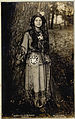 Portrait of Ah-Weh-Eyu of Seneca people

Article(s): none so far
Request: Remove watermarks on top and blue tinge around (I'll take care of further restoration). Brandmeistertalk 19:26, 13 May 2012 (UTC)
Graphist opinion(s):
![]() Done: Done as requested. PawełMM (talk) 23:04, 13 May 2012 (UTC)
Done: Done as requested. PawełMM (talk) 23:04, 13 May 2012 (UTC)
Resolved[edit]
Crowninshield's Wharf[edit]


-

-

-
 color adjusted edit


.jpg)
Article(s): George Ropes
Request: Can someone stitch these fragments into one, retaining its high resolution? One with the frame and another without the frame. KAVEBEAR (talk) 18:56, 28 May 2012 (UTC)
Graphist opinion(s): ![]() Request taken.--GianniG46 (talk) 22:04, 28 May 2012 (UTC)
Request taken.--GianniG46 (talk) 22:04, 28 May 2012 (UTC)
![]() Done - The derivative work loader doesn't work, so the file info has to be adjusted for both files. --GianniG46 (talk) 23:02, 28 May 2012 (UTC)
Done - The derivative work loader doesn't work, so the file info has to be adjusted for both files. --GianniG46 (talk) 23:02, 28 May 2012 (UTC)
Download full size image[edit]

Article(s): Java War (1741–1743)
Request: Please download the full sized image from the National Archives of the Netherlands. Posting here because I think this board's regulars are more knowledgeable in the area. Map is PD because it was published in 1741. — Crisco 1492 (talk) 00:06, 3 June 2012 (UTC)
- Please take note of article 4 on this page: http://www.gahetna.nl/en/terms-and-conditions, the conditions pertaining to the website that shows the requested image. Seems to me well covered for a hands-off approach. --VanBurenen (talk) 15:30, 3 June 2012 (UTC)
- The underlying image is PD; as a faithful scan of a two-dimensional PD work, under US law the work is also PD. (See Template:PD-Art for an example). The US does not recognise the doctrine of Sweat of the brow. — Crisco 1492 (talk) 15:34, 3 June 2012 (UTC)
Graphist opinion(s):
![]() Done - Grabbed file. I will leave it up to you to flesh out description, figure out who the author is and add a category or two. – JBarta (talk) 04:05, 4 June 2012 (UTC)
Done - Grabbed file. I will leave it up to you to flesh out description, figure out who the author is and add a category or two. – JBarta (talk) 04:05, 4 June 2012 (UTC)
- Thanks — Crisco 1492 (talk) 07:37, 4 June 2012 (UTC)
Duke of Caxias (translucid background)[edit]
-
 The Duke of Caxias' wife when a child
 -
 The Duke of Caxias on horseback
 -
 Ângela Fierriol Gonzalez


Article(s): Luís Alves de Lima e Silva, Duke of Caxias
Request: Hi, everyone. I need a .png copy of all three files with translucid background such as in this picture. Thank you very much, Lecen (talk) 00:43, 23 May 2012 (UTC)
Graphist opinion(s):
Did my own thing to the steamship image. Left as jpg and squared off corners, didn't rotate (didn't think it was needed), adjusted colors. Hopefully it suits you. – JBarta (talk) 02:18, 23 May 2012 (UTC)
- It looks great, JBarta. Thank you very much. Now I'll only have to wait for someone else to work on the other pictures. Again, thank you. Regards, --Lecen (talk) 01:31, 24 May 2012 (UTC)
Duke of Caxias (crooked pictures)[edit]
-
 Caxias, 1845
 -
 Caxias in a military parade
 -
 Caxias on horseback
 -
 Brazilian town of Sabará


Article(s): Luís Alves de Lima e Silva, Duke of Caxias
Request: All the pictures above have the same problem: they are crooked. Please straighten them all. Thank you, --Lecen (talk) 00:47, 23 May 2012 (UTC)
Graphist opinion(s): ![]() Done - I have straightened the first three images, by rotating them very, very slightly. The last doesn't look crooked: in particular, the belltowers appear perfectly vertical. I have been careful to avoid overcropping the result. Not all the original frames are rectangular: for example, the top line in the third image is not perfectly horizontal; I suggest further cropping, there. --GianniG46 (talk) 22:32, 31 May 2012 (UTC)
Done - I have straightened the first three images, by rotating them very, very slightly. The last doesn't look crooked: in particular, the belltowers appear perfectly vertical. I have been careful to avoid overcropping the result. Not all the original frames are rectangular: for example, the top line in the third image is not perfectly horizontal; I suggest further cropping, there. --GianniG46 (talk) 22:32, 31 May 2012 (UTC)
Observation Deck at the Owen Roberts International Airport[edit]

Article(s): Owen Roberts International Airport
Request: Remove watermark and decorative border 92.14.181.53 (talk) 11:04, 1 June 2012 (UTC)
Graphist opinion(s): ![]() Done --GianniG46 (talk) 15:25, 1 June 2012 (UTC)
Done --GianniG46 (talk) 15:25, 1 June 2012 (UTC)
ZHP[edit]


.png)
Article(s): ZHP
Request: fix perspective-artistic but not Wikilike... Kintetsubuffalo (talk) 06:04, 2 June 2012 (UTC)
Graphist opinion(s):
Extended content
|
|---|
|
The following discussion is closed. Please do not modify it. Subsequent comments should be made on the appropriate discussion page. No further edits should be made to this discussion. First... what is "artistic but not Wikilike"? Second, altering perspective doesn't work very well with 3D objects... only 2D... like paintings, etc. Personally I think it's a fine image just the way it is. – JBarta (talk) 07:01, 2 June 2012 (UTC)
Despite your objections this little dialogue actually made me want to take a squiz, and having looked I concur with JB; the only way I can see to 'fix' the perspective would be to create a 3D model of the object, use the photo to wrap the texture to the model, then manipulate the 3D model to view it squarely (assuming that is what you meant by 'fix'). That ain't gonna happen. This information I give freely in order to help you, as was the case with JB's 'drive-by' comment. Stop being so combative or you may find your requests really do get ignored. Regards, nagualdesign (talk) 00:26, 4 June 2012 (UTC) Calm down boys, you just need more firepower. Now, do you have a similar pin that is pictured from straight on, I could further adjust the perspective if I know what shape they are, as I've never seen one before so I don't know. Penyulap ☏ 11:53, 4 Jun 2012 (UTC)
Penyulap, you're talking a lot of big talk... and that's fine... but it would probably be a little more convincing if you backed it up with a little big action. Your effort is a reasonable start... but it is hardly impressive at this point. If manipulating the existing image is the route you wish to go, then then it needs to be improved. And you certainly don't need Kintetsubuffalo or anyone else to tell you that... you should already know it. If you think that altering perspective on a 3D object is indeed a simple task for someone like you, then just do it. It needs to be symmetrical and presentable. Bang out a great job the first time and I promise no one will argue with you and you'll get all the props you're looking for without having to squabble for it. – JBarta (talk) 02:31, 5 June 2012 (UTC)
Kintetsubuffalo, as you can see, altering perspective on a 3D object can be a little rough. Can it be done? Sure... anything can be done. You can build a barn out of toothpicks, but that doesn't mean someone will do it or that it's even a good idea in the first place. Penyulap's half-baked attempt above is one way to go about it... alter, mirror, cut, paste, etc, etc. The result, if done well, can look decent and may be what you had in mind, but it takes a lot of work and the results still probably won't be optimal... especially compared to a perfecly respectable original photograph or other methods. Another possiblity is to draw it from scratch. You might drop that request into the Illustration workshop. Someone might draw you the cross and it might look a hundred times better than a manipulated button. And lastly, if I offer an opinion and you don't like it, that's fine. You're welcome to think I'm a complete idiot. But don't think the solution is to tell me just to shut up, and definitely don't think that actions of other editors hinge on my utterances, they don't... as you can plainly see. Though you must admit, the results of this tortured excursion bore out the correctness of my original comment. And I'm still wondering... what is artistic but not Wikilike?? – JBarta (talk) 17:49, 5 June 2012 (UTC)
What do they say in American, 'tell someone who cares' ? no wait, it's "have a nice day", yes, you "have a nice day" and I'd like to warn you that your comments contain numerous personal attacks and are disruptive to the functioning of the page. This is not the place to continue your discussion. Penyulap ☏ 05:08, 6 Jun 2012 (UTC)
As it seems to be quickly going nowhere good, it's probably best that both parties drop this particular line of discussion right here. – JBarta (talk) 05:24, 6 June 2012 (UTC) The discussion above is closed. Please do not modify it. Subsequent comments should be made on the appropriate discussion page. No further edits should be made to this discussion.
|
Kintetsubuffalo, I'd like to know how you feel about the second image I have made. Penyulap ☏ 05:35, 6 Jun 2012 (UTC)
- Lolz, it was only when I collapsed it, that I could see that the matter was resolved to Kintetsubuffalo's satisfaction. Penyulap ☏ 05:38, 6 Jun 2012 (UTC)
Falkland House[edit]
-
 Falkland House

Article(s): Politics of the Falkland Islands
Request: Crop out the buildings on either side of Falkland House 92.14.181.53 (talk) 14:22, 2 June 2012 (UTC)
Graphist opinion(s):![]() Done Image cropped and perspective adjusted. Centpacrr (talk) 16:05, 2 June 2012 (UTC)
Done Image cropped and perspective adjusted. Centpacrr (talk) 16:05, 2 June 2012 (UTC)
New Pictures[edit]
-
 Remove watermark and sharpen color a little bit
 -
 Remove watermark and sharpen color a little bit.
 -
 Remove watermark and sharpen color a little bit.
 -
 Remove watermark and sharpen color a little bit.
 -
 Remove watermark and sharpen color a little bit.


Request: Remove watermark and sharpen color a little bit.--Lil'Monster Heart (talk) 22:11, 3 June 2012 (UTC)
Graphist opinion(s): ![]() Done --GianniG46 (talk) 12:32, 5 June 2012 (UTC)
Done --GianniG46 (talk) 12:32, 5 June 2012 (UTC)
king plate[edit]

Article(s): king plate
Request: reduce glare, remove excess odd space in border... Kintetsubuffalo (talk) 02:12, 5 June 2012 (UTC)
Graphist opinion(s): ![]() Done: Howzat? nagualdesign (talk) 04:18, 5 June 2012 (UTC)
Done: Howzat? nagualdesign (talk) 04:18, 5 June 2012 (UTC)
- Fantastic, thank you!--Kintetsubuffalo (talk) 05:19, 5 June 2012 (UTC)
- At the risk of committing the dreadful sin of a "drive-by comment", I think this image could be improved by evening out the lightness of the object. As it is, there are still remnants of reflection on the left and right. – JBarta (talk) 06:33, 5 June 2012 (UTC)
- I agree. Looks worse than it did last night, if you know what I mean. nagualdesign (talk) 14:41, 5 June 2012 (UTC)
- Tweeked it some more. Comparing my 2 versions it looks like there's a few patches where I've accidentally desaturated it, but viewed on its own it isn't too bad. T'll do. nagualdesign (talk) 20:05, 5 June 2012 (UTC)
- I agree. Looks worse than it did last night, if you know what I mean. nagualdesign (talk) 14:41, 5 June 2012 (UTC)
- At the risk of committing the dreadful sin of a "drive-by comment", I think this image could be improved by evening out the lightness of the object. As it is, there are still remnants of reflection on the left and right. – JBarta (talk) 06:33, 5 June 2012 (UTC)
- Listen, I have already explained myself-nothing negative in this comment, in fact you're right. Can you do it?--Kintetsubuffalo (talk) 13:36, 5 June 2012 (UTC)
Translucid background[edit]
-
 Emperor Pedro I in profile
 -

 Done
Done -
 Brazilian declaration of independence
 -
 Done
Done

.png)

.png)
Article(s): Pedro I of Brazil
Request: Picture to the left: I'd like to see a new .png version of this picture with translucid background, with everything else but the oval part removed, similar to this picture. Picture to the right: It's a little brooked, it must be straightened (rotated a little bit). Id like to have a newer .png version with translucid background similar to this picture. Lecen (talk) 15:31, 4 June 2012 (UTC)
- Thank you, JBarta! You did a great job as always. That was precisely what I was looking for. --Lecen (talk) 12:11, 5 June 2012 (UTC)
Graphist opinion(s): I noticed that the png thumbnail above (Independence or death sketch) looks pretty blurred, so I compared the before and after image file pages and that too looks blurred. It's only when you look at the 2 images full-size that you can see there is no blurring, just a pretty shoddy job of resizing the png done by the Wiki software, whereas it does a pretty good job at resizing jpegs. Maybe this should be brought up at the Village Pump? Just thinking out loud really. nagualdesign (talk) 00:05, 6 June 2012 (UTC)
- It's a fairly well known issue with PNG's on Wikimedia... thumbnails are blurred. Personally I prefer jpgs for all but simple drawn images, but there are many editors who are so enamored with transparent backgrounds that the blurriness becomes unimportant to them. In this instance I just made the images as requested and left off the commentary. – JBarta (talk) 00:18, 6 June 2012 (UTC)
- I see. Well they are good for infoboxes, which have an off-white background. But I'll certainly bear this issue in mind when I make uploads in future. I don't suppose there's any point going to the VP though. Regards, nagualdesign (talk) 01:53, 6 June 2012 (UTC)
- I think the tradeoff of a blurry image kills any benefit from a transparent background in an infobox or anywhere else. My opinion. – JBarta (talk) 02:08, 6 June 2012 (UTC)
- True. But if an image is intended for use in an infobox it can be scaled appropriately before uploading then used full-size, avoiding the resizing issue. Now that I'm aware of the limitation (and a limitation it most certainly is, I agree with that) I can work with it. nagualdesign (talk) 02:31, 6 June 2012 (UTC)
- Well, sizing the image to fit precisely in the infobox can be a bit of a house of cards... doesn't take much to break. The default image size changes from time to time. Editors change images sizes from time to time. Browsers may also change the effective image size under certain circumstances. Not to mention you also have low-res versions of images littered about. And all this nonsense is completely avoided by using jpgs for what they were intended for. – JBarta (talk) 02:50, 6 June 2012 (UTC)
- Well, I'll just do the best that I can do with the information at hand and hope that other editors do the same. I normally set infobox image widths, as I didn't think they had a default size as thumbnails do. If another editor comes along and changes it without considering the result, and without my knowledge, I probably won't loose any sleep. So long as I've done a good job I'm happy. Browser-based resizing isn't much of an issue. I've got mine set at 125% (hi-res screen) and it works way better than WP's resizing. And if a jpeg with an infobox-coloured background were used there would be similar issues if and when the default colour changed, right? Ultimately a software fix would sort this out. Give it time and keep your fingers crossed. Regards, nagualdesign (talk) 04:24, 6 June 2012 (UTC)
- Except for high quality color photos, could GIF's (which are limited to 256 colors, but support transparency) be the right format? --GianniG46 (talk) 08:40, 6 June 2012 (UTC)
- Well, yes and no. It would render better than a png (I think), but there are still issues. If a reader were to click on the gif thumbnail, where would they go? To a little gif? To a large, but 256 color gif? This is also the issue with creating separate small thumbnail images. Click on the thumbnail and all you get is the thumbnail instead of a full sized image. We forget that thumbnails (whether in infoboxes or elsewhere) are just that... thumbnails to a full sized image. When we focus too much on trying to make the thumbnail pretty, we may end up defeating half the purpose of this encyclopedia... large and wonderful images. Using gifs I think would be ultimately not useful. And the only argument for PNG's that seems valid is the one Nagualdesign mentions above... put up with the crappy rendering and hope that some day the Wikisoftware can render them better. For me however, the best route today for photos and paintings is still the good old JPG. – JBarta (talk) 09:20, 6 June 2012 (UTC)
- Except for high quality color photos, could GIF's (which are limited to 256 colors, but support transparency) be the right format? --GianniG46 (talk) 08:40, 6 June 2012 (UTC)
- Well, I'll just do the best that I can do with the information at hand and hope that other editors do the same. I normally set infobox image widths, as I didn't think they had a default size as thumbnails do. If another editor comes along and changes it without considering the result, and without my knowledge, I probably won't loose any sleep. So long as I've done a good job I'm happy. Browser-based resizing isn't much of an issue. I've got mine set at 125% (hi-res screen) and it works way better than WP's resizing. And if a jpeg with an infobox-coloured background were used there would be similar issues if and when the default colour changed, right? Ultimately a software fix would sort this out. Give it time and keep your fingers crossed. Regards, nagualdesign (talk) 04:24, 6 June 2012 (UTC)
- Well, sizing the image to fit precisely in the infobox can be a bit of a house of cards... doesn't take much to break. The default image size changes from time to time. Editors change images sizes from time to time. Browsers may also change the effective image size under certain circumstances. Not to mention you also have low-res versions of images littered about. And all this nonsense is completely avoided by using jpgs for what they were intended for. – JBarta (talk) 02:50, 6 June 2012 (UTC)
- True. But if an image is intended for use in an infobox it can be scaled appropriately before uploading then used full-size, avoiding the resizing issue. Now that I'm aware of the limitation (and a limitation it most certainly is, I agree with that) I can work with it. nagualdesign (talk) 02:31, 6 June 2012 (UTC)
- I think the tradeoff of a blurry image kills any benefit from a transparent background in an infobox or anywhere else. My opinion. – JBarta (talk) 02:08, 6 June 2012 (UTC)
- I see. Well they are good for infoboxes, which have an off-white background. But I'll certainly bear this issue in mind when I make uploads in future. I don't suppose there's any point going to the VP though. Regards, nagualdesign (talk) 01:53, 6 June 2012 (UTC)
Jill Stein speaking[edit]
Centpacrr (talk) 21:27, 9 June 2012 (UTC)
-
 Green Party presumptive presidential nominee Jill Stein speaks at an event in March

Article(s): United States presidential election, 2012 infobox
Request: Please remove the black object behind Stein on the left side of the photo. William S. Saturn (talk) 17:48, 9 June 2012 (UTC)
Graphist opinion(s):![]() Done Centpacrr (talk) 18:26, 9 June 2012 (UTC)
Done Centpacrr (talk) 18:26, 9 June 2012 (UTC)
- That was fast. Thank you very much.--William S. Saturn (talk) 18:53, 9 June 2012 (UTC)
Battle Creek Depot - remove regular noise[edit]
-
 Postcard with regular noise

Article(s): Michigan Central Railroad Depot (Battle Creek, Michigan)
Request: Remove regular noise with FFT, please. I'm pretty satisfied with the colors at this point, but the regular noise is nasty. There are horizontal lines in all three colors, plus hex noise in the blue component. Pi.1415926535 (talk) 06:25, 9 June 2012 (UTC)
Graphist opinion:
![]() Done: Done as requested. PawełMM (talk) 15:23, 10 June 2012 (UTC)
Done: Done as requested. PawełMM (talk) 15:23, 10 June 2012 (UTC)
- Beautiful work. Thanks! Pi.1415926535 (talk) 02:01, 11 June 2012 (UTC)
William Gowland[edit]

Article(s): William Gowland
Request: any way to reduce the pixellation?... Kintetsubuffalo (talk) 18:15, 9 June 2012 (UTC)
Graphist opinion(s):
- At least some of it is regular noise. I'll make an attempt but some of the others here will likely be able to give you a better result. Pi.1415926535 (talk) 19:20, 9 June 2012 (UTC)
- Made an attempt. Further improvements are welcome! Pi.1415926535 (talk) 19:24, 9 June 2012 (UTC)
- I think based on the source material, that's pretty good!--Kintetsubuffalo (talk) 15
- 55, 10 June 2012 (UTC)
Tongan seniti[edit]

Article(s): Tongan seniti
Request: remove funky background since rotation... Kintetsubuffalo (talk) 16:01, 10 June 2012 (UTC)
Graphist opinion(s):![]() Done Centpacrr (talk) 18:16, 10 June 2012 (UTC)
Done Centpacrr (talk) 18:16, 10 June 2012 (UTC)
- Fantastic, thank you!--Kintetsubuffalo (talk) 18:37, 10 June 2012 (UTC)
Pomare II[edit]

Article(s): Pōmare II
Request: Please look at the past five different versions in revision history, linked above, and choose the best one to clean up. Don't crop until after cleaning, crop as a seperate upload. KAVEBEAR (talk) 00:59, 3 June 2012 (UTC)
Graphist opinion(s): ![]() Done - Cleaned third file - cropped in File:Pomare II, engraving by R. Hicks cropd.jpg. Tell if you want color adjustments. --GianniG46 (talk) 16:17, 11 June 2012 (UTC)
Done - Cleaned third file - cropped in File:Pomare II, engraving by R. Hicks cropd.jpg. Tell if you want color adjustments. --GianniG46 (talk) 16:17, 11 June 2012 (UTC)
- Can you change the color and crop the original? There is no need for a second file. You can place a duplicate template on it and delete it--KAVEBEAR (talk) 17:28, 11 June 2012 (UTC)
Daniel Florencio O'Leary[edit]
Article(s): Daniel Florencio O'Leary
Request: crop background so even all around... Kintetsubuffalo (talk) 23:25, 12 June 2012 (UTC)
Graphist opinion(s):
![]() Done – JBarta (talk) 03:39, 13 June 2012 (UTC)
Done – JBarta (talk) 03:39, 13 June 2012 (UTC)
- Thanks!--Kintetsubuffalo (talk) 17:05, 14 June 2012 (UTC)
Oerip Soemohardjo[edit]
-
 Newspaper image of Oerip Soemohardjo

Article(s): Oerip Soemohardjo
Request: Remove giant crease. — Crisco 1492 (talk) 05:46, 13 June 2012 (UTC)
Graphist opinion(s): ![]() Done - Of course, there is some arbitrariness in the eyebrows. Further, I suggest regular noise to be removed by FFT techniques (I don't have FFT in my software). --GianniG46 (talk) 07:17, 13 June 2012 (UTC)
Done - Of course, there is some arbitrariness in the eyebrows. Further, I suggest regular noise to be removed by FFT techniques (I don't have FFT in my software). --GianniG46 (talk) 07:17, 13 June 2012 (UTC)
- Don't think I have it either. Thanks. I'll leave this up in case anyone wants to tackle the FFT. — Crisco 1492 (talk) 07:20, 13 June 2012 (UTC)
- I retouched the eyebrows - hope that now they are more similar to the original. --GianniG46 (talk) 09:25, 13 June 2012 (UTC)
- Yep, looks good. — Crisco 1492 (talk) 09:46, 13 June 2012 (UTC)
- Cleaned and desaturated. PawełMM (talk) 13:56, 13 June 2012 (UTC)
- Looks great! Thanks — Crisco 1492 (talk) 22:54, 13 June 2012 (UTC)
- I retouched the eyebrows - hope that now they are more similar to the original. --GianniG46 (talk) 09:25, 13 June 2012 (UTC)
John Pascoe Grenfell[edit]
-
 Signature of John Pascoe Grenfell
 -
 png file
Article(s): John Pascoe Grenfell
Request: Hi, I' like to have a newer .png file with translucid background, please. Lecen (talk) 13:05, 15 June 2012 (UTC)
Graphist opinion(s): ![]() Request taken by PawełMM (talk) 16:13, 15 June 2012 (UTC).
Request taken by PawełMM (talk) 16:13, 15 June 2012 (UTC).
![]() Done: Done as requested. PawełMM (talk) 16:40, 15 June 2012 (UTC)
Done: Done as requested. PawełMM (talk) 16:40, 15 June 2012 (UTC)
Arsaos[edit]

Article(s): Arsaos
Request: remove background... Kintetsubuffalo (talk) 10:01, 12 June 2012 (UTC)
Graphist opinion(s): ![]() Done: Done as requested. PawełMM (talk) 11:02, 13 June 2012 (UTC)
Done: Done as requested. PawełMM (talk) 11:02, 13 June 2012 (UTC)
- I've refreshed my browser, sometimes still showing the old background. Glitch?--Kintetsubuffalo (talk) 15:51, 15 June 2012 (UTC)
- Those "ears" are pins holding the coin, do we really need the pins?--Kintetsubuffalo (talk) 23:28, 16 June 2012 (UTC)
- Fantastic! Thank you also for bringing them closer together!--Kintetsubuffalo (talk) 08:30, 17 June 2012 (UTC)
Scout Association of the Isle of Man[edit]

Article(s): Scout Association of the Isle of Man
Request: rotate so the three dots are at the bottom... Kintetsubuffalo (talk) 13:27, 16 June 2012 (UTC)
Graphist opinion(s):![]() Done Centpacrr (talk) 15:02, 16 June 2012 (UTC)
Done Centpacrr (talk) 15:02, 16 June 2012 (UTC)
- Thank you, but for some reason it has changed the color and made the border pixellated.--Kintetsubuffalo (talk) 23:31, 16 June 2012 (UTC)
- Thank you! You got it!--Kintetsubuffalo (talk) 08:32, 17 June 2012 (UTC)
Remove background[edit]
-
 Doug Sisson 2012

Article(s): Doug Sisson
Request: Please remove the woman with the flower-covered shirt in the background, or if it would be easier, replace the entire background with a different image. Delaywaves • talk 03:33, 21 June 2012 (UTC)
Graphist opinion(s):
![]() Done – JBarta (talk) 04:59, 21 June 2012 (UTC)
Done – JBarta (talk) 04:59, 21 June 2012 (UTC)
Kuhio Funeral[edit]


Article(s): Abigail Kapiolani Kawānanakoa, John C. Lane
Request: Please crop this higher resolution of these two figures and upload over the existing two images... KAVEBEAR (talk) 18:49, 21 June 2012 (UTC)
Graphist opinion(s):
![]() Done – JBarta (talk) 19:10, 21 June 2012 (UTC)
Done – JBarta (talk) 19:10, 21 June 2012 (UTC)
Catholic Persecution in Hawaii[edit]


Article(s): Roman Catholic Diocese of Honolulu
Request: Crop (with or without text, whichever looks better) and clean up the paper around it (retain yellow color if possible rather than having it black and white). Can the cleaning be done seperately first and the cropping second? KAVEBEAR (talk) 06:28, 23 June 2012 (UTC)
Graphist opinion(s): ![]() Done sequentially cleaning and cropping on the same files. --GianniG46 (talk) 07:53, 23 June 2012 (UTC)
Done sequentially cleaning and cropping on the same files. --GianniG46 (talk) 07:53, 23 June 2012 (UTC)
L'Artemise[edit]

![[1]](https://upload.wikimedia.org/wikipedia/commons/9/9c/Pomare_II%2C_engraving_by_R._Hicks.jpg)
![[2]](https://upload.wikimedia.org/wikipedia/commons/archive/9/9c/20120601062854%21Pomare_II%2C_engraving_by_R._Hicks.jpg)
![[3]](https://upload.wikimedia.org/wikipedia/commons/archive/9/9c/20120601062833%21Pomare_II%2C_engraving_by_R._Hicks.jpg)
![[4]](https://upload.wikimedia.org/wikipedia/commons/archive/9/9c/20120601062621%21Pomare_II%2C_engraving_by_R._Hicks.jpg)
![[5]](https://upload.wikimedia.org/wikipedia/commons/archive/9/9c/20120601062349%21Pomare_II%2C_engraving_by_R._Hicks.jpg)
Article(s): Laplace Affair
Request: Crop away white space first, then lossless crop to the edge of image... KAVEBEAR (talk) 08:16, 23 June 2012 (UTC)
Graphist opinion(s):
![]() Done: Cropped and also cleaned up a bit. Regards, Fallschirmjäger ✉ 23:03, 23 June 2012 (UTC)
Done: Cropped and also cleaned up a bit. Regards, Fallschirmjäger ✉ 23:03, 23 June 2012 (UTC)