
Wikipedia:Graphics Lab/Photography workshop/Archive/Feb 2013
Stale[edit]
Video frame of a poster[edit]
-
 The frame

Article(s): United Armenia
Request: So I took a screenshot of a frame from this video. The poster which is the main object needed shows up in the video from 0:52. Is there any way to take a better screenshot of the frame? Or can the existing file be improved somehow? Երևանցի talk 06:34, 21 January 2013 (UTC)
Graphist opinion(s):
I think what you got is about as good as it's going to get. – JBarta (talk) 14:08, 21 January 2013 (UTC)
Bride Wore Black[edit]


Article(s): The Bride Wore Black (novel)
Request: remove bordering... Kintetsubuffalo (talk) 09:31, 28 January 2013 (UTC)
Graphist opinion(s):
Personally I think it's fine just the way it is. The edges of the (old ratty) cover is not an issue that needs to be "fixed". – JBarta (talk) 09:58, 28 January 2013 (UTC)
- Anyone else, so this doesn't get ignored?--Kintetsubuffalo (talk) 11:16, 28 January 2013 (UTC)
- I agree with JBarta. Modifying the picture would make it no longer a true representation of the book cover. - André Kritzinger 12:35, 28 January 2013 (UTC)
Centpacrr went ahead and edited the image as requested, uploaded a new version and changed the image in the article to his version. I'm not going to revert, though I still believe the unaltered image is the superior and more realistic one. If others agree, we'll change it back. If not, then so be it. – JBarta (talk) 04:01, 29 January 2013 (UTC)
- The purpose of the subject image is to depict what the original first edition cover illustration looked like when this book was published in 1940, not what a single subsequently damaged, worn, stained, and foxed copy looks like over seventy years later. This is no different than restoring a stained, torn, foxed, faded, creased, scratched, and/or otherwise damaged period photograph to reflect what the photographer intended as has been requested and done with thousands of images such as "Golden Gate San Francisco c1895 Digital Restoration.jpg" in this workshop over the years. To pretend anything otherwise it hypocritical. Centpacrr (talk) 23:28, 29 January 2013 (UTC)
- I'll just respond by saying not all "restorations" are necessary and not all are an improvement. Not every image that floats by needs to be twiddled with. My opinion. – JBarta (talk) 00:13, 30 January 2013 (UTC)
- For once I tend to agree with Centpacrr. Aside from his legendary overuse of unsharp masking and increasing the contrast to the point where some of the dirt/damage is now more noticeable, particularly in the centre, the edited image looks.. okay. I would point out that there are several areas which have been airbrushed with a black which is much darker than the surrounding tone, especially around the title, and that the 'repair' done to the lower left looks a bit dodgy, but it does show the book cover (which is the whole point) and not a singular, worn copy of the book. My opinion. nagualdesign (talk) 01:20, 30 January 2013 (UTC)
- The original is a small, highly compressed, low resolution image file (360 × 521 px, 25 KB) so there was not that much to work with and thus everything is a compromise. Centpacrr (talk) 01:53, 30 January 2013 (UTC)
- True, but if you'd used the eyedropper to select a colour/tone (of about ~20% luminosity) rather than pure black the airbrushing would have worked much better. Under the word BLACK in the title you've left a little blob of pure black with quite a hard brush. Even when working with poor quality source images it's best to aim for perfection, rather than claiming that it's a case of garbage in, garbage out. The whole idea of restoration is to try to achieve garbage in, quality out, right? nagualdesign (talk) 18:32, 30 January 2013 (UTC)
- The original is a small, highly compressed, low resolution image file (360 × 521 px, 25 KB) so there was not that much to work with and thus everything is a compromise. Centpacrr (talk) 01:53, 30 January 2013 (UTC)
- For once I tend to agree with Centpacrr. Aside from his legendary overuse of unsharp masking and increasing the contrast to the point where some of the dirt/damage is now more noticeable, particularly in the centre, the edited image looks.. okay. I would point out that there are several areas which have been airbrushed with a black which is much darker than the surrounding tone, especially around the title, and that the 'repair' done to the lower left looks a bit dodgy, but it does show the book cover (which is the whole point) and not a singular, worn copy of the book. My opinion. nagualdesign (talk) 01:20, 30 January 2013 (UTC)
- I'll just respond by saying not all "restorations" are necessary and not all are an improvement. Not every image that floats by needs to be twiddled with. My opinion. – JBarta (talk) 00:13, 30 January 2013 (UTC)
Well then, if the urge here is for a "restoration", then might as well do a decent job of it. Here are some links Centpacrr... [1], [2],[3]. Actually, with a little cleanup that first link would probably be a better bet than the one we have. – JBarta (talk) 19:44, 30 January 2013 (UTC)
- Judging by all the strikeouts it seems Centpacrr bailed again. I took the liberty of taking my own suggestion and cleaned up the #1 link above and uploaded it to the original image. I hope it pleases those who wish it border free and "restored". ;-) – JBarta (talk) 23:04, 30 January 2013 (UTC)
- Much better IMO. Nice work JB. It's a pity that Centpacrr has such a low tolerance for even constructive criticism. For the record, I meant no offense. Hopefully I will be getting Photoshop back tomorrow so I can continue to walk the walk, rather than having my armchair punditry fall on deaf ears. Regards, nagualdesign (talk) 03:13, 31 January 2013 (UTC)
- Nagualdesign, I do not mind constructive criticism as long as it is offered respectfully and without speculating about other contributors' motives and mental state, failing to assume good faith, and/or attempting to intimidate myself and other contributors. Centpacrr (talk) 04:17, 31 January 2013 (UTC)
- I was actually referring to my own comment/critique above (18:32, 30 January 2013), not JBarta's. As for the comments you link to, he has a point, don't you think? And the 'attempt to intimidate', as you put it, was quite a witty retort to your 'wall of anonymity' comment, I thought. Try not to take things too seriously Centpacrr, and maybe take other user's critiques as a worthy challenge to help you hone your skills, then perhaps you'll get more satisfaction out of being a Wikipedian. We're all in this together, right? Kind regards, nagualdesign (talk) 04:35, 31 January 2013 (UTC)
- Actually, Nagualdesign, no I don't really find being disrespectful or demeaning (not you) in dealing with other volunteer contributors ever to be acceptable behavior on WP, nor do I find an apparently specious claim of being a "mob assassin" to be a "witty retort" to a seriously posed question. And, for that matter, I don't find anonymity to be a strength of WP but instead an inherent weakness as no other encyclopedia or reliable reference work is written and/or compiled anonymously but instead requires and depends on its authors to identify themselves as a necessary element of reliability and accountability. (I've had seven books published and written thousands of articles and have never considered not putting my name on any of them.) Also hiding behind such anonymity (again not you) tends to lead to the kind of incivility that is rife on WP that its contributors would be far less likely to engage in if they were in "face-to-face" discourse instead of hiding Polonius-like behind the arras. (I think of this as the same kind of bad behavior you see between drivers on the road that the same people would never think of doing outside the protection of their vehicular cocoons.)
- I'm quite sure that I am a good bit older than you and most of the other contributors in WP are and thus was raised in a culture long before that of unconstrained "on-line" anonymity was in behavioral vogue. You (and others) are, of course, free to disagree but that's "my opinion" nonetheless and so you can expect me to act accordingly. As I said, I am perfectly willing to accept constructive criticism as long as it is offered respectfully, without speculation as to my motives and/or "mental state", and made in the assumption of good faith. After all "We're all in this together, right?" Centpacrr (talk) 07:52, 31 January 2013 (UTC) (Above intentionally posted "out of chronological sequence" as it is a reply specifically to the comment immediately preceding it and not to any of those below.)
- Anyhow... Centpacrr, earlier you changed the article to use your version of the book cover. When it appeared you had left the discussion and changed the article back I uploaded a cleaned up version over the original. Then you jumped back into the game with another new version of your own based on the links I offered you. That's fine, but I see you changed the article back to your version again. We now have two competing images for the article... yours and mine. Personally I think my version is the superior one. If you agree, will you change the article back to use my version? – JBarta (talk) 04:46, 31 January 2013 (UTC)
- Centpacrr's version is indeed inferior, given that the strap line text is illegible and the rationale previously put forward by Centpacrr above (23:28, 29 January 2013) still holds, therefore I have reverted the article to use the cleanest, highest resolution version. I'd also recommend that the derivitive work be deleted as it serves no purpose. Sorry Centpacrr. nagualdesign (talk) 05:07, 31 January 2013 (UTC)
- I'd also challenge Stefan2's non-free reduce request, as the resolution of even the larger image is still way below print quality, comparable in size to many WP images of CD album covers for example, and the image ought to be large enough to be a good representation of the original book cover. ie, you should be able to read the text, otherwise what is the point? nagualdesign (talk) 05:15, 31 January 2013 (UTC)
- See here for nonfree image size guidelines. The existing cover exceeds the guideline somewhat, but not by much. I think it's fine the way it is. – JBarta (talk) 05:35, 31 January 2013 (UTC)
- I was actually referring to my own comment/critique above (18:32, 30 January 2013), not JBarta's. As for the comments you link to, he has a point, don't you think? And the 'attempt to intimidate', as you put it, was quite a witty retort to your 'wall of anonymity' comment, I thought. Try not to take things too seriously Centpacrr, and maybe take other user's critiques as a worthy challenge to help you hone your skills, then perhaps you'll get more satisfaction out of being a Wikipedian. We're all in this together, right? Kind regards, nagualdesign (talk) 04:35, 31 January 2013 (UTC)
- Nagualdesign, I do not mind constructive criticism as long as it is offered respectfully and without speculating about other contributors' motives and mental state, failing to assume good faith, and/or attempting to intimidate myself and other contributors. Centpacrr (talk) 04:17, 31 January 2013 (UTC)
- Much better IMO. Nice work JB. It's a pity that Centpacrr has such a low tolerance for even constructive criticism. For the record, I meant no offense. Hopefully I will be getting Photoshop back tomorrow so I can continue to walk the walk, rather than having my armchair punditry fall on deaf ears. Regards, nagualdesign (talk) 03:13, 31 January 2013 (UTC)
Bundy clock in the Sun[edit]
Article(s): Time clock, Walsall Arboretum, Birmingham City Transport
Request: can someone "burn in" the clockface, please? Andy Mabbett (Pigsonthewing); Talk to Andy; Andy's edits 17:51, 21 January 2013 (UTC)
Graphist opinion(s):Clock face digitally replaced with that from another image of a BCT clock (there is not enough information in the original image to "burn in") and the new file uploaded to Commons however because of a fault in the wikimedia software there is often a delay as to when the full size new image appears in its host file although you can see by its thumbnail in the file history section that it is there. In the meantime you can see a copy of the repaired image which I have also uploaded to my own server here. Centpacrr (talk) 18:28, 21 January 2013 (UTC)
- Thank you, but the shadows of the hands on the new face don#t match those of the clock and surroundings. Andy Mabbett (Pigsonthewing); Talk to Andy; Andy's edits 18:42, 21 January 2013 (UTC)
- Centpacrr, the clock face you pasted on to the image is inaccurate. You should already know that such creative editing is highly unencyclopedic. Also, there really is no need to litter these pages with links to your personal website. The images are on Commons even if they don't update immediately. – JBarta (talk) 19:39, 21 January 2013 (UTC)
- This clock face was taken from another BCT clock. There is absolutely no useful digital information in the clock face in the original image to "burn in" so if the requester wants to show what the clock looks like with a face (as opposed to just a blank white space) then it is either use the composite with the face from another BCT clock or find another image altogether. I'll leave that up to the requester. Centpacrr (talk) 20:49, 21 January 2013 (UTC)
- A simple search would have given you the same clock with the face visible. I take issue with you so easily manufacturing an image under the guise of "cleaning up" or "restoring" them and no mention of the actual type of edit you did in the edit summary. People will think that's the actual image when it's not. You did that here as well. That sort of thing might be fine for your website, but (generally) not here. If you are going to do that sort of thing, at least get it right. And put an honest description in the edit summary (and image summary if necessary) so people viewing the image know what they're looking at. – JBarta (talk) 21:42, 21 January 2013 (UTC)
- It seems to me that the clock without a face is a relatively useless and uninformative illustration of the subject, but I will leave that up to others to decide. As for the other image, I simply made it legible and nothing else. Centpacrr (talk) 01:03, 22 January 2013 (UTC)
- That's not the point. The point is that you pasted a face from another clock onto this one, and not only did you get it wrong, but your edit summary didn't reflect what you did. As far as the other, what you did was double it in size and paste in new text over the old. That's not entirely "making it legible" and it certainly isn't "Additional clean up". Anyhow, as far as the clock, if you were to do it over using the correct clock face and note in the edit/image summary that you in fact pasted in another clock face, then that would be acceptable. – JBarta (talk) 03:43, 22 January 2013 (UTC)
- As the original photographer, and uploader, respectively, in those two cases, I'd like both edits to be undone, please, for the reasons JBarta states (the intermediate Radio Times edit looks OK). Centpacrr is entitled, of course, to upload his versions as derivative works. Andy Mabbett (Pigsonthewing); Talk to Andy; Andy's edits 23:08, 23 January 2013 (UTC)
- (I should really write this comment above, but here we are..) Not only is the text on the Radio Times badly implemented, in terms of its aspect ratio and other factors, but the text at the top is clearly wrong. Although it's difficult to make out the words on the original image, the length of the words suggests that it does not say Radio Times.. as the first word is too short to be Radio. And on the right it almost certainly shouldn't say 2p, given that in 1936 pence was shortened to d. The Radio Times did cost 2d in 1936 but that wasn't printed on every page. I suspect it should be the page number in the top right. All this is academic of course. As JBarta says, it's not good practice to simply take liberties with these things, given that this supposed to be is an encyclopedia. Otherwise why not simply start with a nice, blank, pink rectangle and insert whatever typography you wish over the top, then claim that the onus is on the requester to decide if that is acceptable?! The answer to that should be obvious by now, Centpacrr. ..BTW, happy New Year everybody! nagualdesign (talk) 23:47, 23 January 2013 (UTC)
- Assuming that this static clock is still existing, it might be nice to just retake the picture, using a tripod and avoiding flash. I agree with JBarta and was looking for current guidelines and policies that support this opinion. Here's what I found on editing images and uploading an edited version: "Extensive manipulations must be clearly described in the image text, for example by means of the Retouched picture template." per Commons:Image guidelines. Information about overwriting exsisting files can be found at Commons:Overwriting existing files - in a nutshell: you should have uploaded a different version, rather than overwriting the original and inform people about your changes. Regards, Peter Weis (talk) 09:20, 24 January 2013 (UTC)
- (I should really write this comment above, but here we are..) Not only is the text on the Radio Times badly implemented, in terms of its aspect ratio and other factors, but the text at the top is clearly wrong. Although it's difficult to make out the words on the original image, the length of the words suggests that it does not say Radio Times.. as the first word is too short to be Radio. And on the right it almost certainly shouldn't say 2p, given that in 1936 pence was shortened to d. The Radio Times did cost 2d in 1936 but that wasn't printed on every page. I suspect it should be the page number in the top right. All this is academic of course. As JBarta says, it's not good practice to simply take liberties with these things, given that this supposed to be is an encyclopedia. Otherwise why not simply start with a nice, blank, pink rectangle and insert whatever typography you wish over the top, then claim that the onus is on the requester to decide if that is acceptable?! The answer to that should be obvious by now, Centpacrr. ..BTW, happy New Year everybody! nagualdesign (talk) 23:47, 23 January 2013 (UTC)
- As the original photographer, and uploader, respectively, in those two cases, I'd like both edits to be undone, please, for the reasons JBarta states (the intermediate Radio Times edit looks OK). Centpacrr is entitled, of course, to upload his versions as derivative works. Andy Mabbett (Pigsonthewing); Talk to Andy; Andy's edits 23:08, 23 January 2013 (UTC)
- That's not the point. The point is that you pasted a face from another clock onto this one, and not only did you get it wrong, but your edit summary didn't reflect what you did. As far as the other, what you did was double it in size and paste in new text over the old. That's not entirely "making it legible" and it certainly isn't "Additional clean up". Anyhow, as far as the clock, if you were to do it over using the correct clock face and note in the edit/image summary that you in fact pasted in another clock face, then that would be acceptable. – JBarta (talk) 03:43, 22 January 2013 (UTC)
- It seems to me that the clock without a face is a relatively useless and uninformative illustration of the subject, but I will leave that up to others to decide. As for the other image, I simply made it legible and nothing else. Centpacrr (talk) 01:03, 22 January 2013 (UTC)
- A simple search would have given you the same clock with the face visible. I take issue with you so easily manufacturing an image under the guise of "cleaning up" or "restoring" them and no mention of the actual type of edit you did in the edit summary. People will think that's the actual image when it's not. You did that here as well. That sort of thing might be fine for your website, but (generally) not here. If you are going to do that sort of thing, at least get it right. And put an honest description in the edit summary (and image summary if necessary) so people viewing the image know what they're looking at. – JBarta (talk) 21:42, 21 January 2013 (UTC)
- This clock face was taken from another BCT clock. There is absolutely no useful digital information in the clock face in the original image to "burn in" so if the requester wants to show what the clock looks like with a face (as opposed to just a blank white space) then it is either use the composite with the face from another BCT clock or find another image altogether. I'll leave that up to the requester. Centpacrr (talk) 20:49, 21 January 2013 (UTC)
Being Eileen[edit]

Article(s): Being Eileen
Request: Can you make it so it has a translucid background, and overide the original image? Plus any other minimal fixes. Thanks! :) — M.Mario (T/C) 19:40, 5 February 2013 (UTC)
Graphist opinion(s): Not really. If you remove the blue background you're left with white text. And white text on a default white background doesn't really work. nagualdesign (talk) 00:30, 20 February 2013 (UTC)
Resolved[edit]
Some image cleanup[edit]
-
 It's an image of Peter the Great and Franz Timmerman discovering the botik

Article(s): Botik of Peter the Great
Request: It would be great if someone could restore this. It's pretty faded and a lot of what is going on in the background is hard to see. There's an etching here with more detail (that I need to get around to adding), but it's not nearly as good of a picture. Ryan Vesey 13:23, 23 January 2013 (UTC)
Graphist opinion(s):![]() Done Centpacrr (talk) 22:40, 23 January 2013 (UTC)
Done Centpacrr (talk) 22:40, 23 January 2013 (UTC)
Tribe of Mic-O-Say[edit]

Article(s): Tribe of Mic-O-Say
Request: remove distracting background, perhaps pngify... Kintetsubuffalo (talk) 08:46, 26 January 2013 (UTC)
Graphist opinion(s):
![]() Done by Centpacrr, Fallschirmjäger ✉ 19:08, 26 January 2013 (UTC)
Done by Centpacrr, Fallschirmjäger ✉ 19:08, 26 January 2013 (UTC)
- The left side is great, the right side beads are cropped almost in half.--Kintetsubuffalo (talk) 12:07, 27 January 2013 (UTC)
- Thank you!--Kintetsubuffalo (talk) 11:22, 31 January 2013 (UTC)
South African Class 18E Series 1[edit]
-
 Class 18E Ser 1 18-065
 -
 Class 18E Ser 1 18-123
 -
 Class 18E Ser 1 18-197


Article(s): South African Class 18E, Series 1
Request: Please remove the inscriptions. André Kritzinger 18:28, 27 January 2013 (UTC)
Graphist opinion(s):
![]() Done – JBarta (talk) 17:55, 31 January 2013 (UTC)
Done – JBarta (talk) 17:55, 31 January 2013 (UTC)
- Perfect, thank you. I believe those were the last of my watermarked pictures... - André Kritzinger 20:23, 31 January 2013 (UTC)
Order of the White Falcon[edit]
Article(s): Order of the White Falcon
Request: straighten... Kintetsubuffalo (talk) 11:17, 31 January 2013 (UTC)
Graphist opinion(s):![]() Done Centpacrr (talk) 11:57, 31 January 2013 (UTC)
Done Centpacrr (talk) 11:57, 31 January 2013 (UTC)
- Great, thank you!--Kintetsubuffalo (talk) 14:20, 31 January 2013 (UTC)
Heart and Soul[edit]
-
 Scan of the record

Article(s): Heart and Soul (1961 song)
Request: Get rid of that "21" label taped onto the record, clean up, make the text/font/images sharper, rotate to be horizontal, etc. Feel free to do what ever you decide, even replacing the image with a better one. -- Uzma Gamal (talk) 20:28, 2 February 2013 (UTC)
Graphist opinion(s):
![]() Done - Removed the tape and did some minor cleanup. Seemed pretty straight to me. Also, that doesn't need to be a non-free image. It's not cover art... it is simply letters... nothing creative to be copyrighted. It should be public domain. Can upload to Commons. – JBarta (talk) 20:42, 2 February 2013 (UTC)
Done - Removed the tape and did some minor cleanup. Seemed pretty straight to me. Also, that doesn't need to be a non-free image. It's not cover art... it is simply letters... nothing creative to be copyrighted. It should be public domain. Can upload to Commons. – JBarta (talk) 20:42, 2 February 2013 (UTC)
- Thanks! Looks like new. I'll see if Commons wants it. -- Uzma Gamal (talk) 22:41, 2 February 2013 (UTC)
John Collins Covell[edit]
-
 Image of John Collins Covell taken prior to 1887

Article(s): John Collins Covell
Request: This image was captured from a scanned book entitled, A History and Record of the Protestant Episcopal Church in the Diocese of West Virginia, and Before the Formation of the Diocese in 1878, in the Territory Now Known as the State of West Virginia. Would it be possible to remove the scanning lines from this portrait of Covell? -- Caponer (talk) 22:43, 2 February 2013 (UTC)
Graphist opinion(s):
![]() Done - Not perfect, but definitely better. – JBarta (talk) 23:53, 2 February 2013 (UTC)
Done - Not perfect, but definitely better. – JBarta (talk) 23:53, 2 February 2013 (UTC)
Geographic tongue.JPG[edit]

.jpg)
Image ideally would be cropped so only area of interest (i.e. the tongue) is shown. Thank you, Lesion (talk) 22:42, 3 February 2013 (UTC)
![]() Done – JBarta (talk) 23:52, 3 February 2013 (UTC)
Done – JBarta (talk) 23:52, 3 February 2013 (UTC)
- Great, thanks! I will upload the cropped image as anew version of the original file. Lesion (talk) 00:02, 4 February 2013 (UTC)
Translation of image annotations into English[edit]
-
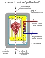 Schematic depiction of pebble bed reactor.
 -
 English translation by CRYptex
_svg.svg)
.svg)
Article(s): Pebble bed reactor
Request: Please change the annotations in the image into English. Unfortunately, I don't speak Italian, so I cannot help with translation. -- Toshio Yamaguchi 16:05, 4 February 2013 (UTC)
Graphist opinion(s):
![]() Done
File:Pebble_bed_reactor_scheme_(English).svg --CRYptex talk 20:36, 4 February 2013 (UTC)
Done
File:Pebble_bed_reactor_scheme_(English).svg --CRYptex talk 20:36, 4 February 2013 (UTC)
First we need proper translations:
- schema di reattore "pebble bed" = pebble bed reactor schematic
- nuove sfere di combustibile = new fuel pellets
- gas di raffreddamento = cooling gas
- fluido caldo alla turbina = hotfluid to the turbine
- fluido freddo dalla turbina = gold fluid from the turbine
- circolatore = pump
- sfere di combustibile esaurito = spent fuel pellets
- cemento armato = reinforced concrete
I sent requests to a few translators. Hopefully one will come by and help us out. – JBarta (talk) 19:00, 4 February 2013 (UTC)
- I replaced the image in the article with the new version. Thanks to all involved, very much appreciated (and I am sure our English speaking readers agree). -- Toshio Yamaguchi 21:12, 4 February 2013 (UTC)
- I see that someone's proposing alternative translations. I'm no expert in this field, so I checked on the English Wikipedia article, and I found "fuel spheres". I'm not sure why you're proposing "gold fluid" in lieu of "cold fluid" (freddo is literally "cold", but I could be misunderstanding some technical thing). CRYptex talk 21:38, 4 February 2013 (UTC)
14 Hours[edit]
Article(s): 14 Hours (2005 film)
Request: Can you please remove the watermark from the bottom right of the image? I considered cropping it but felt that the text at the bottom should stay to preserve the image as a poster iComputerSaysNo 00:14, 7 February 2013 (UTC)
Graphist opinion(s):
![]() Done – JBarta (talk) 01:04, 7 February 2013 (UTC)
Done – JBarta (talk) 01:04, 7 February 2013 (UTC)
Median rhomboid glossitis- request crop[edit]

.jpg)
Article(s): Median rhomboid glossitis
Request: Please could this image be cropped to show only the area of interest (i.e. the tongue). Also, I note a shadow is cast over the mouth, once the crop is done, maybe this could be improved by making it lighter? Thank you. Lesion (talk) 11:13, 7 February 2013 (UTC)
Graphist opinion(s):
![]() Done Made the shadow area a little lighter though a shadow is still noticetable. Didn't want to overdo it. Looks ok to me. – JBarta (talk) 14:45, 7 February 2013 (UTC)
Done Made the shadow area a little lighter though a shadow is still noticetable. Didn't want to overdo it. Looks ok to me. – JBarta (talk) 14:45, 7 February 2013 (UTC)
More requests for image cropping[edit]
-
 Description of image
 -
 2nd image (If there is one)


Article(s): Ranula
Request: Requesting crop to focus on area of interest (the mouth)...first only needs a minor crop probably (Sorry, but I only have paint and aparently it won't let you zoom out far enough to crop images like this)... Lesion (talk) 13:58, 8 February 2013 (UTC)
Graphist opinion(s):
![]() Done – JBarta (talk) 14:44, 8 February 2013 (UTC)
Done – JBarta (talk) 14:44, 8 February 2013 (UTC)
-
 Henry Bell Gilkeson
 -
 Samuel Lightfoot Flournoy


Article(s): Henry Bell Gilkeson and Samuel Lightfoot Flournoy (West Virginia senator)
Request: The above images were cropped from an 1897 publication. For the Gilkeson image, it is requested that one of the brilliant graphists extract and rotate the oval portrait. For the Flournoy image, it is requested that one of the brilliant graphists clean up the sides where I initially extracted the image myself. If there is anything your brilliant graphists could do to improve the overall image quality, that would be great, too! Note: the Henry Bell Gilkeson article is not yet published, but is currently in the final stages of drafting in my sandbox at User:Caponer/Henry Bell Gilkeson. It is likely the Gilkeson image will also be utilized in the West Virginia Schools for the Deaf and Blind article, as will Flournoy's. -- Caponer (talk) 03:15, 10 February 2013 (UTC)
- Addendum: The 1897 publication mentioned above is listed below with a web link to a scanned copy at Google Books:
- Maxwell, Hu (1897), History of Hampshire County, West Virginia: From Its Earliest Settlement to the Present, Morgantown, West Virginia: A. Brown Boughner, retrieved 2013-02-09
{{citation}}: Unknown parameter|coauthors=ignored (|author=suggested) (help)
Graphist opinion(s):![]() Done
Done
2 Chaplin images[edit]
-
 Charlie Chaplin and his family
 -
 Charlie Chaplin receiving an Honorary Oscar


Article(s): Charlie Chaplin -- To be added once the images are clean.
Request: I'm hoping someone is able to remove the watermarks. Lobo (talk) 13:21, 10 February 2013 (UTC)
![]() Done I notice this has been done by User:Centpacrr. Fantastic job, thank you! --Lobo (talk) 18:30, 10 February 2013 (UTC)
Done I notice this has been done by User:Centpacrr. Fantastic job, thank you! --Lobo (talk) 18:30, 10 February 2013 (UTC)
- You're welcome although I have not marked these as "Done" or "Resolved" as they are interim repairs that are subject to being deleted and overwritten by another user as inadequate. Thanks for your kind words however. Centpacrr (talk) 20:31, 10 February 2013 (UTC)
Marshall S. Cornwell[edit]
-
 Portrait of Marshall S. Cornwell
 -
 Line Portrait of Marshall S. Cornwell


Article(s): Marshall S. Cornwell, other articles regarding West Virginia literature currently in development
Request: The above image was cropped from an 1897 publication. Seeking whatever improvement is possible to the image's overall appearance, as it was snagged from a digitized 1897 book. As always, any magic the extraordinary graphists could work on this image would be greatly appreciated! Note the image was taken from the following source: Maxwell, Hu (1897), History of Hampshire County, West Virginia: From Its Earliest Settlement to the Present, Morgantown, West Virginia: A. Brown Boughner, retrieved 2013-02-09 {{citation}}: Unknown parameter |coauthors= ignored (|author= suggested) (help) -- Caponer (talk) 23:32, 10 February 2013 (UTC)
Graphist opinion(s):
![]() Done - Found a better image for the first, the second is more or less ok as is, though label needed to be cropped out. – JBarta (talk) 00:59, 11 February 2013 (UTC)
Done - Found a better image for the first, the second is more or less ok as is, though label needed to be cropped out. – JBarta (talk) 00:59, 11 February 2013 (UTC)
Need help to left align a caption in a template[edit]
See here: [5]
Thank you!!!!
TCO (talk) 03:11, 15 February 2013 (UTC)
![]() Done – JBarta (talk) 03:52, 15 February 2013 (UTC)
Done – JBarta (talk) 03:52, 15 February 2013 (UTC)
Southern belle[edit]

Article(s): Southern belle
Request: fix weird rainbowing... Kintetsubuffalo (talk) 13:12, 15 February 2013 (UTC)
Graphist opinion(s):![]() Done
Done
- Thank you!--Kintetsubuffalo (talk) 07:49, 16 February 2013 (UTC)
Foods of the painted turtle[edit]
Please make a table of images (similar to the minerals in Fluorine) that will show 4 different foods of the Painted turtle. The table should be centered on the page and show the images at about 200px each, but variation because of aspect ratio is fine. I don't care if the outline of the table shows or not, use your judgment what looks good. Title: Common foods of the painted turtle.
Image captions:
Louisiana crayfish (in aquarium)
Dragonfly larva (Ontario)
American water lily (native to Eastern United States)
Duckweed (Louisiana, bald cypress in background)
Images and modifications requested: for any changed images, please make a new variant...otherwise is a danger of Commons users reverting to old image and messing our table up.

(I like this image within our Commons set, since it is actually native food, and since it shows the thing in water and with some contrast. Not perfect, but the best I could find.)

(fine as is, like the mod that centpacrr did, more contrast.)

(I like this one since it shows the underwater part of the plant. there are some very pretty pics of floating flowers, but they are not as educational.)

(I like some of the others just showing floating leaves, but they are all from Europe.)
TCO (talk) 21:12, 17 February 2013 (UTC)
P.s. If we can't get a decent view of the duckweed or even if it seems too busy with 4, may just go with 3 images. Like to try 4 first though.
![]() Done – JBarta (talk) 11:44, 19 February 2013 (UTC)
Done – JBarta (talk) 11:44, 19 February 2013 (UTC)
| Common foods of the painted turtle | |||
Louisiana crayfish (in aquarium) |
Dragonfly larva (Ontario) |
American water lily (native to Eastern United States) |
Duckweed (Louisiana, bald cypress in background) |
Thank you!
Richard Briers[edit]

Article(s): Richard Briers
Request: Please remove the pink blob (the subject's thumb) from bottom left; other cleanup (sharpening, logo removal, etc) at your discretion. Thank you. Andy Mabbett (Pigsonthewing); Talk to Andy; Andy's edits 11:40, 19 February 2013 (UTC)
Graphist opinion(s):
![]() Done – JBarta (talk) 11:59, 19 February 2013 (UTC)
Done – JBarta (talk) 11:59, 19 February 2013 (UTC)
- Thank you. Andy Mabbett (Pigsonthewing); Talk to Andy; Andy's edits 18:17, 19 February 2013 (UTC)
File:Notable British people of Black African descent.jpg[edit]
The following discussion is closed. Please do not modify it. Subsequent comments should be made on the appropriate discussion page. No further edits should be made to this discussion.

Article(s): Black British
Request: Please could the image in the centre of the third row be blanked (unfortunately the image it was derived from was discovered to be a copyright violation). January (talk) 19:16, 4 February 2013 (UTC)
Graphist opinion(s):
Maybe it would be better to replace the image rather than simply block it out? If so, go ahead and find a replacement picture. – JBarta (talk) 19:26, 4 February 2013 (UTC)
- Blanked out for now. When a replacement image is found, please leave a note here. – JBarta (talk) 19:54, 4 February 2013 (UTC)
Replaced blank square with PD image of British Black composer Ignatius Sancho (c1729-1780) who is mentioned in the article. Centpacrr (talk) 21:14, 4 February 2013 (UTC)
- I'd recommend finding another candidate for inclusion. While Mr Sancho may be historically significant he has been dead for over 230 years and isn't particularly well known (though still notable, obviously), whereas the rest of the pictures are contemporaries who are all very much alive and easily recognisable to any British person. nagualdesign (talk) 23:10, 4 February 2013 (UTC)
- Nagualdesign, Ignatius Sancho is both specifically mentioned in §2.3.1), and the total article itself contains far more material about the history of Black Britons (including many who are long deceased) running all the way back to Roman times with far less emphasis on currently living persons. To properly reflect the article encyclopedicly with a montage in the infobox, a majority of the images it contains should really be of historic Black Britons with perhaps just a few contemporary ones and not the other way around. (Only two of the eight images of people within the article itself are of living persons while the other six are of those who have been deceased up to three centuries.) As it is now, the montage actually constitutes a misleading representation of the article's overall topic, not an accurate one. Centpacrr (talk) 23:59, 4 February 2013 (UTC)
- Actually I too would suggest that all the rest of the photos, being of modern individuals with a heavy tilt towards popular entertainers shows a noticeable lack of depth. Surely there were British blacks of accomplishment before 1990. – JBarta (talk) 00:24, 5 February 2013 (UTC)
- That's more of an issue for the article as to what picture to use in the infobox. And perhaps the current image doesn't reflect the article well. But I would suggest that Notable British people of Black African descent.jpg be left as it is (but with a different person in the centre) so as to show living or currently notable people. I do agree that someone (wink, wink) ought to create a new montage for the article that's more appropriate. Good idea. (wink, wink) nagualdesign (talk) 00:58, 5 February 2013 (UTC)
- Actually I too would suggest that all the rest of the photos, being of modern individuals with a heavy tilt towards popular entertainers shows a noticeable lack of depth. Surely there were British blacks of accomplishment before 1990. – JBarta (talk) 00:24, 5 February 2013 (UTC)
- Nagualdesign, Ignatius Sancho is both specifically mentioned in §2.3.1), and the total article itself contains far more material about the history of Black Britons (including many who are long deceased) running all the way back to Roman times with far less emphasis on currently living persons. To properly reflect the article encyclopedicly with a montage in the infobox, a majority of the images it contains should really be of historic Black Britons with perhaps just a few contemporary ones and not the other way around. (Only two of the eight images of people within the article itself are of living persons while the other six are of those who have been deceased up to three centuries.) As it is now, the montage actually constitutes a misleading representation of the article's overall topic, not an accurate one. Centpacrr (talk) 23:59, 4 February 2013 (UTC)
Nagualdesign, I was only responding to your comment that "In certain circumstances a dead person is no longer considered a person" and that this did not seem to comport with the historical approach of the article. Centpacrr (talk) 07:00, 5 February 2013 (UTC)
- Yes, I understand. And you're right. I was really making comments about the picture rather than the article. Perhaps if the image was titled Famous British people of Black African descent.jpg or even British celebrities... (yeuch! foul C-word) it would make more sense, as 'famous' (and perhaps moreso 'celebrities') kind of implies living people. ...I haven't actually checked that all of the people pictured are alive. If not then perhaps I'm talking rubbish.nagualdesign (talk) 14:54, 5 February 2013 (UTC)
I've replaced the centre image with Sade and altered the image description page. If anyone wishes to compile a list of historically significant British people of African descent and can source some images I would be happy to make another image more suitable to the article, but I haven't got the patience to look for 25, 16 or even 9 images. nagualdesign (talk) 02:13, 19 February 2013 (UTC)
- Judging by the lack of activity on their own talk page on this subject, no one over there seems to give much of a shit either way. – JBarta (talk) 11:06, 19 February 2013 (UTC)
- Indeed. I've marked this (copyright issue with the image) as 'resolved'. If anyone wishes to use a different image for the infobox they can discuss it on the Black British talk page. *tumbleweed...* nagualdesign (talk) 00:13, 20 February 2013 (UTC)
- The lack of discussion there may reflect the fact that no-one knew there was a discussion on replacing the entire montage here - which is completely the wrong place to have such a discussion. Ghmyrtle (talk) 08:57, 20 February 2013 (UTC)
- I left a note for y'all letting you know there was a discussion here. So if no one knew about it then no one was checking that talk page... or more likely, no one really cared about the issue or didn't think anything was amiss. But now that you've stumbled by you are more than welcome to continue the discussion on the Black British talk page and maybe even lead the charge in doing something about that montage (if you're so inclined). Happy trails. – JBarta (talk) 09:14, 20 February 2013 (UTC)
- Please try not to make too many assumptions. The original discussion was about replacing one of the images in the montage, not about redesigning the whole thing - and a comment saying "To whoever is interested, there is a bit of a discussion going on about this image in the Graphics Lab" did not really help to clarify the matter. Ghmyrtle (talk) 09:39, 20 February 2013 (UTC)
- I left a note for y'all letting you know there was a discussion here. So if no one knew about it then no one was checking that talk page... or more likely, no one really cared about the issue or didn't think anything was amiss. But now that you've stumbled by you are more than welcome to continue the discussion on the Black British talk page and maybe even lead the charge in doing something about that montage (if you're so inclined). Happy trails. – JBarta (talk) 09:14, 20 February 2013 (UTC)
The above discussion has ceased here. Anyone wishing to comment further is welcome to do so on Talk:Black British – JBarta (talk) 09:42, 20 February 2013 (UTC)
Predators of the painted turtle[edit]
Make a table of images (similar to the minerals in Fluorine) that will show 3 different predators of the painted turtle. The table should be centered on the page and show the images at about 250px each, but variation because of aspect ratio is fine. I don't care if the outline of the table shows or not, use your judgment what looks good. Title: "Predators of the painted turtle through its life cycle". I want to show a very typical predator of eggs, than of hatchlings, then of adults.
Image captions (top):
Of eggs
Of hatchlings
Of adults
Image captions (bottom):
Red fox (Quebec)
Common snapping turtle (Colorado)
Racoon (Ontario)
Images and modifications requested: for any changed images, please make a new variant...otherwise is a danger of Commons users reverting to old image and messing our table up. In particular crops cause issues if someone reverts back to a different aspect ratio.

(Fine as is, maybe crop the right side.)
.jpg)
(fine, unless you want to mess with it.)

(fine as is, I think.)
TCO (talk) 22:14, 17 February 2013 (UTC)
![]() Done – JBarta (talk) 12:11, 19 February 2013 (UTC)
Done – JBarta (talk) 12:11, 19 February 2013 (UTC)
| Predators of the painted turtle through its life cycle | |||
| Of eggs: Red fox (Quebec) |
Of hatchlings: Common snapping turtle (Colorado) |
Of adults: Racoon (Ontario) | |
Thanks again.TCO (talk) 16:15, 20 February 2013 (UTC)
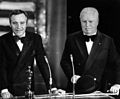
Spandau[edit]
-
 Changing the guard at Spandau

![[1]](http://www.sternrarebooks.com/pictures/20757P.jpg)
![[2]](http://i817.photobucket.com/albums/zz91/book_books/bride1.jpg)
![[3]](http://i1128.photobucket.com/albums/m499/spitoonga/DSC02364.jpg)
Article(s): Rudolf Hess
Request: Hi there! This is a great image but the camera must not have been held parallel to the ground, as it's tilted. Could this be rectified? Thanks. Dianna (talk) 01:48, 21 February 2013 (UTC)
Graphist opinion(s):