
Wikipedia:Graphics Lab/Photography workshop/Archive/Apr 2014
Tbilisi pics (repost)[edit]
-
 Tbilisi
 -
 Tbilisi (home of Gamsakurdia)


Article(s): Konstantine Gamsakhurdia
Request:
- These pics are a set taken by the same author; I think they definitely need a light adjustment, especially the second one (I tried with GIMP, but didn't achieve anything good, note excessive lighting in the upper part of the second pic). They were already posted more than one month ago but they were archived without being marked as stale.--Carnby (talk) 10:32, 2 April 2014 (UTC)
Jacopo da Empoli, Martirio di San Sebastiano[edit]
-
 Blurred, distorted, dark image

Article(s): Jacopo da Empoli
Request:
- Hard work. Probably it would be better to manipulate the original pic and give it the resemblance of a book picture (cropping and adjusting perspective). Then it should be enhanced (lighting, gamma, white balance and so on).-- Carnby (talk) 10:44, 2 April 2014 (UTC)
Graphist opinion(s):![]() Done Adjusted perspective, cropped, tweaked gamma, saturation, shading, softened "graininess", removed reflections, etc. Centpacrr (talk) 11:08, 2 April 2014 (UTC)
Done Adjusted perspective, cropped, tweaked gamma, saturation, shading, softened "graininess", removed reflections, etc. Centpacrr (talk) 11:08, 2 April 2014 (UTC)
- Thank you, isn't it possible to reduce more that magenta graininess?--Carnby (talk) 12:04, 2 April 2014 (UTC)
- I have desaturated the magenta channel by 50% but there is not much that can be done about the graininess ("digital noise") as the original image was taken at such a low light level. Centpacrr (talk) 13:06, 2 April 2014 (UTC)
- I have tried an alternative processing method. I think it gives better colours and shading, but please use the version you prefer. (Hohum @) 23:16, 3 April 2014 (UTC)
- Centpacrr, please leave it to the requester rather than reverting to your preference. (Hohum @) 20:25, 4 April 2014 (UTC)
- This image was reverted because: 1) the existing restoration that you prematurely overwrote was still being considered by the OP, and; 2) in doing so you reintroduced numerous surface reflections and other faults from the original file that I had digitally repaired in the restoration that you overwrote and which I explained in the edit summary when I reverted to the cleaned up version. (See here.) Centpacrr (talk) 22:34, 4 April 2014 (UTC)
- Centpacrr, please leave it to the requester rather than reverting to your preference. (Hohum @) 20:25, 4 April 2014 (UTC)
- I have tried an alternative processing method. I think it gives better colours and shading, but please use the version you prefer. (Hohum @) 23:16, 3 April 2014 (UTC)
- I have desaturated the magenta channel by 50% but there is not much that can be done about the graininess ("digital noise") as the original image was taken at such a low light level. Centpacrr (talk) 13:06, 2 April 2014 (UTC)
<sigh> (Hohum @) 16:56, 8 April 2014 (UTC)
- Hohum I am truly puzzled by your apparent position here. The stated purpose of the Graphics Lab project is "to improve the graphical content of the Wikimedia projects." Is it really your view that posting a version of this image in which all of the light reflection artifacts and other defects in the original file are ignored and left in place is "preferable" to the one you summarily overwrote in which these defects had all been recognized and digitally repaired? Really? Centpacrr (talk) 18:05, 8 April 2014 (UTC)
- I provided an alternative. Your version was still available for the requester to choose. Your versions still have terrible colour issues, I believe mine shows the main figure far better, the reflection issues could be worked on and are fairly trivial to address. I think you have ownership issues. I'm not going to bother to fight you, it's not worth the effort. In my opinion, your non-collegiate approach puts people off, which damages the project. My apologies to the requester. (Hohum @) 17:12, 9 April 2014 (UTC)
- Well, sir or madame, that was quite a harangue which also reflects that you are apparently also still missing the point. (I am also puzzled by the tone of your comment above which indicates a lack of assumption of good faith by you even though I had also provided you with the two affirmative reasons why I had reverted the image. I also do not recall ever having any previous interactions with you in here before.) To be precise, this has nothing whatever to do with "ownership", engaging in a "fight", or being "non-collegiate" (I presume you actually meant to say was "non-collegial" as "noncollegiate" means activities, events, etc that are unrelated to a college or university, a term that has nothing whatever to do with "collegiality"), but the issue instead has to do with following an orderly process to produce the best possible image for the project without working a cross purposes. This is what I was engaged in working on when you decided to short circuit that process before the OP ever had the opportunity to evaluate a second version of the image in which I had desaturated the magenta channel at his request by your summarily overwriting that file. The file you uploaded, however, also reintroduced multiple flash reflection artifacts and other faults to the image that I had already digitally repaired. While you claim that these are "fairly trivial to address" you also did not address them in your version but instead just left them there sticking out like a proverbial sore thumb.
- I provided an alternative. Your version was still available for the requester to choose. Your versions still have terrible colour issues, I believe mine shows the main figure far better, the reflection issues could be worked on and are fairly trivial to address. I think you have ownership issues. I'm not going to bother to fight you, it's not worth the effort. In my opinion, your non-collegiate approach puts people off, which damages the project. My apologies to the requester. (Hohum @) 17:12, 9 April 2014 (UTC)
- Whether or not the color balance in your version would have proved to be "better" than what the then still ongoing process that I was engaged with with the OP would have eventually produced is, of course, both subjective and wholly a matter of conjecture. However had you bothered to incorporate the digital fixes to the non color related faults that I had already made instead of reintroducing them, I would likely have not reverted the image file. As you did not do that, however, in the spirit of collegiality I have now done it for you and again made the repairs to these faults to your version which I have now uploaded for the consideration of the OP. I hope that you will now show good faith in the process and allow the OP to decide if this version (which adopts both your personal interpretation and preference of color balance and my digital repairs of flash artifacts and other defects) resolves all the issues he raised before summarily overwriting it again with something else and accusing other WP editors with "damaging the project" with their good faith contributions with which you may disagree. Centpacrr (talk) 23:29, 9 April 2014 (UTC)
- Follow up note: I have now replaced the faulty low light image file with a new one which I adjusted and derived from a much better free image (Creative Commons Attribution-Share Alike 3.0 Unported license) of this painting. This should now close the matter. Centpacrr (talk) 03:00, 10 April 2014 (UTC)
- Whether or not the color balance in your version would have proved to be "better" than what the then still ongoing process that I was engaged with with the OP would have eventually produced is, of course, both subjective and wholly a matter of conjecture. However had you bothered to incorporate the digital fixes to the non color related faults that I had already made instead of reintroducing them, I would likely have not reverted the image file. As you did not do that, however, in the spirit of collegiality I have now done it for you and again made the repairs to these faults to your version which I have now uploaded for the consideration of the OP. I hope that you will now show good faith in the process and allow the OP to decide if this version (which adopts both your personal interpretation and preference of color balance and my digital repairs of flash artifacts and other defects) resolves all the issues he raised before summarily overwriting it again with something else and accusing other WP editors with "damaging the project" with their good faith contributions with which you may disagree. Centpacrr (talk) 23:29, 9 April 2014 (UTC)
If I may interject.. I think the problem here, as is often the case, is that Centpacrr views uploading an image as 'summarily overwriting' his version. He wants the original requestor to evaluate his work before anyone else proffers an alternative, perhaps thinking that it may get overlooked if consigned to the File history section. Although he claims that the OP should have final say on which version is used, he reverts as he pleases, providing verbose justifications for his actions and ignoring his own rule of the requestor being ultimate arbiter. Et cetera. Ad nauseum.
I think what we need is a clearer set of guidelines that we can all agree to, so that disruptive editors can be brought into line. For one thing, uploading an edited image for consideration should never be discouraged (per WP:BOLD) and this necessarily 'overwrites' the previous version. However, as with all edits on Wikipedia, nothing is thrown away. The images up for consideration (by all editors, not just the OP) can be viewed quite easily from the File history section. We could follow the WP:BRD cycle of course, but what is the point of reverting image edits, often temporarily, which only clutters up the File history, when the discussion is already ongoing here? If you have a point to make about someone's edit then state your case and garner consensus, or state your case in the form of a subsequent upload that addresses the issues discussed in some way, working towards consensus, right? nagualdesign 21:11, 10 April 2014 (UTC)
- If you had read my comment fully, sir, you would have seen that I said the primary reason that I reverted it was that Hohum's subsequent version had reintroduced a number of flash artifacts and other faults that I had already repaired in the version that he overwrote. I stated in my comment above that had Hohum also repaired those faults instead of ignoring and reintroducing them I would likely not have reverted the image. Since he failed to do that, however, I subsequently again repaired those same faults on his version and then uploaded that one over mine. Subsequently I was able to find a very much better, high resolution, and well lit free image of the painting, corrected its perspective, digitally removed some apparent surface stains, and uploaded that one in place of the noisy, poorly lit image derived from the original files. That is the image currently in place for the OP to accept or reject.
- On the issue of process raised in my comments, I have always and still believe that while an editor who has originally undertaken a request is still engaged in an ongoing process of interacting with an OP who had made additional requests of that editor to further modify the file that it disrupts and renders inefficient the process of reaching a final best result when additional, previously uninvolved editors start overwriting (and thus effectively hiding) proposed versions not yet commented on by the OP especially, as in this case, when such new versions reintroduce faults that had already been repaired. Centpacrr (talk) 07:19, 11 April 2014 (UTC)
- Yes, I already read your comment in full. And you are again waffling, sir, raising the same points that are already up there ^^ in black and white for everyone to read, so there's no reason to repeat yourself. I've made my own points, which I also need not repeat. You seem to have largely confirmed what I was saying. All I have to say is this; "thus effectively hiding" speaks volumes about your world view, not the OP's or anyone else. What you should have said is, "yes, I believe that images consigned to the File history section are given less consideration", and then proffered suggestions as to how we might tackle this. Perhaps providing information for the casual user as to how to read an image file page, how to open different versions of the same image in different tabs, that sort of thing. Get with the program, mate. Up your game. nagualdesign 19:11, 11 April 2014 (UTC)
- This is simply a disagreement regarding the empirical evidence of the behavioral psychology of how in the real world viewers understand and treat images in "history" as opposed the "active" one, and not whether or not I am "with the program" as you personally perceive it. You have also again not addressed the issue of replacing one edit with another that reintroduces defects that had already been repaired which is the main reason that the reversion was made. So as an experiment to see if my view on this has merit I have reverted the image from the hi res perspective adjusted version that I created to Hohum's original posting and see how long (if ever) anyone other than you, Hohum, or the OP takes to notice that there is a better version available in the image file's history and restores it. (I will assume on good faith that neither you or Hohum will canvass another WP user to revert this to my hi res version and will allow this experiment to run on its own. If nobody changes it back in a week I will then restore the hi res version myself for the OP to consider.) Centpacrr (talk) 00:10, 12 April 2014 (UTC)
Since the file was reverted to my attempt, I reduced the effect of reflections and uploaded it as an improvement - I then noticed that a clearly superior version had been uploaded which must be from a different source, so I have reverted to that. Apologies if that upload was mentioned in the walls of text above. The new source should be included on the commons page. (Hohum @) 15:58, 12 April 2014 (UTC)
- Actually, Hohum, the "clearly superior version" I derived and created (adjusted perspective and cleaned up) from another image was indeed specifically "mentioned" in my posting immediately above which your own comment clearly indicates that you had to have read as you directly referred to it in your posting. With respect it then really does not seem credible that you then independently "noticed" my hi res version thus making ring hollow your curiously added comment:"Apologies if that upload was mentioned in the walls of text above." This also has defeated by prematurely ending the experiment relating to how viewers and editors understand and treat images in a "file history" section as opposed the "active" one in the real world, an issue I raised that was being challenged by Nagualdesign. Centpacrr (talk) 16:34, 12 April 2014 (UTC)
- Let me be clear, I wasn't challenging anything. I was simply trying to say that if you have misgivings then voice them here. If you believe that files consigned to the File history get overlooked (they may indeed) then perhaps proffer a suggestion as to how we might increase awareness of this issue among requestors, in order to help us all better work together. The solution is NOT to take it upon yourself to revert any edit which you disagree with. This is how all of Wikipedia functions, and the Graphics Lab is no exception.
- So, let's just assume for the sake of argument that Centpacrr is correct - that some requestors are ill equipped to understand how to compare the different image edits on offer because they don't understand how to read or use the image file page - what shall we (collectively) do about it? This question is to everyone. Personally, I think creeping normalcy has left the whole of the Graphics Lab so visually different from the rest of Wikipedia, and contrary to the MoS, that newcomers probably arrive a little bewildered. I propose to rebuild the Graphics Lab, with greater emphasis on user-friendliness, clear guidelines and less 'fluff', and have been slowly working towards that goal here. You are all welcome to help. nagualdesign 20:18, 12 April 2014 (UTC)
- Ignoring the non-constructive responses. nagualdesign, is there a way to show thumbnails of old versions of a file? That would make the various options more accessible for review. This is more of the subject for the talk page. (Hohum @) 22:17, 12 April 2014 (UTC)
- Yes, that would be ideal, but I don't think the software works that way. If we could - bingo! Perhaps we should put a request in at WP:VPR? nagualdesign 01:37, 13 April 2014 (UTC)
- I have been voicing my misgivings about the issue of the oblivion of "file history" in here for a couple of years to no avail and dead silence from others. And again the main reason I gave for reverting was not that but that the replacement image reintroduced a number of faults that I had already cleaned up in the image I reverted to. Centpacrr (talk) 16:28, 13 April 2014 (UTC)
- Yes, that would be ideal, but I don't think the software works that way. If we could - bingo! Perhaps we should put a request in at WP:VPR? nagualdesign 01:37, 13 April 2014 (UTC)
- Ignoring the non-constructive responses. nagualdesign, is there a way to show thumbnails of old versions of a file? That would make the various options more accessible for review. This is more of the subject for the talk page. (Hohum @) 22:17, 12 April 2014 (UTC)
-
 Vazha
Vazha

Article(s): Abovementioned.
Request:
- Please SVG oval crop the image and upload it as seperate file. Jaqeli (talk) 20:01, 3 April 2014 (UTC)
Graphist opinion(s):
- @Jaqeli:
 Done File:ვაჟა-ფშაველა. ალექსანდრე როინაშვილი cropped.png by ///EuroCarGT 01:30, 6 April 2014 (UTC)
Removal of date and time from two images.[edit]


Article(s): St Catherine's Hill, Dorset
Request:
- Is it possible to remove the date from these two images? If so that would be great. Thanks-- Ykraps (talk) 16:51, 6 April 2014 (UTC)
Graphist opinion(s):
 Request taken by ///EuroCarGT 17:40, 6 April 2014 (UTC).
- The second one might be hard to do. ///EuroCarGT 17:41, 6 April 2014 (UTC)
- Done by ///EuroCarGT 02:03, 7 April 2014 (UTC)
- The second one might be hard to do. ///EuroCarGT 17:41, 6 April 2014 (UTC)
South African Class H 4-10-2T[edit]
-
 Class H 4-10-2T

Article(s): South African Class H 4-10-2T, 4-10-2, South African locomotive history
Request:
- Please remove scratches and picture surface peeling damage -- André Kritzinger (talk) 01:10, 7 April 2014 (UTC)
Graphist opinion(s):
- @Andre Kritzinger: Done, I'll also attempt to remove some unwanted parts and get a restore on this. ///EuroCarGT 01:45, 7 April 2014 (UTC)
- Thanks, looks great so far! If you can get rid of the water pipe "growing out" of the dome, that'll be great. And maybe also repair around the picture edges at left bottom and top left. -- André Kritzinger (talk) 10:58, 7 April 2014 (UTC)
- Removed standpipe behind dome; repaired left edges. Centpacrr (talk) 11:47, 7 April 2014 (UTC)
- Thanks, both of you. Looks good. -- André Kritzinger (talk) 14:37, 7 April 2014 (UTC)
- Removed standpipe behind dome; repaired left edges. Centpacrr (talk) 11:47, 7 April 2014 (UTC)
- Thanks, looks great so far! If you can get rid of the water pipe "growing out" of the dome, that'll be great. And maybe also repair around the picture edges at left bottom and top left. -- André Kritzinger (talk) 10:58, 7 April 2014 (UTC)
Etchmiadzin[edit]

Article(s): Etchmiadzin Cathedral
Request:
- This photo looks too saturated and the colors are evidently artificial. Any way to make it look less fake? -- Երևանցի talk 05:14, 8 April 2014 (UTC)
Graphist opinion(s):I have desaturated the color information by 25%. Any more would render the image unacceptably flat. Centpacrr (talk) 07:16, 8 April 2014 (UTC)
- Nice work Centpacrr, I just gave it a little tweak as the blacks were just a tad undersaturated, I agree any further and it would look flat. Regards Fallschirmjäger ✉ 20:14, 8 April 2014 (UTC)
- The reason it looked flat, particularly the trees, was because the luminosity had been affected quite badly. I've uploaded another version that is simply the previous edit with the original image on a layer above, with its blending mode set to 'luminosity'. To avoid this flattening effect in the future when desaturating an image, set the adjustment blending mode to 'color', which preserves the luminosity and stops the blacks turning grey. Ya get me, blood? nagualdesign 17:47, 9 April 2014 (UTC)
-
 Stalin

Article(s): Stalin
Request:
- Please remove a chair out of the image. Also please remove that shade which is at the head of Stalin at the corners of the image. Jaqeli (talk) 11:11, 9 April 2014 (UTC)
Graphist opinion(s):Removed chair, lightened background as requested. Centpacrr (talk) 11:41, 9 April 2014 (UTC)
SAAF Command Nov 1989[edit]
-
 South African Air Force Command & Staff Councils, November 1989

Request:
- The fishmoths (silverfish) did some damage to my picture. Repair please, if possible. -- André Kritzinger (talk) 19:05, 9 April 2014 (UTC)

Graphist opinion(s):
- Request taken by ///EuroCarGT 19:51, 9 April 2014 (UTC).
@Andre Kritzinger: Hey! May I ask, on the first person (Maj Gen G.C. Nel) on the front (LtoR) what is on the shoulder patch? ///EuroCarGT 20:23, 9 April 2014 (UTC)
- Done ///EuroCarGT 21:04, 9 April 2014 (UTC)
- Crossed sword and baton and the old SADF castle pip. See example on the picture alongside. -- André Kritzinger (talk) 21:09, 9 April 2014 (UTC)
Vazha[edit]

Article(s): Vazha.
Request:
- Please remove that white thing in the middle of his clothing. Jaqeli (talk) 13:31, 10 April 2014 (UTC)
Graphist opinion(s):![]() Done Centpacrr (talk) 14:20, 10 April 2014 (UTC)
Done Centpacrr (talk) 14:20, 10 April 2014 (UTC)
Signature of Vazha[edit]
-
 Signature of Vazha-Pshavela
 -
 Vector version


Article(s): Vazha.
Request:
Graphist opinion(s):
- Request taken by ///EuroCarGT 20:10, 10 April 2014 (UTC).
- @EuroCarGT: Done? Jaqeli (talk) 16:47, 13 April 2014 (UTC)
- Whoops, forgot about it. I'm on it. ///EuroCarGT 17:22, 13 April 2014 (UTC)
- The blue on the signature is not going well with the raster to vector conversion. I'll see what I can do. ///EuroCarGT 17:44, 13 April 2014 (UTC)
- Whoops, forgot about it. I'm on it. ///EuroCarGT 17:22, 13 April 2014 (UTC)
- @EuroCarGT: Done? Jaqeli (talk) 16:47, 13 April 2014 (UTC)
![]() Done ///EuroCarGT 17:55, 13 April 2014 (UTC)
Done ///EuroCarGT 17:55, 13 April 2014 (UTC)
@Jaqeli: File:Vaja signature.svg, I didn't use blue. ///EuroCarGT 18:23, 13 April 2014 (UTC)
- @EuroCarGT: What is that? That's not even vectorized. The vectorized signature should be like this one here for example. I want that signature to be transparent and the size to be reduced and cleaned. I meant that in my request. Can't you do it again like the one I've posted ? Jaqeli (talk) 18:26, 13 April 2014 (UTC)
- @Jaqeli: It is vectorized - see the .SVG file extension. This one is raster and not vectorized. ///EuroCarGT 18:30, 13 April 2014 (UTC)
- @EuroCarGT: I am sorry but it does not seem so. I mean I see all the vectorized SVGs in the categories on commons and that signature is the only one which is not vectorized as such. Could you reduce, clean the signature and upload it again maybe as PNG? Jaqeli (talk) 18:33, 13 April 2014 (UTC)
- @Jaqeli: I'm not sure this is the best option, but I'll attempt to recreate this signature by using a fine point marker, then take a picture and then convert it to vevctor. This is because the given photo is not the best to vetorize with. ///EuroCarGT 18:39, 13 April 2014 (UTC)
- @EuroCarGT: I am sorry but it does not seem so. I mean I see all the vectorized SVGs in the categories on commons and that signature is the only one which is not vectorized as such. Could you reduce, clean the signature and upload it again maybe as PNG? Jaqeli (talk) 18:33, 13 April 2014 (UTC)
@EuroCarGT: Done? Jaqeli (talk) 16:25, 16 April 2014 (UTC)
- Unfortunately, the signature attempt was not good. ///EuroCarGT 19:58, 16 April 2014 (UTC)
@Hohum: Thanks a lot. It is done perfect. @EuroCarGT: Thanks anyways for your time. Jaqeli (talk) 10:42, 17 April 2014 (UTC)
Rustaveli[edit]
.jpg)
Article(s): Rustaveli.
Request:
- Please remove that white light dots on the left and right sides which are around the face of Rustaveli. Jaqeli (talk) 15:21, 11 April 2014 (UTC)
Graphist opinion(s):
- Done ///EuroCarGT 17:55, 13 April 2014 (UTC)
CGR Season Ticket[edit]
-
 CGR Season Ticket

Article(s): South African Class 6J 4-6-0
Request:
- Would it be possible to make Mr Smith visible on the picture in the ticket? -- André Kritzinger (talk) 23:21, 11 April 2014 (UTC)
Graphist opinion(s):This is not "perfect" because there is not really all that much distinct image data to work with, but I think this is a bit better without altering the character and tone of the image too much so that it does not look artificial. At least you can now tell that it is a photograph of the cardholder. Centpacrr (talk) 23:48, 11 April 2014 (UTC)
- Although enhancing could be done, this is going to be difficult. The portrait is extremely low quality and isn't quite visible. ///EuroCarGT 23:32, 11 April 2014 (UTC)
- Thanks. I wasn't very optimistic to begin with... -- André Kritzinger (talk) 16:30, 12 April 2014 (UTC)
Arrows on letter A[edit]
-
 A
A -
 Arrows

.jpg)
Article(s): Georgian script-related.
Request:
- Please put on the first image the arrows based on the second image.
- Make the color of the arrows this blue .
- Upload the image as seperate file as SVG. Jaqeli (talk) 10:12, 14 April 2014 (UTC)
Graphist opinion(s):
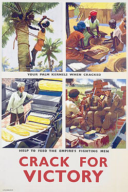
Palm kernel[edit]
-

-
 Derivative
 -
 Derivative
with altered font

.jpg)

Article(s): Palm kernel
Request:
- rotate to straight and remove border... -- Kintetsubuffalo (talk) 10:47, 16 April 2014 (UTC)
Graphist opinion(s):![]() Done Centpacrr (talk) 12:17, 16 April 2014 (UTC)
Done Centpacrr (talk) 12:17, 16 April 2014 (UTC)
- Much better, thank you!--Kintetsubuffalo (talk) 13:40, 16 April 2014 (UTC)
User:Kintetsubuffalo's officious interference is neither wanted nor needed[edit]
I've asked User:Kintetsubuffalo a number of times over a number of years to stop adding stupid "remove border" tags to historic/archival images where removing the last few pixels of border and/or other improvements (or alleged "improvements"[sic]) would require very significantly manipulative lossy editing (as opposed to special techniques for performing limited editing losslessly, avoiding generation loss). It seems that User:Kintetsubuffalo added this image here very specifically in order to spite me or annoy me personally, since he enjoys acting in an obnoxious way. As far as I'm concerned, you can go crazy cropping or enhancing or "enhancing" this image -- however, PLEASE UPLOAD SUCH LOSSY-MODIFIED IMAGE VERSIONS AS SEPARATE FILES UNDER A DIFFERENT NAME, because otherwise you're serving as instruments of User:Kintetsubuffalo's petty little pointless revenge a lot more than you're doing anything to improve anything on Commons. Thanks... AnonMoos (talk) 00:29, 20 April 2014 (UTC)
- A couple of technical points: None of the editors seem to have availed themselves of the color chart in the original scan of this image. Simply setting the white point, gray point and black point (or applying equivalent non-Photoshop tools) to the references gives a better result in 3 clicks than those images that were uploaded. And since we should always work from the original source (to avoid destructive editing) I'm surprised that it was overlooked. As for the lossy modification argument, it's worth noting that loss of original data doesn't always imply loss of quality, particularly when we're talking about a lossy-compressed 80 KB image where faithfully reproducing compression artifacts is neither wanted nor needed. Yes, autonomically applying a rotation to an image can be destructive, but if there's a seasoned pixel peeper at the controls who's determined to do no harm you can bet that the only thing lost will be noise. nagualdesign 03:35, 20 April 2014 (UTC)
- Such restoration efforts can be of high or low quality, but I didn't feel like expending much effort to try to tell the difference in this particular case, considering that the only reason he took this image to this page was to spite me personally (notice that seven minutes after he made this edit he created this section of the page above)... AnonMoos (talk) 18:00, 20 April 2014 (UTC)
- I have no comment to make about your disagreement, apart from to say that other editors' contributions should always be properly assessed before being reverted. Discourteousness is not contagious. Perhaps you might feel better if you compare my latest upload with the original. I've now removed most of the jpeg compression artifacts. Technically speaking this is a very lossy edit, as I've painted over much of the original dataset, but it's also a constructive edit, right? So was it worth removing the border? Regards, nagualdesign 18:36, 20 April 2014 (UTC)
- Looks nice, but I don't feel like examining details under magnification. Generally, it's not worth it to do a lossy-editing job just to remove a last few pixels of border, which is why I take exception to User:Kintetsubuffalo's pattern of adding "border" templates to historic/archival images seemingly without thinking about what the real concrete benefits would be in each particular case... AnonMoos (talk) 14:47, 21 April 2014 (UTC)
- Well, provided that edits are done carefully, and derivatives are uploaded separately if necessary, I don't see the harm in tagging images. Quality control is the main issue, IMO. And then there are editors like Centpacrr who completely justify what you are saying. He's sidestepped this discussion entirely, uploaded his own version with all of the text completely replaced (with a different font, no less) and swapped out the image in the article for his version. My mind once boggled at his behavior, now I just think of my blood pressure and laugh it off. (I'm reminded of Cecilia Gimenez.) Perhaps if there was a template that said "please treat this historic image with kid gloves if you plan to restore it" we could kill two birds with one stone? *wink* nagualdesign 18:24, 21 April 2014 (UTC)
- Oh please just relax, Nagualdesign. It is not a different font but is the WWII "Keep Calm" British poster font. Me thinks thee doth protest too much. Centpacrr (talk) 04:23, 23 April 2014 (UTC)
- You replaced the font, and it is different. And you did this to an historic image when there had already been concerns raised about lossy editing. I'm busy here, trying to persuade AnonMoos of the benefits of careful restoration and you pull a Cecilia Gimenez. Perhaps the irony is lost on you. nagualdesign 12:49, 23 April 2014 (UTC)
- Oh please just relax, Nagualdesign. It is not a different font but is the WWII "Keep Calm" British poster font. Me thinks thee doth protest too much. Centpacrr (talk) 04:23, 23 April 2014 (UTC)
- Well, provided that edits are done carefully, and derivatives are uploaded separately if necessary, I don't see the harm in tagging images. Quality control is the main issue, IMO. And then there are editors like Centpacrr who completely justify what you are saying. He's sidestepped this discussion entirely, uploaded his own version with all of the text completely replaced (with a different font, no less) and swapped out the image in the article for his version. My mind once boggled at his behavior, now I just think of my blood pressure and laugh it off. (I'm reminded of Cecilia Gimenez.) Perhaps if there was a template that said "please treat this historic image with kid gloves if you plan to restore it" we could kill two birds with one stone? *wink* nagualdesign 18:24, 21 April 2014 (UTC)
It's *clearly* a different font, most obvious with the letter C. Baffling. (Hohum @) 17:50, 23 April 2014 (UTC)
- @AnonMoos, instead of trying to paint me as a bad guy, please explain why Commons needs to host crooked images. Certainly the host where the image came from has the image nicely crooked for you. This is an encyclopedia, images should be straight, not amateurish and sloppy.--Kintetsubuffalo (talk) 09:02, 17 May 2014 (UTC)
- You may have no intention of acting as a "bad guy", but your highly negative responses to my various requests that you stop for a moment with each image and consider the balance of all the factors involved (including the historic and archival nature of the image, the lossy nature of the editing which would be involved, the actual degree of benefit which would be obtained, etc.) before slapping on tags which request overwriting of the image, has unfortunately created a unnecessarily antagonistic situation -- and by your action of adding this image to this page 7 minutes after you made made this edit, you pretty much cast doubt on the purity of your own motives in this case... AnonMoos (talk) 06:06, 18 May 2014 (UTC)

Article(s): Ioane Petritsi
Request:
Graphist opinion(s):![]() Done Centpacrr (talk) 00:49, 18 April 2014 (UTC)
Done Centpacrr (talk) 00:49, 18 April 2014 (UTC)
- Can you please give it this background colour?
Jaqeli (talk) 13:54, 18 April 2014 (UTC)

Article(s): Nebularia, Mitra coronata
Request:
- Is it possible to improve this very poor quality image of the shell of a sea snail? Unfortunately the highlights have no detail in them at all, but in addition the color is way too saturated, the contrast is turned up way too much, and the color balance is also off (the shell should be browner, not this incandescent orange-red color). Here is a page with images of several shells in the same species which gives you a good comparison: http://www.gastropods.com/0/Shell_1120.shtml However, I do understand that the original image is quite poor and there is a limit to what you can do with it. Even a small improvement would be valuable until we can get a better image.
P.S. Would it help to have a grey background instead of a black one? Invertzoo (talk) 00:55, 19 April 2014 (UTC)
Graphist opinion(s):
![]() Done I have tried - perhaps someone else can do better. (Hohum @) 18:55, 18 April 2014 (UTC)
Done I have tried - perhaps someone else can do better. (Hohum @) 18:55, 18 April 2014 (UTC)
Rustaveli statue[edit]
![]() Not done
Not done
.jpg)
Article(s): Abovementioned.
Request:
- Please remove that brown wooden thing behind the statue of Rustaveli. Jaqeli (talk) 20:47, 18 April 2014 (UTC)
Graphist opinion(s):
- PMSL!
 You mean the "door"? nagualdesign 17:20, 19 April 2014 (UTC)
- Yes :-) Jaqeli (talk) 18:07, 19 April 2014 (UTC)
- Anyone? No one? Jaqeli (talk) 18:43, 21 April 2014 (UTC)
- @Jaqeli: What could it be filled with? ///EuroCarGT 23:38, 22 April 2014 (UTC)
- @EuroCarGT: That wall what is on the right side of the statue would be good if it would be filled with. Jaqeli (talk) 06:01, 23 April 2014 (UTC)
- I'm afraid it would be quite unencyclopedic to replace the background in that way, as it would materially misrepresent the subject (it's tantamount to lying, really). Replacing the background altogether, with white or something neutral, is generally accepted, but given that this statue resides in a specific location (it isn't something that could be photographed elsewhere) the background arguably has encyclopedic value. The article caption currently reads, "Statue of Rustaveli at the entrance of the National Parliamentary Library of Georgia", so perhaps the entrance (that brown wooden thing) is important, yes? nagualdesign 12:58, 23 April 2014 (UTC)
- @EuroCarGT: That wall what is on the right side of the statue would be good if it would be filled with. Jaqeli (talk) 06:01, 23 April 2014 (UTC)
- @Jaqeli: What could it be filled with? ///EuroCarGT 23:38, 22 April 2014 (UTC)
- Anyone? No one? Jaqeli (talk) 18:43, 21 April 2014 (UTC)
- Yes :-) Jaqeli (talk) 18:07, 19 April 2014 (UTC)
- nagualdesign is correct, it's not really the best option as having the full environment around the statue is the best way to go. I've have done it at File:Shota Rustaveli (crop & edit).jpg however you could see it doesn't have that natural feeling, so I think keeping the door will be good as is. ///EuroCarGT 20:44, 23 April 2014 (UTC)
Arseniy Yatsenyuk[edit]
-
 Arseniy Yatsenyuk

Article(s): Arseniy Yatsenyuk, Prime Minister of Ukraine, Yatsenyuk Government
Request:
- Could the image be brightend a little and maybe a little clean up. Most likely more requests for improvement will come from here. -- Spongie555 (talk) 23:43, 19 April 2014 (UTC)
Graphist opinion(s):Lightened, flyspecked as requested. Centpacrr (talk) 23:52, 19 April 2014 (UTC)
- Thank you it looks good. Could you also remove the black spec on the left of the image its like in the middle on the background? Spongie555 (talk) 00:43, 20 April 2014 (UTC)
- Done Centpacrr (talk) 01:31, 20 April 2014 (UTC)
- Thank you it looks perfect now. Spongie555 (talk) 01:35, 20 April 2014 (UTC)
- Thank you it looks good. Could you also remove the black spec on the left of the image its like in the middle on the background? Spongie555 (talk) 00:43, 20 April 2014 (UTC)
The Passing of the Great Race[edit]

Article(s): The Passing of the Great Race
Request:
- fix perspective... -- Kintetsubuffalo (talk) 14:17, 20 April 2014 (UTC)
Graphist opinion(s):![]() Done Perspective adjusted Centpacrr (talk) 15:32, 20 April 2014 (UTC)
Done Perspective adjusted Centpacrr (talk) 15:32, 20 April 2014 (UTC)
- Thank you!--Kintetsubuffalo (talk) 10:38, 21 April 2014 (UTC)
Yenovk Shahen[edit]


Article(s): Yenovk Shahen
Request:
- Proper cropping is required. The circle needs to be boldened a bit more. Any other general improvements would be great. Second photograph: please get rid of the blots and make other general improvements if necessary. Thanks, Étienne Dolet (talk) 04:17, 21 April 2014 (UTC)
Graphist opinion(s):![]() Done Centpacrr (talk) 09:30, 21 April 2014 (UTC)
Done Centpacrr (talk) 09:30, 21 April 2014 (UTC)
shibuichi[edit]


Article(s): shibuichi
Request:
- trim vast excess blank space... -- Kintetsubuffalo (talk) 21:57, 22 April 2014 (UTC)
Graphist opinion(s):
- Done. I also lightened them a bit. nagualdesign 23:36, 22 April 2014 (UTC)
- Fantastic, thank you!--Kintetsubuffalo (talk) 22:27, 23 April 2014 (UTC)
Anthim the Iberian[edit]

Article(s): Anthim the Iberian
Request:
- Please crop out and upload seperately the face of Anthim the Iberian. Jaqeli (talk) 12:45, 24 April 2014 (UTC)
Graphist opinion(s):
- Done at File:Le Métropolitain Antim crop.jpg ///EuroCarGT 04:23, 26 April 2014 (UTC)
Yazoo[edit]

Article(s): Yazoo
Request:
- fix right bottom warp and equalize border... -- Kintetsubuffalo (talk) 03:16, 26 April 2014 (UTC)
Graphist opinion(s):
- Done (Hohum @) 13:11, 26 April 2014 (UTC)
- Thank you!--Kintetsubuffalo (talk) 04:11, 29 April 2014 (UTC)
Rick Hall[edit]

Article(s): Rick Hall
Request:
- new version crop to focus on subject... -- Kintetsubuffalo (talk) 03:42, 26 April 2014 (UTC)
Graphist opinion(s):
- Done at File:Rick Hall at FAME Recording Studios crop.jpg. ///EuroCarGT 04:36, 26 April 2014 (UTC)
- Thank you!--Kintetsubuffalo (talk) 06:27, 26 April 2014 (UTC)
HUAC[edit]

Article(s): HUAC
Request:
- remove border... -- Kintetsubuffalo (talk) 06:25, 26 April 2014 (UTC)
Graphist opinion(s):
- Done (Hohum @) 12:53, 26 April 2014 (UTC)
- Thank you!--Kintetsubuffalo (talk) 04:09, 29 April 2014 (UTC)
Jeb Bush[edit]
-
 Jeb Bush

Article(s): Jeb Bush
Request:
- What do you think about the glasses in the lower left. Can they be zapped? Anythingyouwant (talk) 04:44, 27 April 2014 (UTC)
Graphist opinion(s):
- @Anythingyouwant: Separate file or overwrite? Regards, ///EuroCarGT 04:52, 27 April 2014 (UTC)
- Done at File:Jeb Bush 2013 CPAC by Gage Skidmore (edit).jpg. ///EuroCarGT 05:07, 27 April 2014 (UTC)
- Nicely done, thanks very much.Anythingyouwant (talk) 06:22, 27 April 2014 (UTC)
Sceptre[edit]

Article(s): Above.
Request:
Graphist opinion(s):
- Done ///EuroCarGT 17:39, 27 April 2014 (UTC)
Face of David IV[edit]
-

-
 David IV (cropped, perspective adjusted; removed hanging candle)

.jpg)
Article(s): Above.
Request:
- Please crop out from the second picture the face of King David IV and upload it as seperate file. Please after the crop out remove that candle from his face. Jaqeli (talk) 19:49, 27 April 2014 (UTC)
Graphist opinion(s):![]() Done Centpacrr (talk) 00:10, 28 April 2014 (UTC)
Done Centpacrr (talk) 00:10, 28 April 2014 (UTC)
Ferris Wheel[edit]
-
 The original Ferris Wheel

Article(s): Ferris Wheel
Request:
- General wikification - crop and, as much as possible, clean up. Might need rotating a fraction too, but not sure about that. Thanks in anticipation. 49.230.66.180 (talk) 20:25, 27 April 2014 (UTC)
Graphist opinion(s):
- Done at File:Original Ferris wheel in Lincoln park, Chicago (edit).jpg. ///EuroCarGT 21:16, 27 April 2014 (UTC)
- Many thanks! 49.230.155.17 (talk) 22:11, 27 April 2014 (UTC)
David IV[edit]
.jpg)
Article(s): Above.
Request:
- Please colour those crop-outs at the corners at the top and down by making them the same colour as the main background colour is. Jaqeli (talk) 09:20, 28 April 2014 (UTC)
Graphist opinion(s):
- Done by Centpacrr. Fallschirmjäger ✉ 17:47, 11 May 2014 (UTC)
Interstate 540[edit]
-
 File:I-540 and US 71 run in Fayetteville.jpg

Article(s): Interstate 540 (Arkansas)
Request:
- It's a bit slanted. The road sign's poles on the right hand side should be straight up and down. -- –Fredddie™ 22:30, 28 April 2014 (UTC)
Graphist opinion(s):![]() Done Rotated 10º CCW and crop. Centpacrr (talk) 23:12, 28 April 2014 (UTC)
Done Rotated 10º CCW and crop. Centpacrr (talk) 23:12, 28 April 2014 (UTC)
The Pale[edit]

Article(s): The Pale
Request:
- remove border and watermark... -- Kintetsubuffalo (talk) 04:07, 29 April 2014 (UTC)
Graphist opinion(s):
- @Kintetsubuffalo: Does the caption on the photo need removal? I got the watermark and border removed, how bout the caption? ///EuroCarGT 03:04, 30 April 2014 (UTC)
- Sorry was in hospital, yes please!--Kintetsubuffalo (talk) 04:06, 17 May 2014 (UTC)
- Done at File:The Pale According to the Statute of 1488 edit.jpg ///EuroCarGT 05:14, 17 May 2014 (UTC)
- Thank you! For Wikipedia purposes, you don't need to create a separate file. Borders and caption watermarks are discouraged for internationalization. You can just overwrite.
Ayrton Senna[edit]


Article(s): Various
Request:
- Please remove the Watermarks from these images. Thanks in advance. --109.79.118.141 (talk) 23:01, 29 April 2014 (UTC)
Graphist opinion(s):![]() Done Centpacrr (talk) 13:47, 30 April 2014 (UTC)
Done Centpacrr (talk) 13:47, 30 April 2014 (UTC)
Hagop Terzian[edit]

.jpg)
.jpg)
.jpg)
Article(s): Hagop Terzian
Request:
- General improvements would be great. I'd appreciate proper cropping. Perhaps darken it a bit. The circle needs to be boldened a bit more. This image can be an exemplary model. Thanks in advance. Étienne Dolet (talk) 05:36, 30 April 2014 (UTC)
Graphist opinion(s):![]() Done Centpacrr (talk) 13:23, 30 April 2014 (UTC)
Done Centpacrr (talk) 13:23, 30 April 2014 (UTC)