
Wikipedia:Graphics Lab/Map workshop/Archive/Sep 2010
Stale[edit]
Empire of Charles V[edit]
-
 Empire of Emperor Charles V

Article(s): N/A
Request: Could someone possibly redo this map in SVG please thanks Mackay 86 (talk) 11:13, 21 July 2010 (UTC)
- Would it be possible to get the original source, or a different one? The original image by Lucio Silla doesn't cite a source, and it's difficult to understand the symbology, or what was being shown when the map was changed. Lesqual (talk) 18:09, 22 July 2010 (UTC)
- From the Karl V page: "Habsburgide impeerium enne 1526. aastat. Lilla (Kastiilia), punase (Aragón) ja tumekollasega (Burgundia) on tähistatud Karl V võimuala, kollasega (Austria) Ferdinand I valdused." What is signified precisely by pale yellow, and by the dark black line? Lesqual (talk) 18:46, 22 July 2010 (UTC)
- Also, would this map be appropriate as a template to show the appropriate borders? The African coast looks a little different so I'd need an additional source there, but other than that it looks about right. Lesqual (talk) 18:46, 22 July 2010 (UTC)
The dark black line signifies the Holy Roman Empire and the pale yellow signifies the other German states. And yes this map would be appropriate to use as a template. Mackay 86 (talk) 10:40, 23 July 2010 (UTC)
Graphist opinion(s):
Elakala Falls[edit]
Article(s): Elakala Falls
Request: Create a map using topographic data to show steepness of the location. Official park map and here is a link to google maps showing the location of the 4 waterfalls. I would like a map, hopefully in SVG format to show these 4 waterfall locations and the offical trail/roads of the park shown as well. Anyone up for this task? — raeky (talk | edits) 16:14, 24 June 2010 (UTC)
Graphist opinion(s):
![]() Request taken by Matthewedwards.: I'll do this :)
Request taken by Matthewedwards.: I'll do this :)
Unstale. — raekyT 12:54, 28 July 2010 (UTC)
Racibórz[edit]
-
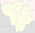 This is the way how the requested map should look like.
 -
 Map of Racibórz county. Racibórz is at the centrum of this map.
 -
 Maybe this map also can be helpful. Racibórz County is on the west side of the map.


Article(s): articles connected with Racibórz
Request: Hi. I'm from polish Wikipedia. I've created pl:Wikiprojekt:Racibórz and I need some help right now. I want to create a location map (like this for example) for my city. Map should show the borders of Racibórz, borders between other gminas and marked with more thick line border between County's. I don't need any special effects like headings or colors - background should be white, maybe just the background out of borders of Racibórz should be grey. Many thanks for anyone who could create that map and sorry for my poor english! :) Olos88 (talk) 11:51, 22 July 2010 (UTC) P.S. here is the map with more precise borders of Racibórz. Olos88 (talk) 11:53, 22 July 2010 (UTC) P.S.2 I've upload a low quality example here. Olos88 (talk) 08:38, 28 July 2010 (UTC)
Graphist opinion:
Tuvan People's Republic[edit]


Article(s): Tuvan People's Republic
Request: English-language version of the German map, please incorporate the border from the second map if you can... Chris (クリス • フィッチ) (talk) 11:37, 28 July 2010 (UTC)
Graphist opinion(s):
London Underground Hammersmith & City Line map[edit]
-
 The map of the Hammersmith & City Line as it is currently
Article(s): Hammersmith & City Line
Request: Update the map to reflect on the opening of the Wood Lane tube station and the renaming of the Shepherd's Bush station to Shepherd's Bush Market. DReifGalaxyM31 (talk) 16:39, 28 July 2010 (UTC)
Graphist opinion(s): File:Hammersmith & City Line.png -- it would be easier to update File:Hammersmith & City Line.svg and create a new png from that file than to edit the png. The information on the file page says that it was created from GPS data. Does the line need moving any when Wood Lane station is added? It might make more sense, and perhaps be quicker, in this case to ask one of the two users who created the image to carry out this work, although I would be happy to do it if they cannot. They are Commons:User:ed g2s and Commons:User:Jdforrester. Matthewedwards : Chat 23:05, 29 July 2010 (UTC)
Resolved[edit]
Second French Empire[edit]
-
 Second French Empire
 -
 Perhaps using this map as a base for redrawing borders.
.png)

Article(s): N/A
Request: Some island territories maybe missing & borders need to be redrawn to match 1860s borders. Mackay 86 (talk) 07:06, 17 August 2010 (UTC)
Graphist opinion(s):
![]() Done by (talk) Mackay 86 (talk) 01:22, 2 September 2010 (UTC)
Done by (talk) Mackay 86 (talk) 01:22, 2 September 2010 (UTC)
Mayabeque[edit]
Kmusser (talk) 10:50, 2 September 2010 (UTC)

Article(s): Mayabeque
Request: Remove top caption per WPMOS... Chris (クリス • フィッチ) (talk) 10:29, 13 August 2010 (UTC)
Graphist opinion(s): ![]() Done I went ahead and cropped it, though I think that file is likely to get deleted as a copyvio. Kmusser (talk) 11:28, 13 August 2010 (UTC)
Done I went ahead and cropped it, though I think that file is likely to get deleted as a copyvio. Kmusser (talk) 11:28, 13 August 2010 (UTC)
- What makes it jump out as copyvio?--Chris (クリス • フィッチ) (talk) 13:40, 13 August 2010 (UTC)
- There is that. I knew I should have learned how to read!--Chris (クリス • フィッチ) (talk) 12:35, 16 August 2010 (UTC)
- Here's a numbered image of Cuba generated from GADM data, just in case the other one can't be used. I guess it'd need to be modified to account for the new province. gringer (talk) 11:49, 17 August 2010 (UTC)
- The GADM license is not compatible with Wikipedia either, GADM is for non-commercial use only, unless you got permission. The only completely free GIS data for admin boundaries that I know of is VMAP0. Kmusser (talk) 13:46, 17 August 2010 (UTC)
- How much do I need to modify the GADM vector data by to make this not an issue? I'm currently doing a simplification of vector data by removing points that are closer than some resolution limit (so GADM is higher resolution than the generated maps), but I could do other things (e.g. jitter the points a bit, use a non-linear projection like WT or orthographic). gringer (talk) 15:55, 17 August 2010 (UTC)
- I'm not sure you can, they've copyrighted the database, so no matter what you do to it you'd still be using it for a commercial use, it's not the same as a copyrighted map where you just need to change the symbology. That said copyrighting databases is a gray area - it hasn't been clearly established whether that protection extends to individual items of the database or only applies to the database as a whole. You might be fine, it just isn't clear without getting lawyers (or asking permission). Kmusser (talk) 13:52, 18 August 2010 (UTC)
- Vmap0 is copyright-burdened by ESRI on some of its admin-boundaries layer, unlike the rest of the datasets. Natural Earth Data was created by journalists & web cartographers as a modern, explicitly public domain dataset, and it has admin0 and almost all admin1 boundaries. I'm unresolving this in order to use it to make a new map that will withstand copyright claims today or tomorrow.
 Request taken by lesqual. -Lesqual (talk) 15:28, 21 August 2010 (UTC)
- How much do I need to modify the GADM vector data by to make this not an issue? I'm currently doing a simplification of vector data by removing points that are closer than some resolution limit (so GADM is higher resolution than the generated maps), but I could do other things (e.g. jitter the points a bit, use a non-linear projection like WT or orthographic). gringer (talk) 15:55, 17 August 2010 (UTC)
- The GADM license is not compatible with Wikipedia either, GADM is for non-commercial use only, unless you got permission. The only completely free GIS data for admin boundaries that I know of is VMAP0. Kmusser (talk) 13:46, 17 August 2010 (UTC)
- Thanks heaps for pointing this out. I'll have a go at making a general script for NED, because it seems to fit a license that is compatible with wikimedia commons [1].
- All versions of Natural Earth raster + vector map data found on this website are in the public domain. You may use the maps in any manner, including modifying the content and design, electronic dissemination, and offset printing. The primary authors, Tom Patterson and Nathaniel Vaughn Kelso, and all other contributors renounce all financial claim to the maps and invites you to use them for personal, educational, and commercial purposes.
- gringer (talk) 11:48, 22 August 2010 (UTC)
- I ran into some problems selecting and modifying the data in QGIS, evidently someone did some counter-clockwise digitizing or something verboten along those lines. Graphically everything showed up right, but selection and geoprocessing operations refused to work. 'Repair Geometry' is generally easy with ArcGIS, but was taking seconds per province in QGIS. I found a fixed-up file which worked just fine on their forums. Note that they only added the Bahamas in version 1.2, so they're missing that in the fixed download. Lesqual (talk) 17:42, 22 August 2010 (UTC)
- Thanks heaps for pointing this out. I'll have a go at making a general script for NED, because it seems to fit a license that is compatible with wikimedia commons [1].
So I made the locator maps to convention (I think... are those borders right?) and tacked on a diagram of the changes as a bonus. Lesqual (talk) 17:50, 22 August 2010 (UTC)


Evidently I did something wrong to Image:Mayabeque_Locator_Map.svg but since it's nearly identical to the Artemisa locator map, I'm at a loss as to what that is. Lesqual (talk) 17:59, 22 August 2010 (UTC)
Seaboard Air Line Railroad passenger routes map[edit]
-
 SAL passenger routes, ca. 1950

Article(s): A tentative idea for the Seaboard Air Line Railroad article.
Request: Hey guys, this is my first attempt at making a map for Wikipedia, so it may look a little amateurish, but I was thinking of making a map for this article (which I've written/edited extensively in the past) which would be easier to understand than the old, muddy maps already available there.
It's not truly essential for the article, so I'm not necessarily asking for someone to make a better map for me here. But as you can see, the map I used as the basis of this one (US Locator Blank2.svg) has very thick state and ocean borders, which screw up the readability of the text on the map. Any suggestions on where to find a map background with cleaner borders?
Or any other helpful ideas; I don't have fancy software (Microsoft PhotoDraw . . . yeah, way old but works for me) and have no clue about creating svg or png files. If you have anything to show me, you can post it on my sandbox page also. Thanks.Textorus (talk) 14:43, 30 August 2010 (UTC)
Graphist opinion(s): Some comments...
- You should (in fact have to) specify the sources (US Locator Blank2.svg) in the image description. If you upload the file via derivativefx this information will be added automatically. You probably also used a book or other source which should be mentioned here instead of "created this work entirely by myself".
For a first map it looks very good. I am impressed. I am not familiar with MS PhotoDraw, but you could install the free inkscape to edit svg files. It is not that hard to operate. BTW, did you edit the svg file or the wiki-generated png? Some map related suggestions follow:
- The map is (over)full of information. You should clean up a bit: remove the description box ("Schematic map...") which just doubles the image description. When used in wikipedia articles, images/map get a caption anyway, so it is not necessary to have a caption in the map itself.
- If I understand correctly, the orange text could be shortened to: "Pennsylvania R.R." or "operated by Pennsylvania R.R.". Similarly for the light blue text. Possibly combine these two texts and a third red text (for the main network) in a legend.
- Not sure, but the logo might be copyrighted and not usable in this context.
- It is not clear to me what the meaning of the red line (as opposed to light blue and orange) and the grey broken lines is.
- Since Memphis and New Orleans are in the map, why not draw the grey lines all the way?
- Not sure how important it is; if you just want to show the railroad network, you could remove the bottom left box ("Major named trains") to unclutter the map even more.
- If you don't want to edit svg (with which you could decrease the border thicknesses), you could try another background such as File:Blank US Map with borders.svg or any other in commons:Category:SVG maps of the United States.
- To increase readability of text that crosses over lines (such as "Columbus"), I do the following: add a rectangle below the text ("Columbus") and above the background. Change the fill color of that rectangle to the background color (here light yellow?, the color of the states), change the transparency (opacity) of that rectangle to something like 70% (need to try what looks best). This way you can still see the state borders. See for instance this map for what it looks like.
- For many of the city labels, you can improve readability by just moving them around a bit: move "Wilmington" a bit south; Savannah, West Palm Beach,... a bit east; Birmingham a bit west;...
- If you are running out of space you could introduce numbered labels "1", "2",... and a legend for the cities. Or have a thin black (or grey) line point to a city dot from a label that is a bit further away. It is however preferable to have labels next to the dots as you did.
Lots of criticism, hope you are not discouraged. Just nit-picking, the map is really pretty good. bamse (talk) 23:14, 30 August 2010 (UTC)
- Thanks so much, bamse, these are great suggestions and links. You're right, the first version was much too cluttered. I found a better map background and reworked the map to be more complete (without showing every single little branch off the main lines), and using thick/thin lines to suggest the difference between heavily travelled routes and those less travelled or freight-only (again, without getting too precise, which would require a complicated legend to explain). Mainly I want to give someone who is unfamiliar with the SAL a quick, easily-understood glimpse of what the main lines were, and let them look up further details on their own if they want to.
- I did add more source information when I uploaded this version; but I see the way I did that, it displays the new map but the old info. Grr. When I get done tweaking it, I'll upload a new file as a separate image with all the right info and license stuff, etc. Too bad there's not a way to upload an image temporarily into an "image sandbox," like there is for text, without it becoming a permanent part of the Commons.
- My only comment at this time is, that is not where Charlotte is. I understand that, as a schematic, it doesn't have to be accurate, but in this case you have Monroe (a much smaller city) taking up Charlotte's location. The larger city should go in the correct location, and Monroe should be moved to accommodate. --Golbez (talk) 14:03, 31 August 2010 (UTC)
- Perfect! City names are much more readable now. Congratulations. I'd still move some of the coastal city names out to the sea so that they are not partially above the blue coastal line. Baltimore and Washington might be more readable to the left of the dot. You could explain what "M. D. & S." means, for instance in the left bottom corner of the map: "M. D. & S. = ...". What happened to the route to Memphis? As for adding source information, just edit the file description page. You might want to decide on using either "and" or "&" ("Louisvilla AND Nashville" but "Richmond, F. & Potomac"). bamse (talk) 16:55, 31 August 2010 (UTC)
- I double-checked on the Memphis connection and discovered that my memory was faulty: it was the Southern, not the Seaboard, that forwarded through sleepers from B'ham to Memphis via the Frisco.
- I debated what to do with the Macon, Dublin, and Savannah; it was owned or at least controlled by the Seaboard but not actually merged till 1958, a bit late for the time period the map is intended to display. I'll see how it works to put a note at the bottom corner; or I may simply eliminate that line to Macon and avoid all confusion.
- You're right about the ampersand inconsistency, I'll fix that. And I will see if the file description page edit is workable, though I think I already tried that. But the whole image upload process is a bit cumbersome and tricky to get just right.
- Just a word of warning to reiterate what bamse said, this will probably get tagged with {{SVG|map}}, because it looks like a vector diagram, but isn't. The benefit of vector maps is that if colour conventions change, it is much easier to change map colours to match (anti-aliasing gets in the way of that). They're also more easy to edit in general by people other than the ones who created the map (who presumably have a vector-based source image). If you're just getting into this area, have a go with Inkscape. It's been recently updated with a whole heap of swish features, but a core principle of the design of the application is its user-friendliness, so it's quite easy to learn how to use. gringer (talk) 12:37, 1 September 2010 (UTC)
Okay, here's my final version, after a week of work and re-work and search and re-search. Now I'm ready to let go of it; I'll try using Inkscape another time, this is the best I can do for now. See what you think.

BTW, I did find evidence in the Official Guide and another authoritative source that there was some SAL through service - probably a Pullman or two - to Memphis from Birmingham, so I re-included that line. Also checked and rechecked a lot of little details of geography and rail connections that nobody but a railfan would know or care about. Grin.
FYI, my admittedly arbitrary criterion for "major passenger route" is at least two or more trains in each direction per day; but I didn't think that worth stating on the map. If anybody disagrees, they can make their own map, I'm done. Thanks for all the great tips and help, guys. Textorus (talk) 21:58, 4 September 2010 (UTC)
- Looks great - I wouldn't put your major criteria route on the map itself, but it probably is worth mentioning on the image description page. Kmusser (talk) 04:52, 5 September 2010 (UTC)
Truk[edit]
-

-
 Translation


Article(s): Truk
Request: English language version, please... Chris (クリス • フィッチ) (talk) 14:13, 4 September 2010 (UTC)
Graphist opinion(s):
![]() Request taken by bamse.: Is this ok? The original is a jpg, which is not ideal for editing purposes. Higher quality might be achieved if you ask the original uploader to upload a png or svg. bamse (talk) 22:45, 4 September 2010 (UTC)
h
Request taken by bamse.: Is this ok? The original is a jpg, which is not ideal for editing purposes. Higher quality might be achieved if you ask the original uploader to upload a png or svg. bamse (talk) 22:45, 4 September 2010 (UTC)
h
- It's great! Sorry I didn't catch it earlier! Thank you!--Chris (クリス • フィッチ) (talk) 08:21, 6 September 2010 (UTC)
Cape Verde (orthographic projection)[edit]
Kmusser (talk) 10:49, 2 September 2010 (UTC)
-
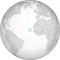 Location of Cape Verde in the globe using orthographic map projection
 -
 Created using User:Gringer/perlshaper
.svg)

Article(s): Cape Verde
Request: Could someone tweak this to conform to the remaining grey-green ortho maps? I'm not sure whether there's a specific program or script to produce these (GMT?), I had to convert it by hand from the .ps source obtained from http://www.aquarius.ifm-geomar.de/omc/make_map.html (not availably anymore -- that's a link to the web archive). Waldir talk 08:17, 19 June 2010 (UTC)
- I found this on their page. It looks like they've stopped doing orthographic projections, and they now use MapServer - I don't know what they used before.
- It looks like Brazil has the correct source infobox, though the datasets don't all show up:
Aquarius.geomar.de
{{GFDL-GMT|migration=redundant}}
I guess we need another host for this. Lesqual (talk) 03:48, 27 July 2010 (UTC)
Graphist opinion(s):
![]() Done: There's not an explicit convention for grey-green maps here, but I've attempted to get what I think to be the consensus for this map. My script works for orthographic projections, and can centre on (and highlight) a specific country (identified by its 3-letter ISO code) other projections will follow sometime later. Comments welcome. gringer (talk) 23:45, 30 August 2010 (UTC)
Done: There's not an explicit convention for grey-green maps here, but I've attempted to get what I think to be the consensus for this map. My script works for orthographic projections, and can centre on (and highlight) a specific country (identified by its 3-letter ISO code) other projections will follow sometime later. Comments welcome. gringer (talk) 23:45, 30 August 2010 (UTC)
- Awesome, thanks a million! I think there isn't an explicitly defined convention, but rather a de facto standard from the existing maps at commons:Grey-green orthographic projections maps. I do think the map you made would be better off with a slightly darker grey and possibly a lighter green overlay (so that the islands' contours are more visible). What do you think?
- Also, I'm curious about your script. Does it get vector data from Natural Earth and convert it to the orthographic projection? If so, do you think you could host an online version of it so people could generate maps like the OMC (Online Map Creation) site?
- Waldir talk 14:30, 31 August 2010 (UTC)
- The colours can be quite easily changed (see lines 431-439 in the current code, beginning '
} elsif($mapType eq "orthographic"){'). I'm using the lighter grey as used on File:BlankMap-World6.svg, which seems to be what is used for grey areas on other maps. I will have a go at putting a specification up on the map colours page to attract more comments on colouring. I'm not quite sure about the border colour, but in areas like the pacific where there are many islands, a light border gets overwhelmed by the sea (see File:NZL orthographic NaturalEarth.svg). The Perl script currently loads data assuming unpacked local shapefile(s), but I have some experience with retrieving web data from within Perl, and I believe there are some facilities available to look inside .zip files, so I'll have a go at implementing that in the future. - The projection conversion is done by the Perl module 'Geo::Proj4', and works with pretty much any projection you want (the '-tproj' command line option). I've currently only got the script working well for orthographic projections at the moment, but intend to update it to work for at least location, locator, area, world, and orthographic maps (most of those are equirectangular projections).
- Scaling is probably my main issue, because Proj4 outputs 1 unit (or pixel) as 1 metre, so output size changes depending on projection. For orthographic maps, it's easy to scale, because the diameter of the earth (in metres) is the width of the map. I haven't quite worked it out for other projections though.
- gringer (talk) 01:27, 1 September 2010 (UTC)
- The colours can be quite easily changed (see lines 431-439 in the current code, beginning '
- Updated to include zoomed map (using 10m data) to show islands. gringer (talk) 03:57, 1 September 2010 (UTC)
- Thanks, but I'm not sure I like this version as much. Maybe if the circle was partly outside the globe, the potential misinterpretation of the islands' size and position could be avoided. What do you think? --Waldir talk 19:58, 2 September 2010 (UTC)
- Okay, well I've done that. gringer (talk) 12:39, 3 September 2010 (UTC)
- Thanks! That's awesome :) However, the green "cone" still grabs too much attention compared to the rest of the image, don't you agree? What about using only dashed lines without fill? Or maybe add some transparency to make it less strong.
- Also, I still think a darker grey for the continents would make the map look better, by offering a bit more of contrast. Maybe not as dark as in the original image, but a bit darker than it is right now. Btw, you said "a light border gets overwhelmed by the sea", but I never suggested a lighter border.. What I asked for was that the green fill that (at the time) existed inside the circle was made lighter, so that the borders of the islands would stand out inside it; I see you removed that fill altogether, but since the islands are small, the location doesn't stand out immediately by looking at the map, especially with the image on a reduced size (e.g. for infoboxes). I think the fill could be there, but either a little lighter, or having the borders on a darker color.
- Finally, I think the enlarged circle could be placed on the lower right corner of the image (i.e, with its center on the top -left→bottom-right diagonal of the image), which seems liek a more "natural" position and would also eliminate the need to extend the border of the image on the lower left edge. With a transparent "cone", not much of Africa would get covered, and anyway, its full shape is prescindible for the purposes of this image, imo.
- So, what do you think about all this? --Waldir talk 20:41, 5 September 2010 (UTC)
- My short summary is that I don't agree, but that shouldn't have anything to do with it (I'm not the one making the request, and there's no clear consensus for styles used in the grey-green orthographic maps). I've made a few changes, and now have the same colour countries as in File:Africa_(orthographic_projection).svg. The changes were made in Inkscape with the SVG (by modifying fill attributes of the 'gCountries' and 'gCPV' groups, which had a side effect of changing a couple of point-defined islands in the Caribbean to a lighter colour). I also replaced the gradient with some dotted lines, and put a lighter shading on the map circle. gringer (talk) 12:34, 6 September 2010 (UTC)
- Okay, well I've done that. gringer (talk) 12:39, 3 September 2010 (UTC)
- Thanks, but I'm not sure I like this version as much. Maybe if the circle was partly outside the globe, the potential misinterpretation of the islands' size and position could be avoided. What do you think? --Waldir talk 19:58, 2 September 2010 (UTC)
- Being the requester doesn't make me right :) If you would like to explain your reasons, I'd be pleased to consider and discuss them. Also, I've edited with Inkscape before, so if these changes do not include running the script, I can adjust whatever we agree on myself, so you don't have to be constantly regenerating the image. Oh, btw, I included the map in the Cape Verde article :) --Waldir talk 17:03, 6 September 2010 (UTC)
- I think someone reverted your edit. I don't think the colours of the world map are all that important, as long as a person can see the general outline of continents (I've used the more standard blue/yellow here). What is important is being able to easily determine where in the world Cape Verde is — it is a somewhat small group of islands, so any help you can give to point out its location is good. Circling the group in on the world map is essential, shading the circle background not so much, because otherwise you can't tell the difference between the highlighted islands and the surrounding countries. I added the green cone gradient to make it really obvious where the place is, probably too obvious for someone who is familiar with the region. The person who reverted your edit may have other opinions on what looks good, but they didn't give reasons for their revert. gringer (talk) 13:46, 8 September 2010 (UTC)
United Nations Trusteeship[edit]
-
1st map
-
2nd map
Article(s): United Nations Trusteeship Council, Self-determination
Request: It looks pretty self-explanatory. Please create proper svg maps based on these. The black bar at the very bottom can be cut out. thank you. Gryffindor (talk) 19:38, 2 September 2010 (UTC)
Graphist opinion(s):


Unfortunately, the bulky text-as-shapes conversion was necessary as WP's SVG text-as-text rendering isn't quite mature. If anyone wants to bother fixing it so RSVG works, the original revision of each file has native text that renders correctly in Inkscape and Firefox. ![]() Done Lesqual (talk) 05:02, 7 September 2010 (UTC)
Done Lesqual (talk) 05:02, 7 September 2010 (UTC)
- If you want fonts to look right in wikimedia, you're pretty much restricted to Arial and Times New Roman (i.e. not helvetica). I've changed the fonts in the first image to Arial, and it seems to render properly. There may be some issues with the shape of Arial being slightly different from Helvetica, but that usually doesn't matter. gringer (talk) 22:08, 7 September 2010 (UTC)
- Great, thank you. Gryffindor (talk) 17:36, 9 September 2010 (UTC)
Extra US County on Map[edit]
-
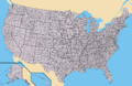 Description of image

.png)
.svg)
.svg)
Article(s): County (United States)
Request: This map has an extra county colored in. The long, thin county just north of the mainland of Dare County, North Carolina and Tyrell County, North Carolina is actually water and should be blue as it is part of the sound, not land. Thank you. Rufous-crowned Sparrow (talk) 04:12, 21 September 2010 (UTC)
Graphist opinion(s): ![]() Done Kmusser (talk) 14:03, 21 September 2010 (UTC)
Done Kmusser (talk) 14:03, 21 September 2010 (UTC)