
Wikipedia:Graphics Lab/Map workshop/Archive/Oct 2010
Stale[edit]
Route of flight[edit]
-
 Example

Article(s): 1963 Elephant Mountain B-52 crash
Request: Hello! I would appreciate if someone could PLEASE draw me a map of the intended route of an aircraft (with time stamps / Location name). I would like to see the elevation of the terrain (not toooooo much detail) on the map since it is suspected the practice flight was supposed to take place close to mountain ranges and in valleys. The B-52C departed Westover AFB, Massachusetts which is located at 42°11′38″N 072°32′05″W at 12:11 p.m. The aircraft spent 95 minutes in the area. At 2:30 p.m. it crossed the Princeton, Maine VOR Station located at 45° 19' 45.12" N 067° 42' 15.13" W just south of Princeton, Maine, near West Grand Lake and head north to Millinocket. From there, it would and fly over the mountains in the Jo-Mary/Greenville area. At 2:52 p.m., just after passing Brownville Junction, the aircraft encountered turbulence. It subsequently crashed at 45°31′40″N 69°26′5″W on the western slopes of Elephant Mountain (Piscataquis County, Maine). The crew had further planned to turn northeast near Seboomook Lake and southeast near Caucomgomoc Lake to proceed through the mountains of northern Baxter State Park. After crossing Traveler Mountain, the aircraft was supposed to return to Westover AFB via Houlton VOR located at 02' 22.18" N 067° 50' 02.94" W.
In the beginning, between Westover AFB and Princeton, a dashed line would be good (since their actual flight path is unknown). Between Princeton and the crash site, a line (without dashes - it doesn't need to be completely straight, it can curve with mountain range) and the part of the route they did not fly anymore could be a thinner line (or different color).
I know, the most locations are not given in detail but you can just pick the middle of the lake or something in the area which would have given the low flying aircraft visual clues. I GUESS they avoided towns (since they were only flying 500ft high). If you can do that without sharp turns (airplanes have a hughe turn radius) please do so. A little scale on the bottom or side (statute miles and km) would be AWESOME) Thank you!!! WideBlueSky (talk) 02:26, 5 August 2010 (UTC)
Edited coordinates of crash site in text! WideBlueSky (talk) 14:12, 5 August 2010 (UTC)
Graphist opinion:
Map of Love Parade 2010 incident.[edit]
-
 OpenStreetMap snapshot of the area
 -
 Another map of the incident


Article(s): Love Parade stampede
Request: I'd love it if someone can draw a map of the layout of the the Love parade 2010 incident. There are non-free examples of the layout and the accessroutes available [1] [2], [3]. The best would be if there were actually two maps, one of the layout, and one of the accident spot, highlighting the bridge and wall where the deaths occurred. I can help point them out if need be. —TheDJ (talk • contribs) 22:03, 26 July 2010 (UTC)
- Areal based illustration: http://www.wdr.de/themen/panorama/unfall07/loveparade/zoomify/index.html —TheDJ (talk • contribs) 23:44, 26 July 2010 (UTC)
- You can get a 3MB openstreetmap SVG version of that area from here (link copied from the png file source, png changed to svg). OpenStreetMap is a vector-based website, and can export its maps as SVG files. —Preceding unsigned comment added by Gringer (talk • contribs) 07:16, 7 August 2010 (UTC)
Graphist opinion(s):
Japanese empire[edit]


Article(s): Japanese empire
Request: Fix the South Pacific Mandate borders to the curvature of the globe. Essentially they follow the exact borders of the original TTPI. Thanks. Chris (クリス • フィッチ) (talk) 11:44, 28 July 2010 (UTC)
Graphist opinion(s):
This type of thing is extremely difficult, particularly for open-ocean boundaries, and particularly without understanding the projection used. A vector artist will only ever be able to make a vague approximation, while a GIS user would have to guess-and-check the original projection in order to georeference it. The easiest solution is probably to start over with fresh GIS boundary data - would you mind tracking that down for us?Lesqual (talk) 19:57, 29 July 2010 (UTC)
- I went looking for a GIS file for the TTPI border and came up empty - I think the original map would be better off just deleting that border entirely. Kmusser (talk) 20:27, 6 August 2010 (UTC)
- I've georeferenced and re-digitized the old naval chart for the TTPI, but that's not the end of the process. I guess I need to either A) figure out precisely what the projection is, make a map of that into an svg, and cut & paste the border area, or B) get the rest of the boundary data for the Japanese Empire and make an entirely new map. Would equirectangular or mercator as opposed to orthographic damage the artistic point the article is trying to make? Lesqual (talk) 16:22, 9 August 2010 (UTC)
Mount Cayley volcanic field[edit]
-
 Mapping of Mount Cayley volcanic field.

Article(s): Mount Cayley volcanic field
Request: Colors need to be made wiki-friendly, looks like a good target for SVG conversion IMO. ResMar 16:48, 10 August 2010 (UTC)
Graphist opinion(s):
- This appears to be a simple recoloring & de-annotation of a work currently under Crown copyright. Is this eligible for WP use based on UK copyright laws? 173.79.52.233 (talk) 18:44, 10 August 2010 (UTC)
- It would be Canada not UK, but it should be ok, User:Black Tusk made the map and while it references a map under Crown copyright his is quite a bit different than theirs. If someone did want to make a completely new map using GIS the data is available to do so at http://www.geobase.ca/geobase/en/index.html. Kmusser (talk) 01:00, 11 August 2010 (UTC)
American Scouting overseas[edit]

Article(s): American Scouting overseas
Request: replace with standard wiki-style map, no meridians... Chris (クリス • フィッチ) (talk) 13:47, 13 August 2010 (UTC)
Graphist opinion(s):
Battle of White Wolf Mountain[edit]
-
 A contemporary map of the area for reference

Article(s): Battle of White Wolf Mountain
Request: I'd like a reproduction of this battle map here http://www.anu.edu.au/asianstudies/decrespigny/peace_maps/map16.pdf that is coloured and suitable for Wikipedia. Thanks! _dk (talk) 23:21, 22 August 2010 (UTC)
Graphist opinion(s):
Scottish ancestry[edit]
-
 Map without a legend

Article(s): Scottish people
Request: Is it possible for someone to copy the legend from the source map to this one. Jack 1314 (talk) 11:49, 20 July 2010 (UTC)
- Copied over from the Maps project talk page, could also use SVG-ification. Kmusser (talk) 13:01, 20 July 2010 (UTC)
Would the one on the Valpairiso website that I found via Maps of American ancestries be sufficient as a drop-in replacement? PDF-> SVG is painless.If we're going to go all the way back to the data, constructing a new series of SVG ancestry maps from source for all the ancestry categories, with a consistent style, shouldn't be much more work than constructing one. My dead-tree Census Atlas of the United States has this in the unfortunate choice of 50-state enumerated graduated circle symbology, so that's right out. Lesqual (talk) 16:53, 20 July 2010 (UTC)
- The Valpairiso website map looks good. Thanks. Jack 1314 (talk) 17:01, 20 July 2010 (UTC)
- I'd support just replacing them with the Valparaiso maps as well. Kmusser (talk) 17:07, 20 July 2010 (UTC)
- Edit: Whoops, didn't note the tiny JTK signature on them, I had assumed they were US Census products. Can't use them, unfortunately. I'll have time this weekend to see about choropleth map conventions on wikipedia, it sounds like a nice self-contained project. Lesqual (talk) 17:11, 20 July 2010 (UTC)
- I believe that also means that the Jewish and Finnish maps on Wikipedia which do copy the Valpo graphic need to be removed as well. The Jewish one even has the creator's full name, and the current copyright holder noted. While US Census Data and maps are free, anything created independently which uses US Census data has its own licensing. Lesqual (talk) 17:17, 20 July 2010 (UTC)
Is it possible to get an update on this request? Thanks. Jack 1314 (talk) 10:47, 27 July 2010 (UTC)
Graphist opinion(s):
![]() Request taken by Lesqual.
Request taken by Lesqual.
Resolved[edit]
Combined UK county map (Tyne & Wear, Northumberland and Cumbria)[edit]
Graphics Lab/Map workshop/Archive/Oct 2010 | |
|---|---|
 Location in Tyne and Wear | |
| Coordinates: 54°57′N 1°35′W / 54.95°N 1.59°W | |
| Location | Tyne and Wear, England, UK |
Graphics Lab/Map workshop/Archive/Oct 2010 | |
|---|---|
 Location in Northumberland | |
| Coordinates: 55°18′N 1°41′W / 55.30°N 1.68°W | |
| Location | Northumberland, England, UK |
Graphics Lab/Map workshop/Archive/Oct 2010 | |
|---|---|
 Location in Cumbria | |
| Coordinates: 54°30′N 3°15′W / 54.5°N 3.25°W | |
| Location | Cumbria, England, UK |
Article(s): Hadrian's Wall
Request: I'd like to complement the Wikipedia article on Hadrian's Wall with a route graphic. Would anyone be able to do something like the county location maps but combining Tyne & Wear, Northumberland and Cumbria? It's a little (a lot, if I'm truthful) beyond my skills, I'm afraid, but would be a useful addition to the article. Sammy_r (talk) 15:30, 15 September 2010 (UTC)
Graphist opinion(s):
![]() Done: Nilfanion (talk) 22:09, 22 September 2010 (UTC)
I can do this from the OS OpenData I've been using to create the "new" county locator maps. This includes the route of the Wall so a basic map will be easy (The strongly related Hadrian's Wall Path is also included). Question is what precisely you want to display: Do you want a present-day map, an ancient map or some combination of both? Present-day info is easy and I could include modern admin boundaries, rivers, lakes, modern roads and cities. As the lake data includes eg Kielder Water showing the natural lakes only will be slightly harder.
Done: Nilfanion (talk) 22:09, 22 September 2010 (UTC)
I can do this from the OS OpenData I've been using to create the "new" county locator maps. This includes the route of the Wall so a basic map will be easy (The strongly related Hadrian's Wall Path is also included). Question is what precisely you want to display: Do you want a present-day map, an ancient map or some combination of both? Present-day info is easy and I could include modern admin boundaries, rivers, lakes, modern roads and cities. As the lake data includes eg Kielder Water showing the natural lakes only will be slightly harder.
If you want a primarily ancient map, I may be able to add on the Roman roads but this will take some time. If you can provide a latitude/longitude list of point locations such as towns and forts you'd want shown I can add those easily enough.--Nilfanion (talk) 19:15, 18 September 2010 (UTC)
- I was really after a relatively simple map allowing the reader to see where the wall runs in relation to modern features (physical and/or political). The initial idea is to give a high-level idea of the route, e.g. "oh . . it runs through Carlisle along the R Eden, . . . it runs along the south of the Solway Firth, . . . it starts at that bend on the R Tyne.", etc., almost at a glance. Very much like the UK county maps currently do (very well IMHO) for non-linear features. However, if the reader can additionally have something that allows them to see it in more detail . . . well that would obviously be wonderful, though I must admit it was outside my original concept. Likewise with the more ancient map showing Roman roads (and preumably settlements). Totally brilliant, but well above and beyond the call of duty, as it were. Incidentally, I have the OS Roman Britain map, if you need bits of it scanning and sending. Thanks very much for considering my request. Sammy_r (talk) 22:10, 20 September 2010 (UTC)
- OK, well uploaded File:Hadrian's Wall map.svg, which shows relationship to rivers, modern counties and towns (the basic concept you had in mind). Any feedback on it appreciated. A more complex map is doable, but certainly would be hard. For what its worth I have the OS map too, and I'm thinking about how I could create a similar one from the free OS data...--Nilfanion (talk) 22:09, 22 September 2010 (UTC)
Hermannstädter Stuhl - Josephinische Landesaufnahme[edit]

Can anyone view the image resolve? Best version is from September 5.Asybaris01 (talk) 16:40, 9 September 2010 (UTC)
- Views fine at full resolution for me. You might want to convert your original to PNG format before compressing, noticed some small compression errors in the last version. Kmusser (talk) 17:08, 9 September 2010 (UTC)
Update Starbucks map[edit]
Article(s): Starbucks
Request: Please update Vietnam as Starbucks is now available in Ho Chi Minh city, Vietnam Josh (talk) 11:44, 11 October 2010 (UTC)
Graphist opinion(s):
![]() Done Wereldburger758 (talk) 05:18, 12 October 2010 (UTC)
Done Wereldburger758 (talk) 05:18, 12 October 2010 (UTC)
Error in svg-file[edit]

Article(s): [5]
Request: file creates error on wikipedia: Error creating thumbnail: librsvg-ERROR **: _rsvg_acquire_xlink_href_resource called for external resource: " base: (null)
aborting... Fix the error please. Wereldburger758 (talk) 21:43, 10 October 2010 (UTC)
Graphist opinion(s):
![]() Done Did it myself. Wereldburger758 (talk) 13:26, 12 October 2010 (UTC)
Done Did it myself. Wereldburger758 (talk) 13:26, 12 October 2010 (UTC)
inaccurate maps of Croatian motorways[edit]
-
 Map of Croatian motorway A1
 -
 Map of Croatian motorway A13


Article(s): A1 (Croatia), A13 (Croatia)
Request: Please fix coloring of certain route parts as explained at commons:User talk:Minestrone#Croatia Autocesta A1.svg and commons:User talk:Minestrone#File:Croatia Autocesta A13.svg - the original uploader hasn't answered the original request in a while, and it really just takes a few touches in an SVG editor. (The part of the request about city labels is entirely optional.) TIA. --Joy [shallot] (talk) 11:59, 8 October 2010 (UTC)
Graphist opinion(s): ![]() Done Please check and make sure I got them right. Kmusser (talk) 14:18, 14 October 2010 (UTC)
Done Please check and make sure I got them right. Kmusser (talk) 14:18, 14 October 2010 (UTC)
- It looks good, thanks! --Joy [shallot] (talk) 18:36, 14 October 2010 (UTC)
Utah Population Density[edit]
-
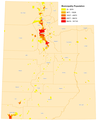 Map of the population of Utah municipalities

Article(s): Wasatch_Front
Request: This map is very confusing. It claims to show population density, but density is expressed in population/area. This map merely shows the population for the municipalities. Besides, the map has the traditional layout of a population density map. Whole areas colored in various shades of red/yellow normally do indicate density. A map that only shows population sizes of towns will generally have dots of varying sizes for the towns. A third problem is the bizarre classification. '15,027 - 42,670' is not a normal class. 94.208.18.55 (talk) 22:34, 23 September 2010 (UTC)
Graphist opinion(s):
You're right, this is not a map of population density. The odd class ranges might be the result of some "natural breaks" algorithgm, like Jenks Natural Breaks Optimization... maybe. What should be done? I see it is used on the Wasatch Front page, although the caption describes it correctly as "A map showing the population of Utah municipalities". Still, the map itself is titled "population density". I suppose someone could edit out the present title and insert something better. Or are there other maps available? I'll check the Commons in a little bit. Pfly (talk) 02:39, 13 October 2010 (UTC)
- Ah, there's an actual population density map on the Utah page, File:Carte Utah population.png. I'll use that to replace this one on the Wasatch Front page. Pfly (talk) 04:00, 13 October 2010 (UTC)
West Indies Federation[edit]

Article(s): West Indies Federation
Request: change color so member islands show up better-Wiki grey land, white ocean, green referenced area is best... Chris (クリス • フィッチ) (talk) 14:41, 25 September 2010 (UTC)
Graphist opinion(s):
- Er, that colour scheme has already been done. Check the file history of that image. FWIW, with the location map colours they're using, the West Indies should probably be marked in red. gringer (talk) 02:55, 26 September 2010 (UTC)
- Run with it!--Chris (クリス • フィッチ) (talk) 02:13, 11 October 2010 (UTC)
- I switched them to red as Gringer suggested and also cropped it a little. Kmusser (talk) 14:00, 14 October 2010 (UTC)
- Not quite that red, I've changed it to something less saturated, now that the map had something easy to search for. The tentative map conventions can be found here (also linked to at the top of the Map Workshop page). gringer (talk) 11:57, 18 October 2010 (UTC)
- I've circled all but the two largest islands (I think), because I wasn't happy with the visibility of the small islands. I also looked at the image in Inkscape, and noticed land outside the picture area, which has now been removed. gringer (talk) 12:24, 18 October 2010 (UTC)
- I switched them to red as Gringer suggested and also cropped it a little. Kmusser (talk) 14:00, 14 October 2010 (UTC)
- Run with it!--Chris (クリス • フィッチ) (talk) 02:13, 11 October 2010 (UTC)
map adjustments[edit]
-
 Territory map of Le Golfe-du-Saint-Laurent RCM
 -
 Territory map of Minganie RCM


![[1]](http://www.festivalpig.com/images/Love-Parade-Directions.gif)
![[2]](http://www.loveparade.ro/images/Loveparade-zugang421.jpg)
![[3]](http://www.loveparade.ro/images/news2010/Loveparade-Streckenplan-201.jpg)
Article(s): Le Golfe-du-Saint-Laurent Regional County Municipality and Minganie Regional County Municipality
Request: These 2 maps need to be updated to reflect recent boundary changes, see http://www.mamrot.gouv.qc.ca/publications/cartotheque/region_09.pdf. -- P 1 9 9 • TALK 19:23, 30 September 2010 (UTC)
Graphist opinion(s):
![]() Done
Done
- Thanks for the nice PDF! File:Quebec MRC Le Golfe-du-Saint-Laurent location map.svg and File:Quebec MRC Minganie location map.svg have been uploaded to Commons. Odysseus1479 (talk) 02:39, 14 October 2010 (UTC)
Article(s): Lebanon – Iran relations
Request: Could someone make a map highlighting Iran and Lebanon (preferably focused on the region since both countries are nearby and it would then show up) Something akin to other such maps on these pages (eg:India – Palestine relations or India – Ireland relations) Lihaas (talk) 04:49, 14 October 2010 (UTC)
Graphist opinion(s):

![]() Done Wereldburger758 (talk) 07:42, 14 October 2010 (UTC)
Done Wereldburger758 (talk) 07:42, 14 October 2010 (UTC)
- Cool, and quick. Thanks ;)
- Just 1 query, i've used this map, but is it possible to get one focused on the region?
- Another quick one, can we get one for Iran - Ecuador relations too? Thanks(Lihaas (talk) 11:05, 14 October 2010 (UTC));
- There is already one on wikipedia: [6]. It is a png-file though. For another request, start a new request or it won't be noticed. Wereldburger758 (talk) 11:15, 14 October 2010 (UTC)
- I went ahead and did the Iran - Ecuador one. Kmusser (talk) 13:37, 14 October 2010 (UTC)
- Another quick one, can we get one for Iran - Ecuador relations too? Thanks(Lihaas (talk) 11:05, 14 October 2010 (UTC));
- Alternative orthographic versions for Iran-Ecuador and Iran-Lebanon are now available, just because I could.... gringer (talk) 12:53, 18 October 2010 (UTC)
- Looks good. Wereldburger758 (talk) 06:30, 20 October 2010 (UTC)
- Just 1 query, i've used this map, but is it possible to get one focused on the region?
![[6]](https://commons.wikimedia.org/wiki/File:Iran_Lebanon_Locator.PNG)
.svg)
.svg)