Request: The image uploader has retired from Wikipedia unfortunately. 1. The label for Indiana Territory is incorrect and should be removed. That area was all part of Illinois Territory, no part of Indiana Territory at that time is shown in the map. 2. For use of the image in the article, Illinois Territory in the War of 1812, a orange dot and label for Peoria at about the e in Illinois River as well as a numbered red dot there. Not sure how that could all be squeezed in. 3. convert to SVG. I don't know anything about this but someone has tagged the image for this. Rmhermen (talk) 14:16, 4 April 2011 (UTC)[reply]
Request: I'd like to have a map on the 300+ (!) monitoring stations of the International Monitoring System for the CTBT similar to this map. They come in 5 types (primary seismic, auxilliary seismic, infrasound, hydroacoustics and radionuclide) and 80% of the stations are completed.
Latitude/Longitude Locations are at a US site (at "ANNEX 1 TO THE PROTOCOL") and the status is at the CTBTO prepcom site. I suggest a legend comprising
open symbols for non-certified installations (no specification of planned, testing, construction etc)
closed symbols for certified installations
using separate symbols/colours for the 5 station types.
An additional symbol (asterix, cirkel around it?) identifying those 50% of the radionuclide stations that will do noble gas monitoring (ctbto site above) would be nice as well.
I realize this might be a lengthy task, but appreciate anyone taking it! L.tak (talk) 10:23, 10 April 2011 (UTC)[reply]
Request: The map shows Northern England, with other parts of GB (and offshore islands), but omits the Isle of Man and Ireland. For completeness, these should be added. Ghmyrtle (talk) 16:30, 12 April 2011 (UTC)[reply]
Request: Could you please make a free version of this picture? I want to use it on the above standing articles. Thank you a lot, Aliesperet (talk) 17:06, 16 April 2011 (UTC)[reply]
Request: Either translate the Russian place labels into English, or update the spread of the disease with the information located on page 9 of this document. I understand that the latter is a bigger ask. Malkinann (talk) 09:11, 22 April 2011 (UTC)[reply]
Request: An animated map of this type would be useful to represent the territorial changes of the First and Second Bulgarian empires, with a timespan between 681 and 1396. To make things more compact, a square format map based on this geographic rendition would be good. Source maps with available content are provided above. I'm sorry for making a bit complicated a request, but as far as I know these types of maps can be requested here. - ☣TourbillonA ? 13:22, 19 April 2011 (UTC)[reply]
Comment The above sequence, if converted into an animated map, doesn't include periods when there was territorial extinction eg post-1015. These would need to be included. DeCausa (talk) 21:26, 24 April 2011 (UTC)[reply]
Comment I'm adding a map of the region under Byzantine rule, post-1018, but considering that the timespan encompasses the creation and the collapse of the empires, an extra map with the Ottoman occupation wouldn't be that necessary. - ☣TourbillonA ? 06:02, 25 April 2011 (UTC)[reply]
Request: Can this be cropped to exclude the inset and move "South Pacific Ocean" to the top right; so as to make the image a horizontal rectangle, rather than a square? Anthonyhcole (talk) 05:19, 23 May 2011 (UTC)[reply]
Graphist opinion(s): Request taken by Pi.1415926535.
I'll take a look later today. It's a fairly simple image; do you want a vector version as well? Pi.1415926535 (talk) 21:45, 23 May 2011 (UTC)[reply] Done
The modified version is at File:Pitcairn Islands-CIA WFB Map 2.png. Just let me know if you want any other modifications or a vector version. Pi.1415926535 (talk) 03:54, 24 May 2011 (UTC)[reply]
Request: Could we get the observer states of mexico and panama in a different colour, or a different shade of green? Thnx Lihaas (talk) 23:37, 8 May 2011 (UTC)[reply]
if someone can vectorize this map and post it on Code Geass wikipedia page?
thanks — Preceding unsigned comment added by Drax90 (talk • contribs) 17:27, 31 May 2011 (UTC)[reply]
Graphist opinion(s): The file you have linked appears to be a flag and not a map. Vector requests for flags should be made over at the Illustration workshop. Please place your request over there using the Make a new request button. Thank you! -MissMJ (talk) 23:55, 5 June 2011 (UTC)[reply]
Graphist opinion(s): Request taken by MissMJ.: Why was this ever made in raster format? Sigh. Thankfully it's not too complicated to vectorize and translate.
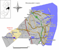
Request: There is an existing map of the county and the placement of the township (Commons, File:Millstone twp nj 025.png), however, it appears to badly misplace the town of Shrewsbury, which is shown located at the left between Roosevelt and Allentown, but according to sources belongs closer to Red Bank way across the county ( see Google Maps, the short link it gave me is being blacklisted ). The original mapmaker seems likely gone (the map was created in 2005), but it might be possible to at least erase Shrewsbury from the map, I gave it an attempt myself but I'm just not skilled enough to get a clean result. Simply removing Shrewsbury would be preferable to the current state, moving it correctly would be even better. --joe deckertalk to me 03:18, 20 May 2011 (UTC)[reply]
Graphist opinion: Request taken by Pi.1415926535.: I'll give this a quick GIMPify. Pi.1415926535 (talk) 21:12, 8 June 2011 (UTC)[reply] Done: New version uploaded, with Shrewsbury moved to proper position. Pi.1415926535 (talk) 21:35, 8 June 2011 (UTC)[reply]
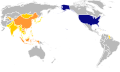
Request: Requesting an orthographic projection (similar to File:North Atlantic Treaty Organization (orthographic projection).svg ) with the United States (and its territories) and those nations listed in Template:Asian Americans highlighted. Request that the highlights for the United States be that of the Flag of the United States, and the highlights of the Asian Nations either be that of their flags, or multiple shades of a single color. RightCowLeftCoast (talk) 17:46, 23 March 2011 (UTC)[reply]
Perhaps the map File:Orthographic projection centred over Magadan.png would make a good base?--RightCowLeftCoast (talk) 13:25, 26 March 2011 (UTC)[reply]
Why no takers? Should I simplify my request? --RightCowLeftCoast (talk) 00:03, 26 April 2011 (UTC)[reply]
How can this request be improved so that interested graphic artist would create such an image? --RightCowLeftCoast (talk) 11:34, 18 May 2011 (UTC)[reply]
Graphist opinion(s):
I think the problem arises from your wish to use an orthographic projection. It is very difficult, if not impossible, to highlight both the United States and all of the nationalities listed in that template while having everything clearly visible. Because of the geographic nature of the Earth and the size of the Pacific Ocean, finding a projection in which both the Asian and the North American continents are clearly visible, as well as any islands, is pretty much impossible. I've looked through the SVG orthographic projections in the Commons and none have the needed angle. While the one centered over Magadan that you linked to comes the closest to the correct angle, it is a PNG file and not editable for this purpose. I would have loved to create a map with a different center myself, but the tool used to make these is... complicated, to say the least. I think one would need to have some serious experience with command line interface and creating maps using the particular software to get anything meaningful out of it. So your choices are to find someone who is comfortable with Generic Mapping Tools if you are dead set on having an orthographic projection, or to settle for a Robinson projection instead. I'd be more than happy to create a map using the latter, provided you give me a list of all the countries you need included—the template you link to isn't particularly clear in that regard, for example, what specific countries are associated with Indo-Caribbean? -MissMJ (talk) 04:14, 5 June 2011 (UTC)[reply]
The reason why I first suggested the Orthographic projection was because it was like the projection used by the UN; however, if it cannot be done, any workable suggestion would do. They key point is to include all areas covered by the WikiProject and the United States, with smaller images of the nation's flags within the map image. This way it would be as inclusive as possible.
Presently someone changed the WikiProject banner to use the 2000 census population density map, however, it doesn't fully encompass the diaspora/immigrant origins of the ethnicities that make up the scope of the wikiproject. --RightCowLeftCoast (talk) 23:11, 5 June 2011 (UTC)[reply]
I can use a blank Robinson projection map centered on the Pacific Blank map to use as base and color in the needed countries, if you would provide me with a list of countries that need to be colored in. Putting flags in all of them would be impossible since only the United States, China, and maybe India are large enough to fit a flag in their area. But colors would be super simple. Maybe two different shades of green? MissMJ (talk) 03:55, 6 June 2011 (UTC)[reply]
Perhaps if the map can be zoomed in with Pakistan being the west most nation, and the U.S. Virgin Islands being the easternmost U.S. Territory?
Perhaps use different shades of Yellow for each nation that fall within the Asian category, with United States in Old Glory/Navy Blue? --RightCowLeftCoast (talk) 17:52, 6 June 2011 (UTC)[reply]
Alright, there we go. I thought yellow might be a bit impolitic >_> so I highlighted it in orange. The areas highlighted are Bangladesh, Cambodia, China, Democratic People's Republic of Korea (North Korea), Guyana, India, Indonesia, Jamaica, Japan, Lao People's Democratic Republic (Laos), Mongolia, Myanmar, Nepal, Pakistan, Philippines, Republic of Korea (South Korea), Singapore, Sri Lanka, Taiwan (Province of China), Thailand, Trinidad and Tobago, United States of America, and Viet Nam, based on the nationalities listed in the Template:Asian Americans. Did I miss any? MissMJ (talk) 02:16, 7 June 2011 (UTC)[reply]
Republic of China, Hong Kong, and Macao should have a different shade than China, as should Tibet (although the latter is not necessary). Forgot Malaysia, Brunei and Bhutan. See this; ancestry categories 600-799.
Done Added highlights for Hong Kong, Macao, Malaysia, Brunei, Bhutan, American Samoa, Guam, Northern Marianas, and Puerto Rico. The Virgin Islands and Minor Outlying Islands were already highlighted. Tibet doesn't have its own ISO 3166-1 alpha-2 code, therefore cannot be highlighted separately from China without going in and drawing the region by hand, which I am not equipped to do. Is it okay to have that association with the color, do you think? :S I tried to stay away from yellow to avoid the falling for the "Asian = yellow" stereotype, so if coloring them in orange has an association of the United States warring with Japan... it may not be the best choice for a project on Asian-Americans? >_> I don't want it to be offensive. I could recolor them in purple or pink or something. xD Let me know. -MissMJ (talk) 06:02, 8 June 2011 (UTC)[reply]
Thanks! looks good to me. I would have suggested brown, but that was a color code plan for a rebellion in the Philippines. --RightCowLeftCoast (talk) 07:14, 8 June 2011 (UTC)[reply]
There's just no colors left without negative associations, is there? xD I guess if anyone gets offended and wants it changed, they can message me. Marking this request as resolved. MissMJ (talk) 19:11, 8 June 2011 (UTC)[reply]
And to answer your question, anything has a negative association, depending on the viewers POV. --RightCowLeftCoast (talk) 07:26, 9 June 2011 (UTC)[reply]
Added Maldives and East Timor, though they are both so small that they're, for all intents and purposes, invisible on the map. >_> -MissMJ (talk) 21:04, 9 June 2011 (UTC)[reply]
Once again, thanks. They are both small, but should still be included for completeness. ^_^ --RightCowLeftCoast (talk) 22:13, 9 June 2011 (UTC)[reply]
Request: Can someone create some two higher quality maps of the Crown of Castile? The first an Orthographic projection version using Spain as a template, The second a "normal" 2D map using the Location map as a basic template. This map with the borders of the current regions [3] should help. - — Preceding unsigned comment added by 89.168.11.251 (talk • contribs)
Graphist opinion(s): Regarding your first request: The Crown of Castile was a medieval state, while the orthographic projection map you suggest using as template depicts modern-day states and borders. Therefore it'd look kinda weird (and wrong) to have medieval borders in a 21st century map, unless you can find a medieval (or early modern) orthograpic projection map, we could use as a template. Now, regarding your second request it is possible, anyone capable enough willing to take the request?--Sisyphos23 (talk) 10:28, 19 May 2011 (UTC)[reply]
I'm confused. File:Corona de Castilla_1400_en.svg seems to be a perfectly good SVG image of the Crown of Castile with several translations. You can't get any higher quality than that. Why would this be replaced with anything else, much less a lower resolution PNG being proposed above...? -MissMJ (talk) 08:08, 10 June 2011 (UTC)[reply]
No, I mean... What's the point? The original request asked for "higher quality maps of the Crown of Castile." The lack of a need for orthographic projection was addressed already, but as to the second map, File:Corona de Castilla_1400_en.svg is already as high quality as you can get. So A. I'm confused as to the point of the request to begin with, and B. what's the point of making a PNG with a part of Spain highlighted? It doesn't look like it serves any purpose in terms of providing any more information than File:Corona de Castilla_1400_en.svg, and being a raster file, it is not easily editable and goes against the goal of vectorizing images in Commons. Not to mention it seems that you have missed a province that needs to be highlighted on the eastern side... MissMJ (talk) 00:05, 14 June 2011 (UTC)[reply]
Request: The German version of this map is far superior in terms of information. It includes the names and boundaries of the Parishes of the island, and also includes in red the "Exclusion Zone" and shows its boundary in red (exclusion zone is due to the active volcano). Can we improve the English version of the map in a similar way to the German one? Also please note: the Key in the English version needs to say "Mountain peak" not "Mountain pick"! Thanks so much, Invertzoo (talk) 13:26, 12 May 2011 (UTC)[reply]
Note that all of the towns in the exclusion zone are uninhabited and uninhabitable. Many of the roads and settlements are completely covered in ash and pyroclastic flows and hardly exist as mappable objects any more. Check Google maps "Island of Montserrat" in map form and satellite image to see what I mean. Invertzoo (talk) 23:32, 12 May 2011 (UTC)[reply]
Graphist opinion(s): Done I didn't include the parishes but added everything else in from the German version. Kmusser (talk) 19:53, 13 June 2011 (UTC)[reply]
Request: The old map was good since it showed the boundaries of the different provinces in each region. The new map does not do that anymore unfortunately. The two provinces are autonomous however and their exact location need to be shown in the region. Can the border as seen on the original map [4] be included in the currently used map [5]? Gryffindor (talk) 12:02, 9 June 2011 (UTC)[reply]
Graphist opinion:
I'll take a look. Should be a case of one to the other. Complicated sizing issues going on. Grandiose(me, talk, contribs) 17:05, 9 June 2011 (UTC)[reply]
I was able to get it. Should be good to go. Kmusser (talk) 20:18, 13 June 2011 (UTC)[reply]
Can the map File:Italy location map.svg also be changed to add the two provinces? Please upload under another name though, call it "Trentino-South Tyrol location map.svg". The borderline between the two should however be of the same greyish colour and thickness like the rest. Thank you. Gryffindor (talk) 23:31, 17 June 2011 (UTC)[reply]
No problem, added at the suggested name. Kmusser (talk) 02:14, 18 June 2011 (UTC)[reply]
Great. Could you make the black borderline however the same grey with the same thickness as the other internal borders? If you could change that on both maps, that would be fantastic. Thank you very much. Gryffindor (talk) 17:21, 18 June 2011 (UTC)[reply]
Request: The traditional colours of the region are green (Tripolitania), black (Cyrenaica) and red (Fezzan). Please switch the pink from Cyrenaica to Fezzan and change Cyrenaica to a grey (since black would be too strong). Thank you. Gryffindor (talk) 16:31, 13 June 2011 (UTC)[reply]
Graphist opinion: DoneKmusser (talk) 20:25, 13 June 2011 (UTC)[reply]
Request: Update the map for the Lonestar Conference. The map shows Oklahoma highlighted although it no longer should be. Needs a map with only Texas & New Mexico highlighted on a US map NativeTexan55 (talk) 00:50, 18 June 2011 (UTC)[reply]
Graphist opinion(s): DoneDerfel73 (talk) 09:06, 18 June 2011 (UTC)[reply]

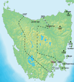
 PNG map of Livonia in 1534
 SVG map of Livonia in 1260
.png)

 Illinois Territory in the War of 1812
 Map of Northern England
 Spread of disease as of 2007, place names in Russian
 Initial image (681 AD)
 Second image (889 AD)
 Greatest extent (927 AD)
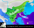 Downfall of the First Bulgarian Empire (ca. 1000 AD)
 Byzantine rule (ca. 1180 AD)
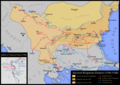 Restoration of Bulgaria (1196 AD)
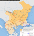 Greatest extent of the Second empire (1241 AD)
 Collapse of the empire (1371 AD)

-TsarSimeon-byTodorBozhinov.png)


.png)


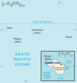 CIA map of Pitcairn Islands (South Pacific)
 UNSAUR permanent memebrs
 UNSAUR permanent members with observer states in light green
.svg)
.svg)
 Map of the Orient Express
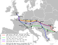 English translation + vector
 French translation
 Russian translation
.svg)
.svg)
.svg)
 It has a bit of an error...
 Colored map
 Done Added highlights for Hong Kong, Macao, Malaysia, Brunei, Bhutan, American Samoa, Guam, Northern Marianas, and Puerto Rico. The Virgin Islands and Minor Outlying Islands were already highlighted. Tibet doesn't have its own ISO 3166-1 alpha-2 code, therefore cannot be highlighted separately from China without going in and drawing the region by hand, which I am not equipped to do. Is it okay to have that association with the color, do you think? :S I tried to stay away from yellow to avoid the falling for the "Asian = yellow" stereotype, so if coloring them in orange has an association of the United States warring with Japan... it may not be the best choice for a project on Asian-Americans? >_> I don't want it to be offensive. I could recolor them in purple or pink or something. xD Let me know. -MissMJ (talk) 06:02, 8 June 2011 (UTC)
 Is this good enough?
 2010 CA 19.svg
 Orthographic projection map
 Map of the Crown of Castile
.svg)


 Request taken by Presidentman. (Only the 2nd one)
 Finished product
 Map of Montserrat in German
 Map of Montserrat in English

 Original map
 Currently used map


 Old Lone Star Conference Map
 Updated Lonestar Conference Map

.svg)
![[3]](http://2.bp.blogspot.com/_GRhaWELNbUE/TDBu30uAnYI/AAAAAAAADL0/5HKn4x0xRXM/s1600/1492.jpg)
![[4]](https://en.wikipedia.org/wiki/File:Map_Region_of_Trentino_Alto_Adige.svg)
![[5]](https://en.wikipedia.org/wiki/File:Trentino-South_Tyrol_in_Italy.svg)