
Wikipedia:Graphics Lab/Images to improve/Archive/Mar 2007
 | This page, part of the Graphics Lab Wikiproject, is an archive of requests for March 2007. Please do not edit the contents of this page. You can submit new requests here. |
 Done Palenque glyphs.jpg
-

-
 edit to adjust levels


Article(s): Mayan languages Maya script Mesoamerican writing systems Maya art
Request: This image is murky and I believe that the contrast between the hieroglyphs and the background is poor, making it difficult to see the hieroglyphs. Could you somehow make the hieroglyphs stand out more, so that the casual viewer can see the detail?? Thanks, Madman 16:09, 17 February 2007 (UTC)
Graphist opinion: This photo isn't that well exposed. I have adjusted the levels to spread out the color information over a broader range. Hope this helps.-Andrew c 18:58, 17 February 2007 (UTC)
- Fabulous!! Just what I was looking for. Thank you so very much. Madman 21:43, 17 February 2007 (UTC)

Article(s): Olmec heartland & in a gallery at w:fr:Art olmeque. This is a classic statue that shows up in several key publications and I would like to use it in Olmec & other articles if it can be cleared up a bit.
Request: I am wondering whether you can bring any clarity to this photo. In particular, the face of the statue is damaged, and is dark under that hat - can anything be done here? Also, any reduction in the general blurriness would be great. The subject is to dark. Help!
Graphist opinion: Well this wasn't quite easy and I'm quite dissatisfied with results too. Maybe someone else could do it better. The major problem is low jpeg quality resulting in visible coloured artifacts at higher brightness. I tried to fix it but the background remained quite blurred as a result. --Miko3k 04:56, 2 March 2007 (UTC)
- Thank you very much for your work. I realize that there's only so much that can be done. You folks are a needed center of expertise and I keep bringing work here and am pleased with the results. Thanks, Madman 13:30, 2 March 2007 (UTC)
Done Nauru map
-
 Original request
 -
 Available German map
 -
 Vector version with French text
 -
 Attempt at an English version


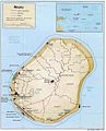
Article(s): Nauru (featured article)
Request: Since such a great job was done on the map of East Timor, I've decided to request another map. This map is the only map in this featured article and is quite difficult to read since it looks scanned. I would like to request that this map be redrawn or edited for clarity in .svg,.png or .jpg, while retaining the map scale, legend and mini map, that would be amazing. Hopefully this featured article can have a fully detailed, easy to read map. Thank you again. Bobo is soft 00:58, 13 December 2006 (UTC)
Graphist opinion:
In commons:Category:Maps of Nauru there are a few maps of Nauru speaking German. I could redraw that map, but I doubt that my job would be any better. I could easily fix the German if you supply some English translation.
/ Mats Halldin 08:41, 13 December 2006 (UTC)
- I'm going to try and copy that great German one as an SVG, and translate into English. --Canley 10:33, 13 December 2006 (UTC)
- Canley, let us know if we can help you in any way. I can't use the demis maps on this one because Nauru is much to small in the resolution available. However, the Swiss guy who made the orginal German map, Tschubby, is apparently using CorelDRAW, so it's possible that the map is already available as vector graphics. The easiest thing to do might be to ask him to produce the SVG from his original file.
- / Mats Halldin 10:24, 15 December 2006 (UTC)
- Yeah, that might be a better idea, I haven't got very far on this to be honest, just traced the outline of the island. --Canley 07:20, 20 December 2006 (UTC)
- Ok, I contacted Tschubby on the German Wikipedia. Let's wait and see.
- / Mats Halldin (talk) 13:53, 20 December 2006 (UTC)
- Tschubby answered that he is not uploading his maps as vector graphics to avoid commersial use of them. He also said that he have produced thousands of maps as PNG and if he accepted to converted the Nauru map he would quickly get thousands of similar requests. So, to put it short, back to work - no simple tricks!
- / Mats Halldin (talk) 16:44, 20 December 2006 (UTC)
- Hi I'm from the french wikipedia, right now i'm working on the vectorisation of the german map it will be made tomarrow so please don't do anything, you will just have to put the english topography; if you want to talk with me detter contact me on the french wikipedia fr:Utilisateur:Kimdime69 --Kimdime69 03:32, 11 January 2007 (UTC)
- Yeah, that might be a better idea, I haven't got very far on this to be honest, just traced the outline of the island. --Canley 07:20, 20 December 2006 (UTC)
Per requested from Bobo is soft on my talk page, I tried to tweak his English version of the French SVG map to make the village labels show up properly. I haven't managed to do that yet, and there are other weird issues with the image, such as a black box that keeps showing up in the thumbnails even though I deleted the element that I thought was responsible. Anyway, I've worked on it enough for today — if anyone else can make it render right, please do. I also noticed that the descriptions of many buildings and other features seem to differ greatly between the various versions; those probably need to be checked against a reliable source. —Ilmari Karonen (talk) 11:14, 24 January 2007 (UTC)
- I've added the English map to the Nauru article for now. All that is needed is for a kind artist to remove the mysterious black bar on the map. Bobo is soft 02:20, 3 February 2007 (UTC)
- I have decreased the file size to almost a forth of what it was, but for some reason now there is a black rectangle apearing near the words "Anibare Bay" on the right side. Any idea what's up? --Indolences 09:45, 11 February 2007 (UTC)
- I've added the English map to the Nauru article for now. All that is needed is for a kind artist to remove the mysterious black bar on the map. Bobo is soft 02:20, 3 February 2007 (UTC)
- Thanks for improving the image. That black bar has been there ever since I uploaded the map, but was not there when I was editing the map in Inkscape. We're waiting for an experienced .svg editor to come along and see if it can be fixed. Bobo is soft 22:38, 11 February 2007 (UTC)
- The first thing I noticed was leftover
svg:foreignObjectinsidesvg:switchin the "hydronimes" group. There are also twosvg:flowRootnodes there that are off the page and seem to do nothing. Removing the twosvg:flowRootobjects gets rid of the black boxes, while removing the "hydronimes" group removes about 130k. Give me a few more minutes and I'll update the svg. —davidh.oz.au 04:47, 24 February 2007 (UTC)
- The first thing I noticed was leftover
DoneVirus replication
-
 Original
 -
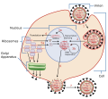 SVG version


Article(s): Influenza, Orthomyxoviridae
Request: From Category:Images which should be in SVG format.↔NMajdan•talk•EditorReview 15:47, 15 February 2007 (UTC)
Graphist opinion: I think I'll take a stab at this one. -YK Times 18:32, 4 March 2007 (UTC)
- Finished. Any improvements needed? -YK Times 02:56, 6 March 2007 (UTC)
West Leeming Primary School Logo

Article(s): West Leeming Primary School
Request: I would like the logo to be converted into a svg. My reasoning for this is that the image is of low quality, there are NO higher quality images available and, the image would be quite simple to convert using inkscape. -symode09 10:10, 2 March 2007 (UTC)
Update I have changed the tag appropriately. Your concerns have been seen to. The image is now appropriate to be vectorizedsymode09 22:04, 3 March 2007 (UTC)
Update 1 The tag hasn't been changed JUST for my needs. I have been wanting this template for a while. There is an almost identical US government equivelant and I know that, as in the US government's case, this image is government owned and in the public domain.symode09 22:04, 3 March 2007 (UTC)
- As we must err on the side of caution before stating an image is in the public domain, can you please provide some evidence as to this? Such as a "Terms of use" page on a website that states the images are in the public domain. I know that I am not familiar with the government of Australia, but I just want to make sure that this school, and logo, fall under the scope of the govt.↔NMajdan•talk 22:08, 3 March 2007 (UTC)
Update 2 You can visit http://www.ipaustralia.gov.au/ for all australian legal information. Australian law in this case is similar to US law. You can use this image in the public domain but can not use it if you are for example writing a letter and attempting to impersonate the organisation by using their logo. symode09 00:57, 4 March 2007 (UTC)
Update 3 The school is a public school (a government school) proof is availavle at http://www.lookatwa.com.au/Community/primaryu-z.html or look it up wikipedia - [west leeming primary school] symode09 01:16, 4 March 2007 (UTC)
Update 4 The school is older then 50 years old anyway. I have checked everything, and feel free to cann the school - the only good way to check. It is, all the problems you have found are incorrect or, have been addressed!
symode09 23:19, 5 March 2007 (UTC)
Graphist opinion: As this is a fair use logo, FUC #3 states that low resolution images should be used. Therefore, I, personally, do not think this should be converted. I am against SVG conversions of fair use logos.↔NMajdan•talk 04:47, 3 March 2007 (UTC)
- I have to agree with that - Wikipedia:Logos says, "Overly high-resolution versions of logos should be avoided, however, as they are less likely to be fair use. Do not use SVG formats, as this can infringe on fair use." Sorry, but I don't think that it would be possible to convert it to SVG without infringing the copyright. Time3000 11:47, 3 March 2007 (UTC)
- Unfortunately, you can't just change the tag to suit your needs. I don't think this falls under the guidelines of public domain.↔NMajdan•talk 14:41, 3 March 2007 (UTC)
- This image is fair use. See commons:COM:L#Australia. Bryan 19:28, 4 March 2007 (UTC)
- Unfortunately, you can't just change the tag to suit your needs. I don't think this falls under the guidelines of public domain.↔NMajdan•talk 14:41, 3 March 2007 (UTC)
WLPS Logo
Article(s): West Leeming Primary School
Request: I would like the logo to be converted into a svg. My reasoning for this is that the image is of low quality, there are NO higher quality images available and, the image would be quite simple to convert using inkscape. talk to symode09's or Reveiw Me! 15:03, 10 March 2007 (UTC)
Update no, I agree, the image is not a work of the us gov. Maybe because it is an public Australian school? (I know it is amazing there is a world outside the United States) If you look above, there are links to pages which say the logo needs to be over around 50 years if I can remember - make sure you read everything above. Oh, I was just joking :]
talk to symode09's or Reveiw Me! 22:12, 10 March 2007 (UTC)
Graphist opinion: Is ok? Chabacano 17:24, 10 March 2007 (UTC) Update I see above license concerns. I hope the PD tag of the original image to be appropiate...
- I do not understand why this was converted. It was determined in the listing above to be a fair use image by an administrator on the Commons. It is definitely not applicable under the license given as the image is not a work of the U.S. Government.↔NMajdan•talk 20:45, 10 March 2007 (UTC)
- My fault. I did not see the previous discussion before doing the conversion. I saw a PD tag and that is all. After that I read that discussion, and hence the "update". Chabacano 00:05, 11 March 2007 (UTC)
- Should the template of the original logo be changed? Now is {{PD-AustGov-Education}}. Chabacano 11:39, 11 March 2007 (UTC)
- My fault. I did not see the previous discussion before doing the conversion. I saw a PD tag and that is all. After that I read that discussion, and hence the "update". Chabacano 00:05, 11 March 2007 (UTC)
Done Image:Catabolism schematic.svg

Article(s): Metabolism
Request: Could somebody convert this to a SVG image, please?
Graphist opinion: Is the conversion ok? Maybe is a bit dull... Chabacano 18:27, 11 March 2007 (UTC)
- The words and arrows at the bottom seem to have shifted out of alignment and there is now too much white space due to the lengthening of the "AcetylCoA" to "Citric acid cycle" arrow. Is this the optimal file type for a simple conversion, would a TIFF file be easier? TimVickers 18:41, 11 March 2007 (UTC)
- I can not achieve a good automatic conversion (it is not problem of the file format, but of the type of image). In consequence I am drawing again the diagram. I updated the image and now is closer to the original. Chabacano 19:07, 11 March 2007 (UTC)
- Converted by another user, thanks for your help. TimVickers 19:49, 11 March 2007 (UTC)
Done Image:Señor de las limas 2.jpg

Articles: Olmec, Las Limas Monument 1, and French and Spanish wikipedia articles on the Olmec
Request: I have nominated this for Featured Picture (see discussion here). Some of the assembled commentators have suggested "an edit to remove the non-black patches [from the background], and to make the black blacker". I do not have the tools to do this and I am again hoping that you all can work your magic. Any other work to improve the image quality would also be much appreciated. Thanks, Madman 15:32, 11 March 2007 (UTC)
Graphist opinion: I have tried it. Comments? Chabacano 17:48, 11 March 2007 (UTC)
- Thanks a lot, Chabacano! Good job!! I very much appreciate the speedy turnaround. Madman 19:05, 11 March 2007 (UTC)
Done FCW maps


Article(s): FA-Finnish Civil War
Request: These maps are confusing and bad quality jpgs, shame for FA (it will be on main page tomorrow, so this request is too late anyway I guess). The map is supposed to represent White's areas (green), Red's areas (red), railway network, offensives (those handdrawn arrows) and battles (two swords). We have some map bases already, Commons:Image:Finland 1918 plain.png. --Pudeo (Talk) 11:42, 24 March 2007 (UTC)
Graphist opinion:I tried it. Usually I do silly errors in my drawings :( so don't be surprised if these maps contain mistakes (I hope they don't of course)Chabacano 15:35, 24 March 2007 (UTC)
- The SVGs are in the article now, so I think we can regard this as done. Time3000 15:20, 25 March 2007 (UTC)
Urnaelettorale.svg

Request: This image, created as a cleanup of Image:Urnaelettorale.png using Corel Draw has ended up with a transparent backgound larger than the image itself. It is the size of the A4 page background used in Corel Draw. How is this best avoided? How does one directly edit an SVG file to remove the effect? LittlePete 12:30, 25 March 2007 (UTC)
Graphist opinion: Import it back into CorelDRAW, upgroup the SVG object, then delete the white background. Afterwards, select all the items you would like to export to SVG, and use the File>Export command (checking all the options carefully) to export to SVG.
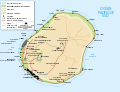
Languages of Guatemala


Article(s): Mayan languages, Guatemala
Request: The image is not currently in FAC Mayan languages because there is uncertainty as to its copyright status. making a new .svg version with a better color key would solve that. Circeus 21:46, 3 March 2007 (UTC)
Graphist opinion: I gave it a try. I could not read some of the labels, but now should be easy to add/correct them. Chabacano 19:44, 5 March 2007 (UTC)
- I was thinking that it would be clearer with a labelled color chart on the sides instead of having the labels inside the map.Circeus 20:46, 5 March 2007 (UTC)
- And there's a spot missing near the edge of the lake on the right, which corresponds to the rightmost label ("Garuna" or something like that).Circeus 20:54, 5 March 2007 (UTC)
- almost all of the language names are completely incorrect in the image to the left.·Maunus· ·Æ· 21:07, 5 March 2007 (UTC)
- It would be useful to know the correct names to do this map... Chabacano 08:31, 6 March 2007 (UTC)
- They all appear in the articles on mayan languages and languages of Mesoamerica and Guatemala·Maunus· ·Æ· 09:24, 6 March 2007 (UTC)
- Please look at the rightmost image (added), above, to correct most of the names - too many errors to list here, though "Nqxn" for Mopan really takes the cake. That other image is actually superior for Mayan Languages for several reasons (extends beyond Guatemala, doesn't include the two non-mayan languages, gives an idea of speaker populations and of language branches). I agree that the center image here would be useful for Guatemala, better geographic precision, but it might be nice to base the language colors here on variations of the colors in the rightmost Mayan Languages image. Missing entirely for the center image here are the labels Q'eqchi (the large upper green patch), Garifuna (a non-mayan Yoruba/Arawak language, a very small coastal strip extending west and then north from where the river hits the Atlantic coast near the (north)east concave corner. Does NOT extend west again along the Belize border to the main concave corner. The original, leftmost map puts it incorrectly east of the rivermouth.) and Q'anjob'al (the blue just west of Q'eqchi.). --Homunq 12:41, 6 March 2007 (UTC)
- Oh, thanks. This new image is much easier to decipher than the previous bunch of pixels. I fixed some things (or at least I hope that). For doing that re-coloration based on the image in the rightmost I need to know where Poqomchi is (now has not assigned zone), and which color should have "Papti" (or "Popti", "Papli" or whatever name it has). Chabacano 14:28, 6 March 2007 (UTC)
- it's Poptà or alternatively Jakaltek·Maunus· ·Æ· 15:00, 6 March 2007 (UTC)
Image:Metabolic pathways.png

Article(s): Metabolism
Request: Could somebody convert this to SVG format please? Also, if there is any way to reduce the file size, that would be great as well. The high-resolution version is here. Thanks. TimVickers 20:45, 5 March 2007 (UTC)
Graphist opinion:
I've reduced the dimensions of the file to have their original values (which I don't think loses much) and converted it to an indexed colour PNG which gets the filesize down to 254KB from 1.17MB. I've also created a smaller but completely lossless version of the original (1.17MB to 975KB) by using PNG filters, and I've overwritten the original with the smaller version. I hope that helps with the filesize issue. Time3000 18:35, 7 March 2007 (UTC)
- Great, thank you very much. TimVickers 22:24, 10 March 2007 (UTC)
Skeletal muscle

Article(s): Muscle
Request: Vectorization and general tidying! it needs it..... - Zephyris Talk 16:12, 18 March 2007 (UTC)
Graphist opinion:
CoA of Grand Duchy of Finland
-
Better than 2nd, except has errors
-
 Should not have eagle and has errors

Article(s): Grand Duchy of Finland
Request: Hard one I belive, but if someone is interested in herardly... The current CoA in the article is wrong as it has the Russian eagle and looks bad, as drawn with Paint.. The first image I attached is what it should be, too bad the image is very bad quality. Also, it has errors, see the 3rd image the big CoA of the Russian Empire, it's on the bottom right. It should be the correct one.
We already had a CoA based on the 1973 CoA of Finland: Image:GD Finland coa.png but it obviously looks wrong when compared to the one in the Russian Empire's large CoA Image:Russian Empire's Big Coat of Arms.jpg Pudeo (Talk) 13:28, 31 March 2007 (UTC)
Edit: Here is quite high reso image of the CoA, only drawn with one color though. But it shows the shapes very well..
Graphist opinion: