
Wikipedia:Graphics Lab/Illustration workshop/Archive/Nov 2018
 | This page, part of the Graphics Lab Wikiproject, is an archive of requests for 2018. Please do not edit the contents of this page. You can submit new requests here. |

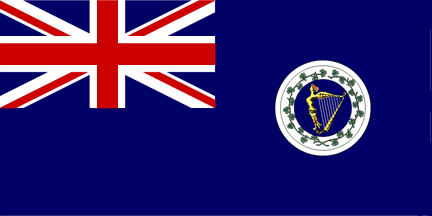
Flags of the Congested Districts Board for Ireland
{{resolved}}
.svg)
.svg)
- Article(s)
- Congested Districts Board for Ireland, List of flags of Ireland
- Request
- Okay, will someone please create SVG files of the ensigns used by the historical Congested Districts Board of Ireland, including:
- 1) The 1893-1907 version, as seen here.
- 2) The 1907-1916 version, as seen here.
- Thanks. Snow Lion Fenian (talk) 18:20, 29 November 2018 (UTC)
- Discussion
- @Snow Lion Fenian:
 Done. TilmannR (talk) 11:06, 1 December 2018 (UTC)
- @TilmannR: Great work, and thanks again. Snow Lion Fenian (talk) 12:24, 1 December 2018 (UTC)
Flag of the Departement of Agriculture, Ireland (circa 1900-1922)
{{resolved}}
.svg)
- Article(s)
- List of flags of Ireland
- Request
- Could someone please create an SVG file of the flag used by the Irish Department of Agriculture from about 1900 to around 1922, as seen here, and a close up of the badge here. Thanks. Snow Lion Fenian (talk) 15:33, 30 November 2018 (UTC)
- Discussion
- @Snow Lion Fenian: Done. TilmannR (talk) 11:55, 1 December 2018 (UTC)
- @TilmannR: Nicely done, and thanks again for your hard work. Much appreciated. Snow Lion Fenian (talk) 12:27, 1 December 2018 (UTC)
Pictogram requests
{{resolved}}


- Article(s)
- Any sport competition article using Template:GamesSport.
- Request
- Many multi-sport event articles including the most recent Youth Olympics need these pictograms. Formula One pictogram is sometimes used instead of karting. For inspiration other pictograms. Thanks!-- Pelmeen10 (talk) 20:20, 1 December 2018 (UTC)
- Discussion
@Pelmeen10: How is that? Pbroks13 (talk) 04:10, 2 December 2018 (UTC)
- @Pbroks13: Thank you! A very fast job, although, is there some specific size for these images? Currently they would look like this:
 Beach volleyball (2)
 Boxing (13)
 Breakdancing (3)
 Canoeing (8)
 Karting (4)
Rhodesian Light Infantry Regimental Colours
{{resolved}}


-
 RLI SVG
 -
 Queen's Colours (1)
 -
 Queen's Colours (2)
 -
 Regimental Colours
 -
 RLI Horn Crest


- Article(s)
- Rhodesian Light Infantry
- Request
- Can svg versions of the RLI's Queen's and Regimental colours (which can be seen in this link) be created please? I have included the images above as a base for it. The C of E God Save the Queen! (talk) 12:14, 29 November 2018 (UTC)
- Discussion
![]() Request taken by Pbroks13 (talk) 14:00, 2 December 2018 (UTC). Pbroks13 (talk) 14:00, 2 December 2018 (UTC)
Request taken by Pbroks13 (talk) 14:00, 2 December 2018 (UTC). Pbroks13 (talk) 14:00, 2 December 2018 (UTC)
- @The C of E: This will take some time to complete, as most everything needs to be traced by hand. Just a heads up! Pbroks13 (talk) 14:09, 2 December 2018 (UTC)
- Light infantry horn symbol
- Light Infantry badge
- Light Infantry badge
- Union Jack obverse
- Royal reverse
- Republican flag obverse
- Republican reverse
- Reverse side drawing
Update: I have the emblem (tentatively) done. See above. Pbroks13 (talk) 03:52, 4 December 2018 (UTC)
@The C of E: Okay, the first draft for the RLI is done. I do not like the emblem, as it doesn't fit the rest of the image, so I'll likely do it again. Thoughts?Pbroks13 (talk) 21:20, 5 December 2018 (UTC)
- @Pbroks13: Very nice on the republic colours though I agree that maybe we could touch the emblem up a bit. As for the Queen's Colours, the 1st one is brilliant though I think with the 2nd one, it still has the Black Watch name and honours on it. Thank you for doing these. The C of E God Save the Queen! (talk) 09:24, 6 December 2018 (UTC)
- @The C of E: For the Queen's, I just saw two different ones while creating them, so I figured I'd make both. I've added the Regimental Colour as well. I'll work on that emblem now. Is there anything else? Pbroks13 (talk) 17:18, 6 December 2018 (UTC)
@The C of E: I believe everything is done now. Let me know if this works for you. Pbroks13 (talk) 23:01, 8 December 2018 (UTC)
- @Pbroks13: Very good thank you very much. Just a minor thing, the "Queen's Colours (2)" file has the Black Watch's honours on them, not the RLI's honours so that file name may need to be changed. Thanks again. The C of E God Save the Queen! (talk) 12:12, 9 December 2018 (UTC)
- @The C of E: The file name should be changed soon. If there's nothing else, I will mark this section as resolved. Cheers! Pbroks13 (talk) 14:18, 9 December 2018 (UTC)
Kashin class destroyer diagram
-
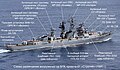 Russian diagram
 -
 Base file
 -
 English diagram


- Article(s)
- Soviet destroyer Sposobny (1970)
- Request
- Could the Russian text please be changed to English text? Translations below:
- Вертолетная площадка - Helicopter pad
- 76-мм артустановка АК-726 & АУ АК-726 - Twin 76 mm AK-726 turret
- Пусковая установка ЗИФ-101 & ПУ ЗИФ-101 - Double ZIF-101 launcher for M-1 Volna surface-to-air missile system
- Антенный пост системы управления артогнем МР-105 "Турель" & Антенный пост МР-105 "Турель" - MR-105 Turel fire control radar antenna
- Антенный пост системы управления "Ятаган" (ЗРК М-1 Волна) & Антенный пост СУ "Ятаган" - Yatagan guidance radar antenna for M-1 Volna surface-to-air missile system
- Реактивный бомбомет РБУ-1000 (два побортно) - RBU-1000 anti-submarine rocket launchers (two outboard)
- 5-трубный 533-мм торпедный аппарат ПТА-53-1123 = Quintuple 533 mm torpedo tubes
- Антенный пост РЛС МР-500 "Кливер" - MR-500U Kliver search radar antenna
- Антенный пост РЛС МР-310 "Ангара" - MR-310 Angara search radar antenna
- Реактивный бомбомет РБУ-6000 (два побортно) - RBU-6000 anti-submarine rocket launchers (two outboard)
- Also remove line of text beginning "Схема" at bottom as redundant to caption. Kges1901 (talk) 16:33, 9 December 2018 (UTC)
- Discussion
@Kges1901: There are four missing translations -- the top right four. Pbroks13 (talk) 17:17, 9 December 2018 (UTC)
- @Pbroks13: Those are the ones that are after the '&' in my list; in English they would be rendered the same because they are the second set of the same equipment. Kges1901 (talk) 17:40, 9 December 2018 (UTC)
{{resolved}}
Flag of Montreal (1935-1939)
{{resolved}}
-
 Arms of Montreal (1833)
 -
 Arms of Montreal (1833)
 -


.svg)
- Article(s)
- Flag of Montreal, List of Canadian flags
- Request
- Would it be possible for someone to create an SVG file of the flag used for Montreal from about 1935-1939 (when a new flag was adopted), as described in this archived article from the Montreal Gazette, dated 3 May 1935, as being a red saltire on a white field, with a rose in the upper field, a beaver in the lower field, a thistle in the left field and three conjoined shamrocks in the right field. Given that this flag is supposed to be based on the 1833 arms of Montreal, I've provided two versions of said arms above as a guide for anyone who'd like to attempt this request. Oh, and given that we have no way of knowing exactly what ratio this flag was displayed in when it was around, I think it only fitting that it be created in the 1:2 ratio, as that's the exact ratio of the 1939 and 2017 versions of the Montreal flag that followed this one. Thanks. Snow Lion Fenian (talk) 21:36, 12 December 2018 (UTC)
- Discussion
![]() Request taken by Pbroks13 (talk) 22:42, 12 December 2018 (UTC).
Request taken by Pbroks13 (talk) 22:42, 12 December 2018 (UTC).
@Snow Lion Fenian: How is that? Pbroks13 (talk) 00:01, 13 December 2018 (UTC)
- @Pbroks13: Terrific work, and thanks for doing this. Just one or two things though: Would it be possible to make the Rose closer in appearance to the Red Rose of Lancaster, rather than the Tudor Rose displayed above? It's just that the Flag of Montreal page specifically describes the Rose on the 1939 and 2017 versions of the flag as that of Lancaster, hence I'd assume it's supposed to be the same for the 1935 version. And could the shamrock be brought closer to the way it's displayed on both of the above arms' (as in three shamrocks with their stems conjoined) as well? If that's possible of course. Sorry about this. Snow Lion Fenian (talk) 19:17, 13 December 2018 (UTC)
- @Snow Lion Fenian: Done. Please don't hesitate to ask for adjustments. Is there anything else you'd like to change? Pbroks13 (talk) 20:14, 13 December 2018 (UTC)
- @Pbroks13: Well, there's nothing else I can think of that needs changing right now, but thanks for asking though. Superb work as usual, and thanks so much for taking the time to do this, I do appreciate it. Snow Lion Fenian (talk) 22:22, 13 December 2018 (UTC)
- @Snow Lion Fenian: Glad to help! Pbroks13 (talk) 04:50, 14 December 2018 (UTC)
- @Pbroks13: Well, there's nothing else I can think of that needs changing right now, but thanks for asking though. Superb work as usual, and thanks so much for taking the time to do this, I do appreciate it. Snow Lion Fenian (talk) 22:22, 13 December 2018 (UTC)
- @Snow Lion Fenian: Done. Please don't hesitate to ask for adjustments. Is there anything else you'd like to change? Pbroks13 (talk) 20:14, 13 December 2018 (UTC)
YouTube Rewind Logo
-
 YouTube Rewind Logo 2013 to 2016
 -

- Article(s)
- List of most-disliked YouTube videos
- Request
- Can someone rename this image in "YouTube_Rewind_Logo_2013_to_2016" and create a new image based on this one here, which is the new logo (2017 to present)? Thanks! -- Lorem Ipsum (talk) 14:06, 14 December 2018 (UTC)
- Discussion
@Lorem Ipsum: It looks like the file name has been changed. I've uploaded the new logo. Pbroks13 (talk) 15:22, 14 December 2018 (UTC)
- @Pbroks13: That's perfect! Thank you :) --Lorem Ipsum (talk) 16:37, 14 December 2018 (UTC) {{resolved}}
Extract image from PDF
-
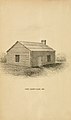 JPG
JPG -
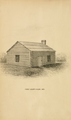 PNG
PNG


- Article(s)
- Pike County Courthouse (Illinois), not yet created
- Request
- The frontispiece of https://archive.org/details/historyofpikecoun00chas has an image of the original Pike County courthouse. Could you extract it and upload it as a JPG, PNG, or other suitable image file? I know I've made a PDF-to-image request in the past (for a different subject), but I can't find it now; all I know how to do is to save and upload a screenshot. Nyttend (talk) 17:11, 16 December 2018 (UTC)
- Discussion
- @Nyttend: The PDF file of this has very strange vector elements in them, so that was not the way to go. I actually just copied and pasted the image directly from the frontispiece (got a 2000x3000 image). I've uploaded it as a jpg and png, as I do not know what is preferred in this case. Pbroks13 (talk) 17:47, 16 December 2018 (UTC)
- Pbroks13, thanks for the help! Can you explain how one copies and pastes the image? If it's anything other than taking a screenshot, I'd be happy to learn about your process. Meanwhile, I think the JPG has turned out a good deal better; would you mind if I deleted the PNG? Nyttend (talk) 22:44, 16 December 2018 (UTC)
- Nyttend, the jpg isn't 'better' per se, it just gives sharper thumbnails with the way mediawiki is configured. Mediawiki sharpens jpg thumbnails, but not png, often resulting in annoyingly, noticeably 'blurry' png thumbnails by comparison. Compare them at full, native size, where they display pretty much identically. Png is a lossless format, unlike jpg which degrades when edited, so there is arguably value in keeping the png as a lossless 'master', even if the jpg is used to generate thumbnails in articles etc. See [1] and phabricator:T192744 for more on this annoying, longstanding issue of 'blurry' png thumbnailing by mediawiki. -- Begoon 03:51, 17 December 2018 (UTC)
- With regards to the image itself, as is often the case, archive.org provides a downloadable zip file of all the "raw" page scans in JP2 format: [2] - so I downloaded that and extracted the relevant page. It seemed very slightly higher quality than what we had, certainly no worse, so I took the liberty of uploading it to the jpg and png files, and updating the source. I then uploaded further revisions attempting to reduce the crease, and cleaning a couple of the most obvious marks - but I didn't want to do too much to it, so I left it at that. You can revert any of those steps if you don't like them, or don't feel they are improvements. -- Begoon 12:16, 17 December 2018 (UTC)
- Thank you for correcting me. I had no clue that the thumbnails would render differently; I saw a blurry PNG and assumed that something had happened in the conversion process that left the PNG rather blurry. I'm aware of c:Template:PNG with JPEG version, so yes I know it's good to keep the lossless original. And I was also unaware that one could download images: I thought your only choices were PDF, plain text, and various e-reader formats. [Interesting that they even offer MaRC] Thanks a lot! Nyttend (talk) 13:32, 17 December 2018 (UTC)
- Yes, it's worth checking with archive.org sources whether the 'raw' scanned images are available, further down the page - they very often are, and it's usually the best way to get the highest resolution version available. The drawback is that the zip file can be very large - in a book of several hundred pages you are downloading several hundred images just to get one. This zip file was 289 Mb, and I only wanted one 170 Kb JP2 file... The thumbnailing issue is very annoying and not widely understood by end users - I really wish one of the suggested technical fixes would be implemented, but it's been a 'known issue' to developers for a very long time now and never seems to get as far as getting resolved. Frustrating. -- Begoon 15:06, 17 December 2018 (UTC)
@Nyttend: To answer your earlier question, I just went to page 6 on the page you linked, right-clicked, and saved the image. Begoon's method does get us a better-quality image. If you are satisfied with these images, feel free to tag this sections a resolved with {{tl|resolved|~~~~}}.
Los Angeles Area Task Force
-
 This is the current logo
 -
 Idea 1

- Article(s)
- Los Angeles Area Task Force
- Request
- The current logo for this Task Force uses the City of Los Angeles flag. This is wrong, because the Task Force covers the entire area, not just the city. I would like a logo with the simple initials "L.A." (without the quotes). It should be solid-looking, with a hint of verticality. Perhaps with ocean waves and mountains, although the simpler the better. -- BeenAroundAWhile (talk) 13:22, 30 November 2018 (UTC)
- Discussion
@BeenAroundAWhile: I've made a quick logo idea based on your request. Your thoughts? Pbroks13 (talk) 15:18, 11 December 2018 (UTC)
- On second thought, this logo looks like a Colorado logo... I'll be working up a new one. Pbroks13 (talk) 14:41, 12 December 2018 (UTC)
@BeenAroundAWhile: I've uploaded a conceptually new logo. I'd like your thoughts. Thanks! Pbroks13 (talk) 19:52, 12 December 2018 (UTC)
- Gee whiz, what great work! I have never used this service before. But we have a way to go. -- We don't have pointy mountain peaks like that: Check out photos of the Santa Monica Mountains for some ideas. Every hill in L.A. is basically rounded. Also the buildings are not L.A.-style buildings, except for the City Hall at the bottom left, which you should really put into the center. Can we get some more recognizable buildings? Watts Towers? The Columbia Records building in Hollywood? An airplane for the L.A. airport? And we definitely need a beach, or some ocean waves, along the bottom of the work. (Some blue coloring would help.) I like the Hollywood sign being relegated to a supporting position, as you have done. How about some greenery for our parks and mountains? Definitely get in a stretch of single-family homes, seen just about anywhere but mostly in the San Fernando Valley.
- As for the lettering, use the same kind of type in the L.A. Dodgers logo, but don't copy the logo because of copyright problems. I think simply using a square-serif type would work. You should use the colors of the L.A. city seal instead of the pastels which you have.
- Thanks again for the imaginative work! BeenAroundAWhile (talk) 06:11, 14 December 2018 (UTC)
- @BeenAroundAWhile: I'll look to incorporate all of that. I see what you mean about the mountain -- we'll make it more hilly. I'd disagree that the LA skyline doesn't look like that, but I'll get rid of the skyline nonetheless and just have iconic buildings. I probably wont put color to them, and just keep them silhouettes, however (it would take a long time to put all the details into these buildings!). Any more specific buildings you had in mind would be great. Lastly, there is no problem using the Dodgers logo, as it is made up of simple geometric shapes. I'll get back to you soon. Pbroks13 (talk) 15:14, 14 December 2018 (UTC)
- Thanks again for the imaginative work! BeenAroundAWhile (talk) 06:11, 14 December 2018 (UTC)
@BeenAroundAWhile: Okay, I've changed it up a bit (be sure to clear your cache, ctrl+F5). This is not the final product, necessarily. The stretch of homes could take some time, so I just wanted to give you an update and get some feedback.
- Very nice. The mountains seem just right. The Hollywood sign is prominent without being overwhelming. I recognize the Watts towers and the theme building at LAX. What are the other structures? You might want to leave some out so as to emphasize those that you do retain, but it's up to you as the artist. The airplane seems a bit lost; that is, it is hard to see. The "LA" is just right, and of course your design won't bump up against WP's really strict policy on copyright. The palm trees are good; you see them all over the city. What do you think about breakers on the top of the wave at the right (surfing, you know)? BeenAroundAWhile (talk) 19:18, 14 December 2018 (UTC)
- @BeenAroundAWhile: Yes, the buildings are (from left to right) The Hollywood Bowl, Theme Building, Capitol Records Building, Watts Tower, City Hall, Eastern Columbia Building, Walt Disney Concert Hall (obstructed by palm tree), and the Hollywood sign. I am also not set on the waves, I may change them as you described. Pbroks13 (talk) 15:54, 15 December 2018 (UTC)
@BeenAroundAWhile: Okay, more changes done. I don't think I'll be able to put in the housing; I'm not sure how to stylize it or where I would make it fit in. I've added the whole name of the task force in there (I needed to fill that white space on the bottom with something), as well as reorganized it. Your thoughts? Pbroks13 (talk) 18:09, 15 December 2018 (UTC)
- Yes, I had some ideas, but they are too complicated for what is essentially a logo. You can forget the housing if it too hard to do and keep the simplicity. (What I had in mind is something like this, on the right side. A few lines might do it.). As for the mountains, could we make 'em a bit darker? It is hard to see that they ARE mountains; they could be a large patch of smog. BeenAroundAWhile (talk) 01:37, 17 December 2018 (UTC)
- @BeenAroundAWhile: I see what you mean about the mountains. I've significantly darkened them. I think I will have to forgo the housing. I tried to impliment them, but it just looked awkward and out of place (sorry!). Pbroks13 (talk) 23:14, 17 December 2018 (UTC)
- Good to work with you. Best-looking Task Force logo I've seen (though I haven't seen many). I like all the actual building silhouettes, and we've kept the Hollywood sign without making it dominant. For L.A. people, the Hollywood element is pretty minor, though for the rest of the world it looms large. In most of L.A. the mountains (whichever set they are) are always prominent somewhere on the horizon. Or the ocean, on the west and south. So the logo does its job in summing up the story. Good job. BeenAroundAWhile (talk) 17:51, 19 December 2018 (UTC)
{{resolved}}
- – BeenAroundAWhile (talk) 15:11, 20 December 2018 (UTC)
 Resolved
Blasphemy laws map correction

- Article(s)
- Blasphemy law, Islam and blasphemy, Blasphemy
- Request
- Firstly, Ireland removed an offence of blasphemy on constitutional level, but it remains present on statutory level (as per Defamation Act of 2009), so Ireland needs to be recolored back. Secondly, Canada has just repealed its section 296 blasphemous libel, hence decoloring is necessary. Fixmaster (talk) 09:26, 14 December 2018 (UTC)
- Discussion
![]() Request taken by TheAwesomeHwyh (talk) 00:26, 15 December 2018 (UTC).
Request taken by TheAwesomeHwyh (talk) 00:26, 15 December 2018 (UTC).
- Done. TheAwesomeHwyh (talk) 00:37, 15 December 2018 (UTC)
{{resolved}}
Uganda Railways flag

- Article(s)
- Request
- Please add the UR logo as seen in this photo and this image for reference. Fry1989 eh? 19:10, 18 December 2018 (UTC)
- Discussion
- @Fry1989: There's discrepancy between all the logos I've seen. Does that work for you? Pbroks13 (talk) 16:00, 19 December 2018 (UTC)
- That is very good. Thanks, I really appreciate it. Fry1989 eh? 18:19, 19 December 2018 (UTC)
- What about the logo itself? RainbowSilver2ndBackup (talk) 02:29, 20 December 2018 (UTC)
- @RainbowSilver2ndBackup: Yes, we should have that too. Done, see File:Uganda Railways Corporation Logo.svg. Pbroks13 (talk) 15:01, 20 December 2018 (UTC)
- What about the logo itself? RainbowSilver2ndBackup (talk) 02:29, 20 December 2018 (UTC)
- That is very good. Thanks, I really appreciate it. Fry1989 eh? 18:19, 19 December 2018 (UTC)
{{resolved}}
Badge of the SES


- Article(s)
- Request
- Bit of a tough one, but might it be possible to create an SVG of the New South Wales SES badge? Fry1989 eh? 02:05, 20 December 2018 (UTC)
- Discussion
@Fry1989: I'll be working on this one. I have nominated the file for deletion in the commons, as it is not a free image. I'll have the vector version done soon. Pbroks13 (talk) 16:08, 20 December 2018 (UTC)
- There is a flag of the NSW SES as well which I intend to create, but the badge itself is above my abilities. I would prefer the file to stay on Commons, but I can't really argue with you about the copyright issue. :( Fry1989 eh? 17:44, 20 December 2018 (UTC)
- @Fry1989: Here is the SVG version: File:NSW SES Rondell.svg.
Now, I may be able to put them on Commons. According to Copyright expiration in Australia, 1955 is the cutoff year for images to be in the public domain, and the NSW SES was created in 1955. I'll have to look into it to see when those emblems were made.Actually, "All NSW State Emergency Service material on this website is licensed under the Creative Commons Attribution 4.0 licence. I'll upload them to commons. Pbroks13 (talk) 18:35, 20 December 2018 (UTC)
- @Fry1989: Here is the SVG version: File:NSW SES Rondell.svg.
{{resolved}}
Flag of South Korea (1949–1984)
.svg)
- Article(s)
- Flag of South Korea
- Request
- Please vectorize this flag. RainbowSilver2ndBackup (talk) 00:36, 20 December 2018 (UTC)
- Graphist opinion(s)
@RainbowSilver2ndBackup: I believe the file already exists. Is that what you were looking for? Pbroks13 (talk) 15:03, 20 December 2018 (UTC)
- It has been renamed per request by CAPTAIN RAJU for the PNG file in the past. RainbowSilver2ndBackup (talk) 18:41, 20 December 2018 (UTC)
- @RainbowSilver2ndBackup: I'm not sure I follow. You would like the SVG to be renamed, or have an identical copy of it under a different name? Pbroks13 (talk) 18:48, 20 December 2018 (UTC)
- It as official from 1949 to February 1984 when the exact dimensional specifications of the flag were codified per of the South Korean flag by FOTW Fivestarflags, Flag of Korea, South by Encyclopedia Britannica, History of the South Korean flag and History|website=Destination South Korea. RainbowSilver2ndBackup (talk) 19:03, 20 December 2018 (UTC)
- @RainbowSilver2ndBackup: How is that? Pbroks13 (talk) 19:49, 20 December 2018 (UTC)
- It as official from 1949 to February 1984 when the exact dimensional specifications of the flag were codified per of the South Korean flag by FOTW Fivestarflags, Flag of Korea, South by Encyclopedia Britannica, History of the South Korean flag and History|website=Destination South Korea. RainbowSilver2ndBackup (talk) 19:03, 20 December 2018 (UTC)
- @RainbowSilver2ndBackup: I'm not sure I follow. You would like the SVG to be renamed, or have an identical copy of it under a different name? Pbroks13 (talk) 18:48, 20 December 2018 (UTC)
Microbat (done)

- Article
- Microbat
- Request
- Please correct the spelling on this graphic. The word "stylohyal" is misspelled "stylohal".--Quisqualis (talk) 04:20, 19 December 2018 (UTC)
- Discussion
- Done -- Begoon 06:39, 19 December 2018 (UTC)
{{resolved}}
Paralympic flag (2004-2008) (done)
-

-
 svg
svg
.png)
.svg)
abd.gif)
.svg)
- Article(s)
- Request
- Please vectorize the flag. RainbowSilver2ndBackup (talk) 07:49, 19 December 2018 (UTC)
- Graphist opinion(s)
- Done - File:Paralympic flag (2004-2010).svg -- Begoon 08:52, 19 December 2018 (UTC)
{{resolved}}