
Wikipedia:Featured picture candidates/Making of a Death Mask
Making of a Death Mask[edit]
Voting period is over. Please don't add any new votes. Voting period ends on 28 Aug 2010 at 21:20:55 (UTC)


- Reason
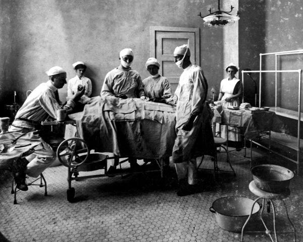
- great historic image from 1908 showing how death masks are made. It has great EV. I, for one, did not know how they are made. How is the dead body handled? Do they apply plaster on the body as it's lying down? etc. The high res of this image, the historical significance, and the fact that it's the only image in the article showing how death masks are made are the top reasons why this should be a featured pic
- Articles in which this image appears
- Death mask
- FP category for this image
- Culture, entertainment and lifestyle
- Creator
- Bain News Service, uploaded by Howcheng
- Support as nominator --AutoGyro (talk) 21:20, 19 August 2010 (UTC)
- Support Sufficiently eye‑catching to get readers to stop, stare & click. Greg L (talk) 01:13, 20 August 2010 (UTC)
- Comment: A few thoughts. Firstly, what's the reason to have a historical shot- why not have a higher quality current one? Secondly, this photo could benefit from some cleanup. Thirdly, some more details would be nice- I assume that's the actual body? Where was this taken? Why is a death mask being created? J Milburn (talk) 13:41, 20 August 2010 (UTC)\
- On the first count, I'm pretty sure that death masks are more or less archaic now as there is little utility for them (cameras are used to document the dead). On the third count, it is most likely a body and the WP article states that death masks were often used to create portraits, to serve as mementos or in forensic investigations. Cowtowner (talk) 17:36, 20 August 2010 (UTC)
- Yes, but in this case in particular. J Milburn (talk) 18:25, 20 August 2010 (UTC)
- I think you are focusing too hard on the “creating a death mask” part of this. If that’s all it was, why not—as you say—show a photo of the very finest and latest technology for doing so? But the subject here is “creating a death mask historically.” I find the way these practitioners dressed to be interesting. How one dressed a hundred years ago was important signaling of social hierarchy and it is quite easy to see who was the assistant here in this picture and who was the proprietor. Sometimes historical images, like this image of an old surgery, are interesting because they are old and help us to realize how things have changed. Perhaps all this caption needs is a tweak to emphasis the historical nature of it. Greg L (talk) 19:45, 20 August 2010 (UTC)
- You can talk about "social hierarchy" and such all you like, but unless it's of importance to the article, it's irrelevant. If I was to nominate a picture of a mushroom obscured by moss and leaves, I couldn't babble on about the interesting moss and the pretty leaves in order to suggest it's better than a picture than one where the mushroom is clear. J Milburn (talk) 20:21, 20 August 2010 (UTC)
- Now you’re just howling at the moon to listen to your own echo. The article says death masks are made of wax or plaster. This one shows a plaster death mask being made so it obviously illustrates how its done. Do you think they now use CAD software to robot-apply plaster? Or maybe you think the technique no longer works unless there is an iPhone sticking out of a Raiders jacket? The fact that it shows the face of a deceased individual is unusual. That it is historical is eye-catching. If you don’t like it, vote “oppose”. I can’t take any more of your rants today. Bye… Greg L (talk) 22:53, 20 August 2010 (UTC)
- Rants? What's ranty here? If anyone has been ranty recently... What I said was completely valid, and it really reveals the strength of your position when you reply like that. We wouldn't accept a low quality image of an animal purely because it's "historical", even if it did show a few irrelevant historical aspects, so why accept this? J Milburn (talk) 00:09, 21 August 2010 (UTC)
- Now you’re just howling at the moon to listen to your own echo. The article says death masks are made of wax or plaster. This one shows a plaster death mask being made so it obviously illustrates how its done. Do you think they now use CAD software to robot-apply plaster? Or maybe you think the technique no longer works unless there is an iPhone sticking out of a Raiders jacket? The fact that it shows the face of a deceased individual is unusual. That it is historical is eye-catching. If you don’t like it, vote “oppose”. I can’t take any more of your rants today. Bye… Greg L (talk) 22:53, 20 August 2010 (UTC)
- You can talk about "social hierarchy" and such all you like, but unless it's of importance to the article, it's irrelevant. If I was to nominate a picture of a mushroom obscured by moss and leaves, I couldn't babble on about the interesting moss and the pretty leaves in order to suggest it's better than a picture than one where the mushroom is clear. J Milburn (talk) 20:21, 20 August 2010 (UTC)
- I think you are focusing too hard on the “creating a death mask” part of this. If that’s all it was, why not—as you say—show a photo of the very finest and latest technology for doing so? But the subject here is “creating a death mask historically.” I find the way these practitioners dressed to be interesting. How one dressed a hundred years ago was important signaling of social hierarchy and it is quite easy to see who was the assistant here in this picture and who was the proprietor. Sometimes historical images, like this image of an old surgery, are interesting because they are old and help us to realize how things have changed. Perhaps all this caption needs is a tweak to emphasis the historical nature of it. Greg L (talk) 19:45, 20 August 2010 (UTC)
- Yes, but in this case in particular. J Milburn (talk) 18:25, 20 August 2010 (UTC)
- On the first count, I'm pretty sure that death masks are more or less archaic now as there is little utility for them (cameras are used to document the dead). On the third count, it is most likely a body and the WP article states that death masks were often used to create portraits, to serve as mementos or in forensic investigations. Cowtowner (talk) 17:36, 20 August 2010 (UTC)
- Support Per Greg. Although, I'm shocked by how horrific the behavior is. (Although those two guys seem to be digging it; defiantly not the third, though.) Gut Monk (talk) 01:14, 22 August 2010 (UTC)
- Oppose per my comments above. J Milburn (talk) 09:46, 22 August 2010 (UTC)
- Support Very striking and interesting image. High EV in historical context. Sir Richardson (talk) 22:31, 22 August 2010 (UTC)
- Comment: Even if we ignore the EV/contextual issues, promoting this, when the image itself is in such dire need of restoration, would be utterly ridiculous. J Milburn (talk) 10:30, 23 August 2010 (UTC)
- We would be throwing high hurdles at ourselves and our nominators if we required that image editing and restoration had to be performed on old pictures that suffered in minor ways from the ravages of time. Sometimes, as when I jumped in and volunteered on the Edward Teller FPC, we can get these images cleaned up. But doing a good job on some of these images requires specialized skills and sometimes people are too busy to volunteer. This nomination is a clean and proper scan of an old artifact. Accepting it as such doesn’t strike me as “ridiculous”; it’s purely an aesthetic issue as to whether we may treat the image like the Mona Lisa (the colors of which have yellowed and dulled with time) without trying to make the image here look better than the actual artifact. I hadn’t even noticed the little tears in the emulsion and other age-related effects until you pointed it out that it should be considered a flaw. To me, this image is properly representative of what it is: an old historical photo. Greg L (talk) 23:45, 24 August 2010 (UTC)
- We don't need a "proper scan of an old artifact", we need a solid illustration of the making of a death mask. FPC is about the best images, so, yes, we do have to expect that older images in a poor state are given restoration work. The in-image labelling is also rather distracting. If you didn't notice the scratches, I question whether you've actually looked close enough at this picture to be qualified to judge it... J Milburn (talk) 00:07, 26 August 2010 (UTC)
- I question whether you've actually looked close enough at this picture to be qualified to judge it... Are you serious? What an unwise thing to write. Gee, I’m sorry. I didn’t realize I was in the shadow of One Of The Qualified Ones®™© who has special powers to click on an image and inspect it closely. Methinks thee should dismount from one’s high horse, as you blocketh the sunlight down here. Good grief. Greg L (talk) 01:34, 26 August 2010 (UTC)
- Methinks thee should actually look at images before voting on them. That's the point I'm fricking making. If you didn't see the appalling quality of the image, what the hell did you look at? The thumbnail, very quickly? I'm not suggesting I'm some kind of expert while you're not, I'm suggesting that if you want to have an opinion on it, you fricking look at it. And congratulations on picking up on the really important part of my comment to discuss, rather than, y'know, the bit actually pertinent to the image. J Milburn (talk) 08:33, 26 August 2010 (UTC)
- Ohhhhhh You mean, “Look at the picture up close!” (silly me) Did I forget to do that? Let me check… nope. As I wrote above (but you seem pleased to ignore) is I have no problem with a fine scan of an aged original, just like I have no problem with fine scans of cracked or yellowed oil pantings. You wrote we do have to expect that older images in a poor state are given restoration work. I suspect you used the majestic plural-form of “we” there; what is clear is you think volunteers here must do image restoration on scans of aged originals. I don’t. We’ll just have to agree to disagree on this one. You know: celebrate diversity and all that. Greg L (talk) 00:53, 27 August 2010 (UTC)
- If you "look[ed] at the picture up close" but "hadn’t even noticed the little tears in the emulsion and other age-related effects", I feel for your optician. The point is that this picture is not being used to illustrate the photo (if it was, I'm sure we could have a very interesting discussion about this) it's being used to illustate the making of a death mask. So, is this a good picture of the picture? Yes, it shows the state it's in and everything. Is this a good picture of the making of a death mask? Nope, the original picture is in a poor state and has things written all over it. J Milburn (talk) 11:53, 27 August 2010 (UTC)
- What is wrong with your ability to understand English? How many times and how many ways do I have to write that I did see all the age-related flaws and don’t have a problem with them? How many times do I have to write that I think the flaws are akin to a proper scan of an aged original, like the Mona Lisa? Don’t you get it? Or are you deliberately trying to be provocative here? I will no longer deal with you on this nomination because you are behaving too oddly for me to possibly handle. Greg L (talk) 23:42, 27 August 2010 (UTC)
- You said "I hadn’t even noticed the little tears in the emulsion and other age-related effects". In the English I speak, that means you didn't see them. J Milburn (talk) 09:54, 28 August 2010 (UTC)
- It means precisely as I wrote it: I hadn’t even noticed the little tears in the emulsion and other age-related effects until you pointed it out that it should be considered a flaw. I had zoomed in and looked intently at what the scene was showing—the information being portrayed. The scratches and other age-related flaws didn’t bother me in the slightest or even get any of my attention. Your comment above (If you didn't notice the scratches, I question whether you've actually looked close enough at this picture to be qualified to judge it is just arrogance because it assumes that if someone looks closely at the image, the age-related defects must to be something that jumps out to the forefront of one’s mind and overcomes the rest of the image. I could just as easily have said that “Anyone who looked at a zoom and wasn’t captivated by all the interesting things in the image like the clothing of the owner and his employee and was instead distracted by silly things like scratches in the emulsion of a picture from 1908 is someone I question is qualified to judge the image.” But I didn’t, because I don’t wouldn’t want to be so obstreperous. I like the image. You don’t. I’m fine with that. You aren’t. To bad; that is something you’re going to have to deal with. Greg L (talk) 17:15, 28 August 2010 (UTC)
- You said "I hadn’t even noticed the little tears in the emulsion and other age-related effects". In the English I speak, that means you didn't see them. J Milburn (talk) 09:54, 28 August 2010 (UTC)
- What is wrong with your ability to understand English? How many times and how many ways do I have to write that I did see all the age-related flaws and don’t have a problem with them? How many times do I have to write that I think the flaws are akin to a proper scan of an aged original, like the Mona Lisa? Don’t you get it? Or are you deliberately trying to be provocative here? I will no longer deal with you on this nomination because you are behaving too oddly for me to possibly handle. Greg L (talk) 23:42, 27 August 2010 (UTC)
- If you "look[ed] at the picture up close" but "hadn’t even noticed the little tears in the emulsion and other age-related effects", I feel for your optician. The point is that this picture is not being used to illustrate the photo (if it was, I'm sure we could have a very interesting discussion about this) it's being used to illustate the making of a death mask. So, is this a good picture of the picture? Yes, it shows the state it's in and everything. Is this a good picture of the making of a death mask? Nope, the original picture is in a poor state and has things written all over it. J Milburn (talk) 11:53, 27 August 2010 (UTC)
- Ohhhhhh You mean, “Look at the picture up close!” (silly me) Did I forget to do that? Let me check… nope. As I wrote above (but you seem pleased to ignore) is I have no problem with a fine scan of an aged original, just like I have no problem with fine scans of cracked or yellowed oil pantings. You wrote we do have to expect that older images in a poor state are given restoration work. I suspect you used the majestic plural-form of “we” there; what is clear is you think volunteers here must do image restoration on scans of aged originals. I don’t. We’ll just have to agree to disagree on this one. You know: celebrate diversity and all that. Greg L (talk) 00:53, 27 August 2010 (UTC)
- Methinks thee should actually look at images before voting on them. That's the point I'm fricking making. If you didn't see the appalling quality of the image, what the hell did you look at? The thumbnail, very quickly? I'm not suggesting I'm some kind of expert while you're not, I'm suggesting that if you want to have an opinion on it, you fricking look at it. And congratulations on picking up on the really important part of my comment to discuss, rather than, y'know, the bit actually pertinent to the image. J Milburn (talk) 08:33, 26 August 2010 (UTC)
- I question whether you've actually looked close enough at this picture to be qualified to judge it... Are you serious? What an unwise thing to write. Gee, I’m sorry. I didn’t realize I was in the shadow of One Of The Qualified Ones®™© who has special powers to click on an image and inspect it closely. Methinks thee should dismount from one’s high horse, as you blocketh the sunlight down here. Good grief. Greg L (talk) 01:34, 26 August 2010 (UTC)
- We don't need a "proper scan of an old artifact", we need a solid illustration of the making of a death mask. FPC is about the best images, so, yes, we do have to expect that older images in a poor state are given restoration work. The in-image labelling is also rather distracting. If you didn't notice the scratches, I question whether you've actually looked close enough at this picture to be qualified to judge it... J Milburn (talk) 00:07, 26 August 2010 (UTC)
- We would be throwing high hurdles at ourselves and our nominators if we required that image editing and restoration had to be performed on old pictures that suffered in minor ways from the ravages of time. Sometimes, as when I jumped in and volunteered on the Edward Teller FPC, we can get these images cleaned up. But doing a good job on some of these images requires specialized skills and sometimes people are too busy to volunteer. This nomination is a clean and proper scan of an old artifact. Accepting it as such doesn’t strike me as “ridiculous”; it’s purely an aesthetic issue as to whether we may treat the image like the Mona Lisa (the colors of which have yellowed and dulled with time) without trying to make the image here look better than the actual artifact. I hadn’t even noticed the little tears in the emulsion and other age-related effects until you pointed it out that it should be considered a flaw. To me, this image is properly representative of what it is: an old historical photo. Greg L (talk) 23:45, 24 August 2010 (UTC)
- Comment I did some light restoration work on the photo and uploaded it as Edit 1. You can decide which version you like better. --AutoGyro (talk) 02:27, 26 August 2010 (UTC)
Oppose: the words "Making Death Mask 305.1" need removed from the image: That wasn't painted on, that was scratched into the emulsion, probably by ancient LoC curators. Adam Cuerden (talk) 08:40, 26 August 2010 (UTC)Support Edit 3 Adam Cuerden (talk) 16:15, 28 August 2010 (UTC)- Why exactly is that a problem? It's not like it's written on any important part of the image. It's a historical artifact. --AutoGyro (talk) 12:26, 26 August 2010 (UTC)
- Comment At any rate, I removed the text from the image. See Edit 2.--AutoGyro (talk) 04:48, 27 August 2010 (UTC)
- Comment See Edit 3 for a new restoration of the original--AutoGyro (talk) 14:12, 27 August 2010 (UTC)
- My support vote applies to whichever one is closest to a consensus, or all of them. I don’t mind the age-related flaws. And I don’t mind the cleaned-uped versions either. Greg L (talk) 00:27, 28 August 2010 (UTC)
- Support interesting subject. I don't mind the text in the original, I thought the photo quality in that one was the best but whichever the closer decides... --I'ḏ♥One 20:11, 28 August 2010 (UTC)
Comments on the edits, please. This appears to have enough supports for something to get promoted, although it's not clear what (5 general supports and 1 support for edit 3). Makeemlighter (talk) 22:11, 28 August 2010 (UTC)
- If we have to promote one, edit 3 is the best, but it's still not as good as it could be. Not the best restoration work I have seen. (I couldn't do better, in case someone wants to pretend to be ten years old, but I've still got a right to expect a high standard at FPC...) J Milburn (talk) 23:00, 28 August 2010 (UTC)
- I feel there's serious quality loss in Edit 3 from the original, compare the hair in both of the man on your left. --I'ḏ♥One 00:28, 29 August 2010 (UTC)
- Any more discussions on this? I think Edit 3 is the best choice out of all options. --AutoGyro (talk) 17:58, 5 September 2010 (UTC)
- Yes. The edit really does lose quite a bit of detail. A restoration should not have less detail than the original. Makeemlighter (talk) 23:59, 5 September 2010 (UTC)
- What do you think of Edit 4--AutoGyro (talk) 02:02, 6 September 2010 (UTC)
- Oppose. Why doesn't someone try a full restoration from the Library of Congress TIFF (download from [1]) instead of the one I uploaded from Shorpy? howcheng {chat} 17:57, 14 September 2010 (UTC)
Not promoted --Makeemlighter (talk) 06:08, 18 September 2010 (UTC)
- Consensus never developed here on which, if any, version to promote. The edits added late in the game may be worthy of promotion, but they received very few comments. Moreover, Howcheng's suggestion of restoration from the original presents the possibility of an even better version. At the very least, a larger version could be uploaded. None of that would be necessary for a re-nomination, but the re-nominator would need to select the best of the edits to nominate (along with the original, probably). There's no need to wait to re-nominate if anyone feels one of the versions worthy; we just need a new nomination with 9 days of attention up top to sort this mess out. Makeemlighter (talk) 06:08, 18 September 2010 (UTC)