
User talk:IsadoraofIbiza/Archive 1
| This page is an archive of past discussions. Do not edit the contents of this page. If you wish to start a new discussion or revive an old one, please do so on the current talk page. |
Good edit on the Firefox Page :) Trewyy (talk) 22:38, 7 April 2012 (UTC)
Map of browsers
In the map the color of leader browsers are missed in some countries: Trinidad and Tobago, Djibouti, Luxembourg, Chipre, etc. — Preceding unsigned comment added by 190.239.220.18 (talk) —Preceding undated comment added 15:47, 11 April 2012 (UTC).
Exact color
Can you change the colors to match exactly to the png version that is optimized for color-blind people. 
— Preceding unsigned comment added by 190.239.220.18 (talk)
- can you?--88.242.154.146 (talk) 14:50, 18 May 2012 (UTC)
In response to your feedback
Visit Wikipedia:Tutorial.
SwisterTwister talk 20:26, 22 August 2012 (UTC)
Election maps
I'm not quite sure if your maps are improving on the older ones. The contrasts still aren't that great, especially for the Republican gains and holds. Is there a reason why we're changing the color scheme out of the blue? --Kurykh (talk) 02:35, 12 November 2012 (UTC)
- Well I'm not a big fan of the #0000ff and #000020 blues and #ff0000 and #200000 reds, they remind me of the MS paint palate. Looking at a bunch of TIME Magazine election maps, they all have a softer shade of blue and red, and have closer "reduced" lighter tones for stuff like Lean Party, gain, etc. The only difference is that they use a more orange-ish color for the lightened-red. If you don't think the contrast is enough, feel free to edit the SVG's and make the pickup states lighter(can be done with a text editor and Find—Replace).
- Another reason is more consistency among the various pages and maps— On some of them, the independents were green, on others, the independents were yellow, and recall elections green. I decided to make all the independent states/districts green, and the recalls a darker version of that particular party's color. The 2010 gubernatorial map also needed to be made consistent with the others.—Kelvinsong (talk) 02:43, 12 November 2012 (UTC)
- Maybe it's my photosensitivity, but I think the new colors are a bit too bright. That's why I made the original maps darker (hence the MS paint-like scheme). I've experimented with several lighter combinations before on different maps and didn't find them optimal.
- I'm not too worried about what color you chose for independents. The thing is that the templates we use for independents is now yellow, so we should stick to the colors used by the templates. Green might not be best because it's used by (surprise) the Green Party. --Kurykh (talk) 03:21, 12 November 2012 (UTC)
- I uploaded a new version that sort of blends both maps. It keeps the original GOP/Dem colors, but the color for the gains is changed. --Kurykh (talk) 03:36, 12 November 2012 (UTC)
- I think the Dem Gains look more like lavender in those maps than blue.
- I have another color scheme idea—
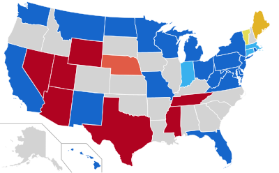
2012 Senate Election with Darker colors, looking at the Democrats.org website, their official color scheme is more of an azure Still, if yellow is for Independents, what color do we use for Libertarians? - Also, even if the colors don't change, I would at least like to make the borders white in the House Election maps, and the district borders are far too thin to be seen in that map too. Here's an example of what I'm talking about—
- I think the Dem Gains look more like lavender in those maps than blue.
- I uploaded a new version that sort of blends both maps. It keeps the original GOP/Dem colors, but the color for the gains is changed. --Kurykh (talk) 03:36, 12 November 2012 (UTC)


- I didn't replace any of the images on the articles.
- Also, if you change the maps, please remember to update the keys on all the pages along with them.
- —Kelvinsong (talk) 13:30, 12 November 2012 (UTC)
- Making the district borders more visible is a great idea, but I would advocate keeping the state borders black for the sake of non-American readers.
- The colors used by Wikipedia aren't decided by me. For some reason they decided on light yellow for independents, so I'm just going along with that.
- I don't think it really matters if the Dem gains are more lavender than blue. It doesn't confuse people as much as having colors that are too similar. --Kurykh (talk) 18:35, 12 November 2012 (UTC)
- I didn't replace any of the images on the articles.
- The thing is, the black borders are even harder to see than the white ones given the dark Republican red. Bumping the white state lines up to 3px making them thicker than the district borders should do the trick(See Nytimes)—
—Kelvinsong (talk) 19:05, 12 November 2012 (UTC)
- The thing is, the black borders are even harder to see than the white ones given the dark Republican red. Bumping the white state lines up to 3px making them thicker than the district borders should do the trick(See Nytimes)—

- I see your point about the state lines. I like your version with the thick white state lines but the original GOP red/Dem blue the best (File:US House 2012-2.svg). It stays true to the simple red/blue dichotomy required without too much fuss and unneeded fancy shades and hues. That's my opinion. --Kurykh (talk) 00:50, 13 November 2012 (UTC)
- One potential issue with thicker white borders that I just noticed: the New York City districts are starting to disappear. --Kurykh (talk) 00:56, 13 November 2012 (UTC)
- Well, I can't really think of any way around that. I don't think it matters that much— nobody will be zooming in on a national map to find NYC districts. —Kelvinsong (talk) 00:18, 15 November 2012 (UTC)