
User:Danny2023/Cerulean
| This is the sandbox page where you will draft your initial Wikipedia contribution.
If you're starting a new article, you can develop it here until it's ready to go live. If you're working on improvements to an existing article, copy only one section at a time of the article to this sandbox to work on, and be sure to use an edit summary linking to the article you copied from. Do not copy over the entire article. You can find additional instructions here. Remember to save your work regularly using the "Publish page" button. (It just means 'save'; it will still be in the sandbox.) You can add bold formatting to your additions to differentiate them from existing content. |
Article Draft[edit]
Cerulean (/səˈruːliən/), also spelled caerulean, is a shade of blue ranging between azure and a darker sky blue. The first recorded use of cerulean as a colour name in English was in 1590.[1] The word is derived from the Latin word caeruleus, "dark blue, blue, or blue-green", which in turn probably derives from caerulum, diminutive of caelum, "heaven, sky".[2]
"Cerulean blue" is the name of a blue-green pigment consisting of cobalt stannate (Co
2SnO
4). The pigment was discovered in the late eighteenth century by Albrecht Höpfner, a Swiss chemist, and first available as a watercolor. The pigment was designated as Cerulean blue in the early nineteenth century. Cerulean blue did not become popular with artists until the 1870s when it was available as an oil paint.[3]
Cerulean blue pigment[edit]
The primary chemical constituent of the pigment is cobalt(II) stannate (Co
2SnO
4).[4][5][6] The precise hue of the pigment is dependent on a variable silicate component.[citation needed]
When the cerulean blue pigment (see the adjacent colour box) was discovered, it became a useful addition to Prussian blue, cobalt blue, and synthetic ultramarine, which already had superseded the prior blue and blue‑ish pigments. The pigment is very expensive.[citation needed]
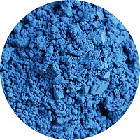
Pigments through the ages shows a "Painted swatch of cerulean blue" to represent the actual cobalt stannate pigment.[7] See also painted swatch and crystals of cerulean blue at ColourLex.[8][a]
Today, cobalt chromate is sometimes marketed under the cerulean blue name but is darker and greener[b] than the cobalt stannate version.[c] The chromate makes excellent turquoise colours and is identified by Rex Art and some other manufacturers as "cobalt turquoise".[9][10]
-
 Cerulean blue PB35
 -
 A sample swatch of cerulean blue hue oil paint. "Hue" in this instance means that other pigments have been used to mimic the color of oil paint that contains the original pigment.
 -
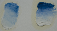 Cerulean blue pigment in oil. On the left as a standoil glaze over zinc white; on the right as a mass tone in oil-based paint.


Visual Characteristics of Cerulean Blue[edit]
Cerulean blue pigment is a greenish-blue color. First available as a watercolor in the 1860s, Cerulean blue had a slight chalkiness. In the 1870s, when the pigment was released as an oil paint, it lost this quality.[11] Physically, Cerulean blue pigment is finely divided and consists of homogeneous, rounded particles which are isotropic, high in refractive index, and blue-green by transmitted light. It has limited tinting strength, but it is the only cobalt blue pigment without a violent tint. [12] It is a sub-opaque, rather than earthy pigment, with moderate tinging power.[13]
History of Cerulean Blue[edit]
The pigment Cerulean blue was discovered in 1789 by the Swiss chemist Albrecht Höpfner by heating roasted cobalt and tin oxides together.[3][14] Subsequently, there was limited German production under the name of Cölinblau.[citation needed] Prior to the introduction of Cerulean blue was Höpfner blue from the late eighteenth century. Making Höpfner blue pigment consisted of mixing a filtered solution of cobalt and aqua regina with tin. This solution was precipitated with potash, washed, dryed and then calcined in a crucible. Höpfner blue was mostly forgotten until the 1850s-60s when it was reintroduced as Cerulean blue.[3]
The pigment now recognized as Cerulean blue was originally referred to as ceruleum blue in the earliest references. The London Times of 28 December 1859 had an advertisement for "Caeruleum, a new permanent colour prepared for the use of artists." Ure's Dictionary of Arts from 1875 describes the pigment as "Caeruleum . . . consisting of stannate of protoxide of cobalt, mixed with stannic acid and sulphate of lime." Cerulean was also referred to as coeurleum, cerulium, bleu céleste (celestial blue). Other nineteenth century English pigment names included "ceruleum blue" and "corruleum blue". By 1935, Max Doerner gave Cerulean blue its main term. Most modern references are to Cerulean blue, through ceruleum is still used. [3]
Cerulean blue was originally made by combining and heating tin oxide and cobalt nitrate, which created a greenish blue mass. This mass was then powdered and washed, creating Cerulean blue. Another way of preparing the pigment consisted of precipitating potassium stannate with cobalt chloride, collecting and washing the precipitate, and then mixing it with pure silica and heating it.[13]
Many claim that Cerulean blue was first marketed in the United Kingdom by colourman George Rowney, as "coeruleum" in the early 1860s. However, the British firm of Roberson was buying "Blue No. 58 (Cerulium)" from a German firm of Frauenknecht and Stotz prior to Rowney.[3] Cerulean blue was only available as a watercolor in the 1860s and did not make much headway until the 1870s when it was released as an oil paint. It was popular with artists like Claude Monet, Paul Signac, and even Picasso. Van Gogh created his own approximation of Cerulean blue using a mixture of cobalt blue, cadmium yellow, and white.[11]
Permanence of Cerulean Blue[edit]
Cerulean blue is an inert, lightfast pigment that can act as a drier in oil paints. It is stable in both watercolor and acrylic.[15] Cerulean blue is particularly valuable for artistic painting of skies because of its hue, its permanence, and its opaqueness.[16]
Notable Occurrences of Cerulean Blue[edit]
In 1887, Monet added Cerulean blue pigment to his arsenal as seen in his painting La Gare Saint-Lazare from 1887. Among the most common mixtures of pigments in the painting include cobalt and Cerulean blue, sometimes incorporating ultramarine. In the shadows of the station's canopy, a pure example of cerulean blue pigment was extracted and identified. Cerulean offered a pigment of sufficiently greenish tone to displace Prussian blue, which may not have been popular at the time.[17]
Berthe Morisot painted the blue coat of the woman in her Summer's Day, 1879 in cerulean blue in conjunction with artificial ultramarine and cobalt blue.[18]
At the end of the Second World War, the United Nations was forced to maintain global peace. For their symbol, they chose a map of the world cupped by a pair of olive branches on a slighly grayish cerulean ground. The architect and designer, Oliver Lundquist, who created the insignia chose Cerulean because it is "The opposite of red, the color of war."[11]
-
 Claude Monet, La Gare Saint-Lazare, 1887
 -
 Berthe Morisot, Summer's Day, 1879
 -
 Symbol of the United Nations


Other color variations[edit]
| Cerulean (Pantone) | |
|---|---|
| Hex triplet | #98B4D4 |
| sRGBB (r, g, b) | (152, 180, 212) |
| HSV (h, s, v) | (212°, 28%, 83%) |
| CIELChuv (L, C, h) | (72, 33, 242°) |
| Source | Pantone TPX[19] |
| ISCC–NBS descriptor | Pale blue |
| B: Normalized to [0–255] (byte) | |
Pale cerulean[edit]
Pantone, in a press release, declared the pale hue of cerulean at right, which they call cerulean, as the "colour of the millennium".[20]
The source of this colour is the "Pantone Textile Paper eXtended (TPX)" colour list, colour #15-4020 TPX—Cerulean.[21]
| Cerulean (Crayola) | |
|---|---|
| Hex triplet | #1DACD6 |
| sRGBB (r, g, b) | (29, 172, 214) |
| HSV (h, s, v) | (194°, 86%, 84%) |
| CIELChuv (L, C, h) | (65, 64, 226°) |
| Source | Crayola |
| ISCC–NBS descriptor | Brilliant greenish blue |
| B: Normalized to [0–255] (byte) | |
Cerulean (Crayola)[edit]
This bright tone of cerulean is the colour called cerulean by Crayola crayons.
| Cerulean Frost | |
|---|---|
| Hex triplet | #6D9BC3 |
| sRGBB (r, g, b) | (109, 155, 195) |
| HSV (h, s, v) | (208°, 44%, 76%) |
| CIELChuv (L, C, h) | (62, 45, 240°) |
| Source | Crayola |
| ISCC–NBS descriptor | Light blue |
| B: Normalized to [0–255] (byte) | |
Cerulean frost[edit]
At right is displayed the colour cerulean frost.
Cerulean frost is one of the colours in the special set of metallic coloured Crayola crayons called Silver Swirls, the colours of which were formulated by Crayola in 1990.
| Curious Blue | |
|---|---|
| Hex triplet | #269DCE |
| sRGBB (r, g, b) | (38, 157, 206) |
| HSV (h, s, v) | (198°, 82%, 81%) |
| CIELChuv (L, C, h) | (61, 65, 233°) |
| Source | [1] |
| ISCC–NBS descriptor | Moderate cerulean |
| B: Normalized to [0–255] (byte) | |
Curious Blue[edit]
Curious Blue is one of the bright tone colors of cerulean
- ^ Maerz, Aloys John; Paul, M. Rea (1930). A Dictionary of Color. McGraw-Hill Book Company. p. 190; Colour Sample of Cerulean: Page 89 Plate 33 Colour Sample E6.
- ^ "cerulean - Search Online Etymology Dictionary". Etymonline.com. Retrieved 20 November 2017.
- ^ a b c d e Siddal, Ruth (2004). The pigment compendium: a dictionary of historical pigments. Amsterdam; Boston: Elsevier Butterworth-Heinemann. p. 90. ISBN 9780750657495.
- ^ "Cerulean blue - Overview". webexhibits.org. Pigments through the Ages. Retrieved 20 November 2017.
- ^ "Cerulean blue - History". webexhibits.org. Pigments through the Ages. Retrieved 20 November 2017.
- ^ "cerulean blue". Cameo.mfa.org. Material name. Boston, MA: Museum of Fine Arts. Archived from the original on 3 February 2009. Retrieved 20 November 2017.
- ^ "Cerulean blue". Pigments through the Ages. Retrieved 30 December 2011.
- ^ "Cerulean blue". ColourLex.
- ^ "Blue". Paintmaking. Archived from the original on 3 March 2016. Retrieved 20 November 2017.
- ^ "Colormaking attributes". Handprint.com. Retrieved 20 November 2017.
- ^ a b c St. Clair, Kassia (2017). The Secret Lives of Color. Penguin Publishing Group. pp. 182–183. ISBN 9780143131144.
- ^ Gettens, Ruthenford J.; Stout, George L. (1966). Painting Materials: A Short Encyclopedia. New York: Dover Publications. p. 103. ISBN 978-0486215976.
- ^ a b Church, Arthur Herbert (1901). The Chemistry of Paints and Painting. Seeley and Company, Limited. p. 212.
- ^ Höpfner, Albrecht (1789). "Einige kleine Chymische Versuche vom Herausgeber". Magazin für die Naturkunde Helvetiens. 4: 41–47.
- ^ Patterson, Steven. 2020. “The history of blue pigments in the Fine Arts — painting, from the perspective of a paint maker.” Journal & Proceedings of the Royal Society of New South Wales 153:164-179. https://royalsoc.org.au/images/pdf/journal/153-2-04Patterson.pdf. 172.
- ^ "Pigments and their chemical and artistic properties". jcsparks.com. Retrieved 20 November 2017.
- ^ Roy, Ashok. “The Palettes of Three Impressionist Paintings.” National Gallery Technical Bulletin 9 (1985): 13. http://www.jstor.org/stable/42616026.
- ^ Bomford, D.; Kirby, J.; Leighton, J.; Roy, A. (1990). Impressionism. Art in the Making. London, UK: National Gallery Publications. pp. 176–181.
- ^ Type the word "Cerulean" into the indicated window on the Pantone Colour Finder and the colour will appear.
- ^ PANTONE. "About Us - Color the Millennium Cerulean Blue". PANTONE. Retrieved 20 November 2017.
- ^ "- Find a Pantone Color - Quick Online Color Tool". Pantone.com. Retrieved 20 November 2017.
Cite error: There are <ref group=lower-alpha> tags or {{efn}} templates on this page, but the references will not show without a {{reflist|group=lower-alpha}} template or {{notelist}} template (see the help page).