
Talk:Canton of Bern/Archive 01
| This page is an archive of past discussions. Do not edit the contents of this page. If you wish to start a new discussion or revive an old one, please do so on the current talk page. |
Many images
My poor little browser window is positively crowded with images here; some of them even overlap each other, or overlap the article text. Such layout trouble is properly the responsibility of one's browser software, but seriously, with all the images the page is beginning to look more like a tourist brochure than an encyclopedia article. Could somebody please identify the most important/relevant few of the images (say, two to four) and cull the rest? Henning Makholm 00:17, 26 January 2007 (UTC)
- My point exactly, see User_talk:Benjiwolf#Canton_of_Berne. I guess we could just as well begin culling the images now. Sandstein 05:53, 26 January 2007 (UTC)
Reduced image sizes and removed a few...yet you both are forgetting one of the most important philosophies of wikipedia..."without images its useless"...and yall are forgetting that the mainly american users of this english version are used to fast moving images...they need pictures people...its as simple as that...they watch TV hours everyday...wikipedia is in stiff competition...if u want to grab their attention away from the TV set to get them to read instead of sit passively...you need some images...and especially younger users need many images...they need color...most of my americans friends that i might be able to persuade to look at the "canton berne" article...that they would have no interest in whatsoever...wouldnt care at all about the text...theyd just want some pictures of what it looks like there...maybe with a couple good pics they might read a few lines...its the sad reality people...wake up to the fact that literature is dying...fewer books are being read and sold...people want movies and music videos...its as simple as that...anyways the pictures are less now...and as to a tourist brochure...well the fact is that all switzerland looks like it comes out of a tourist brochure...this isnt the middle of kansas or something...its just the nature of pictures from switzerland...it looks nice...good enough for a travel brochure...anyways...yalls blank encyclopedia just wouldnt sell or interest many people...just a few scholars perhaps...even they would want some color and pictures to break up the monotony...these are mainly lay people that read wikipedia...they need even more pics...yall have no idea about book format...and i think wikipedia can get people to better their minds and read more...yet its going to take an excellent ability to convey images to help out...sincerely...Benjiwolf 11:38, 26 January 2007 (UTC)
PS: tell me tho if this new page has any images that run over each other...there is difficulty in that first area with the two historical photos i put in...before it was just a bunch of blank dead space there...so i threw something in and tried to reformat it...they should really make it so we can just drag things around to format the page and pics...the way it is now sometimes u are never sure how ur pic will exactly fit sometimes...so tell me if it still isnt working right on ur browsers, that part of the page, and ill try another layout...Benjiwolf 11:44, 26 January 2007 (UTC)
- Thanks for your reply, but I think your notion of what Wikipedia should be is out of sync with what everyone here thinks it should be. Please consider:
- Wikipedia is an encyclopedia. It is a compendium of knowledge. It does not want to entertain.
- Wikipedia is not a travel brochure. It does not exist to promote Switzerland, or literacy, or anything else. It does not need to sell - it's free! We do not care if fewer people read it because it has not enough nice pictures.
- "Without images its [sic] useless" is not a basic philosophy of Wikipedia (or who told you so?). Rather, images that serve no encyclopedic purpose have no place on Wikipedia.
- Given that our policy is clear on these points, I'm going to implement the consensually agreed upon image use policy and evacuate the images that currently serve no purpose to a gallery below. Sandstein 18:45, 26 January 2007 (UTC)
- Oh, and people can find the pictures if they want to, thanks to the Commons linkbox (see at the right). Sandstein 18:56, 26 January 2007 (UTC)
sorry swissie...uve found urself in an editing war with another swissie...i restored the lead photo for the bernese page of the mountain in canton bern (the jungfrau)...that is most noted to being with canton bern and that people associate with canton bern when they think of it...its sort of the accepted symbol for this canton...that and the bear...i restored the historical photos next to the history section...i restored a mountain picture next to the listed peaks...i filled empty blank spaces on the page with the lauterbrunnen picture (a lousy pic of lauterbrunnen yet gives people another idea of what canton bern looks like)(i need one of some rolling tree covered hills too i suppose)...i removed a superfluous picture of people sitting on benches...(it tells people nothing about what it looks like in canton bern and is no contribution to the politics section...it could be anybody anywhere sitting on benches...i may add a photo of the bundeshaus that i saw somewhere when i find time)...if i wanted to make a travel brochure id add photos better than these...yet these give people an idea of what it looks like in canton bern...these photos are all of canton bern...they serve to educate people as to what it looks like in canton bern...u may be an aecetic monk...yet people want some color in their encylopedia...and they want photos of what places look like on articles about places...i would like to find a photo of some people in traditional bernese dress style for this page..i had the alphorn players to take up the spot till i found a pic of that...it was close enough for people to get the idea...people want to see pictures of articles about places...articles about chemicals or something need no to few pictures...places demand pictures...ciao!...Benjiwolf 19:47, 26 January 2007 (UTC)
- Sorry, but I disagree. The people sitting on benches are a relevant picture because they actually depict the subject of the article, the cantonal parliament. The Bundeshaus would be out of place, as it is a federal building, not a cantonal one. The Canton of Berne is a federal state of Switzerland, and not just a tourist destination. Would you agree that we request a third opinion on this issue to help us find consensus? Sandstein 19:54, 26 January 2007 (UTC)
- Actually, I've now gone ahead and requested that someone else add their opinion. Sandstein 20:00, 26 January 2007 (UTC)
I didnt place a picture of the bundeshaus there yet...ill leave it out...the people sitting is totally irrelvant..it gives the reader nothing...it has no place in the article...its not a travel page...yet people need to know what the canton looks like...Benjiwolf 19:59, 26 January 2007 (UTC)
- Certainly! I also like my canton, it's beautiful. But really, your proposal is not the way to go about it, as the images do distract from the text. Could we maybe cooperate on a gallery section at the bottom of the article, like the one below on this page? Then people would still see the pictures. Sandstein 20:04, 26 January 2007 (UTC)
Queued images
These images have been removed from the article and may be re-added once they usefully enhance the content. Sandstein 18:56, 26 January 2007 (UTC)
-
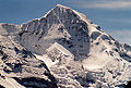 The Mönch(13'474 ft) covered in ice and glaciers and as seen from the northern face
 -
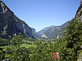 The Lauterbrunnen Valley
 -

-
 Maximiilien de Meuron early 19th Century looking at the Eiger


Hey. I wandered in here from WP:3O. In my opinion, pictures are a good thing. It is a rare article indeed that couldn't be improved by the addition of one or two pictures. However, you can get carried away. Looking at this article it seems the main problem wasn't how many pictures there were; it was how they were laid out. I have re-arranged them some and shrunk them so they took up less room. I put most of the mountian ones in the geography section in the order they are listed. All are right-aligned. What do the two of you think about my arrangement? Are they too small? Are there still too many pictures do you think? Not enough? What do you think? ~ ONUnicorn(Talk|Contribs)problem solving 20:45, 26 January 2007 (UTC)
- Thanks for your assistance. I can live with this selection and arrangement of the images. The Grand Council image should be of equal width as the one next to it, I suppose, though. Sandstein 20:59, 26 January 2007 (UTC)
- Good point. I fixed that. ~ ONUnicorn(Talk|Contribs)problem solving 21:05, 26 January 2007 (UTC)
i think ur new arrangement was excellent!...the addition of the cheese photo to the economy section was great...i changed the size of some a slight bit...and moved the eiger picture next to the peaks list and enlarged it a slight to take up the empty space that is in that corner and to match the box width...the jungfrau picture i moved back to the top as the lead picture...the other way it is just a big blank empty space at the top of the page...there should be a picture of some kind...and the jungfrau frankly is what people think of frequently when they think of canton bern...it is their most famous peak...and a good memory trigger for peoples minds when they try to recall canton bern...and even from the capital in front of the bundeshaus in the city of Bern u gaze out at it...i just think it is a good picture for the lead for the canton bern page...so the page looked better and blank spaces get filled better...and as to number of pics...it seems about right...the gallery u created at the bottom could maybe use some more pics i would think now...as to the main page i think the pics look pretty good now...what do the two of you now think???..and thanks ONUnicorn!...the cheese pic was perfect for the page...emmentaler even...im going to restore the version of the page just before i started to work on the bernese page just to compare what i have added...and then put this most recent one back...en schone mitenand!...Benjiwolf 11:04, 27 January 2007 (UTC)
Images again
Sorry, Benjiwolf, but we do need some layout consistency here. Please look at our featured content, like Mahatma Gandhi. These articles don't have 400px-sized images at the top. Rather, they have a small number of images that actually fit with the content and that are uniform in layout appearance, such as sharing the same width. Let's try and discuss this here, shall we? Sandstein 11:05, 27 January 2007 (UTC)
- I now see your comment above - certainly the Jungfrau is a nice picture, but not in billboard size, please. This is just not Wikipedia's style. We are building an entire encyclopedia here, which requires some consistency. Sandstein 11:07, 27 January 2007 (UTC)
images
i reduced the jungfrau pic size to what it was previous to my editing, i have added photos into the gallery of bernese style buildings and some representative landscapes...i added a pic of lake biel next to the geography section talking of it, one of emme region next to geography section discussing this, and 2 oberland photos next to oberland geography...when someone is telling me about geography of an area i want some photos of the actual geography of the area...even the most brilliant writer just cant at all convey geography, unless the reader has some sense already of what to imagine for the pictures in their head...i could read a book about the bernese alps...yet without some photos i would just imagine them as the mountains where i grew up...("a picture is worth a thousand words")...i wanted some more photos of the mittelland yet i went thru several districts and all municipalities of seftigen, trachselwald, signau, konolfingen...couldnt find even one pic except for the emmental farmhouse...then i just gave up...and this is my point about pics...just what do these districts and municipalities look like??? we have no idea at all about these areas without pics...every district should have at least 3-5 pics and each municipality should have 1 or 2 so we have some basic clue as to what these places look like...even most oberland districts and municipalities dont even have one pic yet...anyways... now one can go to the bernese canton page and get some sense as to what it looks like without surfing thru hundreds of districts & municipalities to try and find a few photos scattered here and there...Benjiwolf 13:58, 29 January 2007 (UTC)
- Right now though, in my browser, the text is unreadable because of the way the pictures are laid out. Having the Jungfrau massif image at the top left the way you have it now doesn't work at all in my browser, and I'm sure it doesn't work very well in others either. I don't understand why you think there is white space in the lead, the infobox has a picture of the coat of arms and a map, both of which add color and are informative. If you want a photo at the top, why not put it at the right and above the infobox? I think the infobox is a better choice for the lead, but at least that way the text would be readable. Going down further into the Geography section I see lots of pictures all crammed right at the beginning on the left side with the text barely readable because it is sandwiched between them and the bottom of the infobox, then going down further there is a long list of mountains with lots of "boring white space" and no pictures because they are all crammed up at the top instead of spaced evenly or placed with thought near relevant text. I thought when I put the gallery in that it could use a few more pictures than it had; but I wanted some way to include the two that I had removed from elsewhere but didn't see any place to put near text - but now there are so many pictures in the gallery that they just kind of blur together in the reader's mind instead of adding much to the article. Before I didn't think there were too many pictures; just that they were poorly laid out. Now there are too many and they are poorly laid out. I see you've included some lovely shots of buildings; is Berne noted for its architecture? Perhaps a section should be added on architecture and some of those pictures could go there. I'm going to try to clean up what's already here some for right now. ~ ONUnicorn(Talk|Contribs)problem solving 17:23, 29 January 2007 (UTC)
hi there...well ill move the jungfrau pic if it doesnt work with ur browser...i think i see a problem here...the page can be assembled totally different on two different users pages...thats a serious issue...i can get it looking perfect on my computer here at the university in switzerland...yet it looks totally different and is layed out in a different way for ur computer...then when u lay it out to look good on ur browser...it looks crummy on mine...thats an issue...anyways what happened on my browser with ur peak pics list is a long part of the page with just these peaks and nothing else on either side them...it was sort of strange as a huge portion of the canton bern page was devoted just to these mountain peaks...that list and chart is great for the oberland and bernses alps pages though...so i restored this page tho...i like the idea of the large gallery tho so one can leaf thru several pics with different looks from the canton...i tried to give a wide range of looks and some buildings to capture several of the typical things someone would see if in canton bern...as to the pics in the main page above the gallery...im sort of at a loss as these browsers work differently...what looks good on one doesnt work on another...i dont know...ill try a slightly different arrangement and tell me how it looks on ur browser...merci...Benjiwolf 09:18, 30 January 2007 (UTC)
- Yeah, I saw what was happening when I went home last night. I use a different browser at home than at work, but haven't been getting on much at home because I've been busy packing and getting ready to move; we're buying a house. My layout looked good at work; but when I looked at it at home it looked awful. Your layout looked better at home but awful at work. The chart I made does turn the focus of this article too much towards mountains, and when I looked at it at home it looked sort of dumb because the infobox pushed it way down and there was an odd gap between the rest of the text and the chart. I also saw what you were talking about with the white space between the infobox and the table of contents. That's really odd; and I'm not sure how to fix it so it'll look good no matter what you're using. ~ ONUnicorn(Talk|Contribs)problem solving 14:22, 30 January 2007 (UTC)