Hi, the lead map in the Infobox at Three Gorges Dam is presently completely useless for indicating where the dam is located. It shows the boundaries of an internal region of China that will be unrecognisable to 99% of English Wikipedia readers. It contains no indication of scale and no clue of where this region is located relative to the country as a whole. (This problem is widespread within Wikipedia. Almost all these "location within local administrative area" maps are useless as lead images.) Would it be possible for someone to create a map that shows the location within a recognisable context, either of China as a whole, or at least the eastern part showing some coastline and well-known cities? Thanks! 109.147.188.227 (talk) 13:58, 31 October 2014 (UTC)
Graphist opinion(s):
There is a better (though not ideal) map further down the article. Would it be an improvement to move the better map up into the info box, and get rid of the map that is currently there? Maproom (talk) 14:26, 31 October 2014 (UTC)
I don't know how to do that ... when I change the map file name I get a bunch of errors that I don't understand. However, when I make the map the size that it would be in the Infobox it becomes illegible, so it wouldn't work anyway. 109.147.188.227 (talk) 20:29, 31 October 2014 (UTC)
Agreed — You can change the location_* fields under
{{Infobox dam
to
| location_map         = China (equirectangular)
| location_map_size    = 200px
| location_map_caption = Location in China
For a shaded elevation map, use
| location_map         = China
| location_map_size    = 200px
| location_map_caption = Location in China
I would have done it, but thought I should get a second opinion. cmɢʟee⎆τaʟκ 13:18, 2 November 2014 (UTC)
Thanks, I changed it. It's much better now. I didn't realise how it worked. 86.160.86.103 (talk) 03:36, 3 November 2014 (UTC)
Request:Could someone convert this jpg map into an svg?.
The areas and the symbols are evolving quite rapidly and it would be much easier to do it in svg. Also it is a file used in several language versions.
Regards --Basquetteur (talk) 08:32, 18 October 2014 (UTC)
The image I propose contains the number and location of hospitals, laboratories and transit centers and also the status of regions in the three countries (active, not active,new). The two images are therefore different. The second image reflects essentially the number of cases and deaths per country. This second image is already in svg and can therefore be easily updated (and also translated into several languages, I have done it for Spanish), the first one not. Hopefully the number of new active regions, the number of active regions will disappear in the near future, but so far that does not look to be the case. Regards --Basquetteur (talk) 13:36, 24 October 2014 (UTC)
Try the above and mark as done if satisfied. -- Veggies (talk) 12:06, 29 October 2014 (UTC)
Thank you very much. I think it is wonderful, very beautifully done. I am going to use it to make a Spanish translation, and possibly French. I hope others might translate it in other languages in West Africa. I do not know about the original version in jpg that RobiH is updating very frequently --Basquetteur (talk) 08:20, 1 November 2014 (UTC)
Though there was a Do not move to Commons tag, Kohelet had already copied it to Commons, and I thought it would be better to fix the mistake on the Commons copy.
I have corrected the spelling on the Commons version. Maproom (talk) 21:35, 2 November 2014 (UTC)
Graphist opinion(s): Done correcting the spelling for the local version. I'm not an admin, so can't delete it. --///EuroCarGT 02:20, 3 November 2014 (UTC)
Schlieffen Plan
Not done See comment below. Philg88 ♦talk 07:53, 12 December 2014 (UTC)
Change the country names, the legend, and the compass to Japanese. The scale units (km, mi) can be as it is. Change the Pas de Calais (Strait of Dover) to Japanese. Other city names and rivers, etc. in the language of the country it is located in. The labels for the armies to Japanese.
Graphist opinion(s):
@Kinos0634: We make maps here, we don't do translation. If you want the map in Japanese then you will need to provide a table showing the current labels with their translations. Thanks, Philg88 ♦talk 07:25, 19 November 2014 (UTC)
Camas pocket gopher. I have shapefile data
We need a distribution map for Camas pocket gopher to move this article up to GA status. Here is IUCN weblink with a map: http://maps.iucnredlist.org/map.html?id=42594 I can also provide the data for the map, which IUCN has released for our purposes. I have it as a .zip containing shapefiles but I don't know how to use these. I can email them if anybody does know how. This should be an easy map. Thank you —Gaffταλκ 16:59, 12 November 2014 (UTC)
A map of the course, along the River Thames from Hambleden Lock to Henley Bridge. Ordnance Survey Open Data is an ideal source, but I don't have the tools readily available to cut the required subsections of the 25MB TIFFs out and stitch them back together. Thanks in advance. The Rambling Man (talk) 12:36, 29 October 2014 (UTC)
Graphist opinion(s):
Same comment as above, how about an SVG with data from OpenStreetMap? Philg88 ♦talk 20:51, 16 November 2014 (UTC)
A map of the course, along the River Thames from Westminster Bridge to Putney Bridge. Ordnance Survey Open Data is an ideal source, but I don't have the tools readily available to cut the required subsections of the 25MB TIFFs out and stitch them back together. Thanks in advance. The Rambling Man (talk) 12:35, 29 October 2014 (UTC)
Glad to help! Please mark the request as {{resolved}}. I will get around to the second one when I have a spare couple of hours. Philg88 ♦talk 10:03, 17 November 2014 (UTC)
Request:
I'd like to request, if possible, an updated version of this map. There are two issues here; one is for improved compliance with contemporary visual and file formatting (SVG instead of PNG) standards for maps on Wikipedia, and the other is that while I hadn't previously noticed this, it's just been brought to my attention that the original creator, User:Earl Andrew, erroneously reversed the names of Lake Erie and Lake Ontario, and thus the map contains a serious error in its current form. (I had previously corrected it for the fact that he had also mislabelled the northern terminus of the highway, but somehow the lake error evaded my notice at the time and I've never really gone back to analyze it much since then.) Thanks for anyone who can assist with this. For the record, it is not critical that the updated map replicate every municipal boundary that the existing one delineates through the entire province — the route of the highway itself is the critical feature here.
Bearcat To start with it would be great if you used the "New Request link" at the top of the page as that gives us all the code and the information we need to proceed the work on your request, so please do this all over again. Thanks --Goran tek-en (talk) 18:20, 4 July 2014 (UTC)
Will do. But in truth, I was fully expecting there to be one and couldn't find it anywhere the first time. I see it now that you've told me that there is one, but could you guys please consider making it more visible and less easy to overlook? Bearcat (talk) 18:23, 4 July 2014 (UTC)
As the Donbass war is progressing, it has become clear that we will need good maps to demonstrate the progression of the conflict from a historical perspective. Whilst reading The Economist, I came across this exceptional map. Is it possible that someone here could make a free version of this map? It would be perfect for our purposes at War in Donbass. RGloucester — ☎ 22:28, 31 July 2014 (UTC)
Graphist opinion(s):
RGloucester It would be great if you used the "New request" link at the top of this page because then all the code we need will be created. Do that and ping me and I will take it and start working on it as I said before, thanks. --Goran tek-en (talk) 16:54, 5 August 2014 (UTC)
@RGloucester: Now I'm ready to work on your requested map if it's still needed.
I can see that this map is updated and used East Ukraine conflict so you will have to tell me if you still need another map, please let me know? --Goran tek-en (talk) 15:36, 10 November 2014 (UTC)
@Goran tek-en: The point of the map I requested is to show the events from a historical perspective, i.e. show the movements over time, as suggested by the Economist map. The present map is constantly updated, and hence doesn't show the progression of the conflict. I'd be quite happy if you'd like to work on it. RGloucester — ☎ 16:17, 10 November 2014 (UTC)
I'd really like a version of The Economist map (including the note about Malaysia Airlines Flight 17), perhaps with one new line showing the present demarcation of territory. It does an excellent job at depicting the region and the conflict. RGloucester — ☎ 16:19, 10 November 2014 (UTC)
@RGloucester: Now there is a draft for you to look at. Give me feedback on it and tell me honestly what you think and what you want changed. You are the one who knows what you want, I'm the tool to make it happens. One thing I'm not sure about is the North-South direction as it differs in different maps, maybe you know. --Goran tek-en (talk) 12:47, 12 November 2014 (UTC)
@Goran tek-en: Excellent! First thing I'd suggest is changing the blue for the 18 June area to something lighter, so that the text is easier to read. Also, it would be best to remove the "th" from "18th" June, as our MoS says not to use "18th June", but instead, "18 June". Next, I'd suggest you replace "rebel" with "insurgent", as that's the one word we've settled on at the article. Thirdly, a more readable font, perhaps a nice sans-serif like you used here, would be much better. The last thing I'd request is that you add one more "colour" for the insurgent-held area, showing the results of the August Novoazovsk offensive. I.e. show the extent of insurgent-held territory as shown in this map. RGloucester — ☎ 18:44, 13 November 2014 (UTC)
@Goran tek-en: One last thing. If you can, please also reduce the size of the crash marker for the Malaysian aeroplane. It is a little big, at the moment. RGloucester — ☎ 20:58, 16 November 2014 (UTC)
@RGloucester: The font I use is Liberation Sans and that is for BOTH of the maps even the one you link to, this is the preferred one. Sans is generally preferred to sans serifs for screen. How a font renders is something which is a bit tricky and I'm not sure I totally can control that. At this link screen you can see how the map you linked to renders for me at commons, this is a bitmap so it has no font in it. How it renders at commons is NOT the same how it renders when you look at a draft at my private links.
I hope I did understand the new color you wanted draft, reload page but it's just for you to give me feedback. Ping me please as the Watch doesn't work all the time, thanks. --Goran tek-en (talk) 11:57, 18 November 2014 (UTC)
@Goran tek-en: The colour looks much better, as do the various other things. However, there is a grave mistake, in that you portrayed the whole of Donetsk and Luhansk oblasts as under insurgent control as of August. This is not at all the case. Look at this map, which is dated to November. The borders haven't changed since the August offensive, due to the ceasefire. The areas coloured in blue and yellow are Ukrainian-controlled. The tan-coloured area is insurgent-controlled. Please fix this error, and then the map will be near complete. RGloucester — ☎ 19:33, 18 November 2014 (UTC)
@Goran tek-en: That's what we need. Two more minor additions, if you please. Firstly, I'd like a town dot for Novoazovsk, and one for Izvaryne. Also, I'm having a bit of trouble, at present, in seeing what territory they control at the latest point. Perhaps you should hash the parts they have now that they had previously with red? Otherwise it looks confusing, because they don't have Sloviansk, but they do have Donetsk, &c. RGloucester — ☎ 13:31, 19 November 2014 (UTC)
@RGloucester: I don't understand exactly what you mean but I understand the problem. I did think about but it but waited for your feedback. We have three layers that we want to be visible so I have tried something which you can look at here at this draft, reload page and then give me feedback. Also look at the legend, I don't know if it's necessary to do like that for August, it's up to you, or any other way you want it. --Goran tek-en (talk) 17:38, 19 November 2014 (UTC)
@Goran tek-en: That resolves the problem. From a purely stylistic perspective, however, I think we need a different colour scheme. The yellow, red, and blue really clash, and make it somewhat hard to read. The roads, too, are too sharp, given that they are not as important. We need a softer, more gradual scheme, one that's easier on the eyes, but which shows contrast well. I'd also say that a less intrusive hashing would be better, perhaps a thin diagonal line-type hashing. I really liked the colour scheme you used in the Georgia map. The blues and greens are soft, and easy to read. I think something like that would be much better. I'd also think that reducing the prominence of the roads would help, perhaps using thinner black and grey lines, or something like that. As it stands, there are just too many colours mixing here, and it makes it hard on the eyes. Finally, I think the coordinates for Izvaryne are off, as it is meant to be a border crossing. See this link here. RGloucester — ☎ 17:51, 19 November 2014 (UTC)
@RGloucester: I totally agree with you but I didn't want to start with that until we had everything in place as we do now.
When we (graphist workers) do maps here we try to do them in a manner so that they resembles each other to make it easier for the users to read them. I think you do the same when you write an article, you stick to some kind of basic so one gets used how to read them. To achieve that we have some templates that we try to use and one of them is Maps template-en. It tells us how different things should look, but of course I DO NOT HAVE to use them but I like to as far as possible. Then above that the different graphist worker puts their personal touch and adds what the requester wants the map to show and in what way. Both this map and the one I did before follow that template but then they contain different things like roads and so on so the look different but the base is the same.
So it's up to you if you want the roads or not in the map, for instance. I put in some but not all the ones from the images you provided as base. Below you find two different drafts with or without roads and I have tried to make them softer.
So look at them and give me feedback. --Goran tek-en (talk) 19:11, 20 November 2014 (UTC)
@Goran tek-en: No problem. Your work is excellent. I definitely prefer the map without the roads. It is just much clearer to read, and the roads don't add any particular information that we need. Everything looks good. The only problem I have now is that the initial area, i.e. that held on 18 June, is not that clear. It almost looks, at present, as if the insurgents only held the light blue area. Perhaps the legend can be changed to show the both colours. Also, the date for the August bit should be "31 August". RGloucester — ☎ 19:39, 20 November 2014 (UTC)
@RGloucester: Have a look at this and particularly the legend. It gets very complex as we have 3 occasions we try to show and that gives one episode 4 different coloring. I'm to deep in to this to really know if anyone not involved does understand. If you could check with someone who doesn't know anything of this it would be great. New draft, reload and get back to me, thanks. --Goran tek-en (talk) 15:51, 21 November 2014 (UTC)
@Goran tek-en: I think that's quite understandable, and definitely better. I'm not sure one needs to include the hashing in the first legend box, though, as the colours do what needs to be done on their own. Why do Luhansk and Kharkiv have different capital icons from the one for Donetsk? Also, I think the Donetsk airport icon is a bit off, as it seems too far from Donetsk.
@Iryna Harpy: Iryna, can you look at this draft map and see if it is comprehensible? Thanks. RGloucester — ☎ 16:27, 21 November 2014 (UTC)
@RGloucester: New draft, reload is up. My mistake with Donetsk. I was thinking of it as national capital and the others as capital of sub-division, thanks for correcting it. I checked with google maps so I hope the airport is more correct now. --Goran tek-en (talk) 15:47, 23 November 2014 (UTC)
@RGloucester: Looks good! I think we're ready to wrap up here. RGloucester — ☎ 15:58, 23 November 2014 (UTC)
@Goran tek-en: Might as well just call it "War in Donbass", or something like that. The description can merely say that it is a map of the war. The category would be Category:War in Donbass, which also exists on the Commons. RGloucester — ☎ 19:24, 23 November 2014 (UTC)
We need a distribution map for the infobox of this leafcutter bee, Megachile campanulae. Article currently under review for a Main Page Did-you-know spot.
@Gaff: For the US map do we add the dots to the map? ///EuroCarGT 20:51, 1 October 2014 (UTC)
@EuroCarGT: I was thinking just a map of the Northeast US/Canda with a vague outline drawn overlay suggesting the distribution area. The two links were just to provide some guidance.. If somebody could show me how easiest to make the map, it would be great. That way I can make them myself. These bee articles I have been working on are not that important and you all have more important work to do. thank you. —Gaffταλκ 21:29, 1 October 2014 (UTC)
@Gaff: Well you could download a Vector graphics editor, my favourite would be Inkscape (open source!). Learn the tools from some websites or video tutorials and you should be on your way to a vector artist. Also i'll try to do this map. ///EuroCarGT 21:38, 1 October 2014 (UTC)
Would any editor here be able to generate either a bitmap or vector map of Europe extrapolated to the full A-Z Ordnance Survey National Grid so that most of the top-left figure in File:Ordnance Survey National Grid.svg needn't be blank, please? If I understood correctly, the projection is a Transverse Mercator centred on 48°N 2°W. -- cmɢʟee⎆τaʟκ 21:35, 11 September 2014 (UTC)
The true origin is actually 49°N 2°W. --Redrose64 (talk) 16:18, 25 November 2014 (UTC)
Graphist opinion(s):
Map of German defensive fortifications from Thiepval to Courcelette, July 1916
Details of your request go here... -- Could someone take a look at this with a view to tidying it up please?Keith-264 (talk) 23:40, 2 November 2014 (UTC)
The article needs a location map of Spain and France together. Currently the article has two separate maps, but it would look much better if there was just one map. If it could have the Basque Country (greater region) shaded darker, or a different color such as Blue that would be really useful. Adam Cli (talk) 12:20, 6 November 2014 (UTC)
I was hoping someone could modify this French map for Wikiprojects related to the Pacific Northwest. The issue with the map is it isn't terribly accurate for the area disputed between the UK and the US prior the 1846 Oregon Treaty. The Americans consistently for decades claimed the portion of Vancouver Island south of the 49th parallel. A different coloured line following the area at times claimed by both nations, modern Western Washington state and most of British Columbia would beneficial. The second map at least gives an idea for the course of the continental divide and the more extensive American claim of 54'40. The French language itself isn't an issue for me, given it is SVG. Thanks! -- Voltaire's Vaquero (talk) 08:29, 8 November 2014 (UTC)
Graphist opinion(s):
Wolf range update
Stale
Range map to be modified (the new African range should be in green).
I don't even understand the map. It should depict Shares of World GDP, but in what way? Please clean this up as to make it understandable at first sight. I have no idea how at the moment, but (sorry for the harsh words) at the moment it seems that any other way would make it clearer. Thank you.... -- Lommes (talk) 14:47, 14 November 2014 (UTC)
According to the article, the IMO's newest member state is Zambia, but Zambia's still marked as a nonmember on the map. Please change its color to reflect its membership. PS, the article says that Niger isn't a member, but it's marked as a member on the map; switching its colors would also help. For bonus points, add South Sudan (nonmember), although that would probably take a good deal of extra work. -- Nyttend (talk) 14:03, 16 November 2014 (UTC)
Graphist opinion(s):
I fixed it, however after uploading the file, I see no difference so it may have been an issue with the code or I'm just not looking properly. ///EuroCarGT 20:23, 16 November 2014 (UTC)
Continents
Stale
mosaic-y automated borders
actual borders
Article(s)
multiple
Request
please fix svg borders to match png -- Kintetsubuffalo (talk) 01:11, 22 November 2014 (UTC)


 The Schlieffen Plan, French


 Route of Ontario Highway 6
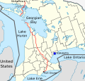 SVG
SVG

 Done ///EuroCarGT 06:37, 23 November 2014 (UTC)


 Range map to be modified (the new African range should be in green).
 Template.
![World share of GDP (PPP) (World Bank, 2011). Source: [1]](//upload.wikimedia.org/wikipedia/commons/thumb/7/7b/%C2%B4World_Bank%2C_icp_2011_gdp_ppp_world_share.png/120px-%C2%B4World_Bank%2C_icp_2011_gdp_ppp_world_share.png) World share of GDP (PPP) (World Bank, 2011). Source: [1]
World share of GDP (PPP) (World Bank, 2011). Source: [1]![World share of GDP (PPP) (World Bank, 2011). Source: [1]](/wiki/File:%C2%B4World_Bank,_icp_2011_gdp_ppp_world_share.png)
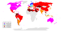 Needs updating to 2014 version
 Created in January 2014, the new report was published in June 2014

 Map of International Maritime Organization member states
 mosaic-y automated borders
 actual borders
