
Wikipedia:Graphics Lab/Images to improve/Archive/Sep 2007
 | This page, part of the Graphics Lab Wikiproject, is an archive of requests for September 2007. Please do not edit the contents of this page. You can submit new requests here. |
 DonePrince's Palace of Monaco
-
 source JPG
 -
 SVG
SVG


Article(s):Prince's Palace of Monaco
Request: I created this image and the one below for the Scottish Parliament building a while back - I understand the preference with such images is to have them in the scalable SVG format - unfortunately I had no way to convert them - I think I've still got the photoshop files, if anyone would like to parse the files? Mcginnly | Natter 10:57, 16 July 2007 (UTC)
Graphist opinion:
Well, this one is of high enough quality that I don't really see a point in conversion.--Cronholm144 11:45, 16 July 2007 (UTC)
- the only reason for SVG-ification would be to reduce file size, and the same for below. --Dave the Rave (DTR)talk 14:55, 16 July 2007 (UTC)
- Not the only. SVG also makes files simpler to edit, including for localization.
I'll go ahead and start on this one - just the sort of menial job I could use ATM. ¦ Reisio 04:50, 17 July 2007 (UTC)Actually I will go ahead and start on this one if you relicense as public domain. ¦ Reisio 07:40, 17 July 2007 (UTC)
- Not the only. SVG also makes files simpler to edit, including for localization.
- That's a good point; I hadn't thought of that. --Dave the Rave (DTR)talk 15:04, 22 July 2007 (UTC)
- I've changed the license - like I said, if it's less work for you guys I can send the photoshop files - seems I can export as png from photoshop if you'd prefer that also. regards --Mcginnly | Natter 08:47, 17 July 2007 (UTC)
- Probably won't make any difference. ¦ Reisio 20:37, 17 July 2007 (UTC)
- To me, it looks like a tricky and time-consuming task to completely do manually. Unless someone else takes up the work that Reisio started, your best bet might be to upload the original Photoshop files to the Internet somewhere and post a link. They may be of use to someone, and could save a lot of manual work. But at least, if you can upload PNG versions here to replace the JPEGs, that would also be good: as a rule, PNG is better than JPEG for maps and diagrams like this. CountingPine 01:00, 26 July 2007 (UTC)
PNG is preferable to jpg however.--Cronholm144 20:40, 17 July 2007 (UTC)
- I'm gonna go on an unplanned hiatus, so I won't be finishing this. I didn't get that far, and anyone doing this would probably rather start from their own blank slate, but here's (32 KB) my Inkscape SVG anyways - some layers may be hidden ATM, I don't remember.. ¦ Reisio 08:36, 23 July 2007 (UTC)
- Can't you just use the trace image tool in Inkscape? Not perfect, but one can tweak it a bit... vlad§inger tlk 00:39, 4 August 2007 (UTC)
- Or the fill bucket tool In the development versions... --Dave the Rave (DTR)talk 07:24, 4 August 2007 (UTC)
- Can't you just use the trace image tool in Inkscape? Not perfect, but one can tweak it a bit... vlad§inger tlk 00:39, 4 August 2007 (UTC)
In an effort to actually complete this request, I've started tracing this in Inkscape. It might take me a while, mind. --Dave the Rave (DTR)talk 22:48, 22 August 2007 (UTC)
- Here's what I've got so far. Not finished yet by a long way. See a higher res version at User:DTR/Sandbox. --Dave the Rave (DTR)talk 23:09, 22 August 2007 (UTC)
- Nearly finished, just need to add the railings or whatever they are. --Dave the Rave (DTR)talk 14:55, 23 August 2007 (UTC)
![]() Done
Done

Article(s): None...yet
Request: I would like to promote this picture for FP on wikicommons. However it has some noise in the sky, which I would like to have reduced. I have done the following to the photo so far.
- Improved saturation by 10
- Tilted to get the horizon straight
- Downsampled from 5Mpixels to 3.7 Mpixels to reduce noise
- Applied and unsharp mask of radius 1.0 and amount 0.7 (this increased the noise a little).
I am using The GIMP. I have tried to remove the noise by making an inverted edgedetected mask and apply this to a LAB decomposed imange in the luminosity channel for doing a Gaussian blur with radius 5.0. However it gave some strange border effect. If you are able to help me I'd be interesting in learning how such that I can do it myself on other images. I can also upload the original unmodified image if this is of any help. Thank you. -- Slaunger 23:08, 3 September 2007 (UTC)
Graphist opinion: Well, I did it myself based on the original (yeah, I know, not very patient). Or at least I tried... -- Slaunger 08:20, 4 September 2007 (UTC)
Done Scouting in Belarus
-
pointed out the four things I see yet needed
Article(s): Scouts-in-Exile, Scouting in Belarus
Request: Can you folks please make the black areas red and crisper defined? This one is about 60 years old, so the copyright is (maybe?) not in question. Thank you again! -- Chris 05:09, 22 August 2007 (UTC)
Graphist opinion: I'll set to work on an SVG > Rugby471 talk ⚔ 07:03, 22 August 2007 (UTC)
- Okay, i've done the outline, where should I upload it to, if it is copyright free then i'll upload it to commons > Rugby471 talk ⚔ 08:08, 22 August 2007 (UTC)
- I'm not so sure that this image is free of copyright. PD-Russia means that the image must have been published before 1954 but the author must also have died before that date in order for the work to be PD. We don't have the name of this person, so how can we tell for sure? Logos are only PD in Germany, not in other nations, so please don't upload the file to Commons. They have deleted a ton of logos for this exact reason. Valentinian T / C 08:23, 22 August 2007 (UTC)
Thanks for clearing that up Valentinian. Hows this for the outline Chris ? (PS: went ahead and coloured per your instructions, added text and cleaned up a bit ( And just noticed MediaWiki's changed the font of the text when rendering the SVG, when we are happy with the position etc, i'll convert it to path so it won't change the font) ) > Rugby471 talk ⚔ 08:45, 22 August 2007 (UTC)
Just remembered to tell you guys, I am not going to be here (off on Holiday) from 23rd August till 3rd SEptemebr, sorry for any inconvenience caused. Have Fun ! > Rugby471 talk ⚔ 19:07, 22 August 2007 (UTC)
- The two leafs look very thin. The original fleur-de-lys has broad leafs with a line running down the centre. Could you make them more like the original? Valentinian T / C 19:27, 22 August 2007 (UTC)
- The base idea is really good, thank you so much!
- As per Valentinian (nice to have a heraldist/vexillologist here!) the petals do look thin, actually part of the petals are missing in the redraw.
- Also, the redraw is much more angular than the original, which though small, should have rounded edges throughout. Is there a way to start with the base image, rather than having to redraw it?
- As to the font, you got the characters exactly, but they should all be upper case, not upper-and-lower. (and sans-serif like Helvetica or Arial if you have it)
- That's all I see for now, thank you so much! Chris 21:31, 22 August 2007 (UTC)
Okay 1) I've now put the extra part of the petals (don't know why I left it out ...) 2) As for the text, it is kind of hard to put it in upper case as the characters aren't english, though they may look it, could you get the Belarus's Scout Motto off the Scout Motto page and convert it to uppercase, then I can put it in 3) When you talk about the angular thing, do you mean that all the corners should be rounded on the emblem?
Anyway I off on holiday now, so don't rush to answer the questions. See you soon ! > Rugby471 talk ⚔ 06:26, 23 August 2007 (UTC)
- Cutting and pasting from the Cyrillic alphabet article, I get "БУДЗЬ ГАТОЎ" as the uppercase version of the motto. I've uploaded a new version with that text, converted into a path so that there can be no rendering problems. I've also smoothed some of the curves a bit, and added missing background to the lower petals. —Ilmari Karonen (talk) 18:01, 23 August 2007 (UTC)
- Thanks, Ilmari, the text is perfect! Kiitoksia paljon! :) I've put up another graphic to point what I see still needed. Chris 02:54, 24 August 2007 (UTC)
- The changes I see needed are:
- there should be no "crimp" at the top, the petal should be less angular
- the sash should be straight on both edges, not curved
- the lower petals are much smaller than in the original
- the center of the bottom loop should not be red, just the loop itself
Chris 23:51, 26 August 2007 (UTC)
Hi Guys i'm back ! Just made the changes to the the logo as stated above & in the instructional image, how does it look ? > Rugby471 talk ⚔ 08:23, 4 September 2007 (UTC)
- Great! Welcome back! If the middle petal could be a little rounder, think an onion dome, that'd be great, then the only other thing left to be done is to make all black details red. This should at the end only be bicolor. Thanks! Chris 21:34, 5 September 2007 (UTC)
This okay ? Edit: If it isn't, could you draw an image that I can trace? > Rugby471 talk ⚔ 16:53, 6 September 2007 (UTC)
- Rugby, you so rock, this is great! Thank you! Chris 21:27, 6 September 2007 (UTC)
Two provincial Argentinian flags (easy)
-
 The CoA of the country (base image)
 -
 Mendoza province
 -
 Jujuy
Jujuy -
Mendoza province
-
 Jujuy
Jujuy -
 Historical Flag of the Andes (for reference, see below)
 -
 (with perspective correction)


.jpg)
Articles: List of Argentine flags, Jujuy Province, Mendoza Province and others
Request: To create SVGs of the two provincial flags. As far as I can tell, the coat of arms at the center of each is just the national one, which we already have an SVG of.
Opinion:article and opinion are still misspelled...—Cronholm144 17:15, 12 August 2007 (UTC)
- Okay then. vlad§inger tlk 17:41, 12 August 2007 (UTC)
- I don't wish to be a pain, but speaking as a heraldry-buff: if a flag or coat of arms doesn't appear the way you'd expect it to, there is often a good reason for it. es:Bandera de Jujuy states that the insignia must be exactly like (something I can't read). See also the illustration on Flag of the Andes and the text below that specifies that Mendoza province uses this design. My guess would both these flags are supposed to display an image of a particular historic version of the coat of arms. This would also explain why the Spanish-language Wikipedia uses images differing from the present version of Argentina's national coat of arms. See also Army of the Andes. Valentinian T / C 15:29, 13 August 2007 (UTC)
Sigh, I will try to whip something up but at that angle it isn't going to be easy—Cronholm144 19:39, 13 August 2007 (UTC)
- I've added another reference image. I hope that's easier to deal with. Valentinian T / C 20:22, 13 August 2007 (UTC)
Yay! They're old but I can cross-reference with all of the stuff we already have. This might take a while but I should be able to cobble something together.—Cronholm144 20:37, 13 August 2007 (UTC)
- Glad to be of help. We all have different skills. I can dig up sources, patch them together, or weigh them against each other but I can't draw a straight line. (grin) Valentinian T / C 20:51, 13 August 2007 (UTC)
O the lameness... well, I guess we'll end up with an EVG of the "Flag of the Andes" as well. Anyway, usually I find that the difference between images of a flag or CoA are due to someone, somewhere,'s incompetence. 68.39.174.238 22:01, 15 August 2007 (UTC)
- That is a really snotty comment to make. The folks that would have painted the first one were doing it freehand, probably right before a battle, with paint on cloth. I'd like to see you do better. Grow up. Chris 07:14, 16 August 2007 (UTC)
- [Edited message] I wasn't referring to the original flag, rather the .GIF and .JPG renderings we have here — there are clearly numerous differences between them and the "Flag of the Andes" shown in the photograph above, THAT was the "Lameness" I was referring to. That said, unfortunately the two SVGs I requested created are useless as there are too many differences between the modrn Argentine coat of arms and the one Belgrano used. Sorry to whoever's time I wasted. User:68.39.174.238 on 71.65.99.0 20:54, 19 August 2007 (UTC)
Done UTA Logo
Article(s): UTA TRAX (only for now, will be on main Utah Transit Authority article once it is improved.
Request: -- Can we make this image transparent for use on UTA articles? I'm not sure IPs can make requests of this nature, but I'm trying anyway. Regards, 67.41.164.160 20:57, 8 September 2007 (UTC)
Graphist opinion: Done, look at Image:Uta-med.png, (and BTW, yes you can request images) > Rugby471 talk ⚔ 08:20, 9 September 2007 (UTC)
- Thank you so much, the image is much better (by the way, I've created an account). Cheers! IT'S DA. . .Ανέκδοτο 17:17, 9 September 2007 (UTC)
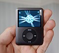
Done iPods
-
 iPod nano 3G
 -
 Truly free nano, awaiting editing
 -
 w/o background


Also: iPod lineup PRODUCT Red iPod Shuffles
Article(s): iPod, iPod nano, etc.
Request: iLounge was graceful enough to upload these photos under CC-BY to Flickr. Is there any way they can be cleaned up to make them more enc? (Background removal, rotation, drop shadow, etc?)-- HereToHelp 11:06, 7 September 2007 (UTC)
Graphist opinion:
Im on it ! > Rugby471 talk ⚔ 16:29, 7 September 2007 (UTC)
- Just finished the iPod family image and iPod UI Image, so far I've done the transparent background and adjusted the colour + lightness/contrast balance, however I'm going to leave the rotation and perspective adjustment to someone else. (BTW i'll upload the transparent background +color balance versions of the images as PNG's so when people are trying to do perspective, it is easier for them as JPG's convert transparency to white. After everything is done, we'll upload them over the originals as JPG's ) > Rugby471 talk ⚔ 18:17, 7 September 2007 (UTC)
- Okay. The nano looks ready for JPG-ification, but the "family portrait" I'm not sure about. That's an iPhone, not an iPod touch, shown. (iPod touch hasn't shipped yet and doesn't say AT&T in the upper left.) To cut out the jargon, it's misleading and probably shouldn't be used in an article (sorry for the inconvenience). Anyway, you might want to try this image instead. Meanwhile, I have written the photographer an email and thanked him for all the photos under a free license, and I mentioned that shooting with the bottom of the unit down makes for better enc photos.--HereToHelp 21:42, 7 September 2007 (UTC)
- Looks like someone beat you to it: there's another iPod classic photo already uploaded, taken from the family portrait. I'l put it in the gallery, and remove the link to the one from Flickr. I'd upload the other ones, but since we're going back and forth with many revisions and different file types, I'll hold off until we have our final versions.--HereToHelp 21:59, 7 September 2007 (UTC)
- Okay. The nano looks ready for JPG-ification, but the "family portrait" I'm not sure about. That's an iPhone, not an iPod touch, shown. (iPod touch hasn't shipped yet and doesn't say AT&T in the upper left.) To cut out the jargon, it's misleading and probably shouldn't be used in an article (sorry for the inconvenience). Anyway, you might want to try this image instead. Meanwhile, I have written the photographer an email and thanked him for all the photos under a free license, and I mentioned that shooting with the bottom of the unit down makes for better enc photos.--HereToHelp 21:42, 7 September 2007 (UTC)
I didn't rightly know there was an image project thing going on, I was just creating images as I saw I needed them. Although turns out one of them was copyrighted, but oh well. The lightened up nano there looks good, it lost some detail but it looks much cleaner now. The family picture, it's way too washed out, you can't really see a thing. I don't know how to add like a subtle shadow in photoshop, but it needs something to stand out. And as for it being a iPhone and not an iPod touch, I made the same mistake a few hours ago, that's why I labeled the top picture on the iPod page. People need to start labeling their pictures in articles, a photo by itself looks good but its a wasted oppertunity to spread more information if you don't caption it, things like what generations the ipods are, or what year a certain picture of a casino was taken. JayKeaton 22:38, 7 September 2007 (UTC)
- I'm going to put the new nano image into the articles, even if it is a PNG. Meanwhile, it's your call on whether or not to upload the other images linked above and put them into use right away, or wait for someone to clean them up. If you do upload them, put them on the Commons where other projects can use them. Also, the author has requested that we tag the images as "Photo courtesy of iLounge.com".--HereToHelp 23:03, 7 September 2007 (UTC)
- Or not. iLounge has changed the copyright on us and there's really nothing we can do. (Or, nothing we can do without taking it to court. Looking over the license with an untrained eye, I think we might have a case, but I'm going to do the polite thing and let them take it back.) We're going to have to speedily delete all the images and wait to get other free copies. Sorry.--HereToHelp 01:27, 8 September 2007 (UTC)
- I'm going to put the new nano image into the articles, even if it is a PNG. Meanwhile, it's your call on whether or not to upload the other images linked above and put them into use right away, or wait for someone to clean them up. If you do upload them, put them on the Commons where other projects can use them. Also, the author has requested that we tag the images as "Photo courtesy of iLounge.com".--HereToHelp 23:03, 7 September 2007 (UTC)
- Creative Commons licenses are non-revocable, see this entry in the flickr FAQ. These images were properly tagged at the time of upload, and in fact iLounge had an entire gallery of images under cc licenses at that time. Until and unless the copyright holder(s) contact the Commons to request removal, these are fine. In any case, they are placholders and will be obsoleted by the possibility of creating superior alternatives in less than a week. ˉˉanetode╦╩ 08:46, 8 September 2007 (UTC)
- As described above, I've been in contact with the author. His current position is that they want to be credited on every occurrence of the image. CC-BY 2.0 says only that those using the work must "give the Original Author credit reasonable to the medium or means You are utilizing". That would seem to indicate that we should follow the Wikipedia standard, namely, attribution on image pages only. But if he wants to be greedy (or at least self-serving), I say let him. He probably didn't realize what he was getting into. Since it's only going to be a week or so, why don't we just affix <small>Photo courtesy of [http://iLounge.com iLounge.com]</small> to the captions, and replace them when new images come up? (I have emailed him a similar response: we might be able to get away with image-page only attribution, but I'll play nice.)--HereToHelp 18:26, 8 September 2007 (UTC)
I'll get on to that nano in the morning :-) > Rugby471 talk ⚔ 19:02, 8 September 2007 (UTC)
Done it, i've uploaded it over the original & done the same with the previous two images (that we have for a week :-) ) > Rugby471 talk ⚔ 09:02, 9 September 2007 (UTC)
- I'm starting to change my mind about those…having all nine iPod shuffles in one place, as they do in the external link above, is not likely to happen again soon. The subject looks okay when it's rotated to a more enc pose (straight down), but I can't fill in the white corners nor remove the background.--HereToHelp 12:57, 9 September 2007 (UTC)
Done the shuffles, however can someone fill in the description / fair use rationale if it needs it. (I uploaded it on wikipedia in case it is fair use) > Rugby471 talk ⚔ 15:49, 9 September 2007 (UTC)
plant stem diagram
-

-
 SVG #1
 -
 Plant nodes c.jpg


Article(s): mainly plant stem, but possible future uses in node (botany) and internode (botany) when these are created.
Request: A SVG (translatable) diagram to illustrate the definition of "node" and "internode" more clearly than the existing labelled images. -- Circeus 22:50, 27 July 2007 (UTC)
Graphist opinion: Okay, i'll get to work on the first. > Rugby471 talk ⚔ 07:14, 28 July 2007 (UTC)
- Uploaded first version, does anything need to be done about the position of the text ? > Rugby471 talk ⚔ 07:49, 28 July 2007 (UTC)
- Knulchunk already explained some problems. besides, this is not a diagram. It's just a svg version of the image. Circeus 17:09, 28 July 2007 (UTC)
Graphist opinion: I think the photographs are stronger. I relabeled the second one, and will link it into the article now.--Knulclunk 15:26, 28 July 2007 (UTC)
The problem with the beautiful first image, and the svg file, is that we cannot see the leaf, so the viewer does not know what a petiole is based on the diagram.--Knulclunk 15:31, 28 July 2007 (UTC)
- This lettering is not an improvement in my opinion. The image has too many distracting elements to make a good illustration of the concept. Hence why I'm requesting a diagram, that also has the advantage to be translatable for other languages. Circeus 17:09, 28 July 2007 (UTC)
- Circeus, could you please be more specific about what you want in the svg image, this would help to fulfill your request.--Cronholm144 13:10, 5 August 2007 (UTC)
- question-is there any graphic format that could leave a "hollow" (for lack of a better term) in an image, that could be programmed by whichever language Wikipedia is using it? What I mean is, say it was a map of the U.S. (yes, I know, systemic bias), and where it says "Colorado" in English, it could be changed to Coloratum in Latin, Колорадо in Russian, and コロラド州 in Japanese. There are location maps where the text can be changed, like for Burma and Syria, here on the 'pedia, simply by putting in the coordinated of a town or city. Am I making sense? Chris 01:07, 14 August 2007 (UTC)
- SVG could do this in principle, but actually using the feature on Wikipedia would require some significant changes to MediaWiki's server-side SVG rendering system. Not to say that it couldn't be done, but it won't work "out of the box" — and even if it did, I'm not aware of any SVG editor that would support creating such files other than by directly editing the SVG markup. Of course, the low tech solution is just to upload local versions of the images with changed text. —Ilmari Karonen (talk) 21:40, 21 August 2007 (UTC)
(Related to the above) Coat of Arms of the "Army of the Andes"
-
Primary source
-
With perspective correction
-
 To be replaced with a more accurate SVG
 -
" " " " " "
-
Current Coat of Arms (Base image)

Article(s): Jujuy Province, Mendoza Province, Flag of the Andes (Supplement to picture), Coat of Arms of Argentina (Comparison to current), and others.
Request:
Background: The current Argentine CoA is clearly based off of, but different from, the original one that Belgrano came up with. These are the main differences:
- The ribbon at the bottom has two loops.
- There is a slight (Maybe ½ of the inner coat) space between the surrounding laurel and the inner shield.
- The sun doesn't have a nose, nor any specific rays of light, only a general fimbration.
- The laurels curve around the shield, and then around the sun, symmetrically.
- There are mountains below the two hands.
If that coat can be made in SVG, then the flags of Mendoza and Jujuy are the above coat of arms on the following backgrounds:
- Jujuy: White field, proportions of 3:2 (Source)
- Mendoza: white over blue, proportions not legally given (source)
I would also request that the base coat of arms from the "Flag of the Andes" be uploaded as well for comparison purposes WRT the current Argentine coat of arms. 71.65.99.0 21:17, 19 August 2007 (UTC) (Normally User:68.39.174.238 who forgot that "~~~~" is relative)
Reply:
It's not really related to your main request, but in case it helps anyone, I uploaded a perspective-corrected version of the Flag of the Andes photo. —Ilmari Karonen (talk) 18:02, 20 August 2007 (UTC)
- It will help, thanks :). I am in the middle of preparing for college so this might take me longer than usual to make the svg.—Cronholm144 19:41, 20 August 2007 (UTC)
- I know the feeling, don't feel pressured by me or this request. 68.39.174.238 21:23, 21 August 2007 (UTC)
{ Done Attempted "Great Seal"/Coatofarms of the United States

Articles: Great Seal of the United States
Request: I'm not sure if this would be useful or not, but would it be possible to create an SVG version of this attempt for the Great Seal? The pyramid in the upper right can be left off as that we already have as the reverse of the seal, but the actual coat of arms I don't think has ever been done outside of the scan of the ancient inscription on paper. 68.39.174.238 15:20, 13 July 2007 (UTC)
Graphist opinion: Just the seal right? I will get on it when I wake up.--Cronholm144 12:30, 14 July 2007 (UTC)
- Which is the seal? I'm not any good @ heraldric phraseology. 68.39.174.238 16:19, 14 July 2007 (UTC)
I would assume the shield part... but maybe it is the whole thing. Anyway, if it is the whole thing the difficult is going to skyrocket--Cronholm144 06:56, 15 July 2007 (UTC)
- Well, you can do what parts of it you feel like, this isn't a really urgent project. 68.39.174.238 12:37, 15 July 2007 (UTC)
If I could get confirmation of what the seal actually is, I will go ahead and do it, otherwise, I would rather not.--Cronholm144 01:45, 21 July 2007 (UTC)
Afaik in heraldry the shield in the middle, the supporting figures to the left on the right and any headgear, animals or other items above, as well as any bands of text are all considered part of the coat of arms, so they should be of the seal. Look at the Current Great Seal of the United States. In heraldic terms, it has a very unorthodox composition with the huge supporting figure behind the shield, but there's also all kinds of fluff around it. forgive me for not paying heraldry it's due respect.-- ExpImptalkcon 03:05, 27 July 2007 (UTC)
- The coat of arms symbol is everything shown on the page except the roundel in the top-right corner, i.e. the shield, the supporters, the motto the two supporters are standing on, the golden helmet and the crest, i.e. the eagle positioned on top of the helmet and the stuff it is carrying. Btw, there is no supporting figure behind the shield; there is a motto underneath it, and a helmet on top of it that carries a crest. It would be great if somebody could find the blazon, i.e. the heraldic description of the insignia. E.g. the thing between the helmet and the eagle looks like a fez, but I'm not sure. Could it be a very oddly shaped Phrygian cap? Interestingly, the helmet doesn't seem to have either mantling or a wreath. Anyway, this proposed insignia was never introduced so the current image should be retained. It is either PD-USGov or at least PD-art under U.S. law, and it is a historically significant illustration. See also coat of arms for more details about what elements constitute a coat of arms. Valentinian T / C 07:01, 27 July 2007 (UTC)
- Thanks, Valentinian. I was just thinking of it in regards to the question, but you are obviously right: As it not used currently, there is no need for an SVG. In fact an SVG would destroy some of the historical information (read precision, variation, paper quality, etc.) contained in the scan. As it is, however only used in historical contexts, the request should be dismissed.-- ExpImptalkcon 17:45, 4 August 2007 (UTC)
- Glad to be of help. :) I agree with your reasoning above about not replacing this image. The illustration conveys a lot of details that a new SVG cannot give, like the feeling that you're peeking over the shoulder of one of the founding fathers who has just put down his quill. Valentinian T / C 18:00, 4 August 2007 (UTC)
- Thanks, Valentinian. I was just thinking of it in regards to the question, but you are obviously right: As it not used currently, there is no need for an SVG. In fact an SVG would destroy some of the historical information (read precision, variation, paper quality, etc.) contained in the scan. As it is, however only used in historical contexts, the request should be dismissed.-- ExpImptalkcon 17:45, 4 August 2007 (UTC)
- I'm not suggesting the SVG totally replace the JPG, which is historically invaluable. 68.39.174.238 16:45, 7 August 2007 (UTC)
Talk about decision time...this has been here ~two months. Is anyone going to spend time on this or not, if it's unclear whether there would be any use for such an image? vlad§inger tlk 22:40, 13 September 2007 (UTC)
- I think it's time to archive. --Dave the Rave (DTR)talk 16:34, 14 September 2007 (UTC)
Done Sara Watkins

Article(s): Sara Watkins
Request: Since the article is about the musician and not the back of that guy's head... -- Chris 06:57, 15 September 2007 (UTC)
Graphist opinion: How's this ? I got rid of both heads and adjusted the colour as well, she was looking a bit blue :-) > Rugby471 talk ⚔ 07:25, 15 September 2007 (UTC)
- You, sir, are a genius, and I bow to your Buddha nature! I call this one done, and very quickly at that, thank you! Chris 07:40, 15 September 2007 (UTC)
History of laser intensity

Article(s): To replace jpg version on Laser
Request: Please note: I uploaded this on Wikipedia first by accident; the correct file is now on commons. The idea here was to replace a jpeg graph on the Laser article. I ran into some trouble along the way: Inkscape believes that there are arrows at the ends of the axes, and also on the lines that indicate points on the graph, but the Wikimedia software doesn't render them. Also, I don't know a really good way to represent mathematical formulae in SVG, and every time a font changes, my superscripts go haywire. --Slashme 14:49, 17 September 2007 (UTC)
Graphist opinion: Don't worry I'm on it > Rugby471 talk ⚔ 15:57, 17 September 2007 (UTC)
- Right, as regards to the arrows, the arrows are an Inkscape only formatting thing, any other editor of SVG preview program won't display them, what I did was make a path of an arrow head and put them on the ends of the lines. Now for the formulae, I wasn't sure about the support of TeX or LateX in SVGs so I just converted the text to path so it will all display properly in articles. I have uploaded first the arrows made into paths (but with the text as text, not paths), and afterwards, the arrows as path (but with the text as paths). If someone wants to attempt the formulae, use the first upload i did. Hope that helps ! > Rugby471 talk ⚔ 16:22, 17 September 2007 (UTC)
Thanks for the fixes, and also thanks very much for the explanation; now I know what to do next time! --Slashme 07:08, 18 September 2007 (UTC)
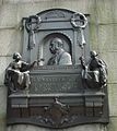
Memorial to W. S. Gilbert
-
-
My attempt at perspective fixing and rotating. Undeuxtroiskid 18:13, 29 August 2007 (UTC)
-
 More perspective correction. Para 10:36, 30 August 2007 (UTC)
 -
 One more attempt. Ilmari Karonen (talk) 23:19, 30 August 2007 (UTC)


Article(s): W. S. Gilbert, etc.
Request: Is it possible to do a perspective correction and fix the tilt? It's always annoyed me a bit... -- Adam Cuerden talk 13:56, 29 August 2007 (UTC)
Graphist opinion:
- Hmm. It still looks a little tilted in the bottom half, though it looks a lot better on the whole. Is that fixable, or are we at about the limit of what can be done, and I should try and find some Wikipedians in London to help out? Mind you, it's not really the best image possible to start with, but, well.... London's a fair ways from Edinburgh. Adam Cuerden talk 19:49, 29 August 2007 (UTC)
- There's only so much that can be done to make a photo look as if it was taken straight from the front when it hasn't. But I think the changes for this one aren't too drastic so it doesn't look that odd yet. --Para 10:36, 30 August 2007 (UTC)
- That looks pretty good. Of course, ideally we could use a new image - it's somewhat harshly cropped - but the chances of that any time soon are low, and this looks a lot better. Thanks! Adam Cuerden talk 10:41, 30 August 2007 (UTC)
- I've uploaded yet another version that has slightly wider margins, though not by much. Even so, I had to resynthesize a bit of stone wall to fill in the corners. —Ilmari Karonen (talk) 23:19, 30 August 2007 (UTC)
- That looks pretty good. Of course, ideally we could use a new image - it's somewhat harshly cropped - but the chances of that any time soon are low, and this looks a lot better. Thanks! Adam Cuerden talk 10:41, 30 August 2007 (UTC)
- There's only so much that can be done to make a photo look as if it was taken straight from the front when it hasn't. But I think the changes for this one aren't too drastic so it doesn't look that odd yet. --Para 10:36, 30 August 2007 (UTC)
Two charts
Article(s): Free Association of German Trade Unions
Request: I created these two charts using Excel and Paint (I know that's about as unprofessional as it gets, but I don't know how to use gimp). I think they could look a lot better, especially the line chart. I don't have the skills to improve them. If anyone is willing to do this, I'd be more than happy to give them the exact data the charts are based on. -- Carabinieri 22:29, 22 August 2007 (UTC)
Graphist opinion: I think the data for the graphs should go on their respective image pages. That way, new graphs may be constructed from them, but it will also allow anyone to view the data the graphs were constructed from.
Regarding the actual graph images, the most immediate improvement I can think of would be to reupload the original images as PNGs so there are no JPEG artifacts - see Wikipedia:Preparing_images_for_upload.
Aside from that, what sort of improvements did you have in mind? CountingPine 03:07, 27 August 2007 (UTC)
- SVG-ification? --Dave the Rave (DTR)talk 22:45, 29 August 2007 (UTC)
Graphs should always have the data on the image description page, and code-produced images should include the source code. If this isn't recommended everywhere images are mentioned in our help pages, it should be. — Omegatron 23:12, 29 August 2007 (UTC)
- Thanks for your responses. I've now re-created and uploaded the two graphs at Image:FVdG Membership.PNG and Image:Change in geographic distrution of FVdG and FAUD members.PNG respectively in PNG format, as you suggested. What mostly bothered me about the original images was the discoloration within the images. Apparently this was a result of them being JPG. SVG-ification would be great, I wouldn't know how to do this though. I've also added the data to the image description pages.--Carabinieri 04:17, 2 September 2007 (UTC)
World Jamboree photo

Article(s): N/A
Request: -- Note this image is on wikicommons. I asked on commons what this needed to make Feature Picture. See [4] and was told it needed cropped and had some fringing (don't even know what that is), but that otherwise it was quite good. I listed it here: [5], but there doesn't seem to be much activity there. I'd really like to get this to FP, as there are no Scouting FPs, but I need help. Thank you.Rlevse 22:22, 2 September 2007 (UTC)
Graphist opinion:
- The half-person on the right could indeed be easily cropped away (even losslessly), but I don't think there's anything we can do about the headless guy; trying to crop him away would just ruin the composition, not to mention decapitating the other people standing to his right. As for the chromatic aberration, correcting it would indeed be easier from a RAW image, but, judging from the image metadata, I doubt you have one. Perhaps some clever person here can still do something about it. —Ilmari Karonen (talk) 01:25, 3 September 2007 (UTC)
Coat of arms of Cote d'Ivoire
-
 SVG of Seal

Articles: Cote d'Ivoire and 44 others.
Request: It's been pointed out (Wikipedia talk:WikiProject Africa) that this image has a typo in it (Iviore for Ivoire). To make things a little more awkward, the image is one of those funny "Copyrighted, but feel free to use a low-resolution version as long as you link back" images, which may (may not?) mean we ave to remake the dratted thing from scratch.
In any case, it's probably worth doing this one right, as it's wide-spread throughout wikipedia projects. [6]
Of course, someone will have to change all the links, but, eh, I'll volunteer to do that. Adam Cuerden talk 19:58, 29 August 2007 (UTC)
- It looks like the coat of arms has been changed, see [7] (top-hand corner). Valentinian T / C 20:39, 29 August 2007 (UTC)
- Valentinian makes a good point, I have seen both, I wonder if this is like the early version of the Stars and Stripes, so long as you had the right number of stars and stripes, you could get them in any order. Maybe so long as it has the elephant and palms, the rest is up for artistic license. I would be curious to see what the written code is on the thing. Also, did anyone else notice it is about 1 degree clockwise from straight? Chris 05:34, 30 August 2007 (UTC)
- To confirm, is the request to vectorise the image? If so, I'll have a go, but the holidays in the UK are coming to an end, so I might take some time. --Dave the Rave (DTR)talk 09:32, 30 August 2007 (UTC)
- Well... I'm not actually sure we can vectorise THIS image, as it's copyrighted under a licence that only allows low-resolution pngs, but if we could make a vector image of the seal.... Adam Cuerden talk 09:57, 30 August 2007 (UTC)
- By the way, it looks like this is the OLD version of the coat of arms. See the description at Coat of arms of Côte d'Ivoire. It looks like the main changes, though, are simply recolourings (thank goodness). Adam Cuerden talk 10:00, 30 August 2007 (UTC)
- It does look like an old version of the arms. According to FOTW [8] the coat of arms was changed around the close of 2000, so I guess it must have been changed again later? I haven't been able to find a copy of the most recent version of the Ivorian constitution, so I have not been able to check if the blazon is listed there. The flag and the national motto are both described in § 29 in the 2000 constitution, but the coat of arms isn't. Valentinian T / C 10:43, 30 August 2007 (UTC)
- By the way, it looks like this is the OLD version of the coat of arms. See the description at Coat of arms of Côte d'Ivoire. It looks like the main changes, though, are simply recolourings (thank goodness). Adam Cuerden talk 10:00, 30 August 2007 (UTC)
- Well... I'm not actually sure we can vectorise THIS image, as it's copyrighted under a licence that only allows low-resolution pngs, but if we could make a vector image of the seal.... Adam Cuerden talk 09:57, 30 August 2007 (UTC)
- To confirm, is the request to vectorise the image? If so, I'll have a go, but the holidays in the UK are coming to an end, so I might take some time. --Dave the Rave (DTR)talk 09:32, 30 August 2007 (UTC)
[reset indent] Arr, this could be difficult, then. I'll see if I can find anything at the library. Adam Cuerden talk 11:33, 30 August 2007 (UTC)
- Well, anyway, I uploaded an SVG of the seal (or what I think you mean by the seal). Ivory Coast isn't on User:Valentinian/Heraldry, so I tagged it with {{Insignia}} and {{PD-self}}. --Dave the Rave (DTR)talk 11:37, 30 August 2007 (UTC)
- I never got around to checking the African material but PD status for official insignia is mostly an East European concept. I can't find the link again, but the paragraph in the 2000 constitution looks identical to the one in the former 1995 constitution [9] (both cases: § 29). Then again, I doubt that the Ivorian administration devotes much of its time on intellectual property issues - cocoa issues and avoiding that the country collapse again are probably higher on the list. Valentinian T / C 18:41, 30 August 2007 (UTC)
- Mind you, they have the most evil copyright ever: After 99 yeaars after the death of a Côte d'Ivoirois author, it finally enters... um... effective ownership by a council of artists and writers, who only have to be paid half the former fee. It's like the RIAA - only... forever. Adam Cuerden talk 09:33, 1 September 2007 (UTC)
By the way, I looked it up in the library - The png we have is pretty much accurate and a near-slavish copy (except for the typo) of the old version - though it's slightly tilted, and I don't think it's supposed to be. So, for the old version of the CoA, it's reasonable to use it as a guide, if the tilt and typo are fixed. Adam Cuerden talk 19:59, 1 September 2007 (UTC)
I've made a start on a palm, but I may be messing it up, so could you take a look at what I've done so far? Adam Cuerden talk 20:46, 1 September 2007 (UTC)
- It looks okay, but the image is stopping the SVG from rendering on Wiki. --Dave the Rave (DTR)talk 21:05, 1 September 2007 (UTC)
- I've set up the basis for the rest of the seal, if someone a bit more competent with inkscape cares to finish it. Adam Cuerden talk 01:45, 2 September 2007 (UTC)
- I'm not quite sure about the shading on the right side of the middle section of the banner, by the way. Tweak at will. Adam Cuerden talk 02:10, 2 September 2007 (UTC)
- I'm Working on it. --Dave the Rave (DTR)talk 21:46, 2 September 2007 (UTC)
- How's that? --Dave the Rave (DTR)talk 09:08, 3 September 2007 (UTC)
- Also, this should probably be on commons. --Dave the Rave (DTR)talk 09:08, 3 September 2007 (UTC)
- Agreed. You want to move it there or shall I? Adam Cuerden talk 21:12, 3 September 2007 (UTC)
- Could you move it please? I'm a bit busy. --Dave the Rave (DTR)talk 08:45, 4 September 2007 (UTC)
- Agreed. You want to move it there or shall I? Adam Cuerden talk 21:12, 3 September 2007 (UTC)
- Also, this should probably be on commons. --Dave the Rave (DTR)talk 09:08, 3 September 2007 (UTC)
- How's that? --Dave the Rave (DTR)talk 09:08, 3 September 2007 (UTC)
- I'm Working on it. --Dave the Rave (DTR)talk 21:46, 2 September 2007 (UTC)
- I'm not quite sure about the shading on the right side of the middle section of the banner, by the way. Tweak at will. Adam Cuerden talk 02:10, 2 September 2007 (UTC)
Right. There's a couple more things to do still: Should we provide the post-2001 version as well? It's hard to find, though. Anyone know the shade of blue used in the otherwise identical circa 1963-1964 one? Adam Cuerden talk 21:14, 3 September 2007 (UTC)
Vichy "standard"
-

-
SVG version of flag.

Article(s): Vichy France and others
Request: SVGification. Image:Flag of France.svg is the background, the stars can probably be stolen from Image:Flag of the European Union.svg, the ax will probably have to be drawn. 68.39.174.238 15:33, 1 September 2007 (UTC) (PS. The EU one is GFDL, whereas the French flag is PD, if the author wants to release their SVGification of this one as PD, they should get the stars from somewhere else. 68.39.174.238 15:35, 1 September 2007 (UTC))
- Comment - it's easy to make stars in Inkscape, don't worry about that. --Dave the Rave (DTR)talk 17:15, 1 September 2007 (UTC)
Graphist Opinion:
- Not sure if i'm supposed to jump in without being invited, but I just doodled this one as an excuse to work with SVG. Everything was sketched by hand, so it's public domain. If this is ok, how do you go about actually getting the GIF replaced? --Sbmehta 07:23, 2 September 2007 (UTC)
- That's fine, but I'd ask that you upload to commons, as the work is PD, and the original was on commons. To replace the image, you'd have to manually change the file link from the GIF to the SVG, but I'd wait for a comment from 68.39.174.238 first. --Dave the Rave (DTR)talk 08:38, 2 September 2007 (UTC)
- OK, i uploaded the file to the commons, but i'm not sure how to force the link in the gallery above to go to the commons and not to the en.wikipedia.org file. Any guidance would be appreciated. --Sbmehta 16:41, 2 September 2007 (UTC)
- By deleting the local version. I've done that for you now, but if you don't happen to have a convenient admin around, you can summon one by adding {{db-author}} (or, in this particular case, {{db-nowcommons}}) to the page, perhaps with a brief explanation in the edit summary. —Ilmari Karonen (talk) 17:51, 2 September 2007 (UTC)
- Nice, the ax head is a little different, but I'm not sure if that's just the difference between the GIF and SVG. Anyway, I like it, but I would rename it as "Presidential Standard of Vichy France.svg" or something similar as as far as I can tell, the Vichy regime actually just kept using the standard French flag... 68.39.174.238 19:05, 3 September 2007 (UTC)
- I've modified the axe head a bit, hopefully it now looks more like the original. I think the dots(?) on the axe handle may still need some tweaking. —Ilmari Karonen (talk) 19:59, 3 September 2007 (UTC)
- Should the spots on the axe really look like that, or should they be stars, equally-sized spots, something else? Adam Cuerden talk 01:00, 4 September 2007 (UTC)
- Excellent, the axhead is perfect now. I don't know quite what those "dots" are about, but I think they're supposed to be equal (Granted, I only know from looking at the old GIF. 68.39.174.238 13:50, 4 September 2007 (UTC)
- I've modified the axe head a bit, hopefully it now looks more like the original. I think the dots(?) on the axe handle may still need some tweaking. —Ilmari Karonen (talk) 19:59, 3 September 2007 (UTC)
- OK, i uploaded the file to the commons, but i'm not sure how to force the link in the gallery above to go to the commons and not to the en.wikipedia.org file. Any guidance would be appreciated. --Sbmehta 16:41, 2 September 2007 (UTC)
- That's fine, but I'd ask that you upload to commons, as the work is PD, and the original was on commons. To replace the image, you'd have to manually change the file link from the GIF to the SVG, but I'd wait for a comment from 68.39.174.238 first. --Dave the Rave (DTR)talk 08:38, 2 September 2007 (UTC)
Amalfi Coast
-
 Original image.
 -
 Improved and resized.


Articles: Featured pictures candidates
Request: The picture is too noisy. Please reduce the noise. Thanks! --Lucas Löffler 21:50, 23 August 2007 (UTC)
Graphist opinion: I've fixed the noise and made color improvements. --Shandristhe azylean 22:24, 6 September 2007 (UTC)
Done Orange contradiction


Article(s): {{contradict}} and {{contradict-other}}
Request: With the new Wikipedia:template standardisation format being rolled out, the contradiction icon clashes horribly with the nearby orange, so if it could be redone in the same color as the default icon, it would be great. While at it, doing it with a thinner border would look good. -- Circeus 06:00, 15 September 2007 (UTC)
Graphist opinion: Okay i'm on it > Rugby471 talk ⚔ 06:51, 15 September 2007 (UTC)
Okay i've done that, however I had an idea of putting the <-- ! --> icon on the purple icon, onto the Tango one. I've uploaded the orange version of the purple over the original but also the Tango derivative one. Which one do you think is better ? > Rugby471 talk ⚔ 07:04, 15 September 2007 (UTC)
- Both look good. The queue for images and stuff is a bitch right now, so it'll take a moment before I can really see what it looks like on the template. Circeus 14:42, 15 September 2007 (UTC)
- It looks nice on template.68.101.123.219 22:39, 26 September 2007 (UTC)
Well it seems Circeus has kinda gone to sleep for hundreds of years since this request :-), so i'll use the tango deriv one on the template. Case closed. > Rugby471 talk ⚔ 06:30, 29 September 2007 (UTC)
Done Saudi Arabian Boy Scouts Association-old
Article(s): Saudi Arabian Boy Scouts Association
Request: This is the older emblem of the Saudi Arabian Boy Scouts Association, we need it trimmed out from inside the postage stamp, so it is just the disk itself. -- Chris 19:18, 9 September 2007 (UTC)
Graphist opinion: Is this really the best way to do it? I mean, it's awfully small, and trimming it won't really let it be seen all that much more detailed... Adam Cuerden talk 08:35, 10 September 2007 (UTC)
- What might you suggest? I don't have a different color image of it. I saw a b/w larger version somewhere. Chris 08:39, 10 September 2007 (UTC)
- Weel, if this is from your collection, the best thing is to scan it a bit bigger, since the detail, after trimming off the rest, will still be quite small-sized. E-mail a bigger scan of it to me, if you like, and I'll erase the background and shrink it down, or just upload a pre-cropped version, and we can work from that.
That said, you'd probably get a slightly better version if the distracting elements were erased while it's rather larger than its final size, then shrunk down. Adam Cuerden talk 18:46, 10 September 2007 (UTC)
- I'm not finding it, sorry. I'm horribly-organized. Are there any other options? Chris 04:40, 12 September 2007 (UTC)
- I suppose some skilled individual could attempt an SVG version, but the original image size will make that quite difficult. vlad§inger tlk 22:56, 13 September 2007 (UTC)
- If anyone is willing to take that up, I would appreciate it. Meanwhile I am looking for a larger image. Chris 05:23, 15 September 2007 (UTC)
- If there are no takers, shall I withdraw this? Chris 01:32, 26 September 2007 (UTC)
- I think you really need a better scan to start from. Surely this isn't the only place where the emblem is to be found? Maybe someone at the organization has an old letterhead? --Slashme 08:35, 26 September 2007 (UTC)
- If anyone is willing to take that up, I would appreciate it. Meanwhile I am looking for a larger image. Chris 05:23, 15 September 2007 (UTC)
- I suppose some skilled individual could attempt an SVG version, but the original image size will make that quite difficult. vlad§inger tlk 22:56, 13 September 2007 (UTC)
- Can't find a better one, withdrawing request. Chris 02:33, 6 October 2007 (UTC)
Done Evaluation from an SVG
-

-

-
 just noticed this


Articles: Various law-related templates.
Request: Could someone who is good with SVG examine this and see if it is as "well constructed"? Looking a the bottom of the pans show strange wavy lines that suggest it was poorly converted from some other format. 68.39.174.238 02:06, 16 September 2007 (UTC)
Opinion: Take a look at User:DTR/Sandbox. If I didn't know better I'd say it was the result of tracing Image:Scale of justice.png automatically. I can try and tidy it up, if you'd like. --Dave the Rave (DTR)talk 18:50, 26 September 2007 (UTC)
- I don't think all the detail is really needed, just the shape of it with the light reflecting off it for perspective's sake. 68.39.174.238 01:49, 27 September 2007 (UTC)
- How's that? --Dave the Rave (DTR)talk 15:54, 29 September 2007 (UTC)
- I don't think all the detail is really needed, just the shape of it with the light reflecting off it for perspective's sake. 68.39.174.238 01:49, 27 September 2007 (UTC)
::::(BTW, I made a mistake on uploading and uploaded a copy to Image:Scale of justice to upload.svg - could someone delete this? --Dave the Rave (DTR)talk 15:54, 29 September 2007 (UTC) Never mind, a bot handled that. --Dave the Rave (DTR)talk 16:19, 29 September 2007 (UTC)
That one looks much less blotchy then the original, nice. 68.39.174.238 23:33, 2 October 2007 (UTC)
- You should Commonize it, otherwise noone'll want to replace it, or wont be able to. 68.39.174.238 21:39, 4 October 2007 (UTC)
- Done. I also noticed Image:Scale_of_Justice.svg, (capital J) which is not being used. --Dave the Rave (DTR)talk 15:19, 5 October 2007 (UTC)
Done Image of past Argentina, etc.
-
 original
 -
 recreation in spanish


Articels: Liga Federal and others
Request: Primarily SVGification as the current image is both ugly and hard to read (EG. What's that thing in Southern Chile say?), and secondly (if possible) translation/an English version. 68.39.174.238 02:36, 16 September 2007 (UTC)
Oppinion: I'm doing this now. aliasd·U·T 00:24, 29 September 2007 (UTC)
- The source material is a bit difficult to work with. Do you know of any other sources? I am trying to overlay the map over a modern map of south america, and it isn't working too well :) aliasd·U·T 03:29, 29 September 2007 (UTC)
- Traced satellite imagery to try and improve perspective, scale, etc.
- Added Key
- Tried to more clearly define modern boundaries vs old ones
- created map in svg
- Could anyone please point out any obvious mistakes, before I do the translation? aliasd·U·T 07:59, 29 September 2007 (UTC)
- Only a suggestion: You may want to put the legend box on top of the Falkland/Malvina islands so this map doesn't get caught up in that ongoing dispute, especially since they have nothing to do with the countries at the time this map is displaying. 68.39.174.238 15:21, 29 September 2007 (UTC)
Note: I still haven't done the English translation if someone else wants to do it, otherwise will do over the weekend. aliasd·U·T 14:53, 4 October 2007 (UTC)
- Also: My map was reverted on Spanish Wikipedia due to factual errors :( It seems the 1815 borders of Argentina are common knowledge in the Spanish-speaking world, so so far I have just had the Spanish Wikipedians scoff at my stupidity. See es:Discusión:Liga Federal.
Done Green icon for template standardization
-
 Current icon
 -
 orange icon to use as base (?)
 -


Article(s): {{ambox}}
Request: A "green" format was added to the standardized templates dealing with current edition or additional material requests, but the eye icon used is quite disturbing. If a round green icon with, say, a small sprouting plant or + symbol could be created that matched an existing icon in style, it'd be great. -- Circeus 03:06, 16 September 2007 (UTC)
Graphist opinion: I'll give it a shot—Cronholm144 03:25, 16 September 2007 (UTC)
There it is, suggestions and improvements welcome—Cronholm144 03:57, 16 September 2007 (UTC)
- Possibly a darker shade for contrast? Circeus 05:14, 16 September 2007 (UTC)
- This any better ? > Rugby471 talk ⚔ 07:23, 16 September 2007 (UTC)
- Yeah... the only thing I don't like in the image (or the original image, by that matter) is that there is zero contrast between the sign and the background. I've added a thin border to the cross, and it has the same color as the outside border. How does it look? Titoxd(?!? - cool stuff) 08:28, 16 September 2007 (UTC)
- This any better ? > Rugby471 talk ⚔ 07:23, 16 September 2007 (UTC)
I'd have to say I like the original better, this makes it stand out too much, it doesn't fit with the 'cool' look of the rest of the icon > Rugby471 talk ⚔ 08:32, 16 September 2007 (UTC)
- The problem occurs when you resize the image. At large resolutions, the orange exclamation mark loses contrast, and looks even fuzzy, at least in my browser; with the border, those artifacts don't occur as much. Titoxd(?!? - cool stuff) 08:36, 16 September 2007 (UTC)
- But are we every going to use them at high resolutions of say 1000 pixels wide? (Oh and in my browser I can't really see what you mean > Rugby471 talk ⚔ 08:50, 16 September 2007 (UTC)
- Er, that was a mental mistake. I meant small resolutions. Titoxd(?!? - cool stuff) 08:44, 16 September 2007 (UTC)
- But are we every going to use them at high resolutions of say 1000 pixels wide? (Oh and in my browser I can't really see what you mean > Rugby471 talk ⚔ 08:50, 16 September 2007 (UTC)
Well the resolutions these are going to be used at mostly are 40px (for in the templates), at that res, I don't see much of a problem, however maybe you could upload separate versions with a border and put a not on the no border image page, saying if resolutions of under 40px are required use the bordered one instead ? > Rugby471 talk ⚔ 08:50, 16 September 2007 (UTC)
![]()
![]()
- I think we can mark this done, considering that the template standardization project a) came up with a better icon on their own, and b) later decided to abandon the green version entirely. (Should there be some way of marking requests as "not done, but no longer relevant"?) —Ilmari Karonen (talk) 17:53, 30 September 2007 (UTC)
- I'll have a go and post a message on the GL talk page.--Dave the Rave (DTR)talk 18:59, 30 September 2007 (UTC)
Done Copyright problem icon
-
 Current icon
 -
Attempted style
-
 Latest attempt
 -
 Latest attempt


Article(s): {{copypaste}}
Request: Could someone with actual skill and/or talent look at this icon? I've made a semi-successful attempt (above) at an icon to represent copyright problems, but I'm not satisfied with it. The exclamation point doesn't stand out sufficiently at smaller sizes (IMO) and I got the shading mostly wrong.
I'm hoping for something that meshes stylistically with the example.
Note: I've put the original in the commons. — Coren (talk) 06:10, 16 September 2007 (UTC)
Graphist opinion: I've made the shadow translucent, made the exclamation mark slighty larger and not rounded, like the ! in the orange icon. Is this better? > Rugby471 talk ⚔ 07:03, 16 September 2007 (UTC)
- Excellent, thanks! I've re-edited it to fix some of the SVG metainformation, but I didn't touch the image itself. Thanks again. — Coren (talk) 14:18, 16 September 2007 (UTC)
I should note that that template's main purpose is not one of copyright alerting (That's {{copyvio}}), rather a stylistic one (Copy and paste articels are usually horrendous). 68.39.174.238 15:09, 16 September 2007 (UTC)
- Perhaps something with glue and scissors? Might be worth looking for such an icon on Commons or on the Open Clip Art Library, there might be one already. —Ilmari Karonen (talk) 14:06, 17 September 2007 (UTC)
- Still, the icon, if not that good for {{copypaste}} is nonetheless lovely - I've added it to {{copyvio}}. It gives just a little touch of class to the stark warning. Adam Cuerden talk 14:13, 17 September 2007 (UTC)
- I'm also using it for {{csb-pageincludes}} and other CSBot notices and templates; the {{ambox}} uses (there are others, more copyright-y place where it is used) are just something else I handled while at it. — Coren (talk) 00:36, 18 September 2007 (UTC)
- Still, the icon, if not that good for {{copypaste}} is nonetheless lovely - I've added it to {{copyvio}}. It gives just a little touch of class to the stark warning. Adam Cuerden talk 14:13, 17 September 2007 (UTC)
glue and scissors uploaded, very rough.—Cronholm144 11:55, 18 September 2007 (UTC)
- Looks good big, but doesn't survive scaling down to icon size that well, but I think you have the right general idea. — Coren (talk) 12:23, 18 September 2007 (UTC)
- I don't think the current version retains any of the style elements attempted. Which would be ok if it worked without them, however, right now it's too busy. I would go for a simpler design. I definitely think the icon needs a copyright symbol, because that is the key issue in matters where this icon will be used. I also like the idea of including the scissors and glue, but I can't think of a way to make it simple and still use them. Maybe someone else can... - Rocket000 22:19, 27 September 2007 (UTC)
Okay, completely scrapped my first idea, how's this ? > Rugby471 talk ⚔ 17:45, 28 September 2007 (UTC)
- It's what I was thinking of, but I don't like the all red part. I think it will be hard to make out at smaller sizes. Rocket000 10:02, 29 September 2007 (UTC)
- What colours should I do it ? > Rugby471 talk ⚔ 10:28, 29 September 2007 (UTC)
- hmm... good question. Maybe the realistic colors, but simplified (more clip-art style than photo-like). And I think it would look better in the opposite corner, with the scissors at an angle over the glue... you know what I'm going to try to show you visibly what I mean. I'll make a rough (i.e. really crappy) version of the design and let you make it pretty. Let's try that... Rocket000 21:22, 29 September 2007 (UTC)
- Ok, this a lot harder then I thought. I just want to say, I really appreciate all the work you guys' do here.
- So, I had problems saving in the same format, so I made this from a screenshot. Moving the scissors was to hard, and probably not worth it. This won't help you, but I figure I'd post it anyway. Mostly I was trying to show the position of the scissors and glue.
- Please don't laugh.
- Let me know as soon as you see this so I can delete it. Rocket000 22:29, 29 September 2007 (UTC)
Okay, I had another go, how is this ? > Rugby471 talk ⚔ 06:35, 30 September 2007 (UTC)
- Not bad, but the glue and scissors seem kind of small. I've tried to make a version where they're more visible. I uploaded it over your version, I hope you won't mind. (If you do, feel free to revert.) —Ilmari Karonen (talk) 17:47, 30 September 2007 (UTC)
I uploaded it separately so it is easier to view side by side, here are both images at the res they need to be. what do you think Rocket ? > Rugby471 talk ⚔ 17:57, 30 September 2007 (UTC)
![]()
![]()
- Wow! Thank you. They both look great. The glue and scissors are a little small, but I suggest using that for now. Let's keep the second one around in case others prefer that one. Thanks again! Rocket000 22:29, 30 September 2007 (UTC)
- And I've tweaked your version one more time to make the glue bottle outline thicker, since it was extremely faint at the small size used in the template. —Ilmari Karonen (talk) 09:37, 3 October 2007 (UTC)
Done Help?:)

The file File:Fdsfsd.jpg has an uncertain copyright status and may be deleted. You can comment on its removal.
Hello I am working on a ethnic wiki and I am writing on race and human body so I wonder if you can draw those breasts separately every each size you see on the picture I posted, very appreciate it and thanks in advance. Nick10000 15:59, 25 September 2007 (UTC)
Graphist's opinion It says, on the image tag, that you're the copyright holder, which makes your request a little strange. Can you clarify where the image came from? Adam Cuerden talk 21:45, 26 September 2007 (UTC)
Done Flower diverse
-
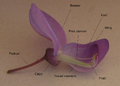 A flower of Wisteria sinensis, Faboideae. Two petals have been removed to show stamens and pistil
 -
 no labels
 -
 Background removed.
 -
 With labels.


Article(s):Fabaceae
Request: Could anybody please help cleaning up the backgound (making it white or very lightly coloured)? This shouldn't be too hard. I can provide the image without labls, if you think it would be better! Thank you very much. Aelwyn 12:28, 27 September 2007 (UTC)
Graphist opinion: OK, I'll sort this one out. --Slashme 13:53, 27 September 2007 (UTC) I'll also have a go at lightnening & upping the contrast on this image, so could you upload the version without the labels. That way the labels wont go gray.
(Slashme, just continue what you are doing, i'll combine them at the end) > Rugby471 talk ⚔ 16:23, 27 September 2007 (UTC)
- Thank you very much. The version without labels is uploaded on en.wiki under the name Image:Wisteria_sinensis_NOLABELS.jpg. Aelwyn 18:34, 27 September 2007 (UTC)
- Ahem! I just spent some time removing the background on this one, and suddenly realized that you had uploaded an 800x600 version. Anyway, I don't think I did a perfect job, so here is the xcf for comment and advice: Image:Wisteria_sinensis_nobackground.xcf and I put up a jpeg (in the gallery above) for those of you who don't use Gimp.--Slashme 07:03, 28 September 2007 (UTC)
- Very fine! Wonderful job, I'll upload both pictures to Common at once. Thank you very very much! Aelwyn 07:28, 28 September 2007 (UTC)
- OK, if you're happy, I'm happy ;-) To the other Graphics Lab Rats: What does one do with intermediate versions of an image? And what is good practice when one has an xcf or similar with removable and editable image masks and captions which can be used to make translations? --Slashme 15:17, 28 September 2007 (UTC)
- You could ask one of our Friendly Neighbourhood Administrators (namely User:Ilmari_Karonen and User:Adam Cuerden (sorry if I forgot anybody!)) to delete the image, or tag the image with {{delete}} (at commons). As for your other question, I've no idea. --Dave the Rave (DTR)talk 16:02, 28 September 2007 (UTC)
- If the versions you want deleted are on Wikipedia (not Commons), you can tag them with {{db-author}} (although plain {{delete}} works here too). As for XCF files, apparently Commons allows you to upload them: they won't show up as images, but they can be downloaded and opened in GIMP. —Ilmari Karonen (talk) 20:29, 28 September 2007 (UTC)
It seems that Slashme has corrected the brightness etc already. This request is closed then! > Rugby471 talk ⚔ 16:28, 28 September 2007 (UTC)
Done SVGify a simple diagram

![[6]](http://tools.wikimedia.de/~daniel/WikiSense/CheckUsage.php?i=Coat_of_arms_of_Cote_d'Ivoire_1964.png&w=_100000#end)
Articles: IOMMU
Request: SVGify if possible? 68.39.174.238 15:24, 29 September 2007 (UTC)
Opinion: No problem, that looks easy. BTW, I'm working on the scales of justice above. --Dave the Rave (DTR)talk 15:27, 29 September 2007 (UTC)
- There you go. --Dave the Rave (DTR)talk 16:50, 29 September 2007 (UTC)
I just made the dotted borders of the squares not interlap. > Rugby471 talk ⚔ 17:22, 29 September 2007 (UTC)
Perfect! Thanx. 68.39.174.238 16:23, 30 September 2007 (UTC)
- Then I'm marking it Done done. --Dave the Rave (DTR)talk 16:46, 30 September 2007 (UTC)