
Wikipedia:Graphics Lab/Images to improve/Archive/Apr 2007
 | This page, part of the Graphics Lab Wikiproject, is an archive of requests for April 2007. Please do not edit the contents of this page. You can submit new requests here. |
 Done Nazi-Soviet Pact
-
 Original version
 -
 SVG version


Article(s): Molotov-Ribbentrop Pact
Request: I think that a better diagram could be created for this image. It seem very "grainy" and difficult to read. I would assume that a better map could be made, perhaps without so many abbreviations. If you have any questions, please contact me at my talk page. Ian Manka 08:13, 31 January 2007 (UTC)
Graphist opinion: I volunteer to create an SVG version of this diagram. With me a good luck :-) --Miko3k 03:07, 26 February 2007 (UTC)
- I just uploaded SVG version. If someone finds any problems with image, please let me know.
Done COA of Kiribati
-
 SVG
SVG

Article(s): Kiribati and all related articles.
- I redrew the png as an svg.
- I don't think mine is too great. Anyone care to help improve it? Thank you.--Indolences 16:16, 28 February 2007 (UTC)
- According to that license, a GIF version of the vector graphic from that website is allowed on Wikipedia. I think creating an SVG version violates the copyright. Maybe somebody else can look into this as well.↔NMajdan•talk 17:57, 28 February 2007 (UTC)
- Can a Coat of Arms of a country be copyrighted? It can always be said that it was based off of any of these images, as it would be true. -Indolences 18:13, 28 February 2007 (UTC)
- Yes and no. The idea or blazon behind the image cannot be copyrighted but a particular artist's version of the insignia can be. Wikipedia practice seems to be that as long as it is not a direct duplicate of a copyrighted version, we'll be fine. Valentinian T / C 23:35, 28 February 2007 (UTC)
- Can a Coat of Arms of a country be copyrighted? It can always be said that it was based off of any of these images, as it would be true. -Indolences 18:13, 28 February 2007 (UTC)
- Okay so I should make it look more like this? As it is on the government website I would think it would not be "copyrighted". -Indolences 05:45, 2 March 2007 (UTC)
- This looks like a good version to base a new image on. From a heraldic perspective, I'd say that the idea about claiming copyright for an official coat of arms image or flag is meaningless, since these images are owned and used by nations. The U.S. flag was designed by somebody, but nobody considers this image off-limits to Wikipedia, no matter that the first person to add the 50th star can't have been dead for 70 years. Unfortunately, U.S. laws weren't designed to take this situation into account. The legal situation behind such images is very tricky and I'd be surprised if traditional encyclopedias didn't simply use such images without consulting others first. But if you create your own image inspired by another image, there'll be no problems at all. If anybody is game for it, a new .svg version of the coat of arms of Denmark would also be very welcome. I'm not the biggest fan of the current .svg version and a better one would be much appreciated. Valentinian T / C 12:27, 13 March 2007 (UTC)
- According to that license, a GIF version of the vector graphic from that website is allowed on Wikipedia. I think creating an SVG version violates the copyright. Maybe somebody else can look into this as well.↔NMajdan•talk 17:57, 28 February 2007 (UTC)
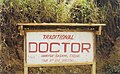
Done Image:Traditional doctor sign in Tatum.jpg
-
 Original
 -
 Edited by Quasar


Article(s): Cameroon
Request: I needed something to illustrate the section of the Cameroon article that discusses health, and a friend of mine agreed to let me use this picture of his. However, it could use some enhancements, and I'm not quite sure what needs to be done. Perhaps red reduction and sharpening? Not really sure. — Brian (talk) 10:17, 27 February 2007 (UTC)
Graphist opinion: What do you think of the edited version above? --Quasar 13:31, 11 March 2007 (UTC)
Also, do you know if this image was shot in JPEG or if there is an uncompressed original available? --Quasar 13:36, 11 March 2007 (UTC)
- That looks much better, thanks! My guess is that the original image was shot on a standard digital camera, and those tend to save in JPG format, right? — Brian (talk) 01:54, 19 March 2007 (UTC)
Done Image:Smithsonian Building NR.jpg
-
 Smithsonian Building with distorted tower
 -
 Edit 1


Article(s): Smithsonian Institution, Smithsonian Institution Building
Request: Even so the image is already a featured picture, I think that there is a little problem with perspective on left tower. --Leyo 17:17, 12 March 2007 (UTC)
Graphist opinion: Better now? Chabacano 11:31, 13 March 2007 (UTC)
- Yes, much better. Do you think that there is no more distortion now, e.g. in the right tower? I'm not sure about that. --Leyo 12:48, 13 March 2007 (UTC)
I have just seen that there are some light green dots in the left tower (just above the trees) in the edited version. Is it possible that you fix this? Many thanks in advance. --Leyo 19:41, 17 March 2007 (UTC)
- Totally my fault :( fixed. Chabacano 16:47, 19 March 2007 (UTC) PD:I uploaded a fixed version to commons, but at the moment it has not been refreshed...
Done Dili
-
 Original CIA jpeg
 -
 Vectorized version


Article(s): Dili, 2006 East Timorese crisis
Request: Could be converted to PNG at least. It should be easier because has a small number of colors, but there were some creases in the paper when it was scanned in. I was wondering if anyone knew if there was a relatively easy way to remove these creases, and otherwise convert to PNG. (and if so, I would be very interested if they could briefly describe the procedure)
Graphist opinion: SVG should be better. I vectorized the map. Comments?Chabacano 16:57, 14 March 2007 (UTC)
- Looks awesome. I wish I could take a class from somebody who knows how to do this sort of thing. A minor point though: the land area in the center of the image, just north of the red road, the white road that runs near the coast, and the river to the west, have large portions hidden by the brown polygon on top (and an even more minor issue, the light-brown patch in the middle of the area is also hidden underneath). I could probably fix it if I spent 15 minutes with it, but maybe Chabacano understands better what's going on with the z-ordering. --Interiot 19:59, 14 March 2007 (UTC)
- Oooops. Fixed. It is not difficult, download Inkscape and practise a bit. You can always undo everything :) Chabacano 20:24, 14 March 2007 (UTC)
- I do have practice with Inkscape, it's just a bit confusing sometimes. Anyhow, bang-up job, thanks. --Interiot 21:38, 14 March 2007 (UTC)
- Oooops. Fixed. It is not difficult, download Inkscape and practise a bit. You can always undo everything :) Chabacano 20:24, 14 March 2007 (UTC)
Done 1958 central dogma

Article(s): None yet, but I want to use it in history of biology.
Request: The arrows in this svg do not display properly when rendered through Wikipedia; when viewed through Firefox (e.g., after clicking on the image page), the image displays correctly.--ragesoss 20:06, 27 March 2007 (UTC)
Graphist opinion:: solved (or at least I see the same in firefox and thorough wikimedia). This kind of problems of the renderes can be avoided converting everything to normal objects. text to path, border to path, etc. Not very elegant, but works. Chabacano 17:19, 30 March 2007 (UTC)
- Awesome. Thanks!--ragesoss 23:03, 1 April 2007 (UTC)
-
 善 shàn
 -
強 qiáng
-
烈 liè
-
和 hé

Article(s): Avatar: The Last Airbender
Request: Make SVG from those small four character may avoid the "fair use" of this screenshots, but I don't know if they are big enough to produce good SVG.--Yug (talk) 21:33, 31 March 2007 (UTC)
Graphist opinion: I've created Image:Shan sinograph.svg, Image:Qiang.svg, Image:Lie sinograph.svg, and Image:He (character).svg from scratch using Inkscape and a free font (AR PL ZenKai Uni). Mike Dillon 04:04, 2 April 2007 (UTC)
-
 善 shàn
 -
 強 qiáng
 -
烈 liè
-
 和 hé
和 hé


.svg)
- This is exactly what I wanted ! I put them immediatly into the article. Many
 Thanks--Yug (talk) 19:11, 2 April 2007 (UTC)
Done Beyonce
-
Skewed and cropped
Article(s): Beyoncé Knowles, Pop princess
Request: Based on the positions of the lights and the angle at which she's standing, it's definitely not level. I tried fixing it by rotating and shearing in The GIMP, but when I got one side lined up, the other wasn't. Would someone mind aligning it so that the horizon is level (and preferably so that the lights are too)?
Graphist opinion:
Surely "lining the lights up nicely" will result in a distorted image of Beyoncé Knowles, who is the main point of the picture. Distorting the subject to make the background look nicer in a documentary photograph seems like a strange thing to want to do. I suppose removing the background entirely might be acceptable. LittlePete 18:34, 28 March 2007 (UTC)
- Well, it should be realigned to some degree as well. I drew a line connecting the middle of her dress to her neck, and her body is definitely at an angle in the picture. So at the very least, it needs to be rotated. ShadowHalo 17:02, 30 March 2007 (UTC)
I've adjusted the horizontal skew slightly, which means that the lights are in line without too much distortion of the subject. I've also had to crop it slightly because of blank areas left by the skew. Time3000 11:00, 8 April 2007 (UTC)
Done Image:Cameroon provinces english.png
-
 Original PNG
 -
 SVG that looks okay in Inkscape at least


Article(s): Cameroon, Provinces of Cameroon
Request: The map is currently a PNG, but comments at peer review have suggested it be converted to SVG format. I'm not quite sure how to do this, so I hoped y'all might be able to help out.
- Related request: While we're on this one, may I suggest

for cleanup? This one is grainy and hard to read, the cleanups may suggest themselves to you, thanks. Chris 04:06, 8 April 2007 (UTC)
Graphist opinion:
- A good source for the SVG shapes would be this PDF which can be used under the {{UN map}} license if modified. I'm struggling with an SVG conversion of a UN map myself now, or otherwise I'd work on this. --Interiot 23:52, 7 April 2007 (UTC)
- Just my personal opinion, but could people please notify the author of these things when they bring them up for improvement? Maybe he *cough* might have some input. (no, I don't, but still, it seems courteous to me) --Golbez 23:57, 7 April 2007 (UTC)
I uploaded a version that looks just fine in Inkscape; the labels at least render in Mozilla; but via rsvg, the labels are gone and the aspect ratio is messed up. I'm tired of battling Inkscape for today... can anyone else figure out what's wrong? If not, I'll take another shot at it in a couple days. --Interiot 22:32, 8 April 2007 (UTC)
- It looks like there is a problem in the uppermost part of the image. It looks like an image of a crescent has been inserted under the eastern part of the northernmost province (IE 7.0 and Firefox 2). Valentinian T / C 22:43, 8 April 2007 (UTC)
- When I said "Mozilla", I meant using Mozilla's internal SVG renderer by viewing the raw SVG in the browser, not just using a browser to view the PNG output of rsvg. Yes, rsvg causes the crescent to appear, among all the other issues... Perhaps Inkscape's layers don't render correctly elsewhere? --Interiot 00:47, 9 April 2007 (UTC)
- The "crescent" is part of one of the letters. It looks like the text is really huge when rendered in RSVG. Mike Dillon 02:32, 9 April 2007 (UTC)
- I fixed this in a pretty hamfisted way by converting the labels to paths. This makes the font rendering more predictable at the expense of future editability and should be fixed if anyone can determine what was actually wrong with the original file. Mike Dillon 02:28, 10 April 2007 (UTC)
- Awesome, thanks. The layers are gone too, and other tweaks were made? Oh well, something worked, thanks. --Interiot 04:46, 10 April 2007 (UTC)
- I think the layers were gone because I saved as "Plain SVG" instead of "Inkscape SVG". I was also having trouble with the "drawing size" being 100 or more times larger than the "page size", so I copied all of the contents from the original SVG into a fresh file. It may be possible to regain the layers from the original drawing, but I couldn't find what the actual scale problem was. For what its worth, the layers were turned into SVG object groups after the initial conversion; I had to ungroup some of them to select the text objects for conversion to paths. Mike Dillon 04:52, 10 April 2007 (UTC)
- Thanks for the great advice! I was finally able to finish commons:Image:JordanRiver en.svg as well. Apparently pstoedit's pdf⇒svg conversion creates an SVG with the scaling problems that you solved. Thanks for the help. --Interiot 09:23, 10 April 2007 (UTC)
- I think the layers were gone because I saved as "Plain SVG" instead of "Inkscape SVG". I was also having trouble with the "drawing size" being 100 or more times larger than the "page size", so I copied all of the contents from the original SVG into a fresh file. It may be possible to regain the layers from the original drawing, but I couldn't find what the actual scale problem was. For what its worth, the layers were turned into SVG object groups after the initial conversion; I had to ungroup some of them to select the text objects for conversion to paths. Mike Dillon 04:52, 10 April 2007 (UTC)
- Awesome, thanks. The layers are gone too, and other tweaks were made? Oh well, something worked, thanks. --Interiot 04:46, 10 April 2007 (UTC)
- I fixed this in a pretty hamfisted way by converting the labels to paths. This makes the font rendering more predictable at the expense of future editability and should be fixed if anyone can determine what was actually wrong with the original file. Mike Dillon 02:28, 10 April 2007 (UTC)
Done Coimbatore District

Article(s): Coimbatore District
Request: A GIF image with a copyright watermark. Should be converted to SVG.↔NMajdan•talk 19:19, 28 March 2007 (UTC)
Graphist opinion:
- Basemaps to re-create this map as SVG already exist [on commons], that may be easier than doing a conversion. Kmusser 17:28, 6 April 2007 (UTC)
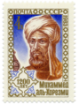
Done Stamp of al-Khwarizmi
-

-
 edit
edit

.png)
Article(s): al-Khwarizmi
Request: Could the light-blue background around the stamp be removed (preferably turned into transparency.) I messed around with the GIMP, but my attempts always ended up in removing to little or too much from the edge of the stamp. —Ruud 23:44, 1 April 2007 (UTC)
Graphist opinion: This was easy enough to do. I hope this is good enough. -YK Times 01:53, 5 April 2007 (UTC)
TRTS Xinzhuang Line DK196 Map
Article(s):Xinzhuang Line (TRTS)
Request:Please fix the aspect ratio, make the text labels eligible at size of 400px and trim the blank border. AirBa 12:40, 8 April 2007 (UTC)
Graphist opinion: Now I find that I did not assign width in svg element. My problem seems to be solved.AirBa 15:45, 10 April 2007 (UTC)
Done Churchill's honorary US passport
-

-
 Perspective cropped and color-corrected
 -
 Removed backround


Article(s): Honours of Winston Churchill, Honorary Citizen of the United States
Request: Brighten so more legible and color is clearer, remove distracting background and only show the actual passport.Pharos 07:32, 10 April 2007 (UTC)
Graphist opinion:
- I posted a cropped version. Unfortunately it's a dark picture, and especially the top of it doesn't have as much detail (as expected from a perspective crop). --Interiot 22:19, 10 April 2007 (UTC)
- Thanks Interiot, that looks much better to me.--Pharos 23:08, 10 April 2007 (UTC)
- Interiot already did the hard stuff, but I figured I'd remove the backround and convert to png.
Done Moon
Article(s): Moon, Luna 3 and Far side of the Moon
Request: conversion to PNG. Nick Mks 17:44, 10 April 2007 (UTC)
Graphist opinion:Done here. --TotoBaggins 12:02, 11 April 2007 (UTC)
Seal of Edward the Confessor

Article(s): Edward the Confessor
Request: Could you please clean the background on this? There was some print showing through from the back of the page. Thanks. Mike Christie (talk) 22:17, 15 April 2007 (UTC)
Graphist opinion:
- I've uploaded a new version (replacing the old one) with a clean white background, hope that's suitable. --Canley 16:00, 16 April 2007 (UTC)
- That's perfect! Thanks for the quick response; much appreciated. Mike Christie (talk) 16:05, 16 April 2007 (UTC)
Emancipation of European Jews map
Image:EmancofJews.gif - Fair use so linked instead of shown.
-
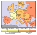 SVG version by Sbrools

Article(s): Jewish Emancipation
Basicaly we should convert this unfree GIF map to a free licensed SVG one. Doesn't have to be exactly the same, so long as the result give the same info. --Sherool (talk) 18:52, 14 February 2007 (UTC)
Graphist opinion:
- I created an SVG version, but it doesn't seem to be working correctly. It doesn't load on my browser when I view the image page, it only loads when I click the link. You can view it here. --Sbrools (talk . contribs) 02:36, 21 February 2007 (UTC)
- Hmm yeah, looks like the server side renderer MediaWiki users doesn't like the image for some reason. Opera renders the raw SVG ok (looks good), but no thumbnail... I'm no SVG expert (it I would have done it myself), but is it correct to have
standalone="no"in the header and what doesxlink:href="EmancofJews.gif"do? Does it just link to the gif image? Maybe ask someone at the technical village pump if they can see any obvious problems that prevents MediaWiki to render the thumbnails. --Sherool (talk) 08:39, 23 February 2007 (UTC)- Yes, that seems to have been it. MediaWiki refuses to render images with external references. Removed the reference to the unised GIF image and change the stand alone option to "yes" and wolla. Image renders now :) --Sherool (talk) 12:35, 23 February 2007 (UTC)
- Since Serbia and Bulgaria are shown as independent nations, Greece and Montenegro should be treated the same way. The borders shown on this map are c. 1880, so the map of Greece should include the three blue sections of this map, i.e.; the Peloponnese, the Ionian Islands, and Thessaly. The old border of Montenegro can be seen here. The border of Serbia is a little too far to the south east and the border of Bulgaria a bit too far north. Valentinian T / C 13:14, 25 February 2007 (UTC)
- I've taken the liberty of removing the "done" tag due to the issues mentioned above. Valentinian T / C 22:45, 25 February 2007 (UTC)
- I'm also thinking that maybe this can be done on another map since the source image was very distorted. There may already exist an SVG map from the time period given that can just be properly colored. gren ã°ã¬ã³ 05:57, 11 April 2007 (UTC)
- Since Serbia and Bulgaria are shown as independent nations, Greece and Montenegro should be treated the same way. The borders shown on this map are c. 1880, so the map of Greece should include the three blue sections of this map, i.e.; the Peloponnese, the Ionian Islands, and Thessaly. The old border of Montenegro can be seen here. The border of Serbia is a little too far to the south east and the border of Bulgaria a bit too far north. Valentinian T / C 13:14, 25 February 2007 (UTC)
- Yes, that seems to have been it. MediaWiki refuses to render images with external references. Removed the reference to the unised GIF image and change the stand alone option to "yes" and wolla. Image renders now :) --Sherool (talk) 12:35, 23 February 2007 (UTC)
- Hmm yeah, looks like the server side renderer MediaWiki users doesn't like the image for some reason. Opera renders the raw SVG ok (looks good), but no thumbnail... I'm no SVG expert (it I would have done it myself), but is it correct to have
Image:Cameroon provinces english.png
Articles:Cameroon, Provinces of Cameroon
Request: While we're on this one, may I suggest the above for cleanup? This one is grainy and hard to read, the cleanups may suggest themselves to you, thanks. Chris 04:06, 8 April 2007 (UTC)
Graphist opinion: I'll take this one. -YK Times 01:47, 13 April 2007 (UTC)
Suicide rate map
-

-
 such? Bamse

Article(s):Suicide and List of countries by suicide rate
Request: This might not be the right place for this. I just need someone to make the above map to look like the map on this http://www.who.int/mental_health/prevention/suicide/suicideprevent/en/ World Health Organization page]. Their image is copyrighted, so that's why I'm not using it. What needs to be done is add a legend to the above svg and fill in the colors. I can't imagine this taking more than 30 minutes. It would be greatly appreciated. MahangaTalk 04:16, 14 April 2007 (UTC)
Graphist opinion: I used the WHO-data to color the map. Please let me know of any mistakes or suggestions for improvements. Bamse 04:46, 16 April 2007 (UTC)
- Fantastic job, Bamse! I checked through it and did not notice and mistakes. Thank you very much! MahangaTalk 20:03, 16 April 2007 (UTC)
Map of Central Yorkshire

Article(s): Scouting in Central Yorkshire
Request: Central Yorkshire is UK Scout County which is concurrent with the Wakefield and Leeds metropolitan areas - would it be possible to generate a map in the same style as Image:EnglandWakefield.png with this region highlighted? -- Horus Kol Talk 06:24, 16 April 2007 (UTC)
Graphist opinion:
Maps of Greater Manchester - East, North, West

Article(s):
- Scouting in Greater Manchester East
- Scouting in Greater Manchester North
- Scouting in Greater Manchester West
Request: Greater Manchester is divided into three UK Scout Counties. The Scout Association have maps highlighting these areas at the following links:
Can we have three maps in the same style as the original [:Image:EnglandGreaterManchester.png] map? -- Horus Kol Talk 06:45, 16 April 2007 (UTC)
Graphist opinion:
Done Structure of the Moon
-
 original image
 -
 Vector done by XcepticZP


Article(s): Moon, Internal structure of the Moon
Request: conversion to SVG. Nick Mks 17:09, 6 April 2007 (UTC) Thanks! Nick Mks 20:00, 8 April 2007 (UTC)
Graphist opinion: Request done by XcepticZP
- I was curious if the thickness of the line representing the crust in the original was supposed to be representative, or if it was just a line with very inconsistent line thickness. Also, does anyone have any idea what the dots and the A15 boxes and such are? -Andrew c 22:37, 10 April 2007 (UTC)
- A12/14/15/16 are the Apollo landings that dropped off seismometers.[1] --Interiot 22:54, 10 April 2007 (UTC)
- Really nice job ! Thank you. Yug 21:07, 6 May 2007 (UTC)
- A12/14/15/16 are the Apollo landings that dropped off seismometers.[1] --Interiot 22:54, 10 April 2007 (UTC)
Shahbag map
Article(s): Shahbag
Request: Ragib 21:05, 9 April 2007 (UTC) Can you please convert it to svg, as requested in the WP:FAC for Shahbag?
- Never mind, the issue has been solved .... Thanks. --Ragib 05:59, 19 April 2007 (UTC)
Graphist opinion:
Done Wikinews Video Edition
-

-

-
 better colours
Article(s): None (yet)
Request: talk to symode09's or Spread the love! 07:34, 11 April 2007 (UTC) I desperately need this converted into an svg. It is for a project to make a video edition of wikinews. This is EXTREMELY inportant... we need this almost immediately
Graphist opinion: How's this first attempt? Stannered 12:56, 11 April 2007 (UTC)
- The colours are slightly different compared to the PNG version - I think the problem is with Image:Wikinews-logo.svg. Looking at various different SVGs there are several different colour schemes in use, so I went back to the official WikiNews logo (I took the one which appears at the top-left of the WN site to be 'official') and used that to produce a version with the 'proper' colours. It seems that Image:Wikinews-logo.svg was using one solid colour layer and another graduated transparency layer on top of that to produce brightness gradients. Time3000 11:44, 15 April 2007 (UTC)
- You might like to backport those changes to the Image:Wikinews-logo.svg file, so other editors using it don't have to repeat the steps (and end up with slightly different inconsistent results). Just my 2¢, naturally. 12:49, 15 April 2007 (UTC)
- Done. Time3000 11:58, 17 April 2007 (UTC)
Done Headlights
-

-
 Lighter version
Article(s): Headlights (band)
Request: I don't have the tools to brighten this up properly. Some help may be useful. badlydrawnjeff talk 00:21, 17 April 2007 (UTC)
Graphist opinion:
- I've lightened up the image using the screen mode layer technique in Photoshop, unfortunately it highlights some of the flaws in the image and JPEG artifacts, but it's a lot brighter. --Canley 08:48, 17 April 2007 (UTC)
- That's much better. Artifacts are bound to happen, but it looks much better. Thank you. --badlydrawnjeff talk 14:16, 18 April 2007 (UTC)
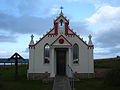
Orkney Chapel
-
-
 Interiot's attempt


Article(s):Italian Chapel
Request: I think this image would do well as a featured picture candidate but at present there are a few things that need minor attention. Specifically there is a slight distortion/leanof the main building in perspective and the image is quite dark. Would someone please help address these problems! Thanks very much! LordHarris 19:00, 19 April 2007 (UTC)
Graphist opinion:
- I posted a version with a perspective crop (though it still looks a bit distorted IMHO... the figure on the left leans left a bit), and selective brightening (brightened everything but the sky, and brightened the figure on the left and the door a bit more). --Interiot 21:08, 20 April 2007 (UTC)
Note
- Thanks that looks a great deal better, good work! I'll list your version as a featured pictured candidate later today. LordHarris 15:23, 21 April 2007 (UTC)
- Ahh, they'll criticize my work then. ;) There are some semi-noticable issues on the edge between the sky and the building's roof. Someone else can probably do a more subtle job. --Interiot 22:51, 21 April 2007 (UTC)
Hargrave Military Academy
-
 Requested shape
 -
 Requested color scheme
 -
 Like this?


Article(s):Hargrave Military Academy
Request: This should be very easy, and I would do it myself, but I don't have access to any image manipulation sofware right now. Could some create an image which uses the shape of the image on the left and the color scheme of the image on the left. Basically, the the green needs to be black and the light yellow needs to be the gold color of the second. Also, this should be a new image, not a replacement of either one, as they are both in use by other articles. Thanks. The Pelican 19:44, 21 April 2007 (UTC)
Graphist opinion: You mean like this one? Stannered 20:31, 21 April 2007 (UTC)
- You beat me to it ;) Mike Dillon 20:35, 21 April 2007 (UTC)
Note That is exactly what I was looking for. Thanks. The Pelican 20:42, 21 April 2007 (UTC)
- No worries :-) At some point I'll look at converting the rest of the images to SVG, too, as JPEG is evil. Stannered 20:43, 21 April 2007 (UTC)
- It seems the color on the new one is a bit brighter. Is that because of SVG? (I'm not trying to say you did a bad job or anything). The Pelican 22:28, 21 April 2007 (UTC)
- Due to the JPEG format, almost every pixel in the gold swash had a different colour. I took an average. JPEG artifacting seems to be causing a blur at all the edges of the swash, giving a muddy appearance. SVG renders with clean crisp edges. Could be either of those. If a specification for the swashes specifies an exact colour, it'd be easy to correct to that. Stannered 23:02, 21 April 2007 (UTC)
- I think that it looks better that way. When the images are eventually changed to SVG, they will all look good, but no need to rush on that. Thanks again for making the image and explaining how it works. The Pelican 00:08, 22 April 2007 (UTC)
Done Image:Gtr Mcr COA.jpg
-
Original
-
 New version

Article(s): Many pages
Request: Found in Category:Images for redraw -YK Timestalk 00:08, 27 April 2007 (UTC)
Graphist opinion: Hm, I had a stab at redrawing this, until I realised that that image isn't really good enough to redraw from. However, the Manchester Has a better version available Image:Gtr Man arms.png, for when its needed (et legal to do so)... tooto 23:10, 28 April 2007 (UTC)
Completed: I was the original author of the file and feel ashamed of this work! I've just redrawn it! -- Jza84 · (talk) 16:25, 25 October 2007 (UTC)
Robert Pinn
-

-
 undeuxtroiskid's attempt


Article(s): Robert Pinn, List of African American Medal of Honor recipients
Request: This image needs to be cleaned up, especially the white mark by his mouth. Can that be filled in? The black line along the right side can be cropped off or filled in, there is also a large scratch on the lower-left. jwillburtalk 21:14, 25 April 2007 (UTC)
Graphist opinion: Removed the black line on the side, removed a lot of scratches, and tried my best at the white mark on his mouth.Undeuxtroiskid 06:14, 29 April 2007 (UTC)
New Orleans death

Article(s): 2005 levee failures in Greater New Orleans
Request:This image while useful looks like it was drawn with ms paint Gnevin 12:49, 26 April 2007 (UTC)
Graphist opinion:
- A true map of New Orleans should be welcome to redraw this. A screen shot of Googlemap, this is ok or not ?? (Free License ?). Provide such map may help graphists to finish the work. --82.244.80.175 13:38, 5 May 2007 (UTC)
- Google Maps is copyrighted, and is not freely licensed. Hence a screenshot would not be OK. OpenStreetMap seems to not cover New Orleans yet, from what I can tell. Unless I'm being an idiot, of course. Stannered 13:48, 5 May 2007 (UTC)
- I'm sure there's lots of freely-licensed versions of the city... eg. page 3 of this PDF contains a vector version... there's a number of raster versions here likely available under {{PD-USGov-Military-Army-USACE}}. --Interiot 14:27, 5 May 2007 (UTC)
- Google Maps is copyrighted, and is not freely licensed. Hence a screenshot would not be OK. OpenStreetMap seems to not cover New Orleans yet, from what I can tell. Unless I'm being an idiot, of course. Stannered 13:48, 5 May 2007 (UTC)