
Wikipedia:Graphics Lab/Illustration workshop/Archive/Oct 2013
Stale[edit]
Seal of Uttar Pradesh[edit]
-
 Seal of Uttar Pradesh

Article(s):
Uttar Pradesh
Haryana
Request:
- Please convert to SVG -- Perumalism Chat 18:17, 22 September 2013 (UTC)
Graphist opinion(s):
Cornish Rugby Football Union[edit]
Article(s): List of Cornish flags
Request:
- Would someone please create an SVG image of the Cornish Rugby Football Union flag found at the bottom of the page http://www.crwflags.com/fotw/flags/gb-corn.html (in case you can't make it out, the motto beneath the shield says ONE AND ALL). — Preceding unsigned comment added by 87.33.42.138 (talk)
Graphist opinion(s):
 Question: Are you sure the flag is released under a free license? FotW forbids commercial use of the content on its site, and the link to the site they got the flag from is dead. SiBr4 ⚑ 12:37, 30 September 2013 (UTC)
- Flags of the World didn't create the image; either it's copyrighted by someone else, or it's in the public domain. Nyttend (talk) 22:09, 30 September 2013 (UTC)
Red Dragon Movement flag[edit]
Article(s): List of Welsh flags
Request:
- Create an SVG file of the green flag used by the Red Dragon Movement in the photograph found at http://www.crwflags.com/fotw/images/g/gb%7Dw-cilmeri.jpg — Preceding unsigned comment added by 5.134.89.17 (talk • contribs) 17:21, 30 September 2013 (UTC)
Graphist opinion(s):
Coat of Arms of Moscovia[edit]
-
 Coat of Arms of Moscovia. 1539
 -
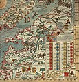 Belarus, Baltic and Russia countries on Carta Marina


Article(s): uk:Московія
Request:
- png → svg -- Volodymyr Fedotov (talk) 09:22, 6 October 2013 (UTC)
Graphist opinion(s):
Resolved[edit]
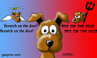
Cartoon-style image with JPG artifacts[edit]
-
 Cartoon of a guardian angel and un-guardian demon
 -
-


Article(s): Shoulder angel, a talk page, and a userspace page
Request:
- This is a Wikipedian-created image meant to resemble a current cartoon in its style. Unfortunately, JPG artifacts are visible, especially in the red area on the right side. Any chance that this could be cleaned up, perhaps by conversion into PNG? Nyttend (talk) 01:43, 30 September 2013 (UTC)
Graphist opinion(s):
 Request taken. - I'll have a look at that for you. Begoon talk 01:49, 30 September 2013 (UTC)
- Have a look at File:Dog's guardian angel retouch.jpg.
- It's always hard to know how much is too much with these, and I had to do a lot of manual masking and such to try to address the artefacts without damaging the drawing. It's always a bit of a trade-off because you can't recreate what has been lost in the recompression. See what you think.
- I initially left it as a jpeg simply because I feel jpeg thumbnails can be sharper with wikimedia software than pngs sometimes, but that's generally photographs, on reflection, and I'm seeing artefacts on the new jpeg here in the thumbnail which the wiki thumbnailing must be creating, because the full size jpeg doesn't have them.
- So I uploaded a png version too in case the jpeg still gives compression/thumbnailing problems. Begoon talk 03:39, 30 September 2013 (UTC)
- I really don't see any difference between the two new uploads at full resolution, which surprises me; I apparently misunderstood what was going on with the compression, or whatever you call what produces the blurriness around the right-side letters and pitchfork in the original. However, when I view thumbnails, the JPG still has some blurriness where the PNG is crisp and clear. Both new uploads are far better than the original, so thank you! Nyttend (talk) 03:57, 30 September 2013 (UTC)
- No, that's exactly the point. The original jpeg had been "damaged" at some point, probably by resizing or editing and choosing a bad jpeg compression setting. So I needed to do a manual retouch to repair and "paint out" the artefacts, for want of a simple description. You can't really get back what was lost, you just recreate how it "should" look.
- Once that was done I saved a jpeg and a png which both have no artefacts when viewed full size, and they look identical because they both come from my new, retouched "master" file.
- But it seems when the wiki software resizes it to generate thumbnails, it reintroduces some artefacts in the jpeg version - so looks like png is the way to go for this. Begoon talk 04:07, 30 September 2013 (UTC)
- I really don't see any difference between the two new uploads at full resolution, which surprises me; I apparently misunderstood what was going on with the compression, or whatever you call what produces the blurriness around the right-side letters and pitchfork in the original. However, when I view thumbnails, the JPG still has some blurriness where the PNG is crisp and clear. Both new uploads are far better than the original, so thank you! Nyttend (talk) 03:57, 30 September 2013 (UTC)
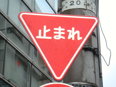
Japanese traffic signs[edit]
-
 Stop
Stop Done
Done -
 Slow Done


Request:
- Would anybody good with geometry and curves in SVG happen to be able to fix up these two signs? I can do squares, octagons, circles, but when it comes to curves I'm screwed. The signs are pretty much how they are supposed to be when it comes to their shape and thickness of each layer, but as you can see they're a bit messed up with the edges, compared to IRL where it's neat and clean. Fry1989 eh? 03:44, 30 September 2013 (UTC)
Graphist opinion(s):
- Request taken. Begoon talk 05:07, 30 September 2013 (UTC)
- Done the first one. The second one I'll do later today... 07:02, 30 September 2013 (UTC)
- I did the second one too - it's a bit of a compromise, because the round corners were a bit "screwy", and all the images I could find to match to had slight differences in position, It's not perfect, but it might do as close enough? Let me know what you think. Begoon talk 12:39, 30 September 2013 (UTC)
- The stop sign is perfect, the slow sign I can't complain cause yeah it's the difficult one. If you ever feel like fiddling around with it a bit more, a good comparison would be other yield/slow signs. Thanks so much. Fry1989 eh? 18:12, 30 September 2013 (UTC)
- Yeah - the best thing, I think, would be to just pick one of the signs on that page and use it as a base then, if you don't have a good photograph of the real thing. I couldn't find anything decent, and the few low res things I did find were all slightly different. If you want us to do that, just tell us which sign to use as the base. The main problem is the round corners are hard to do as strokes, because the circumference on the original file varies, and I don't know what it should be - so I bodged it "somewhere inbetween". If we can come up with a good "specification" based on one of the existing files it would be easiest - but you're the expert. I think one of the problems is the actual signs are inconsistent from the different companies that make them, so somewhere along the line we have to pick one.
- I mean, really, it would be the easiest thing in the world to just recolour File:Vienna convention sign B1.svg and drop the lettering in - but would that be good enough? Your call... I'm not even sure, from what I've seen, whether the white inner triangle should have round corners at all, and if so, what radius - that's the sort of thing you need an original where you can make it out properly. Of the 2 (Japanese) sources linked from the file page, one seems to have round corners, one doesn't... Begoon talk 18:47, 30 September 2013 (UTC)
- Best photo I have is from the Japanese Wikipedia at [1]. You can blow the photo up pretty big which is good, but there aren't any close-ups I've been able to find like for the stop sign. It is weird because the red triangle has properly rounded corners while the inner white triangle has strange ones. This PDF suggests they should be rounded, so you could make them the same, the other option is to do an actual triangle with no curve like many do and which the original upload also did. Whichever is easier for you to do, I wouldn't complain. Fry1989 eh? 19:41, 30 September 2013 (UTC)
- That photo is better than anything I found. It should be enough. Honestly, the round cornering is hardly there if it's there at all on that inner triangle. Just a "softening" of the points. I can certainly "fix it up" better based on that picture, it at least gives the spacing clearly enough. I'll have a look at it later on today when I have a bit of time. Cheers. Begoon talk 00:57, 1 October 2013 (UTC)
- Thanks mate, I really do appreciate all your assistance. Fry1989 eh? 03:52, 1 October 2013 (UTC)
- The stop sign is perfect, the slow sign I can't complain cause yeah it's the difficult one. If you ever feel like fiddling around with it a bit more, a good comparison would be other yield/slow signs. Thanks so much. Fry1989 eh? 18:12, 30 September 2013 (UTC)
Reuters Institute for the Study of Journalism[edit]

Article(s): Reuters Institute for the Study of Journalism
Request:
- This logo looks fine when viewed in full size. In thumbnail the texts moves. Thanks in advance. -- P. S. Burton (talk) 09:30, 1 October 2013 (UTC)
Graphist opinion(s):
- Done I changed the text to outlines to stop the font errors (rsvg resizing to make the png thumbnails), and ran the file through 'vacuum defs' and saved as plain svg in Inkscape to trim the size. It was 1,842 Kb - it's now 58.5 Kb. Begoon talk 10:08, 1 October 2013 (UTC)
- Thank you very much. I am still very new to svg:s. P. S. Burton (talk) 10:31, 1 October 2013 (UTC)
- You must be a quick learner, then - it's a good, faithful svg. The font thing trips everyone up at some time or other. See Help:SVG#Font_issues for more of the gory details...
- If it's only a small amount of type like this, I often prefer to pay the small increased filesize "price" by converting to outlines (paths) (which should always give a perfect match) rather than trying to substitute the font (which might not). With more type the size becomes more of an issue, and if you don't leave pure type in a hidden layer when you convert then it's got to be recreated from scratch for future edits.
- Mostly with logos, which have a small amount of type, it's more important to get a perfect match visually, so paths/outlines is a better option than relying on mediawiki or the user to have the correct font available.
- Having said all that, I forgot to leave the hidden layer in this one...
 . It's only a few words, and I can't see it would need editing. Begoon talk 10:36, 1 October 2013 (UTC)
- OK. All I did was import a pdf to Inkscape. P. S. Burton (talk) 11:31, 2 October 2013 (UTC)
- Ah, ok - I thought you'd recreated it yourself with some copy/paste of elements. The stuff about fonts is still relevant, though, for any svg, no matter how it's created. Importing and exporting can work differently depending on what programs and file formats are involved, and sometimes needs "cleanup". The only reason I babbled on at length about it is it's one of the common "issues" of confusion or rendering with svg files, particularly on wiki software, with the way rsvg renders thumbnails as png images. Begoon talk 12:16, 2 October 2013 (UTC)
- OK. All I did was import a pdf to Inkscape. P. S. Burton (talk) 11:31, 2 October 2013 (UTC)
- Thank you very much. I am still very new to svg:s. P. S. Burton (talk) 10:31, 1 October 2013 (UTC)
Padang[edit]
Article(s): Padang
Request:
- Hello Wikigraphists, please help me to improve this picture before I add it to the article. It really needs to be retouched, the color and the lighting are quite awful to me :( Thank you -- Bluesatellite (talk) 13:00, 2 October 2013 (UTC)
Graphist opinion(s):
- I adjusted the contrast/colour and tone - see if that's any better for you. Begoon talk 13:17, 2 October 2013 (UTC)
- Looks much better. Thank you, Begoon Bluesatellite (talk) 13:47, 2 October 2013 (UTC)
CPP Investemnt Board logo[edit]

Article(s): CPP Investment Board
Request:
- Please update the color of the vertical bar to match the appearance at [2]. This is per a request at Wikipedia:Help desk#Changing company logo. I have been unable to find a logo on the web with the new colors that is of a sufficient resolution for the article. -- Toshio Yamaguchi 21:39, 3 October 2013 (UTC)
Graphist opinion(s):
- Question: to Toshio Yamaguchi: Is there a reason we shouldn't change the "gold" colour itself to closer match the bitmap you reference as well? Begoon talk 03:39, 4 October 2013 (UTC)
This issue has not been resolved. The logo is still the same. I don't believe you should be manually changing the colors of the logo - but rather uploading an official file. (I can't imagine Wikipedia reconstructs every company logo.) The proper logo is on our website - www.cppib.com. (Steven Gangbar, Director Digital Communications, CPPIB) — Preceding unsigned comment added by 38.110.68.146 (talk) 13:25, 4 October 2013 (UTC)
My apologies - I now see the proper logo. Thank you so much! — Preceding unsigned comment added by 38.110.68.146 (talk) 13:28, 4 October 2013 (UTC)
Epigeal vs hypogeal[edit]
-
 Image describing the difference between epigeal and hypogeal germination in plants
 -

prototype base diagramVersion 2 -
Temporary file for explaining changes
-

-

-


Article(s): Cotyledon. If possible, I would like help in creating a Dutch version of this image as well, to use in the articles nl:Epigeaal and nl:Hypogeaal.
Request:
- I would like to have an illustration describing the difference between epigeal and hypogeal germination in plants. Commons has one in Spanish, maybe it would be possible to create an English version of that. Preferably, make it so that it is easy to create other language versions. -- LeRoc (talk) 13:46, 28 September 2013 (UTC)
Graphist opinion(s):
- It's easy enough to redraw as an svg, which will improve the quality, and make it very easy to create foreign language versions. I'm happy to do that, but can you provide the exact English and Dutch translated terms you want to use in the labels? Some are obvious, but a few not so, to me anyway... Begoon talk 08:04, 3 October 2013 (UTC)
| Esp | En | Nl |
|---|---|---|
| germinación epigeal | epigeal germination | epigeale kieming |
| germinación hipogeal | hypogeal germination | hypogeale kieming |
| plúmula | plumule | pluimpje |
| Suelo | soil | bodem |
| Hipocótilo | hypocotyl | hypocotyl |
| Semilla | seed | zaad |
| radícula | radicle | kiemwortel |
| Pelos radiculares | root hairs | wortelharen |
| Epicótilo | epicotyl | epicotyl |
- Have a look at File:Germination.svg. It's very basic - tell me if you'd like to make any colour/shading/artistic changes to that before adding the language labels. Happy to do anything you'd like - there's no reason we need to stay with that style or those colours if you think something else would be better - that's pretty much a copy of the bitmap. I don't like the style of shading much really - solid colours or gradients might be nicer, but I don't know what colours might be appropriate for the various elements, so your input would be great. Begoon talk 16:05, 3 October 2013 (UTC)
- Wow, it looks nice! To be honest, I'm not much of a graphic editor so I don't know much about gradient/shadings. I do think that the original creator of the image was a bit unclear with the use of arrows. Would it be possible to reverse the direction of the arrows that I circled in blue (making them point in the opposite direction), and create two bigger arrows and a slash (/) of a different colour where I drew them? In this way, it would be much clearer: seed then radicles then epigeal germination or hypogeal germination. LeRoc (talk) 19:23, 3 October 2013 (UTC)
- Of course. That's easy to do, and thanks for the feedback. Thanks for doing it graphically too - that makes it so easy...
I hate the "mesh" like shading on the seeds, and I was hoping for a guide or suggested colour so they could be just "coloured in", and I don't know why the "blue" outlines need to be that weird shade of blue (or blue at all). I also wondered if the "dotted" stems etc... might be better in some sort of green (the arrows could just be black to avoid confusion), and that weird jagged flash thing I'm thinking is a leaf - so would it be better drawn as a leaf rather than what it is? Begoon talk 19:38, 3 October 2013 (UTC)
- I agree with you that the stems etc. would better be green (and the arrows black). It is important that hypogeal plants have thicker stems and radicles than epigeal plants. As for the seeds, it would be wonderful if they could be some kind of dark brown or blue with some kind of 'lighting' effect (simulating something like this). I agree with you that the jagged thing is awfully drawn. It would be better if plumule would be a schematized drawing that would represent something like this. Greetings, LeRoc (talk) 19:54, 3 October 2013 (UTC)
- Of course. That's easy to do, and thanks for the feedback. Thanks for doing it graphically too - that makes it so easy...
- Wow, it looks nice! To be honest, I'm not much of a graphic editor so I don't know much about gradient/shadings. I do think that the original creator of the image was a bit unclear with the use of arrows. Would it be possible to reverse the direction of the arrows that I circled in blue (making them point in the opposite direction), and create two bigger arrows and a slash (/) of a different colour where I drew them? In this way, it would be much clearer: seed then radicles then epigeal germination or hypogeal germination. LeRoc (talk) 19:23, 3 October 2013 (UTC)
I uploaded "version 2". Let me know if there's anything you'd like to change on that, or if I missed anything you asked for. Then I can go ahead and add the language labels for 3 versions. Begoon talk 07:24, 4 October 2013 (UTC)
- Wow, very nice! Now that the seed has a different colour from the plumule, it becomes much clearer to see where the seed goes (above/below ground). The only small thing I'm seeing is that the blue in the seeds looks a bit grey. I'm not sure if a slightly darker, 'bluer' blue would be possible. If not, I'm already quite happy with this! Greetings, LeRoc (talk) 14:45, 4 October 2013 (UTC)
- Ok - Done - File:Germination-en.svg, File:Germination-es.svg, File:Germination-nl.svg. Another pair of eyes is always nice to catch the "inevitable" typo(s)... Begoon talk 04:46, 5 October 2013 (UTC)
- Thank you very much! I'm sorry, this pair of eyes has seen a typo. The Spanish words epicótilo and hipocótilo should have accents on the letter o. This was also wrong on the original version of the image. I'm sorry that I've seen this only now. Would it still be possible to change that? LeRoc (talk) 10:31, 5 October 2013 (UTC)
- Heh... Easy, and done...
- That's why I always like someone to proofread, especially for other languages/technical terms. Funny thing is, I copied and pasted the words that did have accents in the original image from the Spanish article, to make sure I got the accents correct. Missed those because they weren't there on the original png (they are now... ) - I should have c/pasted them all... Thanks for checking. Begoon talk 11:34, 5 October 2013 (UTC)
- Thank you! Excuse me, I may be too much of a perfectionist, but could you have a final look at the vertical position of the seed? It is important that the seeds are positioned at the same height (except with epigeal germination where it was pushed above the soil). The leftmost seed seems to be a bit lower than the others (this was also in the original image). Would it be possible to put it to the same height as the second and the fourth seed (fltr)? Thanks, LeRoc (talk) 12:47, 5 October 2013 (UTC)
- Yup. Seed "1" was about 4.5 pt. lower than Seed "2", which was, itself, about 1.5 pt. lower than seed "4" - because, as you surmised, I traced the positions from the png file.
- I moved Seeds "1" and "2" up to the same level as "4", repositioned the arrows/shadows to align, and tweaked the label positions (a couple of which were slightly out anyway), then output and uploaded new files for each of the 3 language versions. Begoon talk 13:49, 5 October 2013 (UTC)
- Thank you, I'm sorry to be causing you so much work
 . Maybe it would be good if some day you could do this repositioning for File:Germination.svg too, in case people want to make other language versions. LeRoc (talk) 14:03, 5 October 2013 (UTC)
- Thank you, I'm sorry to be causing you so much work
- Yeah - I forgot that one - that'll only take a moment - no labels to jiggle. And no need to apologise, if I didn't enjoy it I wouldn't do it... Begoon talk 14:38, 5 October 2013 (UTC)
- Ok - done now. Sorry, I got distracted for a few minutes... Begoon talk 15:01, 5 October 2013 (UTC)
- Thank you very much! This is an important topic in plant development, and it's so much easier to explain this with a good illustration! Greetings, LeRoc (talk) 15:14, 5 October 2013 (UTC)
- No problem at all. I see you're already putting them to good use. You've also been a great pleasure to work with on this - give me a shout if I can help you with anything else. Begoon talk 15:43, 5 October 2013 (UTC)
- I just created the pages epigeal germination and hypogeal germination, the illustration really helps to expain the distinction! If you could look at Wikipedia:Graphics Lab/Map workshop#Area of Carapa guianensis one day, it would be nice. LeRoc (talk) 20:13, 5 October 2013 (UTC)
- No problem at all. I see you're already putting them to good use. You've also been a great pleasure to work with on this - give me a shout if I can help you with anything else. Begoon talk 15:43, 5 October 2013 (UTC)
- Thank you very much! This is an important topic in plant development, and it's so much easier to explain this with a good illustration! Greetings, LeRoc (talk) 15:14, 5 October 2013 (UTC)
Confiscated Armenian properties graph[edit]


Article(s): Confiscated Armenian properties in Turkey
Request:
- This graph looks a little like a child made it. Can you guys help make it look more professional? If there are any improvements you can do that would be great. I would greatly appreciate it. Proudbolsahye (talk) 07:56, 4 October 2013 (UTC)
- This looks great! Thank you so much! My request is pretty much resolved, unless others have other ideas or types of pie charts that they would like to propose. Proudbolsahye (talk) 09:39, 5 October 2013 (UTC)
Graphist opinion(s):
- File:Armenian property in Istanbul.svg. Begoon talk 09:48, 4 October 2013 (UTC)
combine images[edit]
File:Scout rank (Scout Association of Japan).png File:Tenderfoot Scout (Scout Association of Japan).png File:Second Class Scout (Scout Association of Japan).png File:First Class Scout (Scout Association of Japan).png File:Chrysanthemum Scout (Scout Association of Japan).png
File:Venture Second Class (Scout Association of Japan).png File:Venture First Class (Scout Association of Japan).png File:Falcon Scout (Scout Association of Japan).png
File:Fuji Scout (Scout Association of Japan).png File:Fuji Venture Scout (Scout Association of Japan).png
Article(s): Ranks in the Scout Association of Japan
Request:
- Ranks in the Boy Scouts of America has a unitary file File:Boy Scouting ranks (Boy Scouts of America).png, similar ones are needed here. Please combine these files (breaks shown) into 3 separate files: File:Scouting ranks (Scout Association of Japan).png, File:Venture ranks (Scout Association of Japan).png, and File:Fuji Venture Scout (Scout Association of Japan).png (overwrite existing one). Thank you in advance. -- Kintetsubuffalo (talk) 09:05, 5 October 2013 (UTC)
Graphist opinion(s):
- Request taken by Victor•talk 02:24, 6 October 2013 (UTC).
- Thank you, any success yet?--Kintetsubuffalo (talk) 10:48, 8 October 2013 (UTC)
- Thank you so much! Hopefully that will resolve the issue!--Kintetsubuffalo (talk) 16:37, 9 October 2013 (UTC)
Text in sign[edit]
.svg)

Request:
- Please complete the text "RIGHT OF WAY" in the sign, as seen in the photo. Fry1989 eh? 00:52, 8 October 2013 (UTC)
Graphist opinion(s):Does this require a entirely new file? or should I use this file? FOX 52 (talk) 02:17, 8 October 2013 (UTC)
- Oh I uploaded the file just for this, so go right ahead :) Fry1989 eh? 16:01, 8 October 2013 (UTC)
- Request taken by FOX 52 (talk) 02:06, 8 October 2013 (UTC).
WPMED Banner: make it better please[edit]
-
 Guide for desired result
 -
 Constituent image source
 -
 Vectored

Article(s): WP:MED
Request:
- I made this banner out of the wikipedia logo and another image file. It is for the header on the WPMED project page. I am not happy with the result, it turned out a bit pixelated. I also had an afterthought that the "W" could be in the wikipedia logo font, like two overlapping V's (look at the main logo to see what I mean). Would anyone with better ability at this kind of thing be able to help? Many thanks, -- Lesion (talk) 17:20, 10 October 2013 (UTC)
Graphist opinion(s):
- Request taken by FOX 52 (talk) 18:46, 10 October 2013 (UTC).
- Done- See if that works FOX 52 (talk) 00:55, 11 October 2013 (UTC)
- Nice job! --Mark viking (talk) 02:42, 11 October 2013 (UTC)
Royal Standard of the Netherlands[edit]
-
 Royal Standard

Article(s): Royal Standard of the Netherlands
Request: Could someone possibly add the Military William Order to the standard I've created please. As my graphic skills aren't good enough to make it myself, many thanks. TRAJAN 117 (talk) 08:57, 3 October 2013 (UTC)
Graphist opinion(s):
- Hi TRAJAN 117, do you have ".svg" file of "Military William Order" so I can use it? --Victor•talk 02:13, 5 October 2013 (UTC).
- I think that's the whole issue, it has to be made from scratch. FOX 52 (talk) 02:32, 5 October 2013 (UTC)
- It has badges with sash, necklet and ribbons; stars, crosses. Not sure which one should I use in the Royal Standard file? --Victor•talk 22:26, 5 October 2013 (UTC).
- I'm guessing something to attempt to match the image here: File:Royal_Standard_of_the_Netherlands.PNG which is linked from the file description page. Begoon talk 03:32, 6 October 2013 (UTC)
- I think that's the whole issue, it has to be made from scratch. FOX 52 (talk) 02:32, 5 October 2013 (UTC)
- Request taken by --Victor•talk 04:36, 13 October 2013 (UTC).
Philippine President seal[edit]
-
 Seal of the President of the Philippines 1947-1951
 -
 Seal of the President of the Philippines 1951-late 1960s


Article(s): Seal of the President of the Philippines
Request:
- Please vectorize the first two seals. don't include the gradient. The star, sun and lion would be white. (keep the details of the lion) -- Hariboneagle927 (talk) 13:04, 4 October 2013 (UTC)
Graphist opinion(s):
- Request taken by FOX 52 (talk) 13:02, 9 October 2013 (UTC).
- Please let me know if the two fill your requirements FOX 52 (talk) 19:56, 9 October 2013 (UTC)
- The first one meets the requirements while the second one has too many stars on it compared its non-vector version.--Hariboneagle927 (talk) 07:43, 11 October 2013 (UTC)
- Ok star ring fixed - FOX 52 (talk) 05:26, 13 October 2013 (UTC)
- This will do, Thanks!--Hariboneagle927 (talk) 07:32, 13 October 2013 (UTC)
- Ok star ring fixed - FOX 52 (talk) 05:26, 13 October 2013 (UTC)
- The first one meets the requirements while the second one has too many stars on it compared its non-vector version.--Hariboneagle927 (talk) 07:43, 11 October 2013 (UTC)
- Please let me know if the two fill your requirements FOX 52 (talk) 19:56, 9 October 2013 (UTC)
Coat of arms of Belize[edit]
-
 SVG image to improve

Article(s): Belize, Coat of arms of Belize, and many others
Request:
- This coat of arms needs several small improvements. The main problems (in order of priority) are:
- The ribbon of text at the bottom looks awful. See these other versions for ideas: [3][4]
- The oar being held by the person on the right looks nothing like an oar. See Davidzabaneh's version for a better oar.
- The handle of the axe held by the person on the left looks weird. See Davidzabaneh's version for a better axe handle.
- The top of the hammer looks like a marshmallow. See this version for ideas.
Kaldari (talk) 18:45, 12 October 2013 (UTC)
Graphist opinion(s):
![]() Request taken by FOX 52 (talk) 00:05, 13 October 2013 (UTC).:
Request taken by FOX 52 (talk) 00:05, 13 October 2013 (UTC).:
- Done - lettering, one axe handle, one hammer head, and one oar paddle fixed - FOX 52 (talk) 01:18, 13 October 2013 (UTC)
-
 Ideal image
 -
 Original image
 -
 Original image
 -


Article(s): Template:Copy to Wikibooks
Request:
- To use it in the template, can you guys make an icon as the ideal image? Thanks! -- kwan-in (talk) 13:46, 5 October 2013 (UTC)
Graphist opinion(s):
File:Edit-copy purple-wikibooks.svg. Begoon talk 14:18, 5 October 2013 (UTC)
- Oops - sorry Patrick - I didn't even see your
{{I take}}. I just overwrote it along with the comment cruft when I uploaded the file. Mea culpa... Begoon talk 14:33, 5 October 2013 (UTC)
- Yeah, so now we have two versions... please use
{{I take}}yourself in the future to prevent such unnecessary double work. --Patrick87 (talk) 14:36, 5 October 2013 (UTC)
- I generally do - I took a chance as it was a 5 minute job. Thanks for taking it so well. Begoon talk 14:41, 5 October 2013 (UTC)
- @Begoon: If you want to keep your version you should also fix your file description: It's lacking author information, proper categorization and it doesn't mention that the Wikibooks logo is trademarked by WMF. --Patrick87 (talk) 14:43, 5 October 2013 (UTC)
- I have so much to learn, don't I? . Keep yours, it's far superior to mine, and I'd hate to think you wasted any time. I'll nominate my disastrous, incompetent failure for deletion and try to do better next time.Begoon talk 14:49, 5 October 2013 (UTC)
- You might check out the base of the left hand "book" on your version, though - the dark blue border has a tiny error, I think. Begoon talk 15:39, 5 October 2013 (UTC)
- Thanks. It was a known rsvg rendering error that is caused by Scour shortening
c 0,0 x2,y2 x,ypath commands tos x2,y2 x,ypath commands. rsvg seems to not handle this correctly. Sadly those errors are usually quite hard to spot. Good you noticed this one! --Patrick87 (talk) 16:23, 5 October 2013 (UTC)
- Thanks. It was a known rsvg rendering error that is caused by Scour shortening
- I have so much to learn, don't I?
Create Elements Award[edit]
-
 Gold barnstar
Please create an award or barnstar for WikiProject Elements.71.127.137.171 (talk) 20:27, 5 October 2013 (UTC)
- Request taken by Patrick87 (talk) 21:57, 5 October 2013 (UTC).
- I created a proposal (see above). How do you like it? I could easily create additional "copper" and "silver" barnstars to create a complete barnstar series for the WikiProject Elements. --Patrick87 (talk) 22:45, 5 October 2013 (UTC)
- I think it's good. I would just stick with that (don't need different grades of award). but can you put it in a box or template thingie? (rectangle to give to people)? 71.127.137.171 (talk) 22:51, 5 October 2013 (UTC)
- Sure, here you go: {{The Gold Barnstar}}

|
The Element Barnstar | |
| For achievements in articles about the chemical elements. |
remove unit cell from diagram[edit]
-
 AuF3structure.jpg with unit cell
 -
 AuF3structure-2.png unit cell removed


Please remove the unit cell (prism). MAKE A DUPLICATE FILE. (I want a version that is more pretty and accessible to less technical people, but we need to preserve the more techy version also.) 71.127.137.171 (talk) 20:43, 5 October 2013 (UTC)
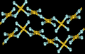
Illustrative diagram of beta-F2 structure[edit]

Request an illustrative diagram of beta-fluorine. I really like how it looks in Pauling 1970 (see the spinning F2 in planes and all). I would like something that mimics that, but is enough different so there are no copyright kvetches. (I don't know how different that is. Maybe if you show a diatomic molecule with wing-like arcs instead of the crosses with wings? Or is it OK just to duplicate Pauling diagram as is?) See here: [5]
71.127.137.171 (talk) 14:43, 13 October 2013 (UTC)
- File:Beta fluorine unit cell.svg - Begoon talk 05:48, 15 October 2013 (UTC)
- Shouldn't it be in colour, like Alpha-fluorine diagram? --Victor•talk 22:37, 15 October 2013 (UTC).
- Sure - we can colour it if you think it will improve it. I made all the atoms that greenish-yellow - not sure if that's "right" - and anything else I'd just be making it up as I went along. Begoon talk 23:09, 15 October 2013 (UTC)
- You rock, man. Love working with the superstars. Thanks.208.44.87.91 (talk) 02:14, 16 October 2013 (UTC)
- Sure - we can colour it if you think it will improve it. I made all the atoms that greenish-yellow - not sure if that's "right" - and anything else I'd just be making it up as I went along. Begoon talk 23:09, 15 October 2013 (UTC)
Quezon City seal[edit]
Article(s): Quezon City
Request:
- update the logo as shown at http://www.quezoncity.gov.ph/, change the width of the logo -- Hariboneagle927 (talk) 12:58, 29 September 2013 (UTC)
Graphist opinion(s):
- Request taken by FOX 52 (talk) 03:37, 30 September 2013 (UTC). Can you give more information on what needs to be improved? FOX 52 (talk) 03:37, 30 September 2013 (UTC)
- Well the tower in the seal is different, the font needs to be change to match the seal at the website. And the objects on the left and right side of their tower should be changed to black and the border changed to white. Keep the red blue and yellow values.--Hariboneagle927 (talk) 15:07, 30 September 2013 (UTC)
Text in signs[edit]
-
 Australia
 -
 Australia
 -
 China
China -
 Maldives


Article(s): Various
Request:
- Please complete the text for me in these signs. The Give Way sign's missing text can be seen here and the hospital sign's text here. The other two are a bit more work but hopefully someone can do it for me. The Chinese one seen here isn't too complicated if you look at it as geometry. The Maldives' sign seen here will be the most work though but luckily you can get the Dhivehi characters here. Fry1989 eh? 01:44, 15 October 2013 (UTC)
Graphist opinion(s):
NBC logo 2011[edit]
-
 2011 logo
Articles(s): Logo of NBC
Request:
Graphist opinion(s):
- Done it is. Please check the vectorized file, I am new in this type of logo. Any suggestion will be appreciated. Thanks --FreemesM (talk) 14:08, 21 October 2013 (UTC)
- It's excellent - you could fiddle with the highlights/gradients a bit if you wanted to - they're pretty close, though. I think there's a keyline on the original too, around each bubble. One of the reasons I don't like vectorising company logos like this is it can never be perfect, so we're misrepresenting it to a degree. It's always infinitely better to find an official version if we can (we should always try - see Wikipedia:Graphics Lab/Resources/Illustration Advice - SVG Logos...), or even stick with the png if not. One thing - you should reduce the nominal size to match the original (yes, I know - it's a vector, and it doesn't matter - but the Non free content patrollers won't like it.) Really nice work, though. Begoon talk 15:19, 21 October 2013 (UTC)
Thanks, everyone. Although, The white edges (the peacock part) are missing. If I may ask Freemesm to revise the vectorized 2011 peacock by "restoring" the white part, just like in the rastorized version of the 2011 peacock. Otherwise, I may be happy to do so myself. Forgive my rudeness. Don-Don (talk) 19:30, 21 October 2013 (UTC)
- I added the white background and keylines for you - didn't have time to mess with highlights/gradients - a perfect match there would be very tricky, but we could get closer. As I said above, though - unless one of us gets time to perfect this it's probably best to use the png. There's nothing wrong with that at infobox/thumb size, and these attempts to mimic are imperfect. Begoon talk 04:49, 22 October 2013 (UTC)
Thanks, Begoon. I appreciate it. Don-Don (talk) 07:58, 22 October 2013 (UTC)
- I'm beginning to think that shading is irrelevant. It probably lacks enough originality for copyright; the Windows logo is not protected by copyright (see commons:COM:TOO). George Ho (talk) 22:21, 23 October 2013 (UTC)
- Then you should take it to WP:MCQ for a discussion if you're not sure. Begoon talk 02:02, 24 October 2013 (UTC)
- Masem says that it is out of copyright. Also, MSNBC logo was nominated for deletion in Commons, and then has been kept. George Ho (talk) 04:54, 24 October 2013 (UTC)
- Good - thank you - it helps to see these here... Begoon talk 04:59, 24 October 2013 (UTC)
- Then you should take it to WP:MCQ for a discussion if you're not sure. Begoon talk 02:02, 24 October 2013 (UTC)
NBC logo 2013[edit]
-
 Raster
Articles(s): NBC, Logo of NBC
Request:
- May I ask someone to faithfully vectorize this image, not just the feathers, but the white/grey peacock sihouette/edges as well? Don-Don (talk) 01:37, 21 October 2013 (UTC)
Graphist opinion(s):
![]() Request taken by FOX 52 (talk) 17:31, 21 October 2013 (UTC).:
Request taken by FOX 52 (talk) 17:31, 21 October 2013 (UTC).:
(to the tune of the NBC chimes) Amazing! (speaking) Thanks, FOX 52. I appreciate it. Don-Don (talk) 07:59, 22 October 2013 (UTC)
- Same with 2011 logo; it probably lacks enough originality for copyright. See commons:COM:TOO. George Ho (talk) 22:23, 23 October 2013 (UTC)
- Masem says that it is out of copyright. Also, MSNBC logo was nominated for deletion in Commons, and then has been kept. George Ho (talk) 04:55, 24 October 2013 (UTC)
[edit]
-
 Request 1: Vanadium's Pourbaix diagram
 -
 Request 1: Vectorized version
 -
 Request 2: Atomic / molecular orbital of triplet oxygen
 -
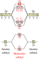 Request 2: Vectorized version


.svg)
Article(s): Vanadium, Triplet oxygen
Request: Please vectorize.
For request 2, please replace the "atom orbital" labels with "atomic orbital", and the central label with "molecular orbitals". -- Jon C (talk) 09:26, 10 October 2013 (UTC)
Graphist opinion(s):
- Request 2. Request taken by Snubcube (talk) 21:25, 12 October 2013 (UTC).
- Thanks for fulfilling the request. I've previously edited the originals to include the link to your new illustrations, and have marked this entry as resolved.
- The superscript/subscript error is a bug of the Wikipedia SVG-render engine --- in my experience, none of the text modifiers from Illustrator (including bold, italic) works, and in some cases even the suggested list of font also breaks. (I've resigned to checking contributions w/ text to make sure that all the labels stay within the bounds of the graphics.) Jon C (talk) 13:18, 25 October 2013 (UTC)
- You may just outline text in a new layer and hide the text layer(s) in Illustrator before saving as .svg. --Victor•talk 00:37, 26 October 2013 (UTC).
Labels on map[edit]
-
 Scan of old map with red labels added

Article(s): Natchez Massacre
Request:
- Can someone put white rectangles behind the red labels on this image? Right now the labels are difficult to read, especially from the thumbnail in the Natchez Massacre article. Jsayre64 (talk) 01:26, 21 October 2013 (UTC)
Graphist opinion(s):
Watermark on Sikh pencil drawing[edit]
-
 Bodyguard of Ranjit Singh

![[1]](https://upload.wikimedia.org/wikipedia/commons/1/1a/Japanese_Traffic_signs_in_Aichi_Pref_r-439_Toyooka.JPG)
![[2]](http://www.cppib.com/content/dam/cppib/common/CPPIB-logo.png.pagespeed.ce.jstCKJBSUQ.png)
.png&action=edit&redlink=1)
.png&action=edit&redlink=1)
.png&action=edit&redlink=1)
.png&action=edit&redlink=1)
.png&action=edit&redlink=1)
.png&action=edit&redlink=1)
.png&action=edit&redlink=1)
.png&action=edit&redlink=1)
.png&action=edit&redlink=1)
.png)
.png)
.png)
.png)
![[3]](http://www.belizephonecard.com/freestuff/wallpaper/wpimages/coatofarms/800x600coat.jpg)
![[4]](http://images.vector-images.com/117/beliz.gif)
![[5]](http://www.benjamin-mills.com/Wikipedia/beta-fluorine-unit-cell-Pauling-1970.png)
Article(s): Punjab Army, Sikhism
Request:
Graphist opinion(s):