
Wikipedia:Graphics Lab/Illustration workshop/Archive/Nov 2013
Stale[edit]
Hideous thing (animation)[edit]
-
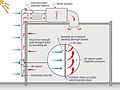
 Animation of some cycle of ATP production or usage, or something unintelligible. A black shoe is spinning in the middle. Bubbles are popping out and others are popping back in to replace the empty craters.

Article(s): [Metabolism#Energy_transformations]
Request:
- Make a flowing animation. Replace the weird shapes with something more meaningful (if possible). Make an image that is twice as big or vector based. -- 109.99.8.67 (talk) 21:05, 9 October 2013 (UTC)
Graphist opinion(s):
Cinepoly Records[edit]
Article(s): Cinepoly Records
Request:
- Previously requested in Photography Workshop. Got stale, however. Need the SVG derivative; hopefully, it is within WP:IUP. -- George Ho (talk) 18:28, 20 October 2013 (UTC)
Graphist opinion(s):
- Not taking this, but I would feel comfortable saying this falls under {{PD-textlogo}} ShepTalk 23:54, 20 October 2013 (UTC)
- Unsure. One character is copyrighted in PRC China, according to commons:COM:TOO#China (PRC). --George Ho (talk) 05:48, 21 October 2013 (UTC)
Keflavík International Airport logo[edit]
Article(s): Keflavík International Airport
Request:
- Please fix. As you see there's a noticeable flaws at the "K" and at the lower left hand side of the globe (which is not in perfect circle). Thank you!-- adkranz (talk) 05:59, 23 October 2013 (UTC)
Graphist opinion(s):
- I deleted a few stray paths that rsvg was rendering oddly, even though they didn't show in the raw svg, and it looks ok now, but...
- There's still something odd about the file which shows up with very large thumbnail rendering. It seems ok up to about 1530px, which means it's fine for your much smaller use in the article, but can you tell us if you drew it yourself, or if not what was the source? I'd like to see if I can find out what's going on with it, because my fix seems to be a "band-aid" rather than a full fix. Thanks.
- (I've kept a copy of the original file in case the old revisions are deleted before it's resolved) Begoon talk 13:19, 23 October 2013 (UTC)
Vectorizing Technical Illustrations[edit]
-
 Request 1: Hydraulic circuit
 -
 Request 2: Pressurized water reactor
 -
 Request 3: Dip-coating
 -
 Request 4: Solar air collector schematic
 -
 Request 5: Biogas plant


Article(s): Hydraulic machinery, pressurizer, Dip-coating, Solar air heat, Biogas
Request: Please vectorize. As these are technical illustrations, conveying the concept is of more importance than the visual appearance. If you think that the illustration can be improved to better convey the concepts, feel free to adjust the colors & presentation as necessary.
For request 3, please locate a Dutch speaker to translate the caption (here) and add that to the English wikipedia entry.
For request 4, please convert into a landscape format (move the inset out of the structure and into the left), and more clearly delineate the expansion (the current black lines could be missed by the casual viewer as an expansion).
-- Jon C (talk) 09:01, 10 October 2013 (UTC)
Graphist opinion(s):
Request 1 ![]() Request taken by BokW (talk).
Request taken by BokW (talk).
- Request 1 actually has a vector version (that is not properly linked to the original). This request is complete. Jon C (talk) 13:25, 15 October 2013 (UTC)
Request 2: ![]() Request taken by Snubcube (talk) 02:11, 13 October 2013 (UTC).
Request taken by Snubcube (talk) 02:11, 13 October 2013 (UTC).
Request 3:![]() Request taken by Tahafalah (talk) 09:56, 10 October 2013 (UTC).
Request taken by Tahafalah (talk) 09:56, 10 October 2013 (UTC).
- I've gotten the translation from a Dutch speaker, and they're as follows: 1. roll with a coarse fabric cloth 2. fabric cloth 3. Bath 4. Liquid material 5. Conductive rolls 6. Oven 7. Scrapers 8. Liquid falling back 9. Liquid that sticks to the fabric cloth. Hope that helps. Jon C (talk) 07:38, 14 October 2013 (UTC)
 Done (belatedly!) at File:Dip coating.svg User:GKFXtalk 22:12, 23 June 2020 (UTC)
Request 4: ![]() Request taken by 文铓 (talk).:
Request taken by 文铓 (talk).:
![]() Done Image:Transpired_Solar_Air_Collector_Operations_Schematic_(vector).svg
Done Image:Transpired_Solar_Air_Collector_Operations_Schematic_(vector).svg
Request 5: ![]() Request taken by JeremyLin15 (talk) 09:52, 10 October 2013 (UTC).
Request taken by JeremyLin15 (talk) 09:52, 10 October 2013 (UTC).
Schematic of pit in plants[edit]
-
 Schematic of pit in plants, German version
 -
 Schematic of pit in plants, Dutch version
 -
 Explanation — broad-leaved plants
 -
 Explanation — conifers


Article(s): Pit (botany)
Request:
- I'm afraid that this is a rather complex request, so I'll hope that you'll see it as a challenge
 . Commons has a German-language schematic of a pit in plants, but I think that it's still unclear in some places. For starters, it isn't clear that each image consists of two illustrations: a cross-section to the left, and a face view to the right. Therefore, I would like to request a couple of things:
- Of course, I'd like to request vectorisation (svg), because this will make it easier to work with the images.
- In each image, I'd like both illustrations clearly labelled as 'cross-section' on the left and 'Face view' on the right. (In the example above I used the German words Durschschnitt and Ansicht.)
- In the illustration to the right (face view/Ansicht), I'd like the oval figure to be completed, and filled in with the same pattern that is used in the left illustration. I guess the image needs to be widened a bit for this.
- I would like the lines that aren't part of the illustration but only serve to link things (text with the illustration, the illustration on the left to the one on the right) to have a different colour from the ones that are part of the illustration.
- I'd like for the term 'porus' to be placed in the middle between both illustrations, with lines linking it to both illustrations (see example above).
- (Here is where it gets complicated ). I would like to request two images, one for conifers and another for broad-leaved plants. In the examples above I tried to explain the differences between both images.
- I would like versions in three languages according to the following scheme:
| English (en) | German (de) | Dutch (nl) |
|---|---|---|
| cross-section | Durchschnitt | doorsnede |
| face view | Ansicht | aanzicht |
| margo | Margo | margo |
| pit cavity | Tüpfelkammer | stippelholte |
| torus | Torus | torus |
| thickened rim | Randwulst | randverdikking |
| pore | Porus | porus |
| pit border | Tüpfelhof | stippelhof |
| pit membrane | Mittelschicht | sluitvlies |
- I'm still looking for a way in which we could illustrate the pit canal, and its inner and outer apertures, and also the radial lines that exist in coniferes. Let me think about this some more.
- I hope this isn't too much to ask -- LeRoc (talk) 18:53, 29 October 2013 (UTC)
Graphist opinion(s):
 Request taken. - yeah - I'll do this for you, LeRoc - it'll be tomorrow before I start it though. If you could give some colour indications for the actual elements in the meantime, that would help. Thanks. Begoon talk 20:02, 29 October 2013 (UTC)
- Thank you, and there's no hurry. To be honest, I don't have a very strong opinion on the colour scheme. It's not that we'll be trying to represent 'real' colours, the most important thing is that the image is clear. I have no problem in principle with the blue-granular pattern in the original image. I like what you did with the epigeal/hypogeal images: making the lines stronger and the colour brighter. Like I said, the important thing is clarity. LeRoc (talk) 10:36, 30 October 2013 (UTC)
- Great - I'll do it over the next couple of days, then. Would have started today, but that awkward other "real" life got in the way when my dishwasher broke and flooded the kitchen. All good now. . Begoon talk 12:44, 31 October 2013 (UTC)
- Oh, in the meantime, did you have any more thoughts on "I'm still looking for a way in which we could illustrate the pit canal, and its inner and outer apertures, and also the radial lines that exist in coniferes."? An image elsewhere, or a diagram? I googled a bit - but not really sure what I'm looking for - I've got some pine trees in the yard and my 10 year old has a toy microscope if that helps...(just kidding) . Begoon talk 18:23, 31 October 2013 (UTC)
- Hmm, maybe I'm coming up with an idea. The pit canal is the roughly cilindrical canal that goes from one pore to the other. The question is how we can render this three-dimensional concept without complicating the picture too much. Maybe with some kind of shading? Give me some time, and I'll try to give some kind of graphical rendering of what I'm thinking about. Any help of your 10 year old will of course be greatly appreciated LeRoc (talk) 19:11, 31 October 2013 (UTC)
- Hmm, maybe I'm coming up with an idea. The pit canal is the roughly cilindrical canal that goes from one pore to the other. The question is how we can render this three-dimensional concept without complicating the picture too much. Maybe with some kind of shading? Give me some time, and I'll try to give some kind of graphical rendering of what I'm thinking about. Any help of your 10 year old will of course be greatly appreciated
- Nah - making something look "a bit 3d" without complicating the illustration is easy. Just describe what, and where (which you kind of already did - I just haven't looked at it yet). And you kid, but I gave her Adobe Illustrator on her laptop 4 weeks ago, and she's already drawing things I'm in awe of. Kids, you see, and computer affinity... Begoon talk 19:24, 31 October 2013 (UTC)
- The next time I don't have an answer straight away about which colour I'd like for a certain item, we'll know whom to ask . What's important for me in the picture is to make a distinction between what is 'real' and what is just a line or an arrow pointing at something. This is very unclear to me in the original picture. (I first thought that the part on the right of the picture was some kind of 3d structure attached to the part on the left.) We'll have to take that into account if we make something look "a bit 3d" too. LeRoc (talk) 19:42, 31 October 2013 (UTC)
- The next time I don't have an answer straight away about which colour I'd like for a certain item, we'll know whom to ask
- That's helpful. I'll start drawing it tomorrow - it's always easier to talk about once you're looking at something. Begoon talk 19:52, 31 October 2013 (UTC)
- I agree. I propose that we'll start looking at the pit canal etc. when we have a first version of the picture ready. That will give us a better idea of what will work and what won't. LeRoc (talk) 22:19, 31 October 2013 (UTC)
- I haven't forgotten this - in fact I started it, but got crazy busy. Sorry - hopefully have something to look at tomorrow. Begoon talk 08:40, 4 November 2013 (UTC)
- No problem, I can wait. I can inform you that I've figured out a way to illustrate the pit canal and its inner and outer apertures. If you don't mind, I prefer to wait until you come up with a basic image, because this will allow me to explain better what I have in mind. LeRoc (talk) 13:42, 4 November 2013 (UTC)
- Yeah, sorry, all I've got today is excuse 4. Really have been very busy, but I've set time aside for this tomorrow, and absolutely promise to do it then... Funny thing is it won't actually take too long, but stuff keeps getting in the way. My apologies, LeRoc. Begoon talk 10:21, 6 November 2013 (UTC)
- No problem, I can wait. I can inform you that I've figured out a way to illustrate the pit canal and its inner and outer apertures. If you don't mind, I prefer to wait until you come up with a basic image, because this will allow me to explain better what I have in mind. LeRoc (talk) 13:42, 4 November 2013 (UTC)
- I haven't forgotten this - in fact I started it, but got crazy busy. Sorry - hopefully have something to look at tomorrow. Begoon talk 08:40, 4 November 2013 (UTC)
- I agree. I propose that we'll start looking at the pit canal etc. when we have a first version of the picture ready. That will give us a better idea of what will work and what won't. LeRoc (talk) 22:19, 31 October 2013 (UTC)
- Great - I'll do it over the next couple of days, then. Would have started today, but that awkward other "real" life got in the way when my dishwasher broke and flooded the kitchen. All good now.
- Thank you, and there's no hurry. To be honest, I don't have a very strong opinion on the colour scheme. It's not that we'll be trying to represent 'real' colours, the most important thing is that the image is clear. I have no problem in principle with the blue-granular pattern in the original image. I like what you did with the epigeal/hypogeal images: making the lines stronger and the colour brighter. Like I said, the important thing is clarity. LeRoc (talk) 10:36, 30 October 2013 (UTC)
Resolved[edit]
Vectorizing Circuit Diagrams[edit]
-
 Request 1: C-element
 -
 Request 2: Current division
 -
 Request 3: Leak detection

.jpg)
Article(s): C-element, current divider, leak detection
Request: Please vectorize. Jon C (talk) 08:54, 10 October 2013 (UTC)
Graphist opinion(s):
Request 2. ![]() Request taken by George Cupertino (talk) 09:46, 10 October 2013 (UTC).
Request taken by George Cupertino (talk) 09:46, 10 October 2013 (UTC).
- Done https://commons.wikimedia.org/wiki/File:Current_Division.svg George Cupertino (talk) 09:39, 24 October 2013 (UTC)
Request 3.![]() Request taken by Treskey (talk) 09:54, 10 October 2013 (UTC).
Request taken by Treskey (talk) 09:54, 10 October 2013 (UTC).
![]() Done https://commons.wikimedia.org/wiki/File:E-RTTM_Method_PC_(Standard)_SVG.svg Treskey (talk) 04:50, 14 October 2013 (UTC)
Done https://commons.wikimedia.org/wiki/File:E-RTTM_Method_PC_(Standard)_SVG.svg Treskey (talk) 04:50, 14 October 2013 (UTC)
Request 1. ![]() Request taken by Snubcube (talk) 21:04, 13 October 2013 (UTC).
Request taken by Snubcube (talk) 21:04, 13 October 2013 (UTC).
- Done https://commons.wikimedia.org/wiki/File:C_element_shaded2.svg Snubcube (talk) 21:27, 13 October 2013 (UTC)
Many thanks to all. This is now marked as resolved. Jon C (talk) 13:44, 29 October 2013 (UTC)
FSP/ML[edit]
 |
Article(s): Free Socialist Party/Marxist-Leninists
Request:
- The image is cropped from an old scanned newspaper cover. Could it be cleaned up to a plain red on white background logo? -- Soman (talk) 20:38, 27 October 2013 (UTC)
Graphist opinion(s): I'll make a vectored version FOX 52 (talk) 23:28, 27 October 2013 (UTC)
![]() Request taken by FOX 52 (talk) 23:28, 27 October 2013 (UTC).
Request taken by FOX 52 (talk) 23:28, 27 October 2013 (UTC).
WLVI[edit]
 |
Article(s): WLVI
Request:
- Please revectorize. I've fixed CW but I thought this one is better. -- jcnJohn Chen (Talk-Contib.) RA 03:13, 30 October 2013 (UTC)
Graphist opinion(s):
![]() Request taken by FOX 52 (talk) 03:21, 30 October 2013 (UTC).:
Request taken by FOX 52 (talk) 03:21, 30 October 2013 (UTC).:
![]() Done: I adapted the color scheme off of this one. Let me know if that works - FOX 52 (talk) 04:08, 30 October 2013 (UTC)
Done: I adapted the color scheme off of this one. Let me know if that works - FOX 52 (talk) 04:08, 30 October 2013 (UTC)
It's OK, though CW seems scratched.--jcnJohn Chen (Talk-Contib.) RA 13:43, 30 October 2013 (UTC)
iCarly[edit]
Article(s): iCarly
Request:
- I noticed a template stating that the image should be transferred to an SVG. I would do it myself, but I don't know how. -- Blurred Lines 16:20, 26 October 2013 (UTC)
Graphist opinion(s):
![]() Request taken by FOX 52 (talk) 21:14, 26 October 2013 (UTC).
Request taken by FOX 52 (talk) 21:14, 26 October 2013 (UTC).
Doug Stone[edit]

Article(s): Doug Stone
Request:
- Could someone please remove the date from the bottom of the picture? I'm no good with graphics. -- Ten Pound Hammer • (What did I screw up now?) 20:50, 1 November 2013 (UTC)
Graphist opinion(s):
![]() Done Let me know if that works for you - FOX 52 (talk) 22:57, 1 November 2013 (UTC)
Done Let me know if that works for you - FOX 52 (talk) 22:57, 1 November 2013 (UTC)
- Looks good. Ten Pound Hammer • (What did I screw up now?) 05:51, 3 November 2013 (UTC)
- Why did you reduce it? I have restored the full size. Secondarywaltz (talk) 15:45, 3 November 2013 (UTC)
- Must have been when saved it to my Photoshop - (unintentional) You fixed it, so all is good. - FOX 52 (talk) 16:51, 3 November 2013 (UTC)
- Sorry if I sounded grumpy, and after checking your other contributions I realized it was probably something like that. Secondarywaltz (talk) 22:55, 3 November 2013 (UTC)
- Must have been when saved it to my Photoshop - (unintentional) You fixed it, so all is good. - FOX 52 (talk) 16:51, 3 November 2013 (UTC)
Please remove annoying line in center of Herschel Grynszpan image[edit]
Herschel Feibel Grynszpan.jpg
The line over his coat is clearly a defect of the photo. Removing it would improve the historical quality of the image. Mikael Häggström (talk) 10:52, 9 November 2013 (UTC)
- Moving to Wikipedia:Graphics Lab/Photography workshop ShepTalk 21:42, 9 November 2013 (UTC)
Solidaity Youth movement flag[edit]
-
 raster
 -
 vectored


Article(s): Solidarity Youth Movement, Kerala
Request:
- Please vectorize. -- കാർത്തുമ്പി (talk) 18:55, 9 November 2013 (UTC)
Graphist opinion(s):
- Done- FOX 52 (talk) 07:14, 10 November 2013 (UTC)
- Thanks --കാർത്തുമ്പി (talk) 05:38, 12 November 2013 (UTC)
SJV logo[edit]
_symbol.png) |
_symbol.svg) |
Article(s): Socialist Youth League of Germany
Request: I need some help making this (cropped from an old scanned newspaper) into a clean red on white background logo.
Graphist opinion(s):
Mathrubhumi News channel logo[edit]
-
 raster
 -
 vectored


Article(s): Mathrubhumi News
Request:
- Please vectorise -- കാർത്തുമ്പി (talk) 08:03, 10 November 2013 (UTC)
Graphist opinion(s):
![]() Request taken by FOX 52 (talk) 22:18, 10 November 2013 (UTC).:
Request taken by FOX 52 (talk) 22:18, 10 November 2013 (UTC).:
- Done- FOX 52 (talk) 06:24, 12 November 2013 (UTC)
- Thanks for your efforts :) --കാർത്തുമ്പി (talk) 15:33, 12 November 2013 (UTC)
Flag of Bangladesh Army[edit]
--Aftab1995 (talk) 18:44, 10 November 2013 (UTC)
 |
Article(s): Bangladesh Army & others
Request:
Graphist opinion(s):
![]() Request taken by FOX 52 (talk) 17:15, 10 November 2013 (UTC).:
Request taken by FOX 52 (talk) 17:15, 10 November 2013 (UTC).:
Filipino Give Way sign[edit]

Article(s):
Request:
- Would somebody good with geometry/math/text be willing to recreate the sign seen in this source? Fry1989 eh? 05:54, 12 November 2013 (UTC)
Graphist opinion(s):
![]() Request taken by FOX 52 (talk) 06:23, 12 November 2013 (UTC).:
Request taken by FOX 52 (talk) 06:23, 12 November 2013 (UTC).:
Illicitencounters.com[edit]
Article(s): Illicitencounters.com
Request:
- The word "Encounters" is hard to see because of white color. -- George Ho (talk) 21:09, 12 November 2013 (UTC)
Graphist opinion(s):
- Done incorporate black background based on website - FOX 52 (talk) 05:50, 13 November 2013 (UTC)
- Can the logo be vectorized (svg)? --George Ho (talk) 06:00, 13 November 2013 (UTC)
- I would prefer not to attempt. Based on the low res requirements it's "size and resolution is sufficient to maintain the quality intended by the company or organization, without being unnecessarily high resolution". - Perhaps another editor can tackle that task. - regards FOX 52 (talk) 06:57, 13 November 2013 (UTC)
- Can the logo be vectorized (svg)? --George Ho (talk) 06:00, 13 November 2013 (UTC)
Ellen (TV series) logo[edit]
 |
|

Article(s): Ellen (TV series)
Request:
- Needs a stand-alone logo. One image, another image. -- George Ho (talk) 06:33, 13 November 2013 (UTC)
Graphist opinion(s):
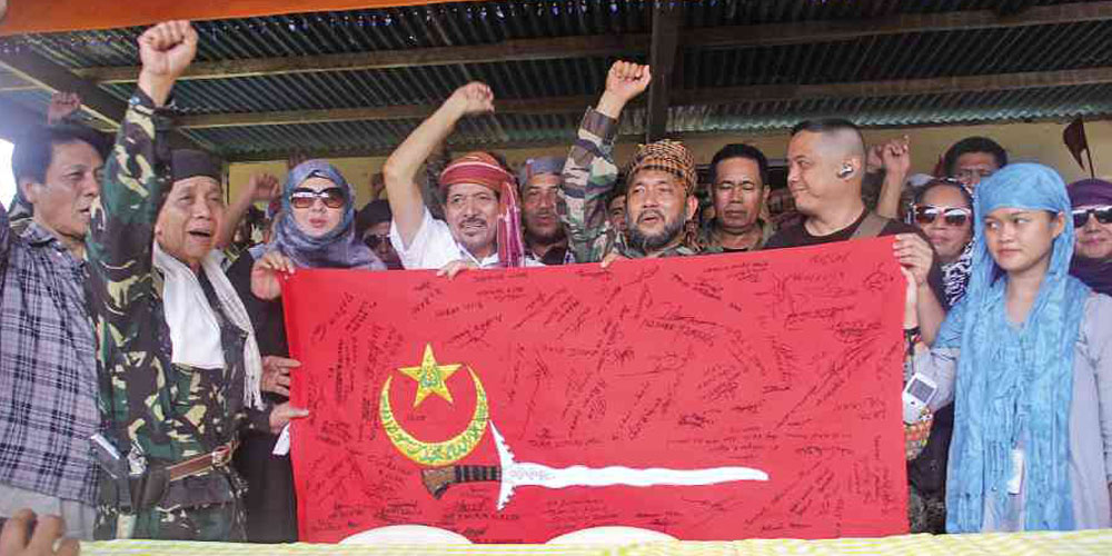
Bangsamoro/MNLF flag[edit]
-
 Flag of the Moro National Liberation Front and the Bangsamoro Republik
 -
vector (plan "Z")

Article(s): Bangsamoro Republik, Moro National Liberation Front and related articles.
Request:
- Please convert to svg. --Hariboneagle927 (talk) 08:00, 17 September 2013 (UTC)
Graphist opinion(s): Do you have any enhanced visual sources to reference from? FOX 52 (talk) 03:24, 18 September 2013 (UTC)
- The flags seems to have many versions. I realized that the inscription on the flag above is likely unclear. Here is a image of the same flag I found in the net although the inscription may still be too unclear. There is also a version of the flag with no inscription and the handle of the sword on this image is yellow not brown. --Hariboneagle927 (talk) 14:15, 18 September 2013 (UTC)
- Do you know what the inscription says? It might be easier to recreate if we had text for it and a relevant font/character set in the absence of a clearer original. The flag is easy enough, but the inscription is a bit trickier - not impossible, but hard to know you're getting it right without a comparison. Begoon talk 18:45, 19 September 2013 (UTC)
The text in the star at top is a stylized version of "Allah" in Arabic script: الله. No idea on the text in the crescent, based on the available images... AnonMoos (talk) 14:24, 26 September 2013 (UTC)
I found a much clearer image, I'm not sure if this would suffice. --Hariboneagle927 (talk) 12:39, 4 October 2013 (UTC)
- That's here: [1] for anyone frustrated they can't right click download it.
- Almost. If I was familiar with the language I could do that, but there are still a couple of "iffy" areas I can't see properly, and wouldn't be confident just tracing. Maybe someone sees it clearer than me... Begoon talk 13:41, 4 October 2013 (UTC)
![]() Done. New file:MNLF flag.svg—Шαмıq ☪ тαʟκ✍ @ 17:03, 29 October 2013 (UTC)
Done. New file:MNLF flag.svg—Шαмıq ☪ тαʟκ✍ @ 17:03, 29 October 2013 (UTC)
- I removed your "resolved" tag, because I'd prefer the requester to indicate they are satisfied with this. Although I can't read the text I can see several differences between what's in this svg and what's on the bitmap(s). If it turns out we're happy with that text, I'll redraw the rest of the flag because the shapes need regularising and tidying up. Otherwise maybe we should continue to use the bitmaps. If we can't produce an svg that is superior to the bitmap versions, I see little point in us doing it, which is why I, and I guess others, haven't so far. Begoon talk 13:08, 31 October 2013 (UTC)
- Is this version ok?—ШαмıQ✍ @ 15:52, 31 October 2013 (UTC)
- After dissecting the vector version it appears to be auto trace file with no change to the text regarding clarity. So I would have to agree with Begoon this issue is nowhere close to being resolved FOX 52 (talk) 16:22, 31 October 2013 (UTC)
- Hmmm... Ok... But as I can read the text, both are equally legible to me (though this needs much understanding of Islamic calligraphy; it reads لا الہ الا اللہ محمد رسول اللہ). My problem is that I do not have the technical know-how to manually fix the text to make it more clear. What we can do is to create the rest of the flag by hand and then add the best auto-traced version of the text to it.—ШαмıQ✍ @ 17:06, 31 October 2013 (UTC)
- No - we don't need to auto trace anything - if that's the correct text we can add it to a properly drawn base flag using the right font, then convert to outlines.
- However, before we do, a couple of points - firstly, did you look at all the images linked in the discussion above? There are several. There's a much better original for the sword - and secondly, why does the text look different in the other linked images? Does it say the same thing? And if not, which version do we use? Begoon talk 17:32, 31 October 2013 (UTC)
- Yup, all the texts effectively read the same. But the positioning of the words in one of the images linked here ([2]) is different from the other two (flag.svg and [3], which are both almost the same). Of these two sets, the first one is easier to create using regular Arabic fonts. I am afraid there won't be any font available which can stack up letters/words (either vertically or horizontally) as is done in the second set of images.—ШαмıQ✍ @ 08:34, 1 November 2013 (UTC)
- Thanks. Sorry for the late reply. As per discussion above, it would certainly better if the text is made more legible at least.--Hariboneagle927 (talk) 09:28, 1 November 2013 (UTC)
- Yup, all the texts effectively read the same. But the positioning of the words in one of the images linked here ([2]) is different from the other two (flag.svg and [3], which are both almost the same). Of these two sets, the first one is easier to create using regular Arabic fonts. I am afraid there won't be any font available which can stack up letters/words (either vertically or horizontally) as is done in the second set of images.—ШαмıQ✍ @ 08:34, 1 November 2013 (UTC)
- Hmmm... Ok... But as I can read the text, both are equally legible to me (though this needs much understanding of Islamic calligraphy; it reads لا الہ الا اللہ محمد رسول اللہ). My problem is that I do not have the technical know-how to manually fix the text to make it more clear. What we can do is to create the rest of the flag by hand and then add the best auto-traced version of the text to it.—ШαмıQ✍ @ 17:06, 31 October 2013 (UTC)
- After dissecting the vector version it appears to be auto trace file with no change to the text regarding clarity. So I would have to agree with Begoon this issue is nowhere close to being resolved FOX 52 (talk) 16:22, 31 October 2013 (UTC)
- Is this version ok?—ШαмıQ✍ @ 15:52, 31 October 2013 (UTC)
What about this version? (Though I know it's not good at all...)—ШαмıQ✍ @ 22:55, 1 November 2013 (UTC)
- The inscription looks clearer (though I can only trust you it's correct.) You've copied the colours from the gif - in all the photographs the yellow seems less "orangey", and the star doesn't touch the crescent (although it's different sizes). The sword handle might be better with the "striped" hilt than what we have here, as the photos show. But since there are different versions, that doesn't mean what you have done is "wrong" - I just would have maybe done it differently.
- Because your file still needs "tidying up, I'll have a go at an alternative later, using your inscription, if you like. Begoon talk 07:51, 3 November 2013 (UTC)
- As you wish... Go ahead with it.—ШαмıQ✍ @ 08:01, 3 November 2013 (UTC)
- Thanks. There's more point now that you've managed to clarify the text. We couldn't have done much, really, if you hadn't been able to do that. I'll try to have a go later today, but if not it will be tomorrow - and thanks again for the work you've done - it was the most important and difficult part. Begoon talk 08:23, 3 November 2013 (UTC)
- Glad I could help. —ШαмıQ✍ @ 08:44, 3 November 2013 (UTC)
- Glad I could help.
- Ok - I quickly redrew it based on the simplest photo: here, and incorporating your text. It's far from perfect, in fact I pretty much hate it - but at least it's all simple shapes if anyone wants to get creative and resize/position it or recolour it/change elements based on the other photos. Linked above as plan "Z" because it's the last thing I'd call good. Anything will be a compromise with all these versions, though... Begoon talk 11:07, 3 November 2013 (UTC)
- Okay, I made some minor tweaks to the flag based on the images. I have scaled the sword and crescent and made the red "warmer" based on other image sources. Well, I believe this would do for now and thanks to those who help.--Hariboneagle927 (talk) 14:58, 19 November 2013 (UTC)
- Thanks. There's more point now that you've managed to clarify the text. We couldn't have done much, really, if you hadn't been able to do that. I'll try to have a go later today, but if not it will be tomorrow - and thanks again for the work you've done - it was the most important and difficult part. Begoon talk 08:23, 3 November 2013 (UTC)
- As you wish... Go ahead with it.—ШαмıQ✍ @ 08:01, 3 November 2013 (UTC)
United Football League (Philippines) logo[edit]
Article(s): United Football League (Philippines)
Request:
- Please vectorize the image, crop excess whitespace, transparent background -- Hariboneagle927 (talk) 08:06, 24 October 2013 (UTC)
Graphist opinion(s):
- Someone else might want to redraw that as a vector - I don't really think it's necessary or even desirable, though.
- There's a huge jpeg version available at http://ufl.ph/wp-content/uploads/2013/10/lbc-ufl-logo1.jpg (but you have to dig it out from their js gallery viewer to find it...)
- Personally, I think Ufl logo.png, which is taken from there, converted to png, cropped and given a transparent background, and scaled to NFCC permitted size should be adequate - and certainly accurate.
- I replaced the poor quality jpeg in the article with the good png for now. Begoon talk 12:49, 24 October 2013 (UTC)
UCD[edit]
Article(s): University College Dublin
Request:
- Since the logo on said page is out of date, can someone extract the logo from ucd.ie for the that page? -- Lihaas (talk) 23:31, 4 November 2013 (UTC)
Graphist opinion(s):
![]() Request taken by FOX 52 (talk) 01:55, 5 November 2013 (UTC).:
Request taken by FOX 52 (talk) 01:55, 5 November 2013 (UTC).:
Copy updated coat of arms into flag[edit]
-
 Improved coat of arms
 -
 Flag image updated


Article(s): Belize, Flag of Belize, others
Request:
- This request is pretty easy. Recently, the Belize coat of arms image got some clean-up. It looks much better now, so all that is left is to copy it into the flag image to replace the older version of the coat of arms within the flag. Hope that makes sense. Kaldari (talk) 07:16, 8 November 2013 (UTC)
Graphist opinion(s):
Today's FBI[edit]
Article(s): Today's FBI
Request:
- Needs a free derivative that truly represents the title logo of the television series. Here are links from flickr: middle size text, large size. Perhaps create stand-alone text? -- George Ho (talk) 08:15, 13 November 2013 (UTC)
Graphist opinion(s):
- Request taken by FOX 52 (talk) 05:35, 18 November 2013 (UTC).:
Australian Tourist Drive route markers (PD-ineligible-USonly)[edit]
-
 Template for creating single-digit route marker images
 -
 Template for creating two-digit route marker images
 -
 Template for creating three-digit route marker images


Article(s): List of road routes in Western Australia and other Australian road articles (Not to be used directly in articles, but as templates to make images to go in such articles)
Request:
- Create an SVG templates (ie, do not convert text to paths) for Australian Tourist Drive route markers, which can then be used to make svg images for particular tourist drives.
- Specifications: [4] (G8-9-2E)
- Colours: Brown #4F372D/ White#FFF
- Fonts: Roadgeek 2005 series
- Templates requested: Single-digit and Two-digit (per the specs above), as well as Three-digit (Example photos: [5] [6])
- Note: These may be copyrighted in Australia, but are covered by {{PD-ineligible-USonly}} (text on a simple shape), so local upload is required
- Additional (Optional): Not part of this request, but if a graphist has the time and inclination, it would be much appreciated if they could make and upload some or all of the required routes: 1 to 75, 200 to 207, 250 to 260, 350 to 360
- Further information:
- Info on how the templates are designed to be used from WP:USRD
- Original request from May 2013 (had been fulfilled, but images were deleted due potential future legal concerns the Australian uploader had – as noted above, the images may be covered by copyright in Australia)
- -- Evad37 [talk] 05:51, 14 November 2013 (UTC)
Graphist opinion(s):
Frasier[edit]
-
 vectored
Article(s): Frasier
Request:
- Needs the SVG logo. Wonder if the drawing of Seattle tall buildings are out-of-copyright. If
sonot, then stand-alone text-logo is needed. Otherwise, need Seattle and the text-logo. Here are links: [7][8][9][10]. -- George Ho (talk) 07:54, 20 November 2013 (UTC)
Graphist opinion(s):
- Request taken by FOX 52 (talk) 05:38, 21 November 2013 (UTC).:
- because is a vectored I can pull just the text if need be, I don't think the line drawing of Seattle is copyrighted . FOX 52 (talk) 06:04, 21 November 2013 (UTC)
Parity clocks[edit]
-
"Parity clocks"
-
 P-conservation (vector)
 -
 P-violation (vector)


Article(s): Parity (physics), Wu experiment, maybe others
Request:
- Essentially, I'd like for this to be redrawn as two images. The first, showing P-conservation, the second, showing P-violation. The caption (Clock, Mirror Clock) and (P-conservation / P-violation) can be included, but it would probably be better to simply omit them for the non-English wikis. The important elements are the clocks themselves, the numbers (12/3/6/9, and their mirrored version), and the hands' direction. Feel free to add the other hours, or to stylize the clocks however you like. If possible, the hand's direction should be color coded (same color for both clocks directions in P-conservation, but the mirror clock direction should have a different color than the regular clock in P-violation).
- File names could be "P-conservation clock.svg" and "P-violation clock.svg", or anything similar. You can delete my image after you're done.Headbomb {talk / contribs / physics / books} 23:30, 17 November 2013 (UTC)
Graphist opinion(s):
- Request taken by SiBr4 ("CyberFour") (talk) 09:10, 21 November 2013 (UTC).
- Done See gallery above. Please comment if you want anything improved/changed (especially regarding the color-coding). SiBr4 ("CyberFour") (talk) 18:00, 23 November 2013 (UTC)
Parish Episcopal School Logo is Outdated[edit]
Article(s): Parish Episcopal School
Request:
- Details of your request go here... -- Parishepiscopal (talk) 19:20, 11 November 2013 (UTC)
Graphist opinion(s):
AAP logo[edit]
-
 The logo of the Aam Aadmi Party.
 -
 vectored
Article(s): Aam Aadmi Party
Request:
- Please vectorize... -- കാർത്തുമ്പി (talk) 17:33, 25 November 2013 (UTC)
Graphist opinion(s):
- Request taken by FOX 52 (talk) 05:37, 26 November 2013 (UTC).:
- Done - FOX 52 (talk) 06:09, 26 November 2013 (UTC)
- Thanks --കാർത്തുമ്പി (talk) 14:25, 26 November 2013 (UTC)
Coat of Arms of Ulcinj[edit]
-
 GIF image of the coat of arms.
 -
vectored

.svg&action=edit&redlink=1)
_SVG.svg)
![[1]](http://farm9.staticflickr.com/8361/8449232347_7beae43a09_b.jpg)
![[5]](http://3.bp.blogspot.com/-2qDOakb2QEk/T8JI8t79-LI/AAAAAAAACrY/g0Eu16qSGyo/s1600/P1060467.JPG)
![[6]](http://expressway.paulrands.com/gallery/roads/wa/numbered/stateroutes/sr51/01_midvaletobayswater/outbound/images/200811_33_guildford_terracerd_td203.jpg)
![[7]](http://images.dvdshopau.com//Upload/uploadfiles/frasier1_011.jpg)
![[8]](http://frasierzone.tripod.com/images/logo.gif)
![[9]](http://laughingwater.files.wordpress.com/2010/10/frasier-season-3.jpg)
![[10]](http://www.silverdisc.com/images/04/097360569445.jpg)
Article(s): Coat of arms of Ulcinj, Ulcinj
Request:
- Could someone vectorize this image, and if possible to fill the boat and colour the small flag red, that would be great. Thanks, in advance. -- Ammar Tivari Talk! 10:55, 24 November 2013 (UTC)
Graphist opinion(s):
- Request taken by FOX 52 (talk) 17:23, 24 November 2013 (UTC).:
- Thanks for taking the duty. --Ammar Tivari Talk! 12:26, 25 November 2013 (UTC)
- Done - FOX 52 (talk) 05:34, 26 November 2013 (UTC)
- Thank you very much...! --Ammar Tivari Talk! 13:20, 27 November 2013 (UTC)
- Thanks for taking the duty. --Ammar Tivari Talk! 12:26, 25 November 2013 (UTC)