Venus (typeface)

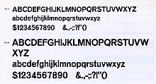
Venus or Venus-Grotesk is a sans-serif typeface family released by the Bauer Type Foundry of Frankfurt am Main, Germany from 1907 onwards.[1][a] Released in a large range of styles, including condensed and extended weights, it was very popular in the early-to-mid twentieth century.[3][4][5][6] It was exported to other countries, notably the United States, where it was distributed by Bauer Alphabets Inc, the U.S. branch of the firm.[7][8]
Like other "grotesque" typefaces of the period such as Akzidenz-Grotesk of the Berthold Type Foundry, Venus has a minimal, 'neutral' design, with a monoline structure and an absence of flourishes. However, compared to many later sans-serifs, such as Helvetica and Univers, it has a more irregular design, with stroke terminals at a variety of angles rather than generally exactly horizontal or vertical.[9] A notable feature is the distinctive motif of unusually high-waisted capitals, visible in the 'R', 'G' and 'E'. Walter Tracy describes this as similar to some of the much more adorned Art Nouveau and Secessionist lettering of the period.[10] Original versions had sheared horizontal stroke terminals on 'E' and 'F', but in the later metal-type period it was sold with alternate capitals without these.[11] The 'g' is single-storey and the sloped form is an oblique, rather than a true italic.[12] A double-storey 'g' was also available as an alternate character.[13]
A prominent use of it was Jan Tschichold's second book, Eine Stunde Druckgestaltung (1930), which used it for body text.[10] It was also used in other avant-garde printing of the period.[14] Sainsbury's, a major United Kingdom supermarket chain, used Venus in its logo for many years.[15]
A number of digitisations have been released based on some styles of the family.[16][17] Monotype's 1920s Grotesque 215 and 216 series, created for their hot metal typesetting system, were also reportedly loosely based on it;[18] the standard Windows typeface Arial is influenced by them.[19][20]
In 2007, David Berlow published the "Vonness" typeface, closely based on the Venus typeface.[21]
Eric Olson designed the Coordinates typeface, a monospaced sans-serif typeface based on the Venus typeface.[22]
Parachute Type Foundry designed the PF Grand Gothik Variable typeface, a blend of Venus and Interstate, with OpenType features.[23][24]
Gallery[edit]
-
Venus Bold Extended
-
Venus Extra Bold
-
Venus Bold Condensed
Notes[edit]
References[edit]
- ^ Alexander S. Lawson (January 1990). Anatomy of a Typeface. David R. Godine Publisher. pp. 298–305. ISBN 978-0-87923-333-4.
- ^ Leonard, Charles C. Paul Renner and Futura: The Effects of Culture, Technology, and Social Continuity on the Design of Type for Printing. Scholarworks (Thesis). Retrieved 13 January 2017.
- ^ Barnes, Paul; Schwartz, Christian. "Christian Schwartz and Paul Barnes deep in the archives: Venus 1907-27". Eye magazine. Retrieved 13 January 2017.
- ^ Jeremy Aynsley (Wolfsonian-Florida International University) (2000). Graphic Design in Germany: 1890-1945. University of California Press. pp. 103─108. ISBN 978-0-520-22796-5.
- ^ Kupferschmid, Indra (6 January 2012). "The True Typefaces of the Bauhaus". Fonts in Use. Retrieved 13 January 2017.
- ^ Philip B. Meggs; Rob Carter (15 December 1993). Typographic Specimens: The Great Typefaces. John Wiley & Sons. pp. 10─11. ISBN 978-0-471-28429-1.
- ^ Budrick, Callie (19 October 2015). "Vintage Fonts: 35 Adverts From the Past". Print. Retrieved 20 March 2016.
- ^ McGrew, Mac (1993). American Metal Typefaces of the Twentieth Century (Second, revised ed.). Oak Knoll. p. 352. ISBN 0-938768-39-5.
- ^ Heidrun Osterer; Philipp Stamm (8 May 2014). Adrian Frutiger – Typefaces: The Complete Works. Birkhäuser. p. 96. ISBN 978-3-03821-260-7.
- ^ a b Walter Tracy (January 2003). Letters of Credit: A View of Type Design. D.R. Godine. pp. 96, 97. ISBN 978-1-56792-240-0.
- ^ Hardwig, Florian (7 November 2018). "Sexual Politics – Kate Millett". Fonts in Use. Retrieved 20 April 2019.
Bauer recut the E, F and L in all sizes and styles of Venus, straightening the diagonally sheared terminals
- ^ Majoor, Martin (Spring 2007). "Inclined to be dull". Eye. Retrieved 3 August 2015.
- ^ Coles, Stephen. "Bauhausvorhangstoffe ad from C. E. Baumgärtel & Sohn". Fonts in Use. Retrieved 8 August 2021.
- ^ Angela Kottke (4 January 2002). Die Auswirkungen des Bauhauses auf die Buchgestaltung der zwanziger Jahre. Diplom.de. p. 86, 87. ISBN 978-3-8324-4869-1.
- ^ "Sainsbury's packages, 1962–1977". 5 April 2013.
- ^ "Venus". Fonts in Use. Retrieved 13 January 2017.
- ^ "Venus". MyFonts. URW++. Retrieved 17 April 2019.
- ^ Mosley, James. "The Nymph and the Grot, an update". Type Foundry (blog). Retrieved 13 January 2017.
- ^ Shaw, Paul. "Arial Addendum no. 3". Blue Pencil. Retrieved 1 July 2015.
- ^ Shaw; Nicholas. "Arial addendum no. 4". Blue Pencil. Retrieved 1 July 2015.
- ^ "Vonness typeface". Fonts In Use. Retrieved 25 March 2023.
- ^ "Coordinates typeface". Process Type Foundry. Retrieved 13 October 2021.
- ^ "PF Grand Gothik Variable on Behance". behance.net. May 2019. Retrieved 28 April 2023.
- ^ "PF Grand Gothik Variable". Parachute Fonts. Retrieved 28 April 2023.
External links[edit]
- Fonts In Use: Venus and Venus breit fett
- Bauer specimen


