
User talk:Jacobolus/Archive 2010
Ansel Adams photos[edit]
[You might be interested in the discussion at] Wikipedia:Peer review/Ansel Adams/archive1 —Mono·nomic 00:40, 22 March 2010 (UTC)
Which vs. that[edit]
I'm not trying to irritate anyone by 'changing' which to 'that' in restrictive clauses, and I realize it's a rule in the U.S. (according to the Chicago Manual of Style, et. al.) but not the U.K. (at least not a firm rule there).
I find, however, that it's a sort of canary in a coalmine, i.e., if I search for pages that contain phrases "those which," they usually have other problems--for example 'which' not preceded by a comma at the beginning of a non-restrictive phrase. Also, while 'that' in restrictive clauses is not a firm rule in the U.K., neither do they consider it to be incorrect. I suspect most people, even the British, wouldn't notice the change if they didn't look at my note in the article's history or at the 'compare' view.
As for shifting the TOC to the right, I only do that on pages where the TOC creates a big, unnecessary block of white space, but I'll be more careful with it.
Thanks. —Preceding unsigned comment added by 75.2.134.125 (talk) 03:48, 3 April 2010 (UTC)
- Yeah. But (a) those big blocks of white space are what users are accustomed to, and (b) contents sections are collapsible. If you look at the talk page, it seems pretty clear that the template is not intended for regular articles, and that such use is quite controversial. (As for which/that; I don’t especially care one way or the other, just tossing out a “heads up”.) –jacobolus (t) 05:03, 3 April 2010 (UTC)
Critique of Ansel Adams[edit]
Hello! I've done an annotated critique of the Ansel Adams article, which I invite you to review at User:Cullen328/Sandbox Ansel Adams. My wife gave me a copy of the Alinder biography for my birthday, which I've just finished reading. I am now prepared to make a lot of edits to the article, but will start out with various factual "nuggets" rather than a major rewrite. I hope to hear your detailed thoughts on how the article can be improved, so that the process can be a collaboration among all interested editors. Cullen328 (talk) 21:54, 11 April 2010 (UTC)
Wikipedia compositing article.[edit]
Thanks for your note -- sorry it took so long to respond. Under pressures of other writing, I've rather neglected Wikipedia.
When I get around to it, I can photograph an actual analog matte painting rescued from the trash at the UCLA film school decades ago -- and I suppose I could mock up a green screen demo. I can't use the stuff I've already got, however, because I did it for the new edition of my video production textbook, which is snailing away through edit and production at the publisher. The Keaton Playhouse shot is in Wiki Commons.
As my recent note says, I'm concerned that the article has been judged a failure in meeting standards for completeness and accuracy. I'm confident of my accuracy (How many people nowadays could correctly create my series of diagrams on classical matting, or know that Linwood Dunn invented the optical printer or that Bell and Howell perforations were used on the film stock because their square-corners registered more accurately than the shaped Academy perforations, which were designed to withstand repeated abuse by pulldown claws in projectors?) But what's incomplete? What have I missed?
If it's a question of details, then that raises the whole question of how much to include in an overview article and how much to leave for the specialized family members. As you wrote, coordination with those other entries needs improving.
For me, the biggest problem is the scarcity of citations and links. I have neither time nor access to troll through proceedings of the SMPTE and such-like; and the popular treatments of these special effects have not impressed me as citation-grade, to put it mildly. The citations I did use are from my own small library.
Sorry for the ramble.
Any thoughts? Best Jim Stinson (talk) 23:29, 13 April 2010 (UTC)
MathML PNG vs HTML[edit]
I'm guessing that my browser setup supports a little more of MathML markup then yours does. I partially reverted to the \,\! which should force PNG mode regardless of the browser and settings used. The page was rendering wrong for me after your revert. PaleAqua (talk) 18:50, 30 April 2010 (UTC)
Hylas and the Nymphs[edit]
Hello! Thank you for uploading the Hylas and the Nymphs painting, it has better detail. thanks. Mantlewood (talk) 04:02, 1 June 2010 (UTC) Mantlewood
- Heh. That was in 2005. It’s not clear to me that it’s actually a better image than the one someone put over it in 2008 though. –jacobolus (t) 17:53, 1 June 2010 (UTC)
Black[edit]
Thank you for clarifying my phrase. English is not my mother language, and perhaps I have not spent much time in editing the expression, but the original statement of a black 30 times more absorbing than a standard black was so amusing... --GianniG46 (talk) 14:36, 18 June 2010 (UTC)
- Yeah, I’m not sure who came up with absorbing 30 times as much. Thanks for catching it! –jacobolus (t) 22:19, 18 June 2010 (UTC)
Orphaned non-free images[edit]
File:Xv hsv-modification.png File:PS 2.5 hue-saturation tool.png File:Avid-hsl.png
DASHBot (talk) 05:21, 25 June 2010 (UTC)
- Okay, I asked on those description pages for no immediate deletions to be done. Thanks. –jacobolus (t) 17:45, 25 June 2010 (UTC)
Notice[edit]
Hello. This message is being sent to inform you that there currently is a discussion at Wikipedia:Administrators' noticeboard/Incidents regarding an issue with which you may have been involved. Thank you. (talk→ BWilkins ←track) 10:09, 11 July 2010 (UTC)
Using your images in a book[edit]
Hi Jacob I am new to this so just wanting to check - there are a couple of your images that I would like to use in a text book- the cielab and munsell colour space diagrams Is this OK under the Creative Commons License or does it count as commercial use? Many thanks Dazeydog (talk) 07:18, 16 July 2010 (UTC)Dazeydog
- They’re released under a CC-BY-SA-3.0 license. To use them, you only need to abide by the terms of that license. The important bits are:
- “You must include a copy of, or the Uniform Resource Identifier (URI) for, this License with every copy of the Work You Distribute or Publicly Perform. You may not offer or impose any terms on the Work that restrict the terms of this License or the ability of the recipient of the Work to exercise the rights granted to that recipient under the terms of the License. You may not sublicense the Work.”
- and then
- “If You Distribute [...] the Work [...] You must [...] keep intact all copyright notices for the Work and provide, reasonable to the medium or means You are utilizing: (i) the name of the Original Author (or pseudonym, if applicable) if supplied, [...] (ii) the title of the Work if supplied; (iii) to the extent reasonably practicable, the URI, if any, that Licensor specifies to be associated with the Work, [...] in the case of a Adaptation or Collection, at a minimum such credit will appear, if a credit for all contributing authors of the Adaptation or Collection appears, then as part of these credits and in a manner at least as prominent as the credits for the other contributing authors.”
- In other words, you should credit me (Jacob Rus), provide a link to the license, and provide a link to the image description page at wikimedia commons, in a “reasonable manner”. There is no restriction on commercial redistribution, as long as you meet those terms: provide a credit, and give readers the same opportunity to re-use the image under the same license.
- If that doesn’t fully answer your question, I can try to clarify further. Also, out of curiosity, what’s the textbook? Who is the publisher? –jacobolus (t) 14:15, 16 July 2010 (UTC)
US flag colors[edit]
Greetings, I just noticed the US flag image has been changed. Honestly, I am not a big fan of the Cable Colors, but I do recognize that they are the official color shades in the US flag (as mentioned in DDD-F-416F: FEDERAL SPECIFICATION - FLAG, NATIONAL, UNITED STATES OF AMERICA AND FLAG, UNION JACK (as of 31 March 2005)). The only thing that is said about the colors in the 2005 document is they are OG Red, OG Blue and White. The values listed on page 23 of the document, which comes from the 9th edition of the Standard Color Card of the United States. This color spec was from 1959 when Hawaii joined the Union. If I can make a statement, the reason why we came up with the Pantone shades is that we had no way to calculate cable colors from earlier sources and everything we come up with will be strange. http://london.usembassy.gov/rcflags.html came up with the Pantone, but some other sites use Pantone 282 C for the blue. The state of Texas changed their flag colors to match the US Pantone specs (281 C and 193 C) and we used http://www.pantone.com/pages/pantone/colorfinder.aspx for the Pantone shades. http://www.mcc.gov/mcc/press/branding/branding-mcc/index.shtml is also using the US flag shades and matches the Pantone that we have. I still think #9B1C2C, #FFF, #33335F should be the new colors of the flag, since it is close to what we have with the Pantone. I am not sure what you feelings are about this, but I did wish I was asked. Frankly, I do not have my heart set on what is used, but we just need not only to be accurate, show people where we get Munsell colors from (I personally use http://www.eonet.ne.jp/~s-inoue/CO6_henkan/index-a.html) and make it match for the other flags. If you want, I can email you this document and see what else I can find out. User:Zscout370 (Return Fire) 05:59, 29 July 2010 (UTC)
- I’m having trouble understanding quite what your jumbled paragraph above is trying to say. Can you separate your points into a paragraph or list item each, and try to clarify each one? –jacobolus (t) 12:05, 29 July 2010 (UTC)
- Ok. The main thing I wanted to get at is I wish yall talked to me before the color change, so I would have been able to send you documents.
- The Pantone values (like 281) were easy to find, but the proper shades were a pain until Pantone put their colors online.
- I still prefer that we use Pantone, but what program did you use to get the Munsell colors? I use a Japanese site to get mine. User:Zscout370 (Return Fire) 18:31, 29 July 2010 (UTC)
- There was discussion up on the article’s talk page and the image description page at the commons for over a month before anything else was done; sorry, I just assumed anyone interested would be watching those. As for Munsell numbers, those were directly given in the JOSA paper. (Note that I used the xyY numbers from that paper to derive RGB values.) I can send you a copy of the paper if you like. If you’re more generally interested in converting Munsell <-> CIE coordinates, I’ve written some python code to do that. We could talk more about it. Feel free to leave messages here or shoot me an email. –jacobolus (t) 23:34, 29 July 2010 (UTC)
- Alright, on a slightly different matter. On the article of the US flag, you present the shades using the Abobe Photoshop program. I would suggest to change the colors from that program and use http://www.pantone.com/pages/pantone/colorfinder.aspx that was created by the Pantone Company themselves. This is what we use when we do make flag images on Wikipedia when Pantone is required. User:Zscout370 (Return Fire) 06:10, 13 September 2010 (UTC)
- Since Pantone does not describe their process for converting colors, or their gamut-mapping method, I really don’t trust using them as a source: it’s quite possible, or even likely, that they make assumptions in the conversion which they believe relevant for their customers but which are not suited to Wikipedia’s needs (but there’s no way to know without further information). In any case, the numbers from Photoshop are based on the CIELAB values provided to Adobe by Pantone, and Adobe’s color management module is well understood and very widely used. Using the Adobe CMM based on the values baked into Photoshop allows us greater precision and the ability to accurately (within the unavoidable constraints of color reproduction) give numbers which are in some sense equivalent for CIELAB, sRGB, and some CMYK space. I’d love it if someone would get some better explanation from Pantone – though I’d guess that’d be hard to pull off communicating with a large bureaucratic company – but, barring that, it’s much clearer to users exactly how these conversions work and what the numbers mean if we use a well understood color conversion method and document exactly what the settings are, than if we adopt Pantone’s unexplained numbers. [Finally, in the specific case of the US flag colors, the unexplained RGB values given by Pantone are clearly worse – especially the red – than using the CIELAB values and the Adobe CMM. I’d like to sometime get some Pantone swatches of those colors to see what they look like in person and perhaps to measure them, but I don’t know any especially easy way to do that and I don’t care enough to put a lot of effort into tracking down physical Pantone samples.] –jacobolus (t) 06:26, 13 September 2010 (UTC)
Unrelatedly, I shot you back a couple emails about the Indian/Chinese flags. Did those ever make it? –jacobolus (t) 06:37, 13 September 2010 (UTC)
- I got those, just have not been able to put them on an image yet. Ok, back to the original issue...hmm...I never looked at it in that way. The main reason we used that Pantone site about the colors is because it is information the public can view regardless of software and used them in flag images since....I would say 2006/2007? I became familiar with the site in 2008. I did find it odd that we did not use the RGB values provided by Pantone itself, but that is another time and place.
- Also, there were some questions asked at the US flag article page that I do have the answers for. About the Texas flag code with the Pantone shades, this was changed in the early 1990's by http://spainforjudge.com/bio/ (a personal friend of mine that I have had the pleasure to meet and obtain some of his research). He was the one that asked for the Pantone shades to be defined in the Texas statue about the state flag. It previously said that the flag colors would match those of the national flag with no specifications. He chose Pantone because it is widely used on flags unlike the Cable Colors (which is also used for the Philippines flag, and that is another issue I will get into later). I am not sure where the US Embassy got their numbers from, but it is the London one we used for the previous Wikipedia image, the Texas law code and in other government publications (like the MCC logo).
- Coming from my point of view, I do feel that the cable colors is not used as often, but until DDD-F-416 is changed to Pantone, the official colors of the US flag should be in the Cable Colors. Plus, the document was changed in 2005 so I hardly call this outdated. If it was outdated, the US Government would have said so. I did write to the Color Association to ask for the values for OG Red, White and OG Blue that are published in the 10th edition. The values you used were from the 9th edition, which is what is mentioned in the illustration on page 23 of DDD-F-416F. Once I find something out, I will give you a heads up.
- Also, if you would like to work on a project with me, I would like to document all of the flag shades that are used officially. I am not sure what interest you have with flags, but I have a lot of documents related to flag color shades. I can provide the values, you maybe can crunch the numbers? User:Zscout370 (Return Fire) 08:02, 13 September 2010 (UTC)
- I’d be totally glad to crunch some numbers now and again. :-) [related to number crunching: I’ve got a ways to go on some Munsell Book Notation → Munsell Renotation code (and then later on some generic XYZ → Munsell Renotation code), and then I’ll try to put actually measured color coordinates up for the Plochere, Ridgway, Taylor/Knoche/Granville, Wilson Horticultural Chart, Federal Standard 595, Color Checker, and perhaps another system or two. None of those are used as the basis for flags, but there are a lot of articles around here which cite a generic “ISCC–NBS” and use the color of the centroid of the block for some color name.]
- It seems unlikely (at least I hope it’s unlikely) that DDD-F-416 will ever base its color recommendations on the PMS system. That sounds like a really bad idea, since Pantone is a proprietary system and does not formally publish specifications for their colors in any format generally useful to the public. That Pantone is currently used to define other flags is frankly quite tragic. –jacobolus (t) 13:22, 13 September 2010 (UTC)
- The only flag that was created by the Federal Gov that might have used Pantone is that of Homeland Security and that might be it. User:Zscout370 (Return Fire) 17:42, 13 September 2010 (UTC)
- It seems unlikely (at least I hope it’s unlikely) that DDD-F-416 will ever base its color recommendations on the PMS system. That sounds like a really bad idea, since Pantone is a proprietary system and does not formally publish specifications for their colors in any format generally useful to the public. That Pantone is currently used to define other flags is frankly quite tragic. –jacobolus (t) 13:22, 13 September 2010 (UTC)
Ok, I have some new information. In 1996, there was a military specification released for internment flags (burial flags). They were the first specification that I saw that cited the 10th Edition of the Standard Color Reference of America. (This is the same book that DDD-F-416F uses in that 2005 document). While DDD-F-416F does not list the cable colors, this 1996 document does. The document, "A-A-52696 "Flag, National, United States of America, Internment,"" list the following colors: 80108 Red, 80002 White and 80075 Blue. I hope this puts the issue to rest, since these are the colors used in all current military specifications. User:Zscout370 (Return Fire) 11:05, 5 December 2010 (UTC)
- That just says the same thing as DDD-F-416. Those numbers are the cable numbers of White and Old Glory Red and Blue in the 10th edition of the Standard Color Card (whether the explicit numbers are listed in DDD-F-416, I don’t remember, but the specification unambiguously refers to the same colors). As far as I know though, even though the numbers were changed to avoid any ambiguity, the colors are close to identical with those in the 9th edition. If you can track down someplace colorimetric specifications of the 10th edition, that’d be great; the best I have to date is still the colorimetric specifications of the 9th edition, as cited in the US Flag article. –jacobolus (t) 19:56, 5 December 2010 (UTC)
- This topic is the thesis of a paper I am going to give at a flag conference next year, so I been doing a lot of research. Anyways, the earliest specification I have is DDD-F-416E (1981) and it has the Cable Colors we currently use for our image. A-A-52696 is from 1996, but this is the first document to my knowledge using the 10th edition of the Cable Colors and it has them numerically listed on page two. DDD-F-416F has the colors just listed as OG Red, White and OG Blue on pages 9-10 without the Cable Color codes. The current edition of the Standard Color Card is 500 USD, so I am trying to get the colors from another method. User:Zscout370 (Return Fire) 01:40, 6 December 2010 (UTC)
- According to http://www.militarymuseum.org/Flags_Over_Ca.pdf, Old Glory Red should convert to Pantone 200, nothing about the blue. If the Color Association will not work, I will try the Army Institute of Herladry. User:Zscout370 (Return Fire) 01:57, 6 December 2010 (UTC)
- All these documents you are mentioning are ones that have already been seen, cited and discussed, as far as I can tell (e.g. see US Flag#cite note-9). All the various Pantone numbers were just made up arbitrarily, and none are especially close to the Standard Color Card colors. None of the sources listing Pantone colors clearly describes who chose them, or by what criteria.
- Whether DDD-F-416F lists the cable numbers or not is pretty irrelevant. “Old Glory Red in the 10th edition of the Standard Color Reference of America” is a clear and unambiguous designation.
- Did you try just writing to the CAUS? –jacobolus (t) 09:02, 6 December 2010 (UTC)
- Page 7 of the California flag's document cited the Institute of Herladry as another source on the colors. There was another website that deals with military medals that also had Cable Colors and Pantone interpretations from the Institute of Heraldry. They also cited Pantone 200 for the red, Pantone 280 for the blue. As for the criteria, I am not certain, but now we have a name who did the conversions. The contact information for the IoH is the following: Technical and Production Division Telephone: 703-806-4985.
- DDD-F-416F does list the colors and while they did not write the actual cable code, supplimental documents does list the current Cable color codes for OG Red, White and OG Blue. So that point is also moot since both documents came from the US military.
- CAUS does not return my messages or calls. User:Zscout370 (Return Fire) 05:17, 7 December 2010 (UTC)
Well, http://siris-libraries.si.edu/ipac20/ipac.jsp?uri=full=3100001~!295849!0#focus can help us out. They offer an Inter-Library Loan for this book and this is something we can obtain and see what kind of information is pulled. I will have to see what my library can do at university, so I am not sure if you want to try and give this a shot or not. User:Zscout370 (Return Fire) 20:18, 15 January 2011 (UTC)
Templates[edit]
If a template is at TfD it is disruptive to remove it from articles. So please don't. If and when it gets deleted then it can be removed, but removing before consensus is reached is prejudging the outcome. Fences&Windows 00:28, 5 August 2010 (UTC)
- There are several articles where it is clearly inappropriate. Even if the template is not deleted, it does not belong on them. –jacobolus (t) 04:42, 5 August 2010 (UTC)
Orphaned non-free image File:Cu-shield.png[edit]
Thanks for uploading File:Cu-shield.png. The image description page currently specifies that the image is non-free and may only be used on Wikipedia under a claim of fair use. Thank you. DASHBot (talk) 05:52, 3 September 2010 (UTC)
New color displays for red, yellow, green, and blue[edit]
Please review the new color displays I have prepared to resolve the dispute regarding which colors to use to represent these four colors. The new color displays are at [1] under the section "New color displays". Best wishes, Keraunos (talk) 04:33, 6 October 2010 (UTC)
Comet[edit]
I'm in agreement with your changes to Comet (programming) and reverted to your version of the lead because I don't think the reasoning given in this edit summary stands up. Just wanted to see if you had further input, Dreadstar ☥ 01:41, 20 October 2010 (UTC)
- Yep, thanks for the support. The editor you reverted has a long history of attempts to prevent that article from saying anything, but the advice in WP:NAD#Fixing bad articles/stubs directly contradicts his preferred approach. I'm too tired of dealing with him to spend much effort on it (he excised literally weeks of my effort from Wikipedia way back when), and he has more time to spend removing my words than I have time to spend improving the article and reverting, but I think policy is so clear on the particular disputed wording in the edit you reverted that he has no legs to stand on there. Cheers. –jacobolus (t) 05:46, 20 October 2010 (UTC)
- Cool, it's not a Neologism anyway, it's a Conversion. A neologism is a new word, which isn't the case with Comet, it's a new meaning given to an existing word and therefore a zero derivation conversion word formation. I've reverted the editor again on these grounds.[2] Dreadstar ☥ 21:32, 20 October 2010 (UTC)
- Although, I may not be right about that...it may actually be a neologism...but your version fits the guideline and it reads better too. I've indicated its status as a neologism in this edit. You can respond here on your talk page to keep the thread together, I've got it watchlisted. Dreadstar ☥ 23:08, 20 October 2010 (UTC)
- Cool, it's not a Neologism anyway, it's a Conversion. A neologism is a new word, which isn't the case with Comet, it's a new meaning given to an existing word and therefore a zero derivation conversion word formation. I've reverted the editor again on these grounds.[2] Dreadstar ☥ 21:32, 20 October 2010 (UTC)
The article Futbolito has been proposed for deletion because of the following concern:
- Spanish name for the subject of the article.
– uKER (talk) 14:27, 1 November 2010 (UTC)
- I really don’t get it. It’s a redirect which might do someone good, and doesn't cause any conceivable harm. We include many such redirects: for example, Futbol redirects to Association Football. –jacobolus (t) 15:47, 1 November 2010 (UTC)
CIELab[edit]
hi! rather than undoing wholesale, could you provide a better opening sentence? http://en.wikipedia.org/w/index.php?title=Lab_color_space&diff=next&oldid=395733662 It's sorely lacking Doceddi (talk) 11:20, 10 November 2010 (UTC)
- No offense, but I think the version that was there is better than your version – the bits you added aren’t really necessary; the wholesale undo is IMO warranted. –jacobolus (t) 07:52, 17 November 2010 (UTC)
Looking for Wikipedia Ambassadors[edit]
Hi! I'm leaving you this message because you are listed as a Wikipedian associated with Harvard. The Wikipedia Ambassador Program is currently looking for Campus Ambassadors to help with Wikipedia assignments at schools in Boston and Cambridge (including Harvard), which will be participating in the Public Policy Initiative for the Spring 2011 semester. The role of Campus Ambassadors will be to provide face-to-face training and support for students on Wikipedia-related skills (how to edit articles, how to add references, etc.). This includes doing in-class presentations, running workshops and labs, possibly holding office hours, and in general providing in-person mentorship for students.
Prior Wikipedia skills are not required for the role, as training will be provided for all Campus Ambassadors (although, of course, being an experienced editor is a plus).
If you live near Boston and you are interested in being a Wikipedia Campus Ambassador, or know someone else from the area who might be, please email me or leave a message on my talk page.
If you're an experienced and active Wikipedian, you might be interested alternatively in becoming an Online Ambassador. The role of Online Ambassadors is to serve as mentors for students; it doesn't require any in-person outreach. Take a look at the Online Ambassador guidelines; the "mentorship process" describes roughly what will be expected of mentors in the coming term. If that's something you want to do, please apply!
You can find instructions for applying at WP:ONLINE. The main things we're looking for in Online Ambassadors are friendliness, regular activity (since mentorship is a commitment that spans several months), and the ability to give detailed, substantive feedback on articles (both short new articles, and longer, more mature ones).
--Sage Ross - Online Facilitator, Wikimedia Foundation (talk) 21:37, 20 December 2010 (UTC)
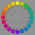
So what's wrong with the SVG exactly as opposed to the PNG? --Morn (talk) 10:52, 23 December 2010 (UTC)
-
 SVG
SVG -
 PNG
PNG


- P.S. I do notice some weird streaks on some labels in the "thumb" version, but for some reason only at that resolution. Is that you issue? --Morn (talk)
- The SVG version uses an unbelievably ugly and somewhat unreadable (esp. at small sizes) font, and the PNG version is perfectly sufficient for all the places where it’s used. Also, the SVG version formerly had no border around it, and had a transparent background, though it looks like those two things have been changed. Finally, no color management is done of the thumbnails generated from SVG images in mediawiki. To be honest, I don’t think the image is especially useful, in any form, because some readers can easily misinterpret it to imply that the specific color chosen out of each hue is somehow unique or special (for example, User:Keraunos has done this, and I don’t know how to explain to him that this is a misunderstanding; he doesn’t seem to listen when I try to tell him that). But if you really think that the image should be SVG, I could probably make an SVG version with a reasonable looking font. I just don’t think it’s tremendously useful: there are plenty of other things to do with the time (either mine or yours) that will make more impact on Wikipedia’s quality. –jacobolus (t) 01:18, 24 December 2010 (UTC)
- Yes, I've updated the SVG with your colors and the neutral background. Maybe the caption (not just image description page) could say that the colors are just meant to be representative for each hue and have been massaged to fit within sRGB gamut or whatever the issue is.
- Color management isn't really necessary for the PNG nor the SVG because both are in sRGB (SVGs I think are always in that color space). I have color management turned on in Firefox, but only because sRGB images look too light if I don't. If you are using Windows or Linux, an uncorrected image on the screen will closely match sRGB (unless you've changed the monitor settings too much from the defaults that is). I've tested this. So color management is mainly required for devices that do not match sRGB, like this old Macbook.
- Of course we could use a nicer font, but turning text into paths just for the sake of beauty means that the file cannot easily be opened in a text editor. So I think generally WP makes uses of installed fonts on the server such as Vera Sans, even if they don't look as nice as e.g. Helvetica. OTOH checking out the list at m:SVG fonts, maybe I could put e.g. URW Nimbus Sans in the SVG CSS. It's the free Helvetica clone used on Linux. That might look marginally better than Vera Sans.
- P.S. I have your talk page on my watchlist, so you can reply here. --Morn (talk) 11:31, 24 December 2010 (UTC)
- P.P.S. Oh wait, Helvetica is also installed! --Morn (talk) 11:32, 24 December 2010 (UTC)
- Changed the font to Helvetica. The gallery-size version above looks a little screwy, but in the Munsell article it's decent (larger-size thumbnail). What I don't like about the PNG is that the labels aren't centered correctly, so I'd prefer to make the SVG version work somehow. --Morn (talk) 11:43, 24 December 2010 (UTC)
- P.P.S. Oh wait, Helvetica is also installed! --Morn (talk) 11:32, 24 December 2010 (UTC)
- The SVG version uses an unbelievably ugly and somewhat unreadable (esp. at small sizes) font, and the PNG version is perfectly sufficient for all the places where it’s used. Also, the SVG version formerly had no border around it, and had a transparent background, though it looks like those two things have been changed. Finally, no color management is done of the thumbnails generated from SVG images in mediawiki. To be honest, I don’t think the image is especially useful, in any form, because some readers can easily misinterpret it to imply that the specific color chosen out of each hue is somehow unique or special (for example, User:Keraunos has done this, and I don’t know how to explain to him that this is a misunderstanding; he doesn’t seem to listen when I try to tell him that). But if you really think that the image should be SVG, I could probably make an SVG version with a reasonable looking font. I just don’t think it’s tremendously useful: there are plenty of other things to do with the time (either mine or yours) that will make more impact on Wikipedia’s quality. –jacobolus (t) 01:18, 24 December 2010 (UTC)
- I generally suggest using outlines for fonts in SVG files, because Mediawiki’s SVG renderer tends to do an awful job with text. Also, personally I don’t think Helvetica is a great font for such purposes. That’s a matter of personal taste though, I suppose. –jacobolus (t) 05:48, 29 December 2010 (UTC)