
User talk:Amandajm/Archives/2015/November
| This page is an archive of past discussions. Do not edit the contents of this page. If you wish to start a new discussion or revive an old one, please do so on the current talk page. |
Not that it matters, but...
...I suspect Mary IV is DeFacto. He was socking again recently, and the Mary IV account was created just a few hours after I made my first edit to the Rodgers article. If he continues to be disruptive I'm happy to handle the SPI paperwork, but it's generally best to ignore him. (EEng, you might want to know about this as well.) Lesser Cartographies (talk) 06:08, 2 July 2014 (UTC)
- Lesser Cartographies User:Mary IV's page would seem to indicate that this person has had previous incarnations as User:Mary, User:Mary II and User:Mary III. Amandajm (talk) 05:25, 3 July 2014 (UTC)
Gerard David
.jpg)

Amandajm, I can't answer all those questions they ask me about a picture. Don't ask you to take parts or vote, but what is wrong with this print? Here. Can you tell me if I am wrong? I think that is a print one sees quite often in books about this topic. Hafspajen (talk) 19:16, 2 July 2014 (UTC)
Amandajm, I wonder what do you think about the colors in the reproduction of this picture? Don't wan't a new controversy if nominatig it. Hafspajen (talk) 19:06, 6 July 2014 (UTC)
- Hafspajen, the colour reproduction is beautiful. However, as usual, I am seeing it a little dull, and need to turn my monitor up to full brightness to register the colours accurately. I wonder if this is in fact a problem with the settings of my monitor, as I would expect it to be correct at a middle setting.
- One of the good indications that the colours are accurate is that there is a very clear definition between the two blue pigments. Ultramarine has been used for the robes and sky, while the landscape uses a much greener blue, probably azurite. I think all the colours are excellent. It is an exquisite painting. It would be nice to see it featured. Amandajm (talk) 06:18, 8 July 2014 (UTC)
OK, then I will - as soon as the week had passed - I added that like three days ago to the article, or something like this. We are a little shy on religious paintings - as well as - nudes - the naked looks like it is an issue, wich is weird when there are so many wonderful paintings depicting them in the art history. Try to change it... Hafspajen (talk) 14:42, 8 July 2014 (UTC)
- You are a great asset. Hafspajen (talk) 06:40, 10 July 2014 (UTC)
- I am worried about the Rembrand article. We just fight over it but it does not keep up to Wikipedia standards. It would need someone who could edit it from the outside - uninvolved. It is a shame to have such a weird way of illustrating it - in my oppinion - still no good. To many forces, to many oppinions - and it is not going anywhere. We say: Rembrandt's greatest creative triumphs are exemplified especially in his portraits of his contemporaries, self-portraits and illustrations of scenes from the Bible. Well, selfportraits we have to many of in the gallery - really, but we removed a lot of portraits lately. We should have more portraits, more organized after the themes and not after the timeline, and more of the great works he had. Hafspajen (talk) 04:42, 17 July 2014 (UTC)
Yes, that Rembrand article would need your hand, to be entirely up to its supposed quality. Hafspajen (talk) 10:53, 21 July 2014 (UTC)
Is
-
 This has been edited.
 -
 ALT - looking as the original (?)- and from museum site.
 -
 This image is much less higher resolution, but the colours are more correct. (as it was in the beggining)


Is this editing such a problem that it should make it impossible to consider it as FP - the edited one? ? Hafspajen (talk) 17:10, 19 July 2014 (UTC)
- Hafspajen, No. 3 has the best colours. The red is properly crimson. The sleeves are white. The flesh is pink and white and the sky is blue. The other two have a yellow cast. It would be easy to correct, but I think that they are too large to load onto my browser. Amandajm (talk) 11:10, 21 July 2014 (UTC)
- Really?? That was a BIG surprise. I had a load of comments on the nomination about ALT being the correct version, coming from the museum site. It would be an idea to upload the Joconde version. Hafspajen (talk) 11:13, 21 July 2014 (UTC)
- Unfortunately, I have to agree with you. I just went to the museum's page and looked at it in detail. None of the impasto whites are white; they are all yellowish. By contrast, the little spots of light reflecting of the surface of the paint are sharp white. So the yellowish hue is definitely part of the picture, as it now exists. Maybe varnish, or smoke stain. (It's what happens to pictures that are in a room with an open fire, or candles.) If it was in the National Gallery, London, they would clean it ... very thoroughly, and ..... well, let's not go there.....
- OK, now - which one is fit - for a Featured picture? I knew that the original painting - the one painted for 500 years ago was like the one you posted. But for a Featured picture what would be the criteria?
- Really?? That was a BIG surprise. I had a load of comments on the nomination about ALT being the correct version, coming from the museum site. It would be an idea to upload the Joconde version. Hafspajen (talk) 11:13, 21 July 2014 (UTC)
- As far as I read it it goes like this: For historic images, acceptable manipulations might include digitally fixing rips, removal of stains, cleanup of dirt, and, for mass-produced artworks such as engravings, removal of flaws inherent to the particular reproduction, such as over-inking. Careful colour adjustments may be used to bring out the original work from the signs of ageing, though care should be taken to restore a natural appearance. The original artistic intent should be considered when deciding whether it is appropriate to make a change.
- So, which one is the one that is the right kind of picture then? Hafspajen (talk) 11:40, 21 July 2014 (UTC)
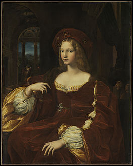
Maybe you were right, from the beggining. Or there are two pictures, see here: http://www.louvre.fr/en/mediaimages/giulio-romano-peut-etre-avec-l-intervention-de-raphael-portrait-de-dona-isabel-de-reques. Hafspajen (talk) 13:17, 24 July 2014 (UTC)
And an other
Titian - now I say that those few pictures that are in the article - are not exactly giving a full impression of this great artist, they are dark, not that great and he has so much more to offer. Tried to add some - but there is a problem - wich ones should be there. I put a selection unsorted works on the talk page of the article, but one should try to find out some clever way of presenting them. Hafspajen (talk) 03:22, 22 July 2014 (UTC)
-
 This absolutely
 -
 Also this
 -
 this is good
 -
 well known
 -
 great picture
 -
 maybe
maybe -
 lovely
 -
 interesting composition
 -
 well known
 -
 well known
 -
 well known
 -
 well known
 -
 interesting
 -
 interesting

.jpg)

_001b.jpg)

.jpg)


.jpg)


From_Bijin-ga_(Pictures_of_Beautiful_Women),_published_by_Tsutaya_Juzaburo_-_Google_Art_Project.jpg)
These for example. Hafspajen (talk) 03:34, 22 July 2014 (UTC)
August 2014
![]() Welcome to Wikipedia, and thank you for your contributions. Although everyone is welcome to contribute constructively to the encyclopedia, please note that there is a Manual of Style that should be followed to maintain a consistent, encyclopedic appearance. Deviating from this style, as you did in Leonardo da Vinci, disturbs uniformity among articles and may cause readability or accessibility problems. Please take a look at the welcome page to learn more about contributing to this encyclopedia. Specifically, you changed "one of the most famous paintings..." to "THE most famous painting...", the latter of which is considered use of peacock terms. DaL33T (talk) 01:11, 10 August 2014 (UTC)
Welcome to Wikipedia, and thank you for your contributions. Although everyone is welcome to contribute constructively to the encyclopedia, please note that there is a Manual of Style that should be followed to maintain a consistent, encyclopedic appearance. Deviating from this style, as you did in Leonardo da Vinci, disturbs uniformity among articles and may cause readability or accessibility problems. Please take a look at the welcome page to learn more about contributing to this encyclopedia. Specifically, you changed "one of the most famous paintings..." to "THE most famous painting...", the latter of which is considered use of peacock terms. DaL33T (talk) 01:11, 10 August 2014 (UTC)