
File talk:Cancer smoking lung cancer correlation from NIH.svg
"Population (men)"...?
Source location[edit]
Found version on current (5th feb 2012) US govt site: http://www.cancer.gov/cancertopics/understandingcancer/cancer/UNDERCAN.PDF page 31. 109.155.139.233 (talk) 10:06, 5 February 2012 (UTC)
Graph is used in a misrepresenting fashion in most articles[edit]
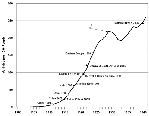
Correlation does not imply causation, please have a look at e.g. http://www1.eere.energy.gov/vehiclesandfuels/images/facts/fotw474-2.gif , which shows the number of cars and thus exhaust inhalation increase in the same timeframe as tobacco consumption. Equally, the number of coal plants, factories, industry and whatever power plants and combustion technology that pumps radon and cancerogenic substances into the air did similarly increase as the graph shows. Thus where ever it is used on wikipedia it is highly misleading and leads people to imply causation. To fix that, please add the car graph data for comparison or power-plant graphs or whatever, thanks. C0NPAQ (talk) 14:04, 19 February 2014 (UTC)
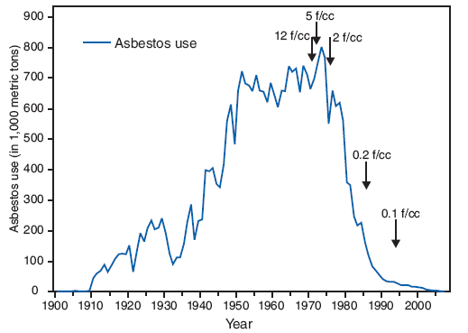
Further critique ... check out asbestos usage http://www.cdc.gov/mmwr/preview/mmwrhtml/figures/m815a3f1.gif , and all the other lung cancer graphs : http://antismokingscam.files.wordpress.com/2012/01/us-smoking-trends-1900-2002.jpg . Plainly using common sense it seems so, that up to 1970-1990 not many pollution and health regulations had been in place. And those regulations were legislated because of the increases in long-term health effects, particularly lung cancer and other cancers, that arose with the industry and population growth. The source file of the graph doesn't name any data sources and contradicts other statistics. For the sake of not implying a nonsensical causation where it is used, it should be removed. C0NPAQ (talk)
- You could try speaking with those who produced this graph. Doc James (talk · contribs · email) (if I write on your page reply on mine) 18:46, 19 February 2014 (UTC)
Graph nonsense, removing it on all pages[edit]
Further checked the whole issue. Seems that in the first half of the 20th century, lung cancer was not really often looked for as a cause of death and differentiated from just cancer. Any statistics about it, at least before 1930 have so many problems with sourcing proper data that it isn't even used in almost all modern analysis about lung cancer, smoking cancer and such. If you check the archive page of the source of the image, it is a single picture with a small text on an page that happens to have .gov in the URL and was taken down, probably for a good reason. So if it is based on any real data at all the values are necessarily extrapolated and also absolute and uncorrected for life-expectancy and what not. Like I said, it also ignores all the industrialization effects that happen to occur at exactly the same time. I did juggle some data together, just to show what really happened. Included respiratory tuberculosis for fun, because that's the next best thing to lung-cancer you will get in mortality statistics before 1960-1930. Turns out stuff is just not that easy. Whatever modern lung-cancer statistics are about, they would have to do a lot of adjusting and bending to correlate it mostly to smoking.

C0NPAQ (talk) 18:48, 19 February 2014 (UTC)
- We just report what reliable sources say. This looks like original research. Doc James (talk · contribs · email) (if I write on your page reply on mine) 18:53, 19 February 2014 (UTC)
- And we don't ignore how things make sense and dig out bullshit from deleted pages that specifically misleads people to draw incorrect conclusions in order to prove some predetermined point. This looks like original research, but like I said its just for fun. Thank you. C0NPAQ (talk) 18:58, 19 February 2014 (UTC)
- Another graph that fits. Just need to click on causes [2] If you are attempting to prove that lung cancer does not cause cancer you may have a little trouble as the best avaliable evidence does not support this position. Doc James (talk · contribs · email) (if I write on your page reply on mine) 19:00, 19 February 2014 (UTC)
- Here is a 2012 report [3] Doc James (talk · contribs · email) (if I write on your page reply on mine) 19:02, 19 February 2014 (UTC)
- I found essentially the same graph, but seemingly with data that wasn't just wildly made up: http://med.stanford.edu/biostatistics/abstract/RobertProctor_paper1.pdf . Probably not usable because of copyright. Also the cigarette consumption line mismatches with the US gov data I got. Maybe it accounts for self-rolled cigarettes and mine doesn't? Anyway, I will look more into this. C0NPAQ (talk) 19:09, 19 February 2014 (UTC)
- That is global rather than US data. Doc James (talk · contribs · email) (if I write on your page reply on mine) 22:40, 19 February 2014 (UTC)
- I see, but it is also extrapolated as mentioned and it doesn't cure the illnesses of the other graph. Plotting something representative here is too big for wikipedia. But I can smell when there is a turd in the oven and those lung cancer graphs all don't smell good. I want to know what economical interests are likely behind this. Very difficult to get proper data. Maybe I should have a look into some nutjob blogs. C0NPAQ (talk) 23:43, 19 February 2014 (UTC)
- That is global rather than US data. Doc James (talk · contribs · email) (if I write on your page reply on mine) 22:40, 19 February 2014 (UTC)
- I found essentially the same graph, but seemingly with data that wasn't just wildly made up: http://med.stanford.edu/biostatistics/abstract/RobertProctor_paper1.pdf . Probably not usable because of copyright. Also the cigarette consumption line mismatches with the US gov data I got. Maybe it accounts for self-rolled cigarettes and mine doesn't? Anyway, I will look more into this. C0NPAQ (talk) 19:09, 19 February 2014 (UTC)
- Here is a 2012 report [3] Doc James (talk · contribs · email) (if I write on your page reply on mine) 19:02, 19 February 2014 (UTC)
- Another graph that fits. Just need to click on causes [2] If you are attempting to prove that lung cancer does not cause cancer you may have a little trouble as the best avaliable evidence does not support this position. Doc James (talk · contribs · email) (if I write on your page reply on mine) 19:00, 19 February 2014 (UTC)
- And we don't ignore how things make sense and dig out bullshit from deleted pages that specifically misleads people to draw incorrect conclusions in order to prove some predetermined point. This looks like original research, but like I said its just for fun. Thank you. C0NPAQ (talk) 18:58, 19 February 2014 (UTC)
- We just report what reliable sources say. This looks like original research. Doc James (talk · contribs · email) (if I write on your page reply on mine) 18:53, 19 February 2014 (UTC)